Development
Research
Client
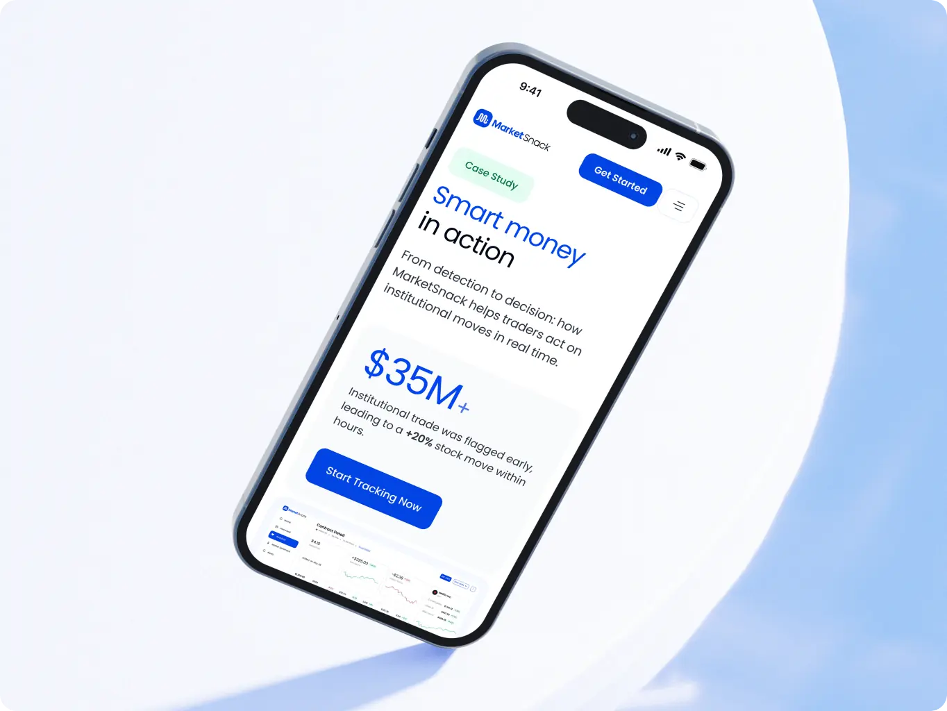
marketsnack
 USA
USA
USA
Services
Website redesign
Website development
Technologies
 Webflow
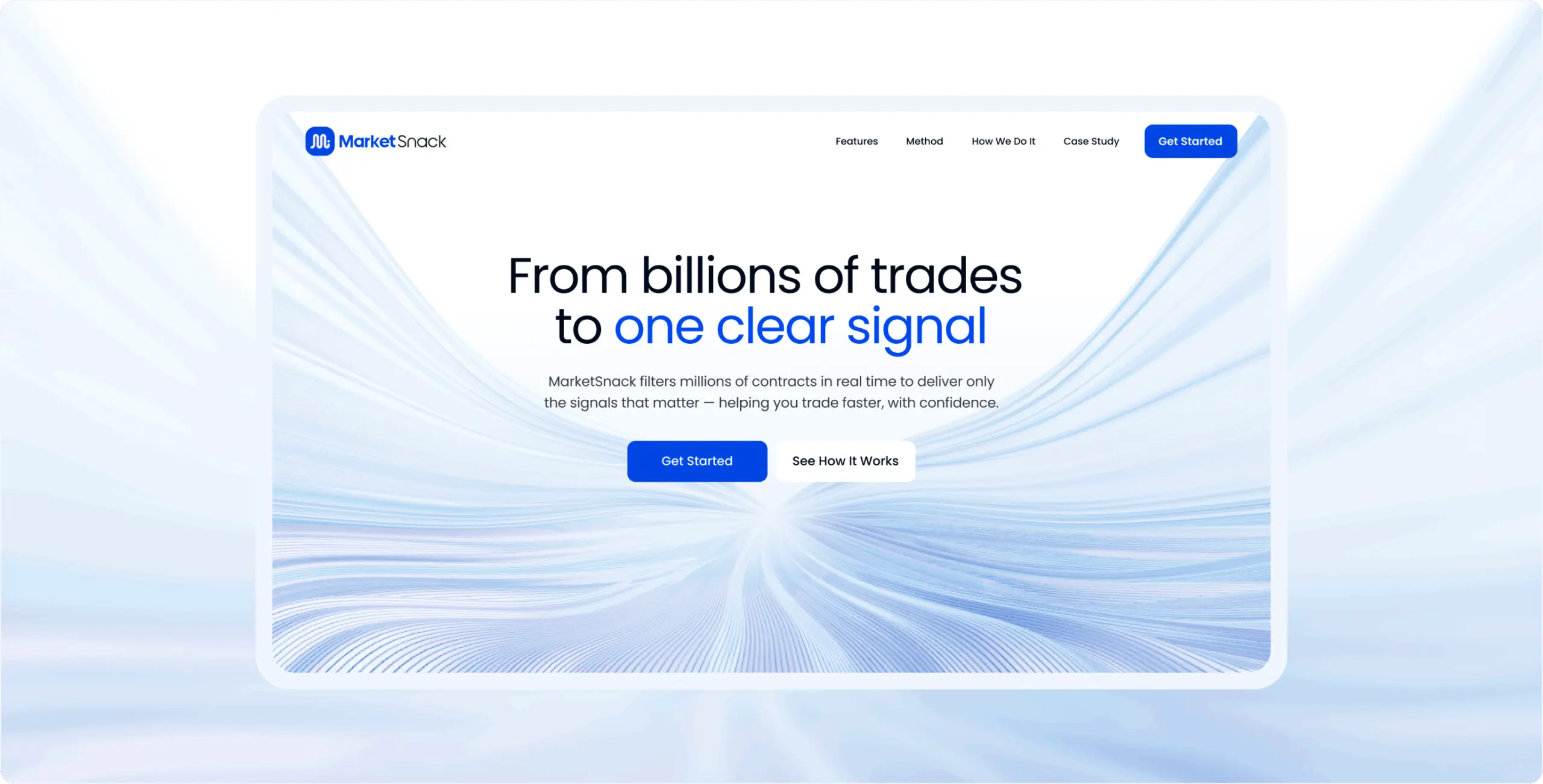
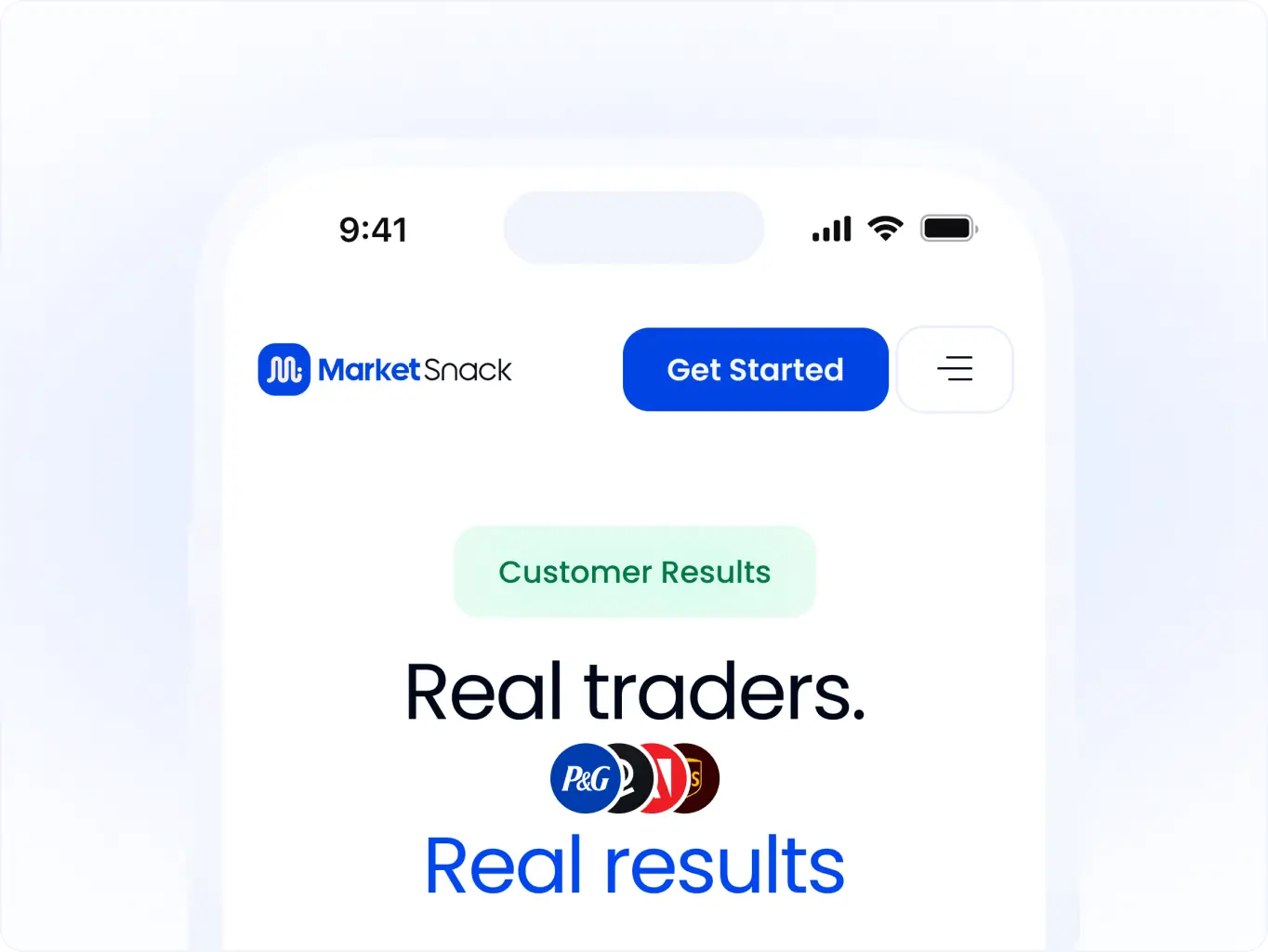
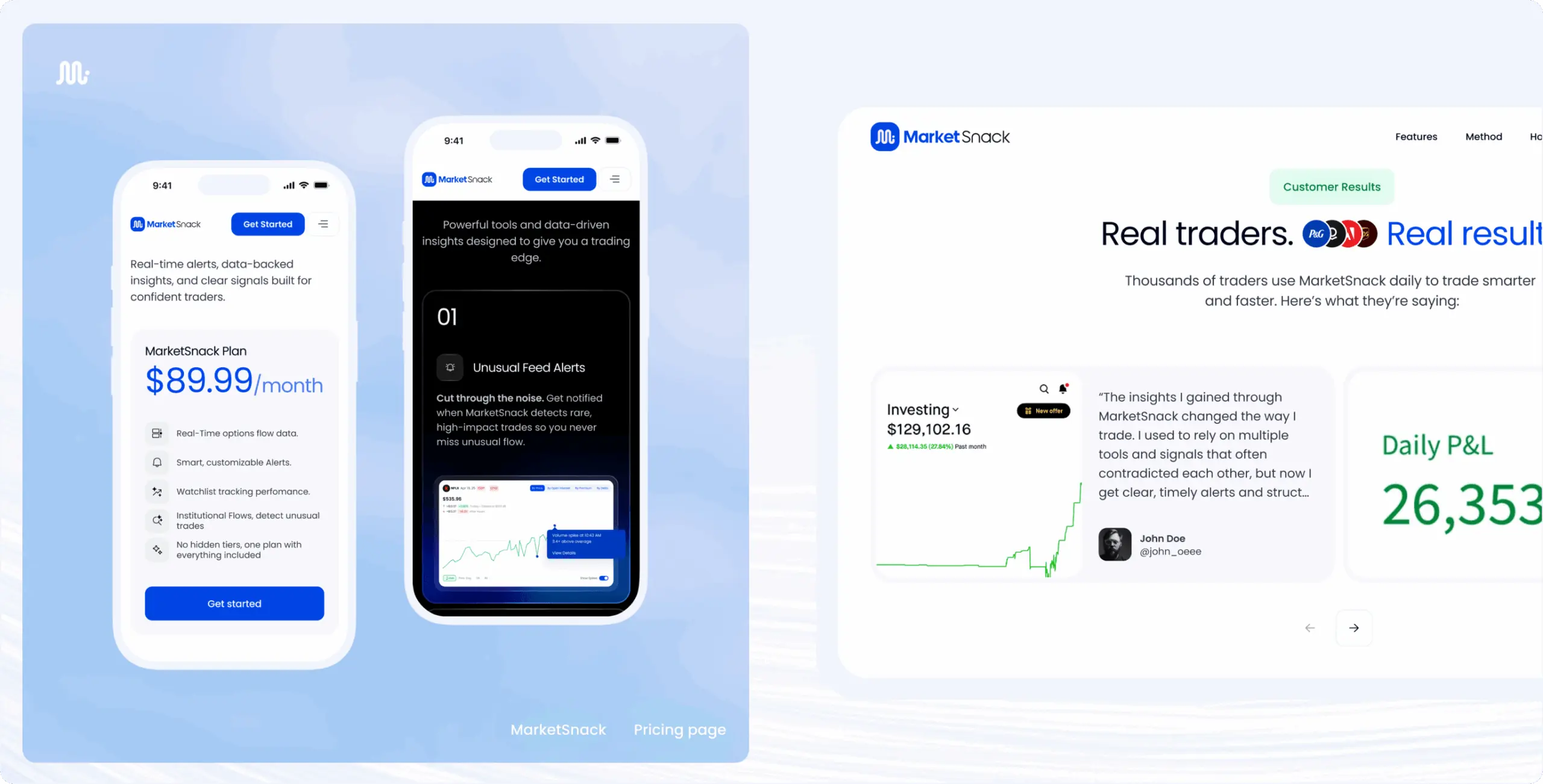
The client’s primary business goal was to transform the website from an informational platform into a scalable acquisition funnel focused on converting visitors into registered and paid users. The redesign needed to support measurable KPIs including signup conversion rate, CTA engagement, funnel completion, bounce rate reduction, and long-term retention.
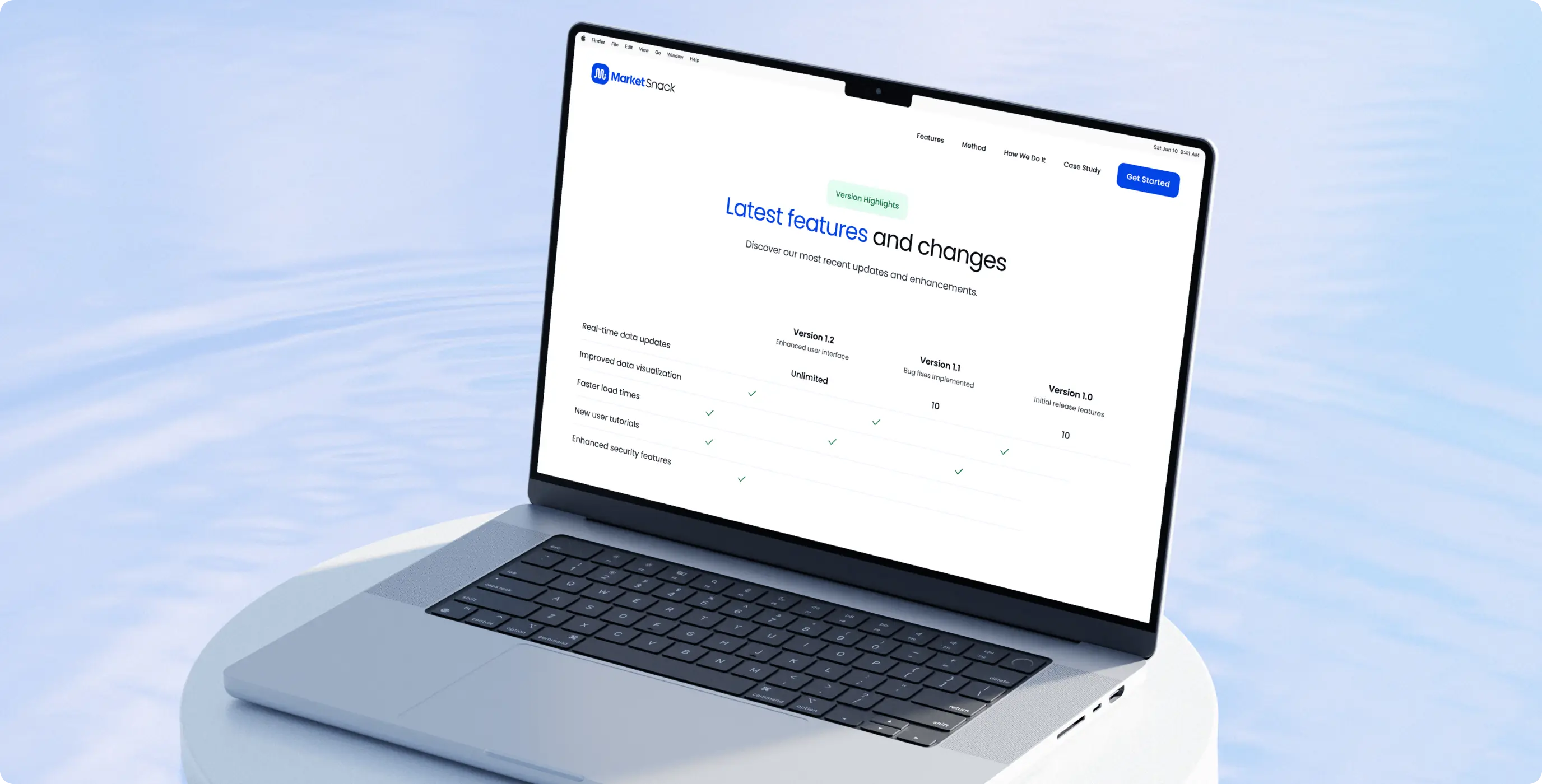
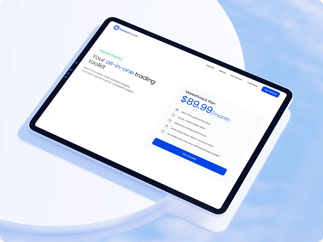
In addition to the landing page redesign, the project included planning and expansion for new business-oriented pages including Pricing, Affiliate Program, and Upcoming Features & Updates. These additions were intended to support monetization, partnership growth, and product transparency while creating a more complete customer journey across the platform.

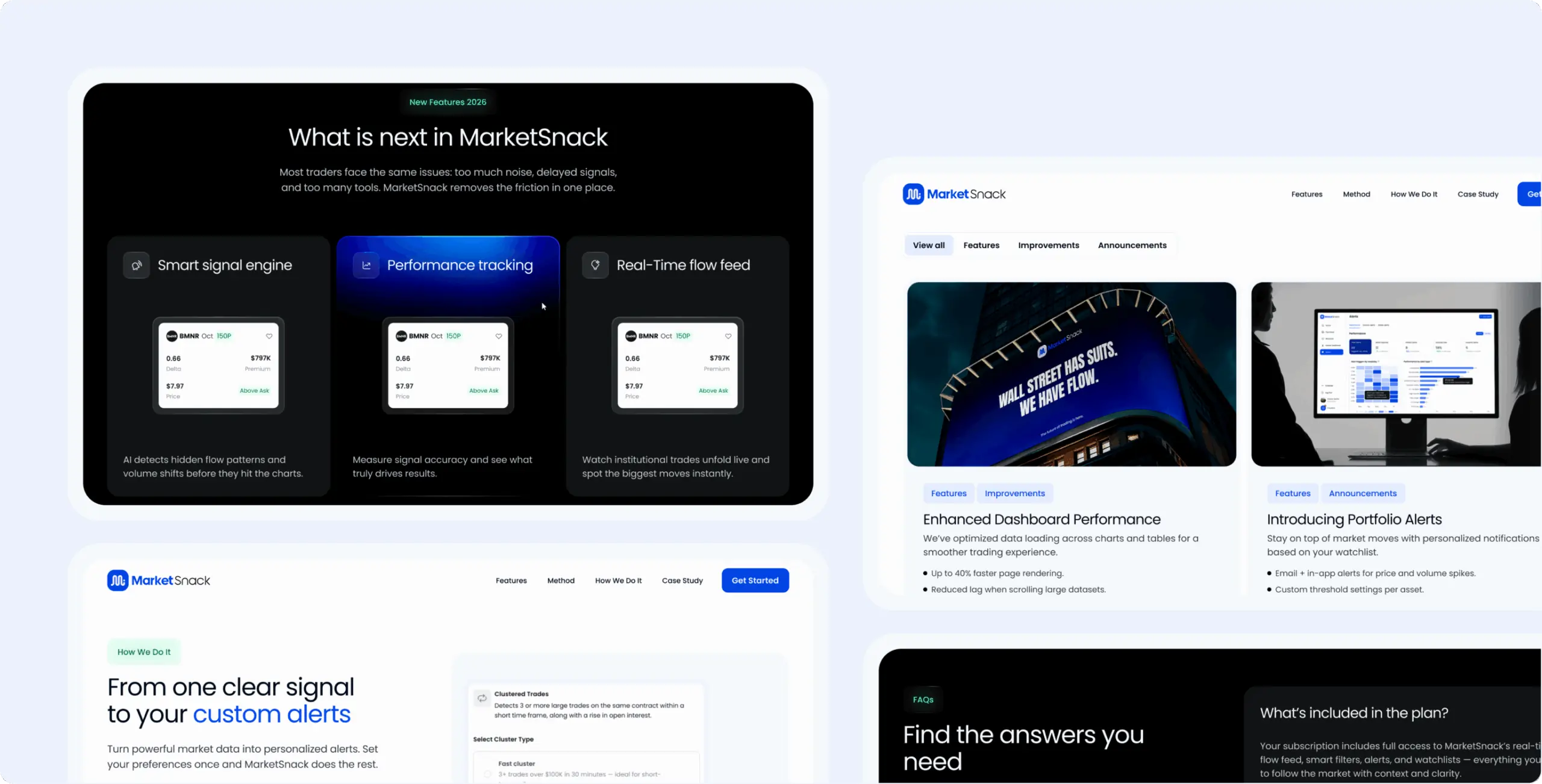
The research phase focused on understanding how leading fintech and trading platforms communicate complex functionality while maintaining clarity and trust. We analyzed competitors including CheddarFlow, Unusual Whales, TradingView, and TradeUI to identify common UX patterns, positioning strategies, onboarding flows, and monetization structures.
Special attention was given to pricing presentation, dashboard communication, CTA placement, and how competitors simplify large amounts of trading data for different user segments. These insights helped shape a more accessible website structure and a clearer product narrative for MarketSnack.
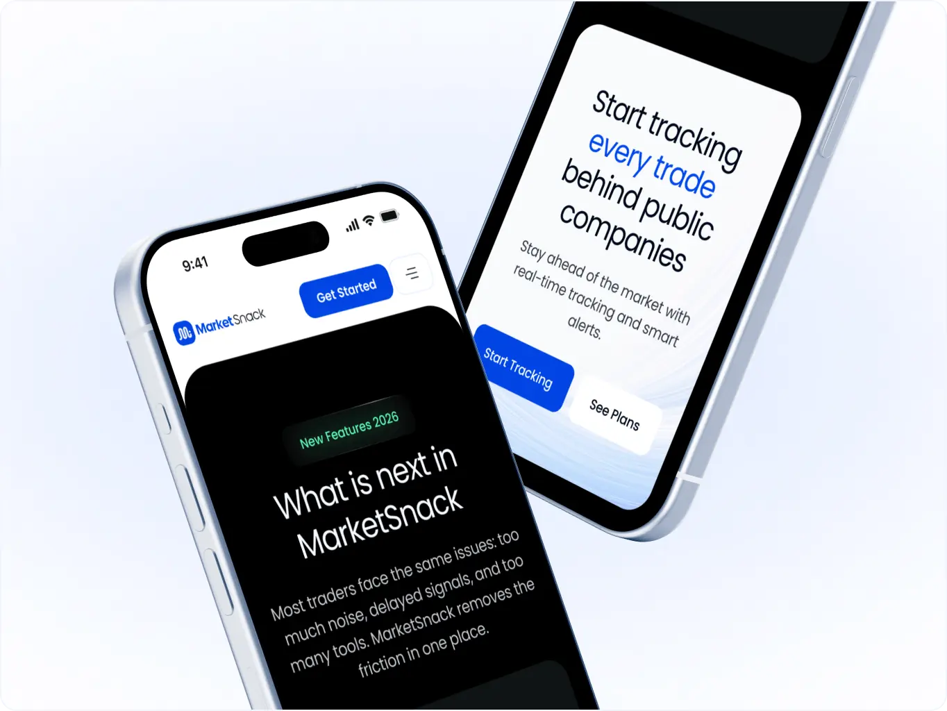
The design stage focused on translating complex trading functionality into a modern, visually structured website experience that supports business growth and user acquisition. The interface system was designed to improve readability, simplify decision-making, and create a stronger competitive presence within the fintech space.
A modular design system, clean data presentation, and conversion-focused layouts allowed the platform to communicate product value more effectively while supporting future scalability across additional pages and features.
Stages
- Wireframes
- moodboards
- concepts
- UI design
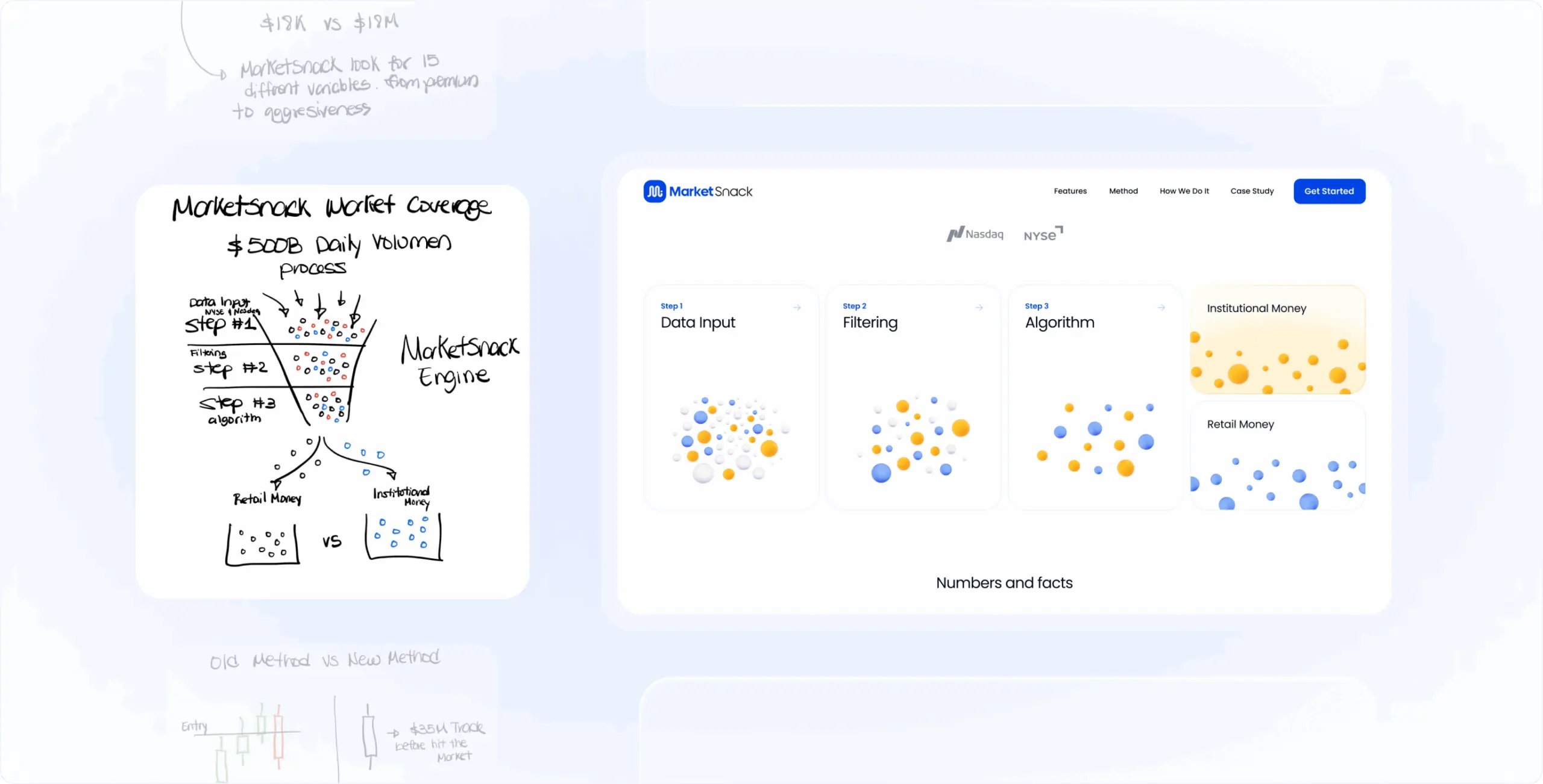
The wireframing stage focused on solving business and communication problems before moving into UI. Multiple wireframe versions and fast sketches were created to test different ways of presenting the product, simplifying trading functionality, and improving the signup journey.
The main goal was to identify the clearest structure for communicating how the platform helps traders make faster and more informed decisions without overwhelming users with technical data.
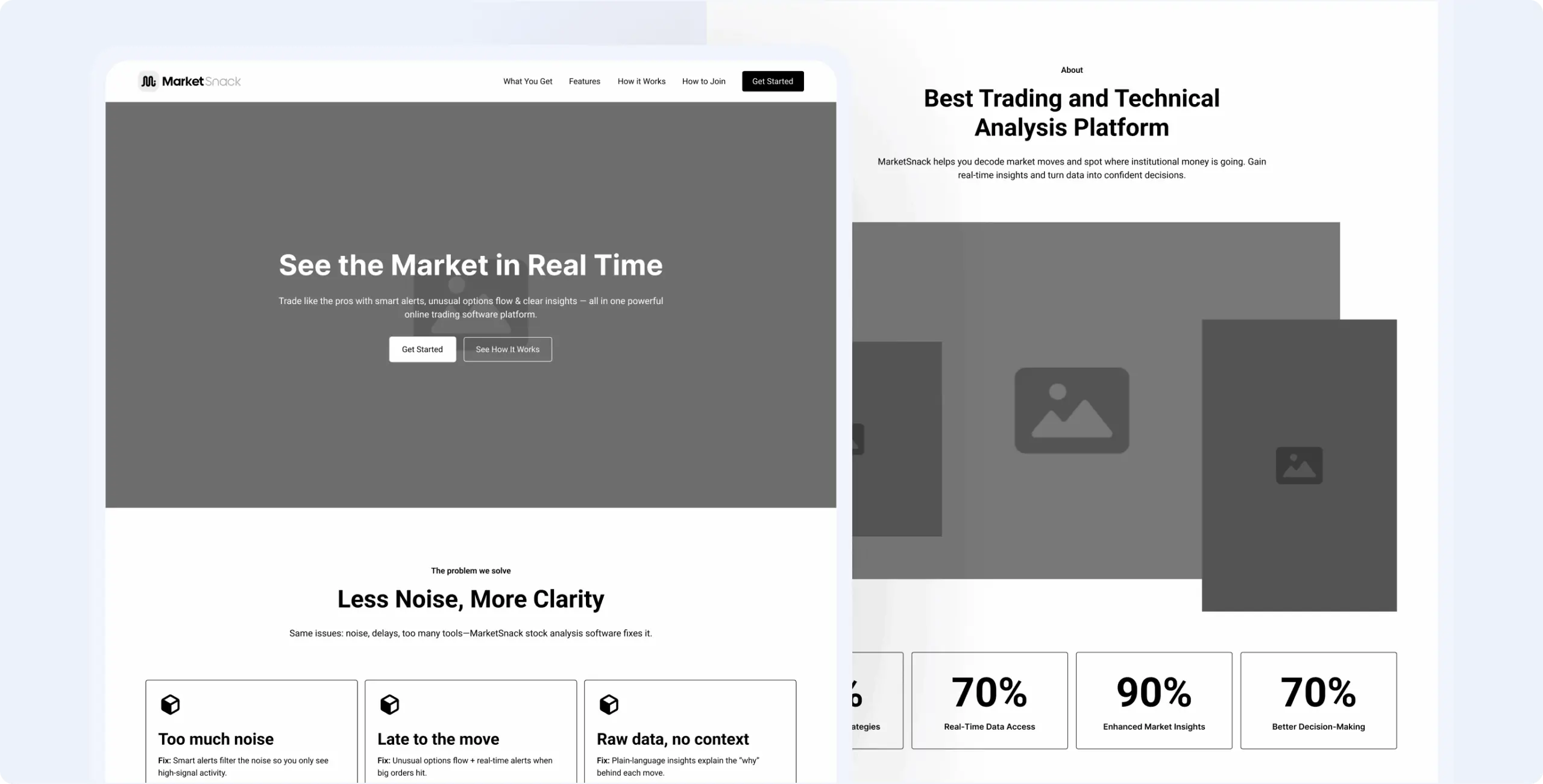
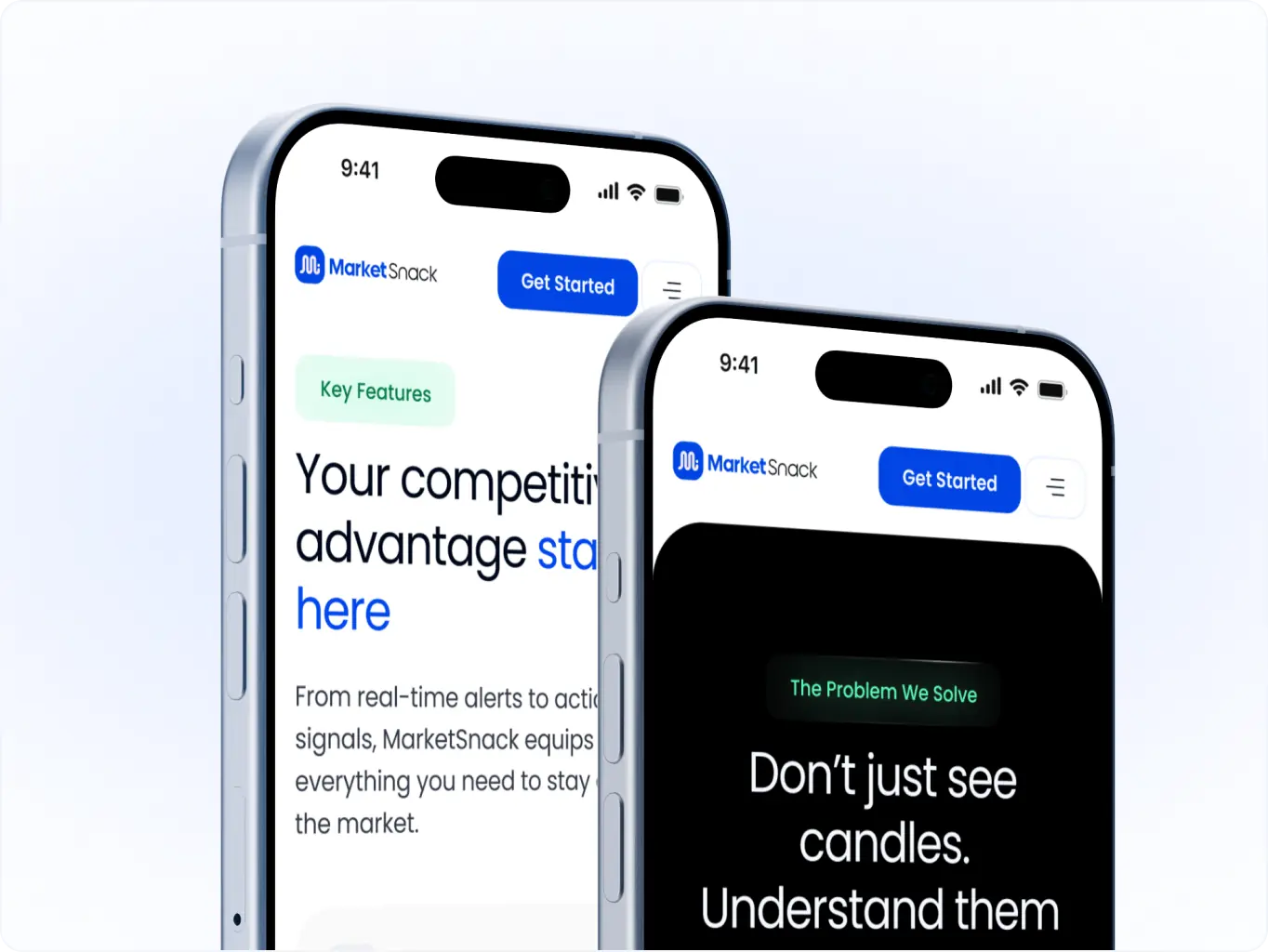
The moodboard stage focused on defining a visual style that helps MarketSnack stand out within a crowded fintech market. Early exploration included darker trading-style interfaces commonly used by competitors, but these directions made the product feel too similar to existing platforms.
Instead, a cleaner and lighter visual mood was selected to make the product feel more approachable, modern, and easier to navigate. This direction also helped simplify the perception of complex trading tools and supported the product’s positioning as a more accessible platform for everyday traders.
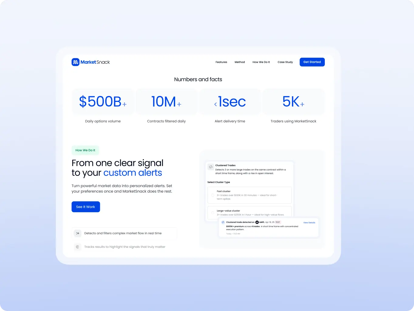
During the concept stage, multiple creative directions were developed to test how the platform could better communicate its value and differentiate itself from competitors. The concepts focused on balancing complex trading functionality with simplified communication and cleaner user flows.
Different approaches to visual hierarchy, product storytelling, dashboard presentation, and conversion structure were explored to identify the most scalable and business-oriented solution.
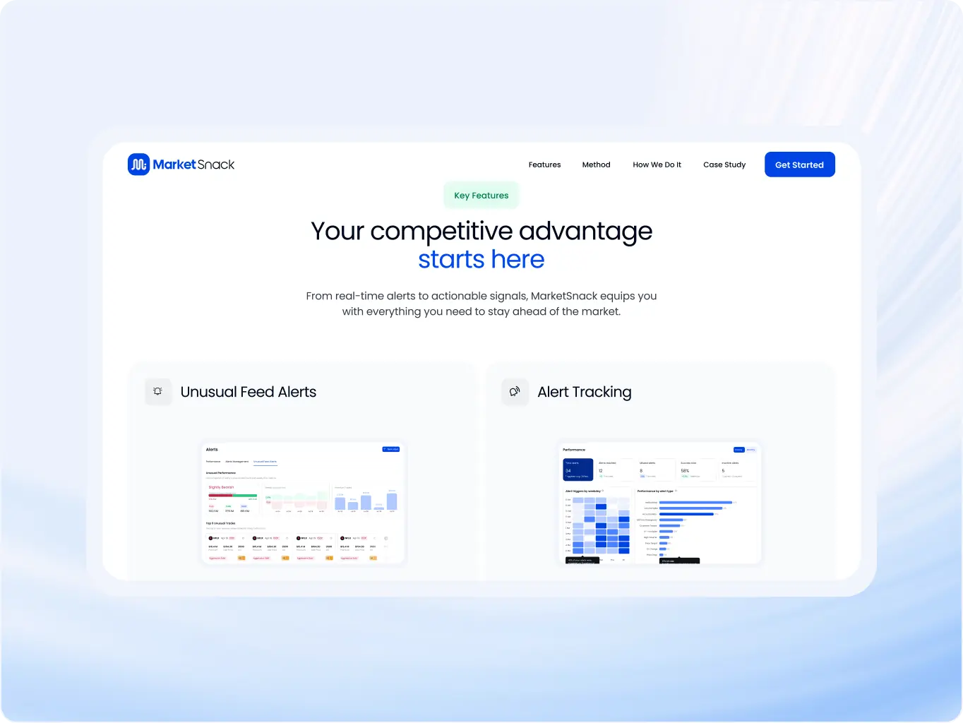
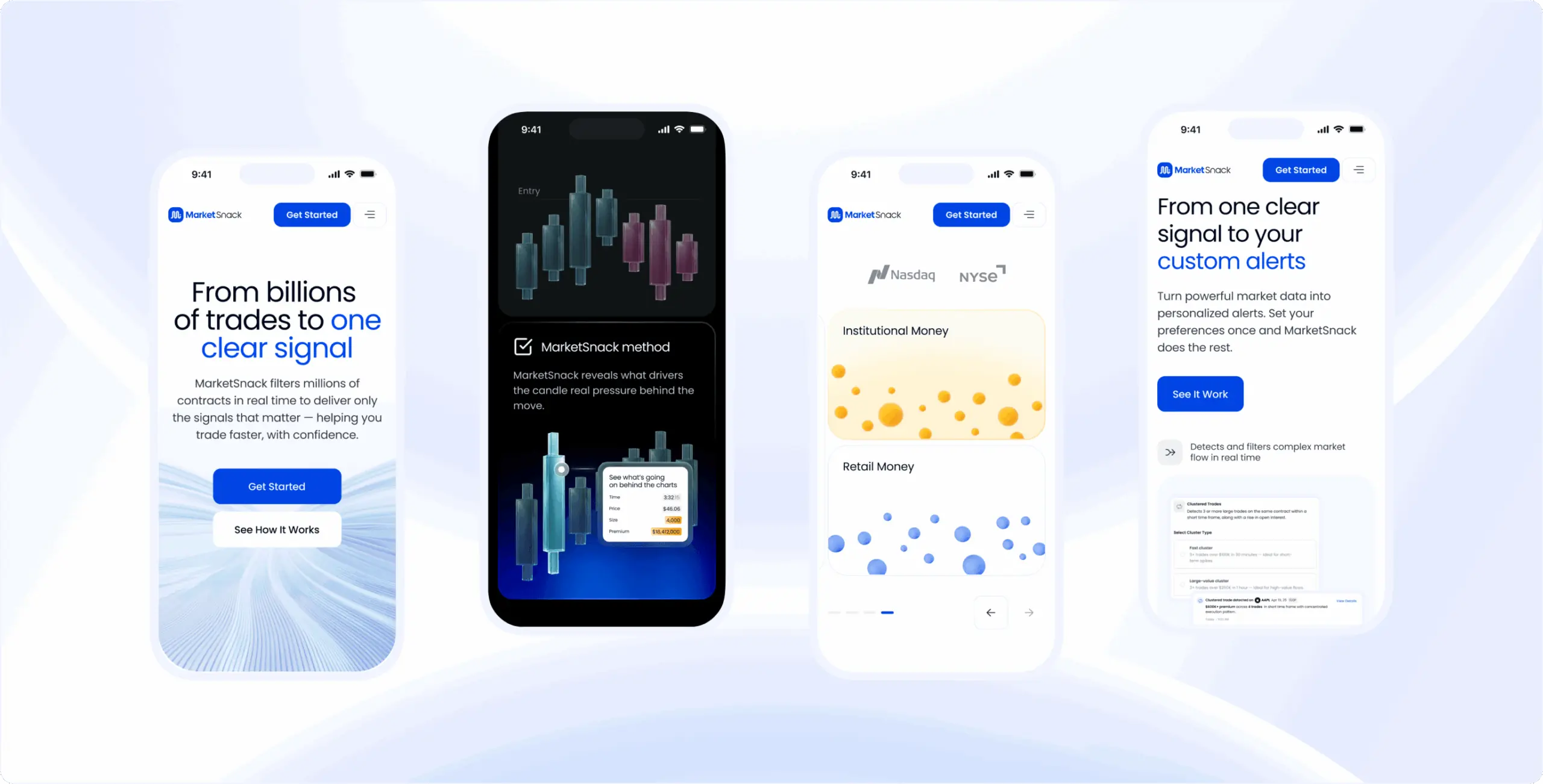
The UI design stage focused on building a consistent interface system that improves readability, accessibility, and user trust across the entire website. Complex product functionality and trading data were translated into cleaner layouts with stronger hierarchy and more intuitive interactions.
The final interface combined modern fintech aesthetics with structured data presentation, helping users understand the platform faster while supporting key business goals such as conversion and onboarding.
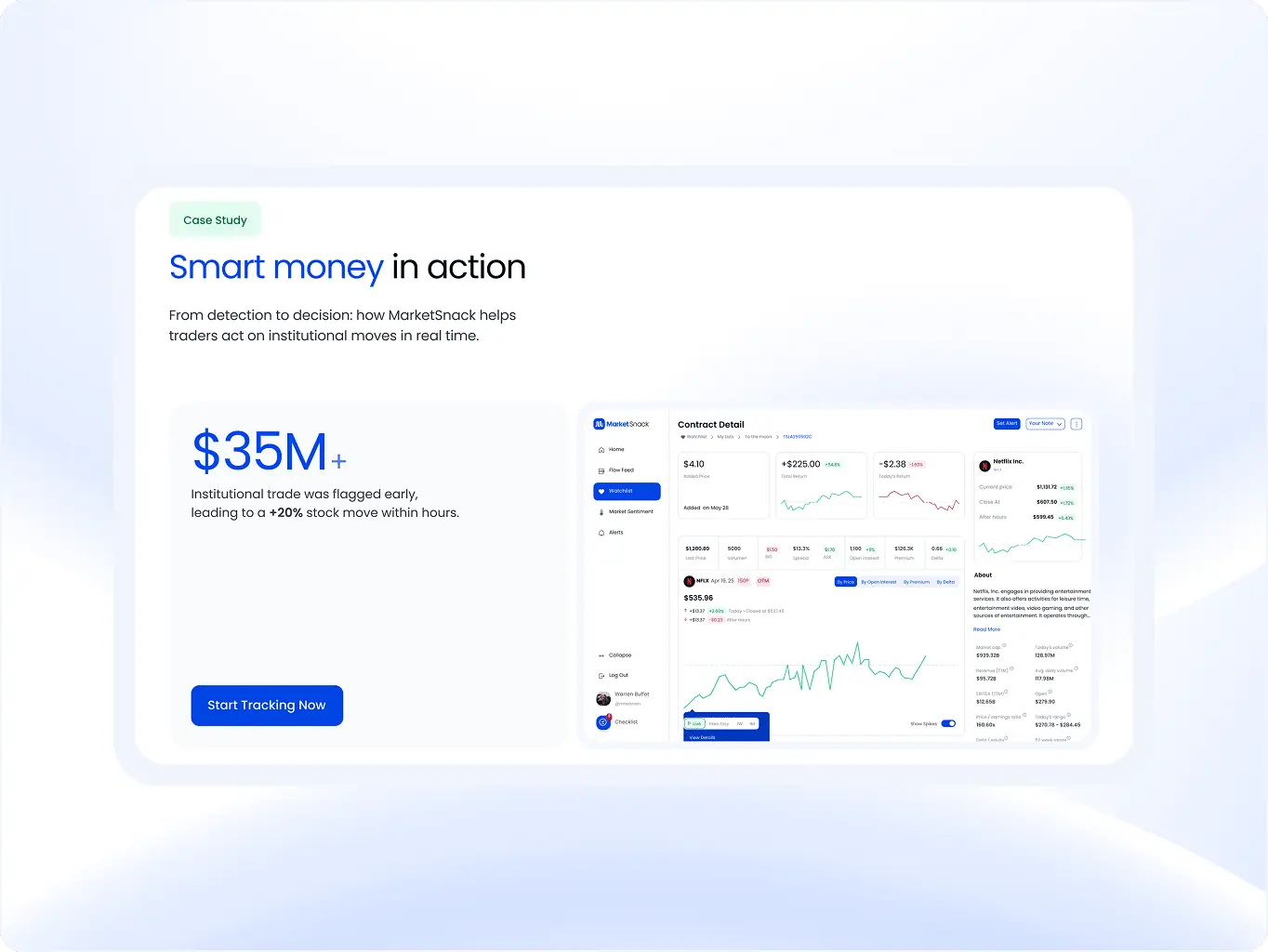
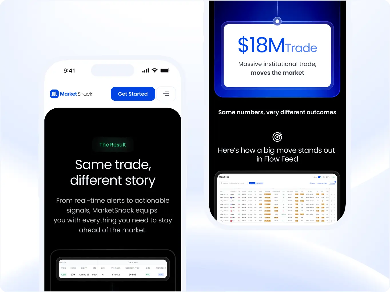
The development stage focused on implementing the website in Webflow with interactive and animated sections designed to support product communication and user engagement. Instead of using animation purely for aesthetics, motion was used to guide attention, explain platform functionality, and improve understanding of key product features.
Animated transitions, interactive content blocks, and structured section behavior helped present complex trading insights in a more digestible way while keeping the landing experience dynamic and conversion-focused across all major pages.

#Product redesign
BETERRA
United States
United States
#Website design #website development
EVERON
United States
United States
#Ux audit #website redesign
Artisan
USA
USA
Have a project in mind?
Let's chat
Have a project to
discuss?
discuss?

Have a partnership in
mind?
mind?