Development
Research
Client
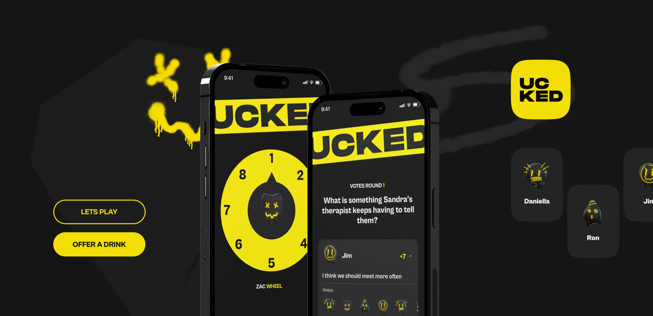
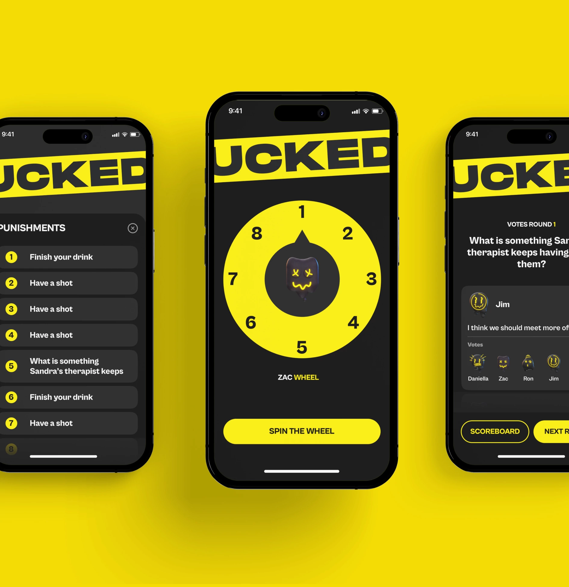
Ucked
 UK
UK
UK
Services
3D illustrations
Motion design
Branding
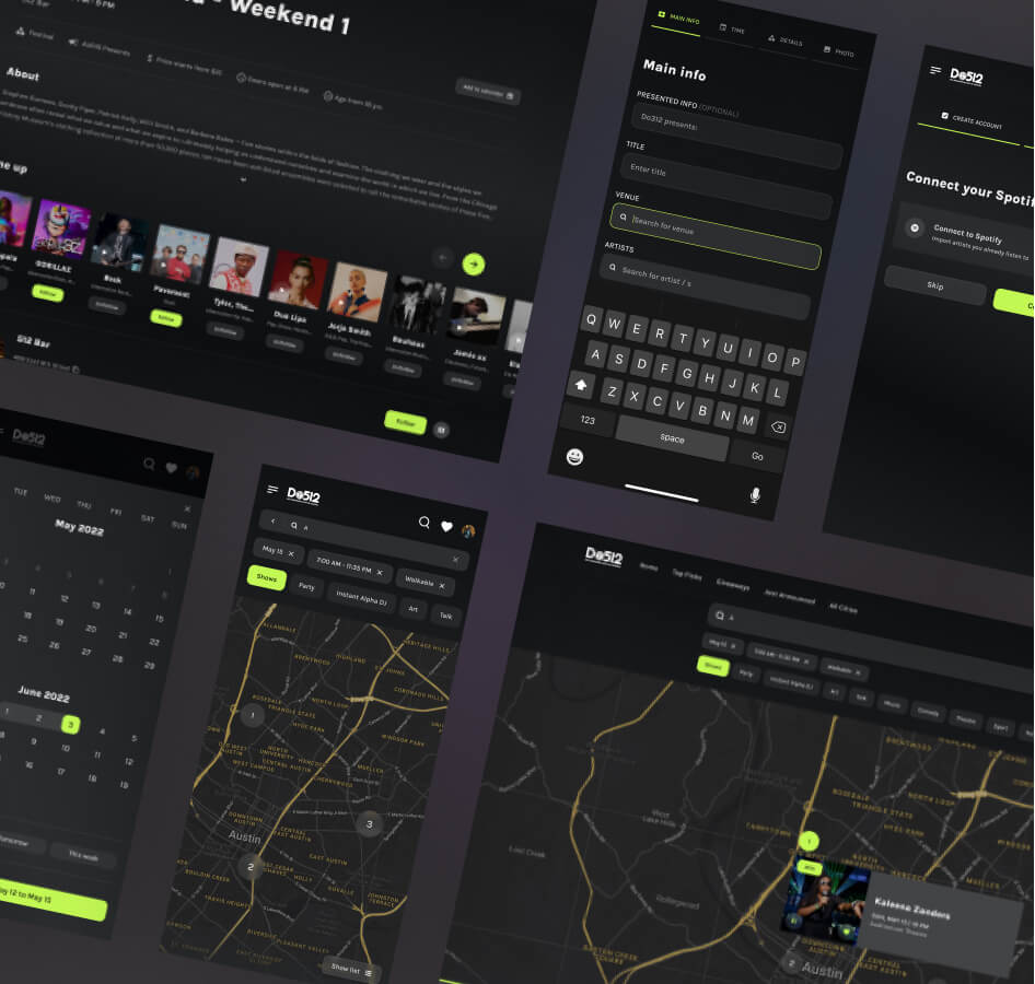
Having conducted UX-Audit, your team found plenty of gaps that needed deeper examination and more work. We spent hours researching best practices, studying user interviews, and discussing what kind of solutions would be optimal for this product.
Logo idea
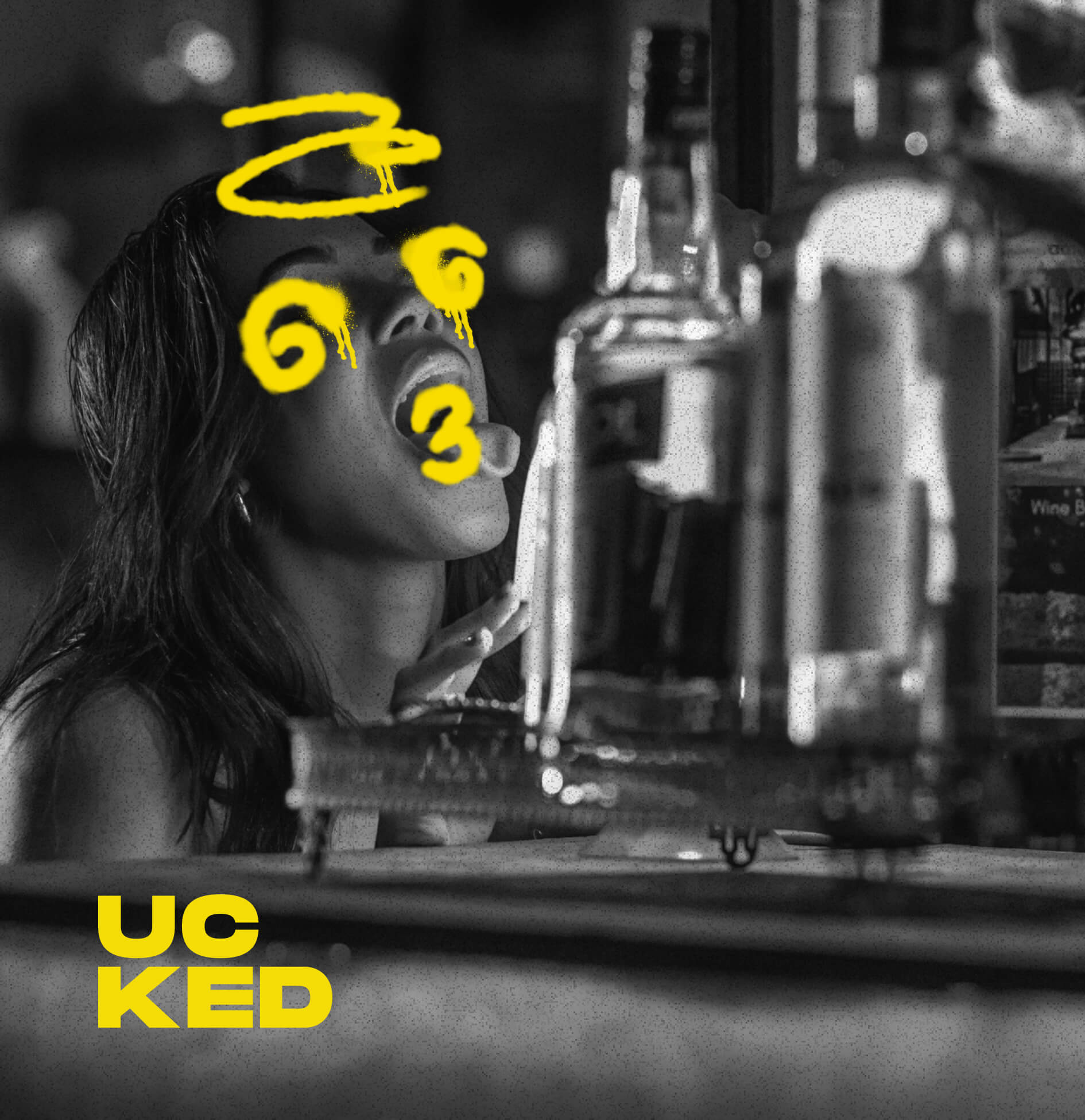
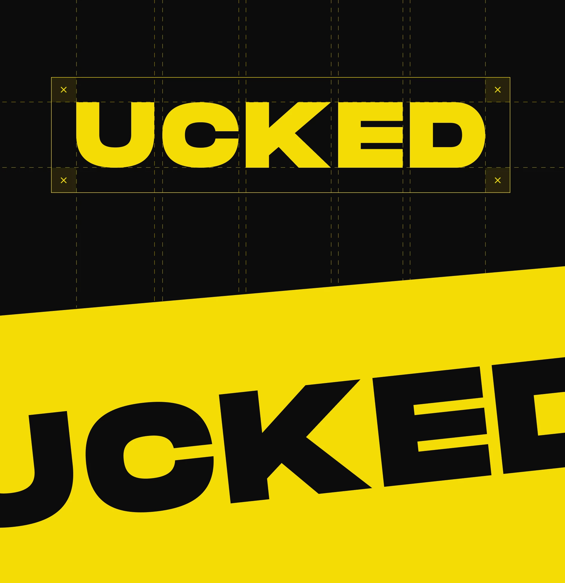
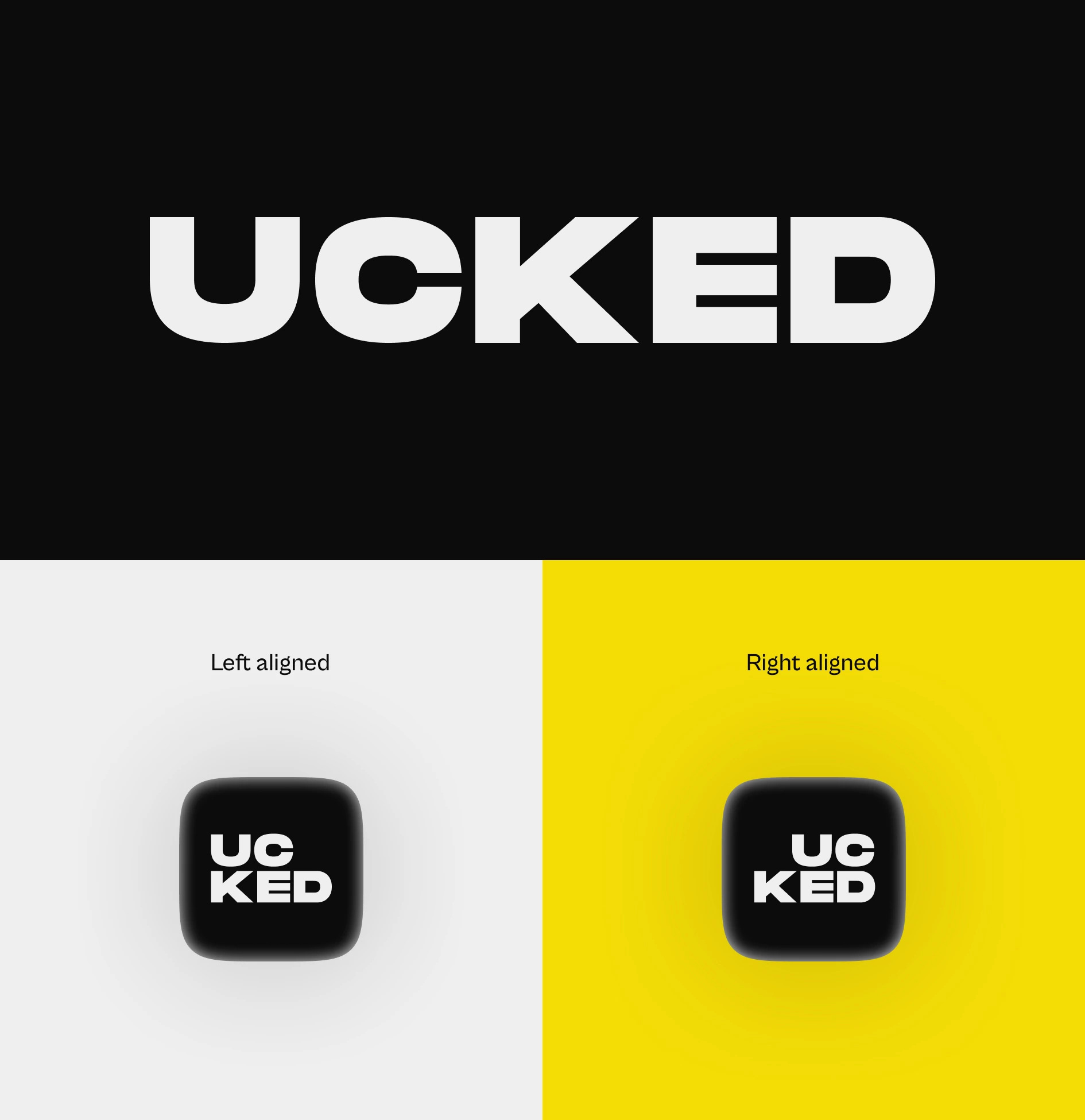
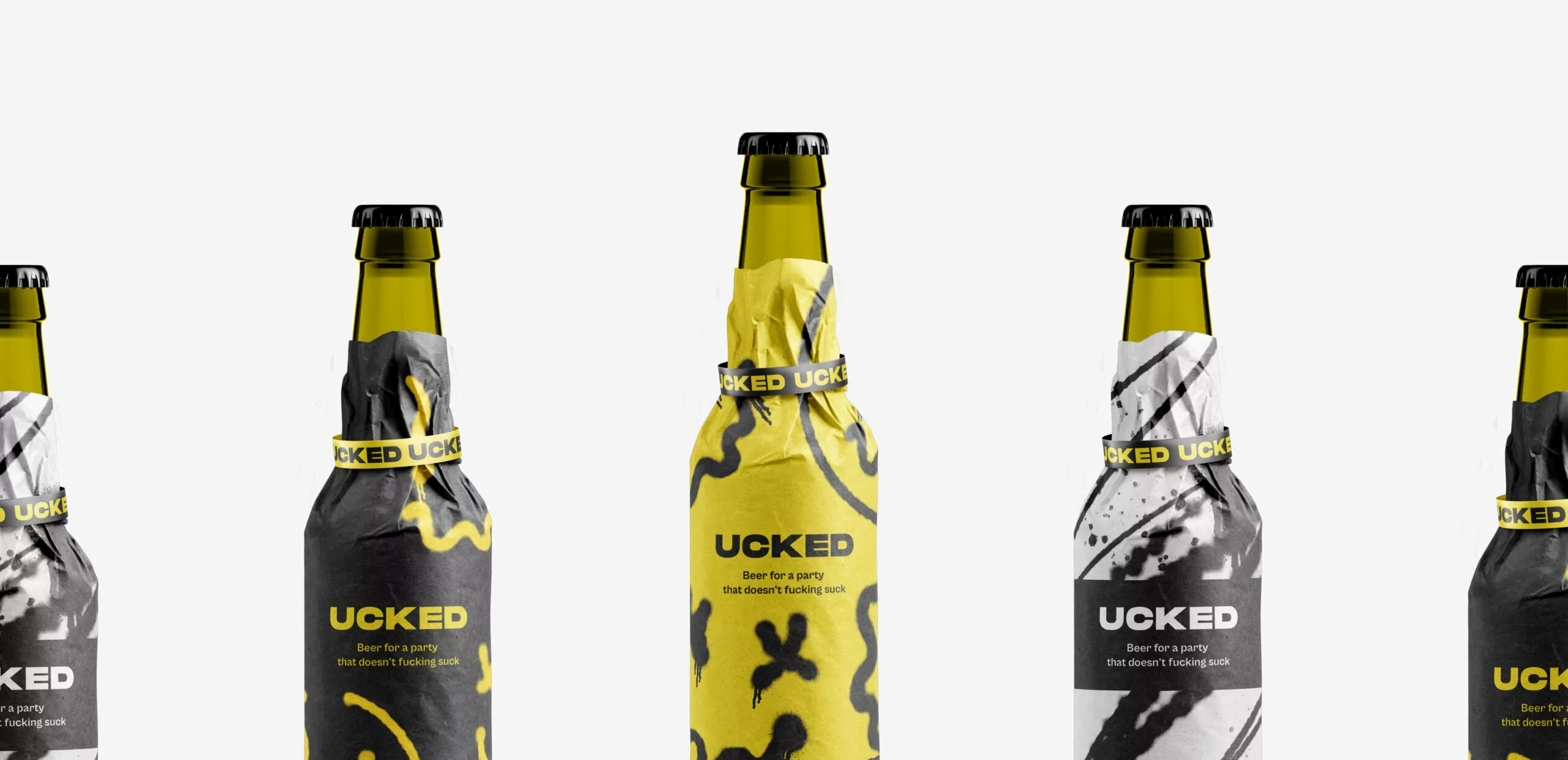
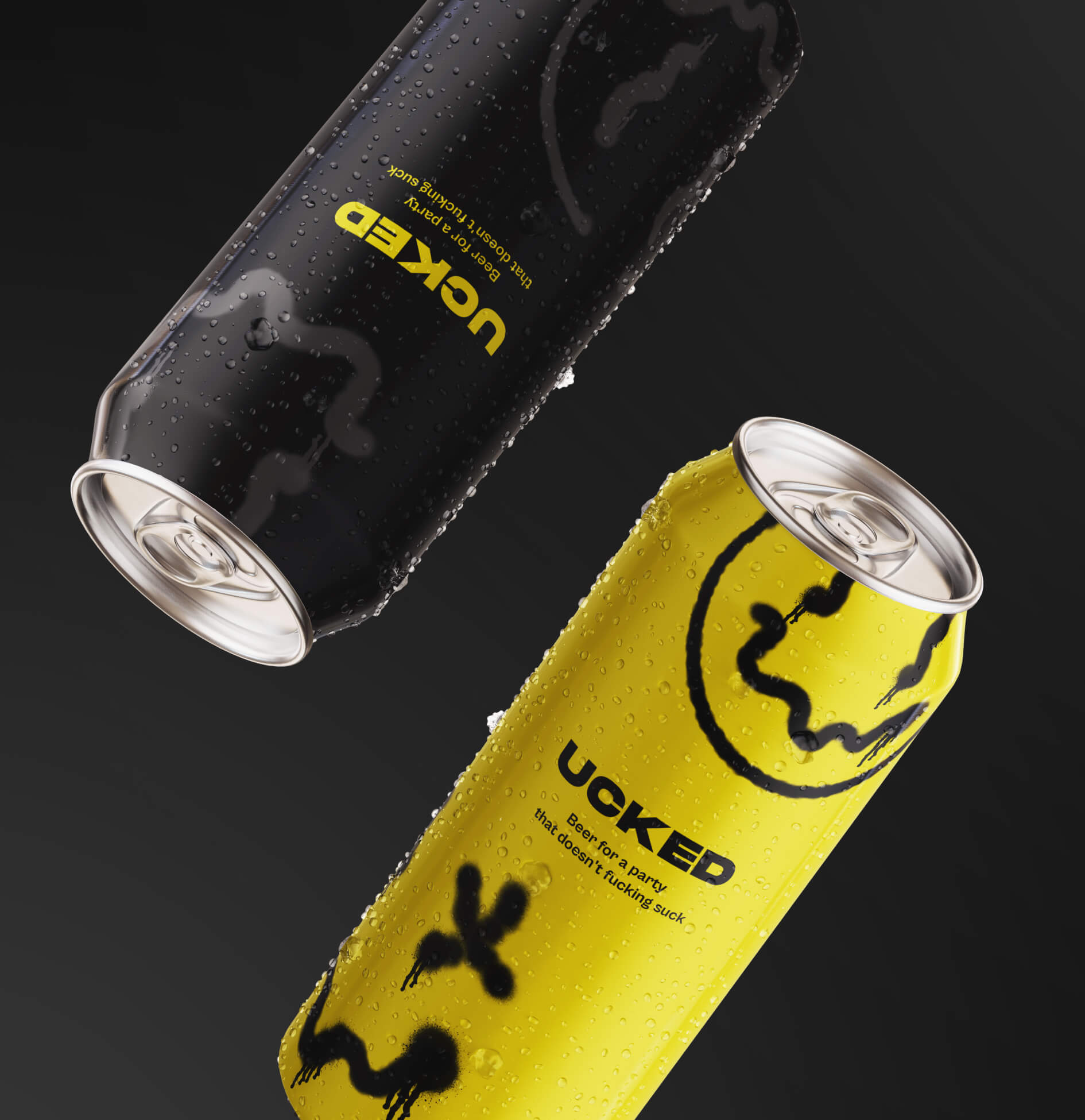
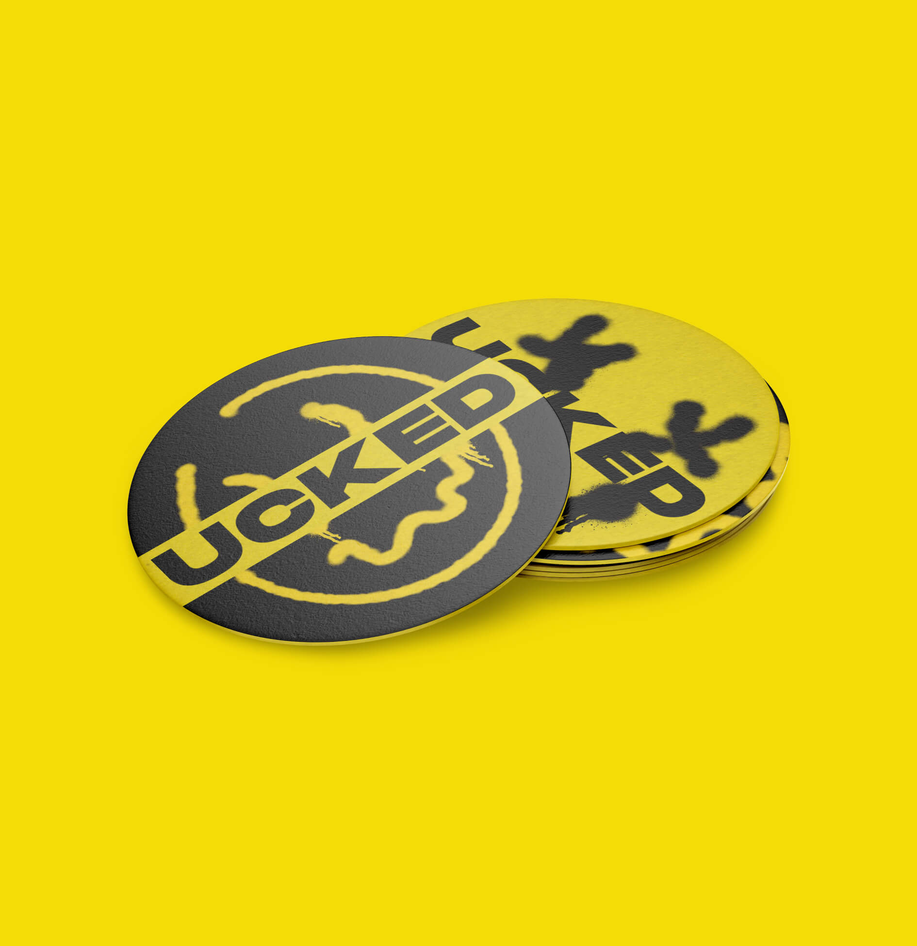
The logo is presented in massive bold type. He has a powerful and brutal character that perfectly reflects the nature of youth and parties. The squashed letters convey the state of a drunken party and fucked up people. The main version of the logo is a one-line version, but there are also more compact two-line versions, with right and left alignment. They are secondary to use.
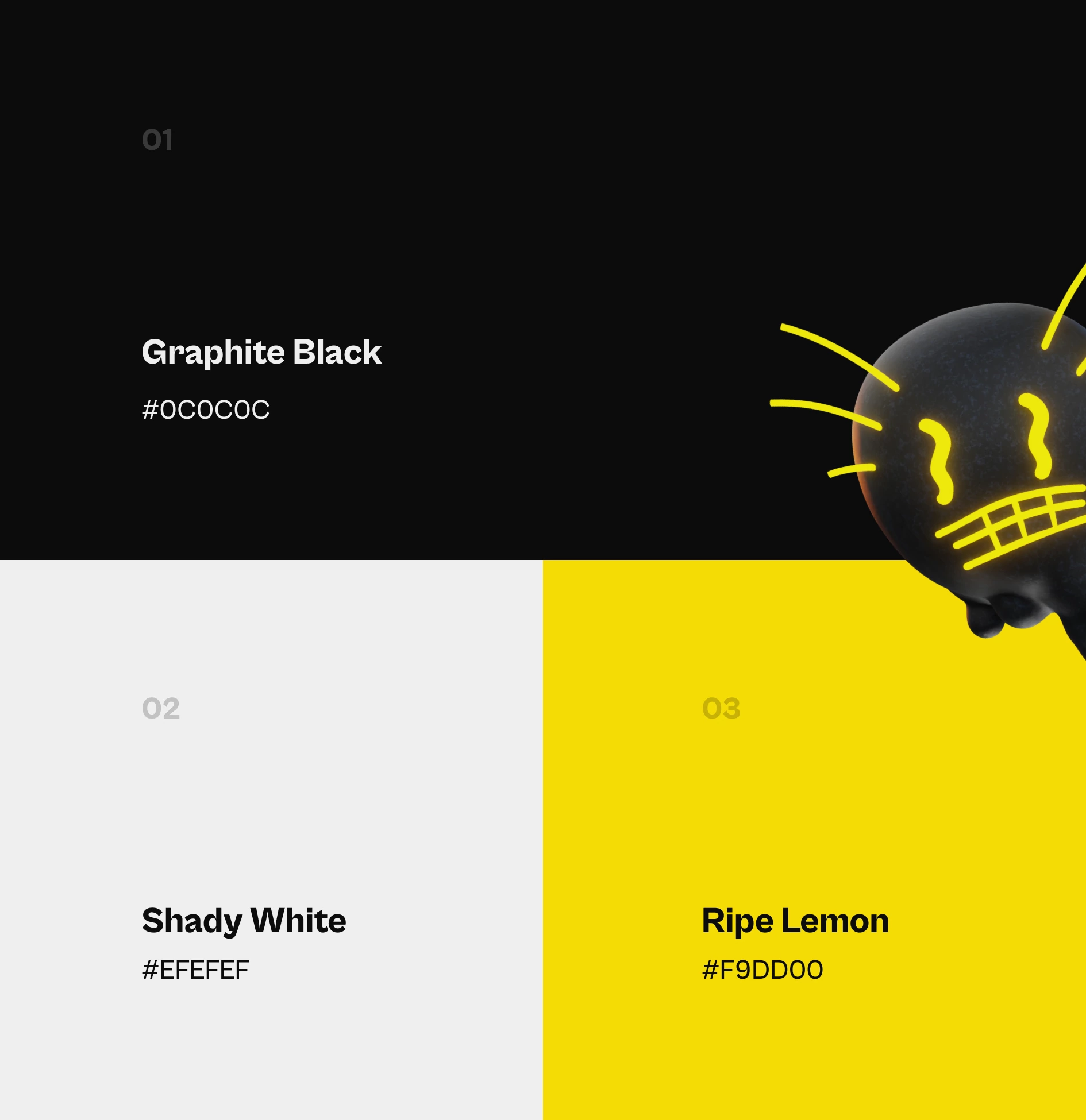
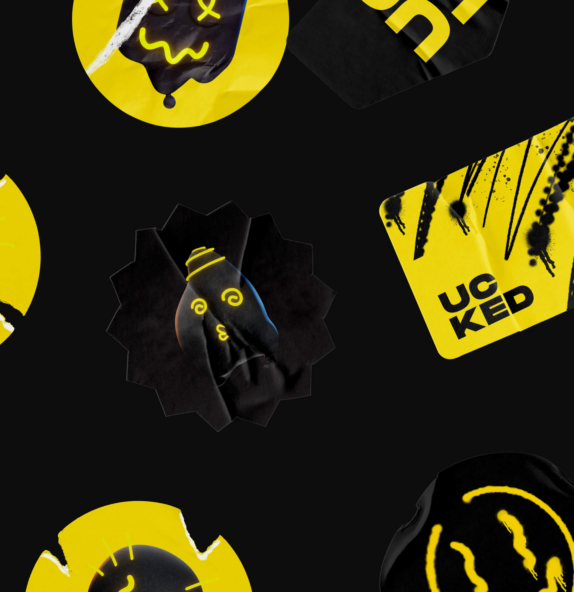
Main colors
There are two primary colors in the corporate style – Black and White. Black and white are text colors and backgrounds (white text on black and vice versa). There are also three complementary colors – 2 shades of gray and neon yellow. Gray color can be used in small quantities for various icons, auxiliary elements, and text. Neon Yellow is also used sparingly for icons, additional elements, and text, but as an accent color.
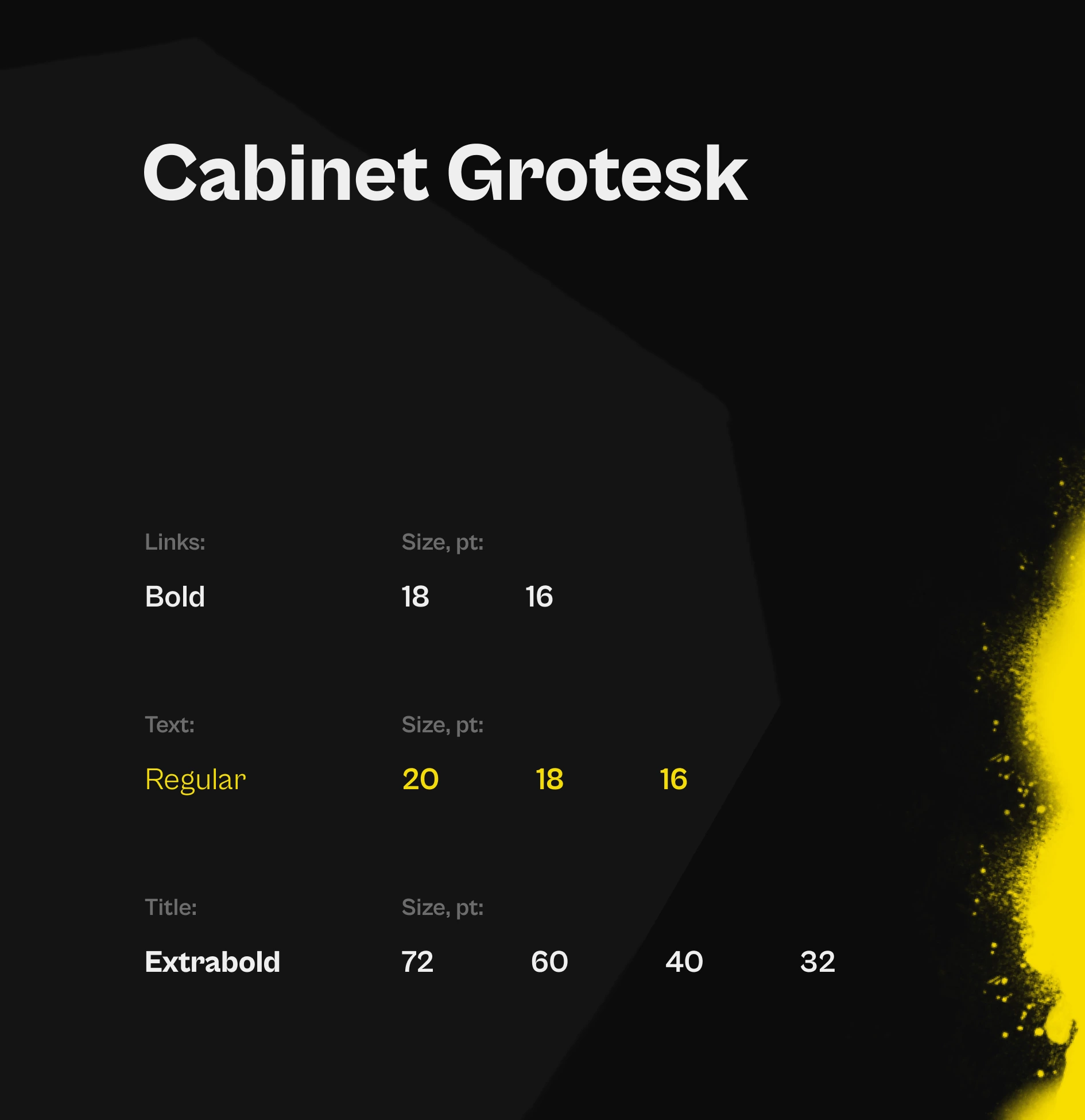
Font styles
Cabinet Grotesk is a family of contemporary fonts. In terms of design, Cabinet Grotesk is a sans; however, its letters feature the kind of stroke contrast that sets them apart from other sans serifs.
We have developed a minimalistic, functional design that succinctly meets the concept and distinguishes the product from other alcohol because of it’s unique, consistent and catchy design.
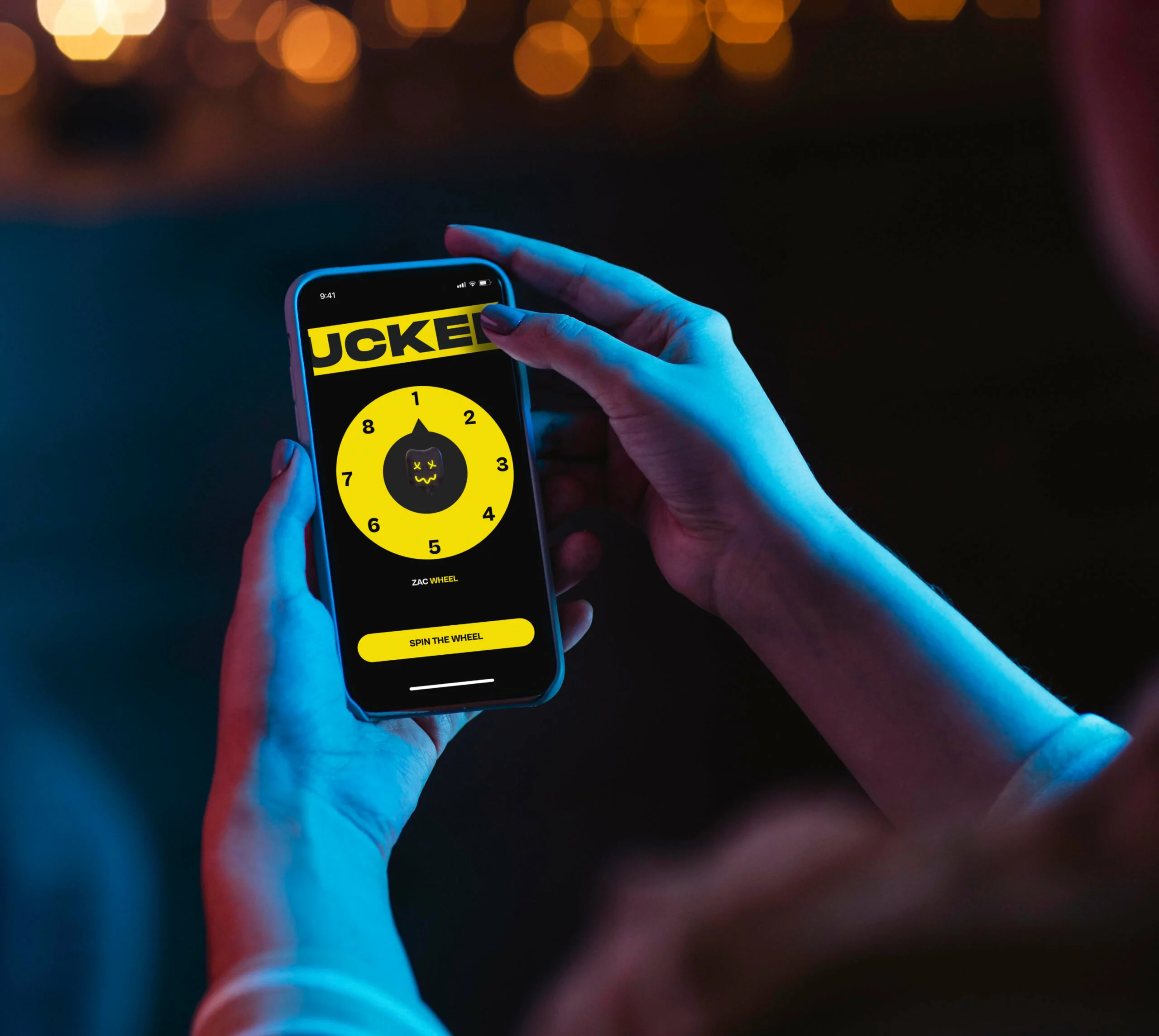
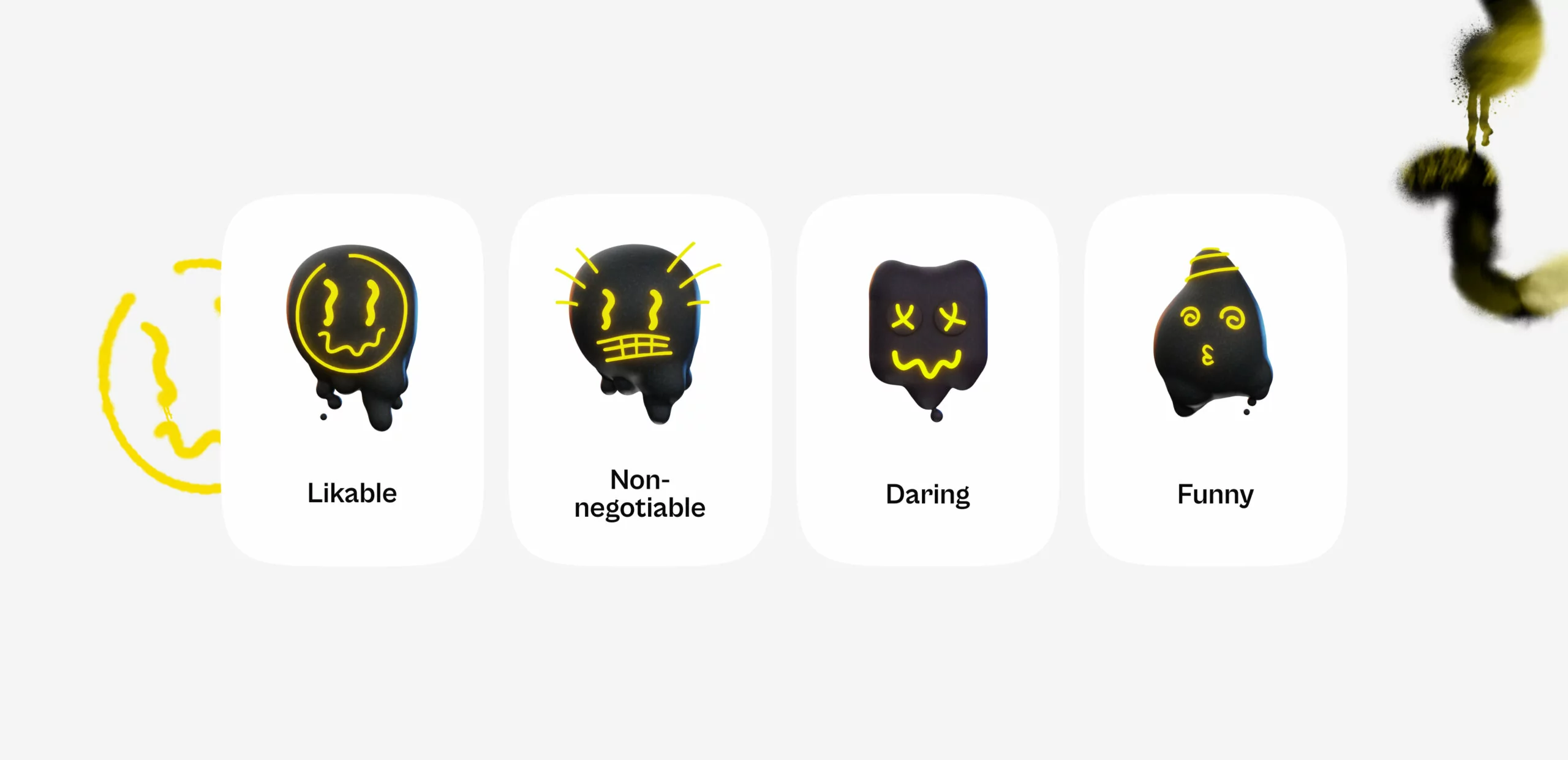
A mascot is an effective way to communicate with the target audience, demonstrating the core values and mood of the brand.
We have created four separate characters that show and help each player express themselves, perfectly connects with a global brand style and become a powerful brand visual.
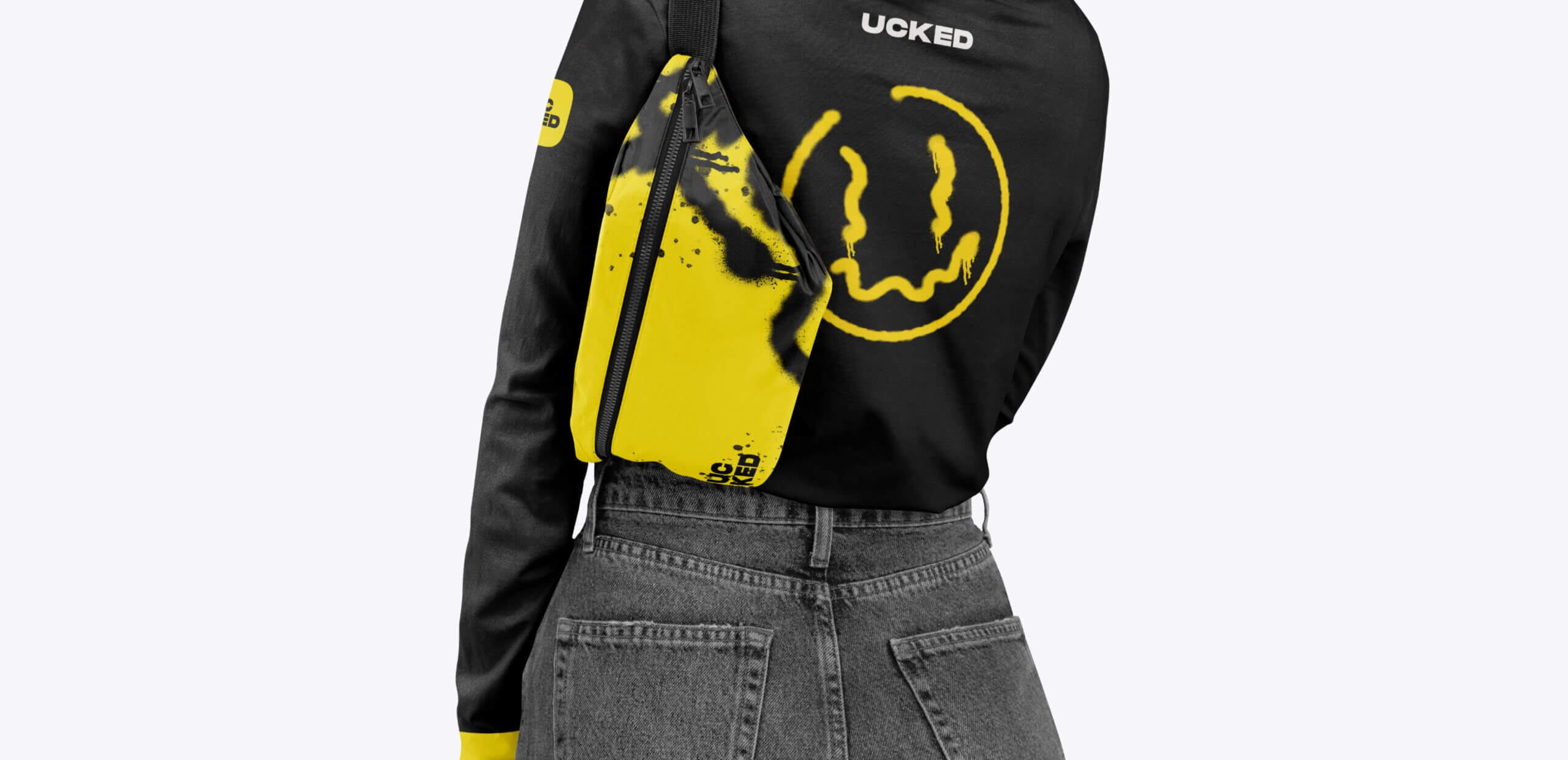
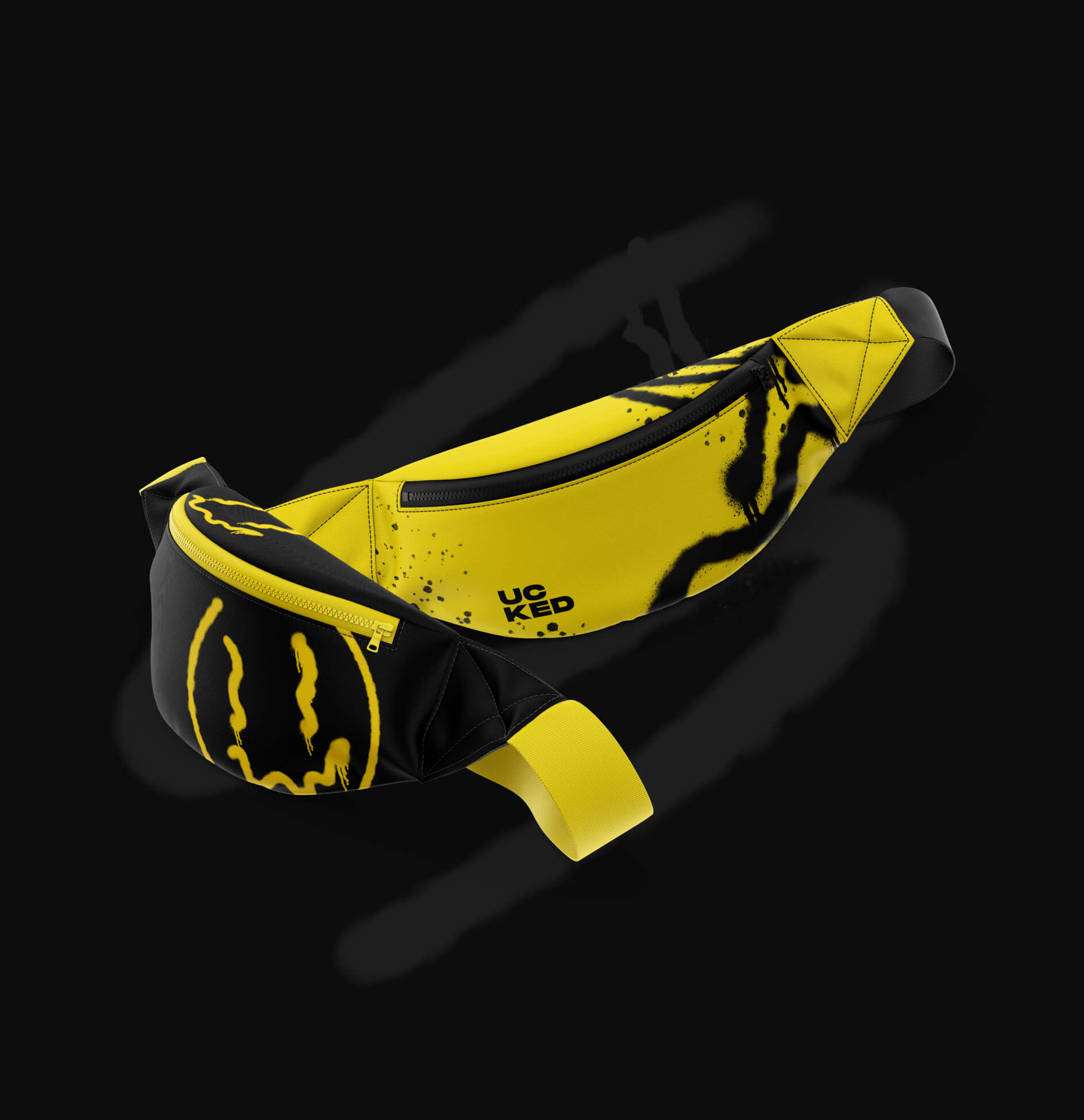
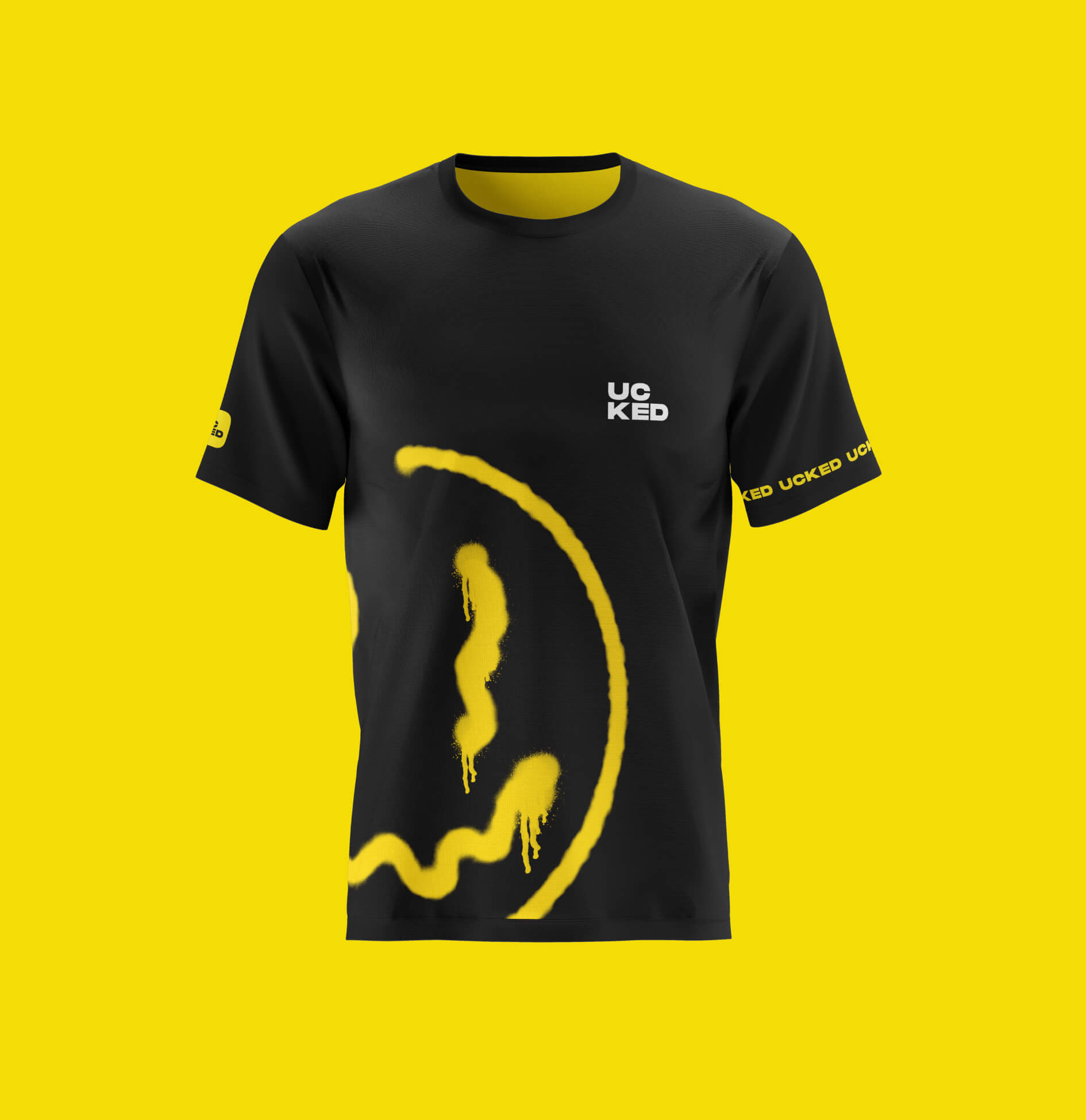
Merch helps to make the idea, mood and values of the brand more visible, recognizable and catchy. We have designed a collection of apparel items that will help the brand promote itself in the real world, and give fans the opportunity to support the product.
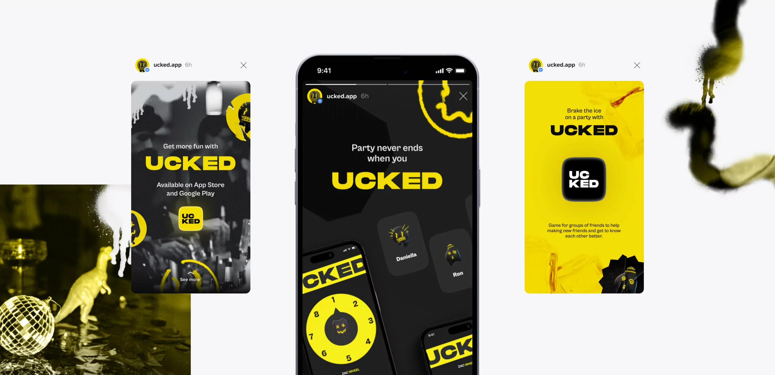
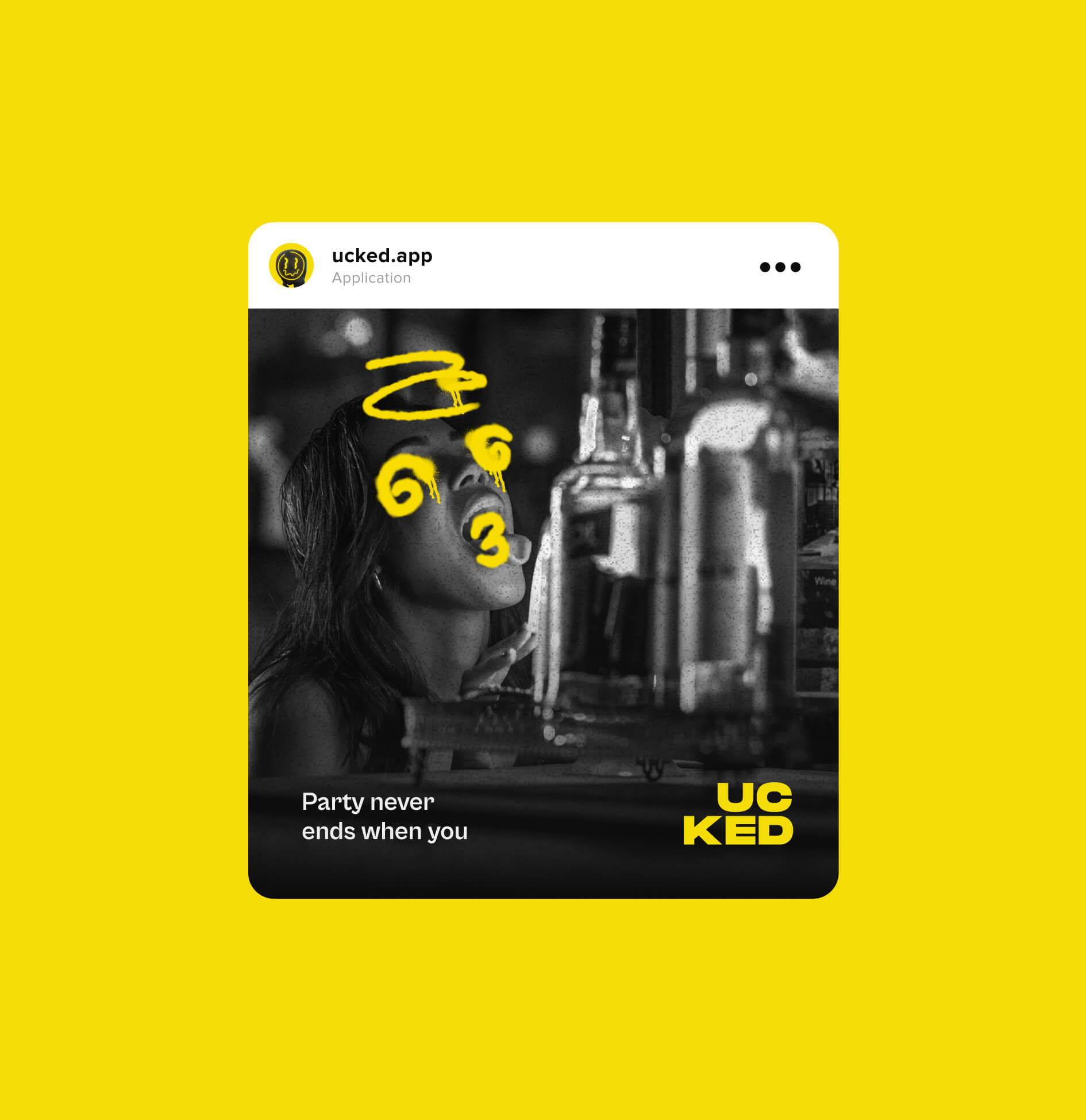
Social media is a powerful tool for the promotion of a brand. We understand it’s potential, which is why it was very important for us to develop a consistent visual style for social media that reflects the brand’s general style.
The result speaks to the target audience in a catchy, bold and effective way.
#Brand identity #Branding guidelines #Package design #Marketing assets design #Motion design
Rapida
 USA
USA
USA
#Website design #Website development
Entertainment
 USA
USA
USA
Have a project in mind?
Let's chat
Have a project to
discuss?
discuss?

Have a partnership in
mind?
mind?