Development
Research
Task
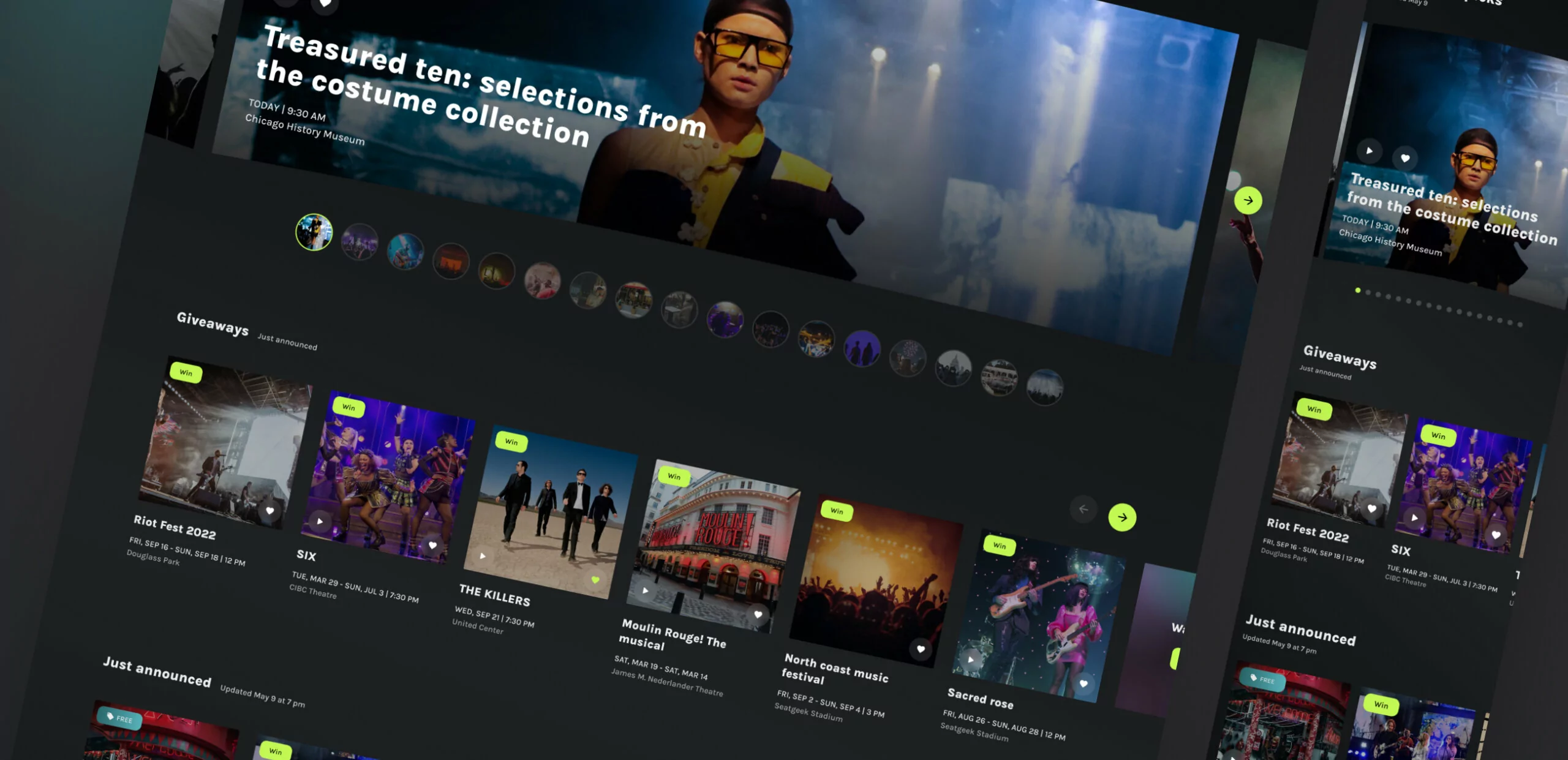
The main task of the redesign was to identify the main weaknesses and improve UX. The platform provides users with a list of different events in 21 cities, there is a separate website for each city with its own accent color. It was essential for us to give each city a unique flavor, but at the same time, preserve the corporate identity and branding.
Solutions
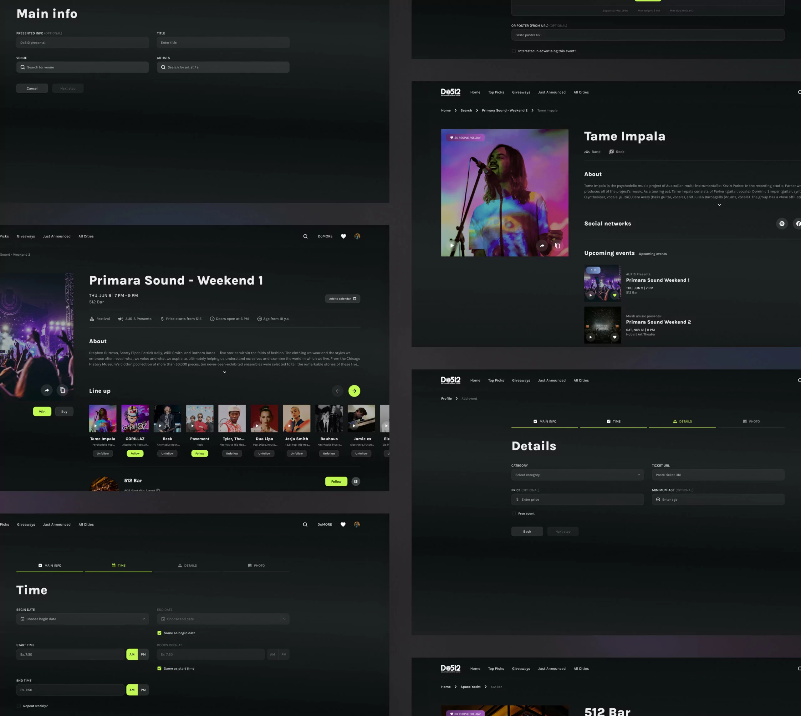
When working on a solution, we had to take into account the specifics of the US market with its large number of competitors and a high entry bar. The point was to create a design that would fully satisfy two important things: make convenient website navigation with the ability to view a large number of events, and simplify the flow of adding an event on the site.
Functionality
At the moment, many services provide information about various events. After analyzing all the main competitors, we identified the main pains for users when looking for leisure for themselves and solved these problems as follows:
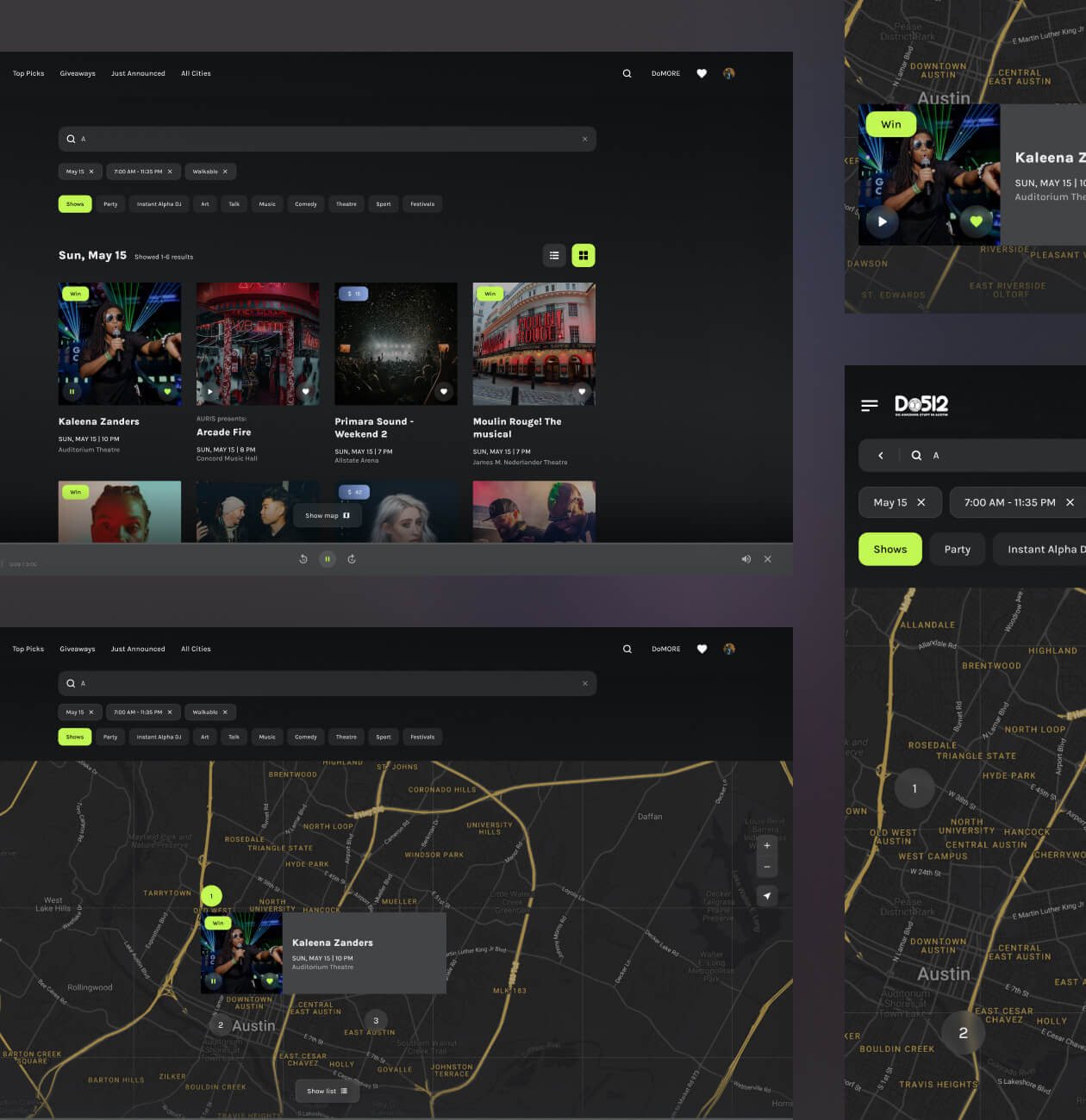
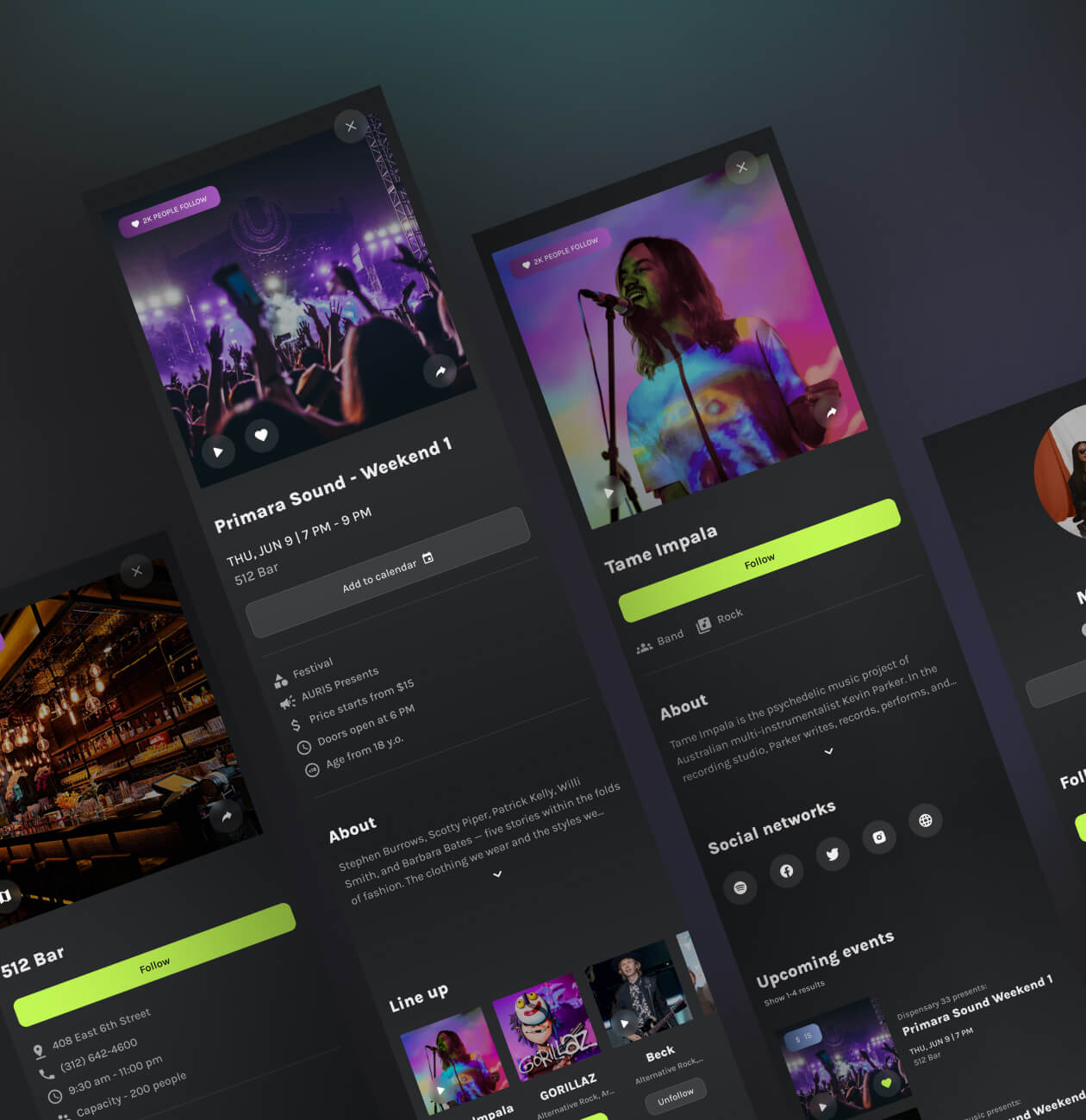
- Separation of events by category. All events are categorized, “Top Piks” category helps the user to get acquainted with the most interesting and popular events in his city.
- Favorites. There is not always time to get acquainted with all the information about the event in detail, so the ability to add it to Favorites and view it later is a must.
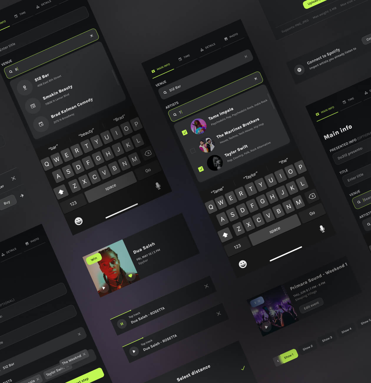
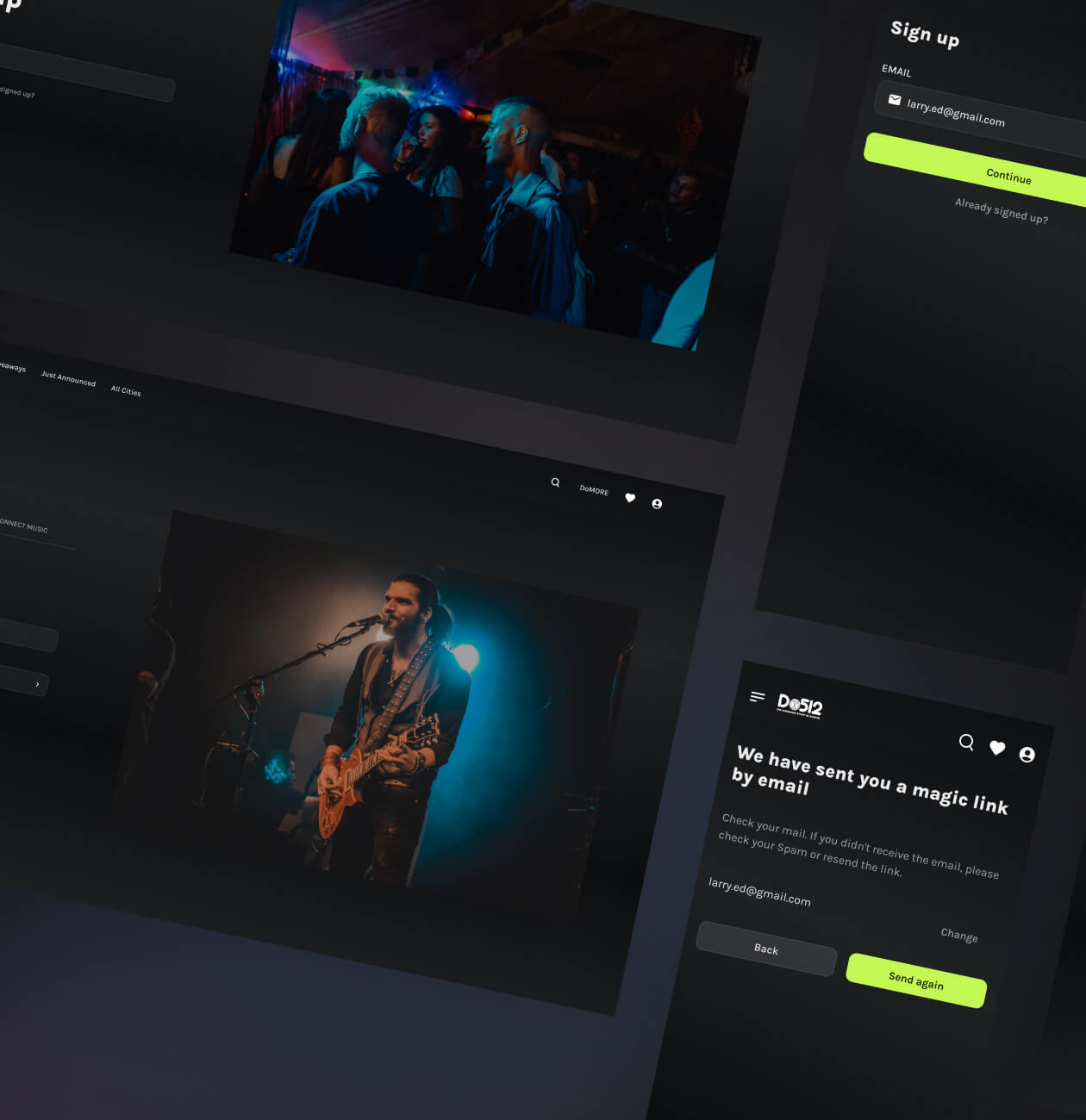
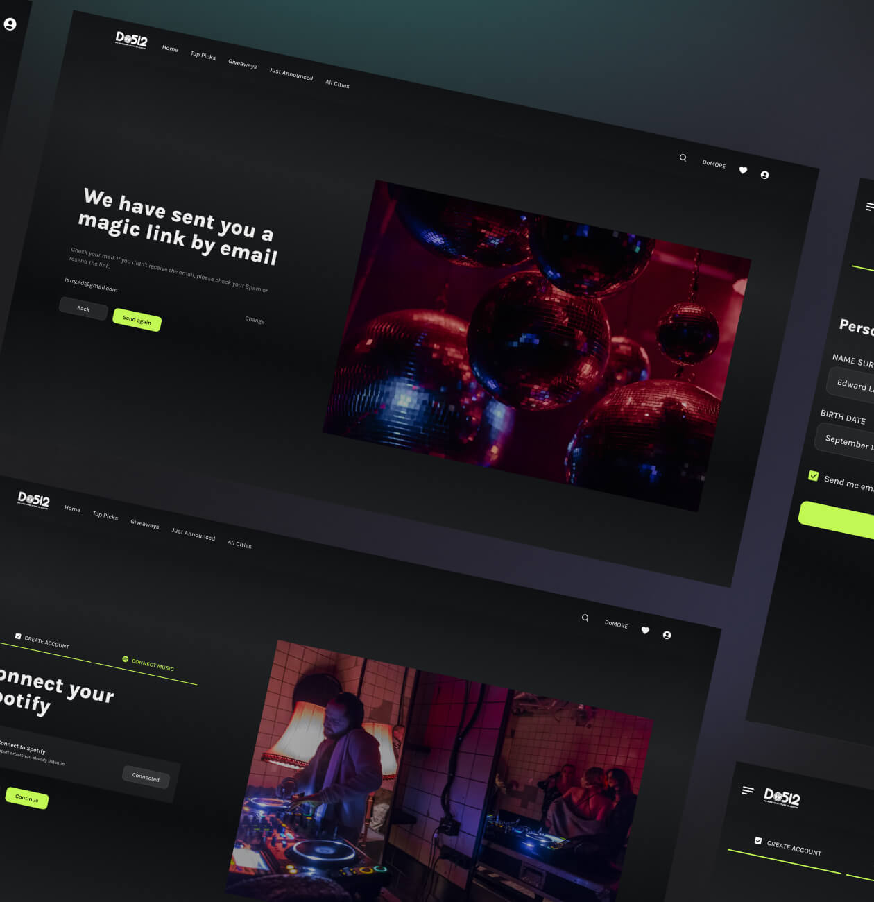
- Synchronization with Spotify. When registering, as well as in account, the user can synchronize his Spotify with the site, and view the music events of the artists he is subscribed to.
Interactions
Our team worked out a design system and interactive components like hovers, drags, clicks, and other states that help the user navigate the service. With this, we reduce the user’s time spent on actions to find the desired functionality.
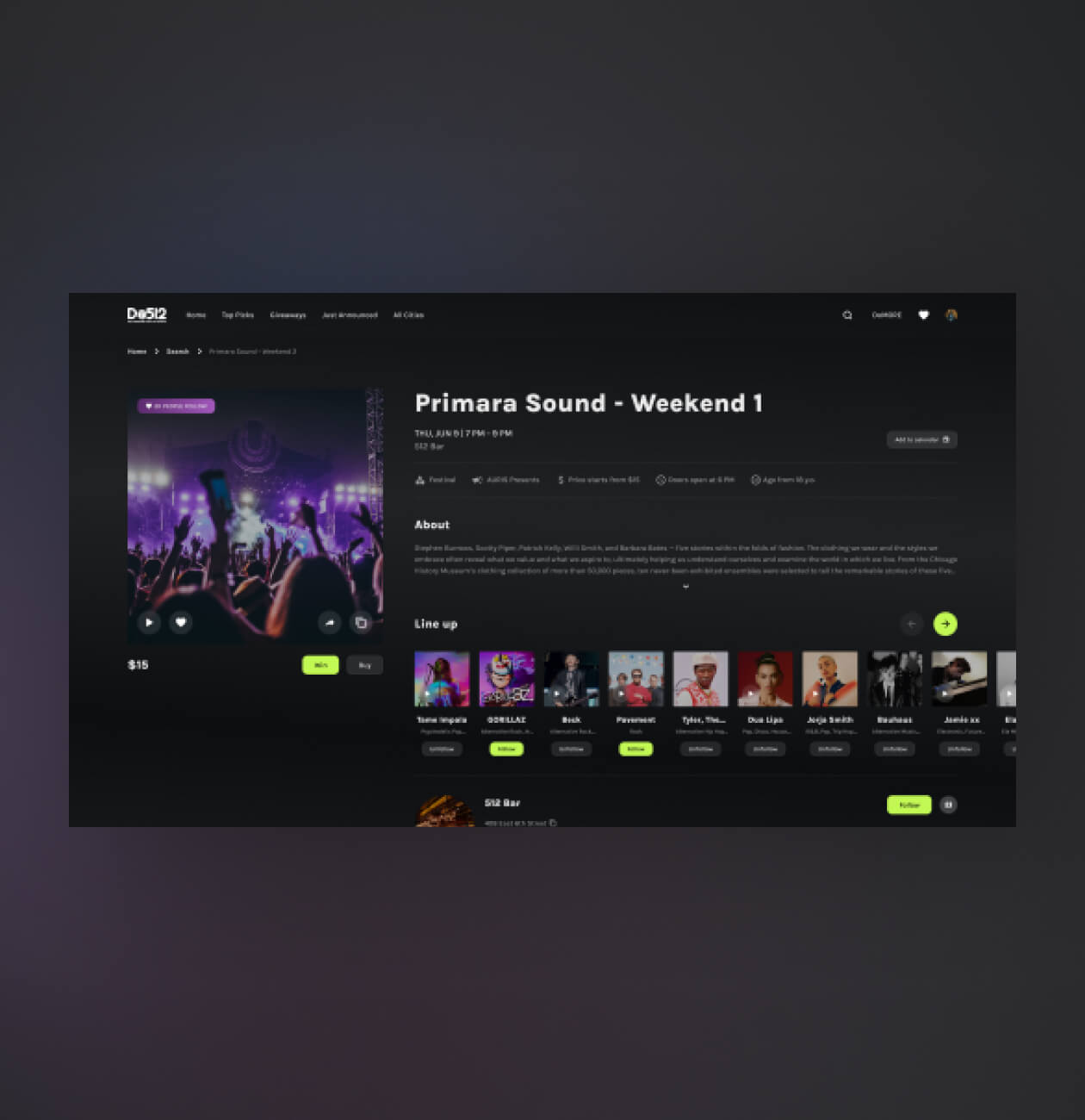
You can get acquainted with the musical event by looking at the poster and reading the description, but also by listening to the track directly on the site. You do not need to search and turn on the artist’s track in parallel, just click on the play button.
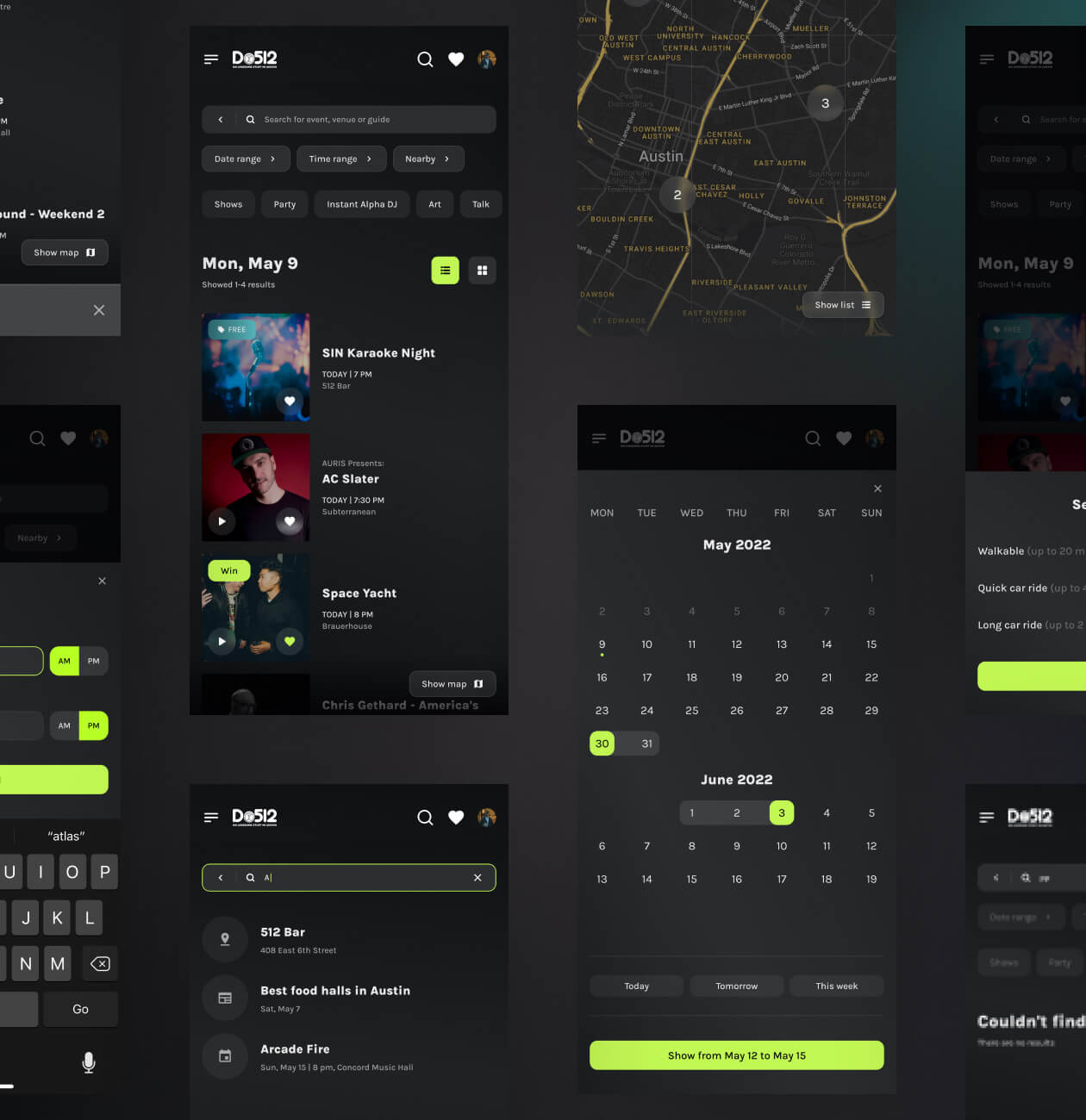
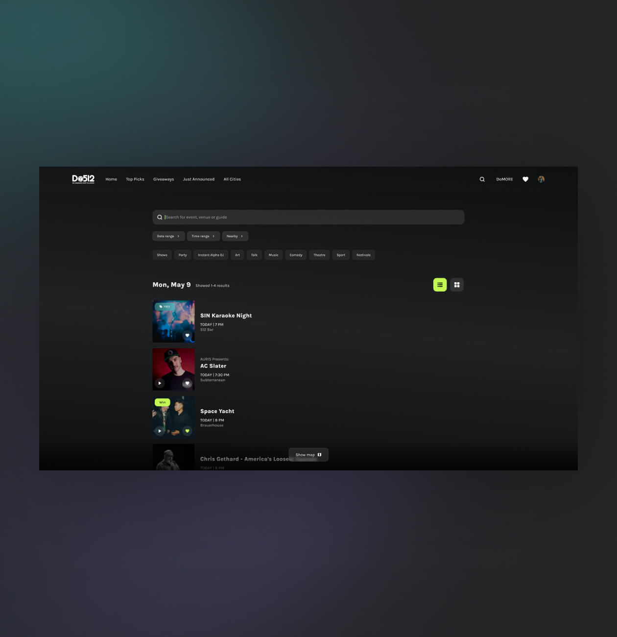
By simplifying the website flow, we made life easier for users. We made an adaptive design for mobile devices since most people use the site from phones. As a result of the redesign, we have created a unique site for finding events that will allow you to plunge into the cultural life of the city.
#3D illustrations #Motion design #Branding
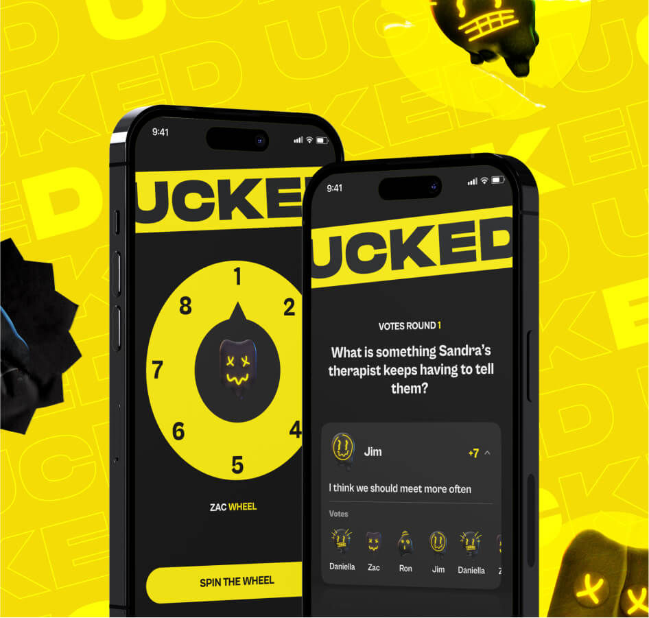
Ucked
 UK
UK
UK
#Branding #Website design #Website development
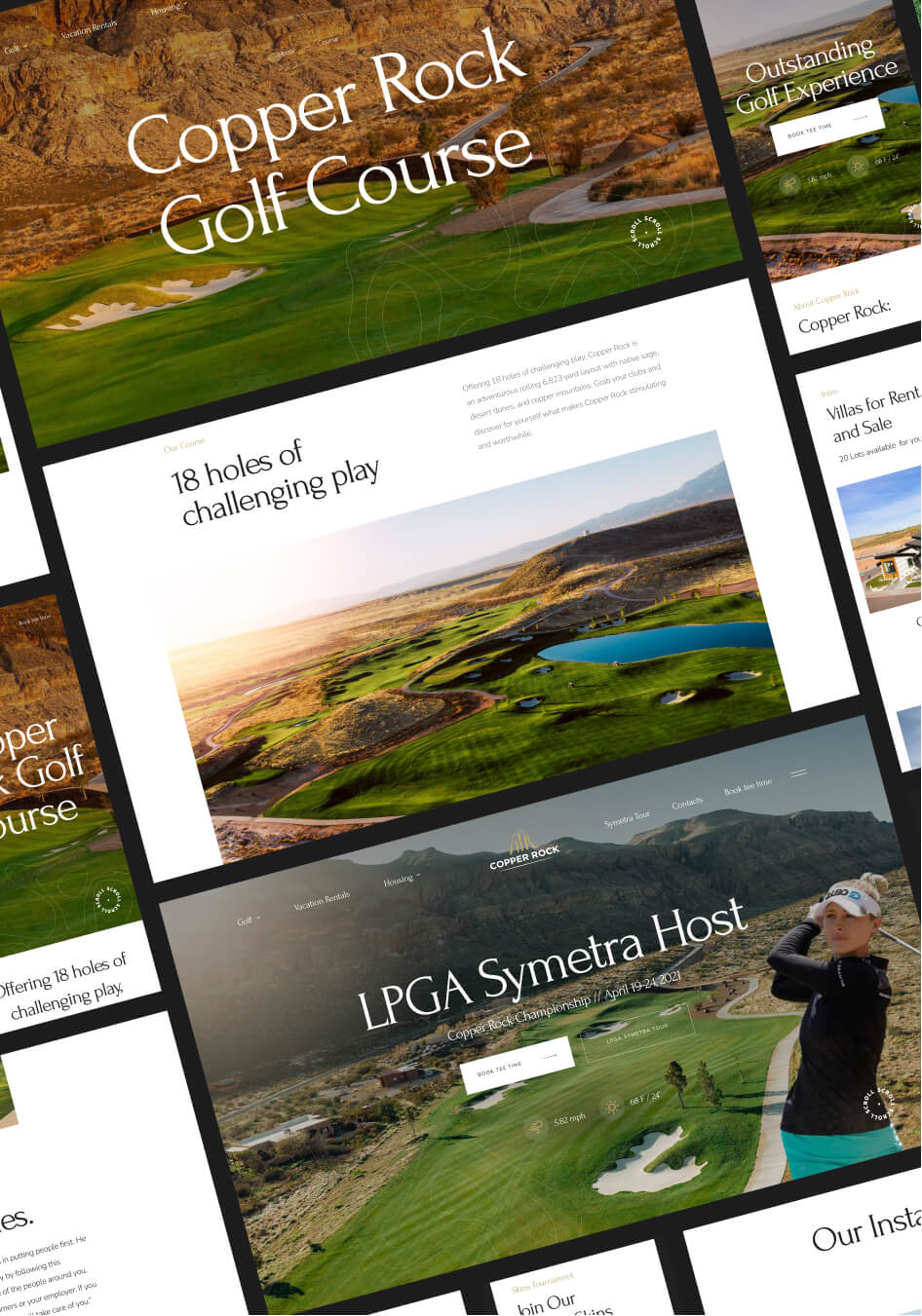
Copper Rock
 USA
USA
USA
Have a project in mind?
Let's chat
Have a project to
discuss?
discuss?

Have a partnership in
mind?
mind?