Development
Research
Client
Tyler Ussery
 USA
USA
USA
Services
website design
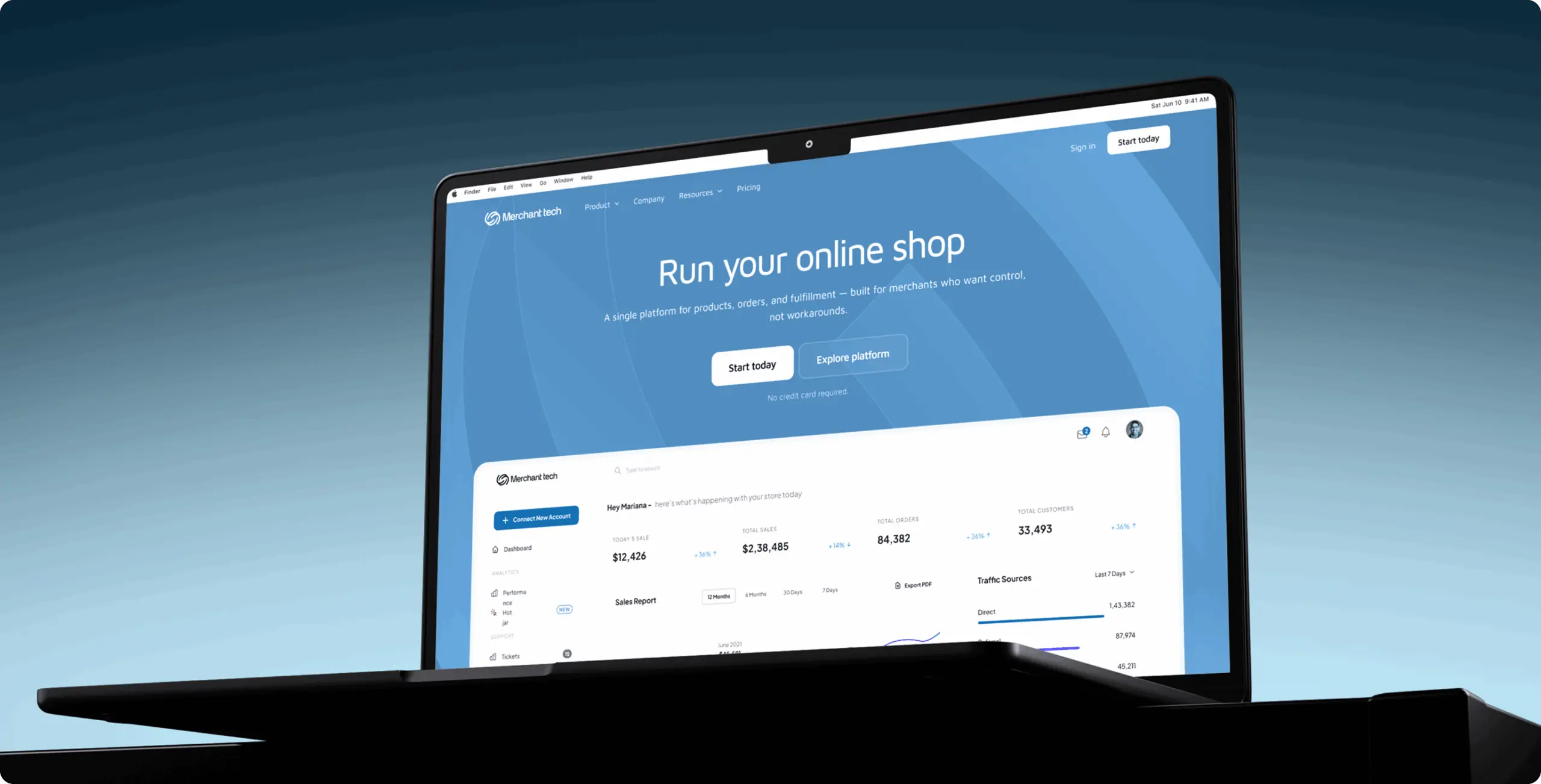
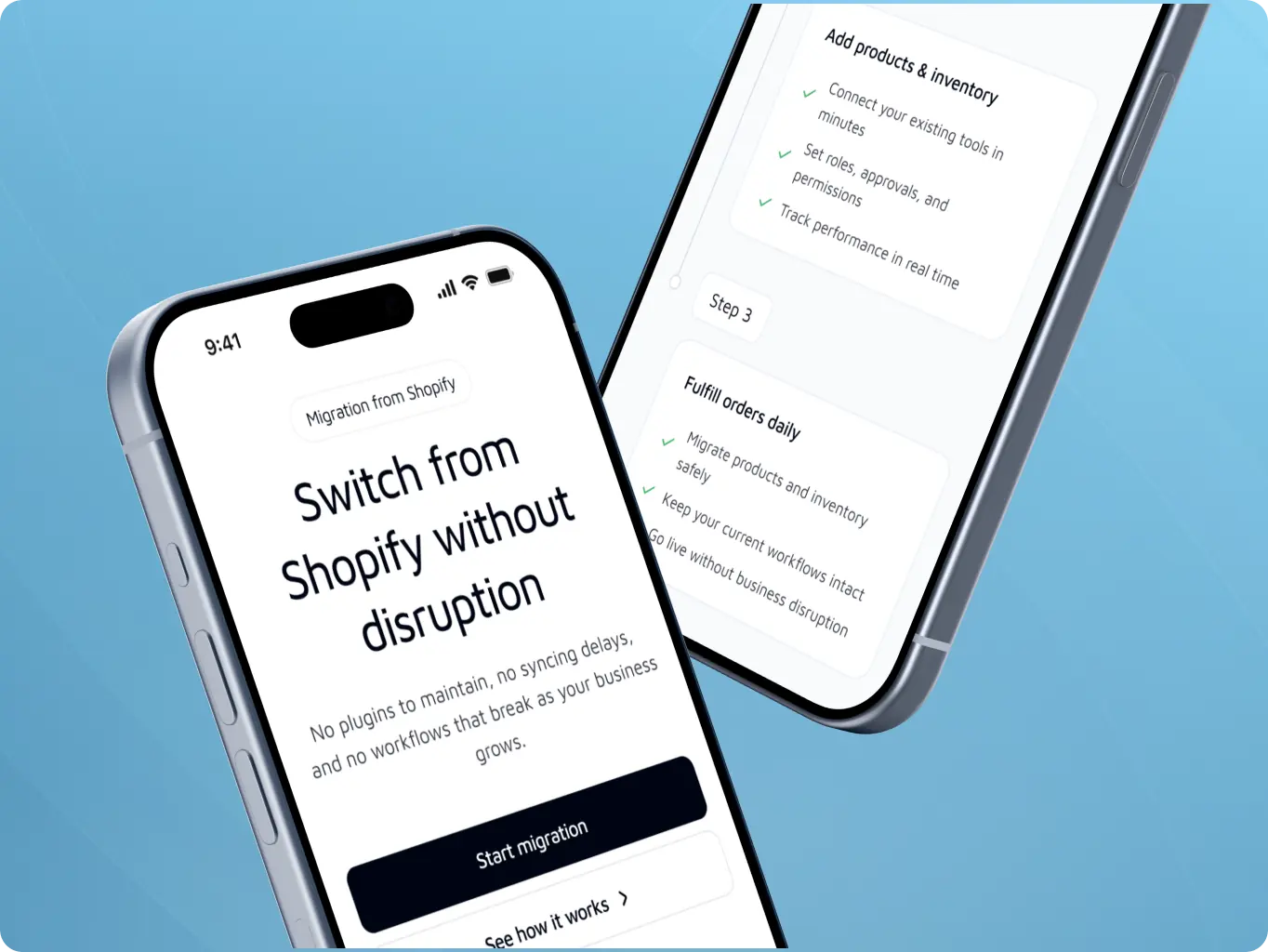
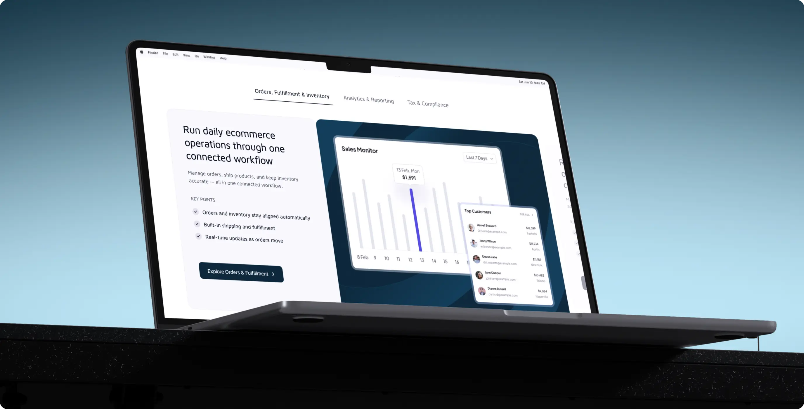
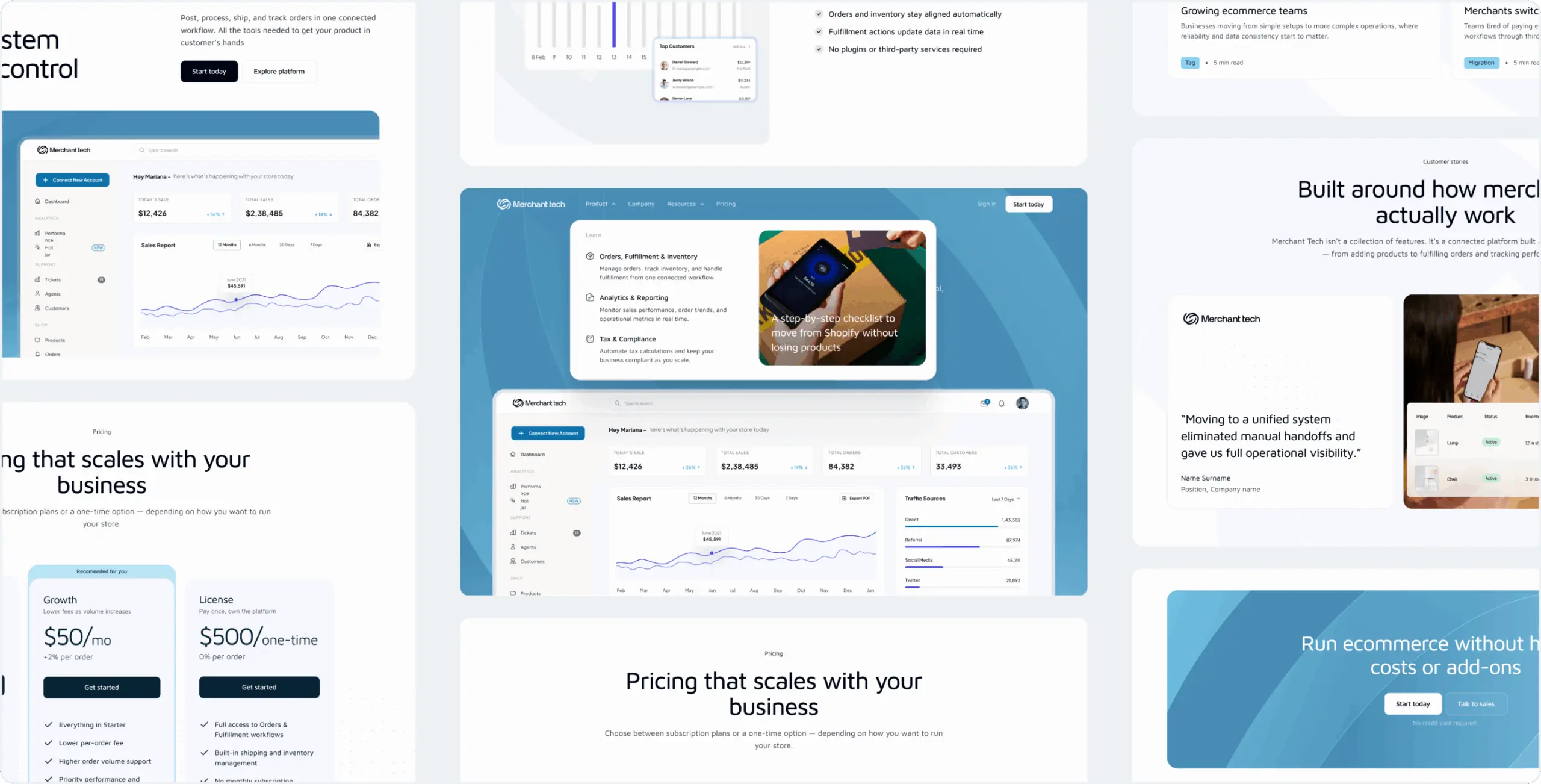
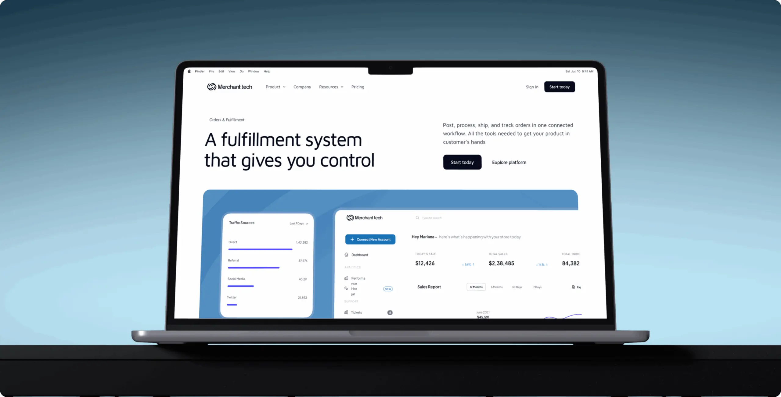
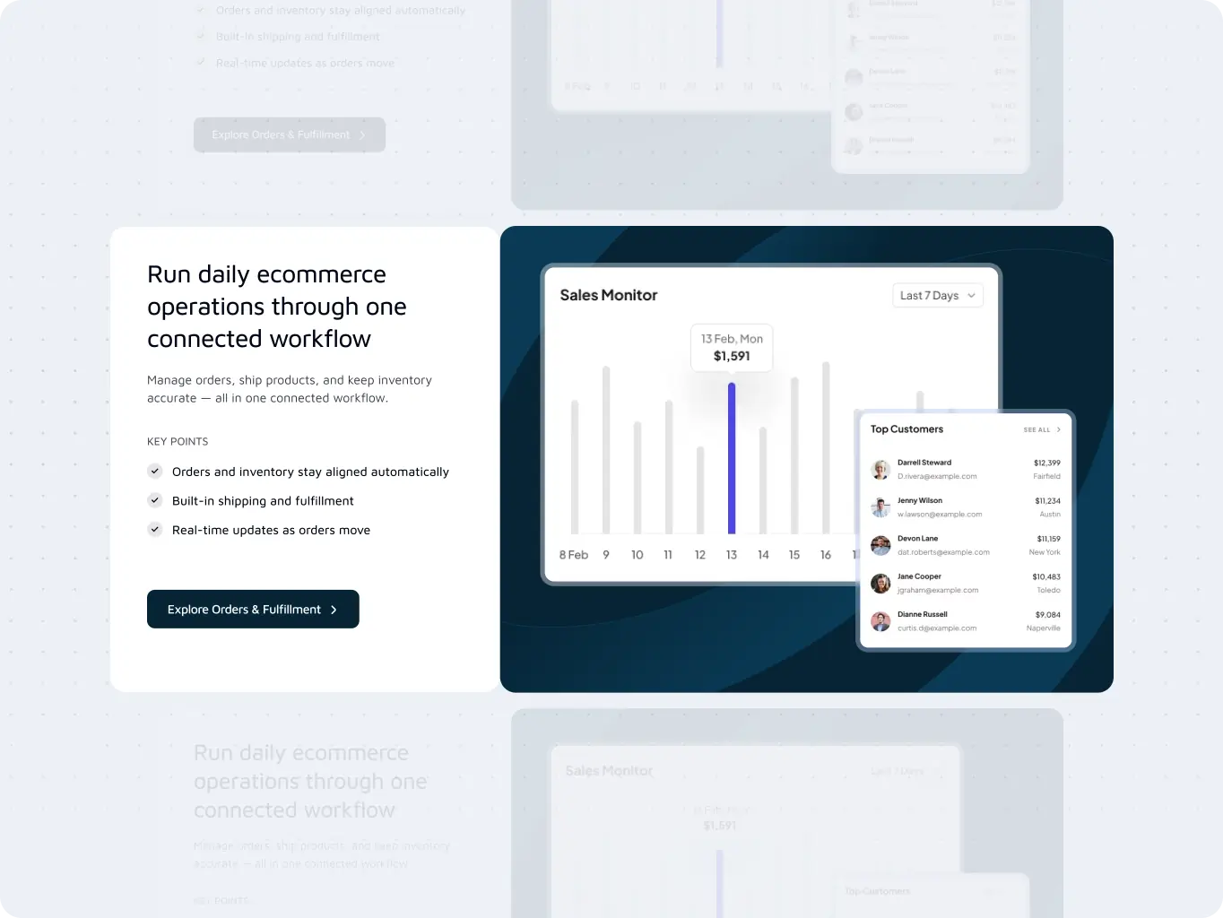
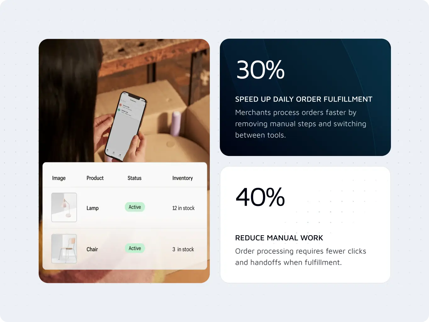
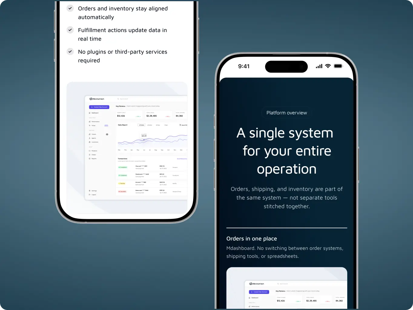
The business needed a website that clearly explains how Merchant Tech solves common e-commerce challenges such as shipping management, tax compliance, fragmented reporting, and operational inefficiencies. The platform also required a merchant portal that provides instant visibility into critical business data and day-to-day operational workflows.
Since both teams had worked together previously, project planning, communication, and stakeholder alignment were established early, allowing more focus on product strategy and business objectives throughout the project.

The research phase focused on understanding how small and mid-sized merchants compare ecommerce solutions, what creates trust during evaluation, and which factors influence platform adoption. Particular attention was given to pricing transparency, operational simplicity, migration concerns, and the role of built-in functionality versus third-party ecosystems.
The findings helped establish a positioning strategy centered around simplicity, transparency, and operational control rather than competing through feature volume alone.
Stages
- Competitor analysis
- Website structure
We reviewed Shopify, Wix, and Big Cartel to understand how they position their products, structure customer journeys, and guide users toward conversion. While competitors focus heavily on website creation, customization, and ecosystem flexibility, Merchant Tech had an opportunity to differentiate through built-in business operations and a simpler ownership experience.
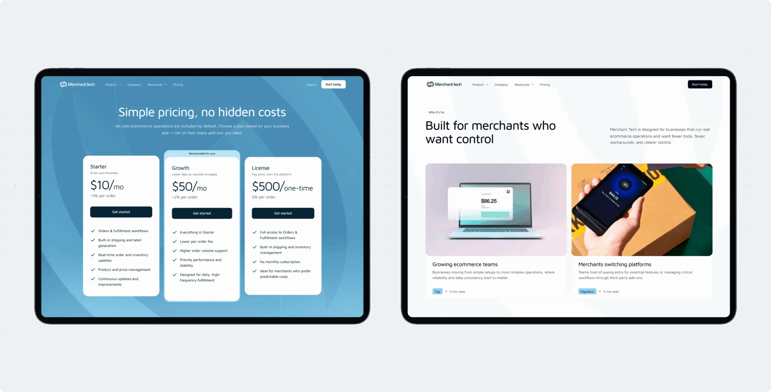
The analysis highlighted opportunities to emphasize transparent pricing, integrated functionality, reduced dependency on apps, and a more direct value proposition for merchants seeking operational simplicity rather than platform complexity.
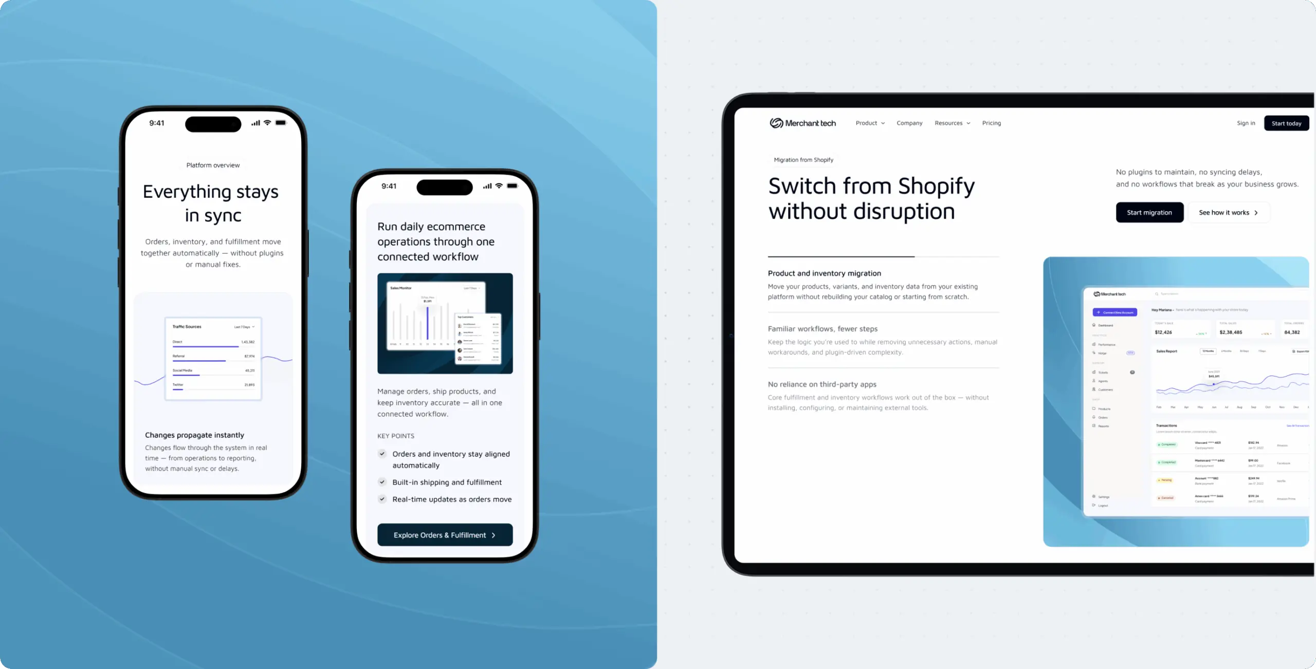
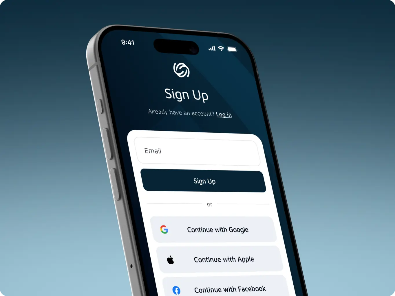
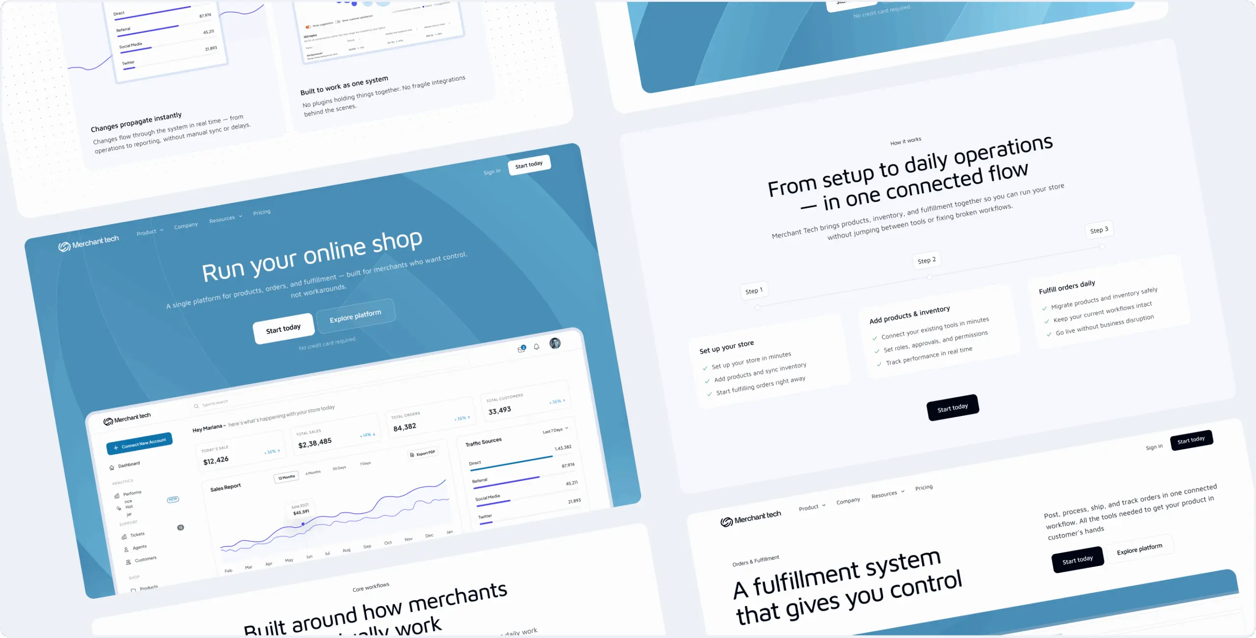
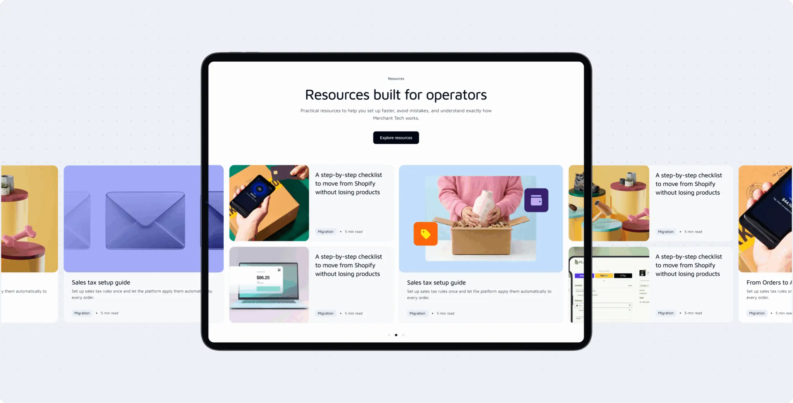
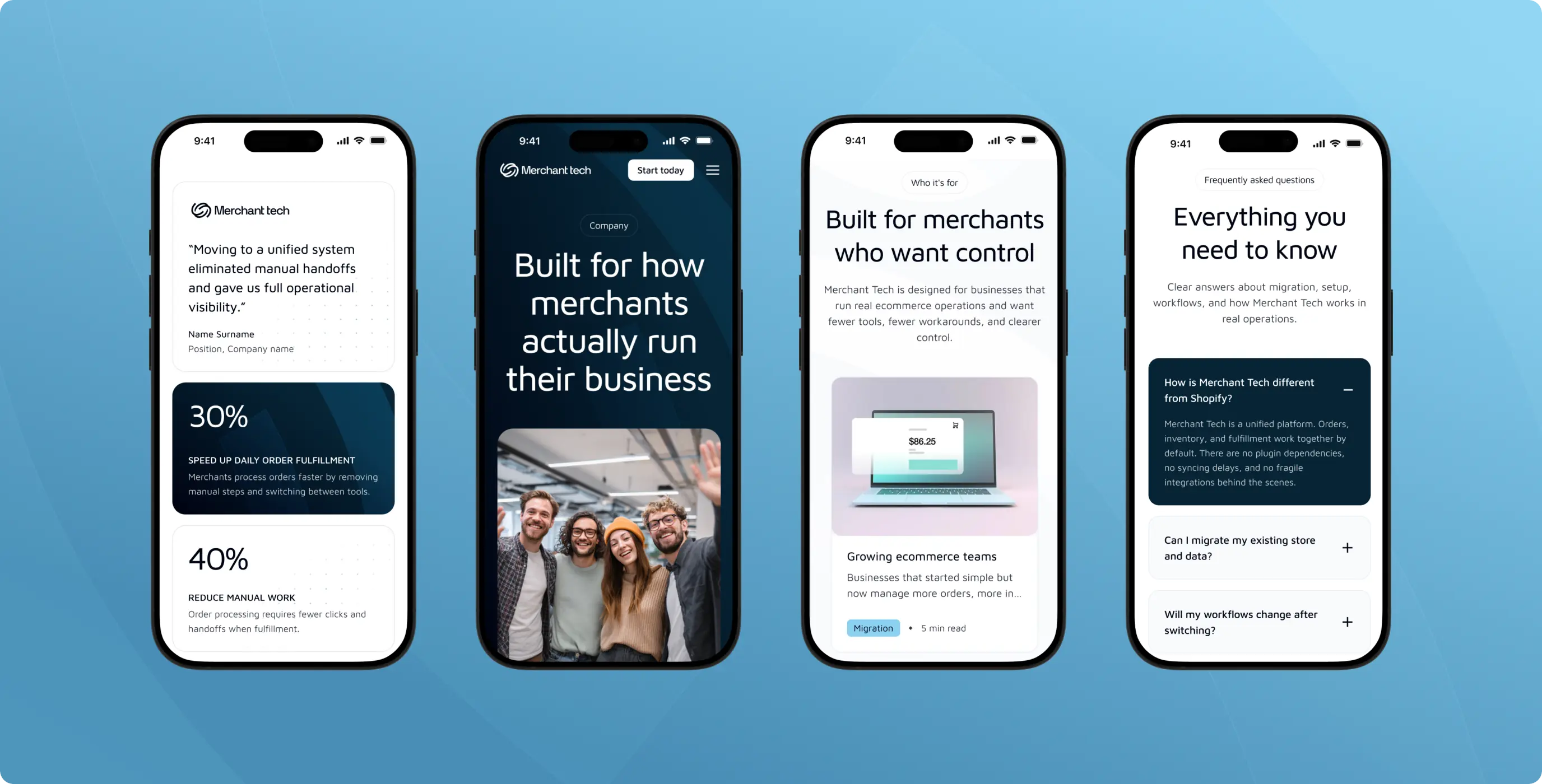
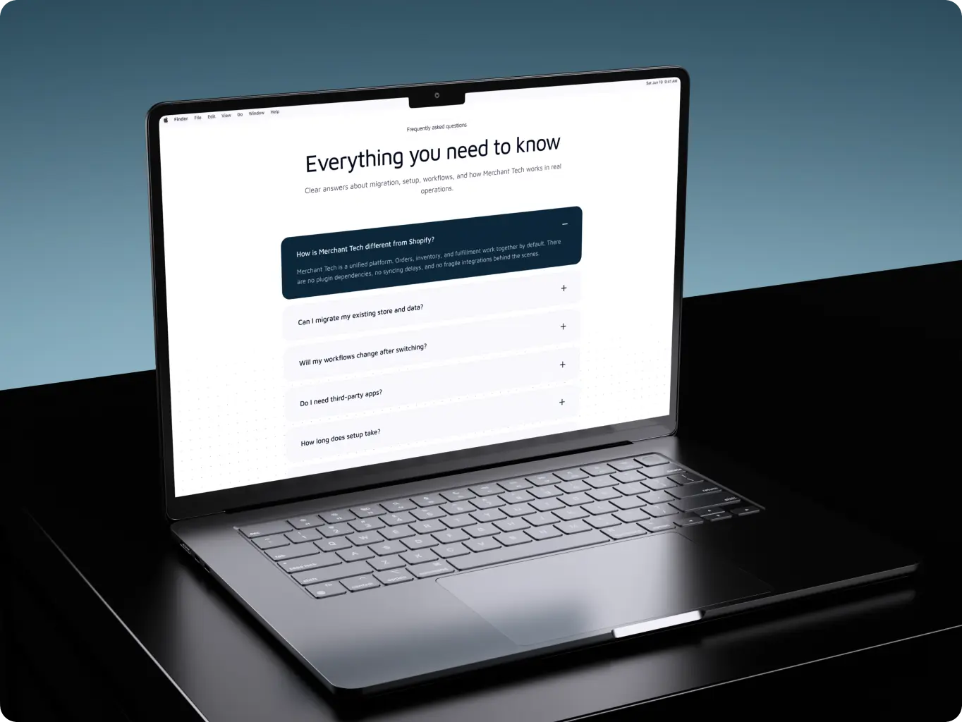
The homepage was structured to move users from positioning and value proposition into workflow-based product proof, trust-building content, platform demonstrations, pricing clarity, and conversion actions. Supporting pages for Product, Pricing, About, Resources, and Sign In/Sign Up were organized to reduce friction and provide clear paths for both exploratory and high-intent visitors.
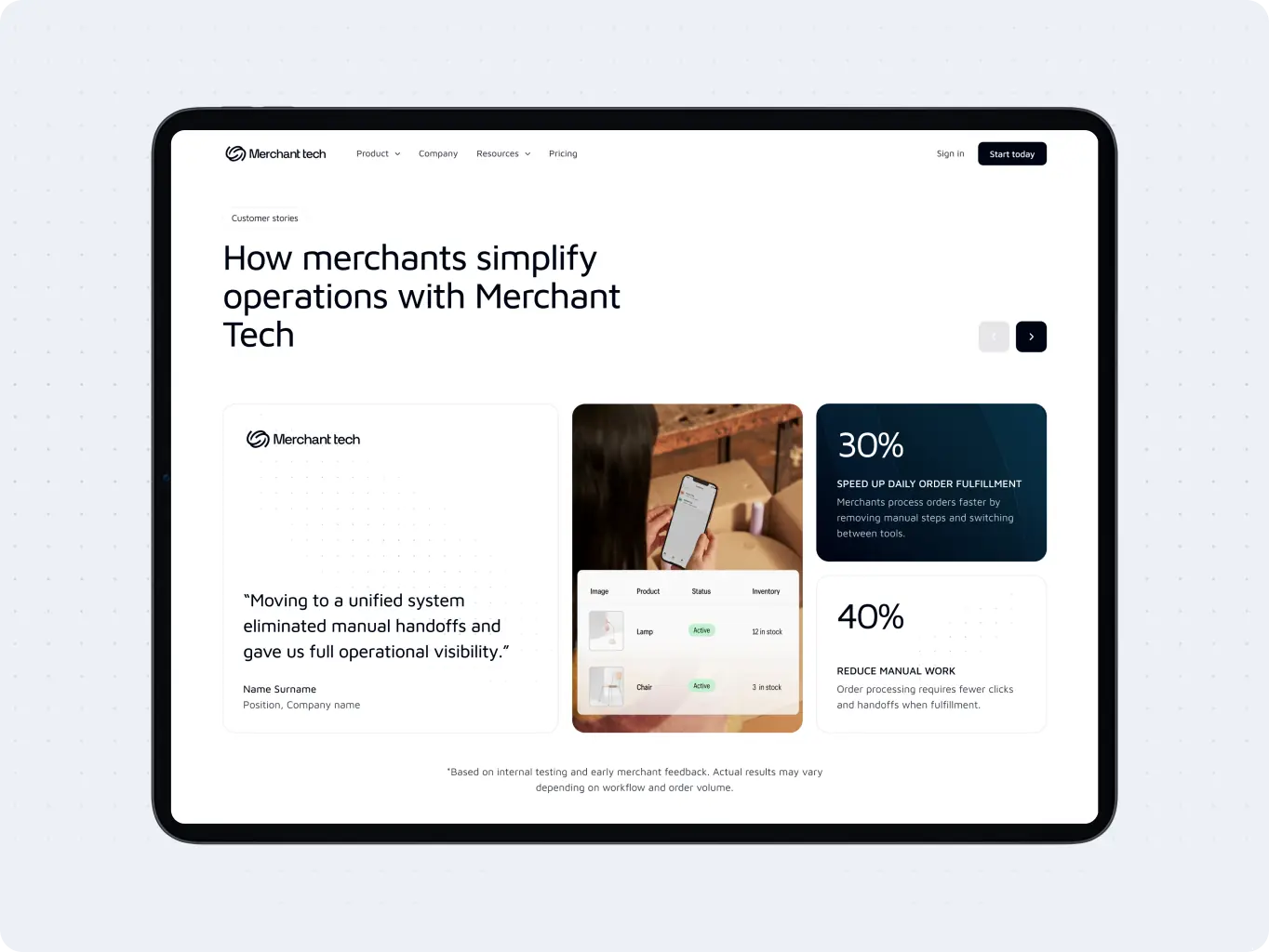
The design phase focused on expressing Merchant Tech’s positioning through clarity, trust, and simplicity. Every major decision was evaluated against the core objective of helping merchants understand the product faster and feel more confident about switching from existing solutions.
Rather than relying on excessive marketing language or complex visuals, the design emphasized product understanding, workflow visibility, transparent communication, and conversion-focused content hierarchy throughout the website.
Stages
- Wireframes
- Design direction
- Mockups design
Multiple wireframe directions and content structures were explored before defining the final website experience. Early concepts tested different approaches to positioning, trust-building, workflow presentation, pricing visibility, and product proof.
The objective was to identify the most effective flow for guiding merchants from initial interest to product understanding and ultimately toward signup or product exploration.
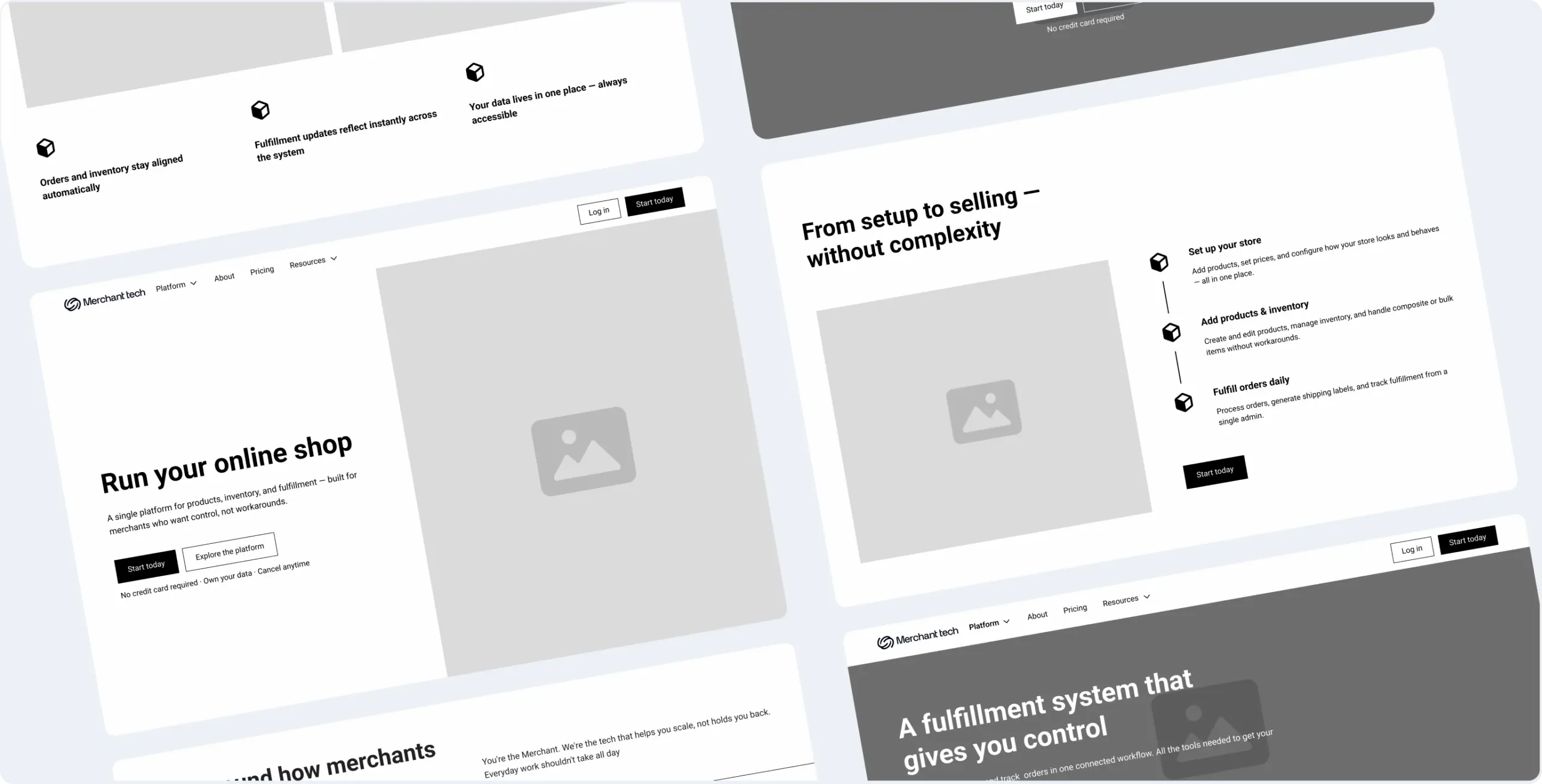
Several concepts were developed around different positioning strategies and homepage narratives. Each explored how Merchant Tech could distinguish itself from Shopify, Wix, and other competitors while maintaining clarity and credibility.
The selected direction focused on operational simplicity, built-in functionality, transparent pricing, and a stronger emphasis.
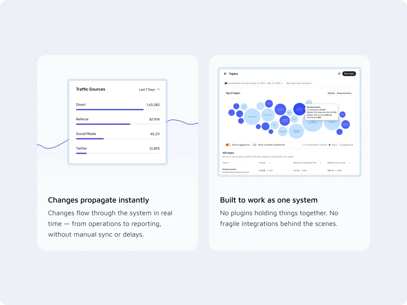
The UI design stage focused on creating an interface that feels reliable, approachable, and easy to understand. Content hierarchy, typography, product previews, and conversion elements were designed to support faster comprehension and reduce unnecessary cognitive load.
The result was a website that communicates confidence and operational simplicity while keeping attention on the product’s business value.

#Branding
Tyler Ussery
USA
USA
#Website redesign #Website development
marketsnack
USA
USA
#Product redesign
BETERRA
United States
United States
Have a project in mind?
Let's chat
Have a project to
discuss?
discuss?

Have a partnership in
mind?
mind?