Development
Research
Client
Sway Finance
 Switzerland
Switzerland
Services
The key task of the project was to create a user-friendly and intuitive interface that would allow users to easily track their expenses, manage their budget and bank transfers and view financial goals.
As for the goals of the business, they wanted to significantly increase the volume of users in order to cooperate directly with banks and receive a significant commission for this in the future.
Our role
Our role was to design a user-friendly, intuitive platform that addressed both the functional needs of users and the strategic goals of the business. We focused on creating an interface that simplified expense tracking, budgeting, and financial goal management, ensuring users could effortlessly navigate and utilize these features.
At the same time, we strategically aligned the platform’s design and functionality to support the client’s business objective of scaling their user base. By delivering a seamless user experience, we aimed to increase user engagement and retention, paving the way for future collaborations with banks and unlocking additional revenue streams through commission-based partnerships.

To design a truly user-focused financial app, we began with a comprehensive research process that included an in-depth competitive analysis. This approach provided critical insights into the existing market landscape, highlighting the strengths, weaknesses, and opportunities of similar products while guiding the development of a differentiated solution.
Through our research, we gained a deep understanding of user expectations and common pain points associated with financial management applications. This enabled us to identify essential features and capabilities required to meet the app’s goals. Additionally, we pinpointed areas where competitors fell short, allowing us to integrate innovative solutions that would set our app apart.
The competitor analysis involved a detailed examination of the features, user experiences, and promotional strategies employed by leading financial apps. By analyzing how these apps communicated their value—whether through core functionalities, unique features, or branding—we uncovered gaps in their offerings and opportunities to deliver a more engaging and user-centric experience.
This thorough research laid the foundation for a product that not only meets industry standards but also elevates usability, functionality, and user experience, positioning it as a standout solution in a competitive market.
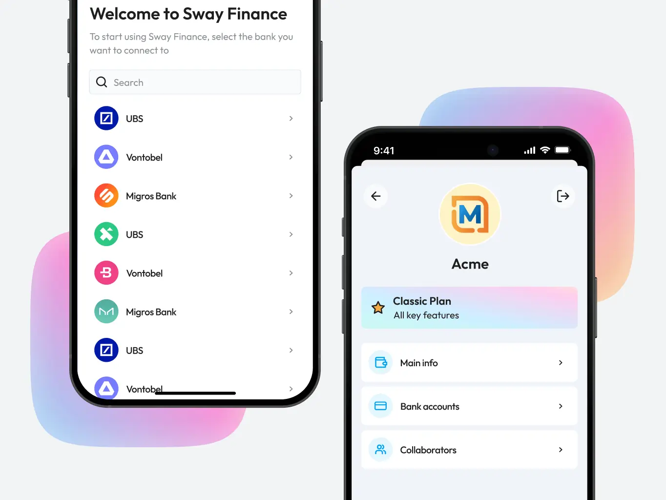
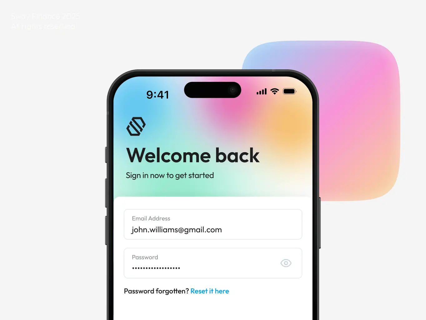
Designing a Sway Finance isn’t just about making it look good—it’s about crafting an experience that empowers users to take control of their finances with ease and confidence. Our approach began with a deep dive into understanding user needs, followed by a meticulous design process that prioritized clarity, simplicity, and efficiency at every step.
The result? An interface that transforms the complex world of financial management into a smooth, seamless process, allowing users to focus on what really matters.
Stages
- Wireframe
- Design direction
- Mockups design
- Dark mode

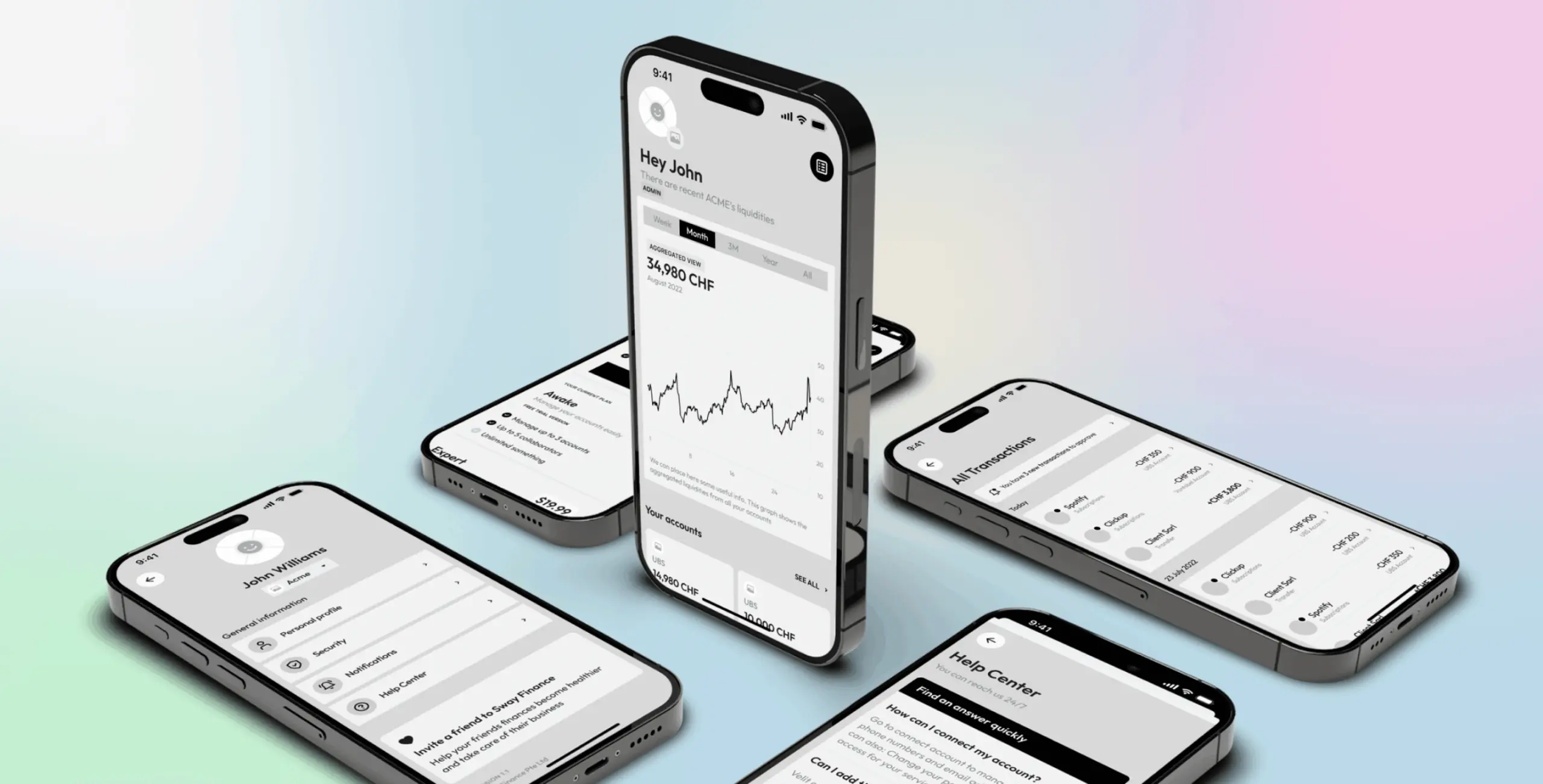
To establish the foundation for an intuitive user experience, we developed detailed wireframes. These wireframes served as a blueprint for the app, allowing us to structure user flows and address key design problems early in the process. We also tackled the challenge of displaying detailed financial statistics without overwhelming users.
Wireframes helped us quickly test and improve the application structure. This process laid a solid foundation for the next stages of design, aligning the app’s functionality with user expectations and business goals.
It was time to unleash our creative energy! We didn’t settle for just one path; instead, we crafted two distinct moodboards overflowing with design inspiration.
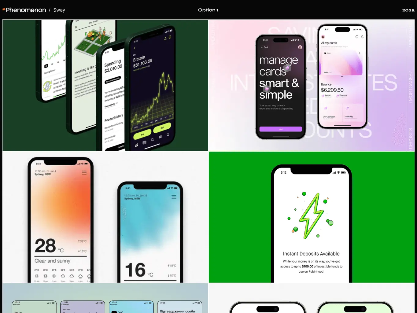
The first option explores a bold, modern aesthetic with bright accents, crisp typography, and clean layouts. It emphasizes dynamic financial visualizations, intuitive interfaces, and energetic branding that seamlessly aligns with innovation and friendliness.
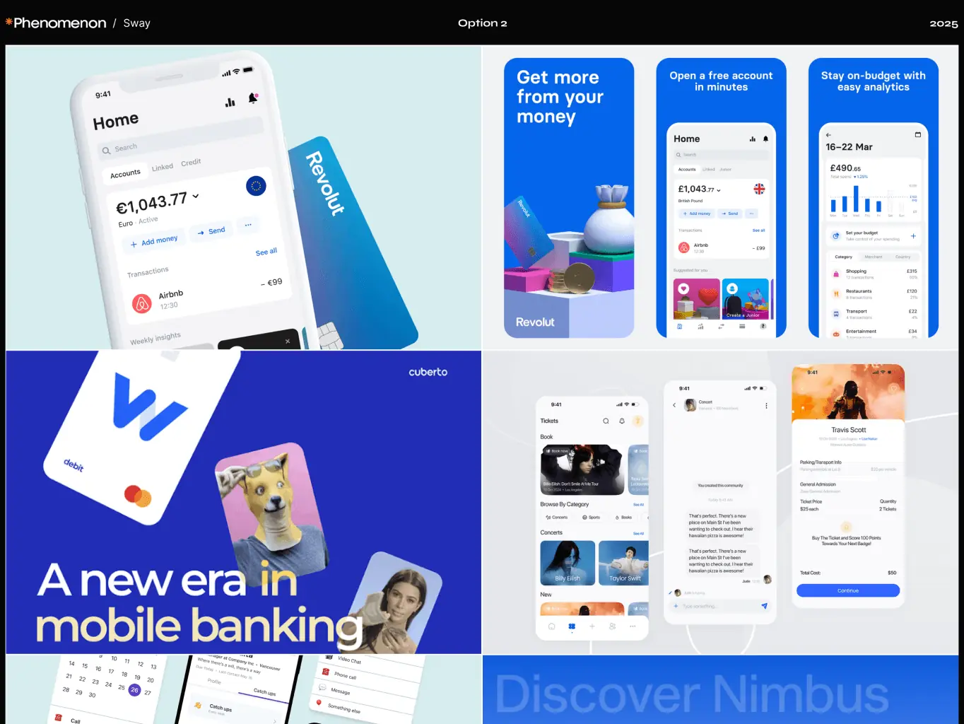
The second moodboard is more focused on cold calculation. It is simple, restrained, without unnecessary colors, accents, etc. and immediately hints to the user that it will be about finance.
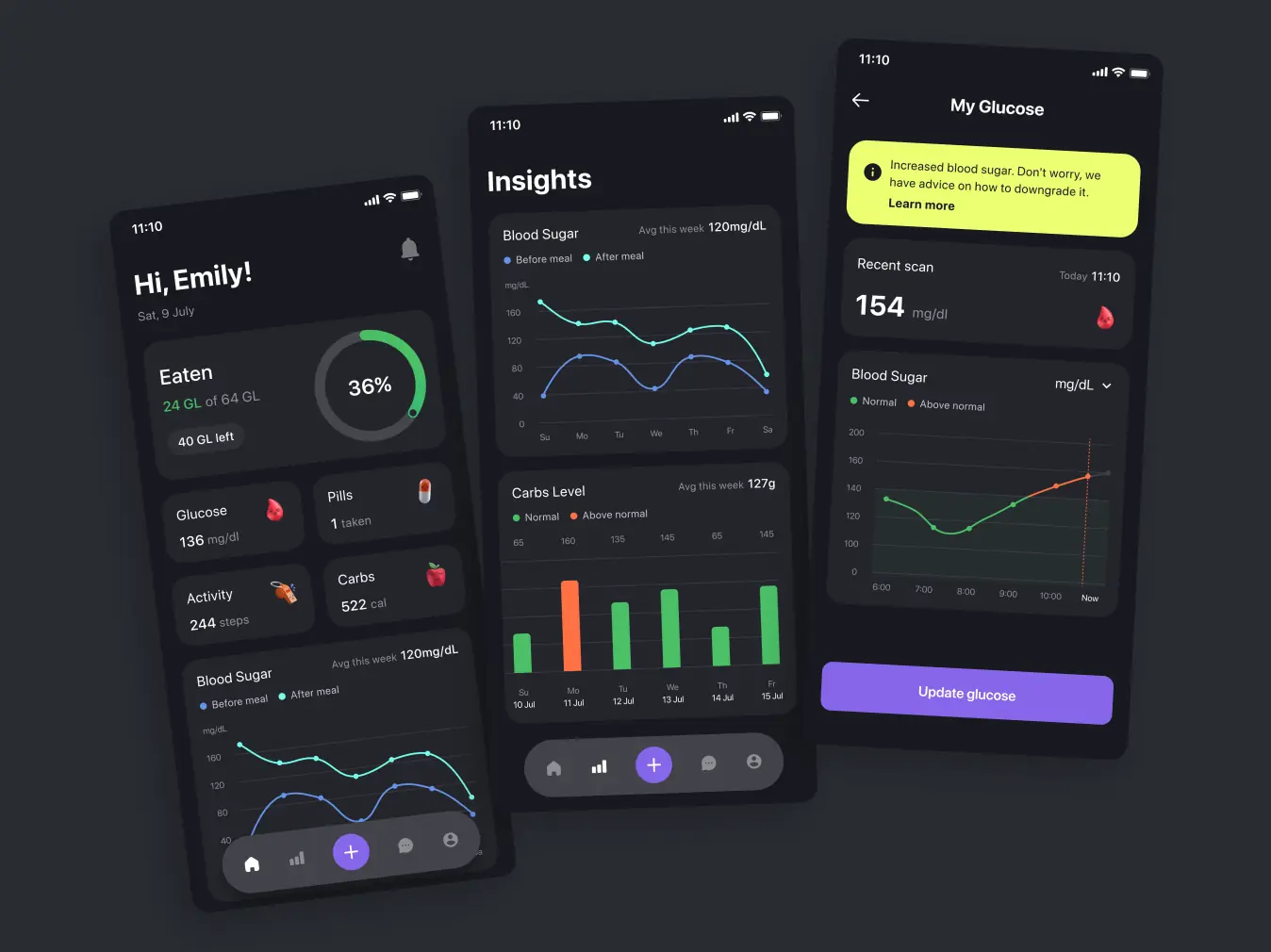
UI design aimed to turn complex financial management into an intuitive and visually appealing experience. A key challenge was to create interfaces that made financial insights—like tracking expenses and monitoring budgets—clear and actionable without overwhelming the user. We tackled this by prioritizing straightforward layouts, meaningful visual cues, and a natural flow between screens. By testing different layouts, we achieved a balance between presenting essential data upfront and offering deeper insights on demand.
The final design strikes a balance between functionality and aesthetics, delivering a polished interface that resonates with users and aligns with the client’s vision for a modern.
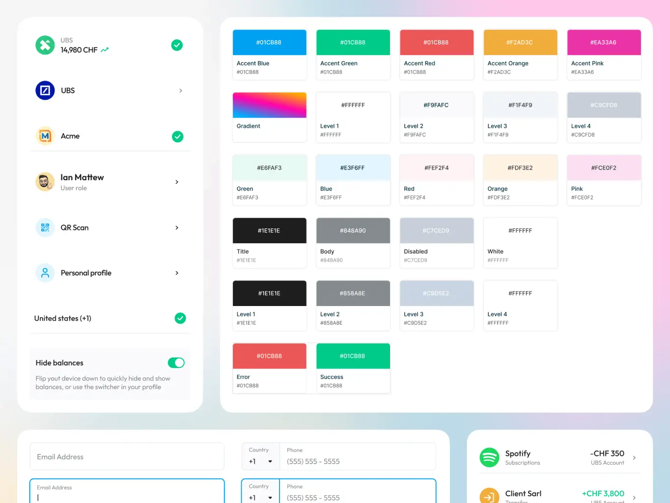
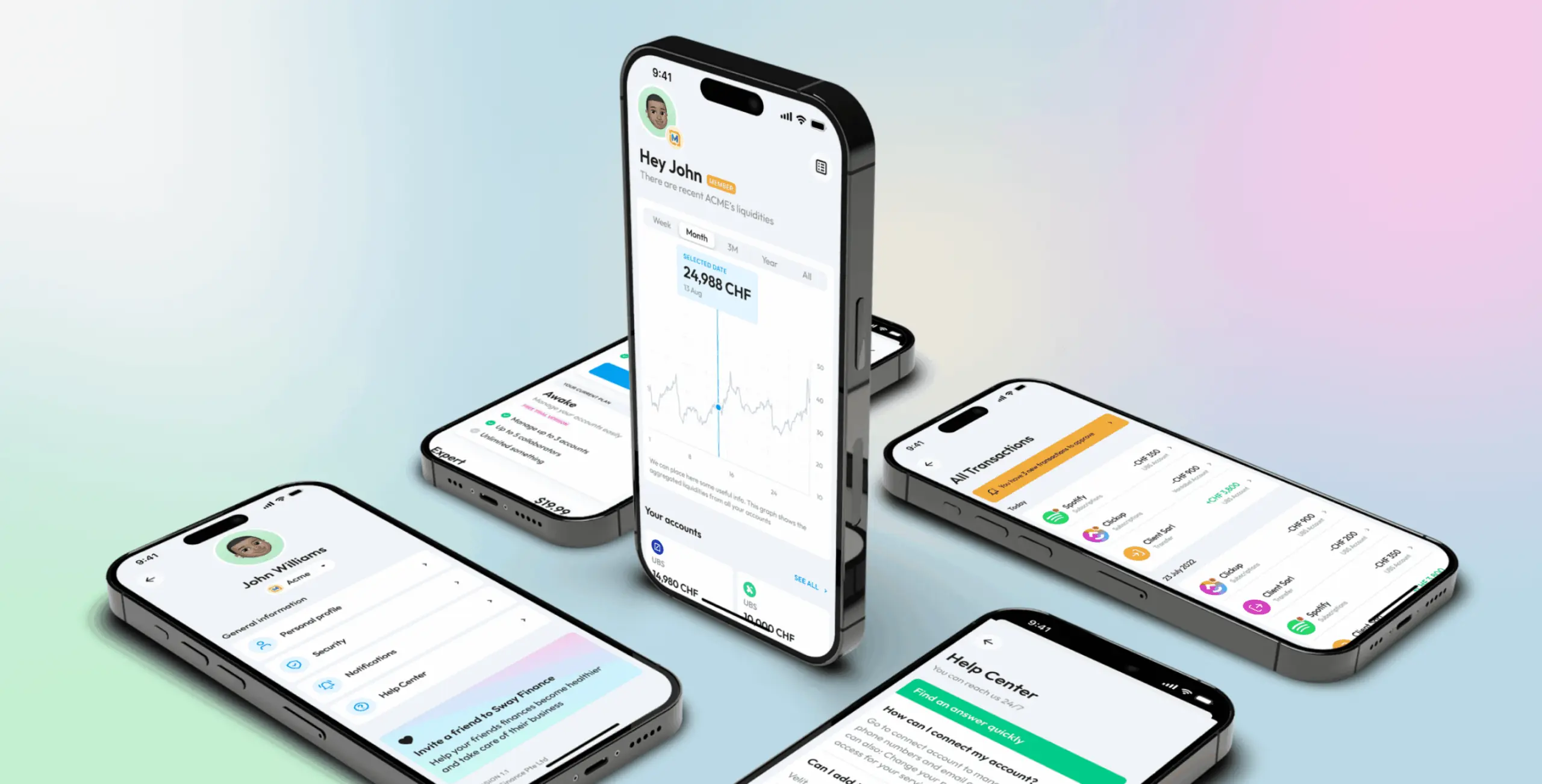
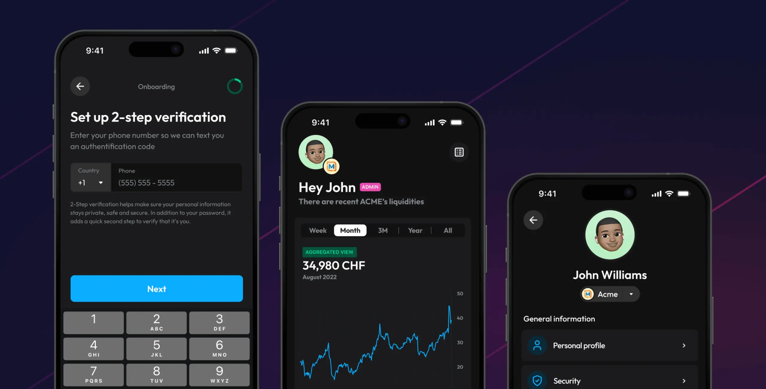
We also developed an additional dark theme as a secondary option to increase the flexibility of the app for users.
The decision to introduce a dark theme was driven by several considerations:
- User comfort: dark themes reduce eye strain, especially in low-light conditions, making it a valuable feature for users who manage their finances during evening hours.
- Modern aesthetic: the dark theme adds a sleek and premium feel, appealing to users who associate darker designs with innovation and professionalism.
- Enhanced accessibility: offering both light and dark themes ensures the app accommodates a wider range of user preferences, aligning with accessibility best practices.
User feedback and our observations have confirmed that the dark theme complements the light design, while increasing the user experience.
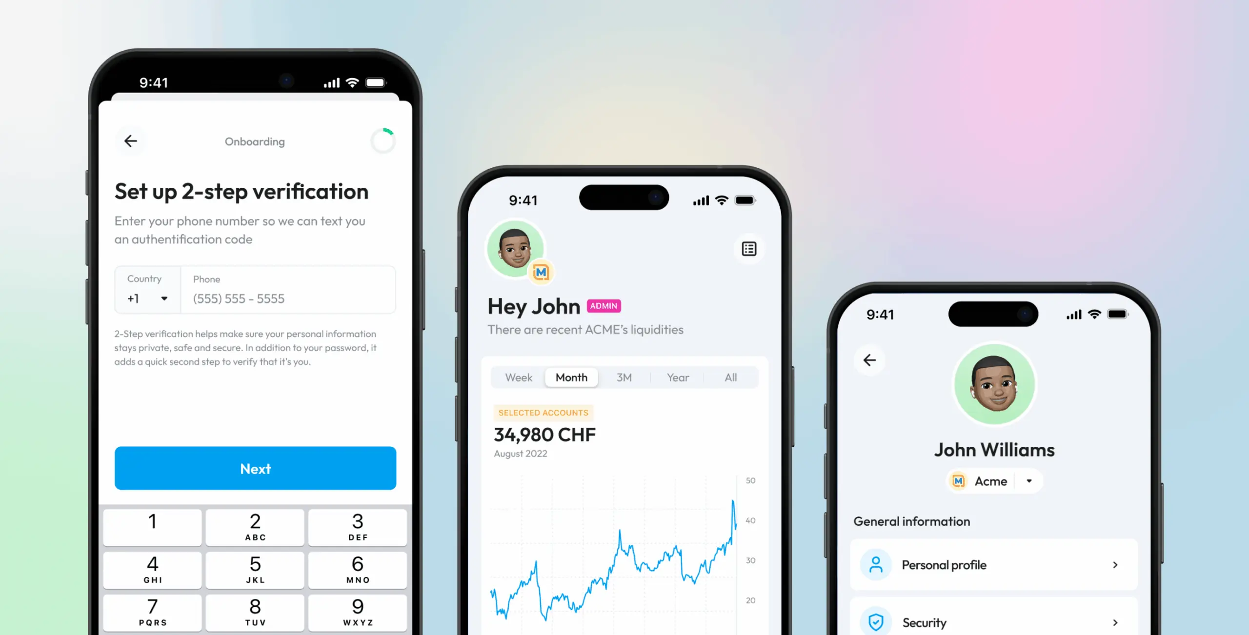
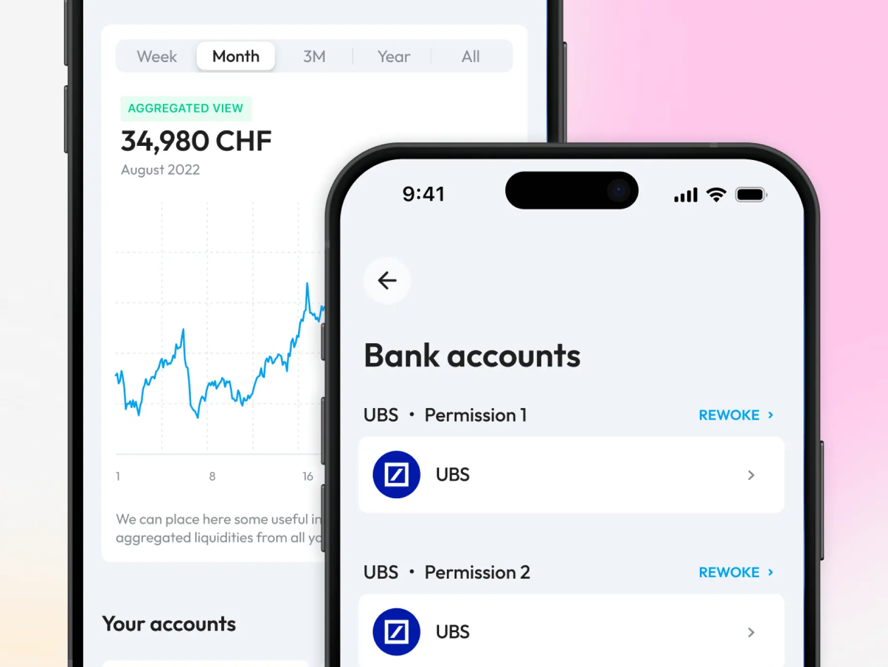
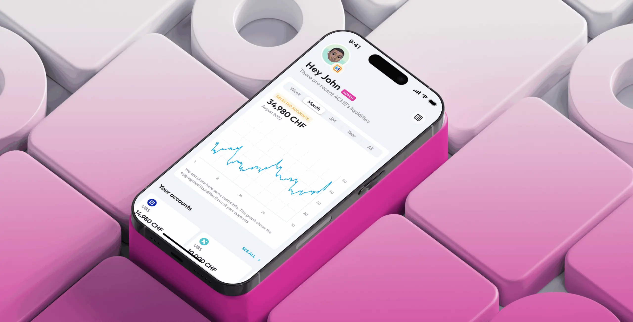
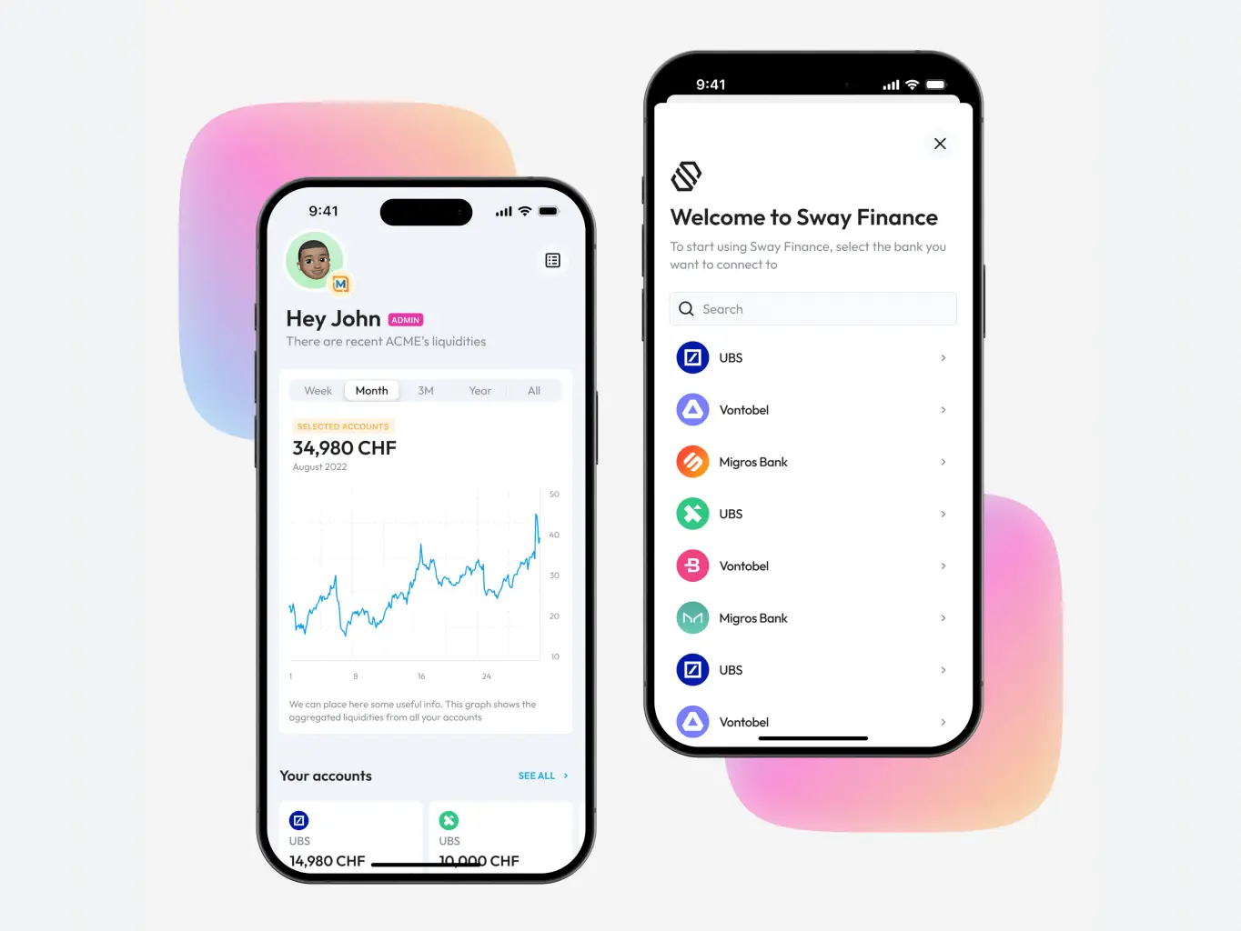
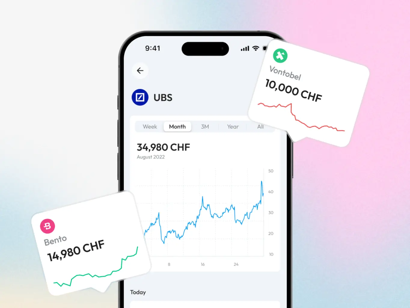
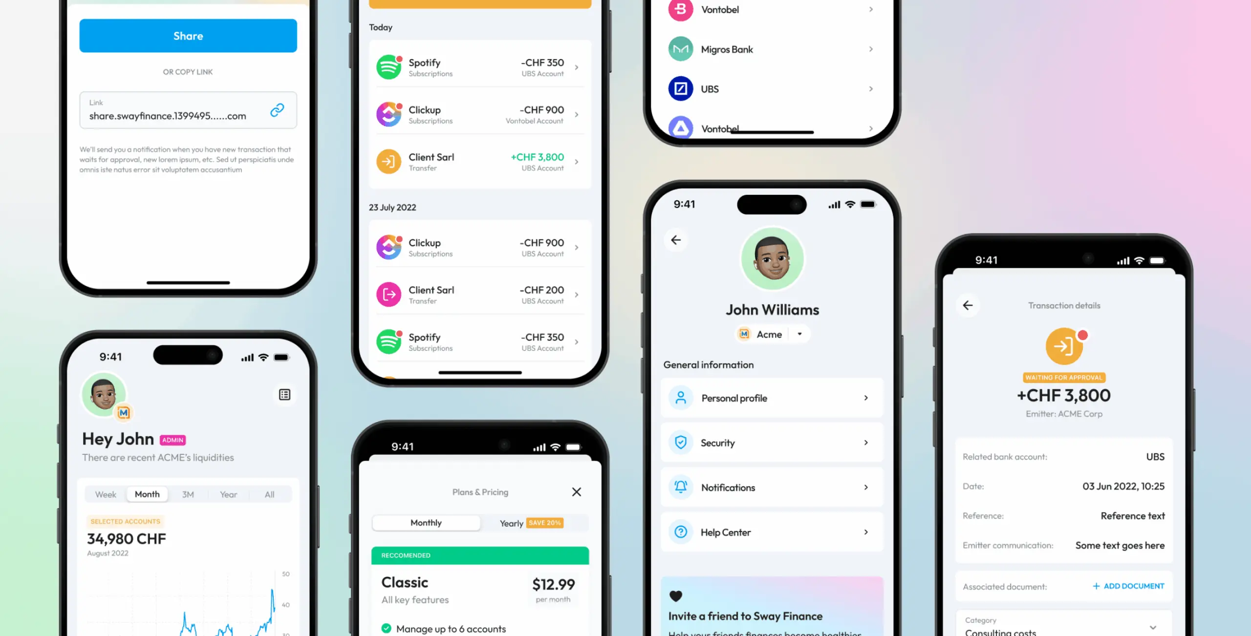
General accounts managment
The headache of users - difficult to get a clear overview of their expenses due to a large number of different accounts in different banks - is solved! Multi-bank synchronization and detailed statistics of expenses and receipts right here on the main screen.
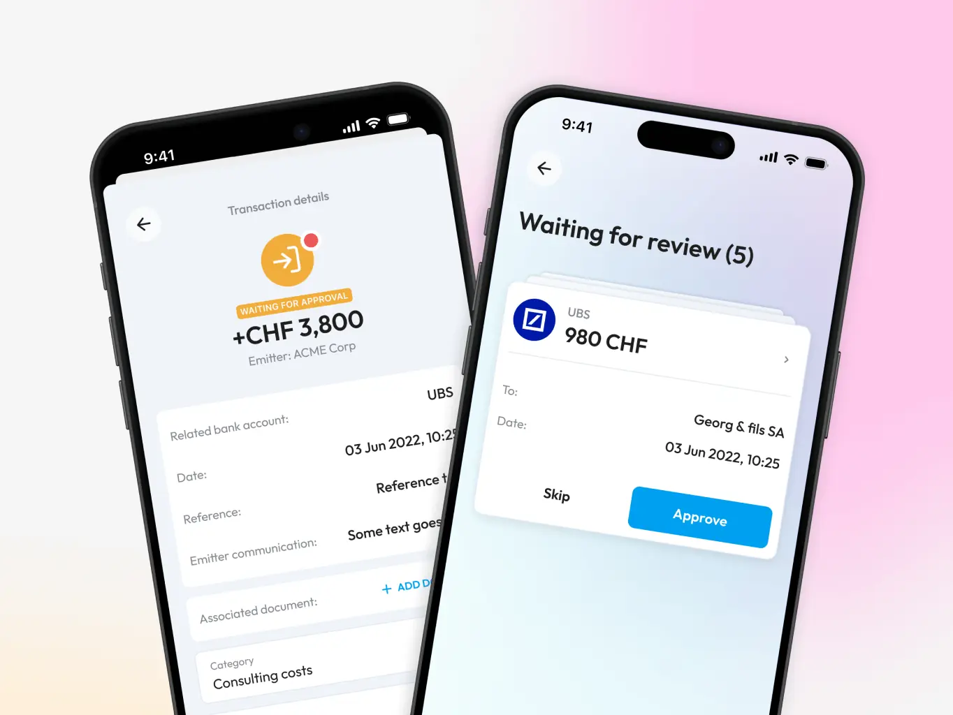
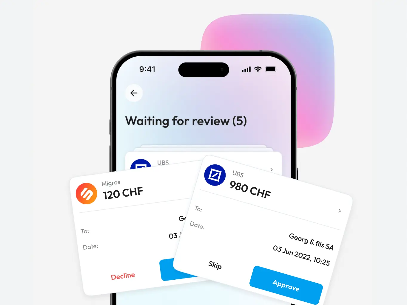
Transaction confirmation
A unique feature to prevent users from paying for subscriptions or automatic payments they don't need or forgot to cancel. All this is collected for verification and you only need to light swipe to confirm or cancel the payment.
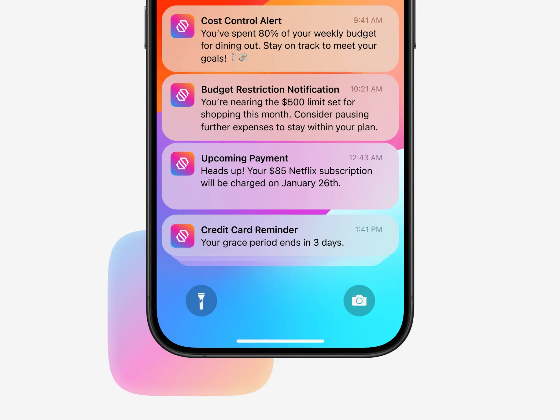
Proactive notifications
Integrated proactive notifications that never spam but bring significant benefits. Be warned in time about budget limits, grace periods, upcoming payments, and absolutely everything that can make you happy or sad.
#MVP development
E-manager, LLC
 USA
USA
USA
#Mobile app design #Mobile development
Glume LLC
 Germany
Germany
#MVP development #Mobile app design
Boost
USA
USA
Have a project in mind?
Let's chat
Have a project to
discuss?
discuss?

Have a partnership in
mind?
mind?