Development
Research

Client
Sway Finance
 Switzerland
Switzerland
Services

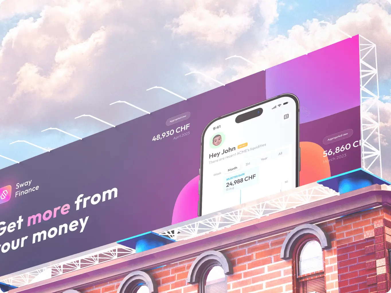
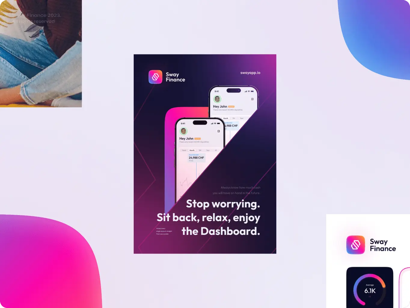
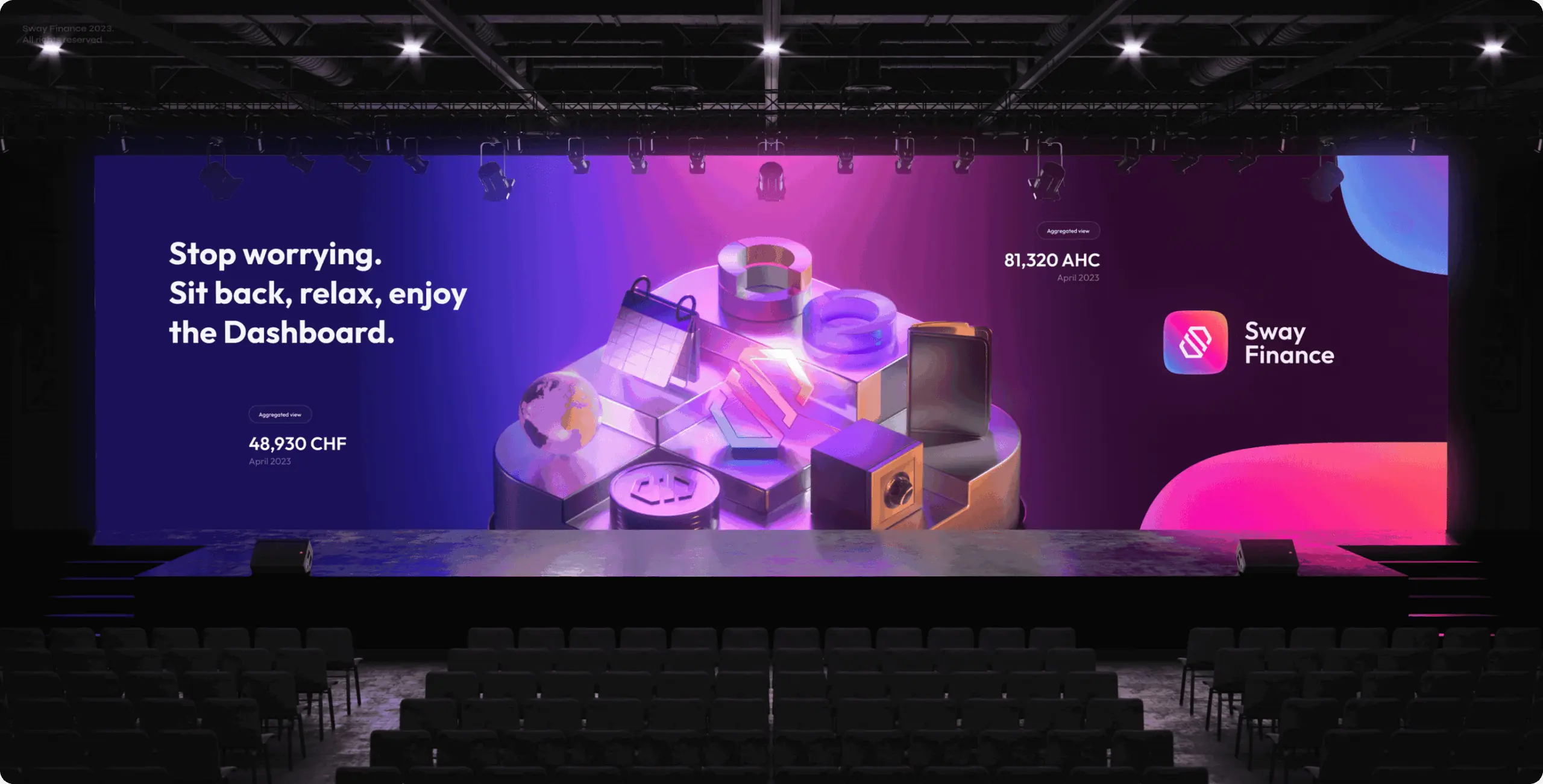
We were tasked with an exciting brief to build an immersive visual experience that reflects the innovative solutions of cash management service. As a financial startup our goal was to show their philosophy, values and mission to the audience with branding, and create an application easy to understand and simple to use.
Sway Finance trusted us with the development of their brand identity and app design. We’re very excited to share the results.
Scope of work
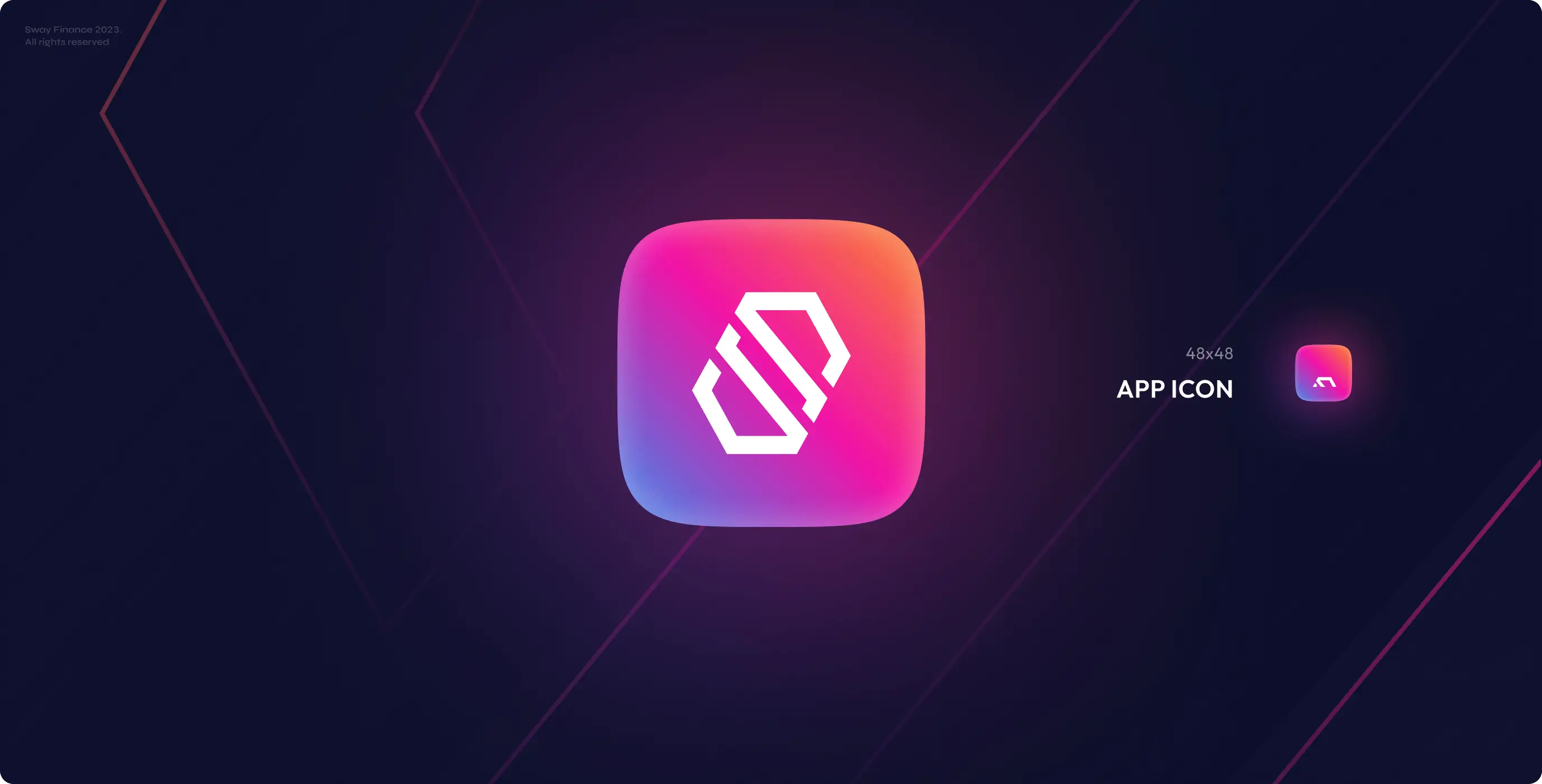
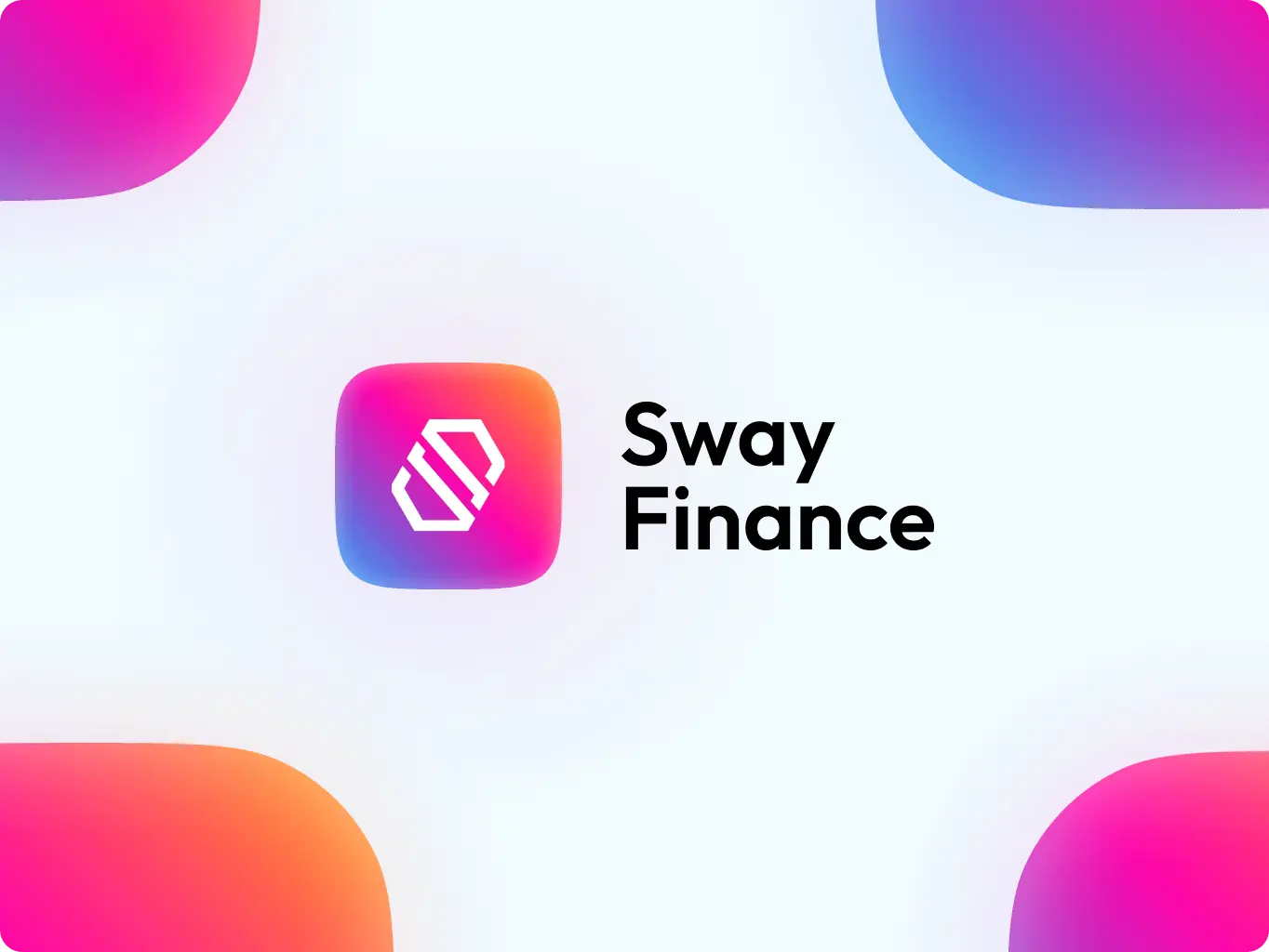
- Logo design
- Guidelines for consistent usage of branding elements
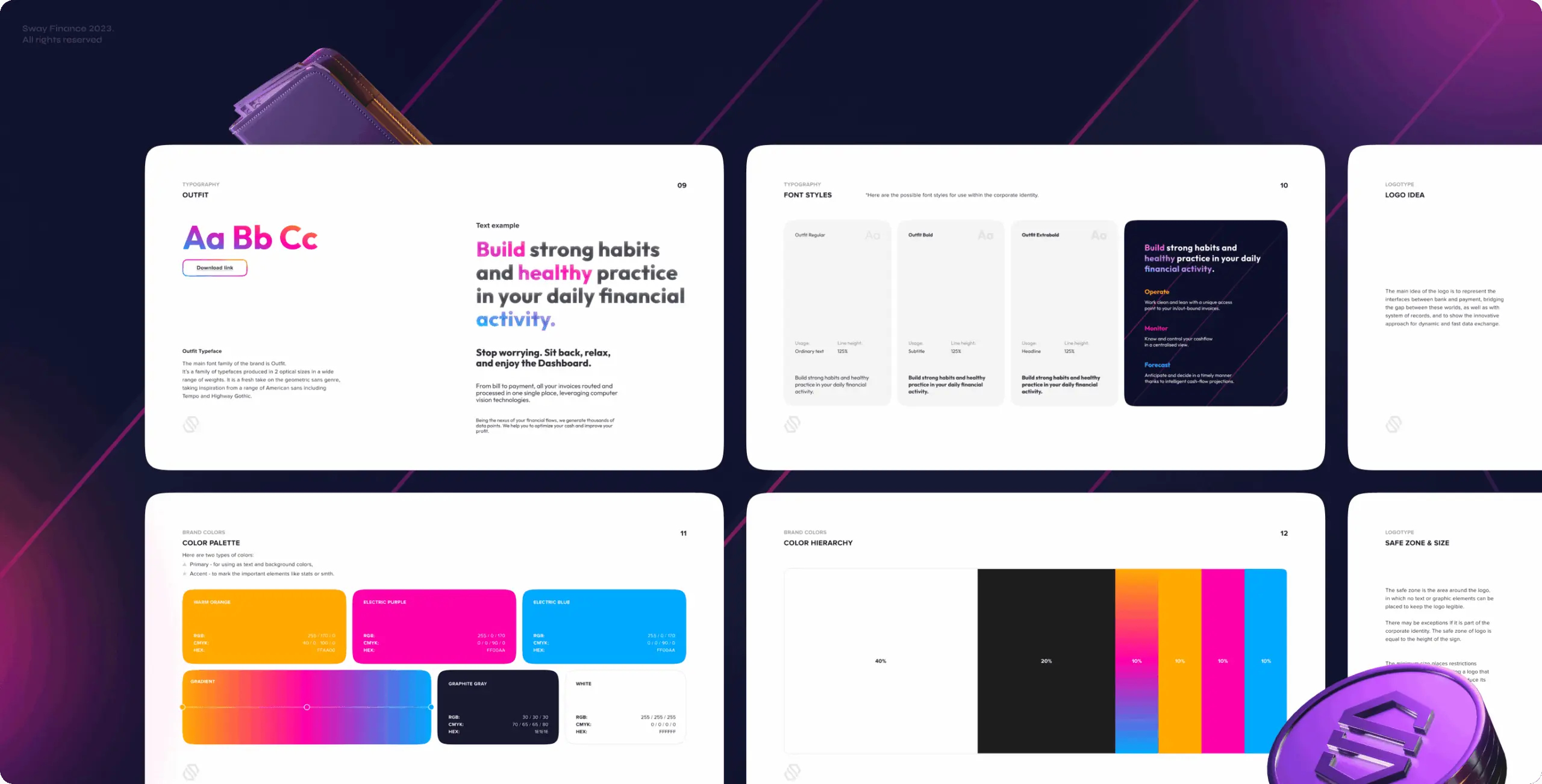
Logo idea
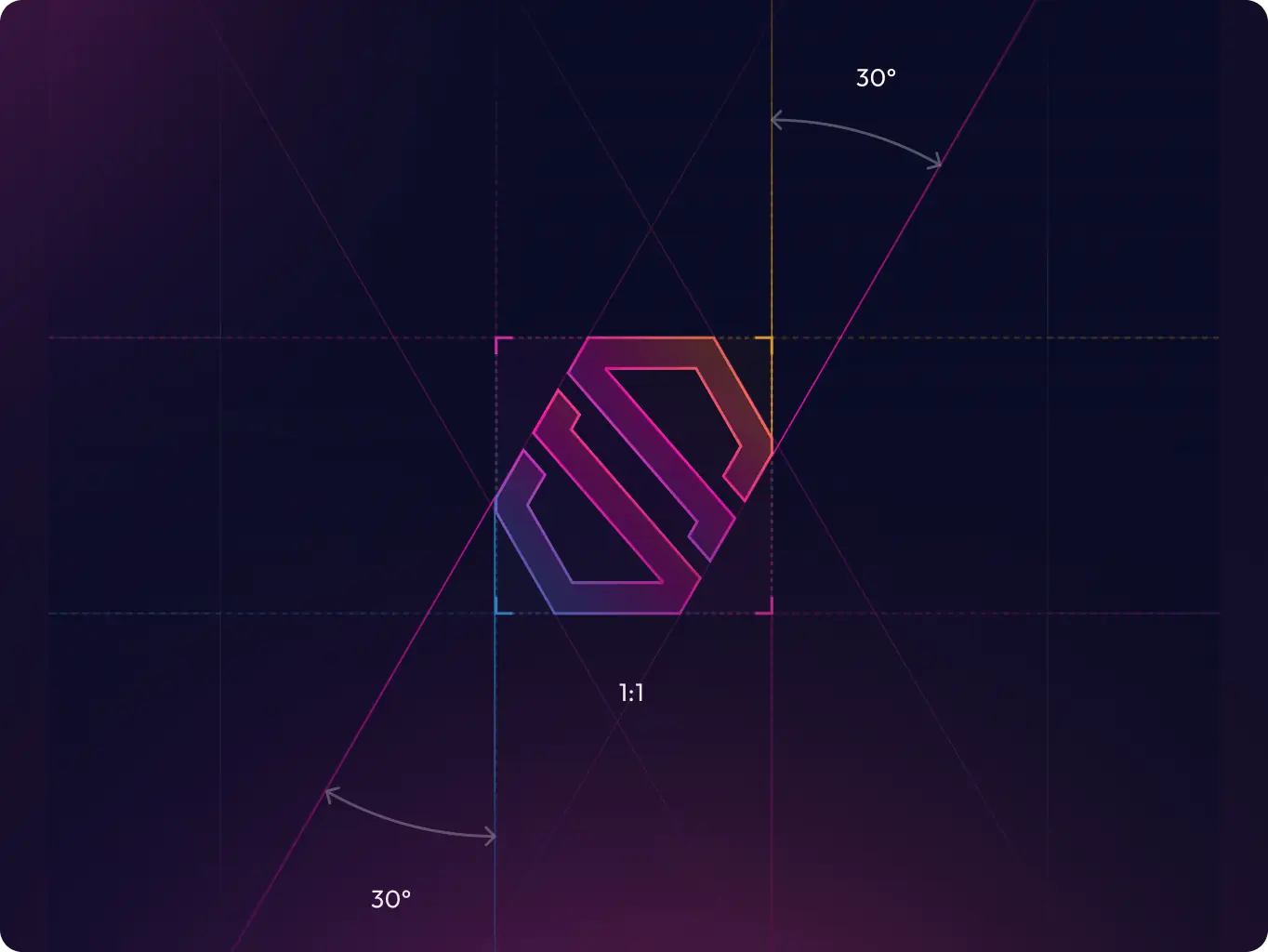
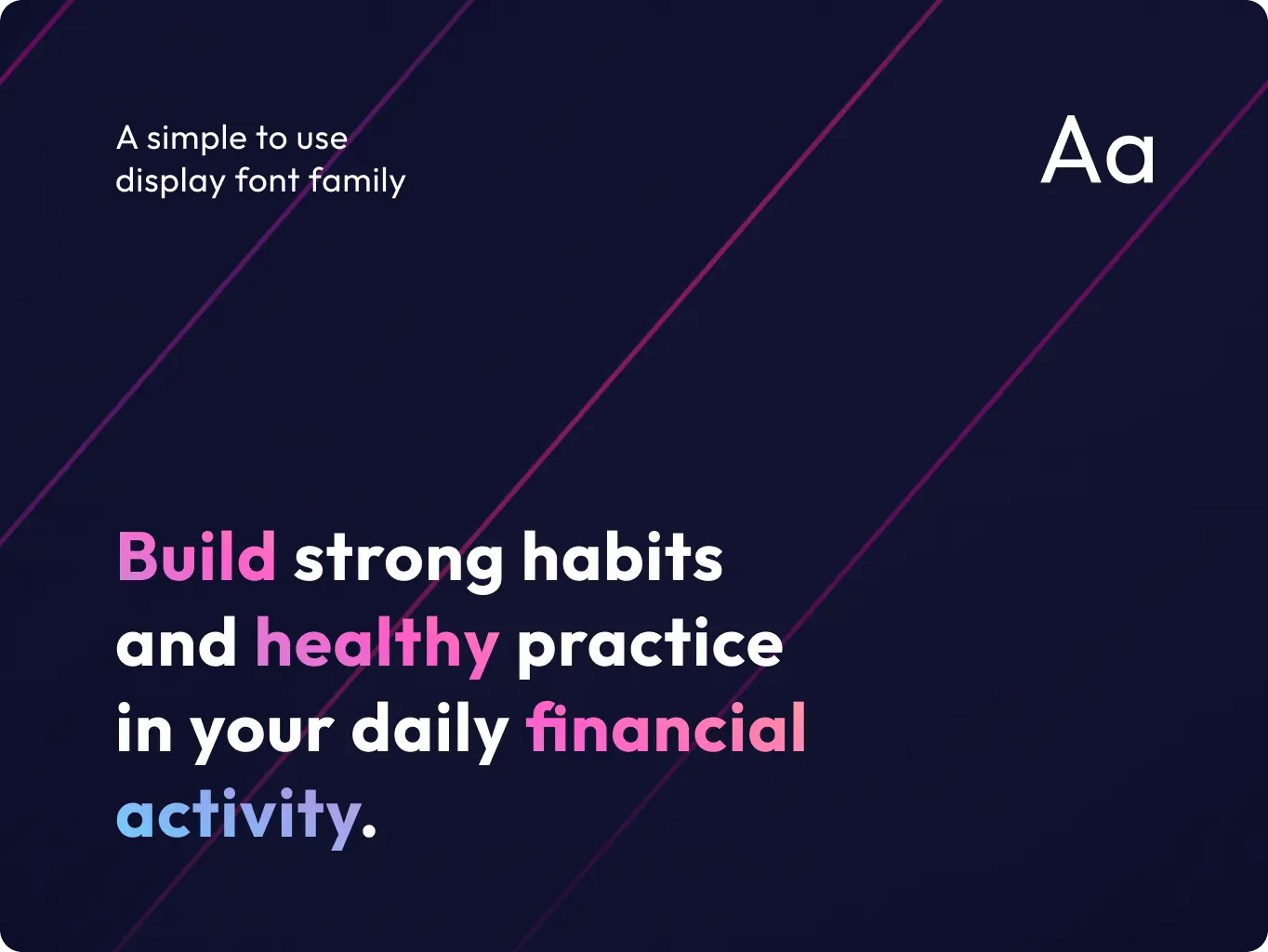
The main idea of the logo is to represent the connection between banking and payment, bridging the gap between these worlds, as well as with the system of records, and to show the innovative approach to dynamic and fast data exchange.
The graphic sign perfectly visualizes these advantages and combines the letter “S”, which shows the connection and synergy between banking and payment, and the spiral element inside, which illustrates the idea of dynamic and fast data exchange.
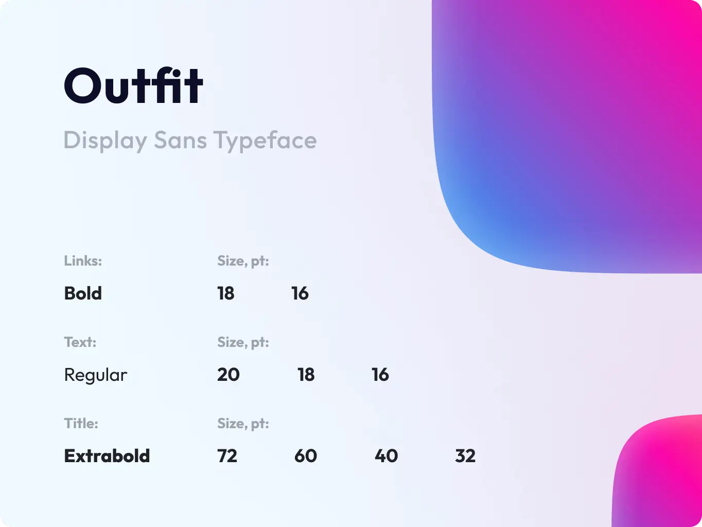
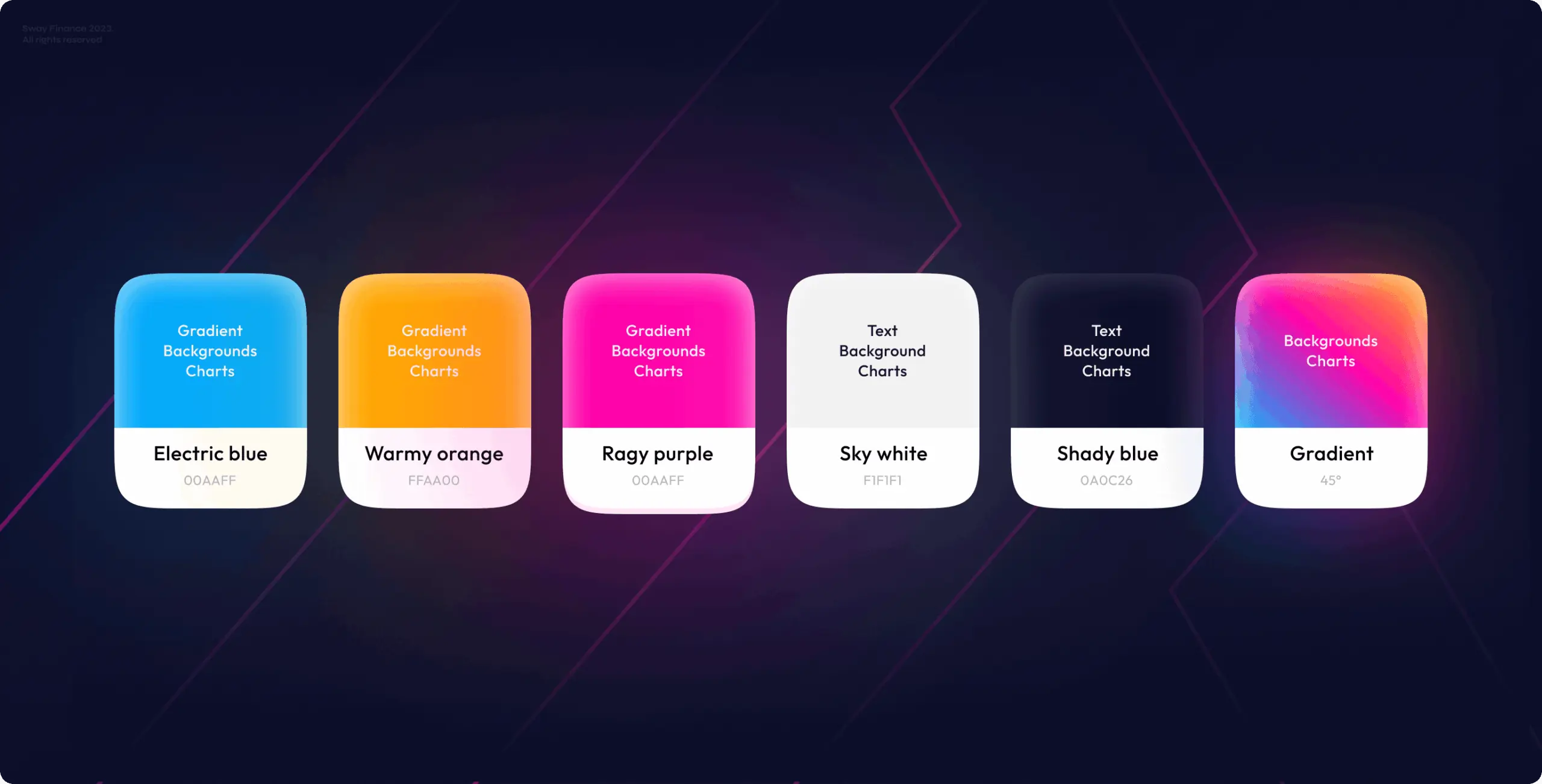
Main colors
Color palette is an essential tool for brand identification because it helps to convey the character and personality of a brand.
The main idea of the brand is simply and happily working with the cash management platform. And to reinforce this effect, we created a color palette that reflects a sense of a light, clean, modern and professional brand.
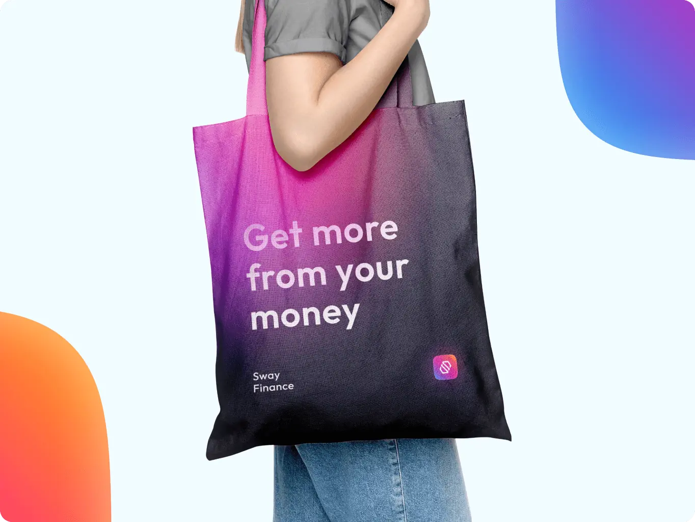
We always consider the various types of brand assets in advance, from the digital sphere to material things. That’s why we have created the brand assets that cover the most important types of communication areas to represent the brand in the most appropriate way.
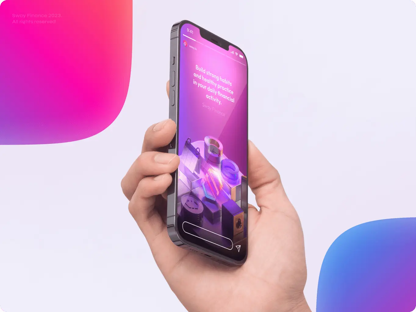
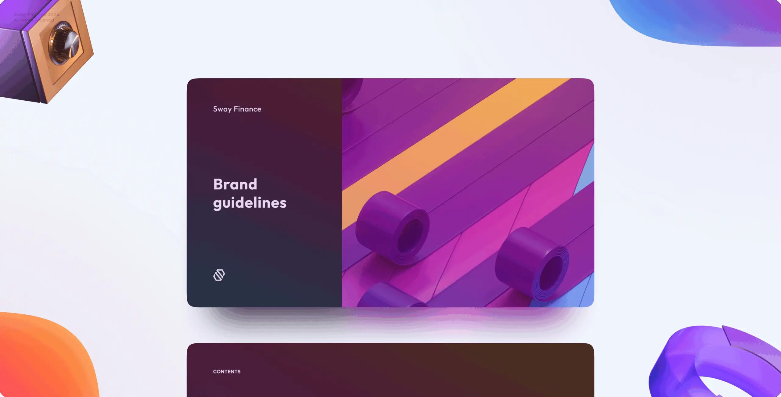
To ensure the brand’s proper usage, we created basic brand guidelines that clarify the appropriate use of logo, color palette, typography, and other graphic elements, collected in a complete folder with all brand assets, readily available for use.
#Branding
Appsent
 USA
USA
USA
#Branding
Phose Protocol
USA
USA
Have a project in mind?
Let's chat
Have a project to
discuss?
discuss?

Have a partnership in
mind?
mind?