Development
Research
Client
Orryx
 USA
USA
USA
Services
As a fast-growing fintech startup, ORRYX set out to disrupt outdated financial norms and offer a bold alternative to traditional investment platforms. Their goal was to build a brand identity that would reflect their data-driven approach, communicate precision and trust, and connect with a younger, innovation-oriented audience.
The client asked us to create a visual and verbal system that could scale across digital dashboards, marketing, merchandise, and outdoor campaigns, ensuring consistency while keeping the brand dynamic, disruptive, and future-focused.

To bring ORRYX’s disruptive vision to life, we structured the process into clear design stages. Each step, from defining the logo and typography to building brand assets and consistency tools, ensured the identity was not only visually striking, but also scalable and future-proof.
Stages
- logo design
- colors & typography
- brand assets
- brand guidelines
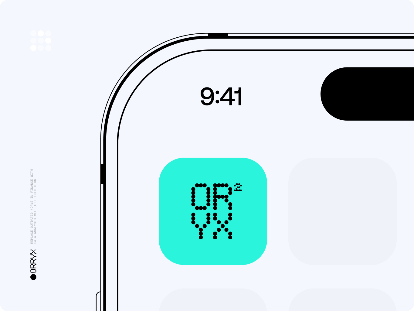
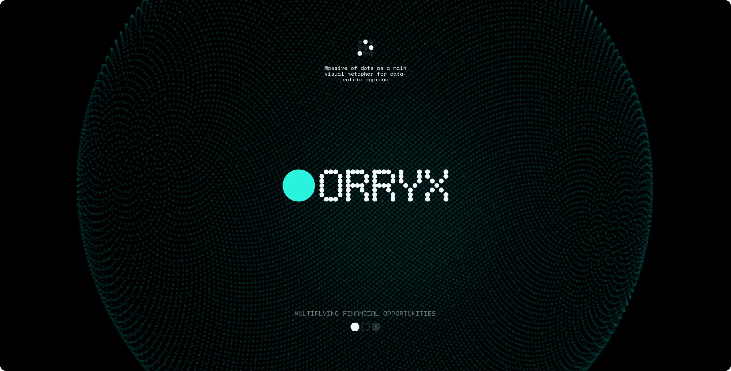
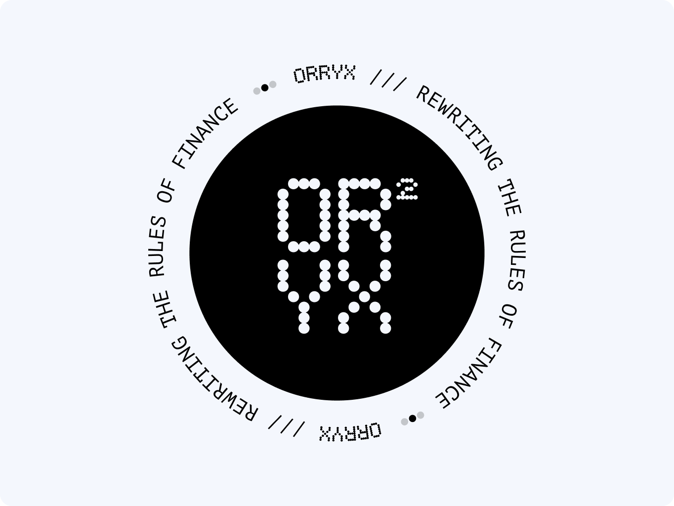
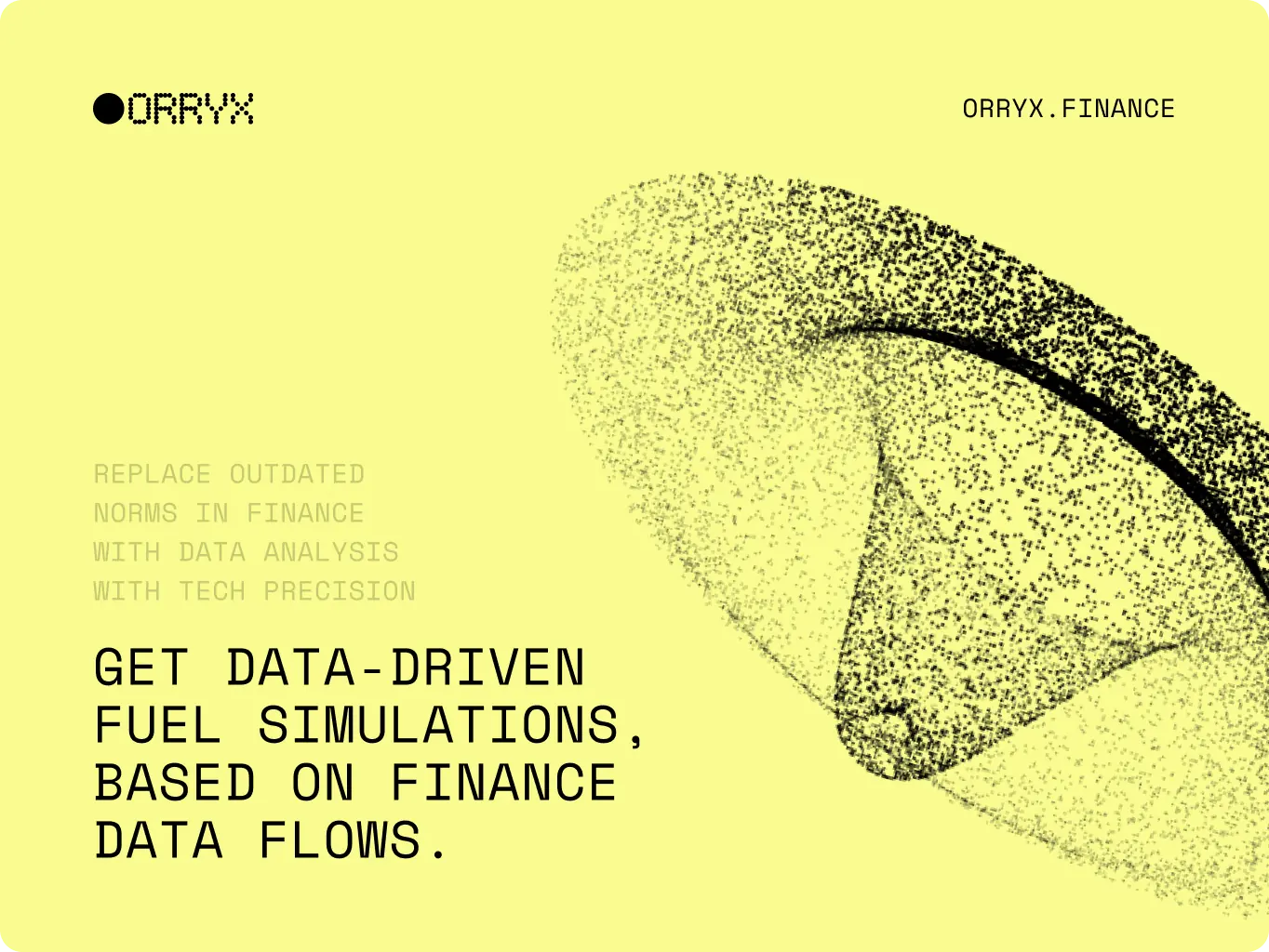
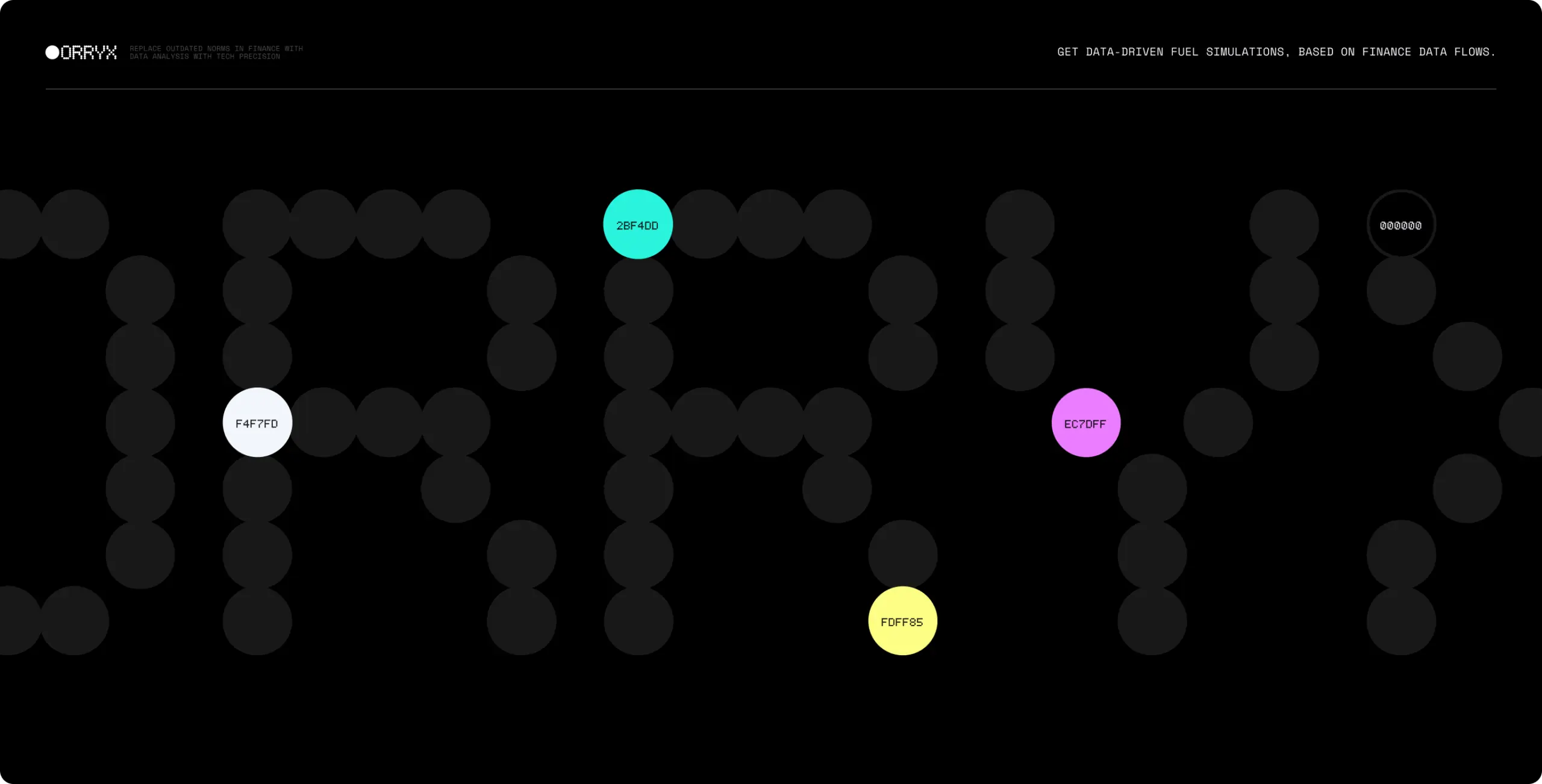
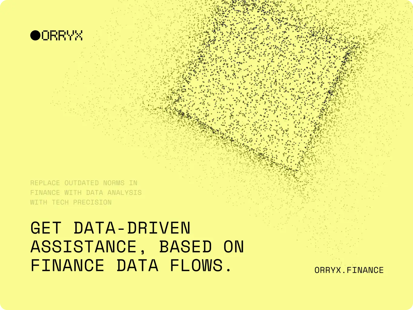
The ORRYX logo was built on a dot-matrix system, turning data itself into a visual identity. This structure clearly represents precision, scalability, and connectivity — the very qualities that define the platform’s fintech approach.
By using a circular structure, the logo becomes both futuristic and stable, symbolizing ORRYX’s mission to rewrite the rules of finance while staying trustworthy. The result is a bold mark that instantly conveys innovation and data-driven clarity.
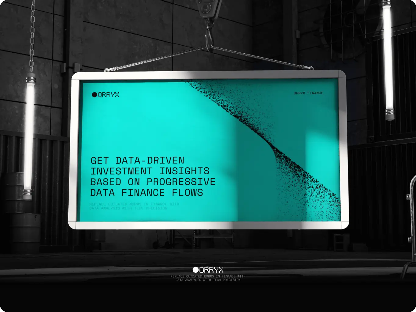
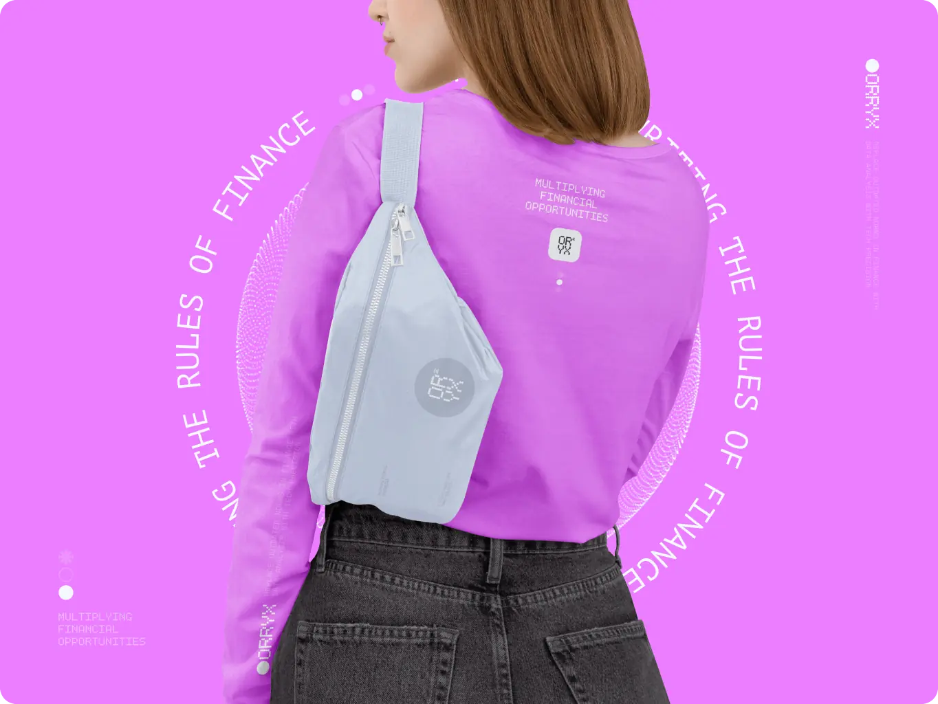
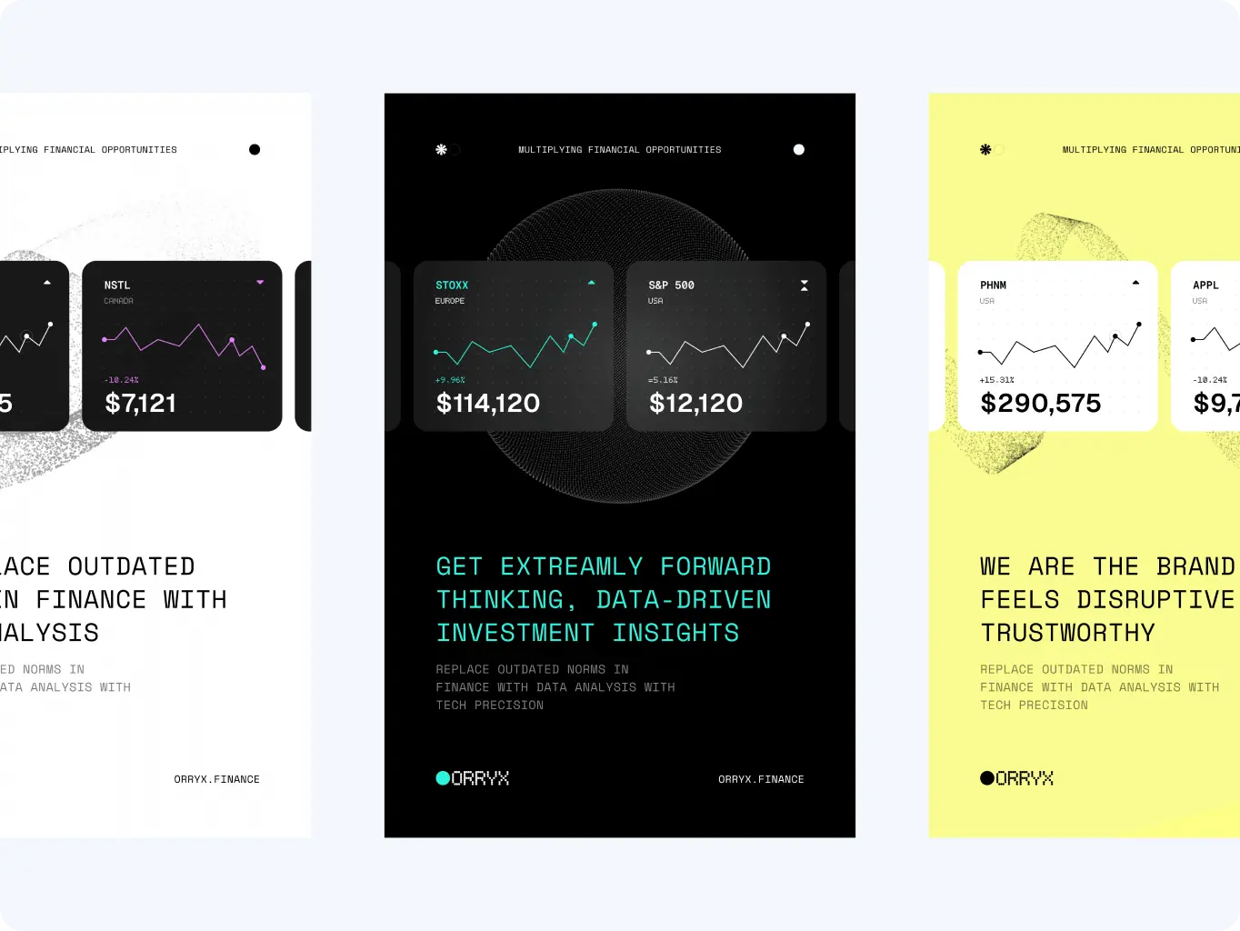
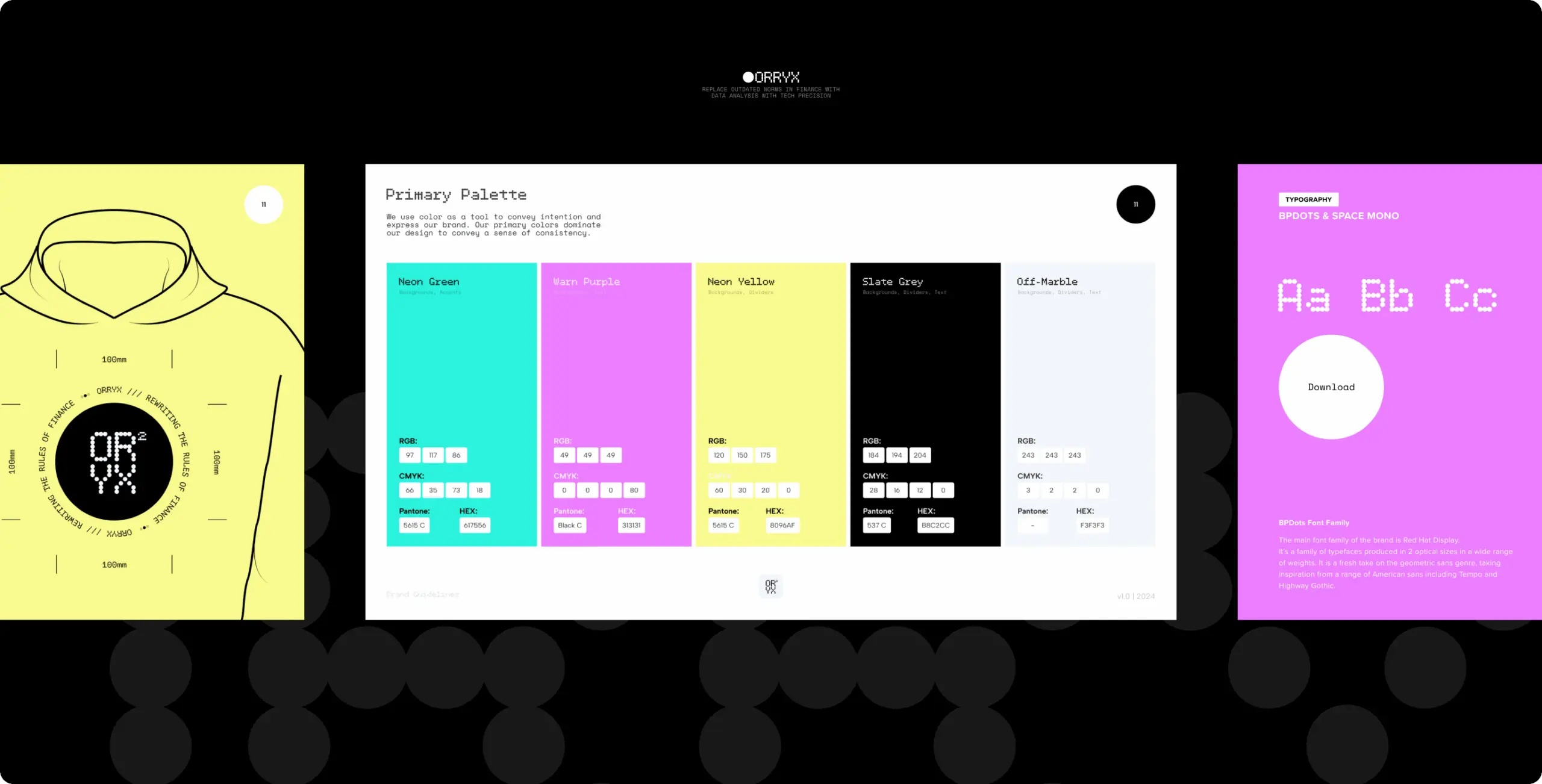
We built the visual system that combines bold digital-neon accents with high-contrast black and white, creating an aesthetic that feels both futuristic and precise. Each color, from electric cyan to vibrant magenta and yellow, reflects energy, disruption, and the dynamic nature of financial flows.
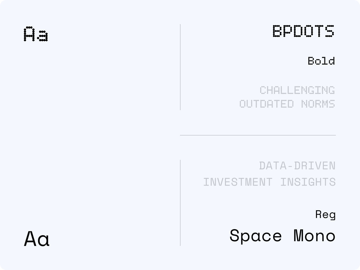
Typography blends BPDots, echoing the dot-matrix identity, with Space Mono, a typeface chosen for its technical clarity and trustworthiness. Together, they balance disruption with reliability, giving ORRYX a voice that feels radical yet credible.
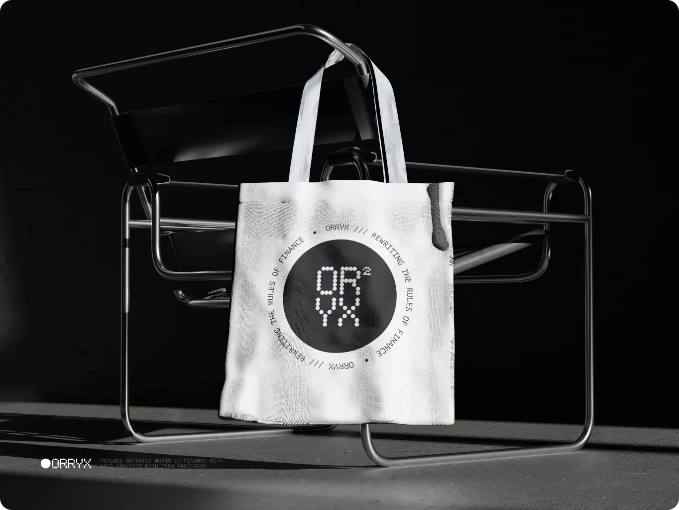
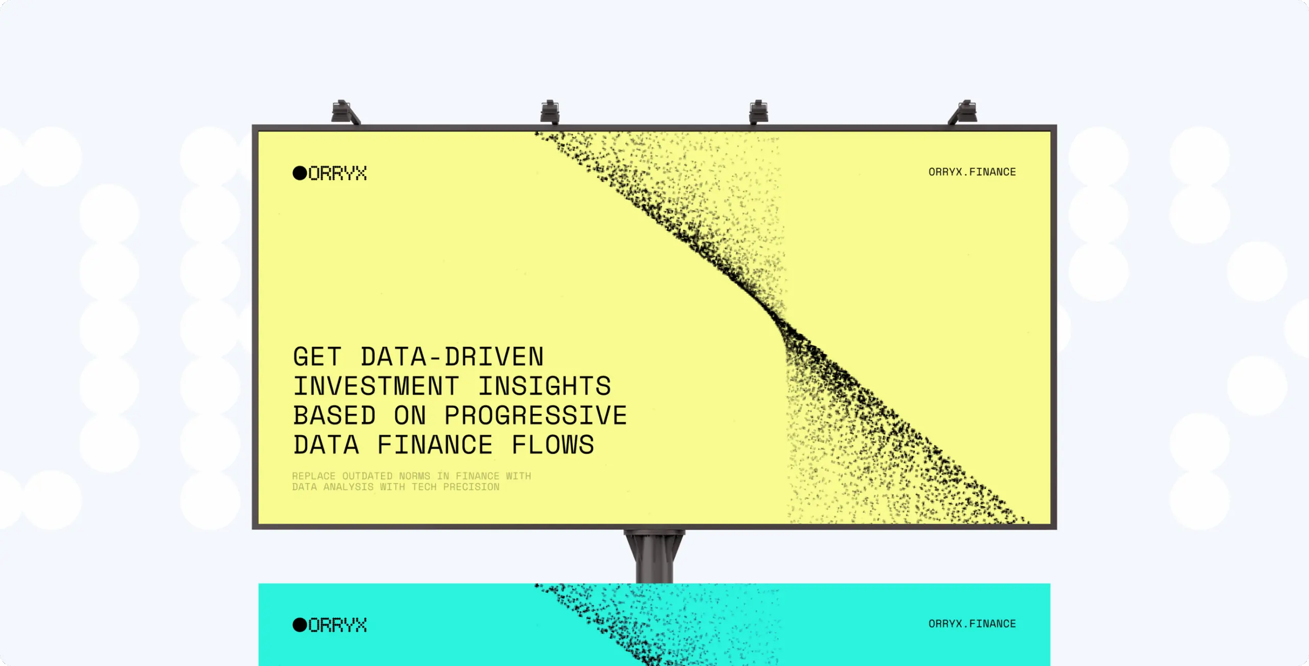
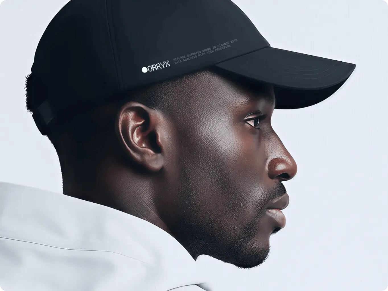
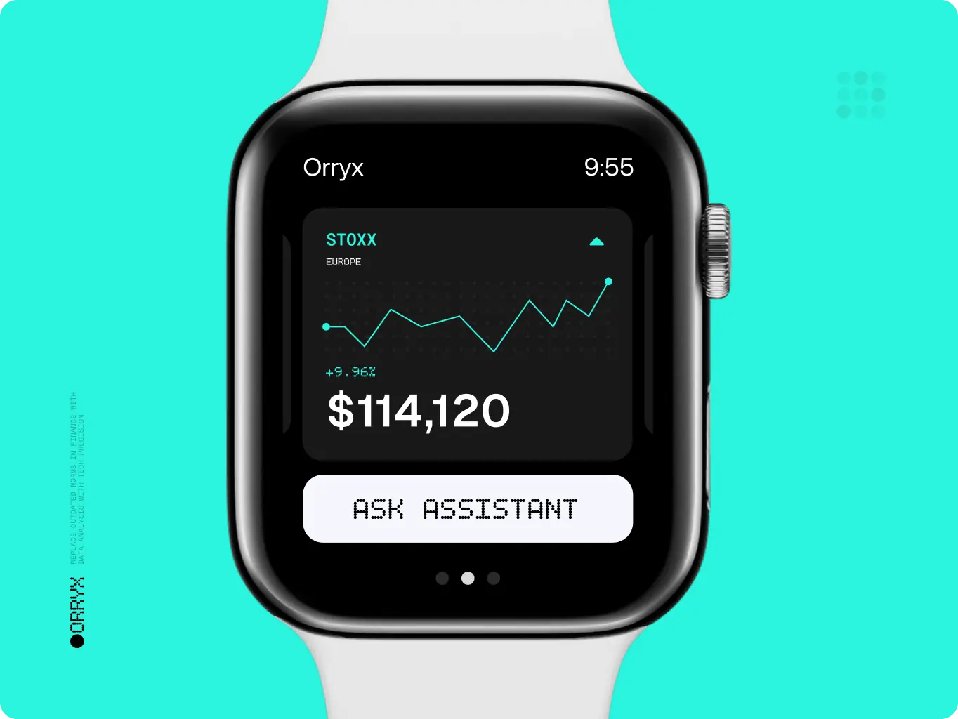
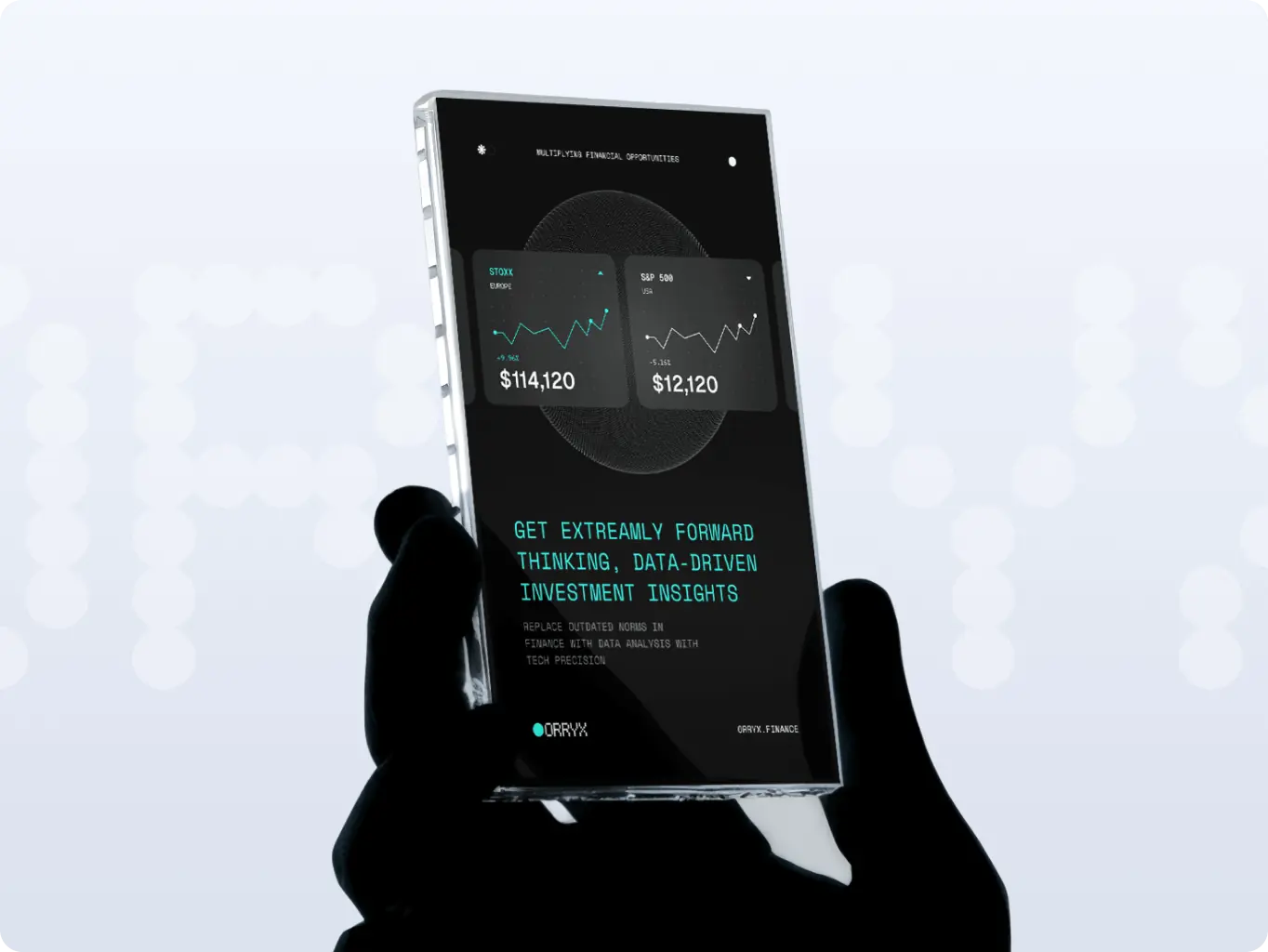
To make ORRYX’s disruptive identity truly scalable, we extended the brand system across every medium, from merchandise and wearables to digital dashboards, outdoor advertising, and marketing campaigns. Each application reinforces the same data-centric language, ensuring clarity and recognition no matter the channel.
A key part of this stage was the creation of the Assets Generation Tool v.001 — a custom software that empowers ORRYX to generate an endless variety of supportive brand visuals. Built on the dot-matrix system, the tool allows precise control over shape, scale, color, and motion. This guarantees consistency across all assets while giving the brand room to evolve dynamically.
The result is a cohesive ecosystem where every touchpoint, whether on a smartwatch, billboard, or digital feed — feels unified, future-proof, and unmistakably ORRYX.
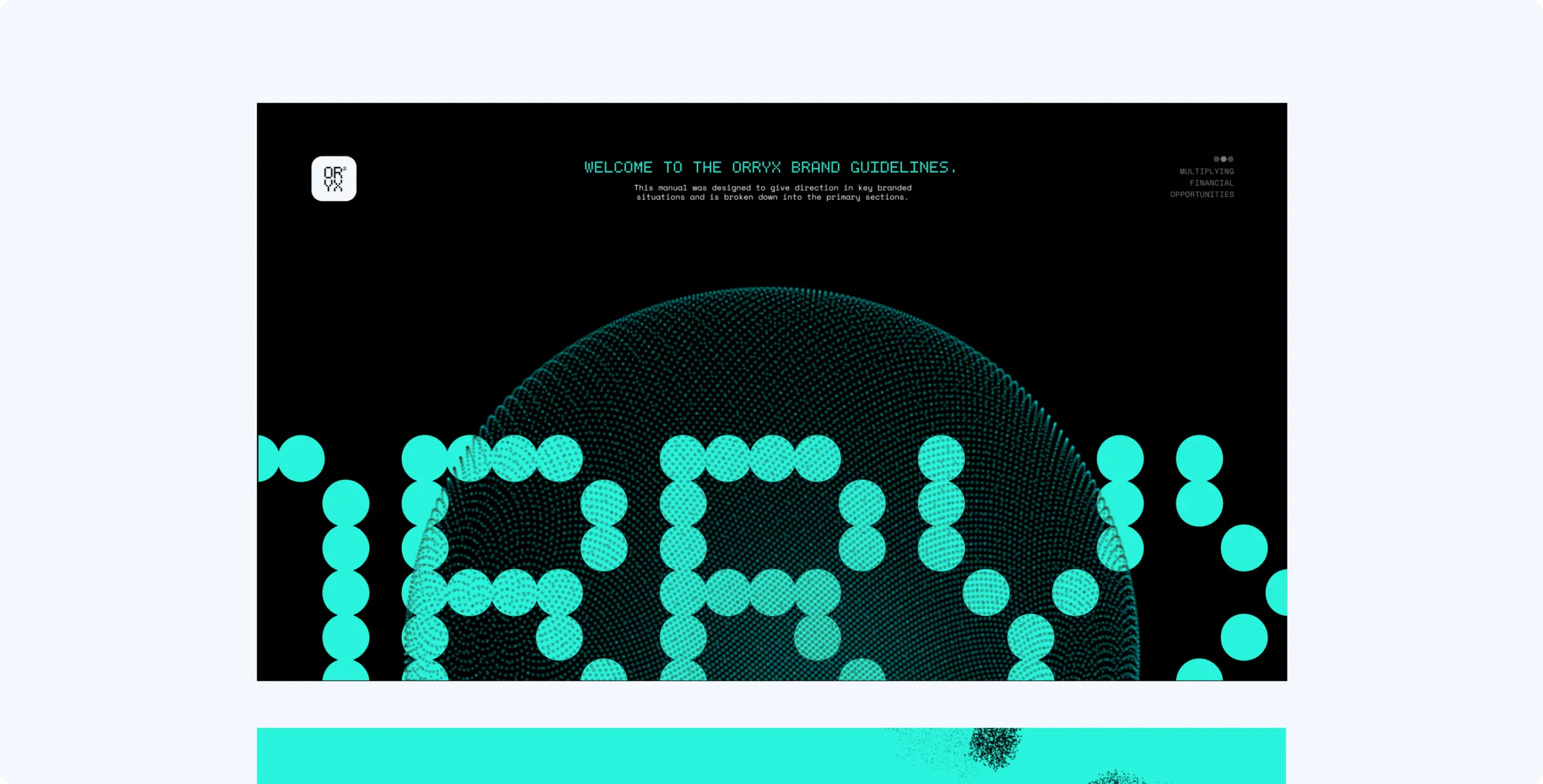
To ensure long-term consistency, we created a comprehensive set of brand guidelines. The system defines how ORRYX’s dot-matrix identity, color palette, typography, and generative visuals come together across digital, print, and physical touchpoints.
The guidelines serve as a practical toolkit for the client’s team — making it easy to scale the brand across new platforms, campaigns, and markets while preserving its disruptive yet trustworthy character.
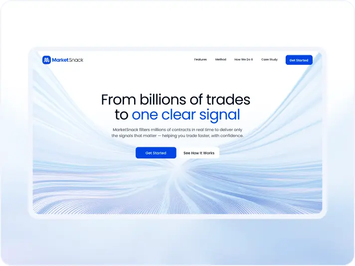
#Website redesign #Website development
marketsnack
 USA
USA
USA
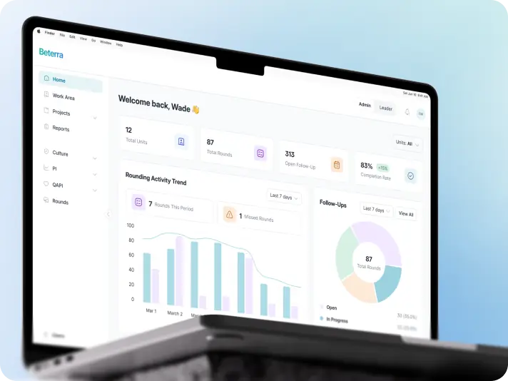
#Product redesign
BETERRA
United States
United States
#Website design #website development
EVERON
United States
United States
Have a project in mind?
Let's chat
Have a project to
discuss?
discuss?

Have a partnership in
mind?
mind?