Our blog has already discussed the importance of easy navigation, usability, and overall customer-centricity. But at Phenomenon, we stand by what we endorse, so this article will explore the advantages of smart predesign decision-making, specifically wireframes and user flows. These steps in information architecture are often overlooked, a major mistake that can lead to irreversible consequences. If users have a negative experience with your website, web app, or mobile app, 88% of them will never return, meaning you only have one chance to impress your visitors. It takes the visitors only 0.05 seconds to determine whether to stay or leave.
While the final product is a culmination of many intricate stages, similar to a well-crafted picture, we confidently assert that user flows and wireframing are arguably the most critical stages impacting your product’s success. Here’s why: user flows and wireframes take center stage in determining whether people will enjoy using your product. A user-friendly experience translates directly into avoiding unplanned expenditures. Think about it: confusing interfaces lead to frustrated visitors who abandon ship, requiring constant customer acquisition and support—both significant cost drivers.
User flows and wireframes act as guiding blueprints, ensuring clarity in project scope and functionality upfront. This minimizes the likelihood of costly revisions and rework during development, ultimately leading to reduced development cost creep and overall product costs.
Key Takeaways
- Wireframes and user flows help businesses save costs in the short and long run.
- Skipping these steps leads to several issues connected to usability and the product’s overall performance.
The Problem: Development Cost Creep
Let’s dive in and decode this fancy way of saying “budget overruns.” Development cost creep refers to the tendency for project costs to gradually increase over time beyond the initially estimated or budgeted amount. It often occurs due to various factors such as scope changes, unexpected challenges, delays, or inefficiencies during the development process. As the project progresses, new requirements may emerge, technologies may evolve, or unanticipated complications may arise, all of which can contribute to higher costs than initially anticipated. Development cost creep can pose significant challenges to project managers and stakeholders, leading to budget overruns and potentially jeopardizing the project’s success. But what increases the chances of development cost creep at times? We have a definitive answer: poorly done or absent wireframes and user flows.
The Solution: Design Thinking with Wireframes & User Flows
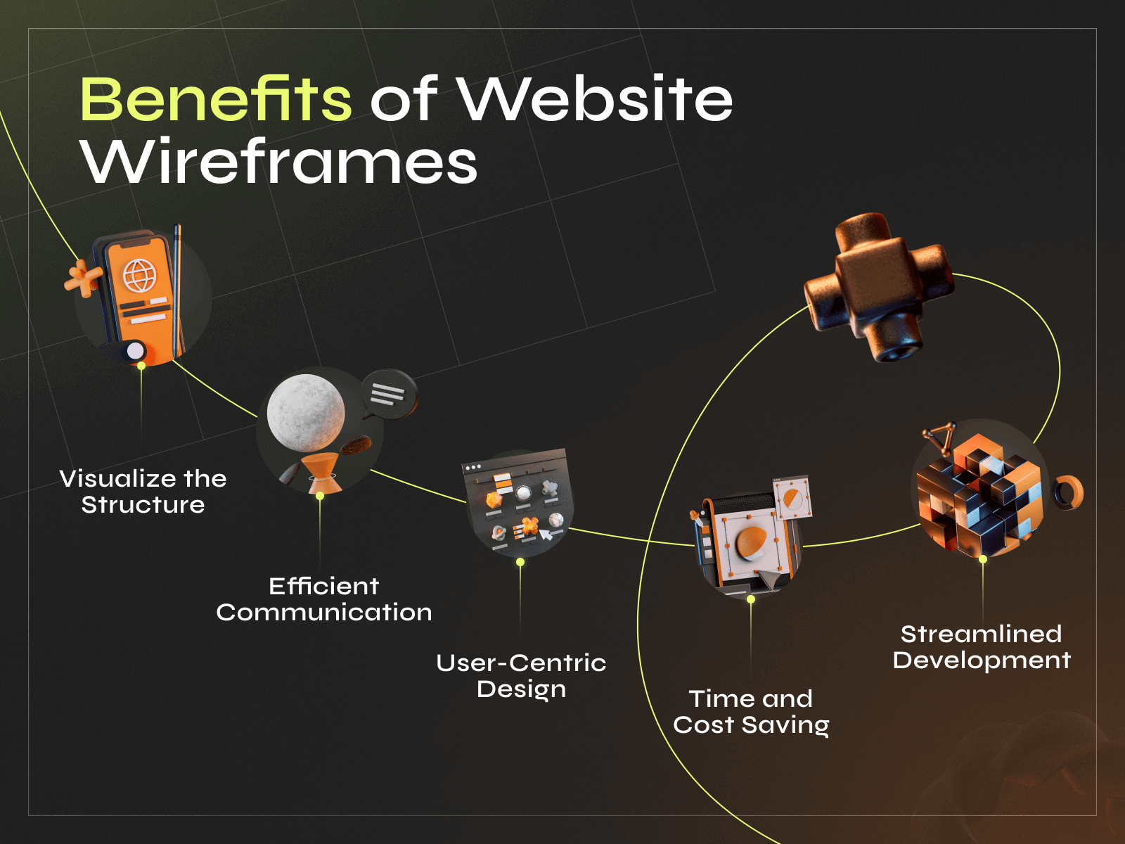
Wireframes, developed early in a project after the research stage (competitors analysis, UX audit, etc.), depict the layout and functionality without design elements, serving as blueprints for stakeholders to validate structure before detailed work. User flows outline user pathways through diagrams, aiding in understanding visitor interactions and improving the overall experience. Now, before proceeding with how to save a project from cost creep by utilizing the two, let’s review some numbers:
- Using wireframes can reduce design time by up to 50%.
- Companies that value design beat their competition by 219% on the S&P 500 index.
Website visitors often leave within 10–20 seconds, but those with a clear purpose stay longer.
A. Wireframes:
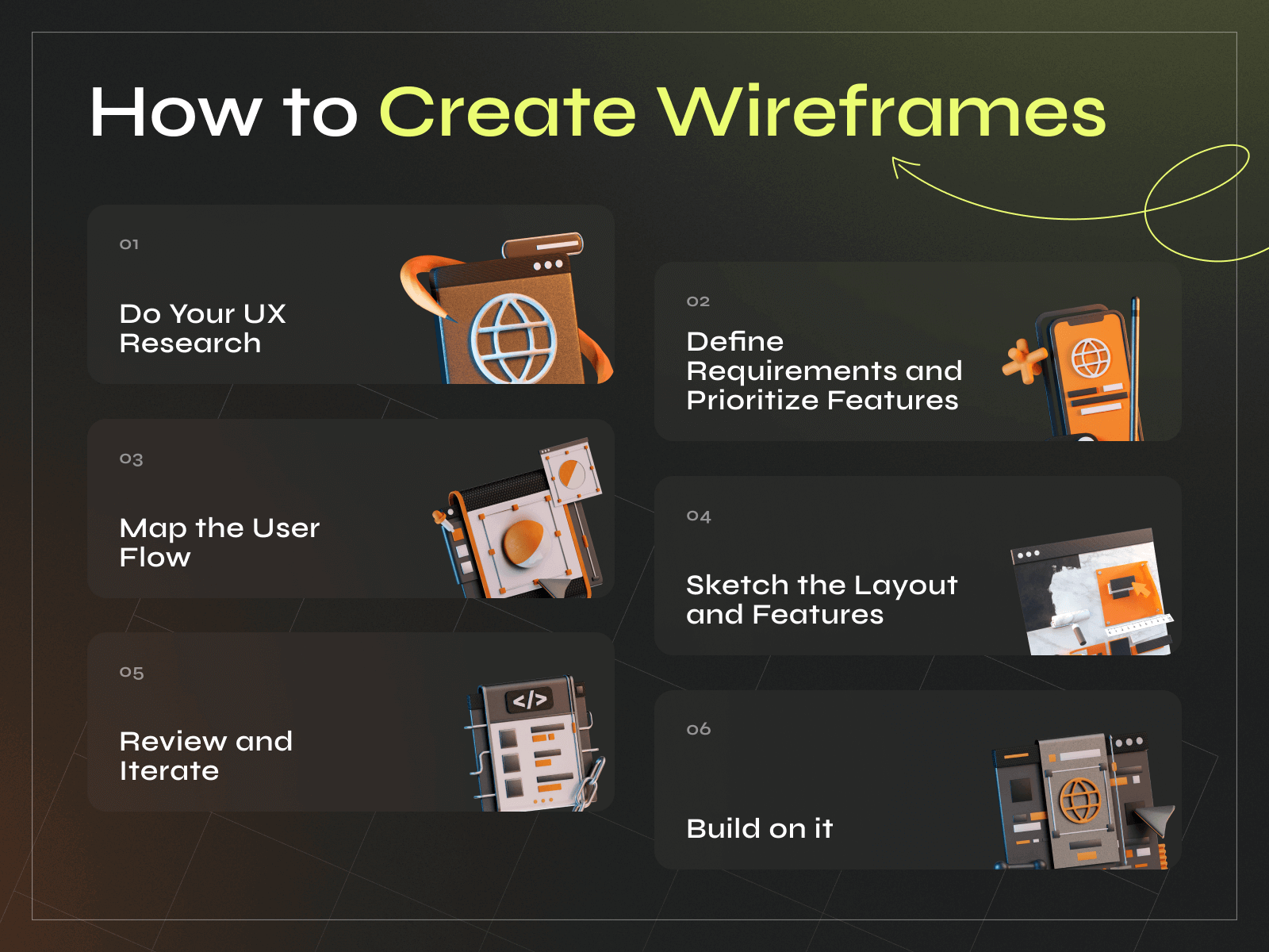
Designing an app without a wireframe is like embarking on a road trip without a map. This initial step serves as a skeleton, helping stakeholders understand how the app, website, or final product will look, including screen layout, navigation bars, interactive elements, and other UI/UX components.
A clear wireframe gives designers room to iterate, incorporating feedback without distracting them with too many visual design details.
- Without a wireframe to outline the project’s structure and functionality, there’s a higher risk of scope creep. Scope creep occurs when additional features or requirements are introduced during development, increasing development time and costs. Without a clear roadmap by wireframes, stakeholders may request changes or additions not initially accounted for, resulting in budget overruns.
- Without a visual representation of the project’s layout and functionality, there’s greater potential for misinterpretation of requirementsbetween stakeholders, designers, and developers. This can lead to misunderstandings and discrepancies between the customer’s expectations and what is delivered. As a result, developers may need to make revisions or rework features to align with the customer’s vision, increasing development time and costs.
- Without the guidance of wireframes, developers may proceed with implementing features based on incomplete or inaccurate information. As a result, they may need to backtrack, redo work, or iterate multiple times to align with the actual customer needs or desired functionality. Each iteration requires additional time and resources, leading to increased costs for the customer.
- Skipping the wireframing stage can lead to user experience (UX) issues discovered later in development. Without a clear understanding of the user flow and interaction points, the final product may not meet customer expectations or be difficult to navigate. Addressing UX issues post-development requires additional time and resources, which may involve redesigning features or restructuring the application architecture. This, in turn, leads to extra spending.
5. The absence of wireframes can delay the development process, as stakeholders may need to review and approve designs at later stages. Delays in the development timeline can result in missed market opportunities or increased competition, ultimately impacting the project’s profitability.
B. User Flows:
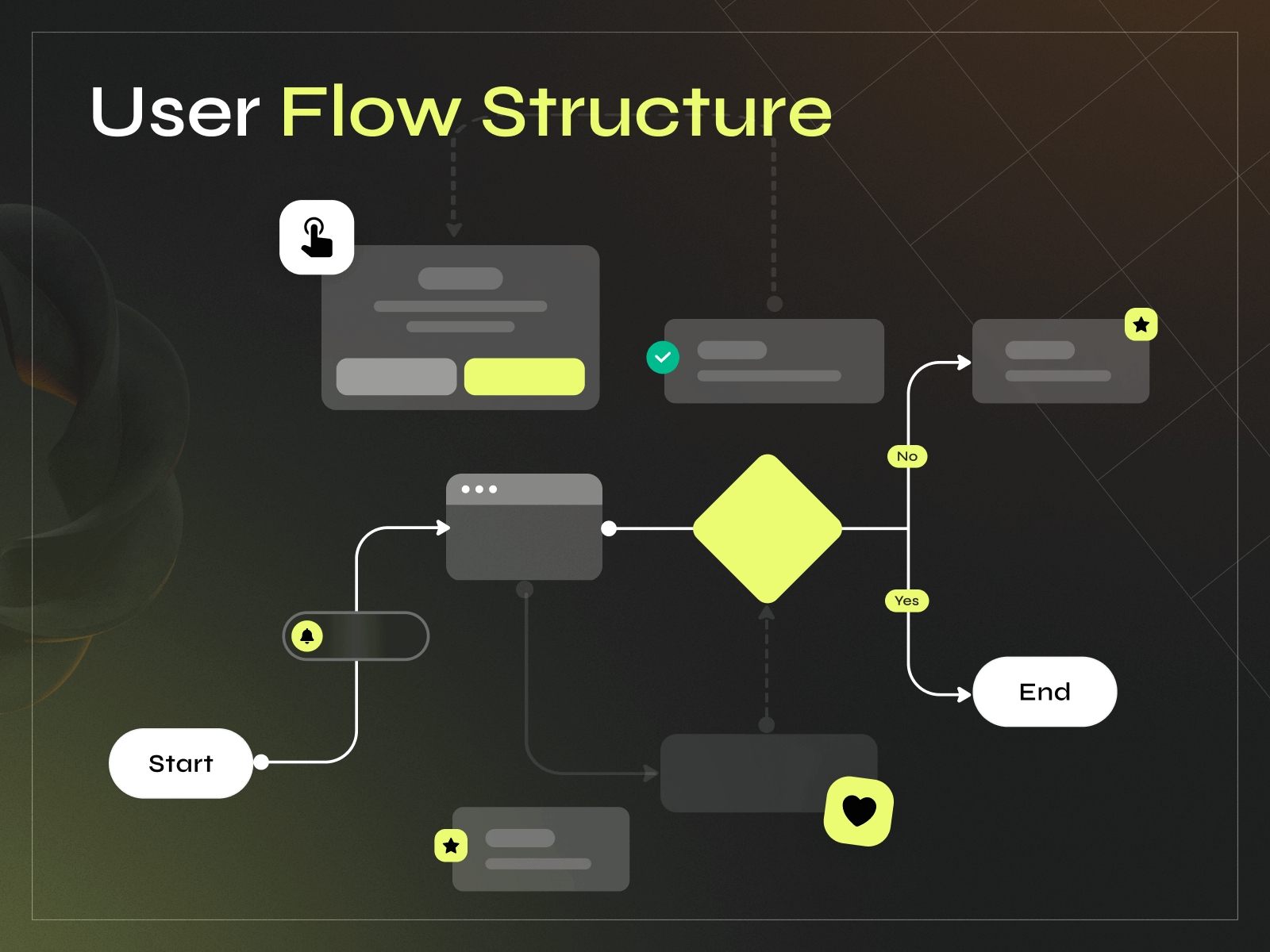
A user flow, journey, or task flow visually represents a user’s steps to accomplish a specific task or goal within a digital product, such as a website or mobile app. It outlines consumers’ actions and decisions as they navigate the product, from their initial entry point to completing the task or goal.
User flows typically include:
- An entry point where the person begins interacting with the product, such as landing on a homepage or opening the app.
- Specific actions that people take, such as clicking buttons, entering information, or making selections, and the decisions they make along the way.
- Different pathways users may take based on their choices or interactions within the product, leading to various outcomes or destinations.
- A completion point at the end of the flow, where the user finishes the task or achieves their goal.
User flows are often represented visually using diagrams, flowcharts, or wireframes. Each flow step is mapped out and connected in a logical sequence. These help designers and developers understand the user’s journey and identify potential pain points or areas for improvement in the experience. At Phenomenon, we utilize Figma to create unique templates that we later adapt to each specific project.
So, how exactly do they help project owners avoid development cost creep?
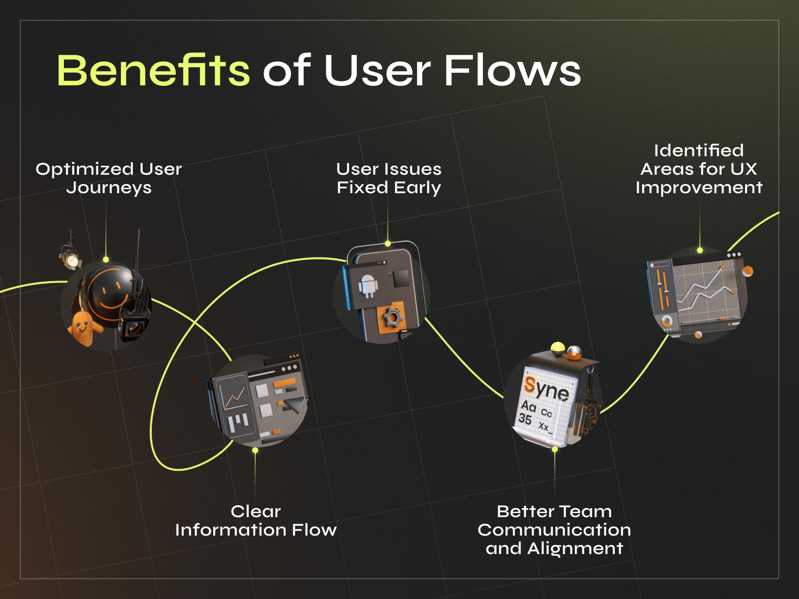
- Without user flows to map out the pathways people will take through the app or website, there’s a higher risk of designing an inefficient user experience. This can result in customers struggling to navigate the product, leading to frustration and increased bounce rates. As a result, the customer may lose potential customers and revenue.
- Without user flows, the product will likely include unnecessary or overly complex features. Without a clear understanding of the user’s journey and goals, stakeholders may request additional functionalities that add complexity without providing significant value to the end-user. This can lead to bloated development costs and longer time-to-market.
- User flows help prioritize and focus on key tasks and goals. Without them, there’s a risk of spreading resources too thin across various features and functionalities, diluting the product’s effectiveness. This lack of focus can result in consumers abandoning the product due to confusion or the inability to accomplish their primary objectives.
- A product without well-defined user flows will likely require ongoing support and maintenance due to confusion or usability issues. Addressing these issues post-launch can be costly, since it may involve redesigning features, implementing additional training or documentation, or providing customer support.
- User flows provide insights into consumer behavior and decision-making, allowing for the optimization of the experience. Without them, there’s a risk of missing opportunities to streamline workflows, remove bottlenecks, or improve conversion rates. This can result in lower-than-anticipated revenue and missed growth opportunities.
- A product without well-defined user flows may also struggle to compete with competitors who offer a more intuitive and seamless experience. This can lead to lost market share and decreased revenue for the customer.
Mapping User Journeys
Mapping out the user journey is essential to creating a user flow. It involves identifying the different touchpoints along the way and understanding how the consumer interacts with each one. This can be done by conducting user research, analyzing data, and creating user personas.
Once the journey has been mapped out, it can be used to create a user flow. It should be designed to guide the user through the product or service logically and intuitively. It should be easy to navigate and provide clear feedback to people at each step.
By creating a user flow, designers can identify areas for improvement and save on expenses by avoiding costly redesigns later on. User flows can also test different design concepts and ensure that the final product or service meets the user’s needs.
Efficiency in Design
Wireframing and flows can save a lot of costs in the long run, but only if implemented effectively. Here are some tactics to make the most of these design methods.
The key to efficient design is to keep it simple. Wireframes should be basic, understandable, and not overly detailed or complex. This helps reduce the time and resources required to create them. Designers should focus on the core elements of the design, such as navigation, content, and user flows.
In our design process at Phenomenon, we prioritize efficiency and effectiveness by using a robust design system and a set of pre-built components within Figma. Instead of following a formulaic approach, we emphasize rapid iteration and problem-solving tailored to our clients’ needs. Our systematic approach allows us to quickly create high-quality visuals and prototypes, all while ensuring alignment with our clients’ challenges and objectives. By utilizing Figma’s collaborative features and extensive library of components, we streamline our workflow and empower our designers to focus on delivering tailored solutions for each project. This integration of design system principles and agile methodologies allows us to maintain a rapid pace of iteration without sacrificing quality, ultimately delivering exceptional results for our clients.
We utilize Figma for our design system and component library, enabling rapid iteration and high-quality visual outputs. Additionally, for collaborative tasks such as user flow mapping, we use Figjam to ensure efficient communication and problem-solving.
Final Words
Though seemingly complicated, information architecture boils down to this: organizing information in a way that makes sense to users. If users can’t find what they need quickly and intuitively, they’ll get frustrated and abandon your product for something simpler or better. This translates directly to lost revenue and increased costs in the long run. Here’s why:
- Attracting new customers is expensive (marketing, advertising, etc.). When customers leave due to a confusing interface, you’ll need to constantly acquire new ones to maintain your base and revenue.
- Frustrated customers often require more customer support, leading to increased costs for handling inquiries and troubleshooting issues that could have been avoided with a clear information architecture.
- If users can’t find the products or features they’re looking for, they simply won’t buy them, representing a direct loss of potential revenue.
- A confusing experience reflects poorly on your brand. Disgruntled visitors might leave negative reviews, impacting your brand reputation and deterring potential customers.
At Phenomenon, we believe your project deserves the best. That’s why we never skip wireframing and flows, essential steps that translate into your product’s success.


