The human brain is an astonishingly complex ecosystem, capable of performing what can only be described as miracles. It remembers vast arrays of information, visualizes, solves intricate problems, and conjures images beyond our wildest imaginations. Consider the process of solving a jigsaw puzzle: the brain seamlessly integrates individual pieces into a unified whole, utilizing Gestalt principles such as continuity and closure. It can often accurately predict and complete the overall image, even when missing pieces.
To delve deeper into Gestalt, let’s explore how these principles influence our perception and cognition and how they shape design requirements. This article will discuss the core Gestalt design principles and unveil how Phenomenon experts apply these principles to projects that bring all the difference.
Key Statistics
To illustrate how important it is to stay abreast of the latest discoveries and the fundamental concepts in UI/UX design, here are several key statistics. These numbers show how critical it is to have easy-to-navigate and well-designed software:
- About 94% of users believe a website reflects a brand’s reputation and that a brand is defined by how its website looks. This means that a well-organized UI and an intuitive UX will define your business’s performance.
- Recent data shows that a well-executed UI has the potential to raise conversion rates by almost 200%, while a seamless UX can lead to an even more astounding rise of up to 400%.
- Simplicity and minimalism are both in line with user preferences across demographics. Over 75% of Baby Boomersvalue plain UI designs the most, while 78% of Millennials choose minimalistic UI designs.
- Just 10% of development expenditure on usability can boost conversion rates by 83%.
- It takes 50 milliseconds to form a “first impression” about a website.
Although not directly related to Gestalt principles, this data highlights the critical importance of customer-centric design in software development. Without a foundational understanding of Gestalt principles and their practical application, designers may struggle to create interfaces that resonate with users.
Core Concepts of Gestalt Principles
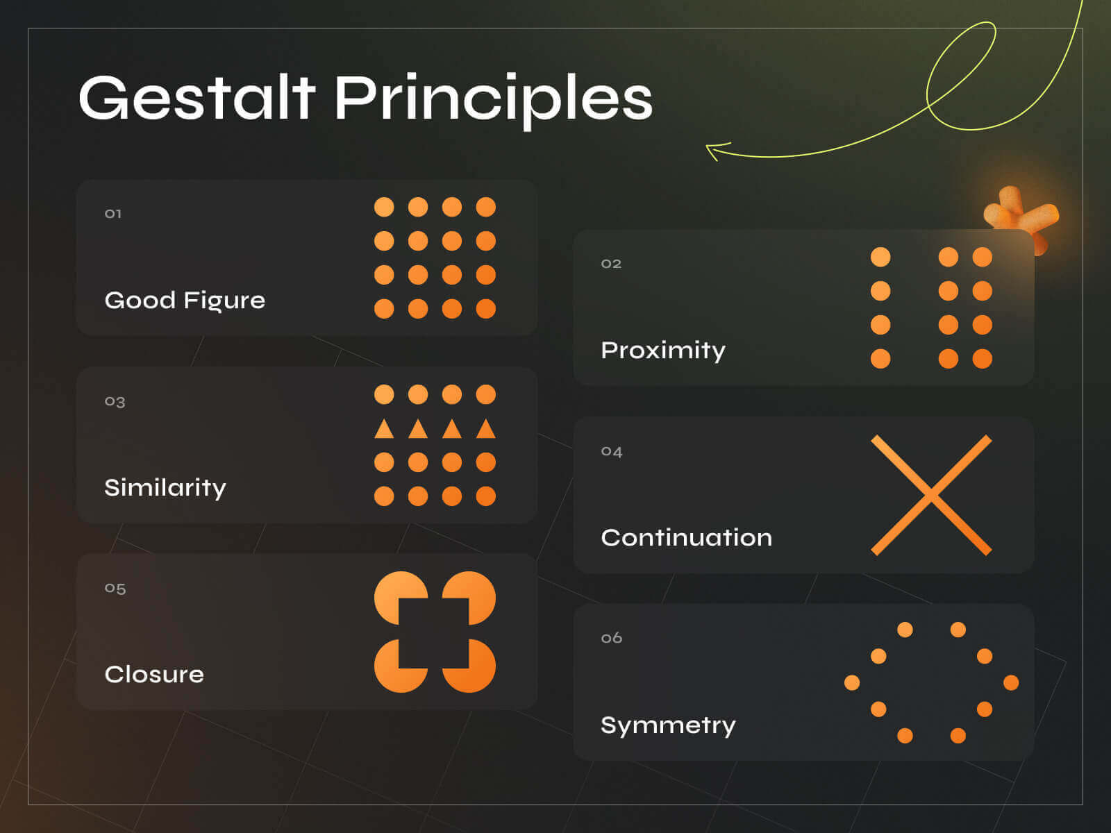
Gestalt translates to “unified whole.” In a nutshell, this term hypothesizes that people tend to organize visual elements into groups. Here are some general rules of Gestalt theory:
- objects will be perceived in the simplest form;
- humans naturally follow lines or curves;
- human minds tend to fill in the details that aren’t there.
Now, let’s get down to explaining the actual principles of Gestalt psychology as they relate to UI/UX design:
Law of Proximity
This principle asserts that objects close to each other are perceived as a coherent group. It’s crucial for organizing information on a user interface. For instance, in a form, input fields for related information such as the user’s address—street, city, state, and zip code—are placed in close proximity. This visual grouping helps users quickly understand which fields are related and should be considered part of a single task, streamlining the data entry process.
Law of Similarity
This principle suggests that elements that share visual characteristics such as shape, size, color, or texture are considered part of the same group. In UI design, this can differentiate types of information or actions. For example, a music player app might use circular buttons for all playback controls (play, pause, stop) and square buttons for settings options, helping users intuitively understand which buttons have related functions.
Law of Continuity
The human eye prefers to see continuous forms and is more likely to perceive a consistent flow in visual elements, even across diverse parts. In interface design, this can be employed by aligning text and other components to lead the user’s eye through the content naturally. For example, aligning labels with their corresponding input fields in a vertical form layout aids in creating a smooth visual path that efficiently guides the user from one field to the next.
Law of Closure
This principle operates on the idea that people can recognize complete shapes even when parts of them are missing. Designers use this to create icons or graphic elements that are visually simple yet recognizable. An example is a logo composed of disconnected parts that the mind fills in to form a complete shape, like the abstract apple with a bite taken out of it for Apple Inc. This reduces visual clutter while maintaining recognizability.
Law of Symmetry and Order
Symmetry is aesthetically pleasing and suggests stability and order. In UI design, symmetry is used to create visually balanced and harmonious layouts, making the interface seem more reliable and easier to use. For example, a symmetrical layout in a photo editing app can balance tools and menus equally on both sides of the screen, promoting a sense of well-structured design.
Figure-Ground Relationship
This principle is crucial for distinguishing foreground elements from their backgrounds, enabling users to focus on key information. In UI design, it emphasizes interactive elements like buttons or important text. For instance, a high-contrast color scheme can cause a “Submit” button to stand out against a background, making it an actionable element distinct from less critical components.
Law of Common Fate
Elements perceived as moving in the same direction are considered part of a single group. This can be used in UI design to indicate relationships between interface parts. For example, when a user adjusts a slider on a control panel, related information, such as values or colors, changes simultaneously, visually linking these elements to the user’s perception and enhancing the overall interaction experience.

The Phenomenon Approach to Design Excellence
Phenomenon Studio consistently ensures design excellence by deeply understanding user needs and devoting meticulous attention to detail throughout the design process. Our team employs a systematic approach to design, combining a carefully selected color scheme, typography, and cohesive style system to create intuitive and appealing interfaces. Every element is strategically placed to maximize usability and consistency, ensuring every interaction feels natural and effortless. Our commitment to clarity and user-friendliness in our designs has led to applications like the e-manager, which meet and exceed user expectations, offering a seamless and satisfying experience.
Still unsure? We invite you to explore our portfolio and discover the elegance and effectiveness of our designs for yourself.
Practical Applications of Gestalt Principles
After exploring the most significant Gestalt principles, it’s time to understand where they could be applied. An experienced designer will always remember that the human brain can instinctively perceive and organize visual information based on these principles deeply rooted in our cognitive processing. Thus, effectively leveraging Gestalt principles can transform a design from merely functional to intuitively usable and aesthetically pleasing.
Web Design and Layout
Gestalt principles play a crucial role in creating effective web layouts. Using the Law of Proximity, designers group related content together, placing a website’s title, navigation menu, and search bar in close spatial relationship to signify their interconnected functions. The Law of Similarity ensures that buttons or links that perform similar actions, such as social media sharing icons, are designed to look similar, aiding users in quickly understanding their use without needing detailed explanations.
Mobile App Interfaces
In mobile app design, the constraints of smaller screens make the application of Gestalt principles even more crucial. The Figure-Ground Relationship differentiates interactive elements like buttons or tabs from the background using color contrast or shadows. This makes the interface more intuitive, especially on the go. The Law of Common Fate can be seen in gesture-based navigation; for instance, swiping gestures in a photo gallery app moves images toward the swipe, indicating their relationship and the action’s outcome.
Dashboard Design
Dashboards utilize these principles to display a large amount of data in an organized manner. Symmetry and Order are essential for creating a stable layout that feels easy to scan, which is critical for users needing to extract insights from data quickly. Continuity is used in the alignment of charts and widgets to guide the viewer’s eye through the data in a logical sequence, enhancing the readability and functionality of the dashboard.
E-commerce Sites
E-commerce sites apply these principles to enhance shopping experiences. The Law of Closure is used in minimalist design approaches where product categories are represented with icons that are easily recognizable despite being abstract. This simplifies the interface and focuses the user’s attention on product selection and purchase. Proximity and Similarity are utilized in listing similar products or suggesting related items, helping users navigate choices efficiently.
Interactive Media and Games
In interactive media and gaming interfaces, the Law of Common Fate is extensively used to provide feedback on user actions through motion. For example, elements moving together on the screen in response to user interaction can signal connection and causality, enhancing the interactive experience. Continuity ensures that the visual flow in games leads players through narratives and gameplay intuitively, making the game easier to follow and more engaging.
Signage and Icon Design
Effective signage and icon design rely heavily on Gestalt principles. Similarity and Closure help create icons that are easily recognizable even from a distance or when only partially visible. This is crucial for signs in airports or apps where quick recognition is needed. Symmetry and Order in signage design convey information in a balanced, accessible way, essential for clarity and immediate comprehension.
Advertising and Visual Marketing
In advertising, attracting and maintaining viewer attention is paramount. The Figure–Ground Relationship is manipulated to make key information or branding elements stand out starkly against backgrounds. This helps in creating memorable and effective marketing materials. Continuity and Proximity guide the viewer’s eye across the advertisement, from the main image or headline to the call to action, ensuring a natural flow that enhances message delivery.
Conclusion
Knowing and following Gestalt principles will guarantee an effective UI/UX design. This craftsmanship requires experience, skill, curiosity, and love for what you’re doing. On the other hand, Gestalt principles help you understand how users’ minds work and adjust your focus accordingly.
Want to build software that’s both appealing and efficient? Contact Phenomenon Studio and start working with passionate professionals experienced in making dreams come true.


