Courier System Dashboard

Wayels is a company that provides logistics services.

Wayels
Background

About the product

Wayels provides transportation, handling, and storage services to assist its customers in the process of moving goods from producer to consumer. The platform was created for the internal tasks of the company, aimed at minimizing costs and optimizing the processes of cargo transportation.

Services:
Country:
USA
Stack:
React - icon React
Team:
Ruslan - teammate emoji
Ruslan
Katerina - teammate emoji
Katerina
Ira - teammate emoji
Ira
Denis Rabota - teammate emoji
Denis
Problem

The challenge we’ve faced

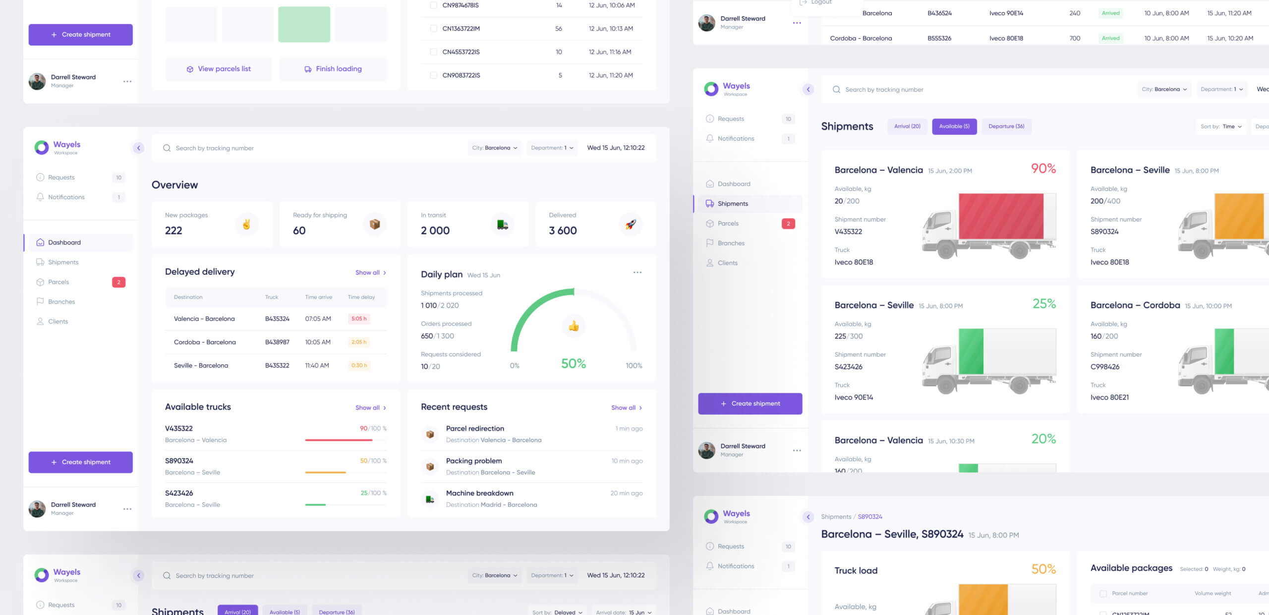
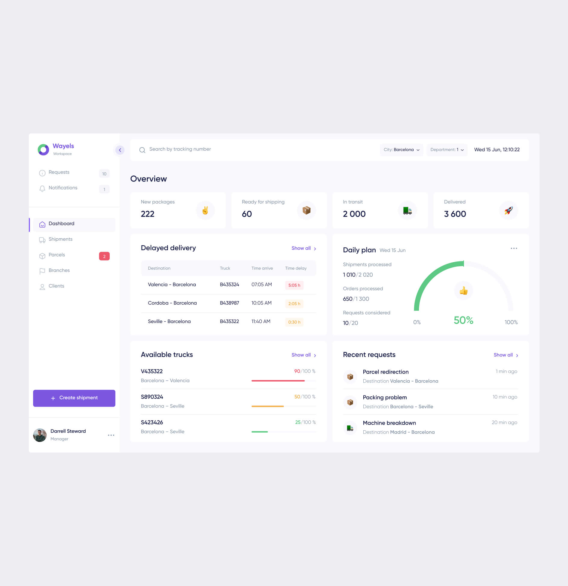
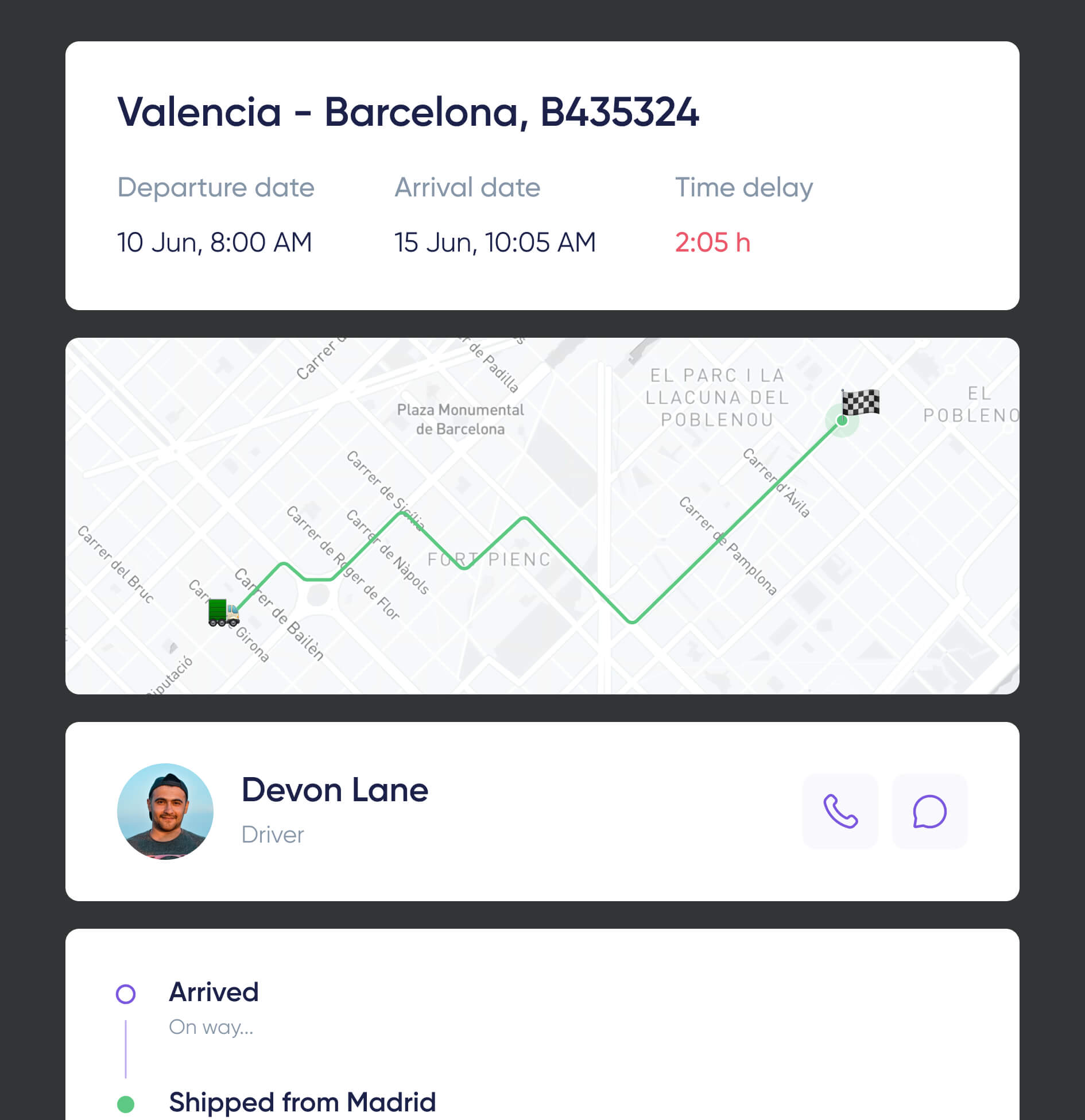
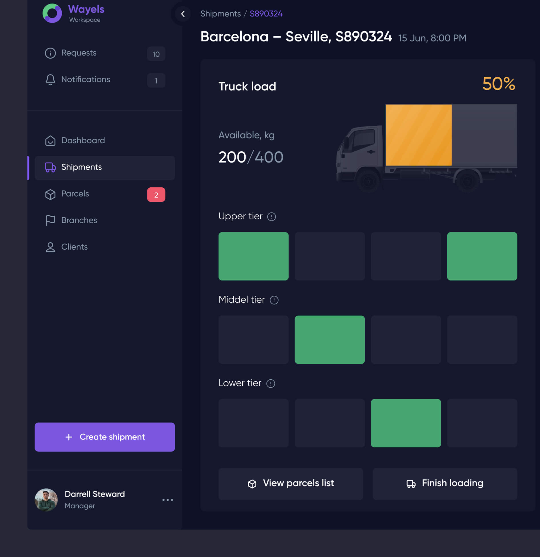
Our main task was to create a user-friendly and understandable dashboard with summary information. The platform should be able to track parcels, receive parcels, form cargo for the selected vehicle, and draw up a route for the driver.

Proccess

General Proccess

The main pain point for employees is the problem of loading cars and tracking the driver’s path. Having researched and tested hypotheses, we came to the conclusion that we need to divide the process into several stages:

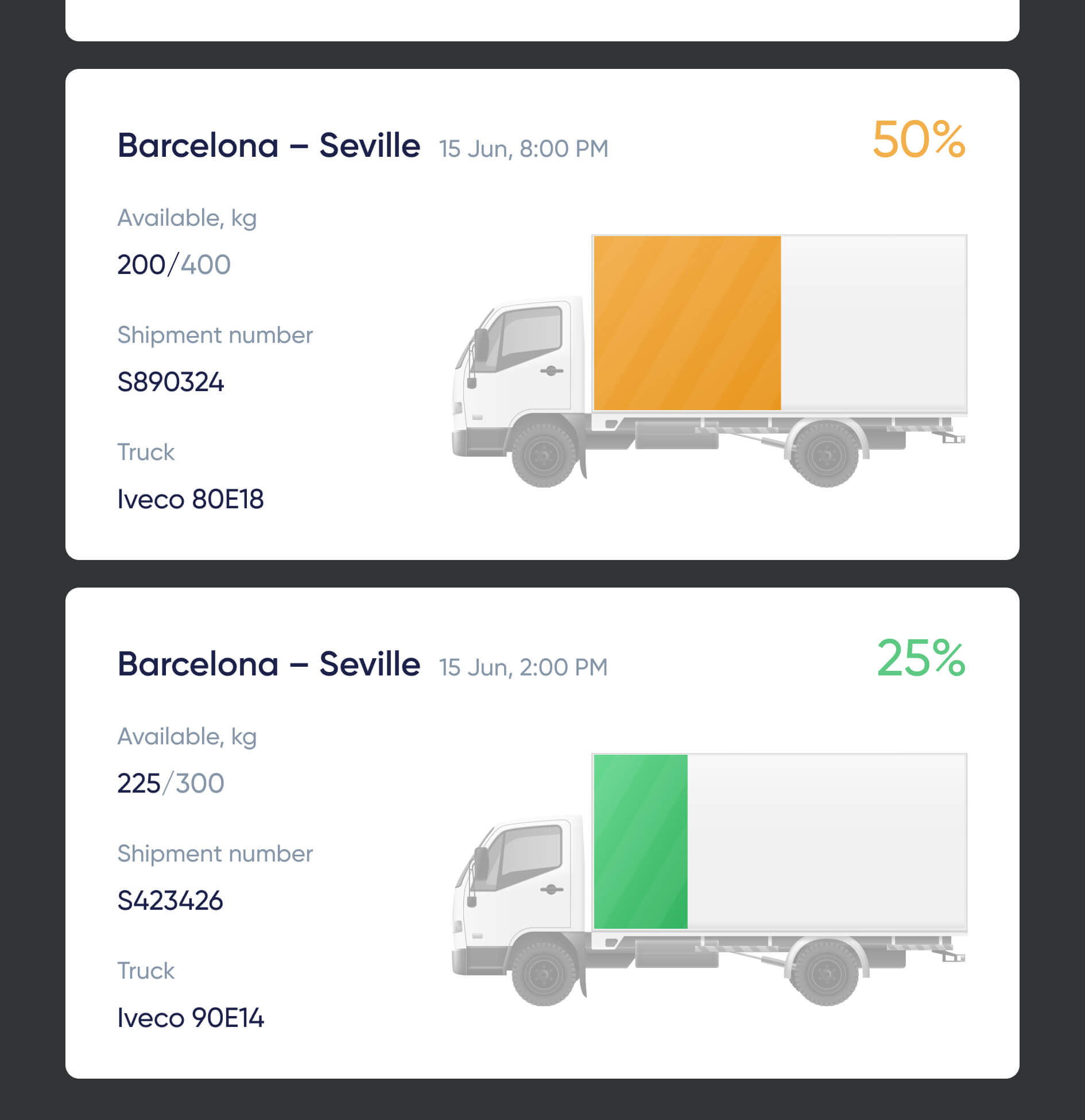
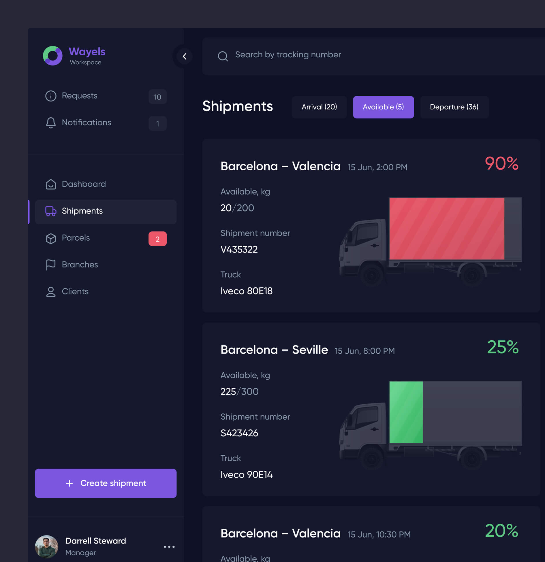
  • Select an available vehicle that shows the load
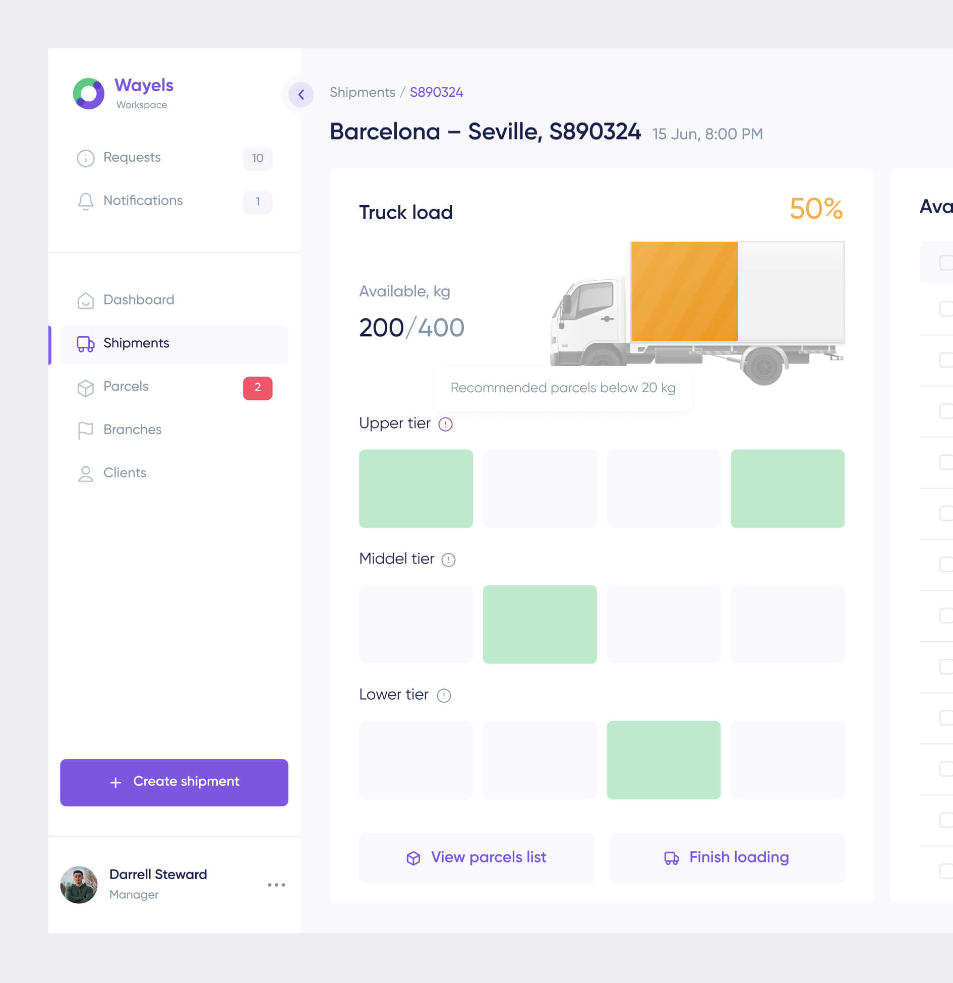
  • Interactive load shaping to minimize errors
  • Automatic calculation and hints
  • Tracking the driver by GPS, with the ability to contact him directly

In this way, managers can quickly determine what and where can be downloaded and tracked in real-time.

Analytics

Interactions

Step 1

Analytics

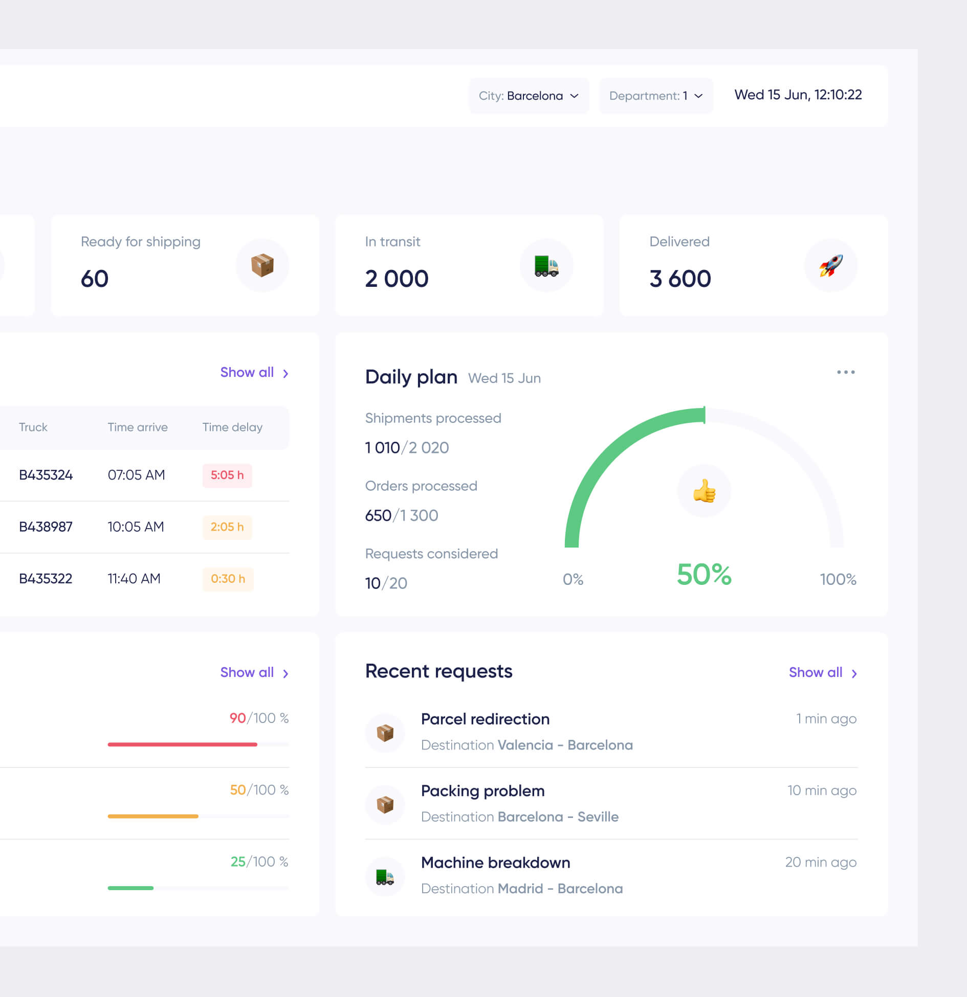
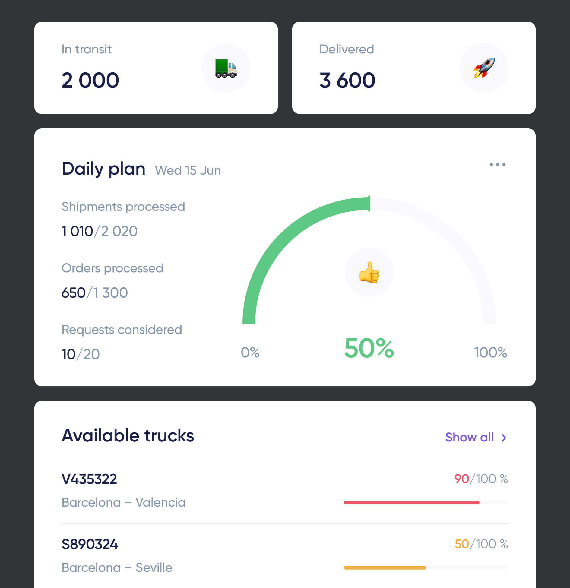
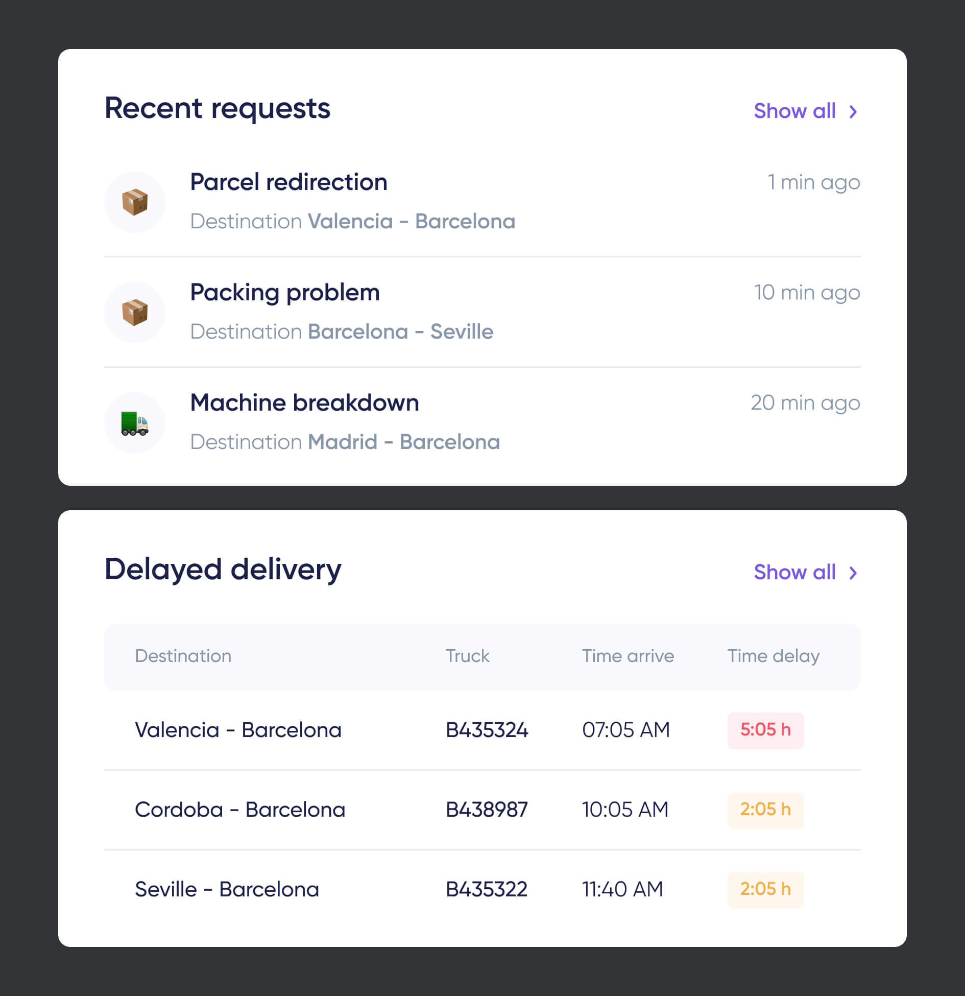
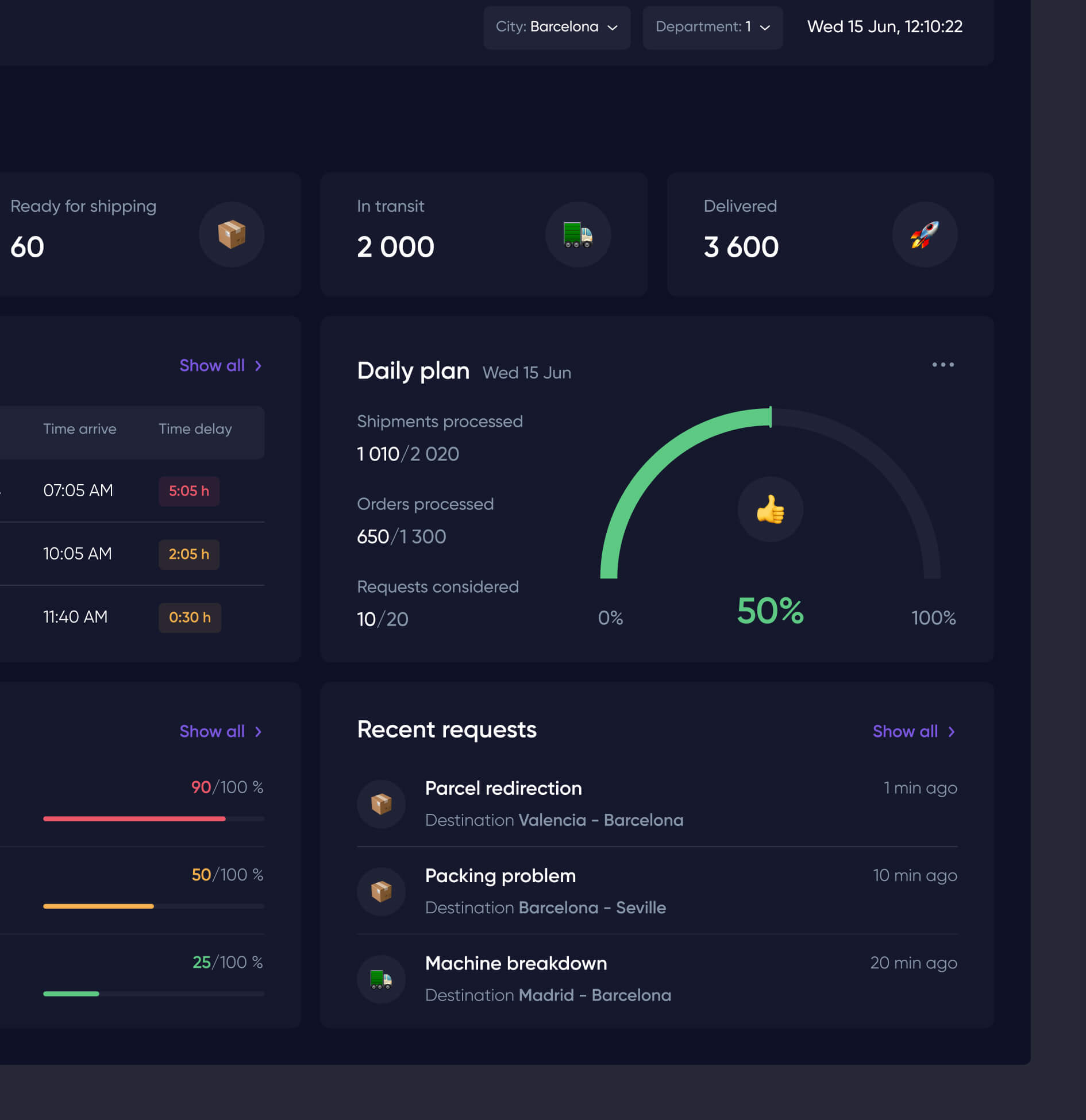
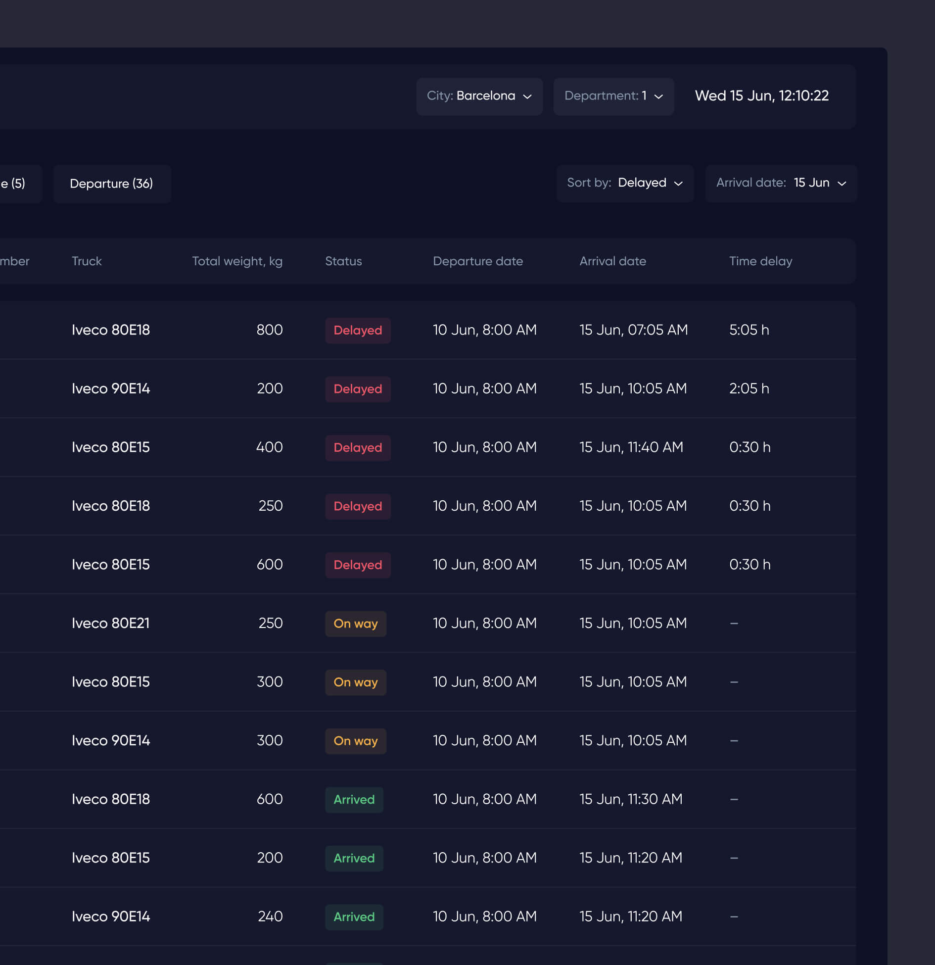
We analyzed the service that the company used to work on and other services and realized that employees do not have enough data to collect useful and understandable information. Therefore, we decided to show analytics through widgets, which allowed us to display only important and user-accessible information. The system combines several essential elements like route planning and management, optimizing way and delivery, monitoring and communication with the drivers, tracking locations in real-time, forming a load for the truck in an interactive form, automatically calculating the load, and other important information.

Step 2

Interactions

There is a lot of functionality on the platform, which at first may seem huge, but thanks to thoughtful interactive components, it is much easier for the user to interact. Our team has developed a large number of tips, reminders, and recommendations that help the user to navigate. By doing this, we minimize the time spent by the user on searching for the desired functionality and completing tasks on time.

Result

Our results

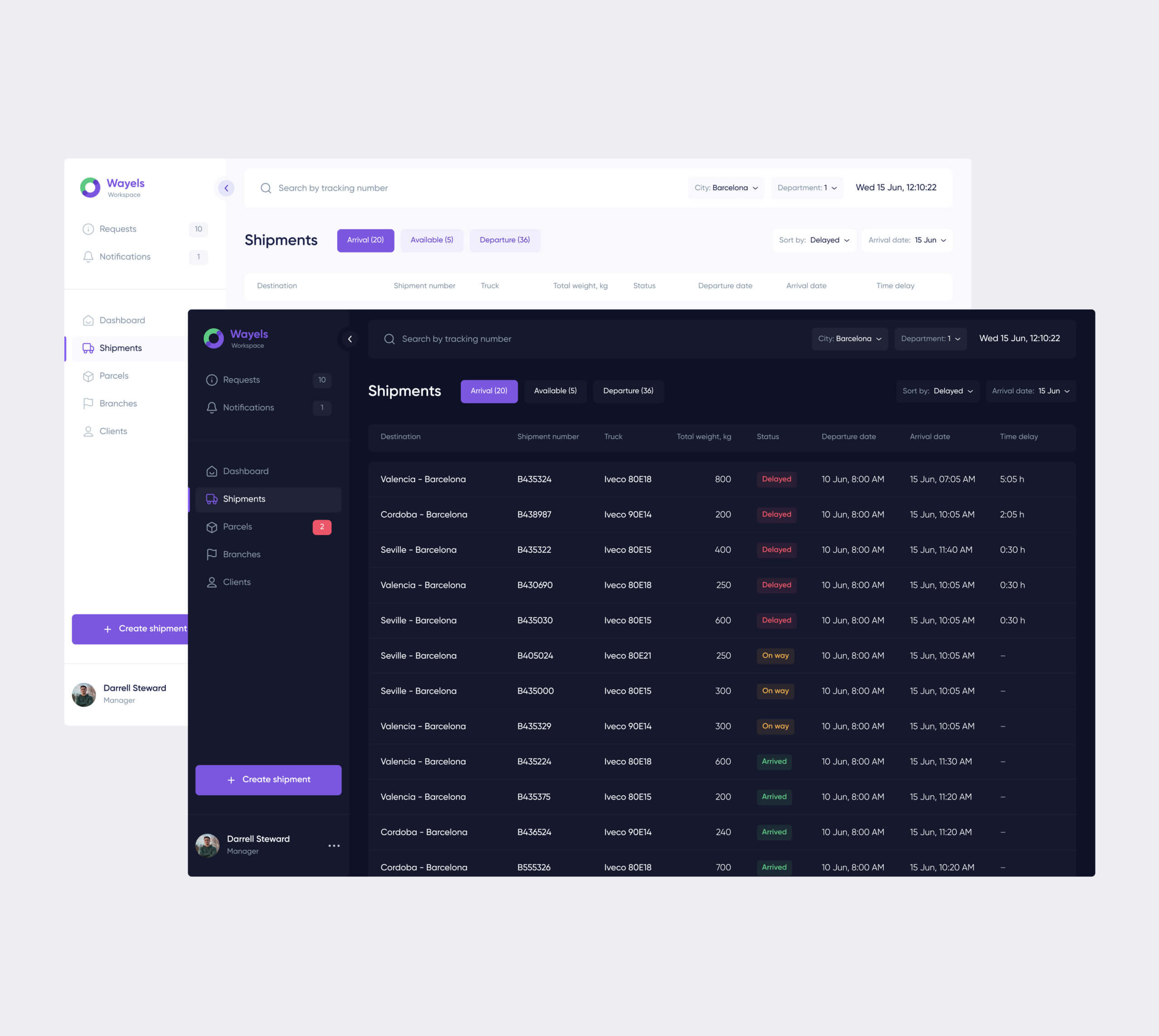
Tracking and loading machines have become more accessible and convenient with a beautiful and intuitive interface.

To organize and present information in a digestible way, we used a card-based design so that managers could quickly view and respond to the data. By adding some bright accents and illustrations, we found a way to keep the interface from looking dull. Light and dark versions of the product were also developed, and each manager can choose a comfortable space for himself.

Recent Case Studies

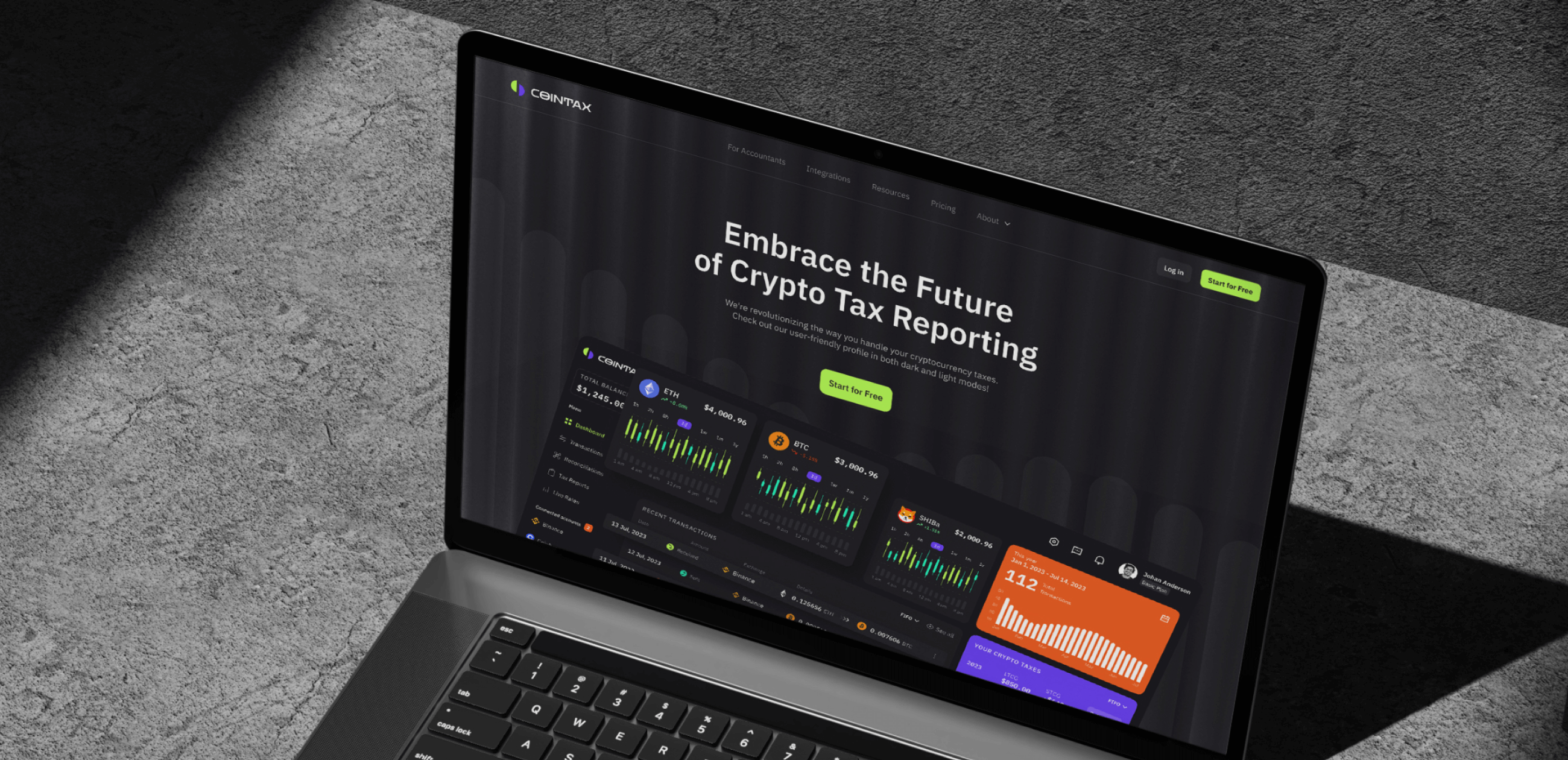
Cointax
Web App Promo Website

Unleash the crypto tax revolution

SaaS Web3 NoCode Development Website Development
Aurora
Innovative AI Solution for Healthcare

Cutting-edge tech meets medical expertise for accurate insights and lightning-fast workflow. Aurora's streamlines your tasks and unlocks new possibilities in patient care.

Healthcare Presentation-Ready-Concept

Ready to bring
your idea to life?

Help us understand your vision by providing some details. We’ll follow up to set a consultation call.

Name

Email

A few words about your project

You can upload maximum 5 files
Some of your file not loaded, because maximum file size - 5 mb
What is your budget for this project?
How did you hear about us? (optional)

By clicking this button you accept Terms of Service and Privacy Policy

Project Talk - Kseniia Shalia
Account Executive
Partnership - Polina Chebanova
Co-Founder
Our website uses cookies