Real-time cash management application

Simplify financial operations and empower business with Sway Finance.

Sway Finance
Background

About the product

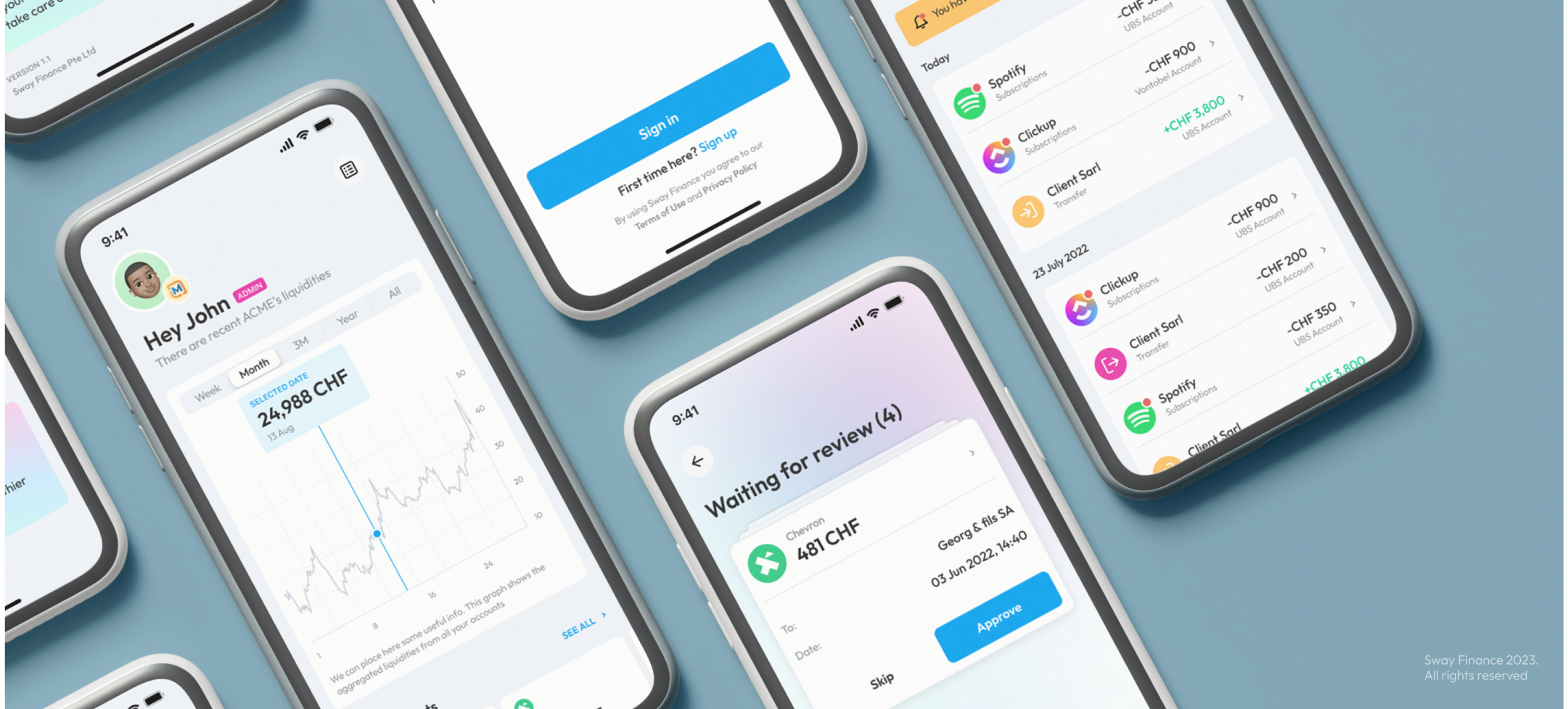
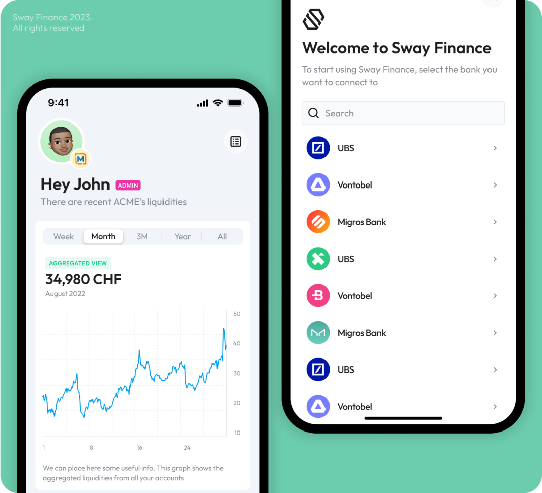
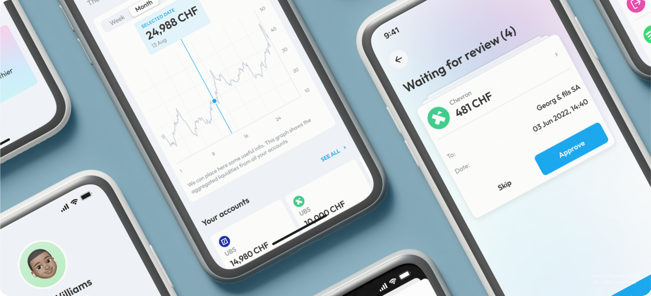
Sway Finance is a mobile application, that provides a tech stack with cutting-edge tools for SMBs to improve their daily cash operations. They utilize innovative integration partners, new technologies, and AI to offer their clients a more efficient and smarter way of working.

Services:
Country:
Switzerland
Team:
Oleksandr - teammate emoji
Oleksandr
Daria - teammate emoji
Daria
Ira - teammate emoji
Ira
Problem

The challenge we’ve faced

We were tasked with an exciting brief to build an immersive visual experience that reflects the innovative solutions of cash management service. As a financial startup our goal was to show their philosophy, values and mission to the audience with branding, and create an application easy to understand and simple to use.

Sway Finance trusted us with the development of their brand identity and app design. We’re very excited to share the results.

Disorganized and time-consuming invoice management

Limited collaboration in cashflow management

Time-consuming manual data entry for transactions

Proccess

General Proccess

Crafting an exceptional user experience for Sway wasn’t just about design, it was an adventure! Here’s a glimpse into our three-stage roadmap that transformed financial management from a chore to a breeze:

X-Ray Diagnosis - The UX Audit

Moodboards - Unveiling the Vibe

High-Fidelity Mockups – Bringing the Vision to Life

Fun Fact

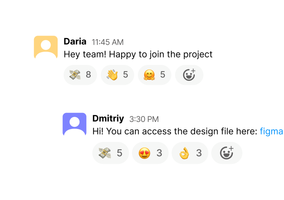
The most used emodji in our project’s slack channel is 💸 💸 💸

Step 1

X-Ray Diagnosis - The UX Audit

Before diving in, we donned our detective hats and conducted a thorough UX audit of the existing Sway app. We meticulously examined every nook and cranny, pinpointing areas for improvement and identifying user pain points. We provide the suggestions on how to improve current issues using the best solutions in the filed.

The UX audit revealed the issue of manual data entry for transactions.

We analyzed not only financial apps but also healthcare apps to find the best practices.

Step 2

Moodboards - Unveiling the Vibe

It was time to unleash our creative energy! We didn’t settle for just one path; instead, we crafted two distinct moodboards overflowing with design inspiration. These boards weren’t created in isolation. We meticulously incorporated Sway’s brand references to ensure the visual style perfectly aligned with their identity.

But our inspiration stretched beyond the realm of finance. We drew influence from the clear and user-friendly data visualization techniques found in healthcare apps, infusing our moodboards with a focus on clarity and ease of use. This resulted in two compelling design options that offered Sway the perfect platform to choose the aesthetic that best resonated with their brand and user base.

Two detailed moodboards were presented

We sticked to the second approach with a few bits from the first one

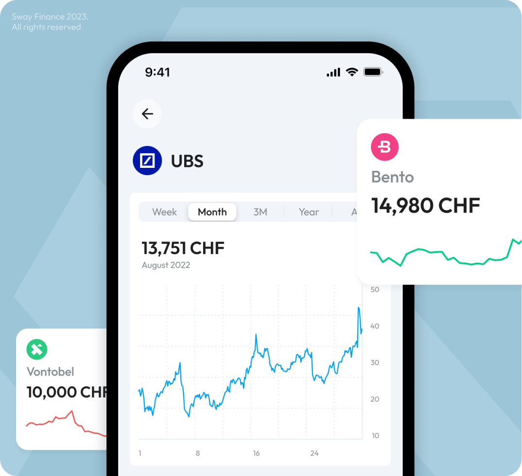
Our main source for data visualisation inspo was healthcare apps

Begin Your Phenomenal Journey with an MVP Development Service

We’ll secure your success by integrating the best industry experts and incredible skills. Your dream is in the right hands.

Step 3

Hi-Fi Mockups – Bringing the Vision to Life

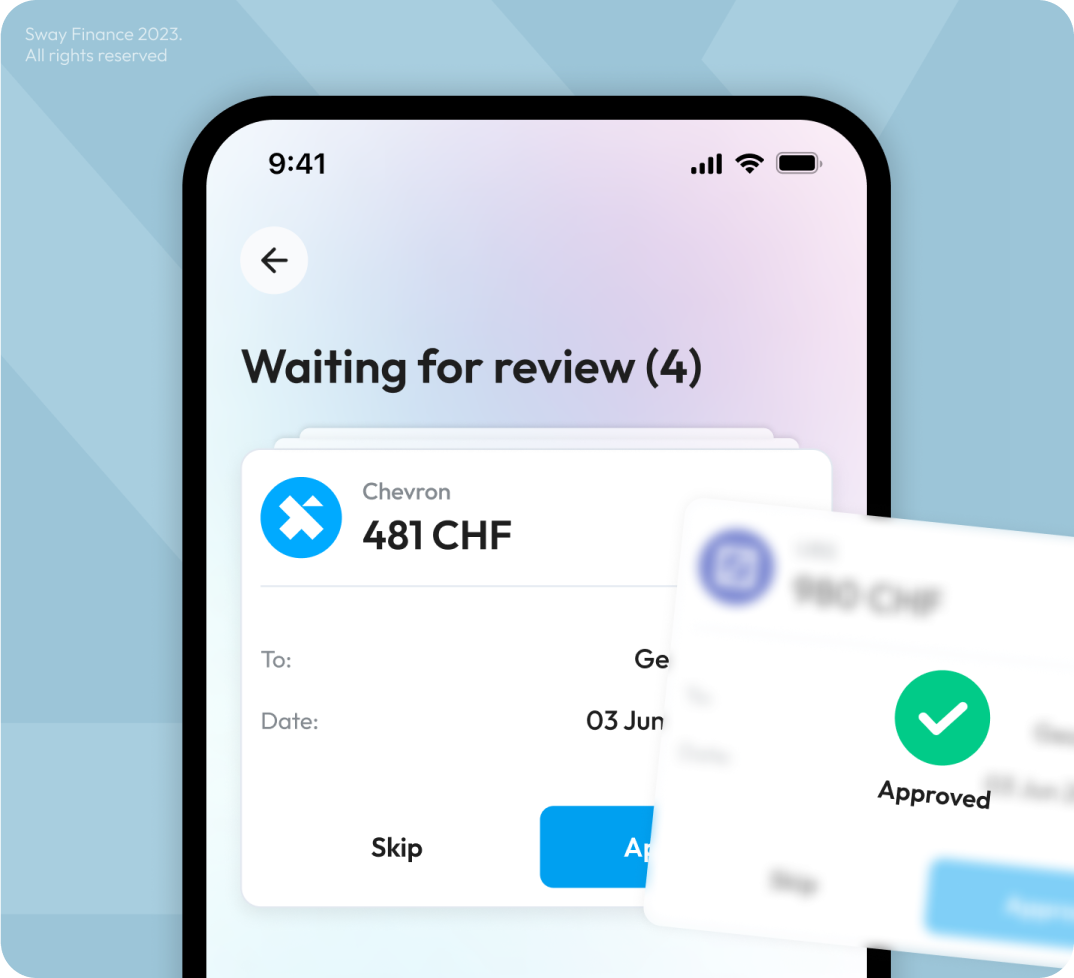
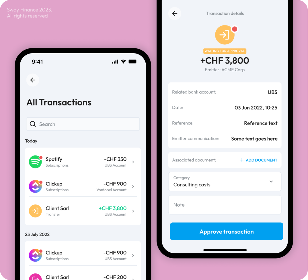
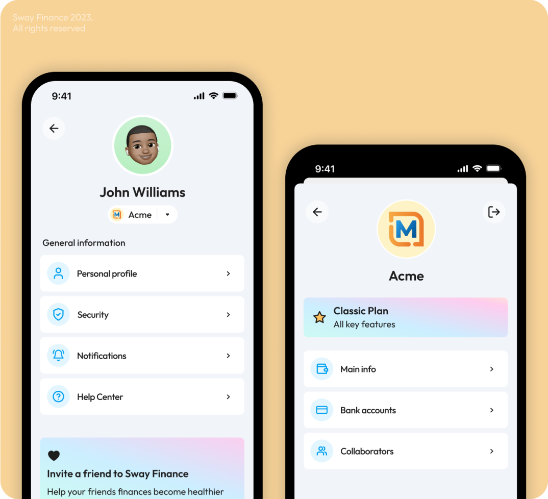
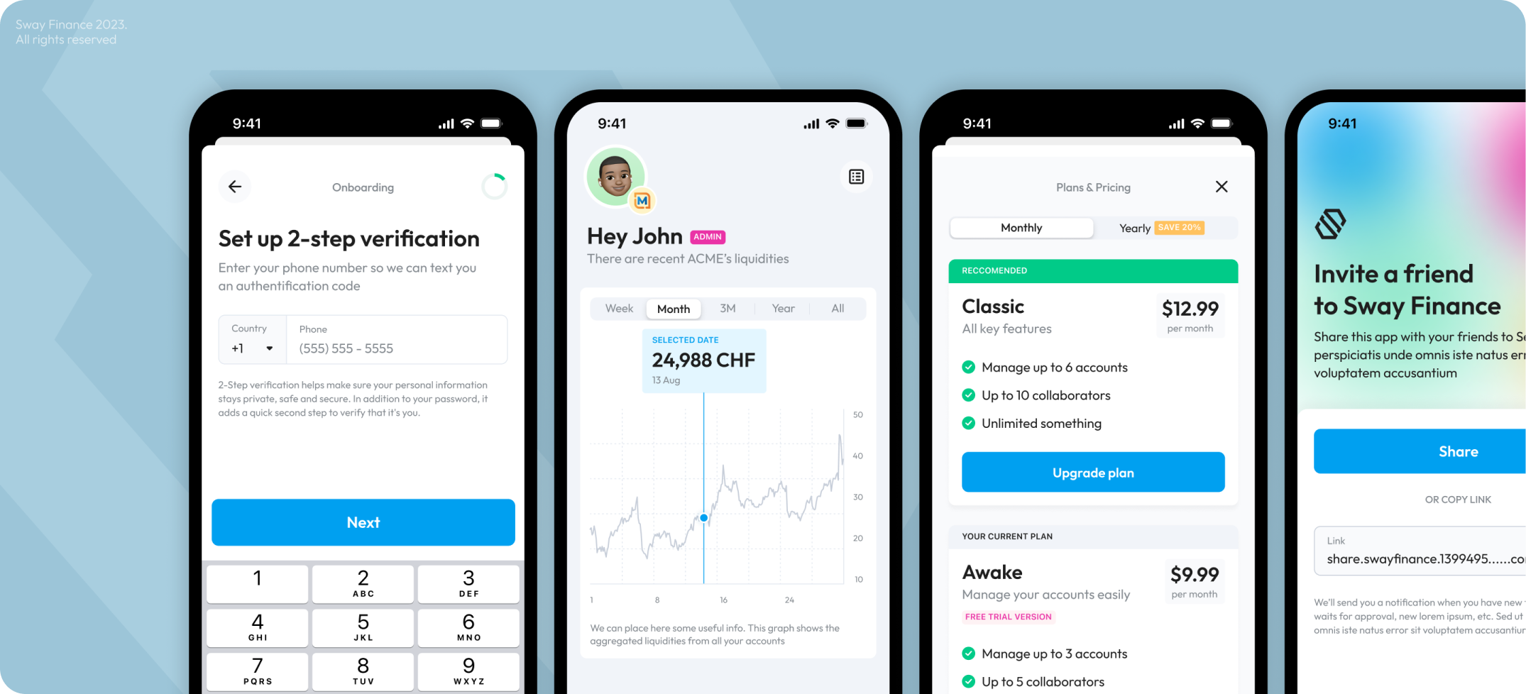
With a clear roadmap and a captivating visual style inspired by the “health app of cash management,” we meticulously crafted high-fidelity mockups in a record-breaking scope! These weren’t just static images; they were interactive prototypes that brought Sway’s future to life.

We took familiar financial app functionalities and reimagined them with a health app touch and feel – think clear, calming visuals paired with easy-to-understand data visualizations, all designed to empower users to take control of their financial well-being.

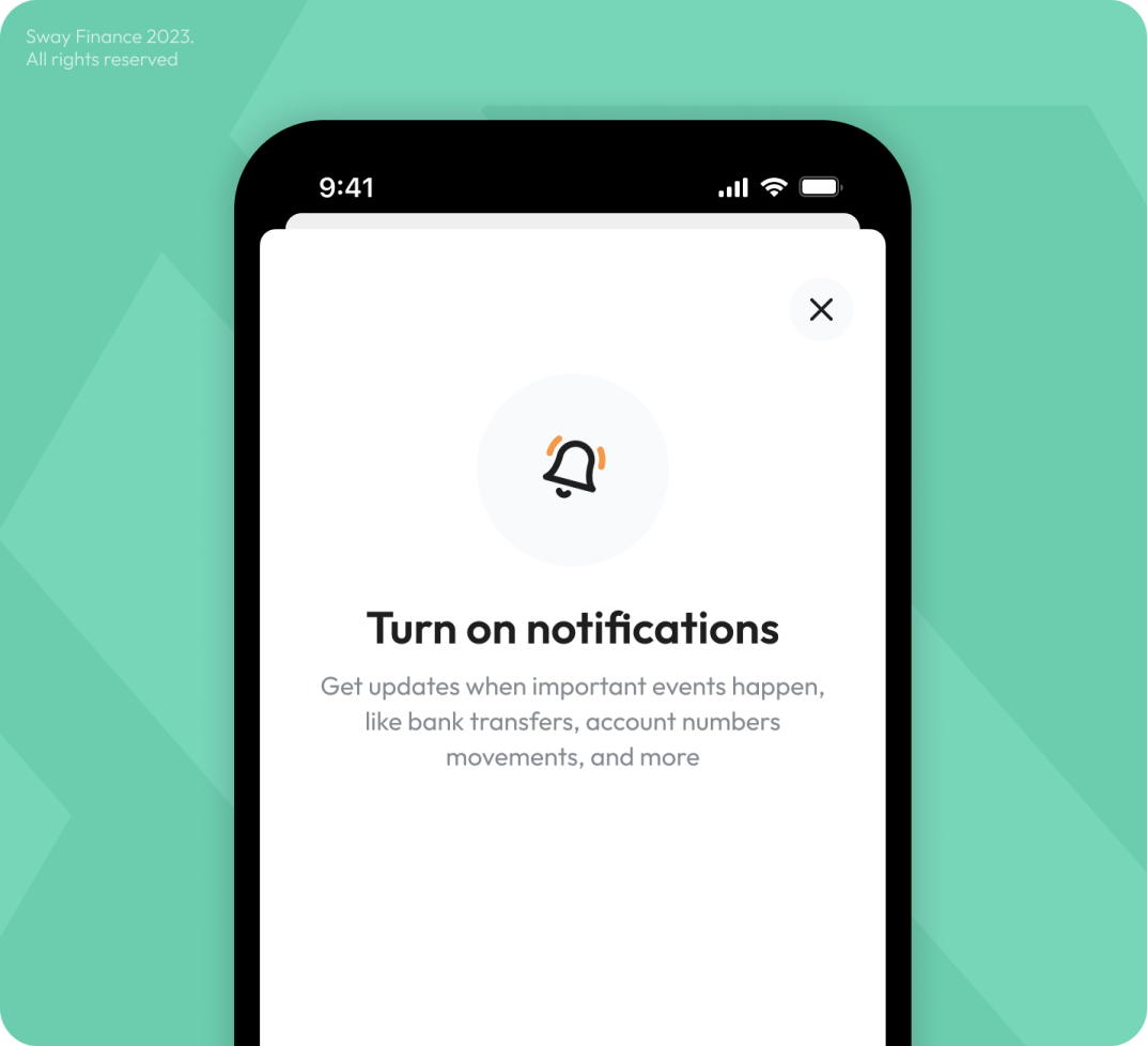
We use native design patterns from popular apps with a familiar and intuitive experience for users on both iOS and Android platforms. The result? Ready-to-develop flows and interactive prototype that allowed for in-depth testing and user feedback, paving the way for a Sway experience that felt innovative, familiar, and empowering – all within a record timeframe.

We completed this part in a record-breaking timeline

We used the native iOS and Android patterns to simplify the development

We provided the team with additional color mode for the future steps

Result

Our results

Sway Finance developers could deliver the first version of the application with our design solution. They also leveraged the provided branding to rebuild their website.

Client and our team are getting a lot of positive feedback from the audience about their new Visual Style. Our team is very grateful to Sway Finance for their trust in us and proud to be a significant part of such an ambitious product!

Recent Case Studies

Sinport
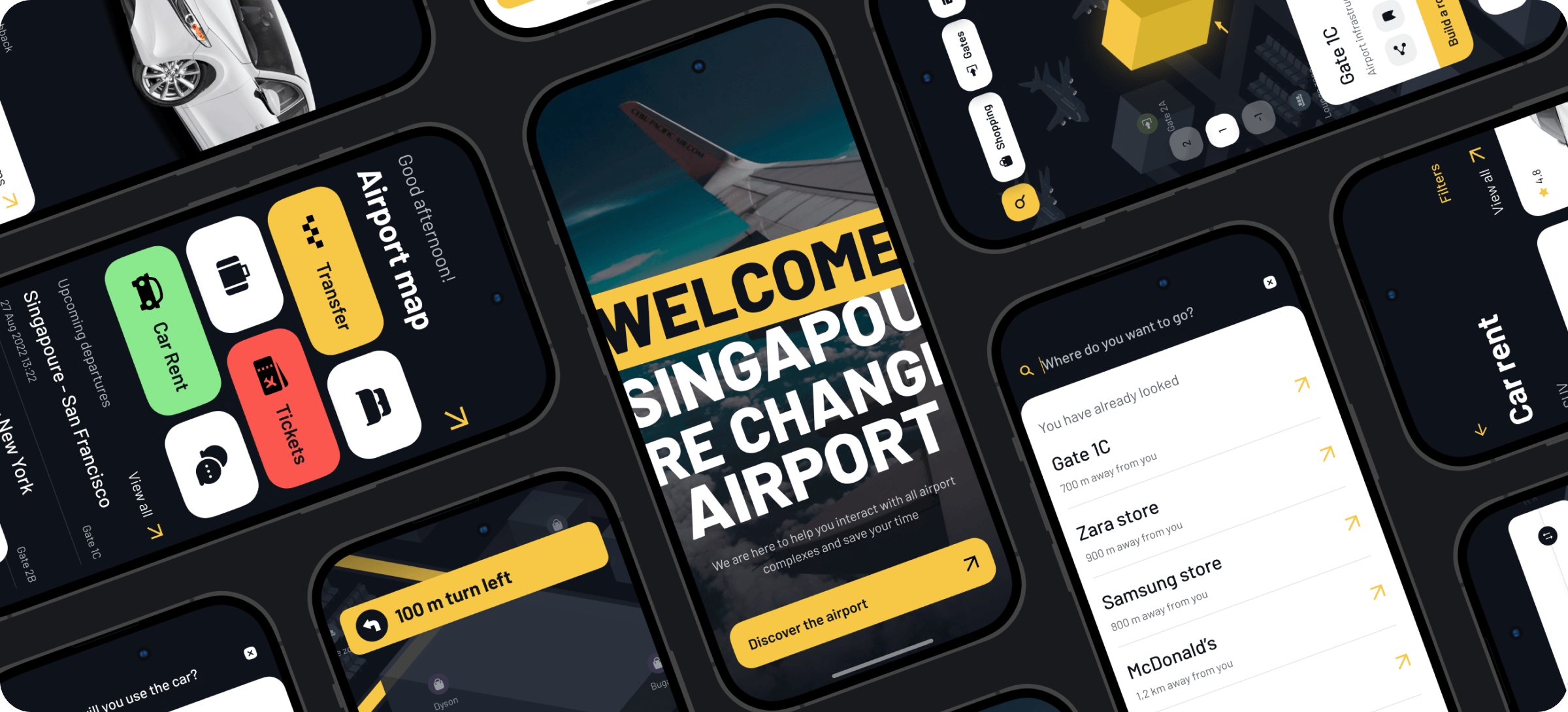
Singapore Airport Navigation App

Navigating around the airport, exploring an interactive airport map, searching for airport facilities/stores, their ratings and prices

Delivery/Booking Branding MVP Building Presentation-Ready-Concept Product Discovery

Ready to bring
your idea to life?

Help us understand your vision by providing some details. We’ll follow up to set a consultation call.

Name

Email

A few words about your project

You can upload maximum 5 files
Some of your file not loaded, because maximum file size - 5 mb
What is your budget for this project?
How did you hear about us? (optional)

By clicking this button you accept Terms of Service and Privacy Policy

Project Talk - Kseniia Shalia
Account Executive
Partnership - Polina Chebanova
Co-Founder
Our website uses cookies