We appreciate your interest in our product design services and will get back to you as soon as possible.
To improve our services, please tell us where you heard about us by selecting an option:
Don’t worry, you’re in the right place. We’re just making new looks for our pages
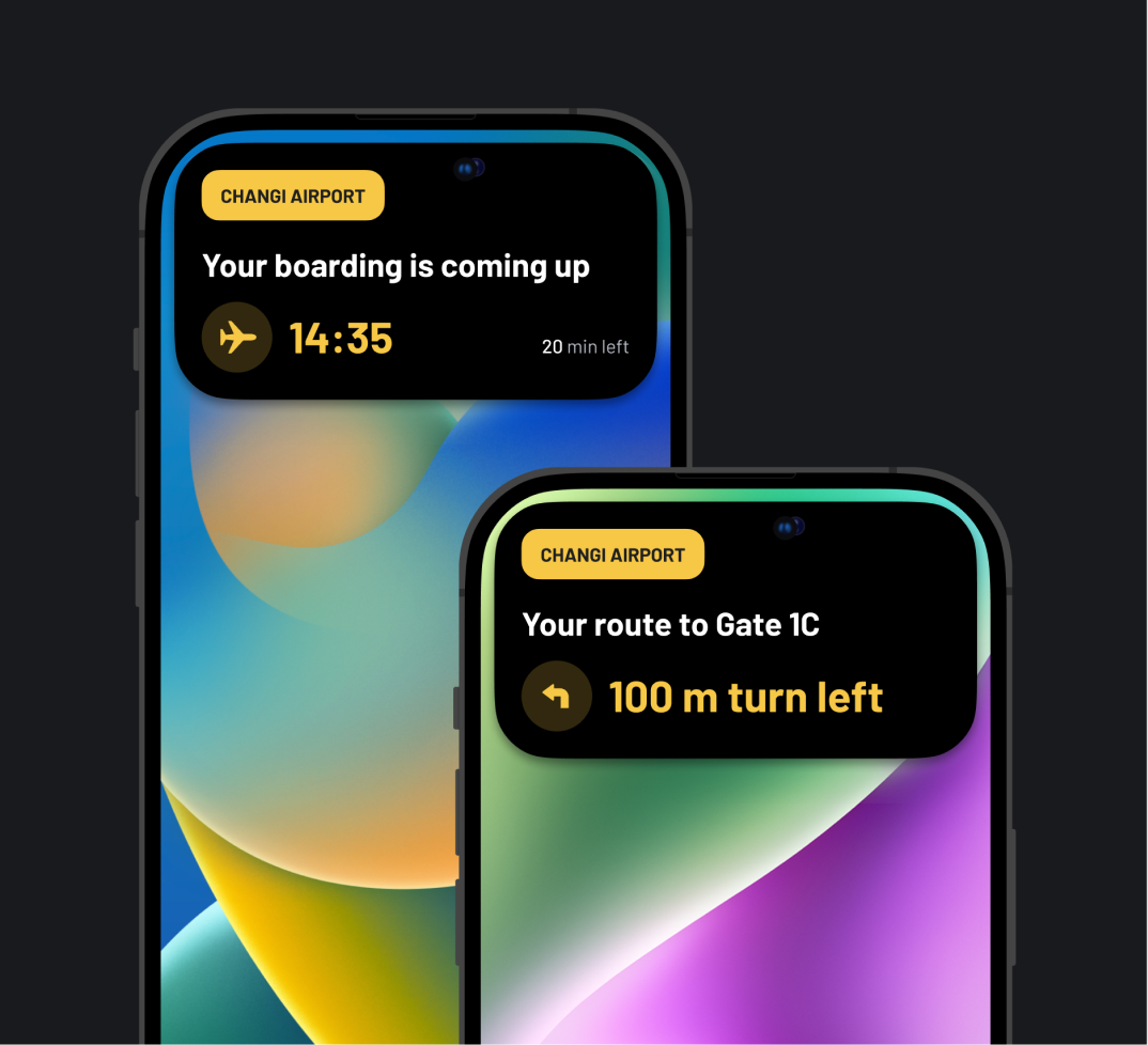
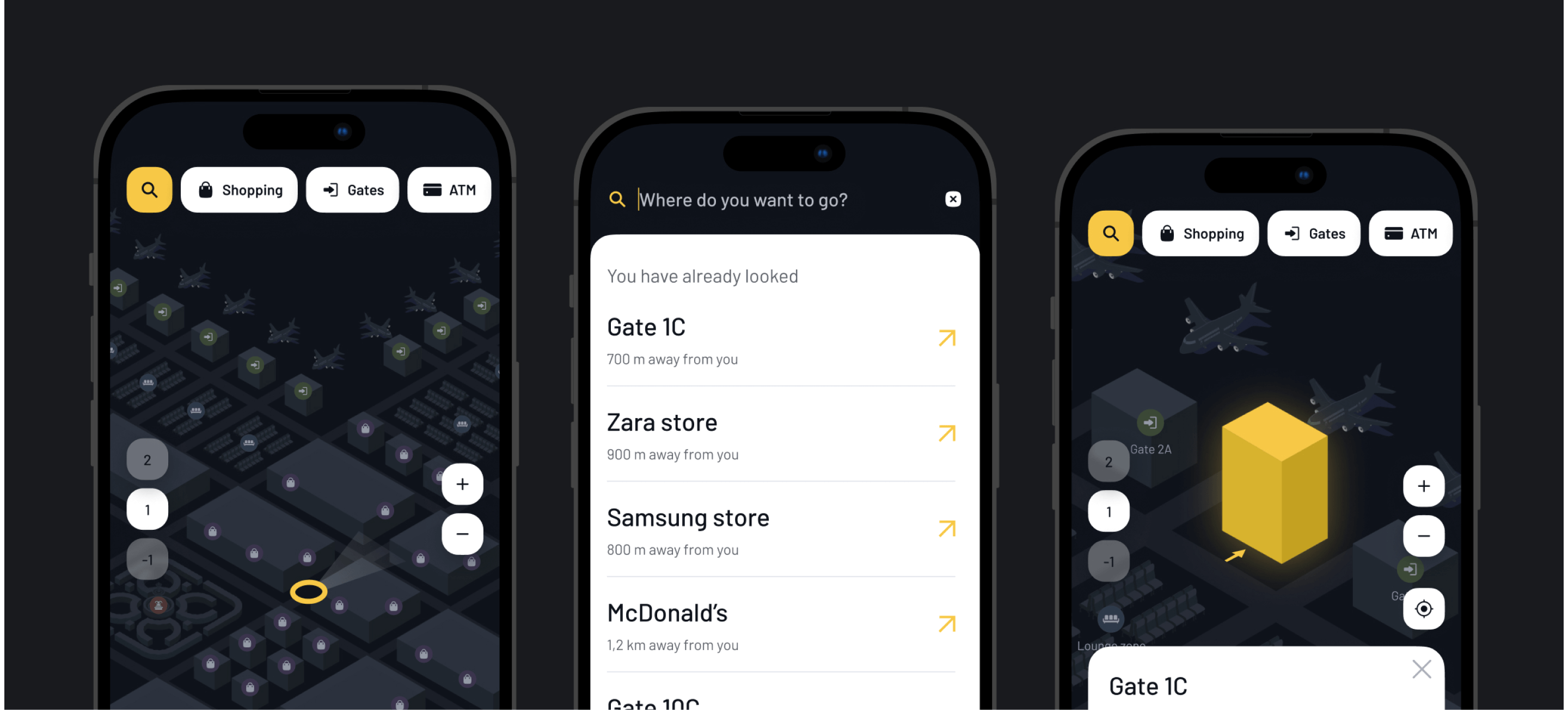
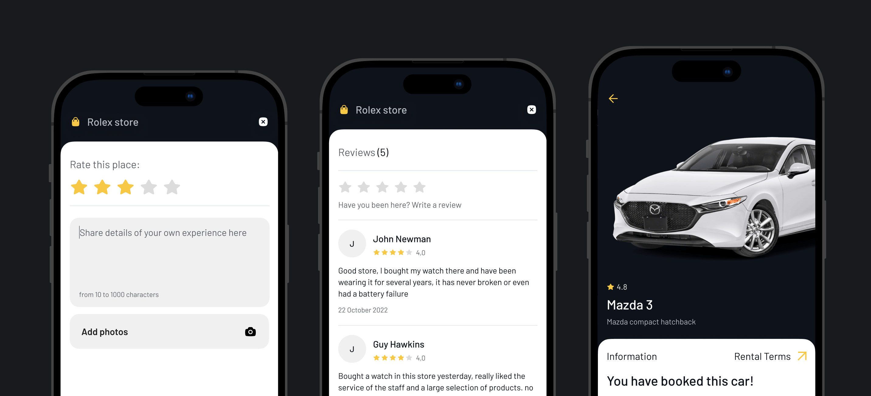
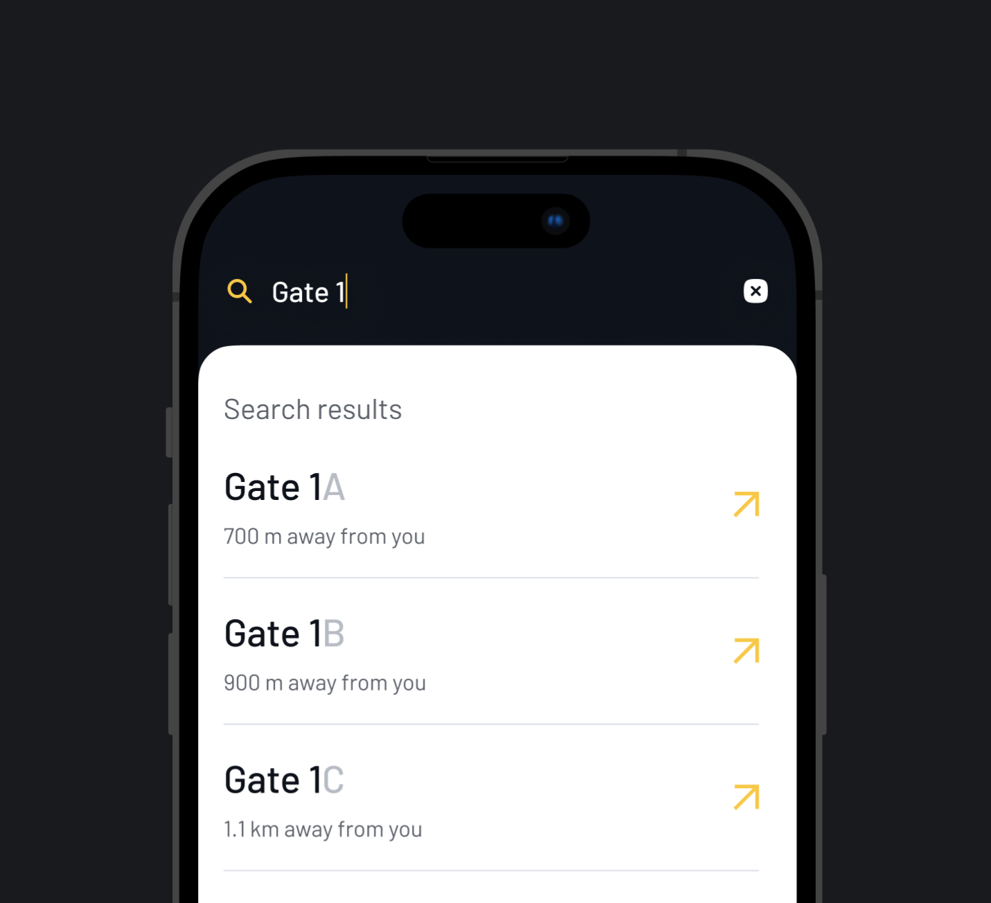
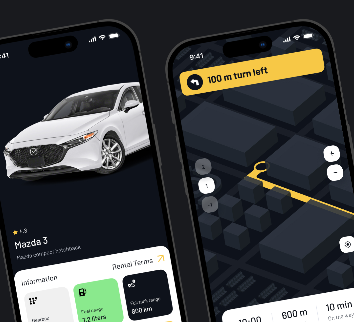
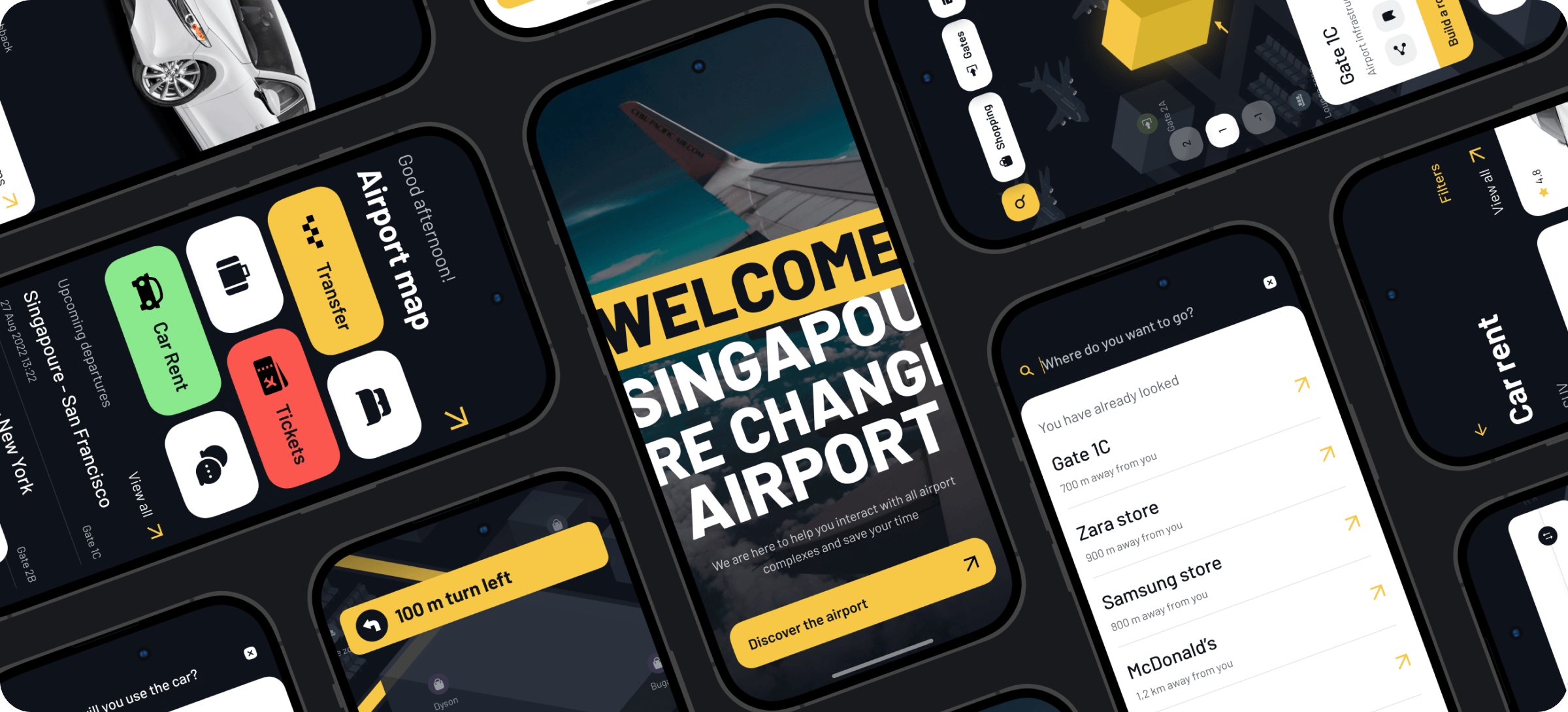
Navigating around the airport, exploring an interactive airport map, searching for airport facilities/stores, their ratings and prices
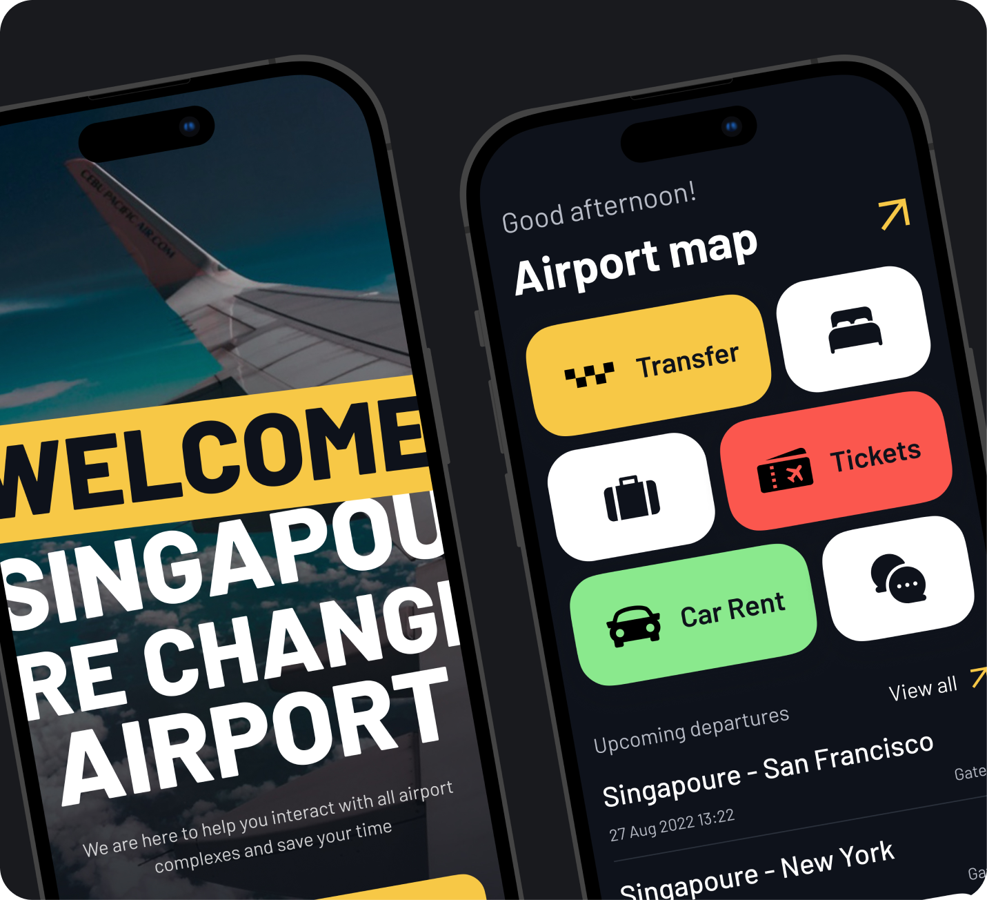
Sinport Navigator is an innovative mobile app designed to streamline the navigation experience for travelers at Singapore Airport, one of the largest and most complex airports in the world.
The core objective of Sinport Navigator is to provide a user-friendly and clear interface that helps users efficiently navigate the expansive infrastructure of Singapore Airport and utilize the diverse range of services it offers. Our challenge was to integrate a traditionally offline navigation experience into a cohesive digital platform that combines essential information and services into a single, accessible application
To improve navigating experience through the Singapore Airport. Navigating large and complex airports like Singapore’s one can be a daunting task for travelers. The sheer size and intricate layout often lead to confusion and frustration, compounded by the reliance on offline navigation tools and scattered information sources.
The development of the Sinport Navigator app involved addressing several key challenges faced by travelers at Singapore Airport.
Singapore Airport's vast size and complex layout make it difficult for travelers to navigate using only offline signage and existing maps.
Essential information like departure board and available services are scattered across different sources.
Booking airport-related services such as transfers, hotels, and car rentals often requires using multiple platforms.
The app development process starts by prioritizing user understanding. This initial phase considers user behavior, market trends, and what competitors offer.
Next, the focus shifts to crafting a clear user experience. Wireframes, like basic blueprints, map out the app’s layout and user flow.
With a solid structure in place, the team brings the app’s vision to life. Initial wireframes focus on core functionalities and user flow. These are then transformed into mockups that incorporate the app’s visual design and branding, providing a clearer picture of the final product.
Throughout this process, user feedback is crucial. The team iterates and refines the design based on this feedback until a polished final mockup is achieved, ready for development.
Initial Research & Analysis
Defining the Information Architecture
Wireframing & Prototyping
Final Mockups & Testing
The first step in developing the Sinport Navigator app was to conduct thorough research to understand the unique challenges and needs of travelers at Singapore Airport. We began by conducting extensive surveys and interviews with a diverse group of travelers, gathering qualitative data on their navigation experiences and pain points.
Additionally, we analyzed existing offline navigation tools and signage at the airport to identify their limitations. To ensure our app would stand out, we also studied competitor apps, benchmarking their features and pinpointing areas for potential improvement. This comprehensive research allowed us to synthesize key insights, which helped us prioritize the most critical features and functionalities for the Sinport Navigator app. By laying this solid foundation, we ensured that our app would effectively address the real-world needs of its users.
Identified 25 common pain points that travelers experience
Spent 12 hours observing traveler behavior and interactions
Held 2 hours of in-depth discussions with airport staff
This step was about establishing a robust and scalable information architecture for the Sinport Navigator app.
We began by compiling a comprehensive inventory of all the content and features that needed to be included. To understand how users naturally organize information, we conducted card sorting exercises with potential users, which provided valuable insights into their preferences.
Based on these findings, we developed a detailed map to visualize the app’s hierarchical structure, ensuring logical organization and easy navigation. This solid information architecture laid the groundwork for a user-friendly and intuitive app.
Held 3 team collaboration sessions to ensure alignment with project goals
Created a detailed map to organize the app's content
Compiled an backlog of 23 features to be included in the app
We’ll secure your success by integrating the best industry experts and incredible skills. Your dream is in the right hands.
With the information architecture in place, we started developing high-fidelity wireframes to outline the basic structure and layout of the app. These wireframes provided a clear blueprint for the app’s design, which we then enhanced into high-fidelity mockups and annotations.
To bring these designs to life, we built interactive prototypes that simulated real user interactions and app functionality. Usability testing with these prototypes was crucial. It allowed us to gather feedback on the navigation flow and overall user experience. Based on this feedback, we iteratively refined the wireframes and prototypes to improve usability and ensure a seamless user experience.
Built 5 interactive prototypes to simulate the user interactions
Conducted 3 rounds of usability testing to gather feedback and refine design
We created detailed high-fidelity designs that incorporated all branding elements, including color schemes, typography, and iconography, ensuring a visually appealing and cohesive look. Advanced interactive prototypes were built using tools of Figma, allowing testers to experience the app as they would in its final form.
Multiple rounds of usability testing with these prototypes provided comprehensive feedback, which we used to further refine the design.
After several iterations of improvements we’ve got final mockups. Once it was approved we’ve crafted design specifications, and guidelines for developers.
Developed 5 advanced interactive prototypes simulating user interactions
Conducted 3 iterations of design improvements based on users’ feedback
The Sinport Navigator project successfully culminated in the development of a user-friendly, intuitive mobile app designed to enhance the navigation and service experience at Singapore Airport.
The app was built to address the specific needs and pain points of travelers, ensuring a seamless and efficient journey through one of the world’s largest and busiest airports. The comprehensive and methodical approach taken during the project’s various stages resulted in a product that met and exceeded user expectations.
We appreciate your interest in our product design services and will get back to you as soon as possible.
To improve our services, please tell us where you heard about us by selecting an option: