Application for creating NFT collections

A service that allows you to create NFT collections in a few clicks

JoCreate
Background

About the product

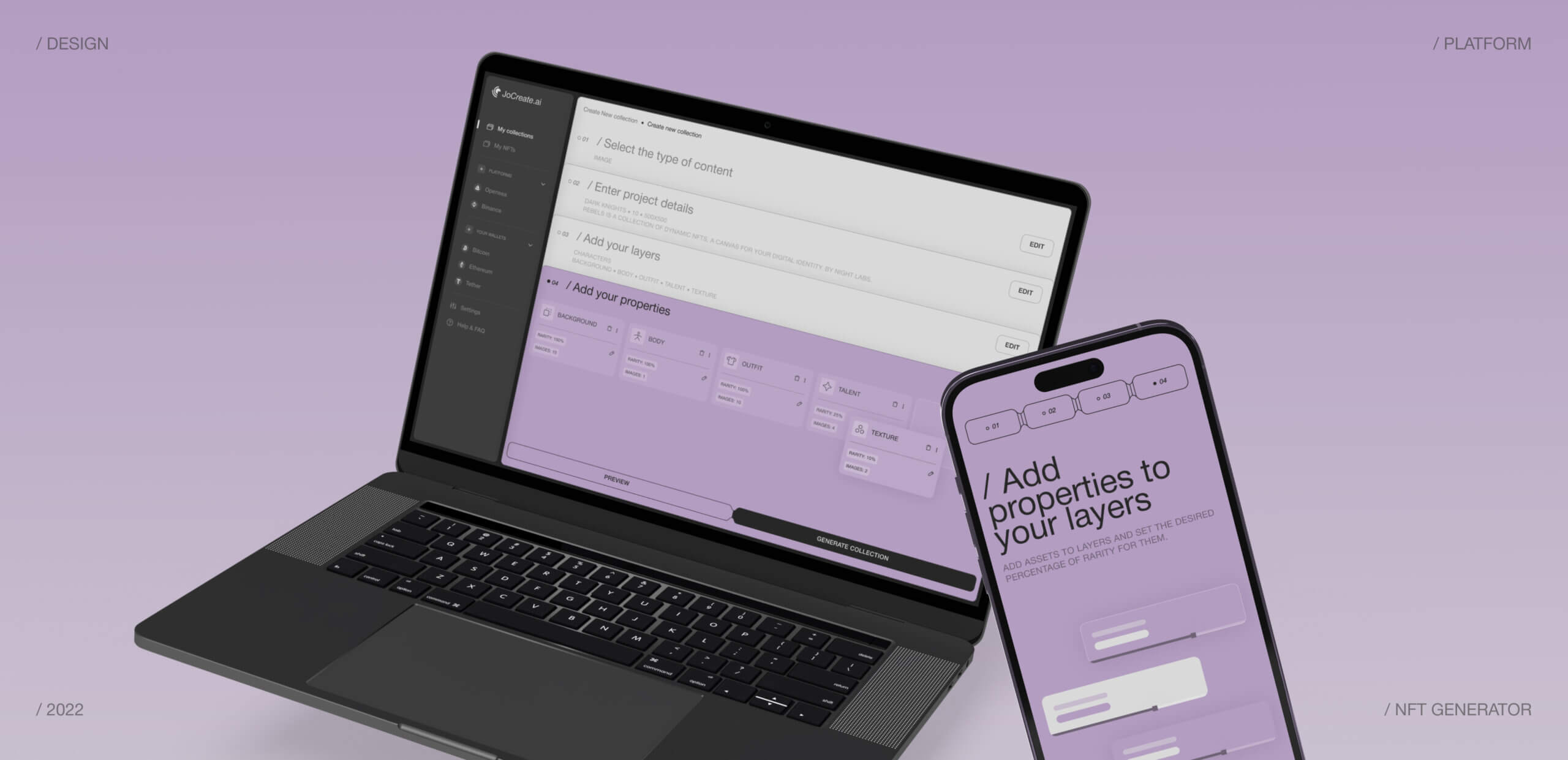
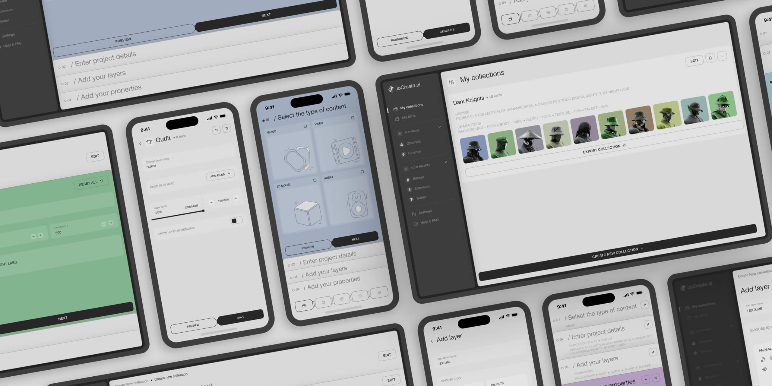
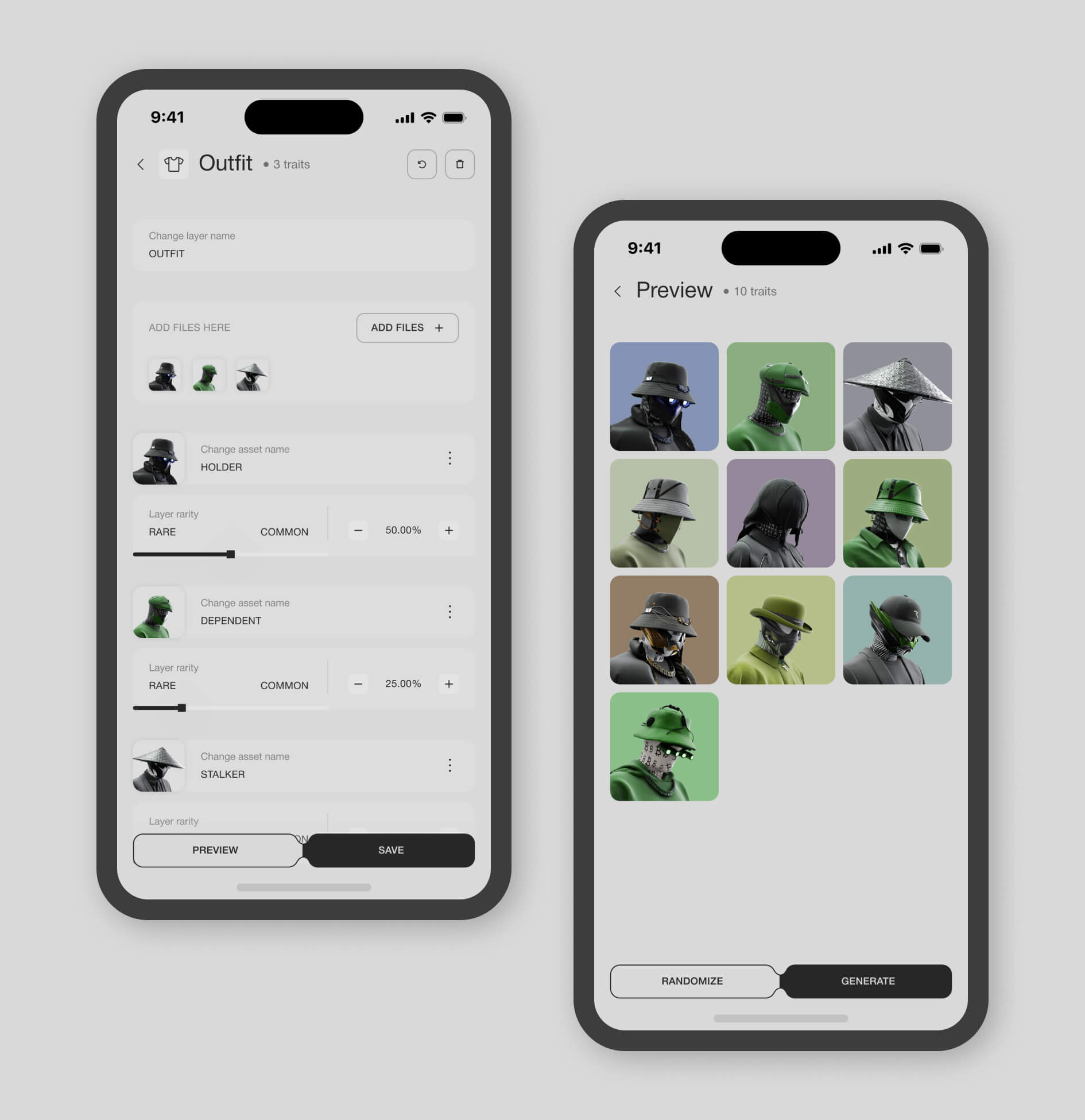
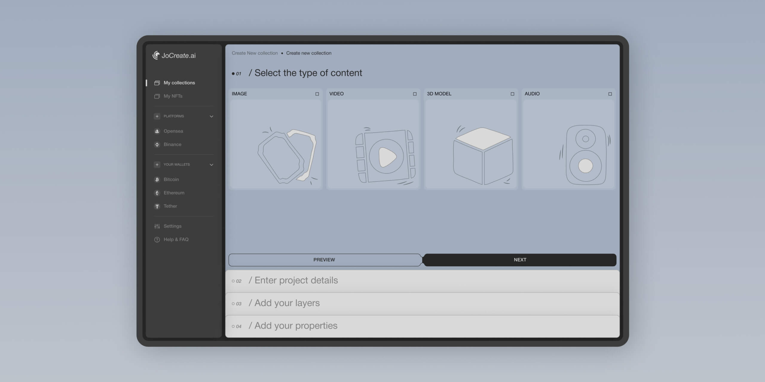
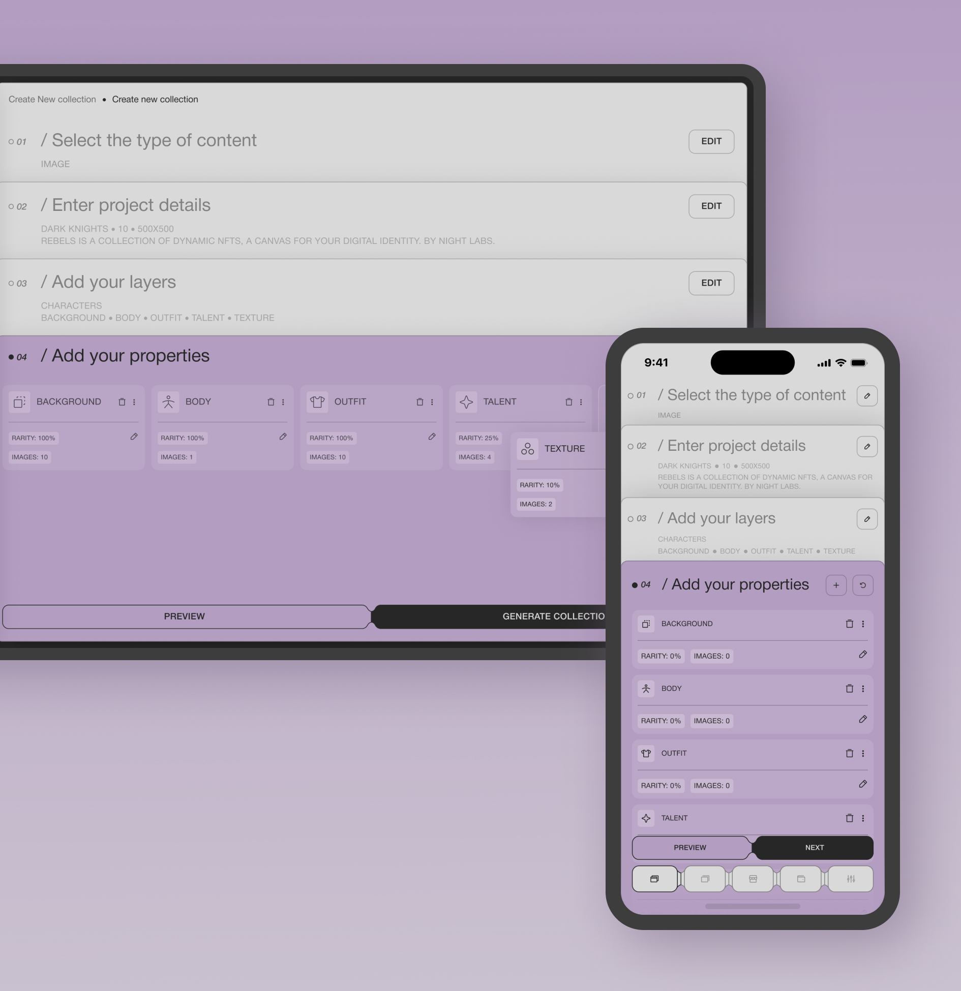
The service allows you to model a set of elements and generate a collection of NFTs based on them. Its functionality is aimed at a young audience – this application’s backgrounds, filters, and visual effects are extremely relevant and modern. With this application, users can also sell their artwork: once it’s finished, it can be exported to the popular NFT marketplaces.

Problem

The challenge we’ve faced

The JoCreate team asked us to develop a stylish and easy-to-use service for creating NFT collections for desktop and mobile versions, with integration into the most popular marketplaces.

The existing generators on the market have a confusing and complex interface with limited functionality. It isn't easy to figure out how to upload your content and generate collections.

While researching the market, our team discovered that there is no service that allows you to upload your created collection to the marketplace for sale immediately.

Most competing services only have a desktop version and a mobile adaptation. There are also separate applications in the Apple Store and Google Play, but they don't have a desktop version.

Proccess

General Proccess

The role of our team in this project was not only to implement solutions. The main goal was to identify these solutions through UX research and competitive and business analysis, such as choosing the best technologies, integrations, and even the best way to synchronize different third-party platforms with our service.

Research process

We analyzed the best competitors in the field of crypto & NFT using a SWOT analysis. We conducted a business analysis to find the best way to implement the features correctly and bring profit to the product.

SWOT Analysis

Business Analysis

Mapping

User flow

Step 1

Competitor Analysis

The main goal of the SWOT analysis for this platform was to identify the weaknesses of competing platforms and turn them into our strengths.

During the SWOT analysis, we found the following problems:

  • Confusing interface, no onboarding for new users
  • Limited functionality, only NFTs and collections can be created
  • There is either a web platform or an application

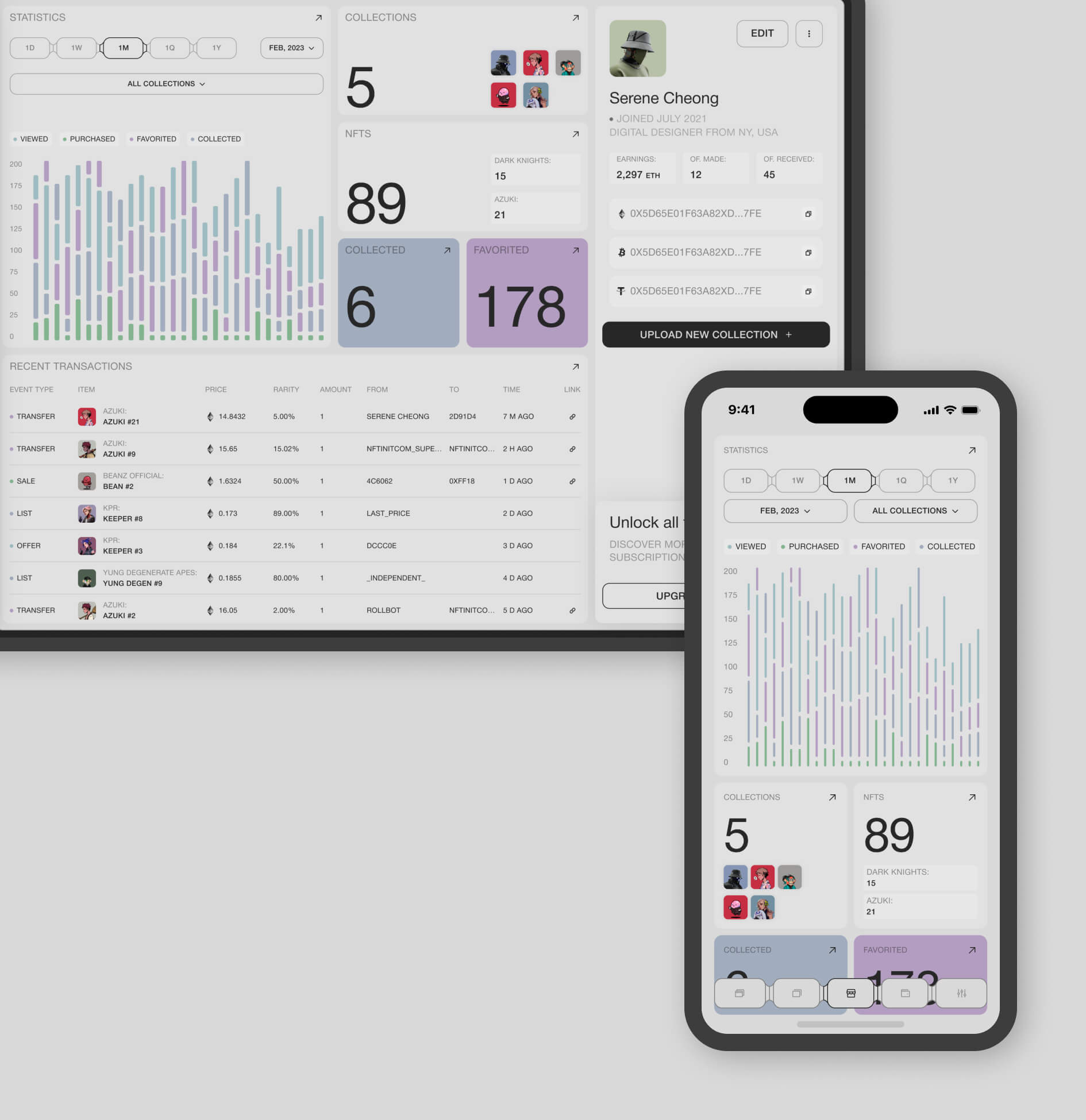
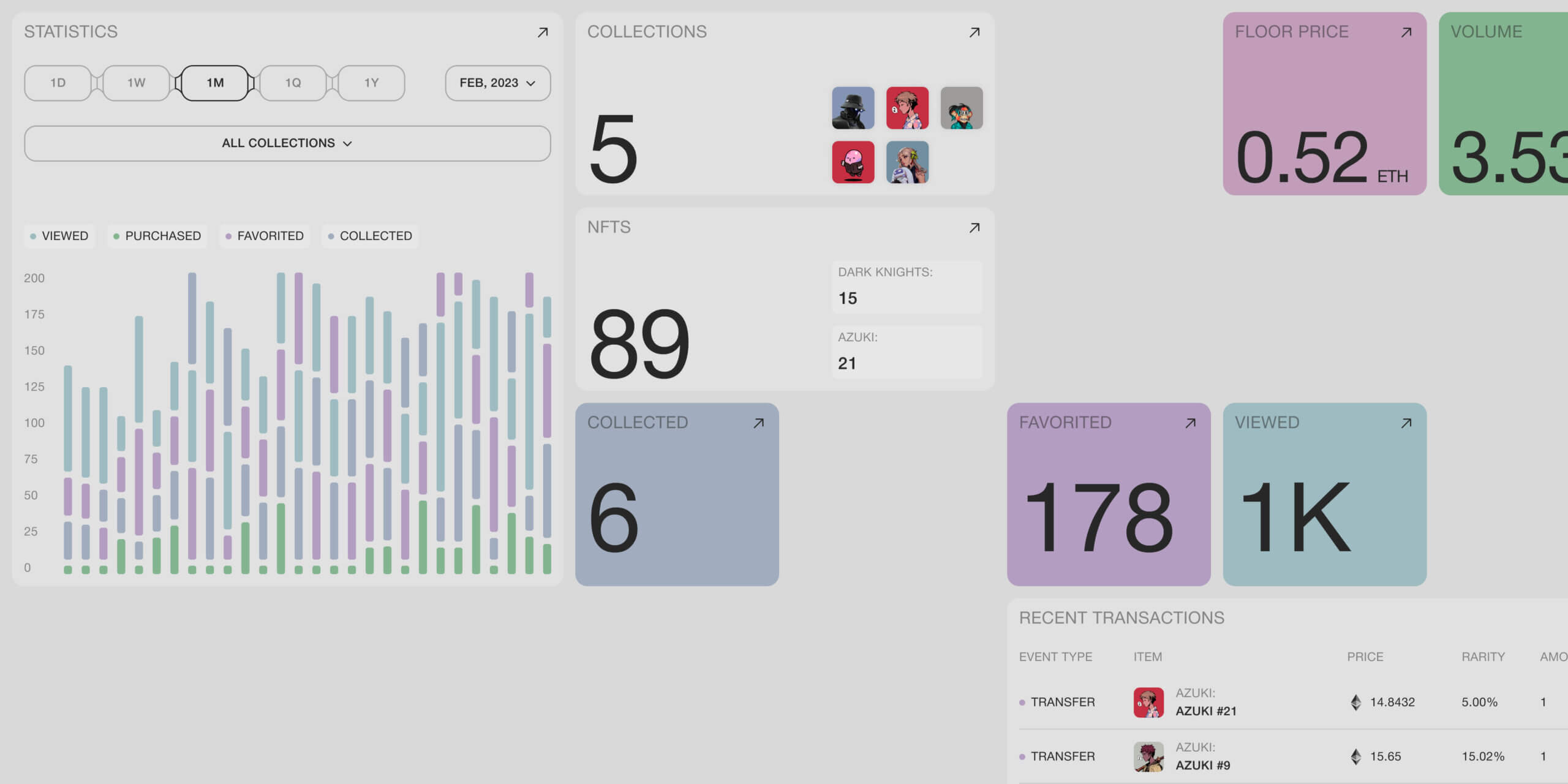
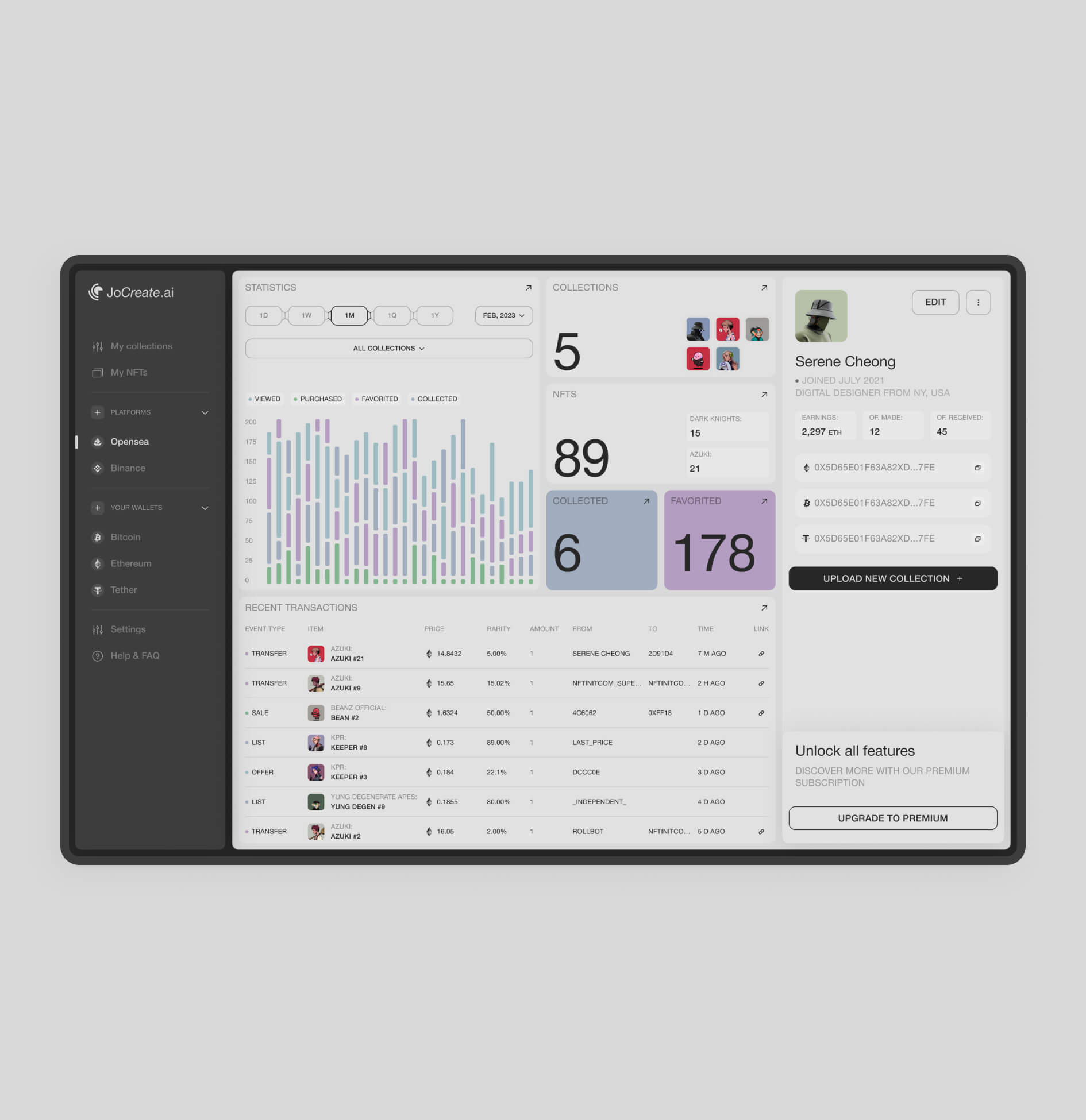
So we were able to optimize the builder and add such important and unique features as synchronization with the most popular marketplaces, tracking the statistics of your collections and profiles in one place, generating in the form of a constructor, linking your crypto wallets to withdraw funds from marketplaces, web and mobile applications with autosaving.

Step 2

Business Analysis

The main goal of the BA for this platform was to describe the functionality through the user story and documentation of each function, through:

  • Analysis of the domain
  • Identifying current problems and their solutions
  • Recommendations and advice on how to implement the solution
  • Prioritized feature list

During the BA, we explained to the client the characteristics of the solutions we had collected and outlined their benefits and risks.

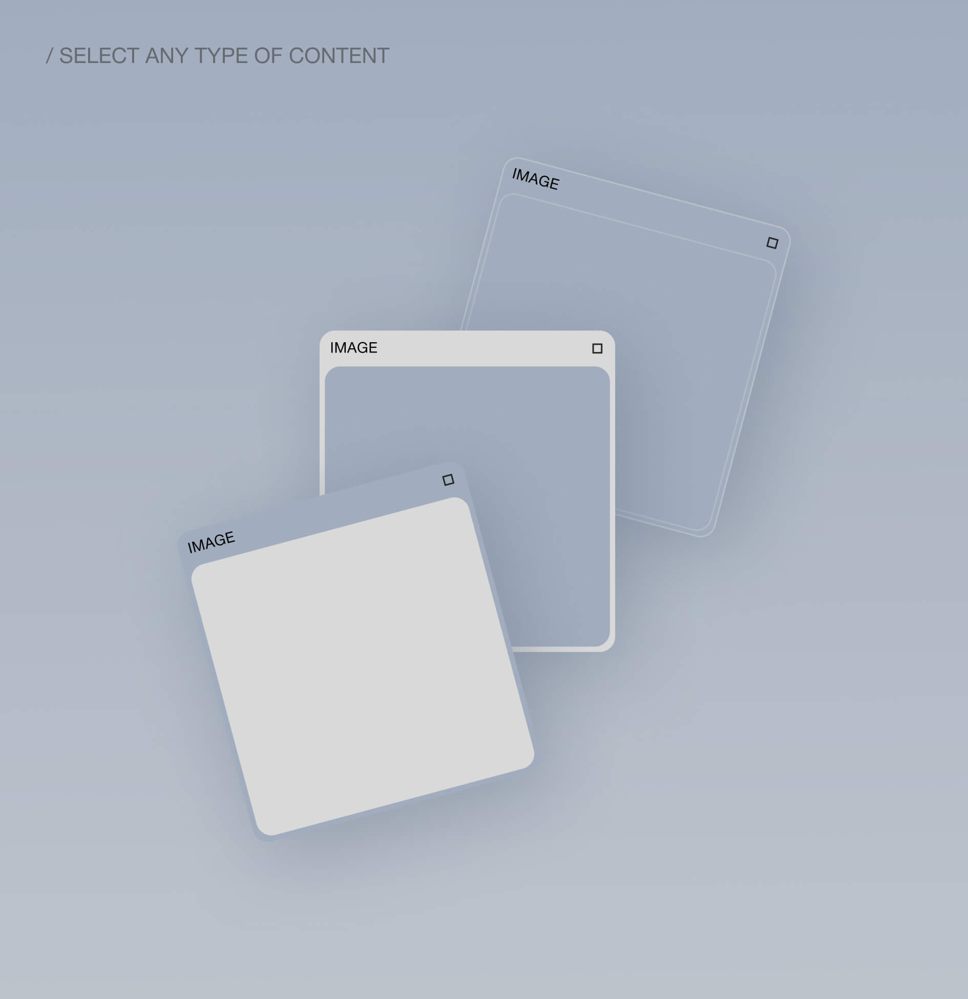
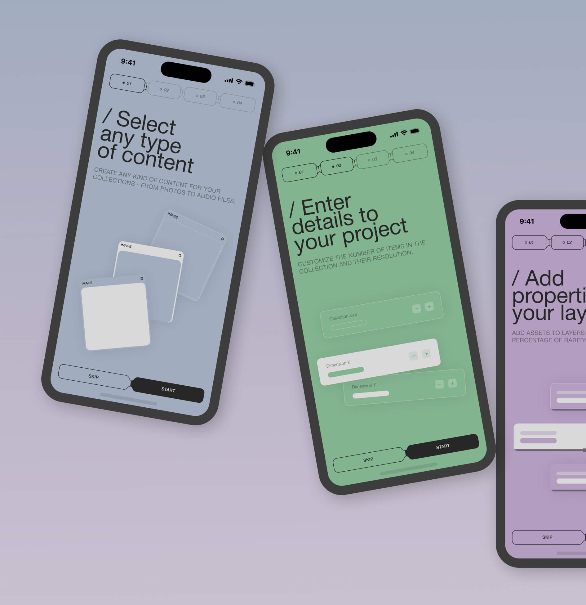
  • Initially, it was decided to implement the platform’s main feature – the collection constructor. For the MVP, we developed the generation of images and 3D objects. Then we added video and audio collections.
  • Our next priority was to integrate the service with the NFT marketplaces. First, we synchronized Opensea and Binance NFT. Then we added Magic Eden, Rarible, and Coinbase NFT.
  • The lowest priority feature was the dark theme, which is very much in demand and essential in the modern world. Due to the fact that our team always works with components and styles in the UI stage, this feature was implemented very quickly and without any problems.

Begin Your Phenomenal Journey with a Website Design Services

We’ll secure your success by integrating the best industry experts and incredible skills. Your dream is in the right hands.

Step 3

Mapping

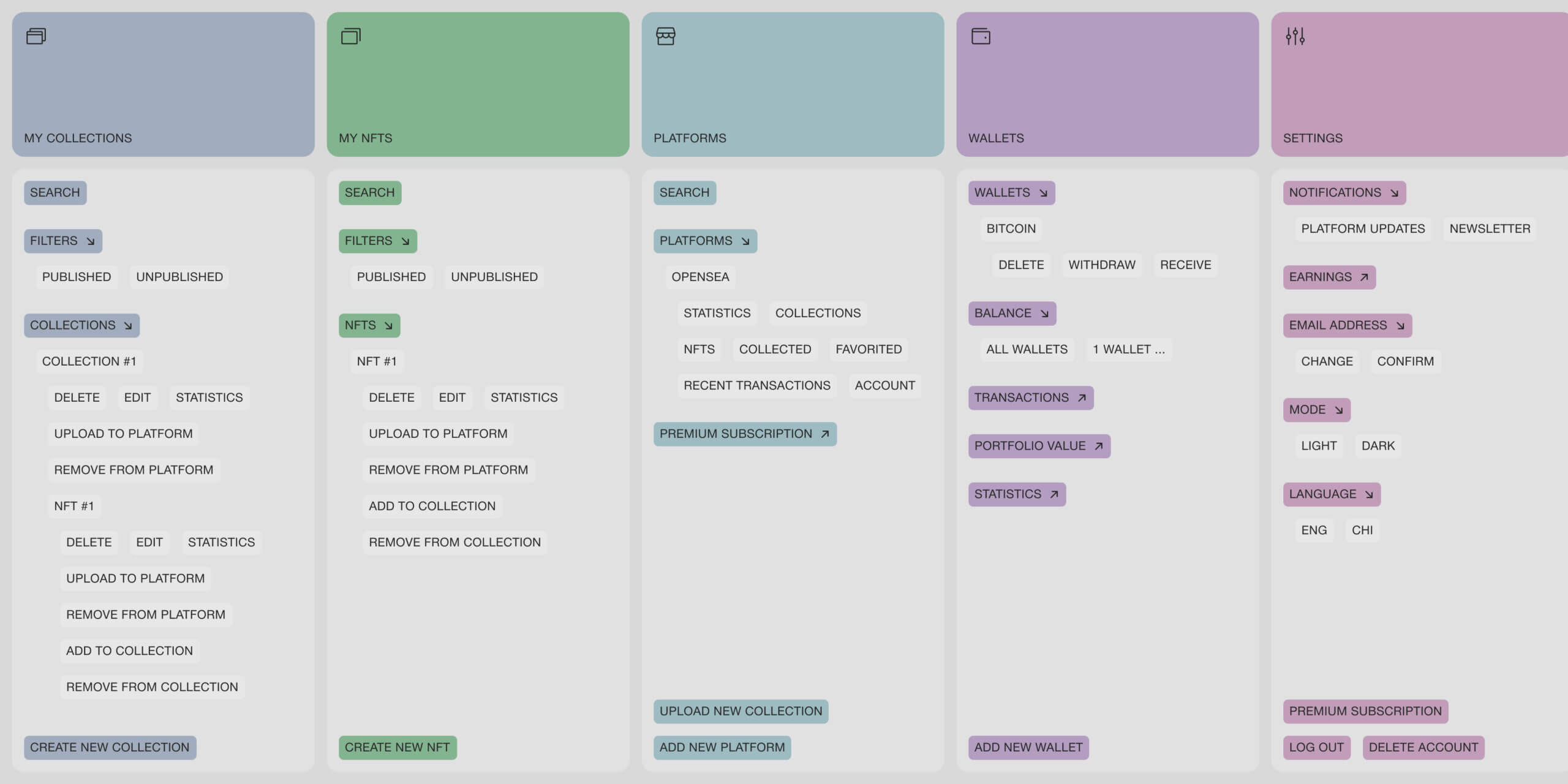
Based on our client’s data and the results of our research, we created an informational architecture for the platform.

Through a series of iterations and deeper dive exploration sessions, we clarified the vision for the application, allowing us to work through the details together, including integration of NFT marketplaces with our platform for instant upload of generated collections, synchronized analytics, and statistics on collections and NFTs, the constructor for 4 types of assets. As a result, we arrived at seven main flows that we continued to develop: authorization, onboarding, collection constructor, uploading a collection to the marketplace, analyzing and viewing statistics, connecting crypto wallets, and withdrawing funds.

Step 4

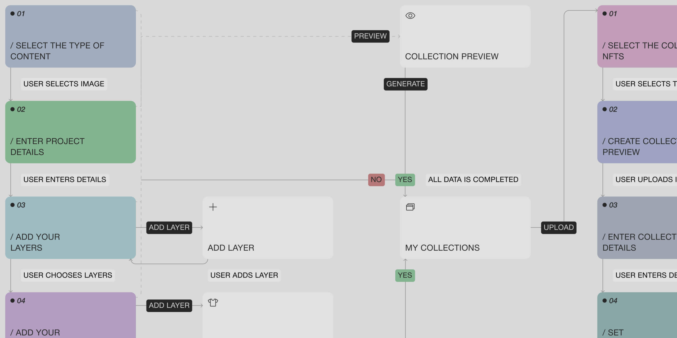
User flow

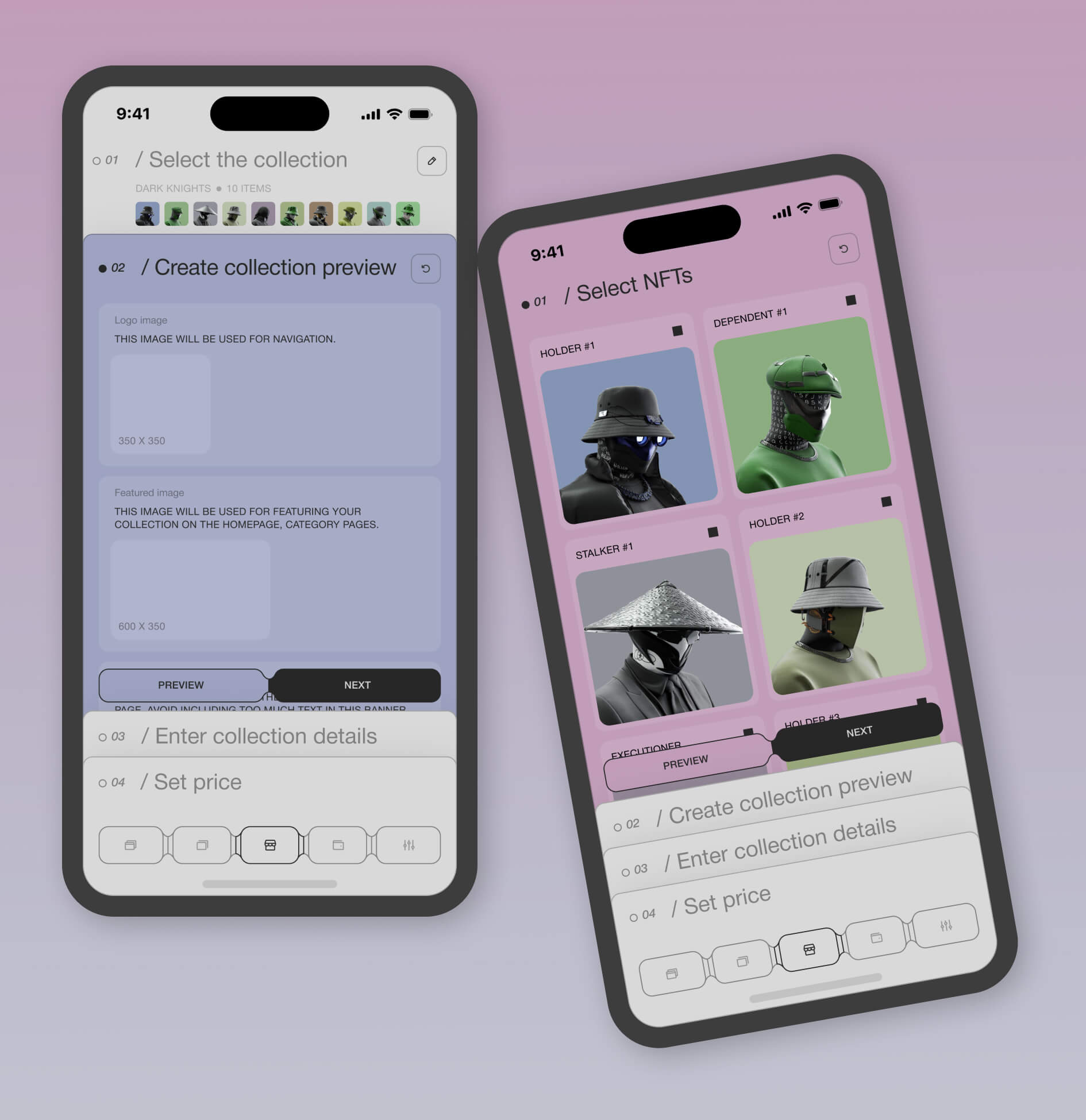
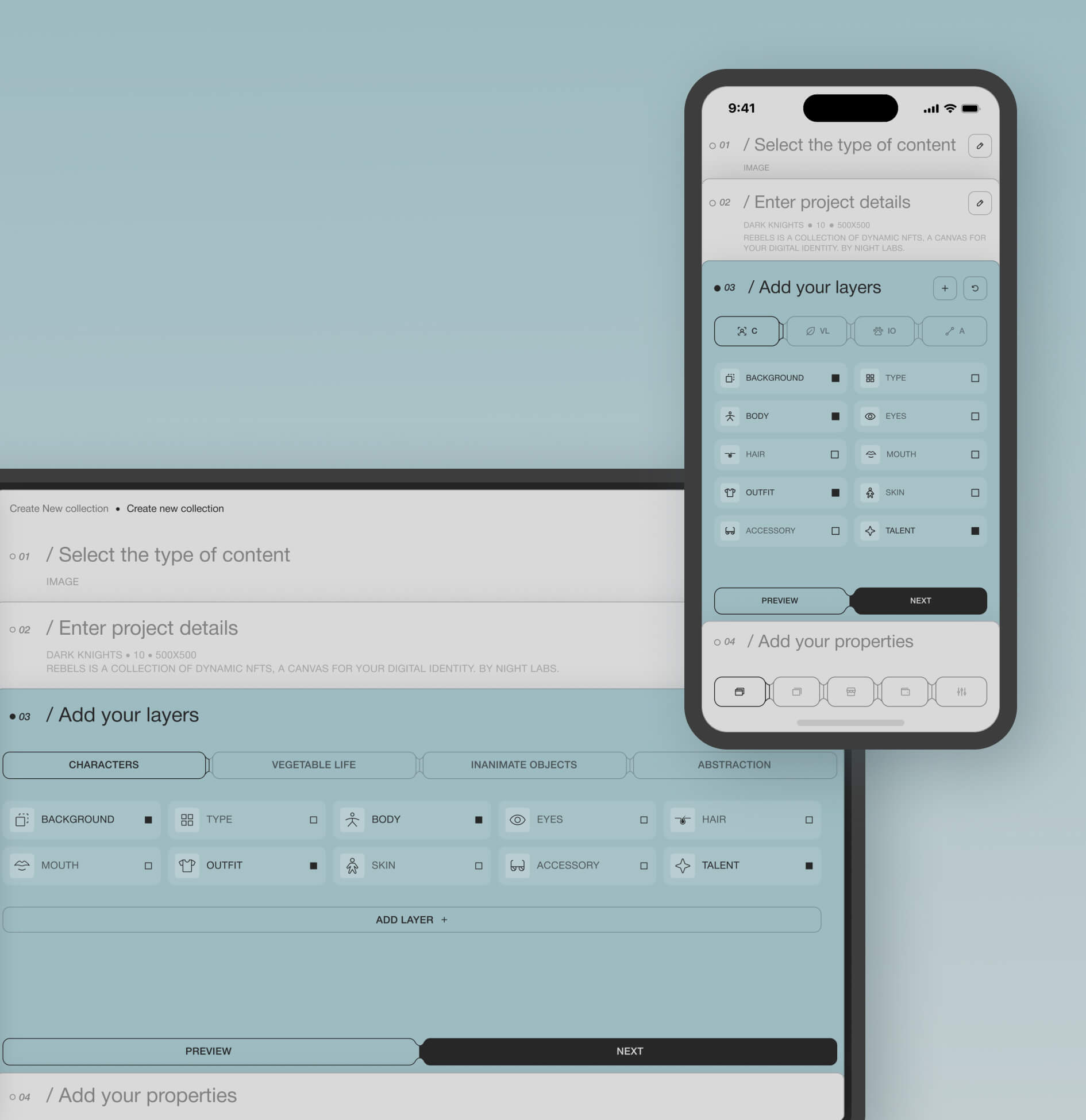
User flow is a visual representation of the sequence of actions the user takes to achieve their goal. Our team built future steps and continued working on the interface to determine how users achieve the goal, calculating positive and negative scenarios. The diagram below shows how easy the constructor is to use. There are clear steps, the collection can be previewed at any stage, and once created, it can be uploaded to the marketplace in a few clicks.

Design

Turn the analysis results into a user-friendly interface that follows good usability rules, solves users’ needs, and makes their journey as smooth as possible.

Wireframes

Moodboard & Design Concept

UI Design

Step 1

Wireframes

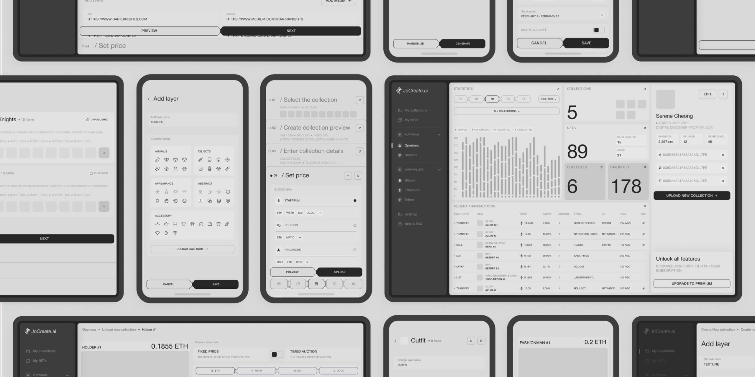
We created wireframes and clickable prototypes as an integral part of working on the design structure, testing and improving the user journey before moving on to the final mockup design.

This stage helped us understand the logic and structure of the future service. We created and approved prototypes for each flow, working out all possible states for each screen, deciding on the size and number of containers for illustrations, and checking the usability and clarity of each flow.

Step 2

Moodboard & Design Concept

To determine the visual direction and style of the interface, our team created a mood board and coordinated it with the client. It allowed us to choose the most appropriate solution at the earliest stage.

Based on the research and the direction chosen in the mood board, our team created the first visual concept of the site, which demonstrated the chosen style in real conditions before creating the finished UI design. The mood board helped us decide that the platform should be in light pastel colors, with an emphasis on typography and muted color accents, minimalist line icons, and illustrations.

Step 3

UI Design

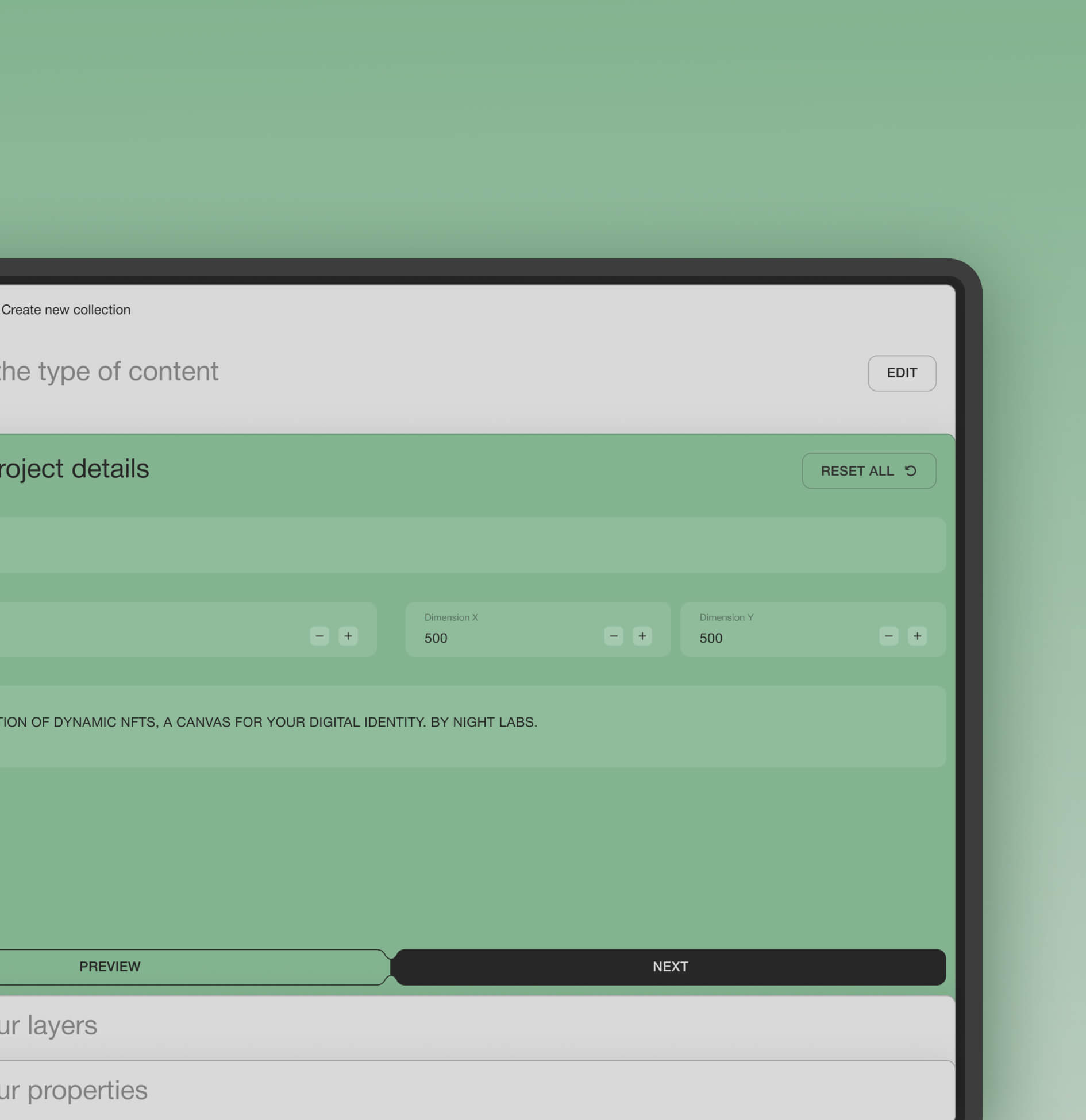
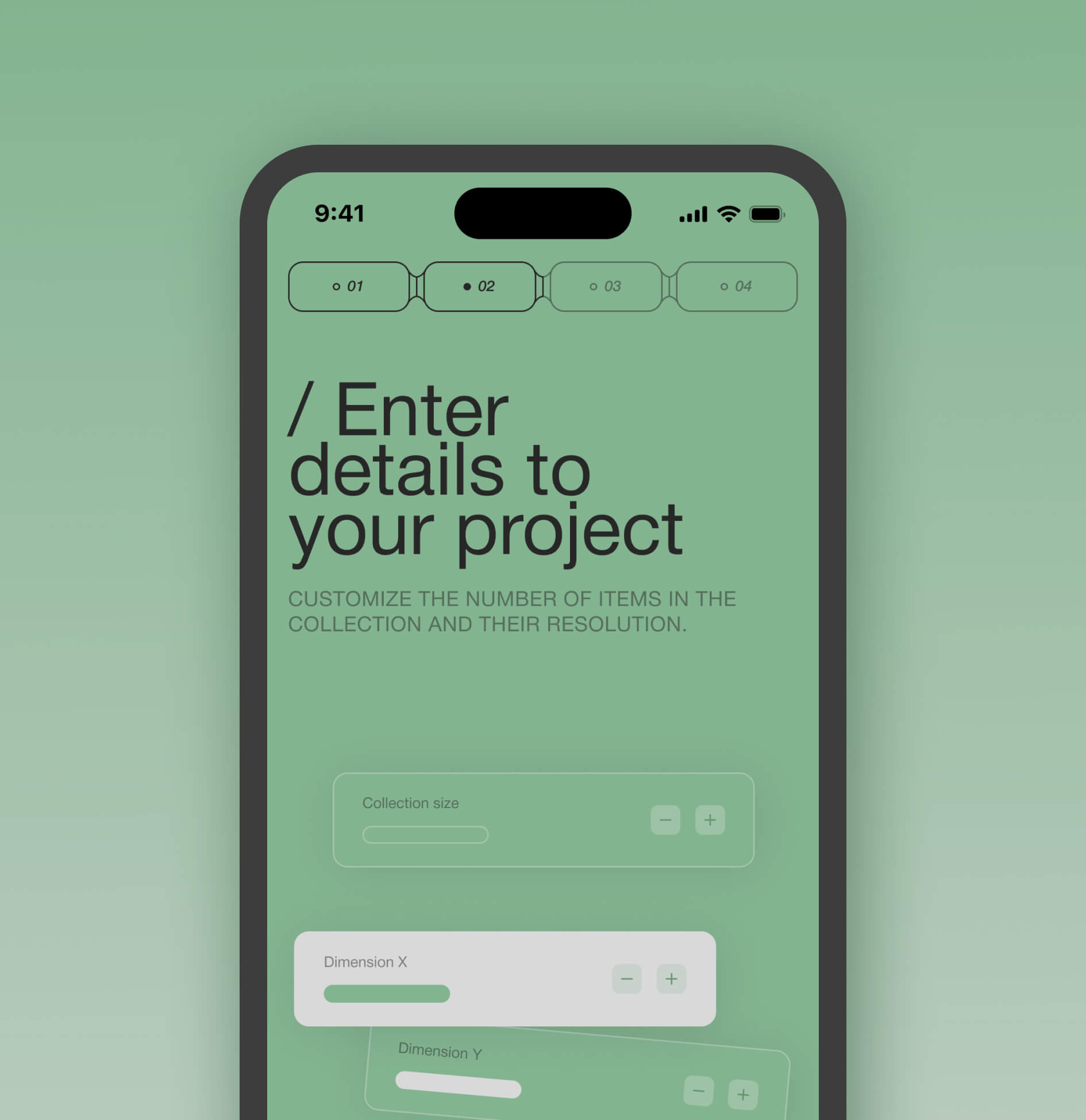
The main color for the interface was chosen to be a pastel beige so that it doesn’t distract from important information and doesn’t overload the design, in addition to the bright NFT assets. We chose a specific color for each step in the process of creating a collection and uploading it to the marketplace, which is associated only with that step. The general style is in the form of cards, which resembles an NFT asset.

Work continues on new features

01
Additional content types

Our team is currently working on adding 2 new content types - virtual worlds and domain names - to attract even more talented people and companies to our platform.

02
Dedicated Marketplace

We plan to develop our marketplace so users can sell collections and NFTs directly on our platform via 3 blockchains (Ethereum, Bitcoin, and Polygon).

03
The platform's NFT collection

Our design team is creating the platform's collection of NFTs - animated 2D heroes that will be sold on our platform and third-party services.
Result

Our results

The team created a thoughtful, straightforward design that helped the client make a name for itself in the crypto & NFT market.


  • The platform gained over 40,000 users in less than half a year.
  • 56% of surveyed users say that the process of creating a collection on our platform is much clearer and easier than on other platforms.
  • The company has already received more than $500K in investment due to its recognition and rapid growth in the market.
  • Customers and our team are getting a lot of positive feedback from the audience about the visual style and functionality of the platform.


We are very grateful to JoCreate for their confidence in our services, and our team is happy to be an important part of such an ambitious product!

Recent Case Studies

Assetario
Branding for the SaaS platform

AI-powered Platform for App Personalization
SaaS Branding Website Redesign
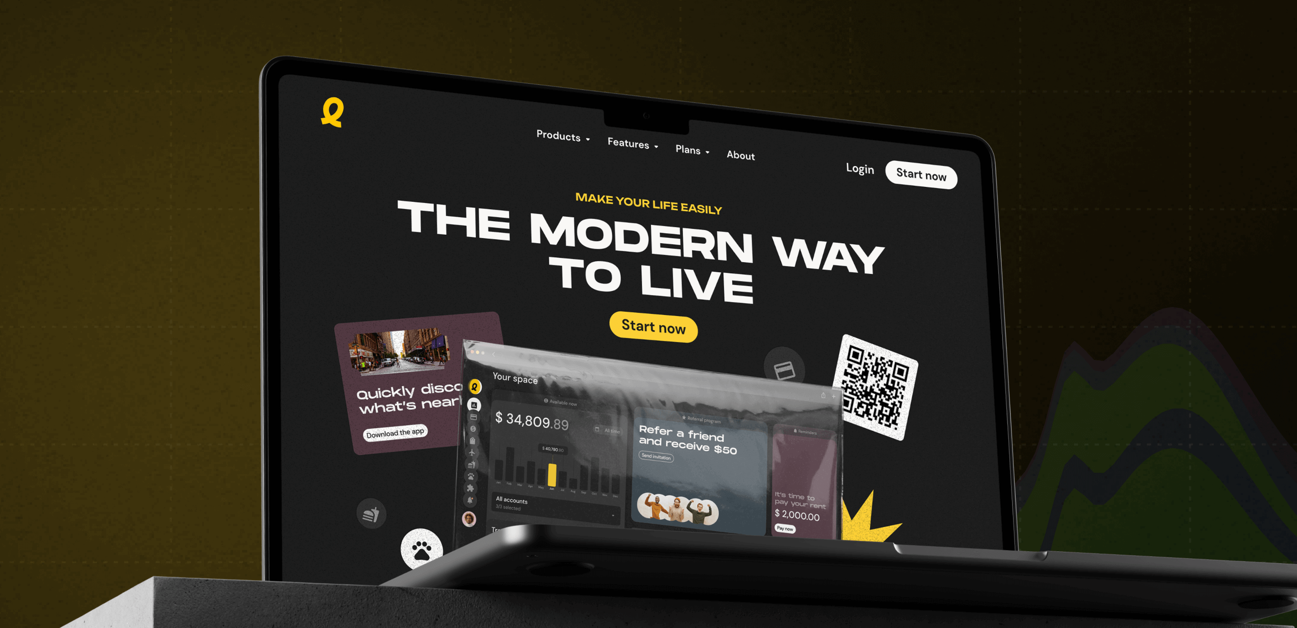
Easily
Promo website for the super app

Captivating Promo Site for the web super app

Fintech Website Development

Ready to bring
your idea to life?

Help us understand your vision by providing some details. We’ll follow up to set a consultation call.

Name

Email

A few words about your project

You can upload maximum 5 files
Some of your file not loaded, because maximum file size - 5 mb
What is your budget for this project?
How did you hear about us? (optional)

By clicking this button you accept Terms of Service and Privacy Policy

Project Talk - Kseniia Shalia
Account Executive
Partnership - Polina Chebanova
Co-Founder
Our website uses cookies