
We appreciate your interest in our product design services and will get back to you as soon as possible.
To improve our services, please tell us where you heard about us by selecting an option:
Don’t worry, you’re in the right place. We’re just making new looks for our pages


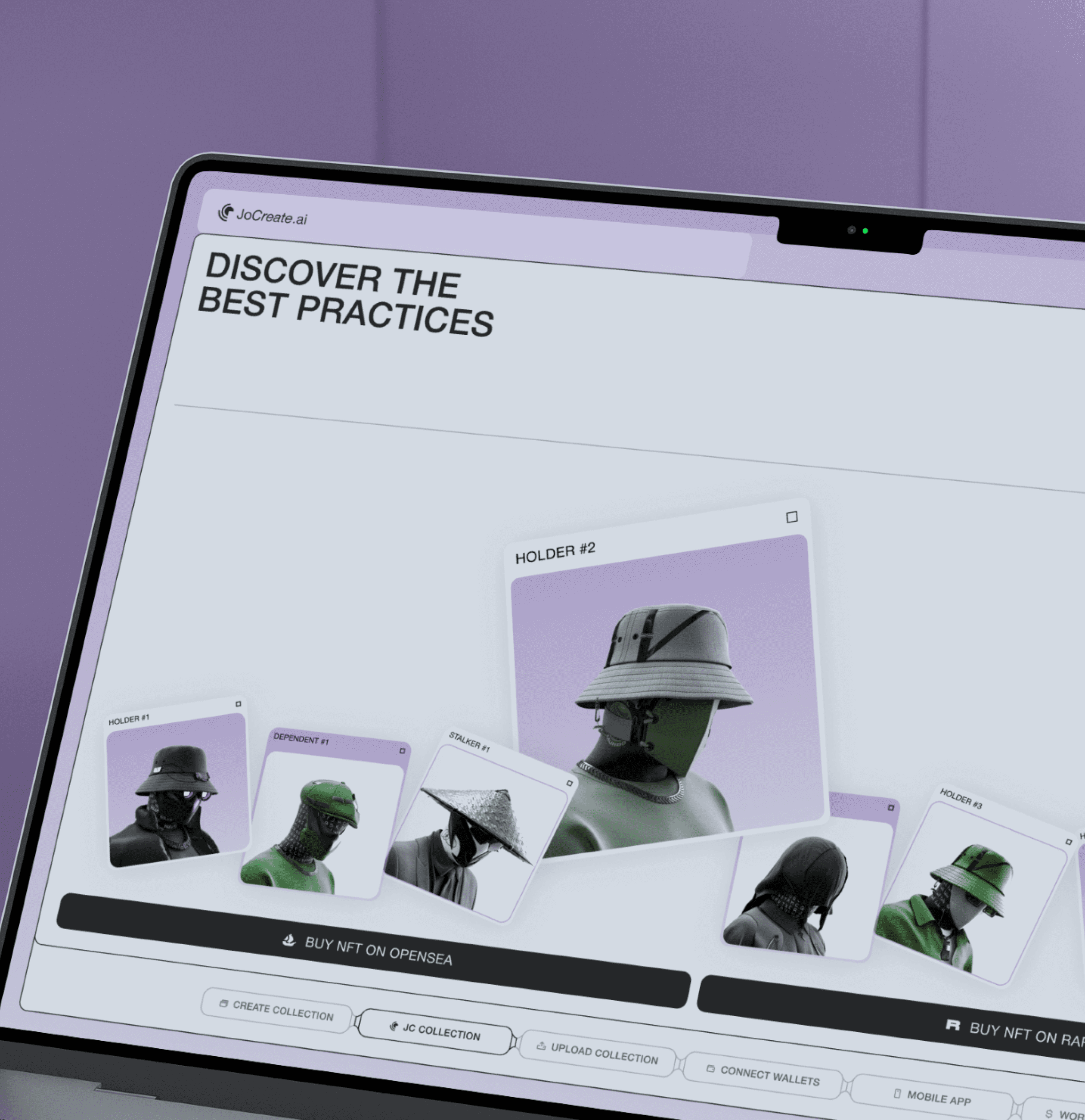
The site was crafted to efficiently show and market the JoCreate app
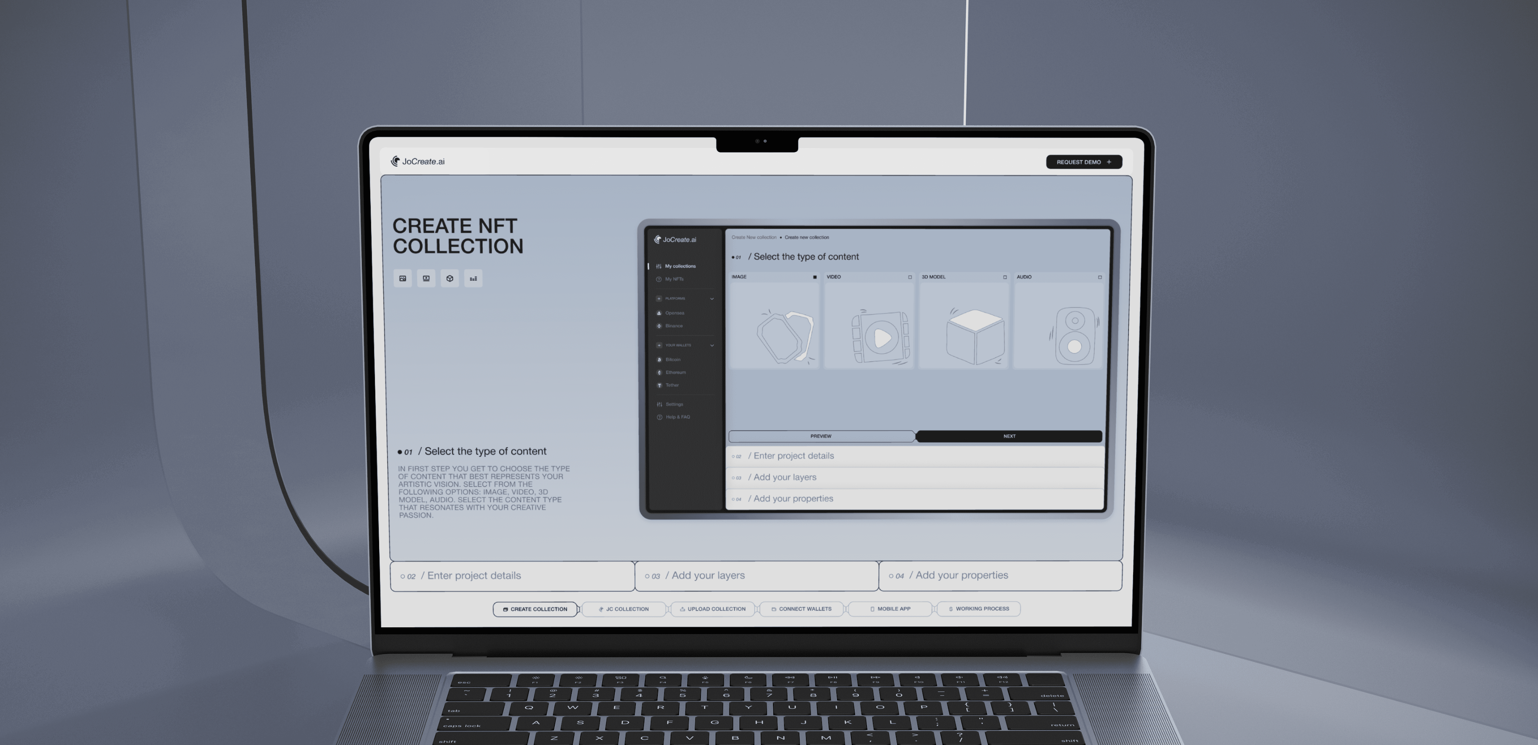
Our team dedicated efforts to build an appealing and informative promotional website that instills confidence and draws users in. We highlighted the key benefits and features of the JoCreate app, emphasized its unique selling proposition, and showcased an interactive and animated approach to displaying data in a simple yet powerful manner.
 Webflow


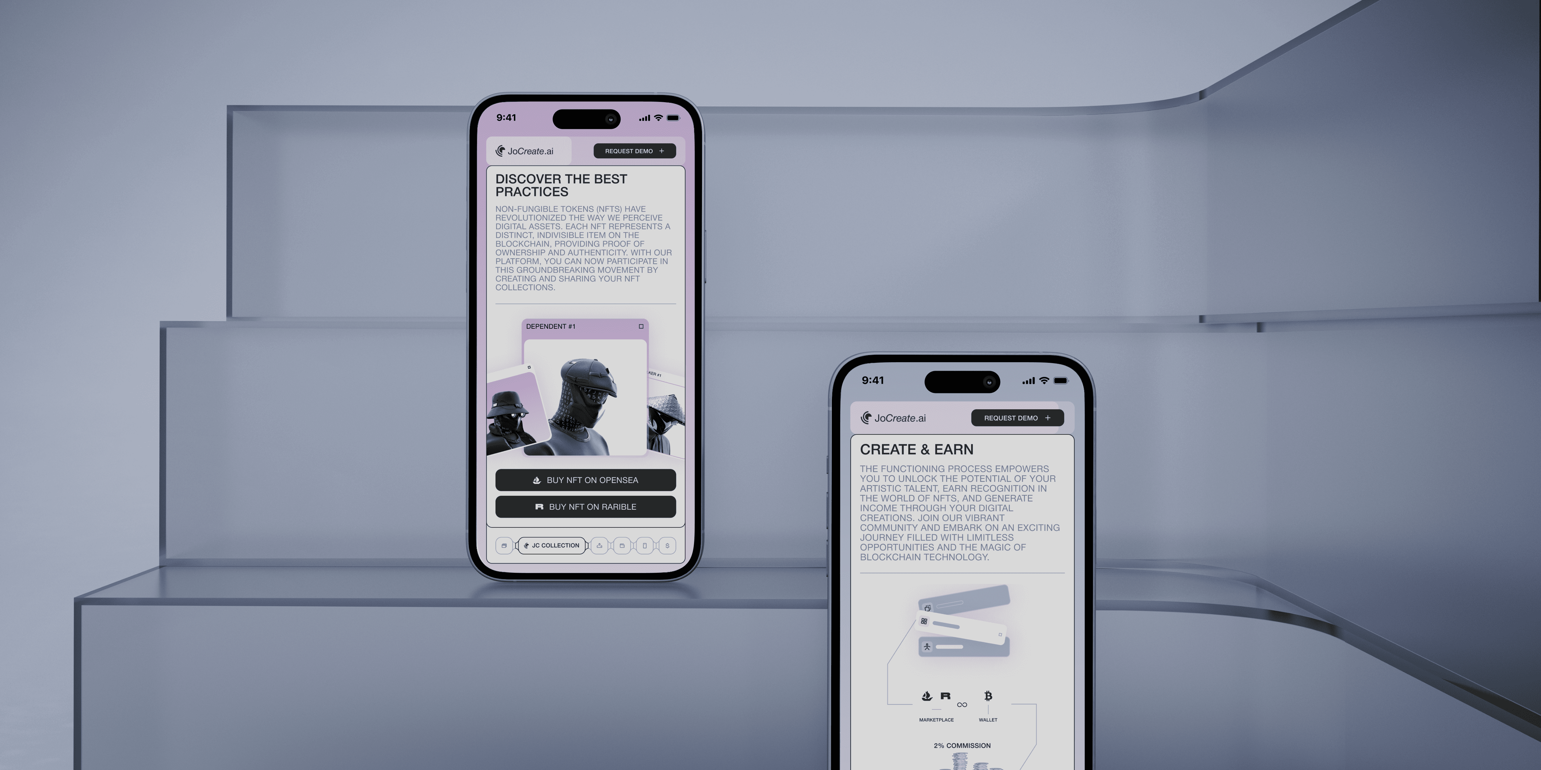
The client’s objective was to ensure the website effectively communicates the key advantages of the JoCreate app, which encompass NFT collection generation, seamless integration with popular marketplaces and crypto wallets, easy uploading of collections to the marketplace, and a user-friendly interface.
The customer wanted that the application’s information be conveyed clearly and uncomplicated, employing interactive and animated elements for effective user engagement. The visual style of the JoCreate app was to be utilized, ensuring a cohesive and harmonious visual experience throughout the promo website.
While analyzing competitors, we discovered that the functionality of their applications is often presented briefly and lacks detailed disclosure, making it challenging to understand the product's true essence and purpose.
Additionally, we recognized that users suffer from a lack of effective communication, making it challenging to grasp the core concept and value of the product.
Considering the client’s preferences and conducting market analysis, we crafted a design that effectively communicates the app’s unique selling proposition. Employing interactive elements and animations, we presented information in a straightforward and compelling manner. The outcome is an engaging and informative promo website that successfully showcases the outstanding features of the JoCreate app, raising awareness among its target audience.
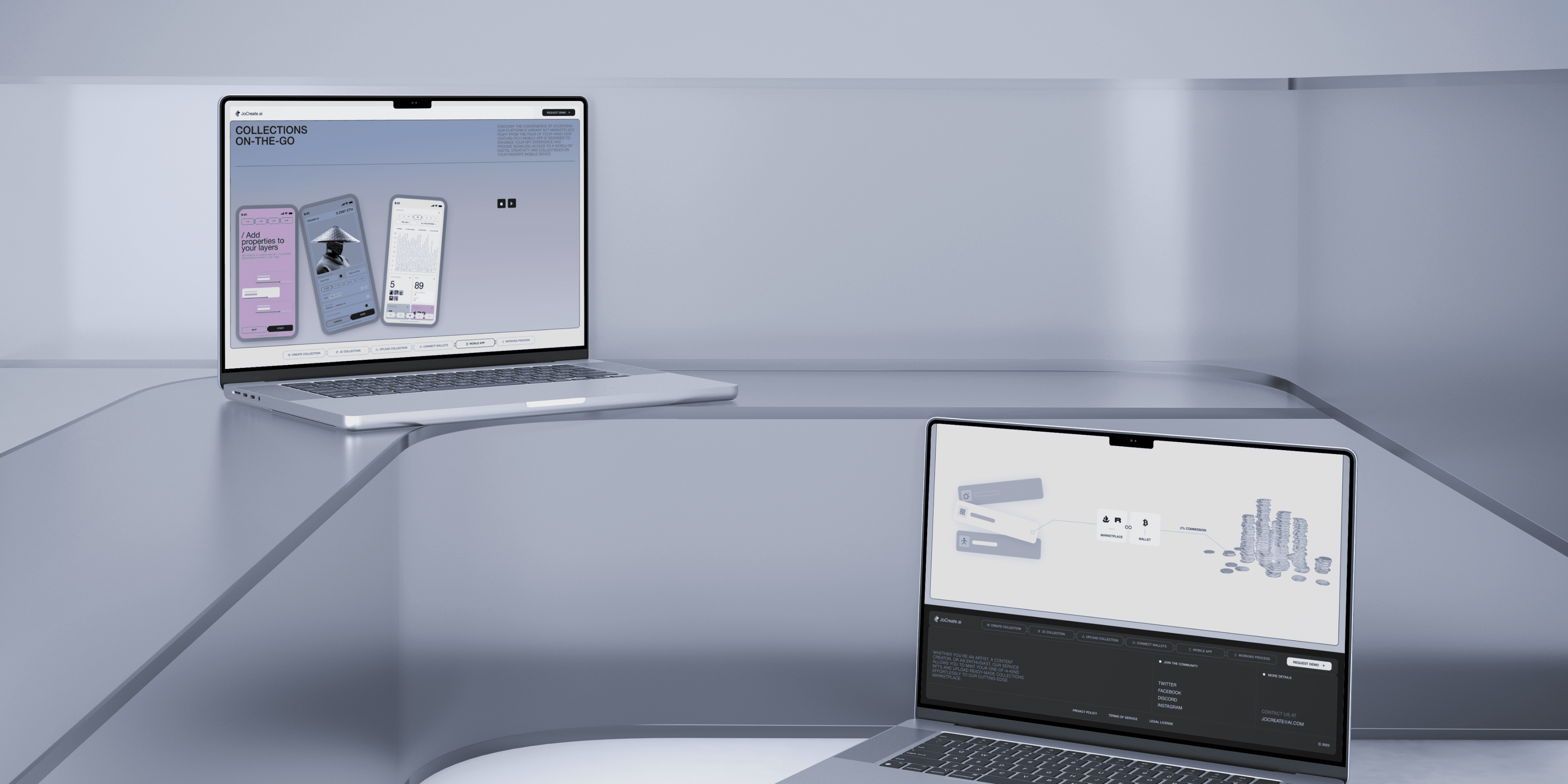
To ensure our web platform stands out as a cutting-edge solution, we conducted an extensive and thorough research process that involved analyzing our competitors.
By conducting a comprehensive research process, we gained a profound understanding of the competitive landscape and how our product could offer a unique and innovative solution in the ever-evolving world of NFT collections and marketplaces. This knowledge empowered us to build a platform that not only competes but excels in providing a seamless and rewarding experience for our users.
Competitor Analysis
Product Analysis
Mapping
The competitor analysis serves the purpose of systematically reviewing promotional websites related to web and mobile apps. It aims to identify and evaluate their strengths, weaknesses, as well as opportunities and threats in the marketplace. Special focus is placed on how apps showcase their functionality, unique selling proposition, and overall positioning in the market.
Through competitor analysis, we pinpointed opportunities to distinguish ourselves and effectively showcase our distinctiveness and capabilities to potential customers.
During our research, we deliberately chose the most exceptional promotional websites, not limiting ourselves to those of similar apps. Our decision was influenced by the distinctive functionality of our app, as we aimed to comprehend how competitors showcase their products, highlight their benefits and functionalities, and position themselves within the market.
By adopting this approach, we were able to pinpoint several crucial factors:
Overall, the analysis of competitors played a pivotal role in guiding our platform’s development and growth. It empowered us to refine our strategies, improve user experience, and leverage our unique strengths to establish a strong presence in the competitive world of NFT collection generators.
In showcasing the JoCreate app and its functionalities, we placed a significant emphasis on comprehensively presenting its features and capabilities on the promotional website. Working closely with our design team, who had a profound understanding of the application, we delved deeper into the product to create the most effective promotional website possible.
This involved showcasing all key functions, including creating NFT collections, smooth integration with well-known marketplaces and crypto wallets, and effortless uploading of collections to the marketplace.
During the website design process, we meticulously incorporated these functional aspects to provide users with a comprehensive understanding of the application’s features and benefits. Our strategic approach focused on visually highlighting the importance of these features, making them easily comprehensible and appealing to users.
The outcome is a website design that effectively conveys the functionality of the JoCreate app in an intuitive manner. Our goal was to craft an appealing and user-friendly interface, enabling users to swiftly grasp the application’s advantages and features, and encouraging them to actively engage in creating NFT collections.
We’ll secure your success by integrating the best industry experts and incredible skills. Your dream is in the right hands.
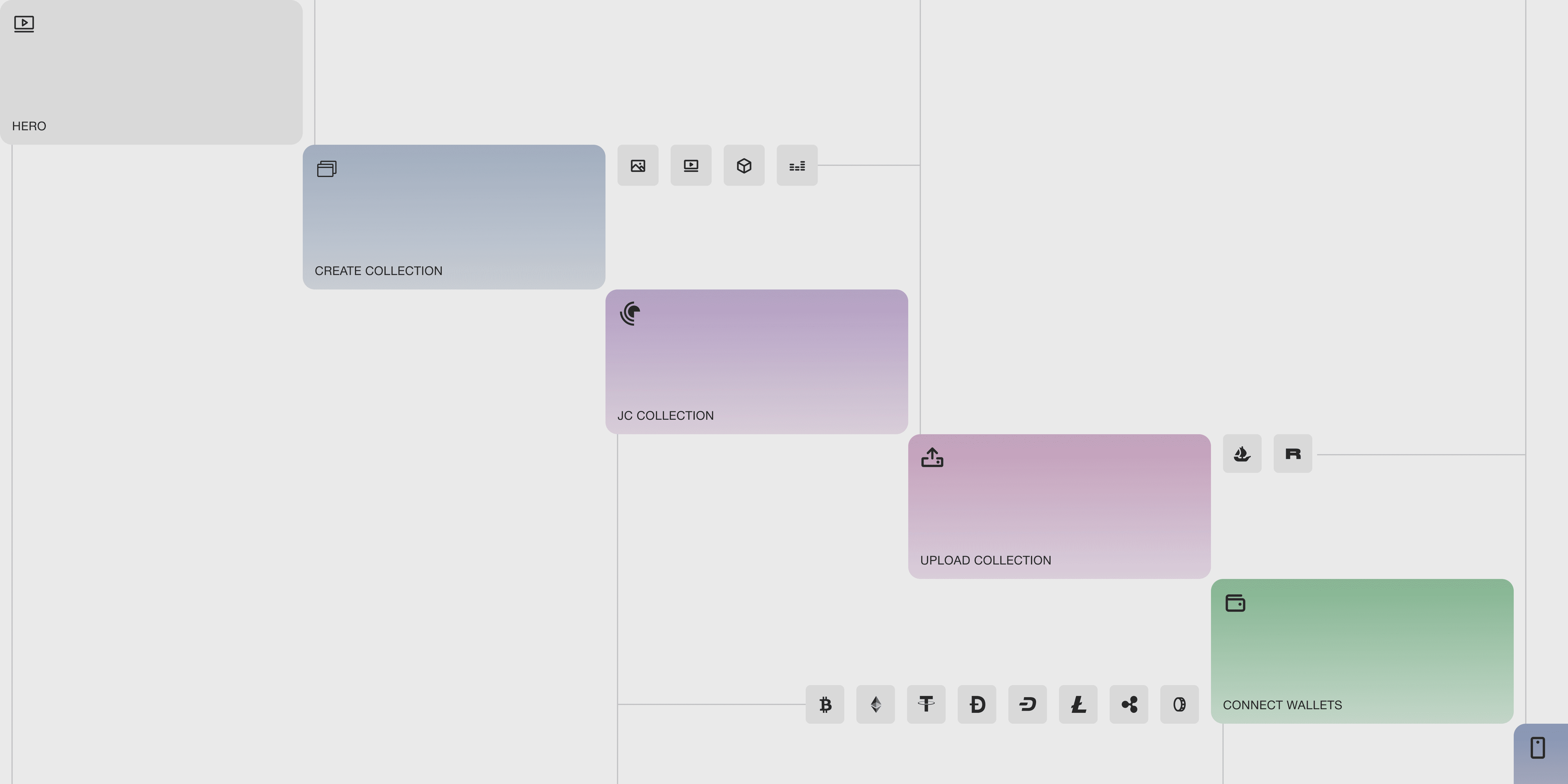
Designing the landing page structure was an important phase of the project, necessitating a comprehensive examination of the app’s functionalities, prevailing market trends, and competitor presentation approaches. Our team meticulously considered various factors, including users’ objectives and expectations, to construct an optimal structure that proficiently conveys the value and advantages of the JoCreate app.
During the BA, we explained to the client the characteristics of the solutions we collected, outlining their benefits and risks.
Consequently, we crafted the page structure to ensure that each block held significant information and value for users. Our primary focus was on creating an informative, visually appealing, and user-friendly site, where users could readily access all the essential details about the JoCreate app, empowering them to make well-informed decisions about its utilization.
After laying a robust analytical foundation, the next phase of designing the JoCreate promo site involves crafting a user-friendly interface. This encompasses designing the interface layout, strategically placing each element, developing an animation storyboard, and defining the interaction for every block.
Wireframes
Moodboard & Design Concept
UI Design
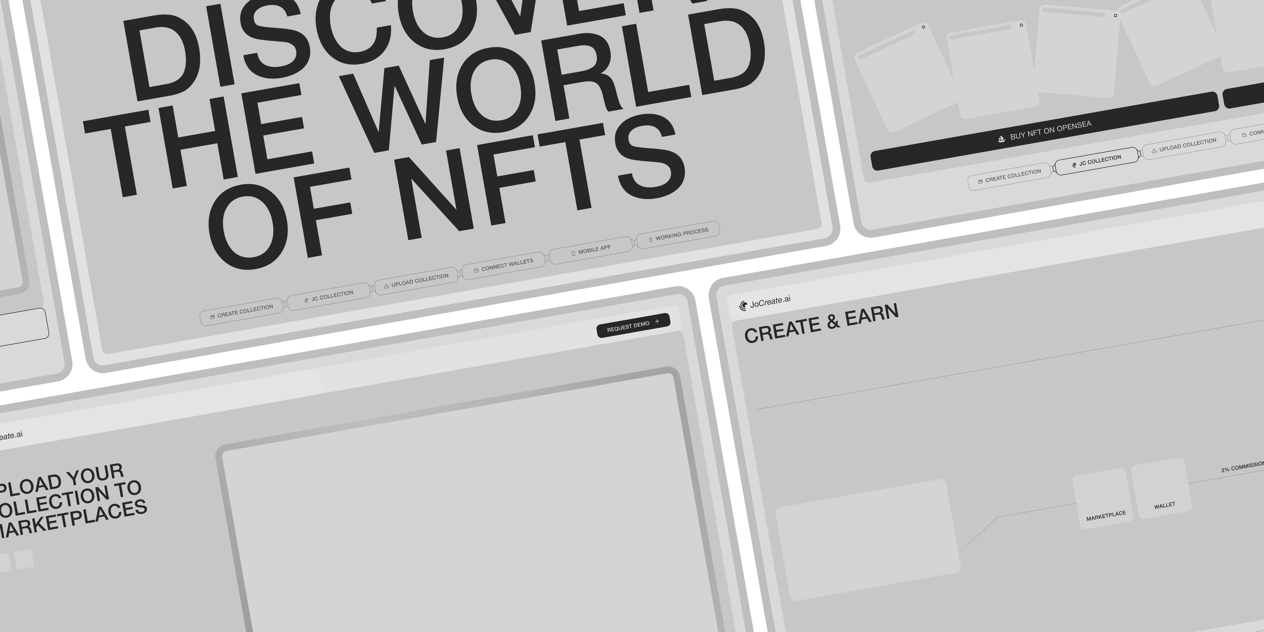
Wireframes play a vital role in the product design process as they offer an initial blueprint of the product’s layout and functionality. The primary objective of wireframes is to provide a foundational understanding of the product’s functioning without delving into intricate details and stylization.
Utilizing wireframes enabled us to concentrate on effectively conveying crucial information without overwhelming the interface. It also allowed us to refine all interactive and animated elements, ensuring a seamless and engaging user experience.
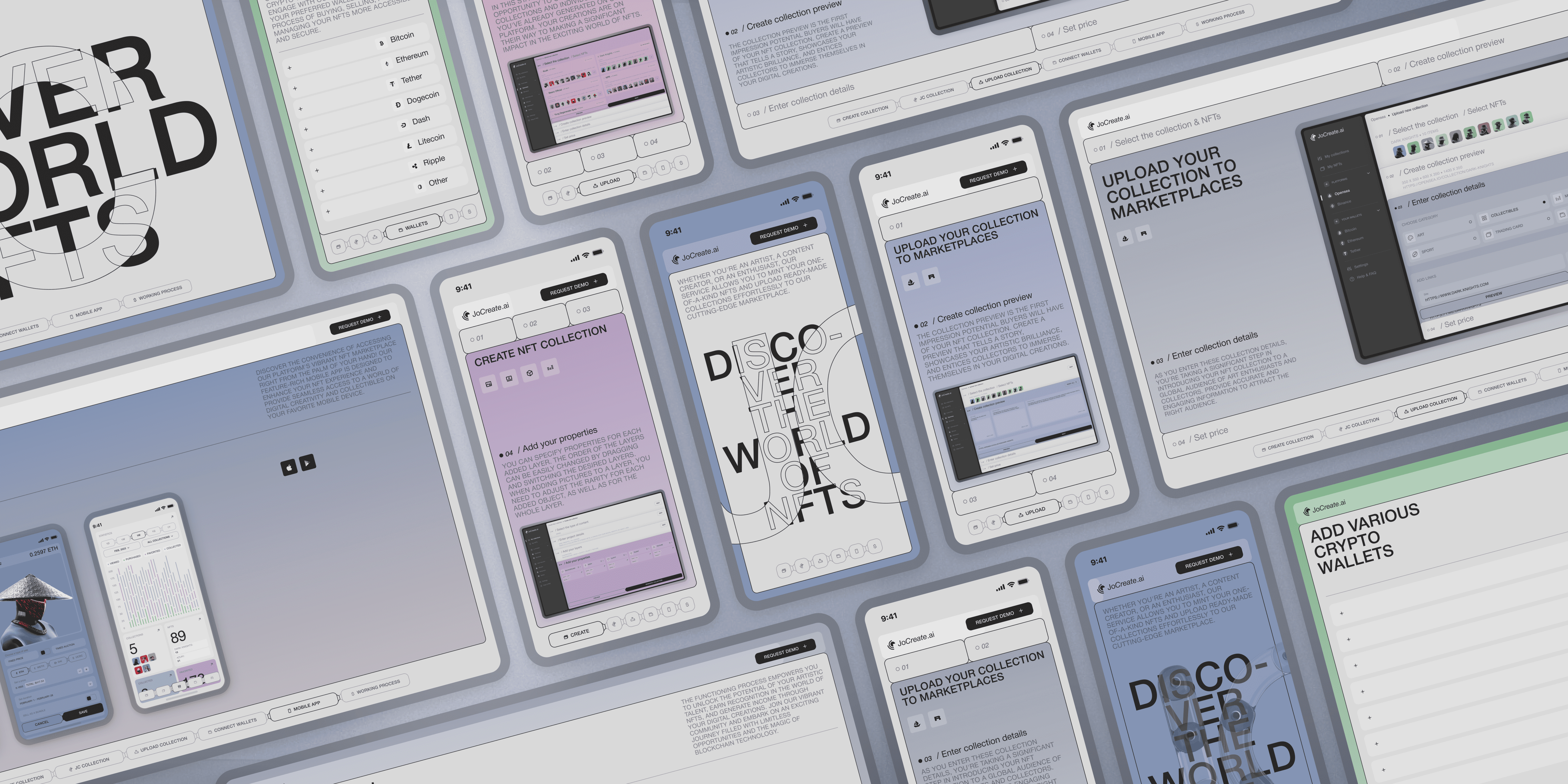
Drawing inspiration from the JoCreate app, we crafted a visual style that established a cohesive and consistent impression between the website and the app. We seamlessly adapted interface elements, color schemes, and symbolism to suit the web format, ensuring a harmonious integration.
The outcome was a visual style that accurately reflected the essence of the JoCreate app, imparting a unified and appealing appearance to the promotional website.
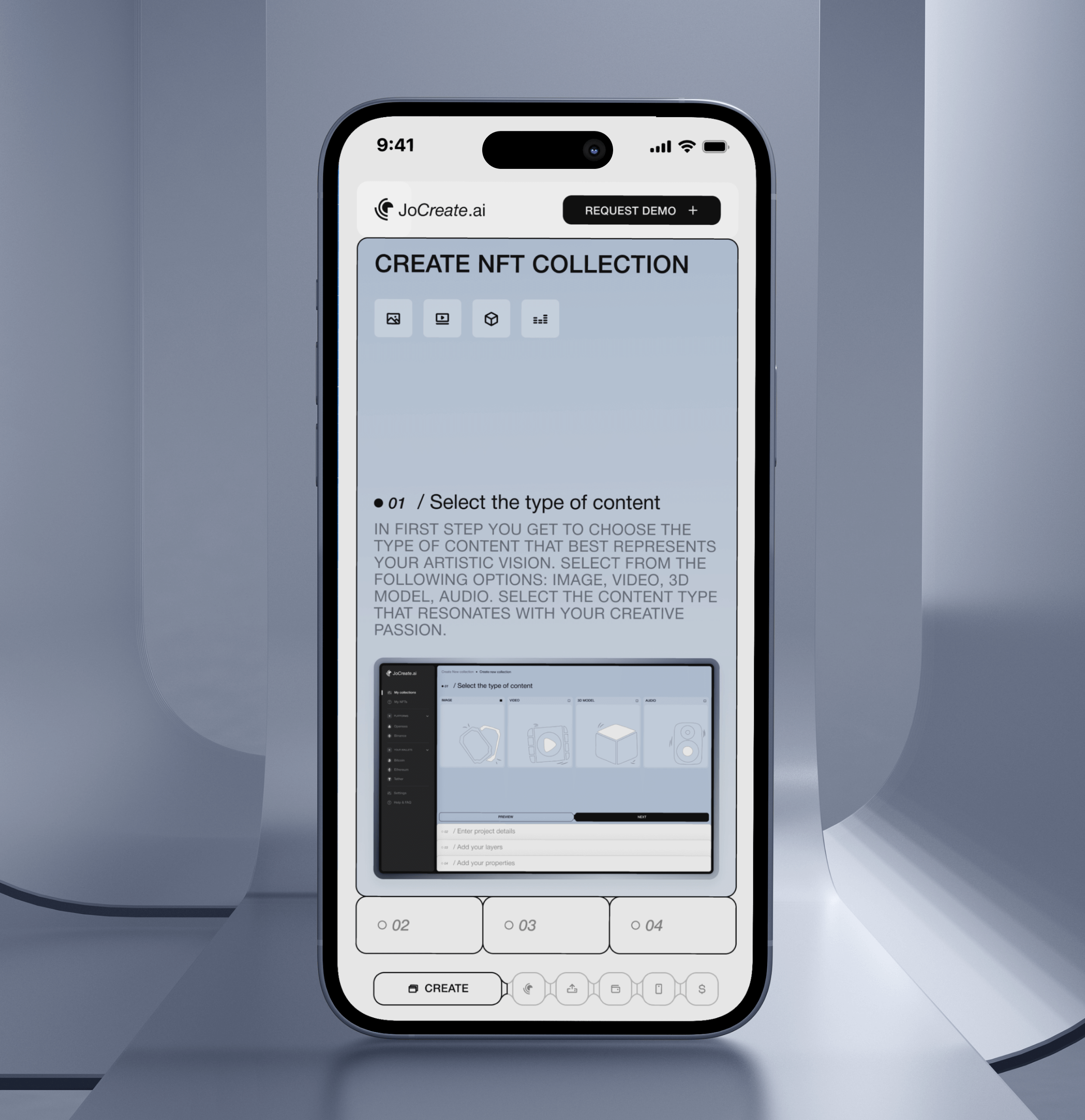
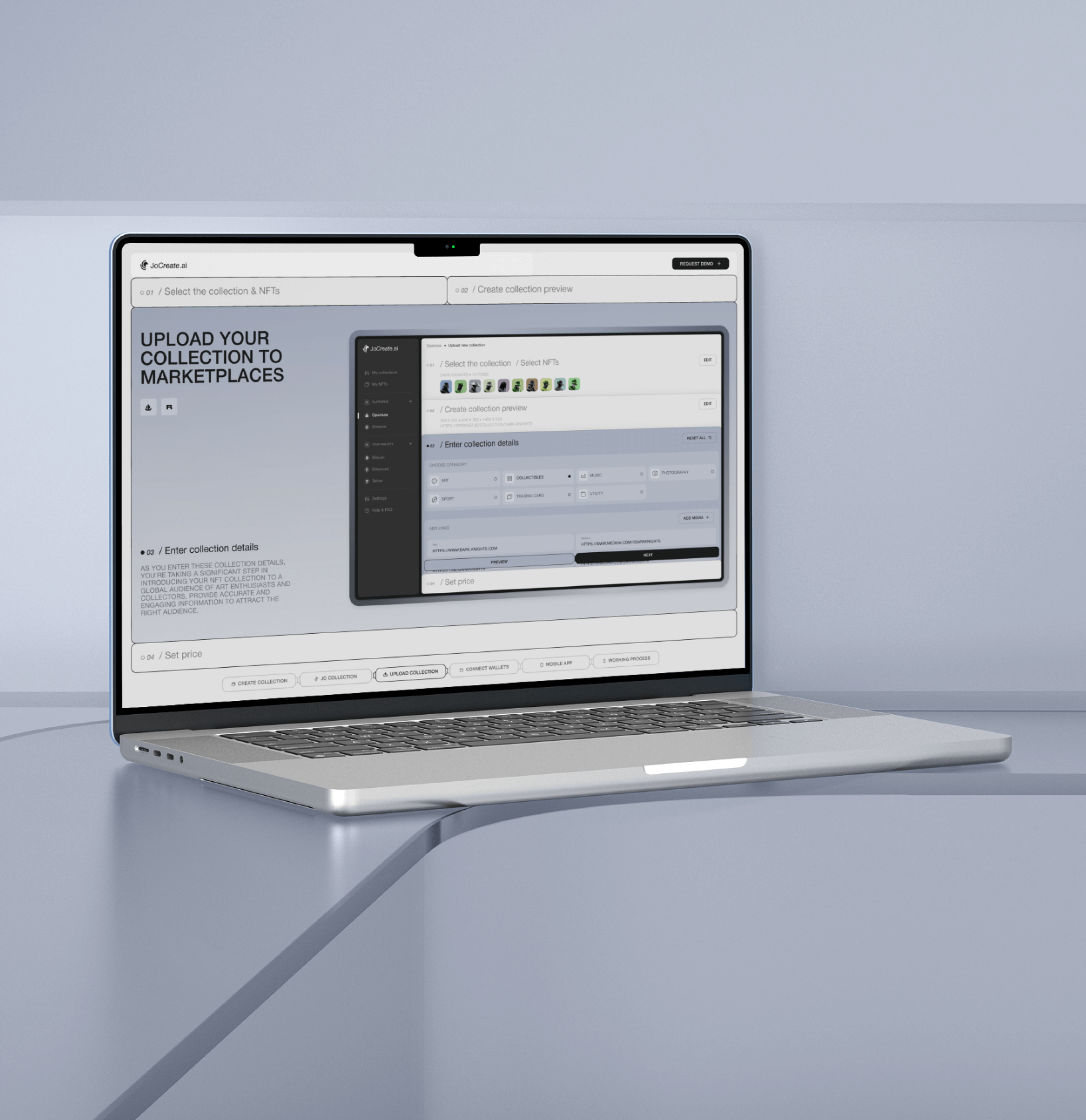
In developing the user interface (UI) for JoCreate, we set out to accomplish several crucial objectives:
Through our diligent efforts, we have successfully achieved a well-balanced and visually appealing user interface that harmoniously blends user-friendliness, modern design, and adaptability. This amalgamation ensures an exceptional user experience, catering to the diverse needs of our valued users.
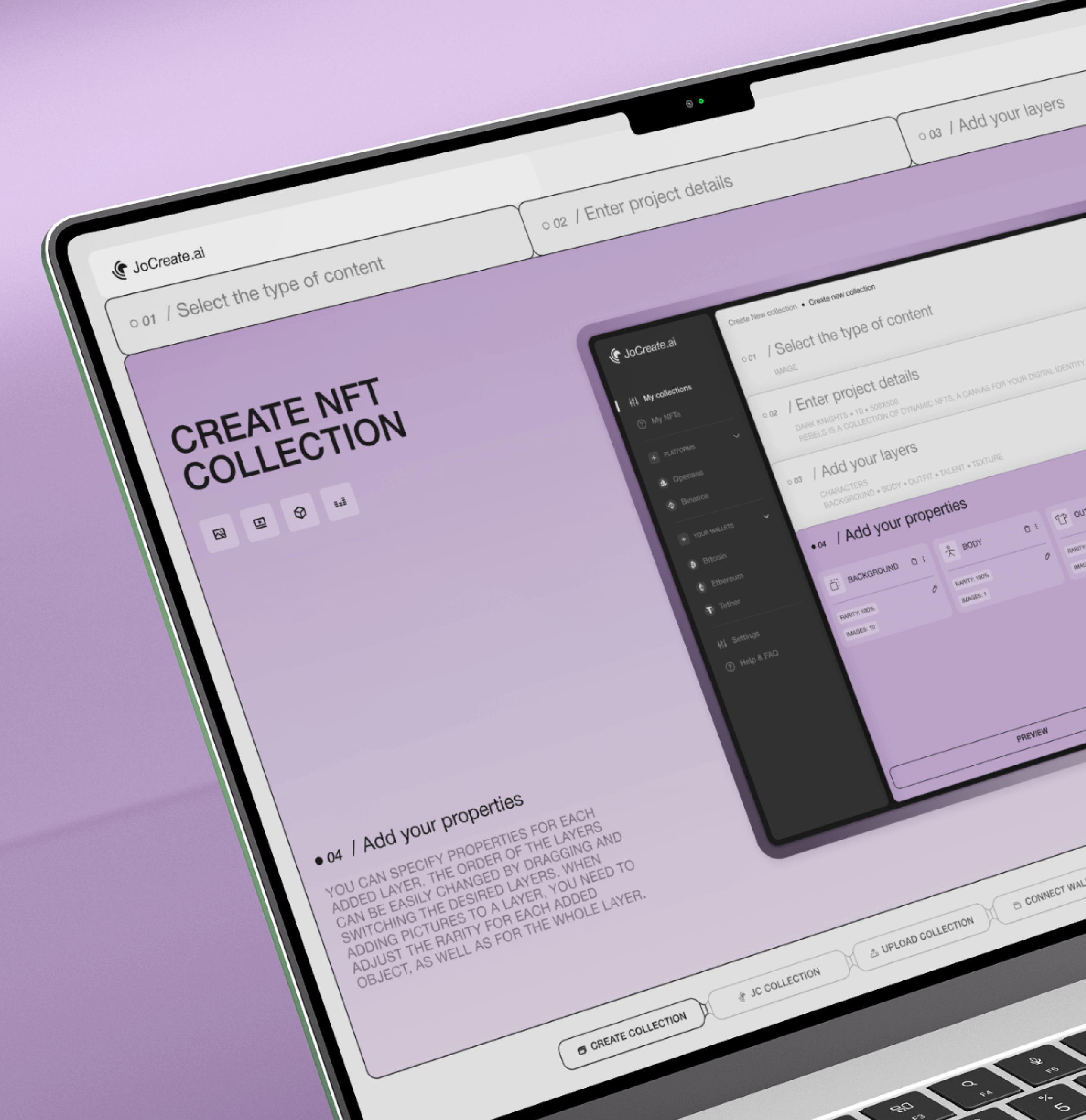
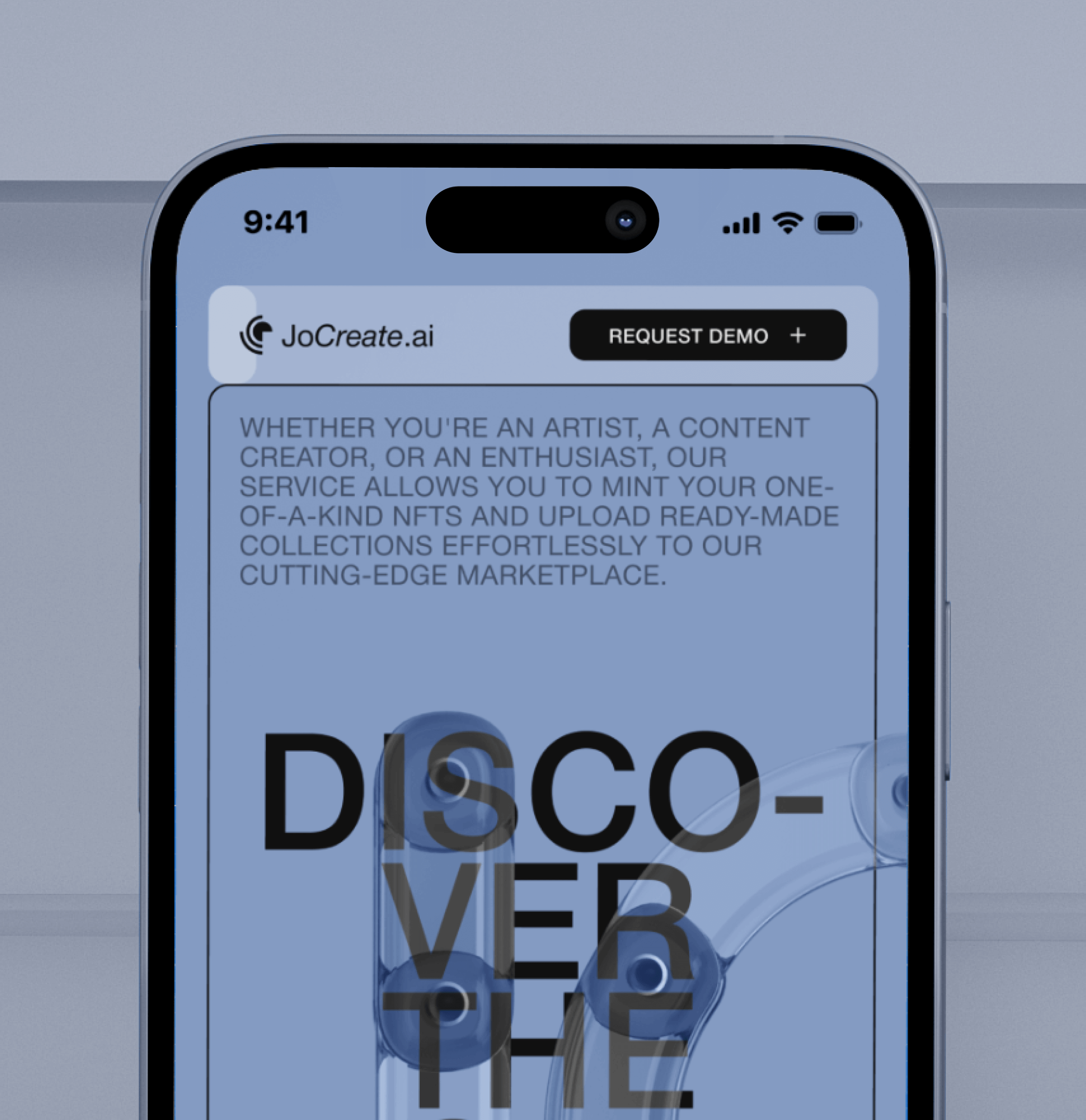
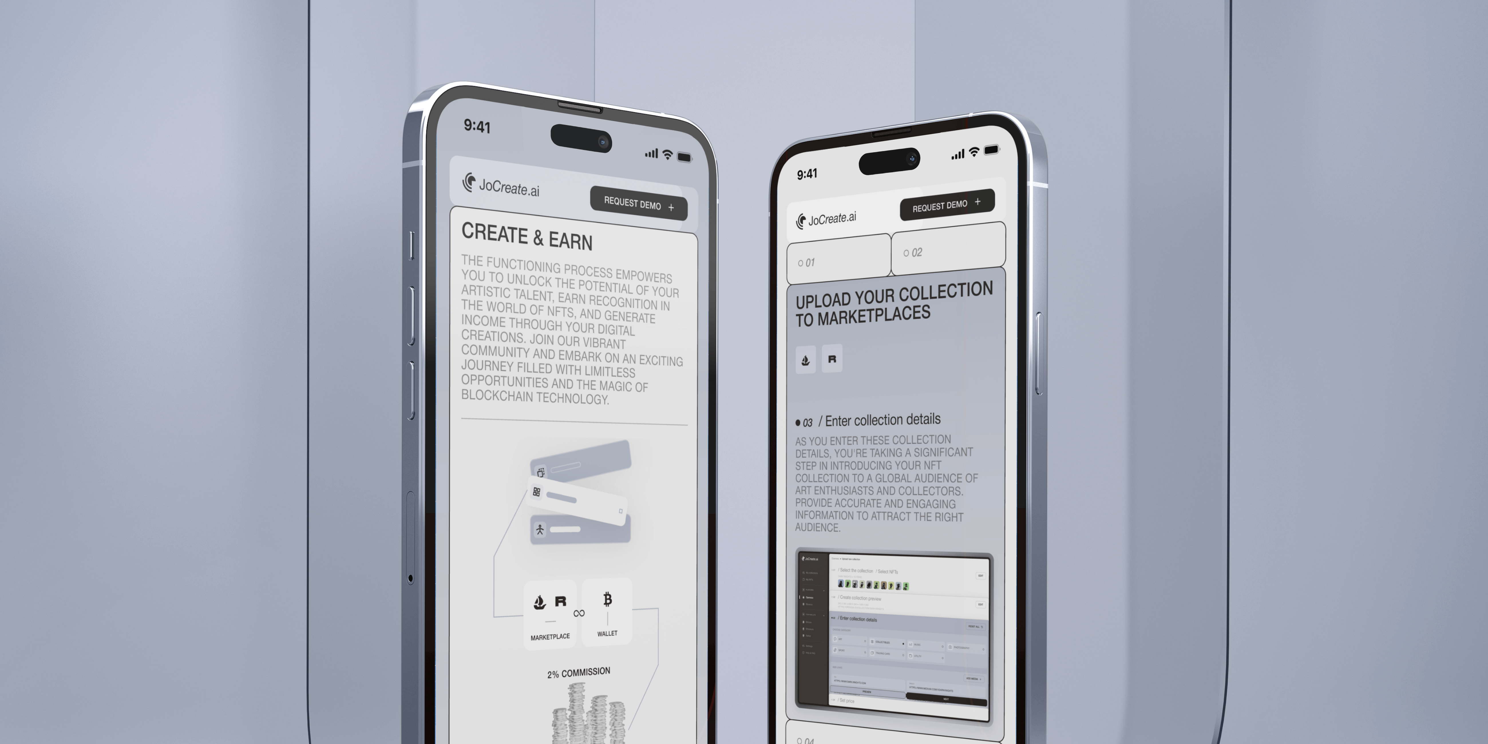
The results of our meticulously crafted promo site have been outstanding and transformative. By implementing an intuitive and informative user interface, we effectively communicated the app’s functionalities, benefits, and unique selling proposition. As a result, our user engagement witnessed a substantial increase, drawing in a broader audience of enthusiasts and creators alike.
The cohesive visual style, adapted from the application itself, instilled a sense of familiarity and trust among our visitors, strengthening the brand identity and fostering lasting connections. With an emphasis on clear and concise information presentation, users found it effortless to comprehend the app’s potential and how it can elevate their creative endeavors in the world of NFTs.
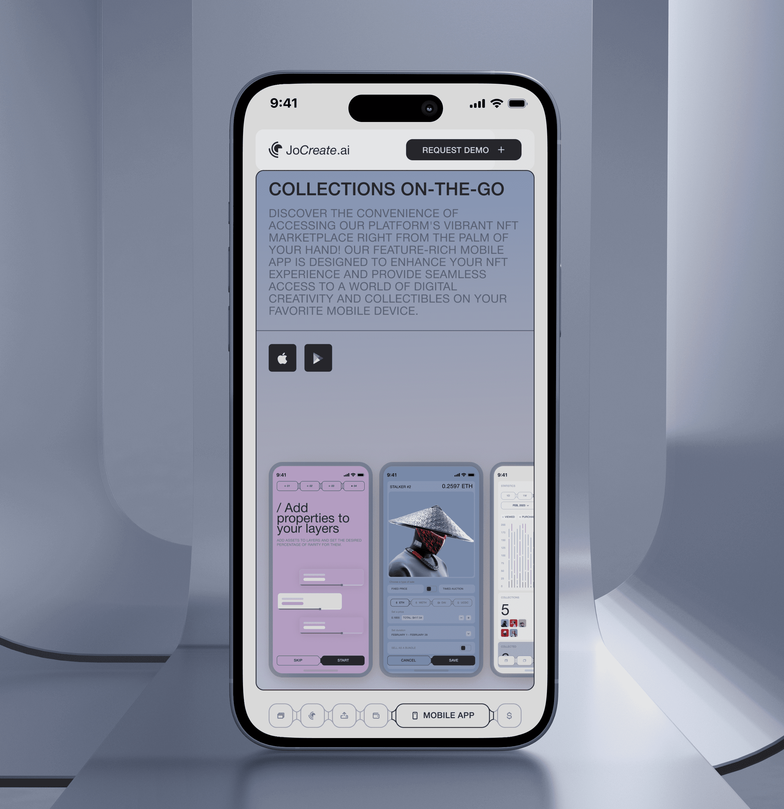
Moreover, the fully adaptive design allowed seamless access from various devices, expanding our reach and ensuring accessibility to users on the go. This adaptability also translated to increased conversion rates, as users could readily participate in NFT collections from their preferred devices.
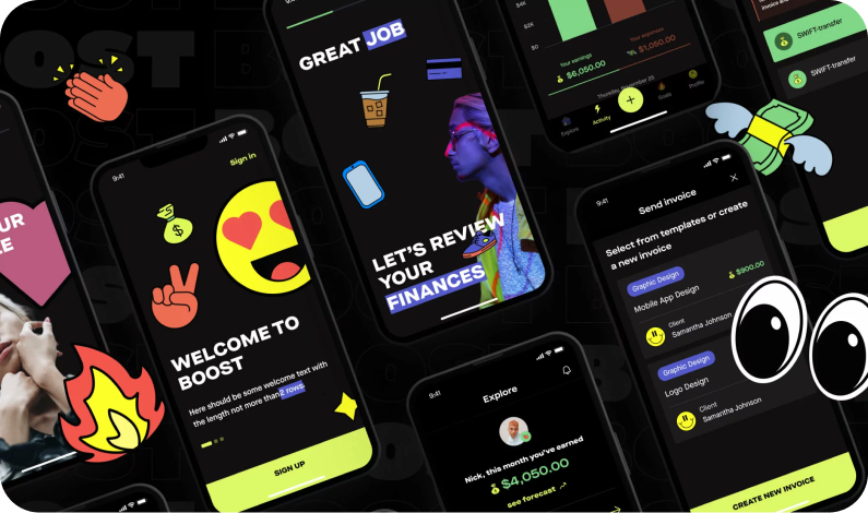
Boost is a money management tool for Side Hustlers
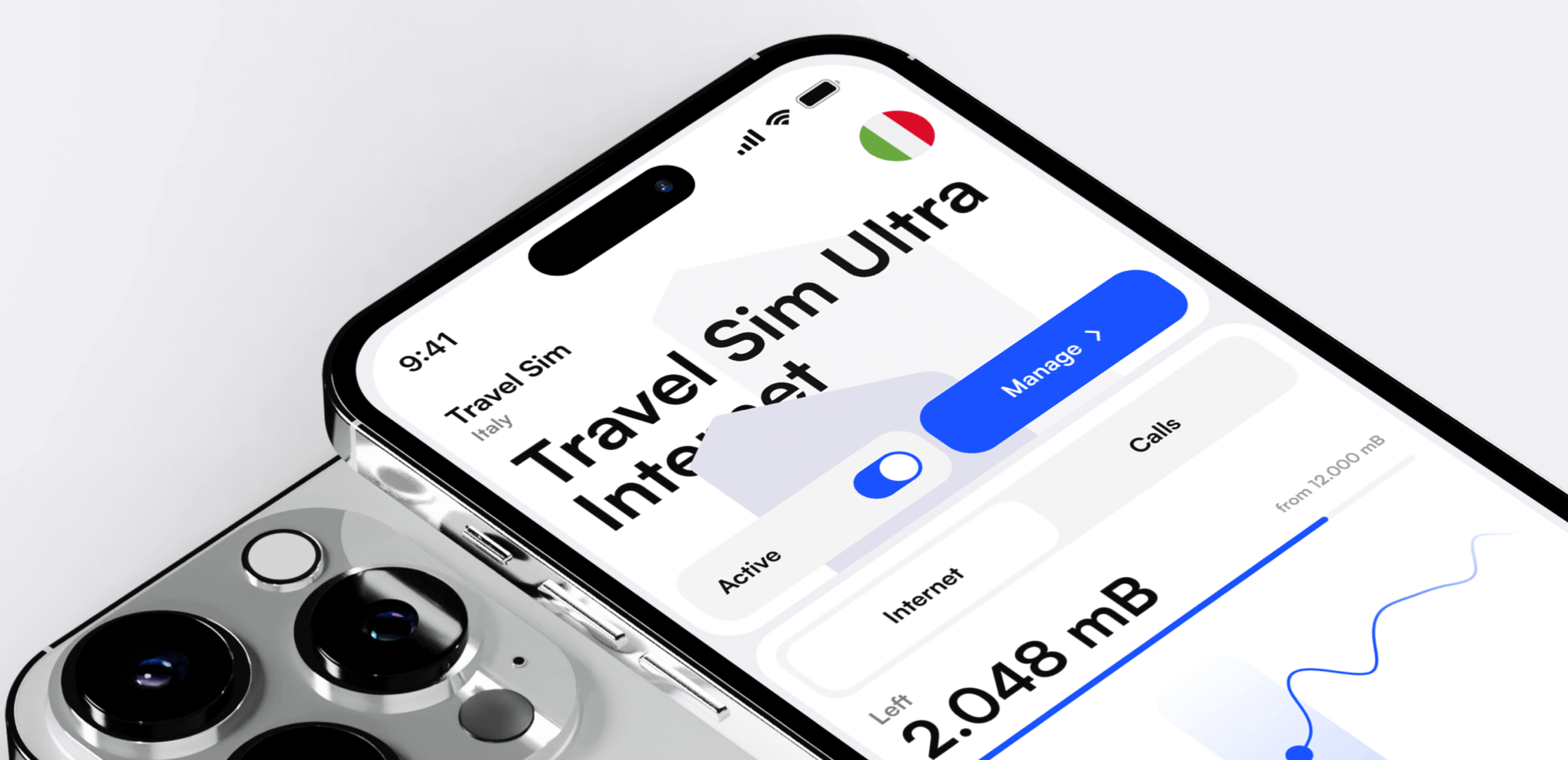
E-manager is a mobile application for managing and controlling e-Sim cards for travelers.


We appreciate your interest in our product design services and will get back to you as soon as possible.
To improve our services, please tell us where you heard about us by selecting an option:

