We appreciate your interest in our product design services and will get back to you as soon as possible.
To improve our services, please tell us where you heard about us by selecting an option:
Don’t worry, you’re in the right place. We’re just making new looks for our pages
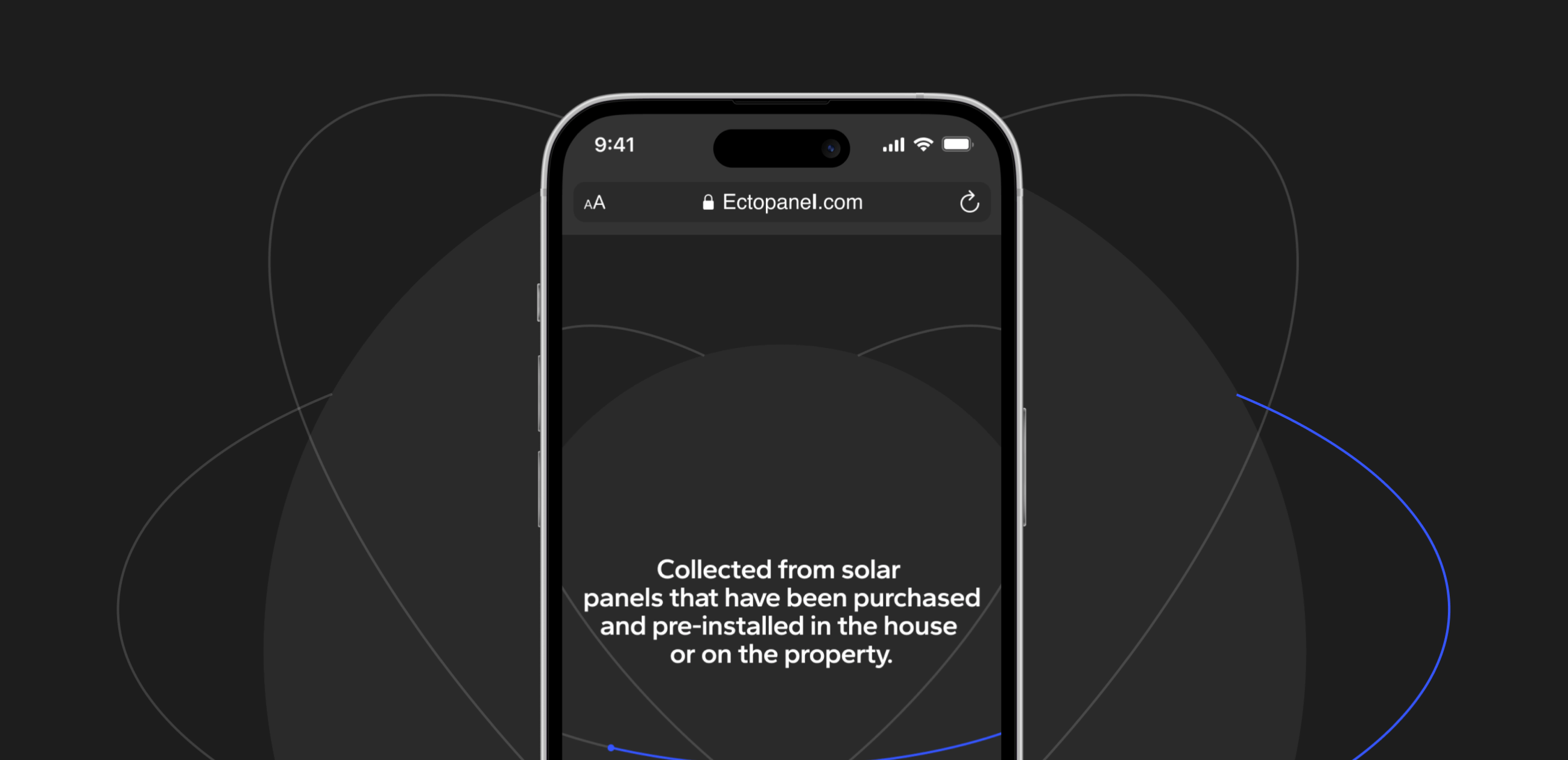
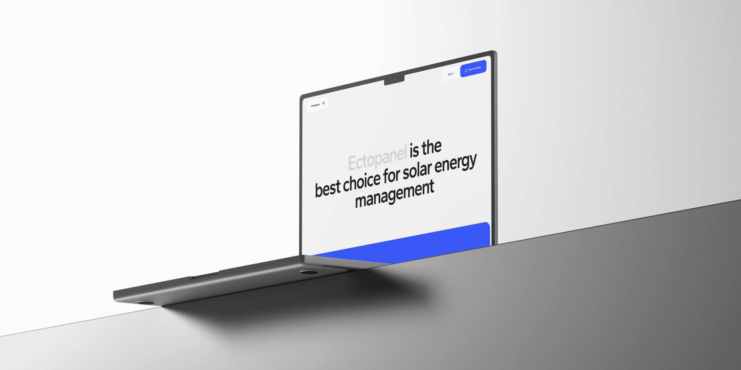
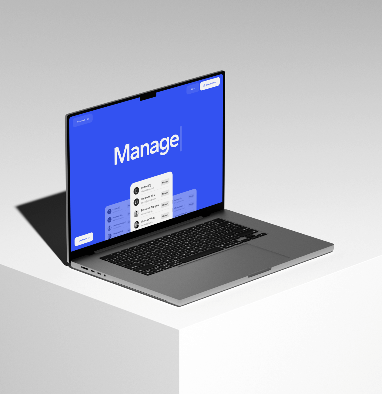
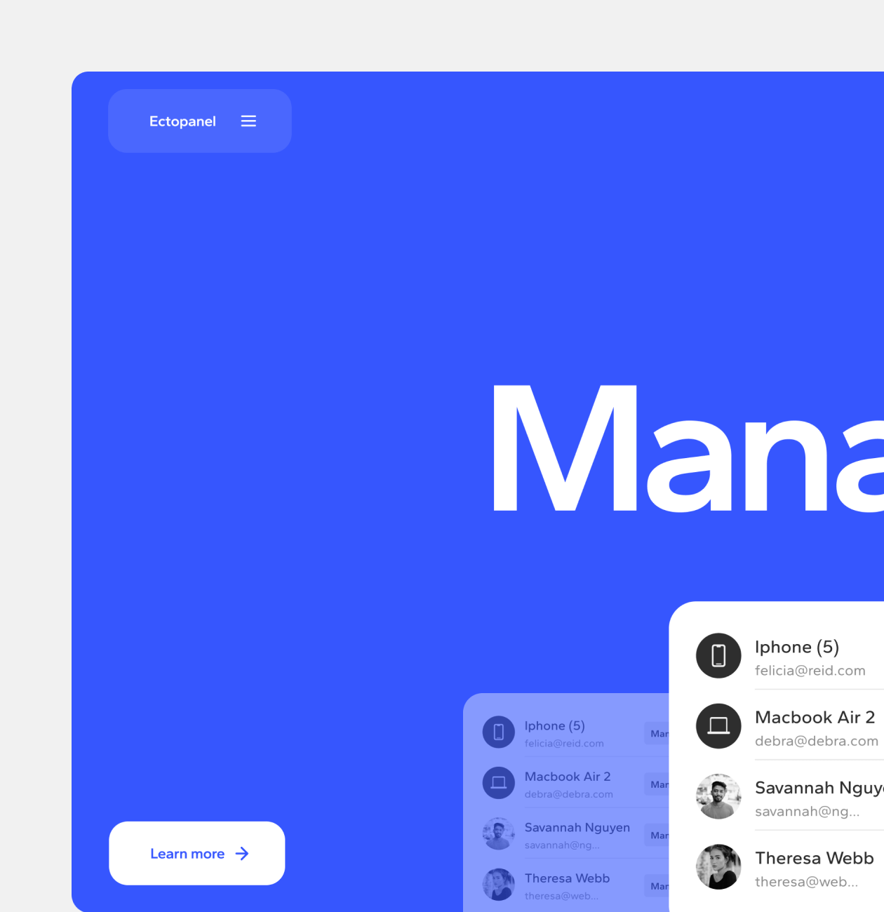
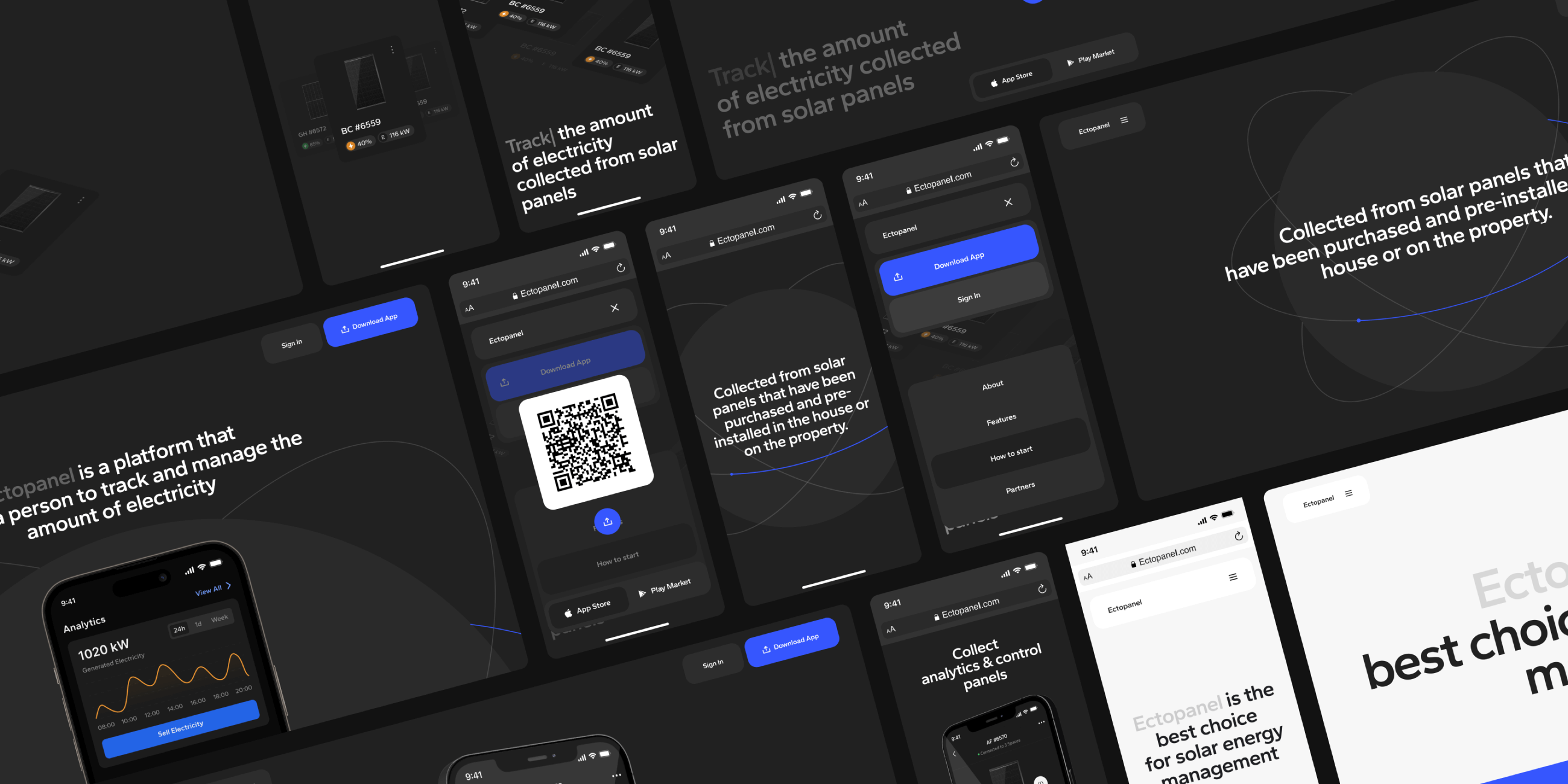
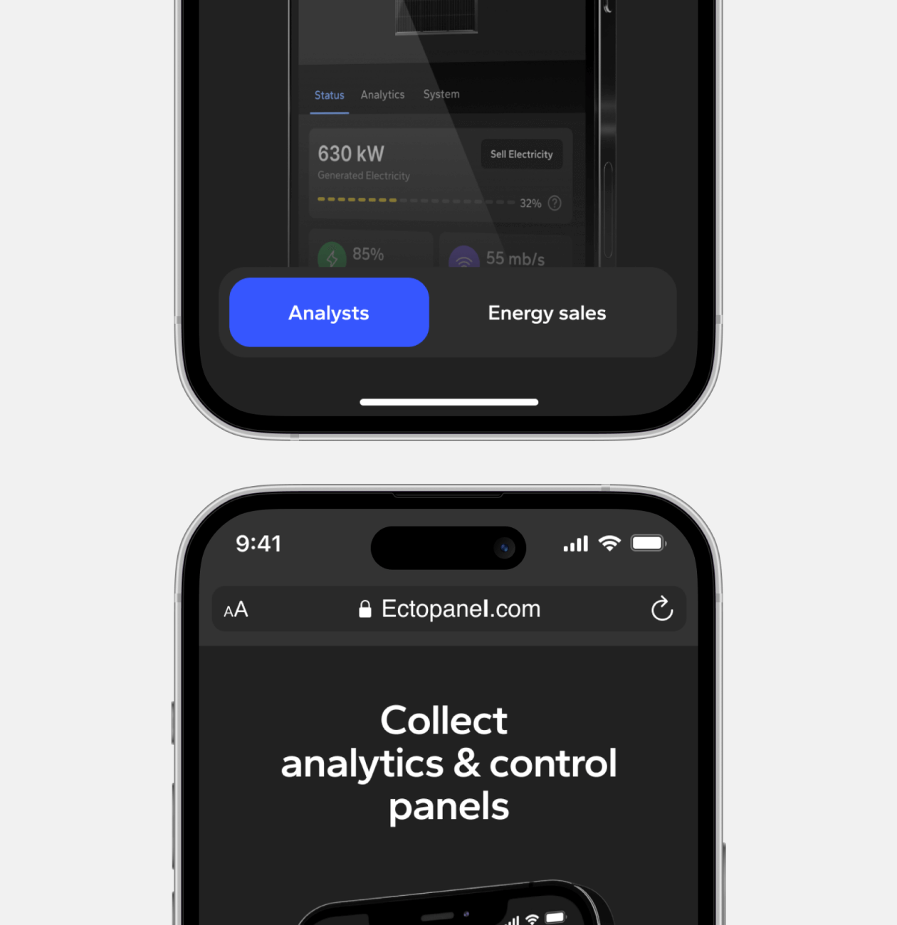
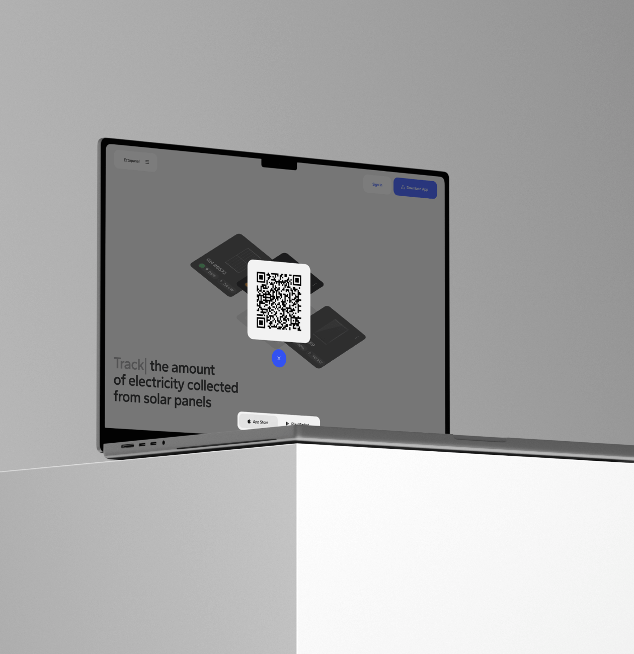
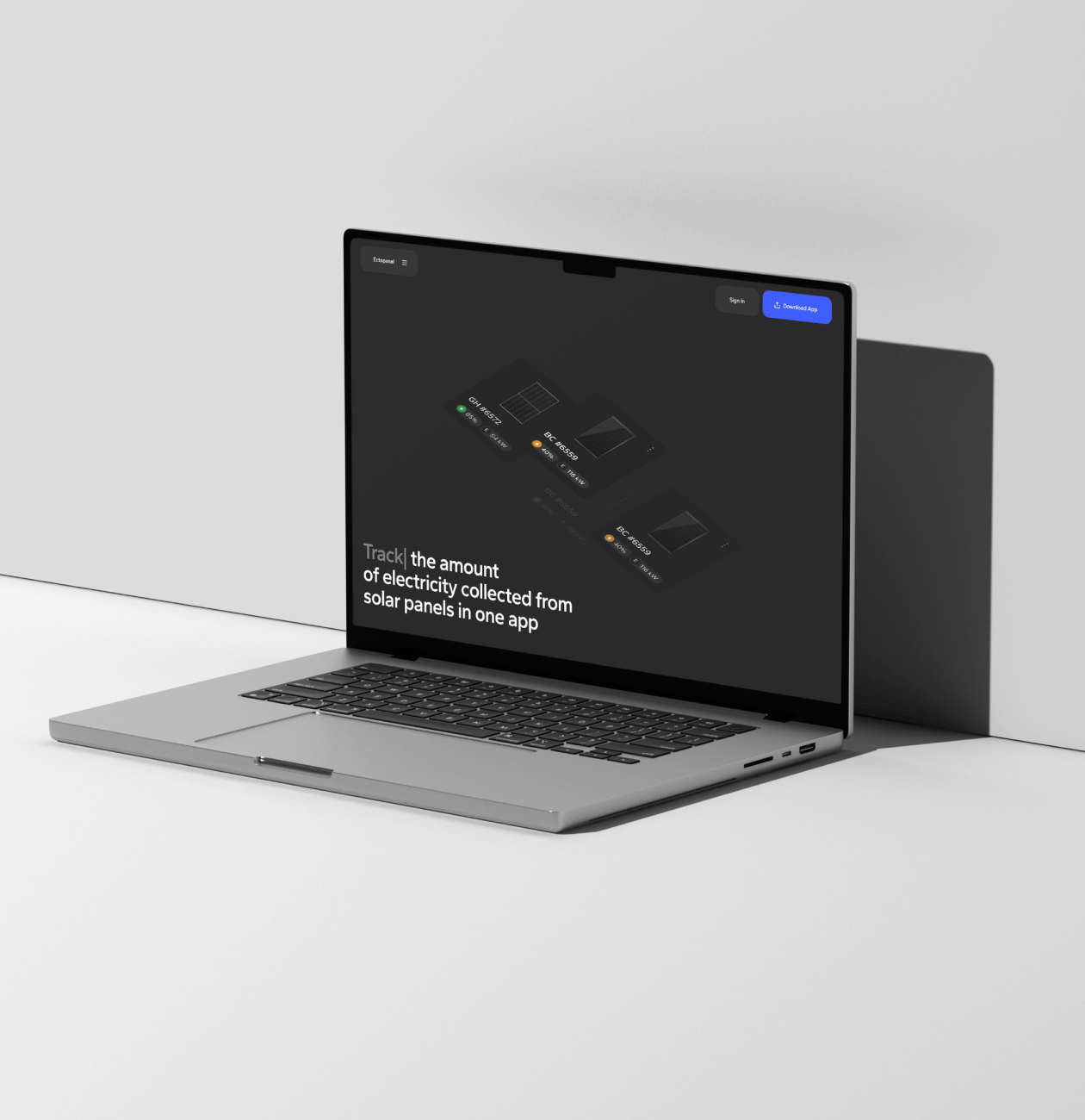
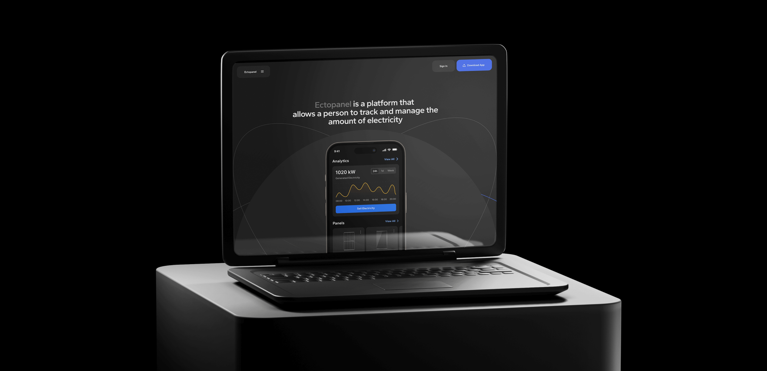
The site was designed to effectively present and promote the Ectopanel application
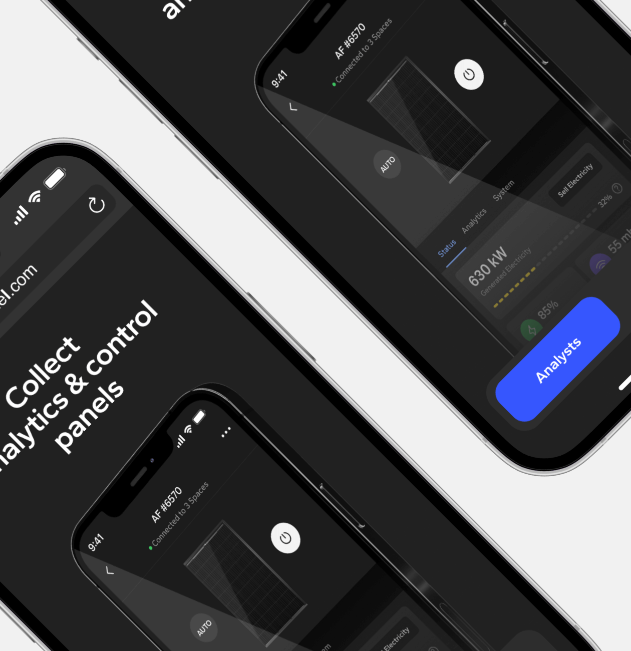
Our team focused on creating an attractive and informative promo site that inspires trust and attracts users. We presented the main advantages and features of the Ectopanel app, highlighted its unique selling proposition, and demonstrated a simple and effective way to display data through interactive and animated elements.
The client wanted the site to clearly present the main benefits of the Ectopanel app, such as electricity tracking and management, surplus energy sales, and a user-friendly interface.
The customer expressed his desire for the information about the application to be presented in a simple and clear way, using interactive and animated elements to ensure effective communication with users, use the visual style of the Ectopanel app itself and adapt it to create a unified and consistent visual experience on the promo site.
During the analysis of competitors, we found that the functionality of applications are often shown very briefly and do not disclose it, because of this it is not always clear what is the product in the end.
Also during the analysis of competitors, we realized that competitors use a lot of text to talk about what or product information, in the end, most users simply do not read this information or can not find the information they need.
We took into account the client’s wishes, analyzed the market and developed a design that communicates its unique selling proposition.
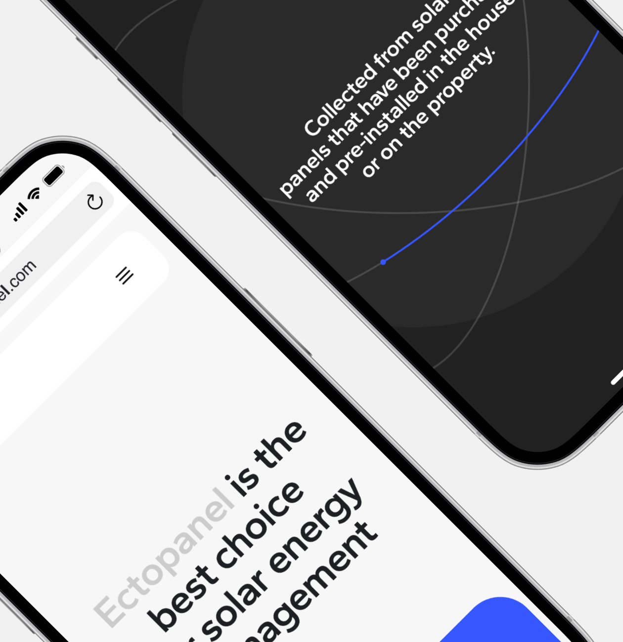
We used interactive elements and animation to present the information in a simple and effective way. The visual style of the Ectopanel app was adapted to the web format, and we created both dark and light versions of the site.
The result of our work is an attractive and informative promotional website that helps raise awareness of the Ectopanel app’s features.
During the study, we conducted a competitor analysis and customer briefing to determine the main and side goals of the project, and we also keep in mind application features.
All phases of research allowed us to design the structure of the site as well as the functionality of individual blocks in such a way as to reveal the important aspects of the application in the best way and convince the user that this is the best and most unique offer on the market.
Competitor Analysis
Product analysis
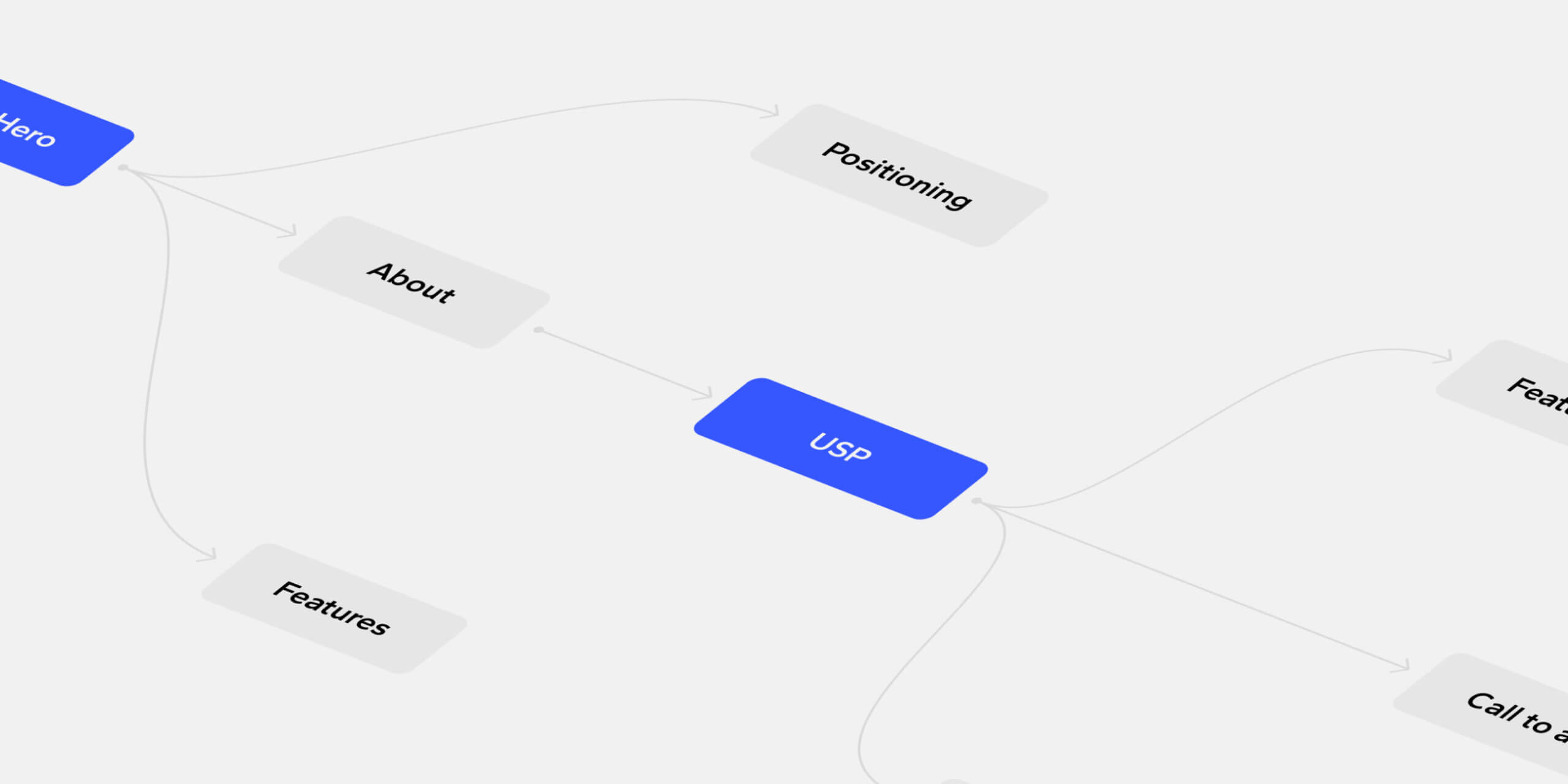
Mapping
The purpose of conducting a competitor analysis is to systematically examine web and mobile app-related promotional websites in order to identify and assess their strengths and weaknesses, as well as to evaluate opportunities and threats in the marketplace. Particular attention is paid to the ways in which apps demonstrate functionality, their unique selling proposition and their overall positioning in the marketplace.
Competitor analysis allowed us to identify areas where we can stand out and effectively demonstrate our uniqueness and capabilities to potential customers. The research allowed us to capture the easiest and most convenient ways to present information that will effectively communicate our unique selling proposition and demonstrate the benefits of our app.
In our research, we consciously selected the best promotional sites rather than just sites belonging to similar apps. Our decision was driven by the unique functionality of our app, and we sought to understand how competitors present their products, their benefits and functionality, and how they are positioned in the market.
This approach allowed us to identify several important factors:
The competitor analysis was a valuable source of information that helped us better understand our product presentation approaches and adapt our web design strategy to effectively communicate our unique selling proposition and maximize user engagement.
In the presentation of the Ectopanel app and its functionality, we paid special attention to fully present its features and functions on the advertising website. We coordinated with our design team who designed this application to go deeper into the product and make the promotional website in the best possible way, showing all the key functions that the application provides, such as tracking and management of collected electricity, power production analytics, power and angle control of panels, and the ability to sell excess energy to the city grid.
When designing the site, we considered these functional aspects in order to give users a complete picture of the features and benefits of the application. We took a strategic approach to visually emphasize the importance of these features and make them easy for users to understand.
As a result, our website design became an intuitive and effective means of communicating the functionality of the Ectopanel app. We aimed to create an attractive and easy-to-understand interface that allows users to quickly understand the benefits and features of the application, and motivates them to participate in the sale of accumulated electricity.
Developing the website and landing page structure was a critical stage of the project, requiring an in-depth analysis of the app’s capabilities, current market trends, and competitors’ presentation methods. Our team sought to consider many factors, including users’ goals and expectations, to create an optimal structure that effectively communicates the value and benefits of the Ectopanel app.
As a result, the structure of the page and site was designed so that each block had meaningful information and value for users. We strived to make the site informative, attractive, and easy to understand, so that users could easily get all the necessary information about the Ectopanel app and make an informed decision about using it.
We’ll secure your success by integrating the best industry experts and incredible skills. Your dream is in the right hands.
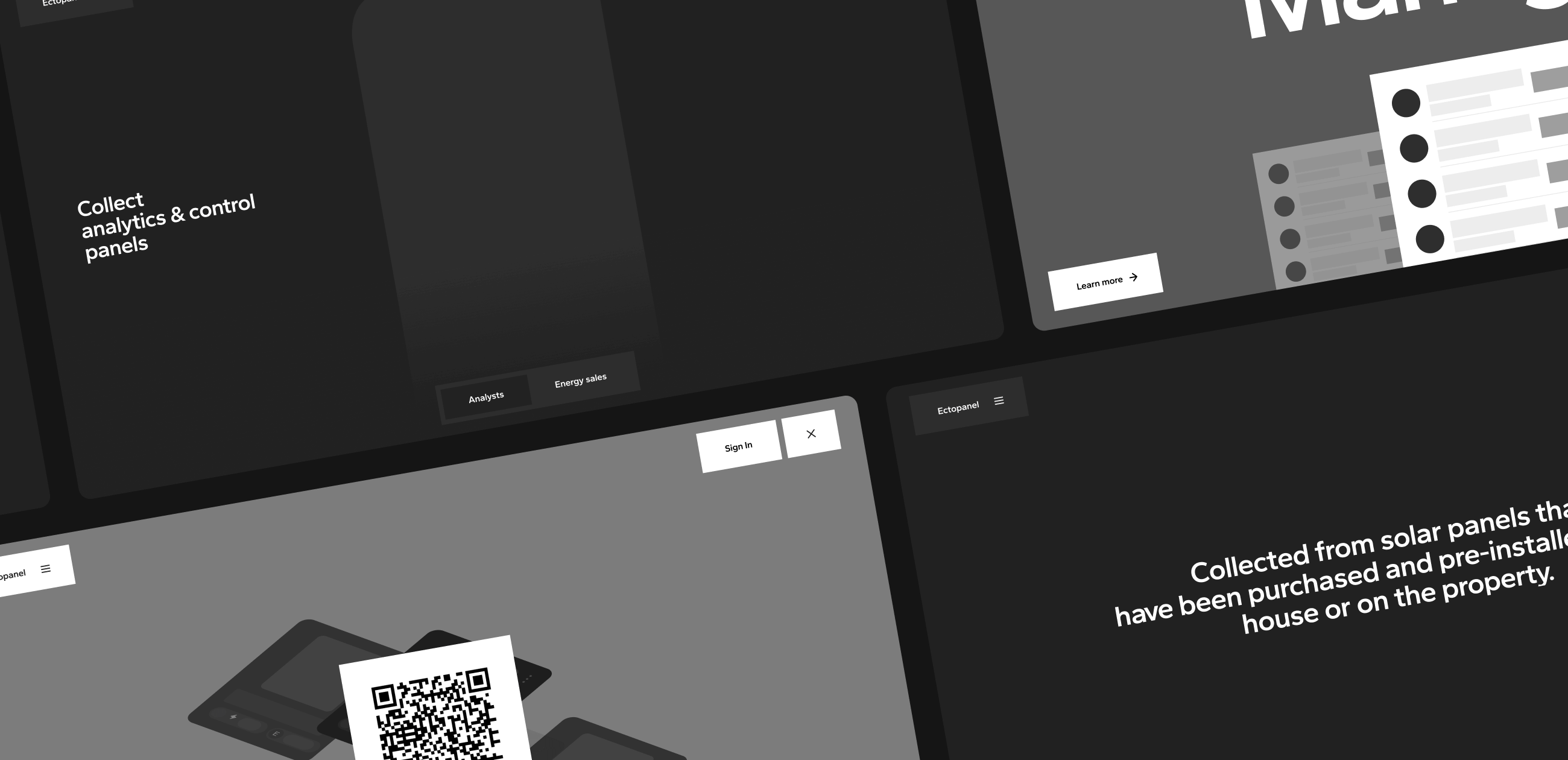
Once a solid analytical foundation has been established, the process of designing the Ectopanel Promo site moves on to creating a user-friendly interface. This includes designing the interface layout, determining the placement of each element, developing an animation storyboard and the interaction of each block.
Wireframes
Moodboard & Design Concept
UI Design
Wireframes are an important part of the product design process because they provide a preliminary drawing of the layout and functionality of the product. The main purpose of wireframes is to give a basic idea of how the product will function without going into too much detail and stylization.
It also helped us to focus on how best to convey important information without overloading the interface and to work out all the interactive and animated elements.
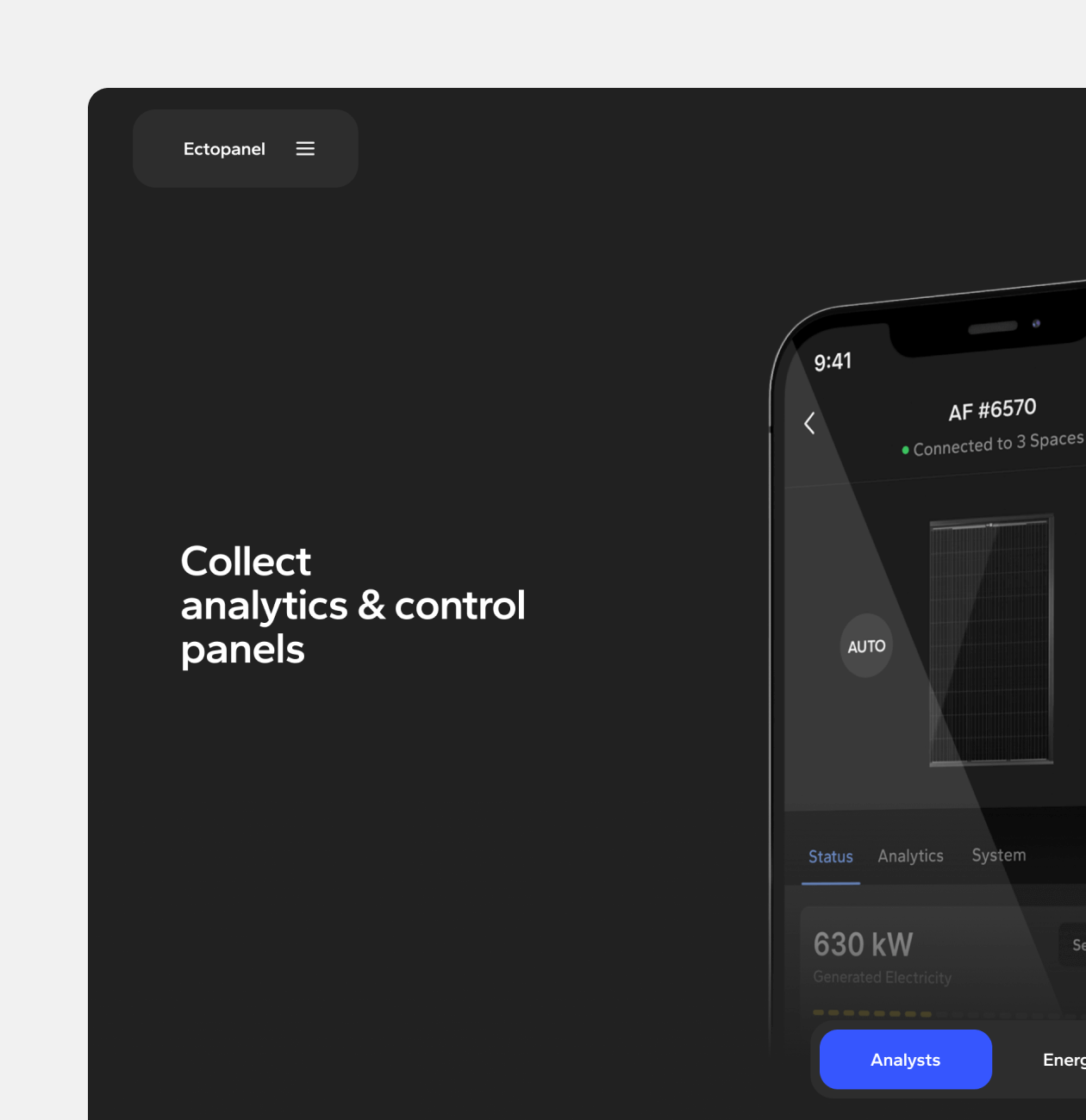
We took the basis of the visual style from the Ectopanel app itself to create a unified impression and consistency between the website and the app itself. We adapted the interface elements, color schemes, and symbolism so that they would fit seamlessly into the web format.
As a result, we created a visual style that reflected the essence of the Ectopanel app, providing a unified and attractive look for the promotional website.
When creating the user interface (UI) for Ectopanel, we wanted to achieve several important goals.
First, we wanted to create a simple and intuitive interface that would allow users to easily navigate and interact with the functionality of the application. We wanted to simplify the navigation and layout of elements so that users could quickly find the features they needed.
Second, we aimed to create an attractive and modern design that reflected Ectopanel’s unique selling proposition. We used clean and modern design elements to emphasize the progressive, friendly, and innovative nature of the app.
In addition, we created both a light and dark theme for the website so that users could choose the most comfortable option depending on their preferences. The light theme provides a clean and bright look, while the dark theme creates an elegant and modern style.
Finally, we made the design fully adaptive to ensure flawless display and functionality on different devices and screens. We took into account different screen sizes and device orientations so that users can access the Ectopanel features from any device with equal ease.
As a result of our work, we have achieved a balanced and attractive user interface that combines ease of use, modern design, and adaptability for maximum user experience.
We created a simple and effective page structure, where each block has its own value for users. With the help of interactive elements and animations we made the presentation of information attractive and easy to understand.
In addition, we have developed a fully adaptive design that provides excellent display and functionality on any device, be it a desktop, tablet, or smartphone. Our team strived to create a superior user interface that effectively communicates the benefits and features of the Ectopanel app.
We are grateful to our customers for their trust and the opportunity to be part of this important project. Working on Ectopanel has been inspiring and we are proud to have been able to bring our contribution to the development of technology and conservation of natural resources.
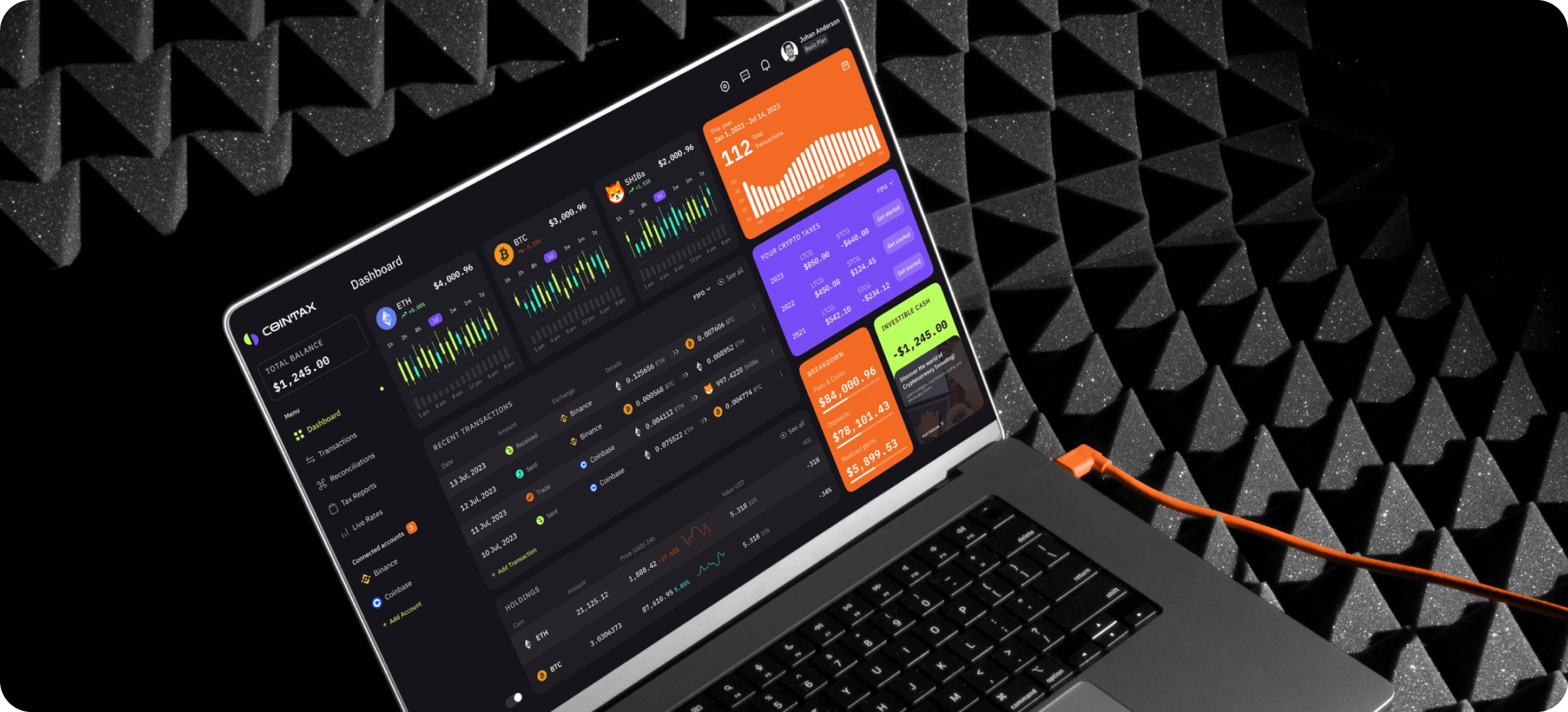
CoinTax is a cutting-edge cryptocurrency tax reporting tool designed to revolutionize how individuals, businesses, and organizations manage and fulfill their crypto tax obligations.
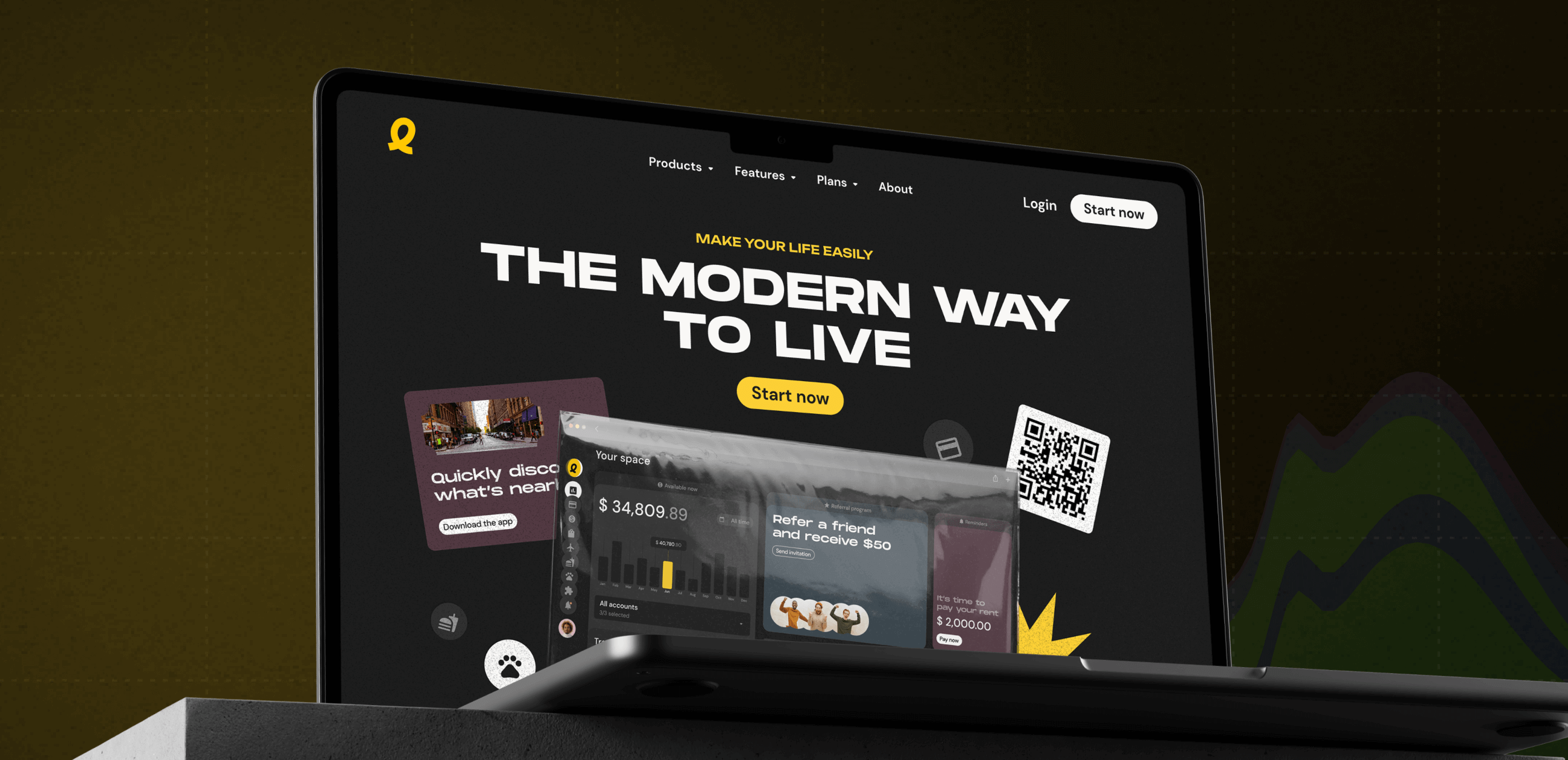
Captivating Promo Site for the web super app
We appreciate your interest in our product design services and will get back to you as soon as possible.
To improve our services, please tell us where you heard about us by selecting an option: