Promo website for budgeting mobile app

Captivating Promo Site for the web super app

Easily
Background

About the product

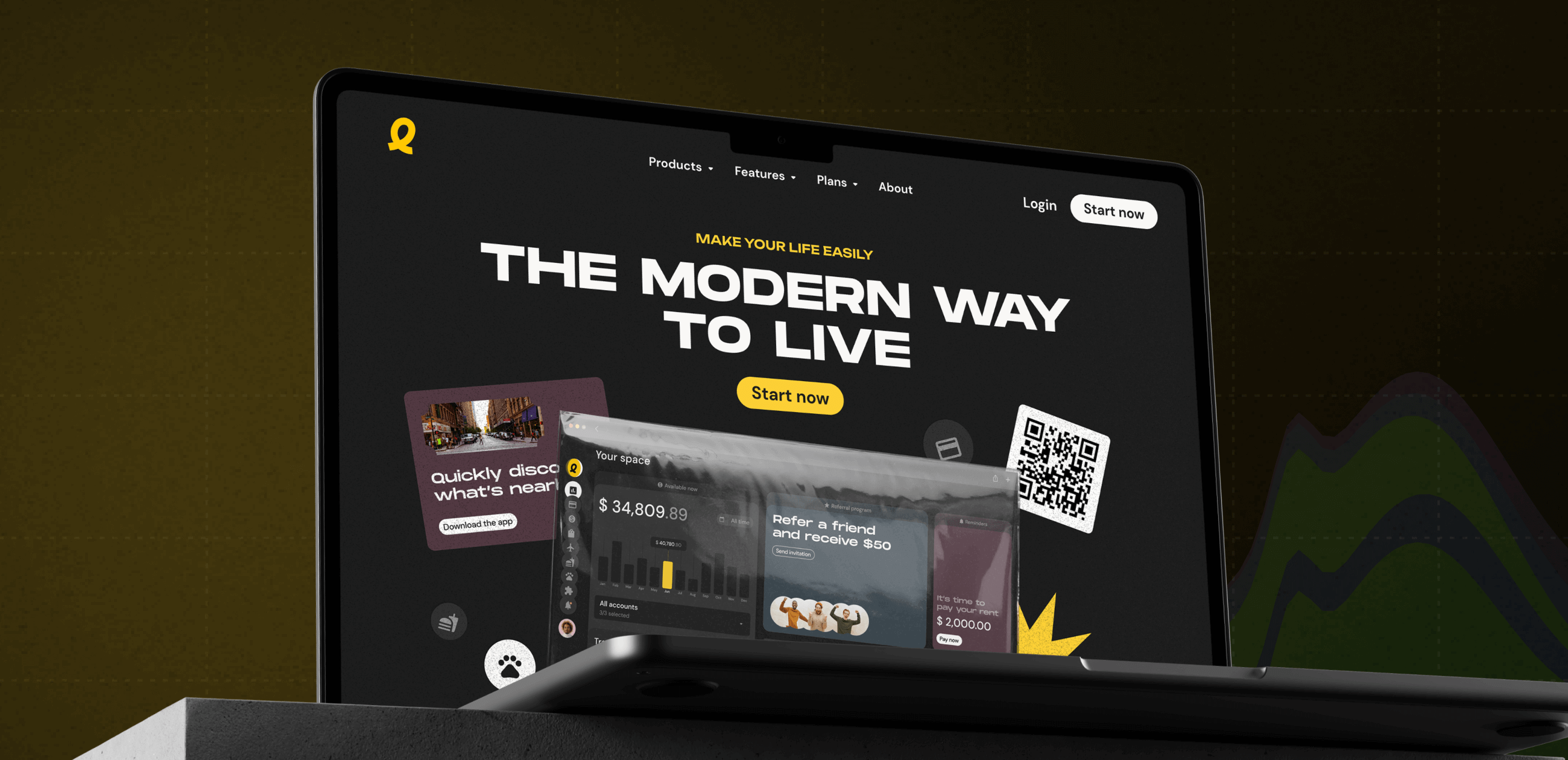
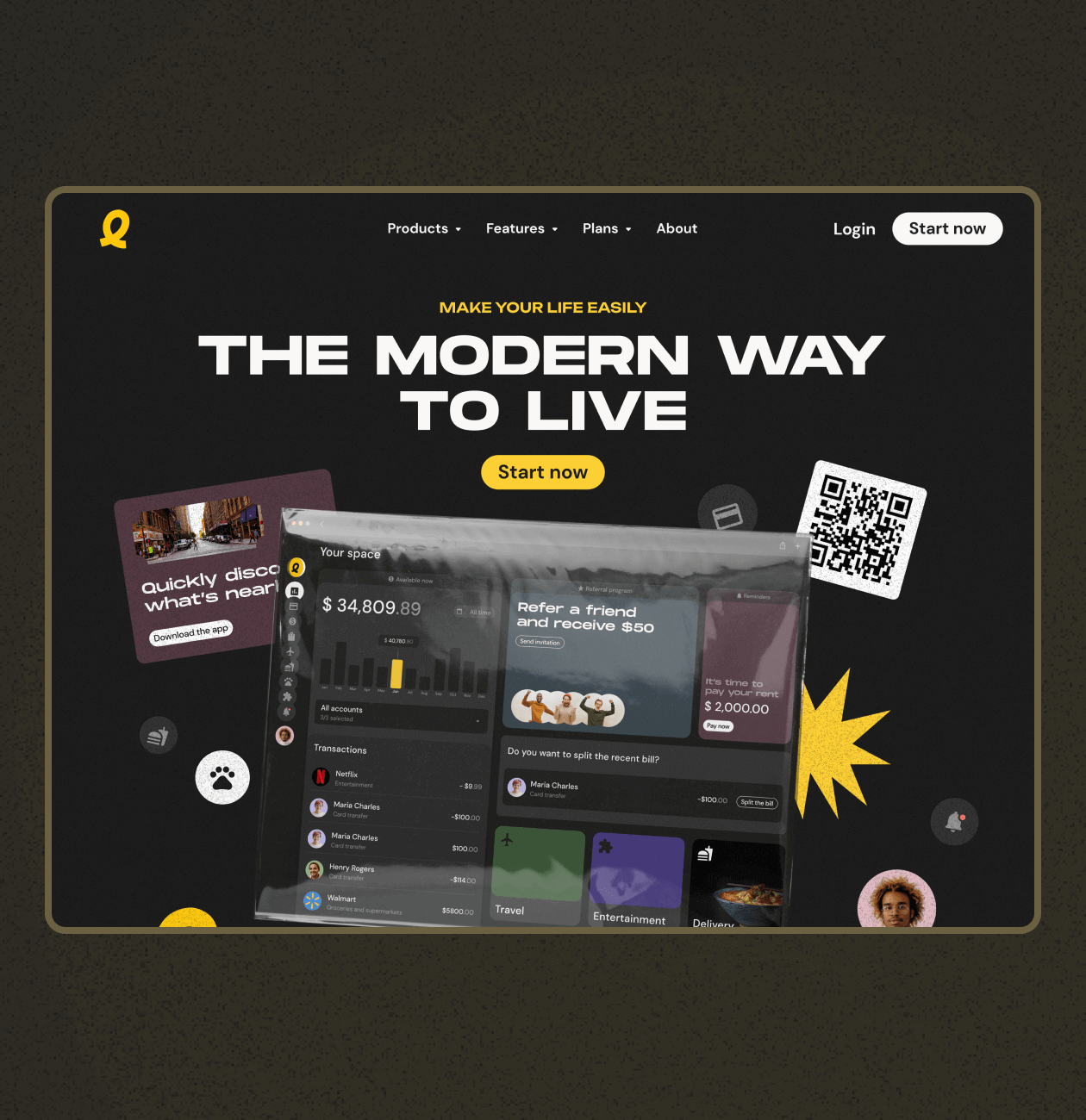
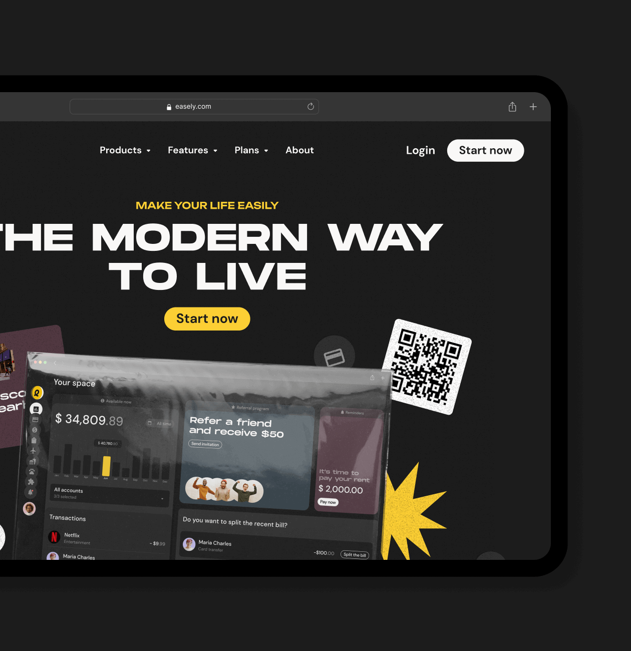
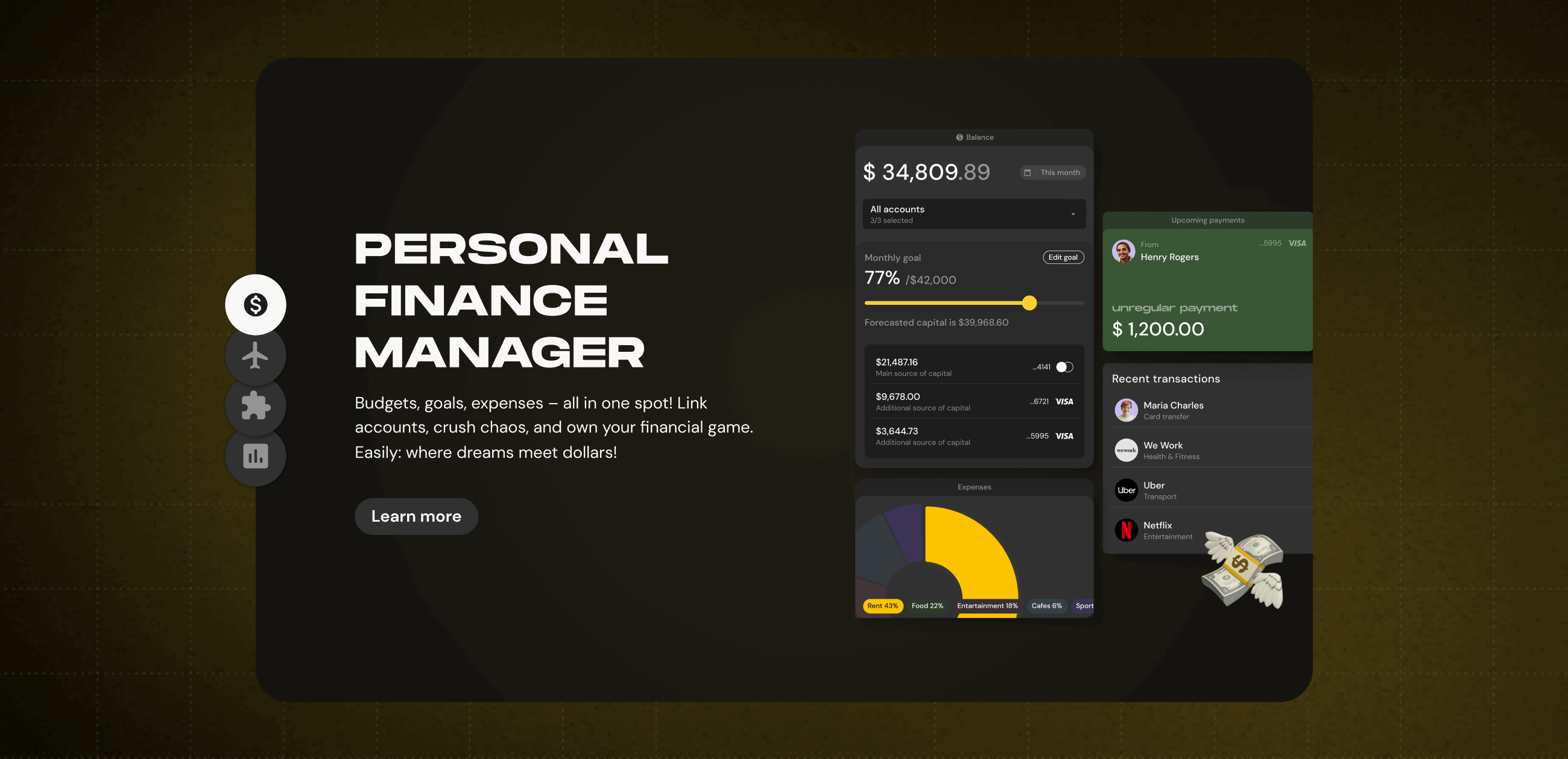
We worked on creating a promotional website for Easily, a finance management app, highlighting its features in a straightforward manner. The aim was to design a site that’s visually appealing and informative, providing a clear picture of what Easily offers. Using simple language and interactive elements, we ensured the site is easy to navigate. The focus was on introducing users to Easily and showcasing its benefits. Our promo site serves as the welcoming entrance to Easily, offering a friendly and informative experience about what Easily can bring to users.

Services:
Country:
USA
Technology:
WordPress - icon WordPress
Team:
Ruslan - teammate emoji
Ruslan
Daria - teammate emoji
Daria
Yuliia - teammate emoji
Yuliia
Problem

The challenge we’ve faced

The client’s request was to create a dynamic and visually appealing promotional website that effectively communicates the key features, benefits, and unique selling points of Easily. The goal was to engage the target audience, primarily millennials and Gen Z, and showcase the app’s diverse functionalities.

Users might have perceived Easily as too complex or overwhelming, especially with multiple services integrated into one app.

Users might not have fully understood the unique features of Easily, leading to underutilization.

Users visited the website but faced barriers in understanding how to take the next steps, such as downloading the app or signing up.

Proccess

General Proccess

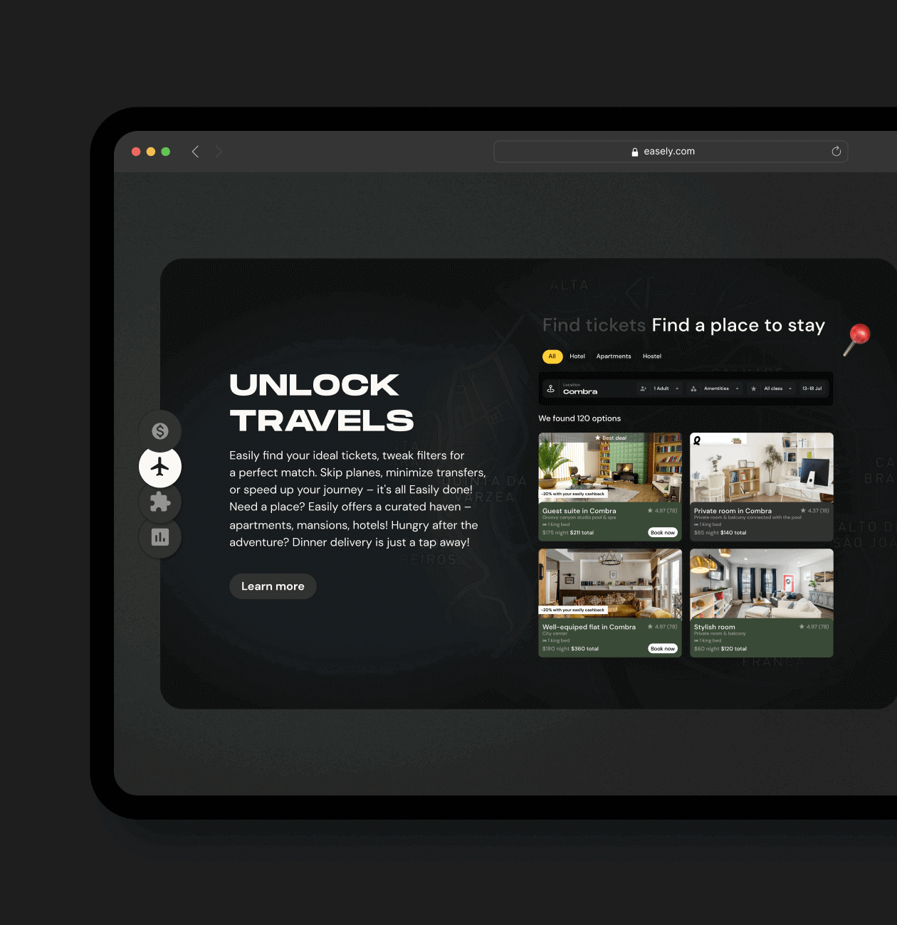
Our team was excited to bring client’s vision to life and create an engaging platform that reflects the unique spirit of Easily. So we designed a website with an intuitive design that aligns with Easily’s user-friendly ethos. Highlighted Easily’s diverse features, focusing on finance management, travel planning, and the fast delivery marketplace. We also used straightforward language and intuitive design to convey the ease of integration into daily routines.

Research process

When we launched the Easily promo site project, we closely examined similar services and identified our potential users and their needs. This insight helped us differentiate Easily from competitors and tailor our offerings to meet users’ exact needs.

It’s all about crafting a promo site that’s not just different but also perfectly matches what our users want.

Competitor Analysis

Mapping

Step 1

Competitor Analysis

In our approach to the Competitor Analysis for the Easily promo site, we started by identifying key players in the same field. We focused on the user experience of their platforms, analyzing how users interacted with features.

We also explored the design and branding strategies of our competitors, aiming to understand what appeals to users. By analyzing user feedback, we gained valuable insights into user preferences and the pain points experienced on existing platforms.

Begin Your Phenomenal Journey with a Website Design Service

We’ll secure your success by integrating the best industry experts and incredible skills. Your dream is in the right hands.

Step 2

Mapping

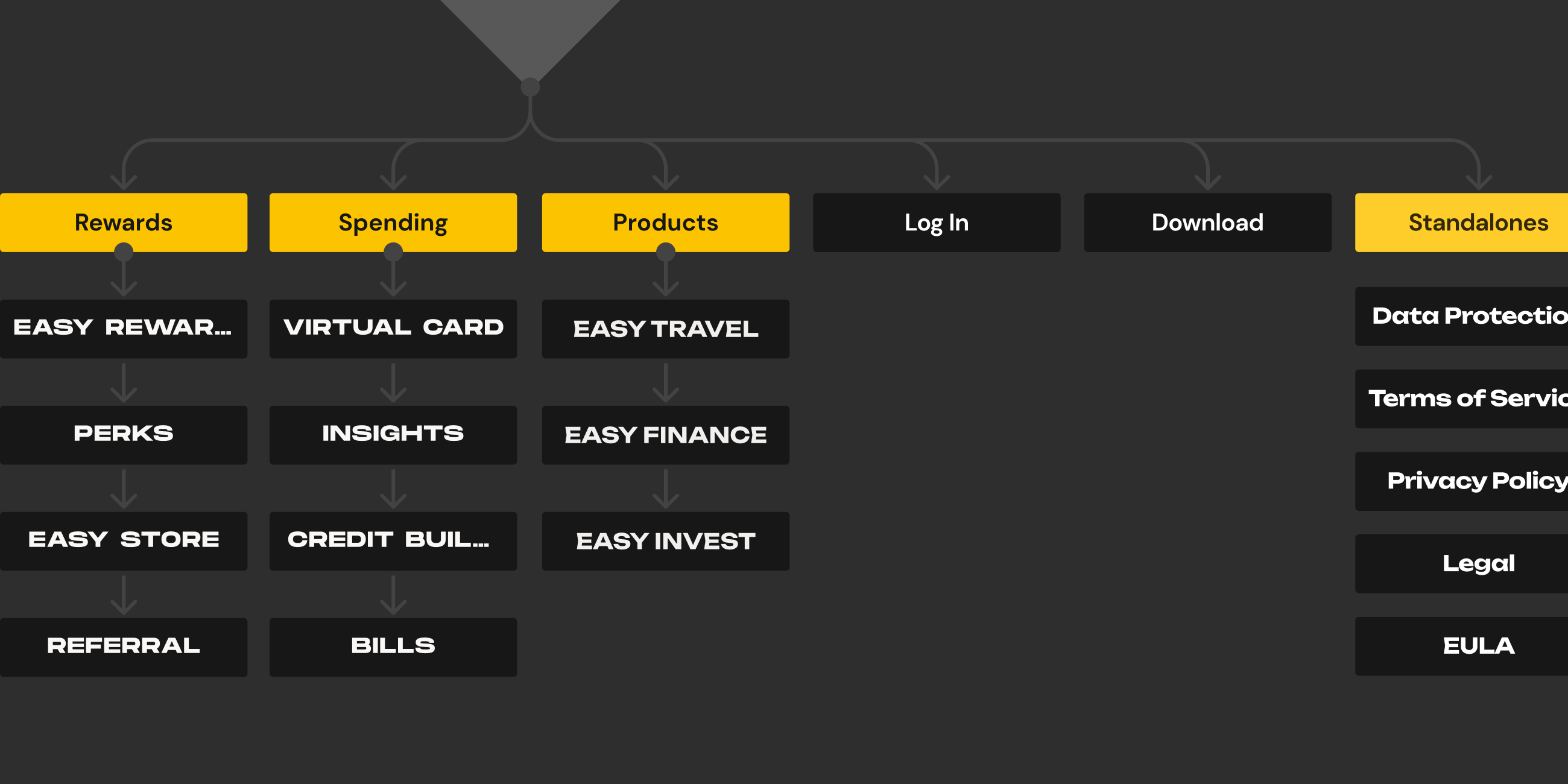
Our team created the app architecture based on insights gathered from competitor analysis, persona analysis, and valuable feedback from the client. The design process was guided by these key elements, ensuring a well-informed and user-centric app structure.

Design

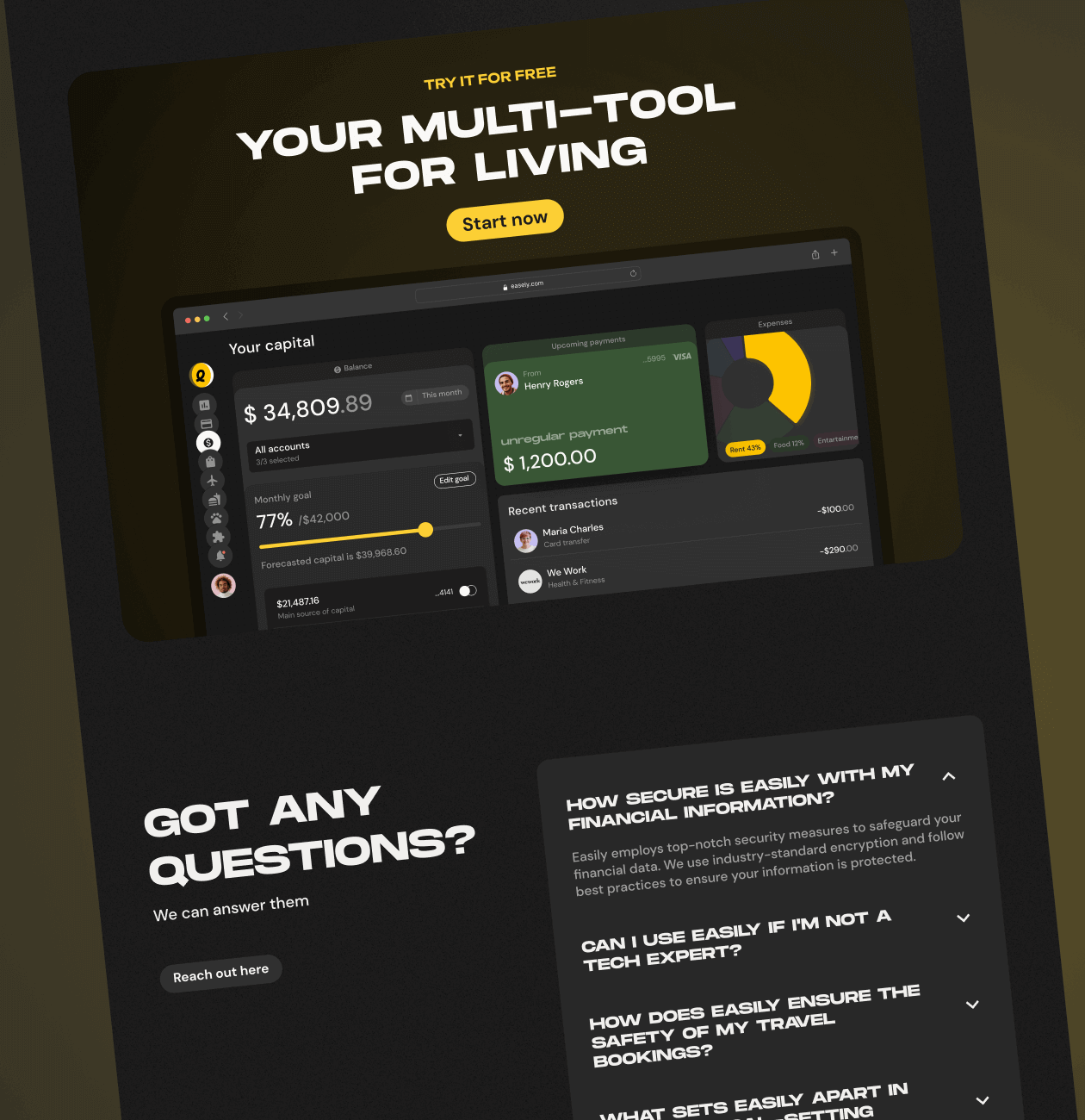
We were thrilled to design the promo site for Easily, a comprehensive web super app that consolidates essential services. Our goal was to create an attractive, informative website that clearly communicates what Easily offers. The site serves as a welcoming gateway, introducing users to the functionalities and benefits of Easily.

Wireframes

UI Design

Interactions

Step 1

Wireframes

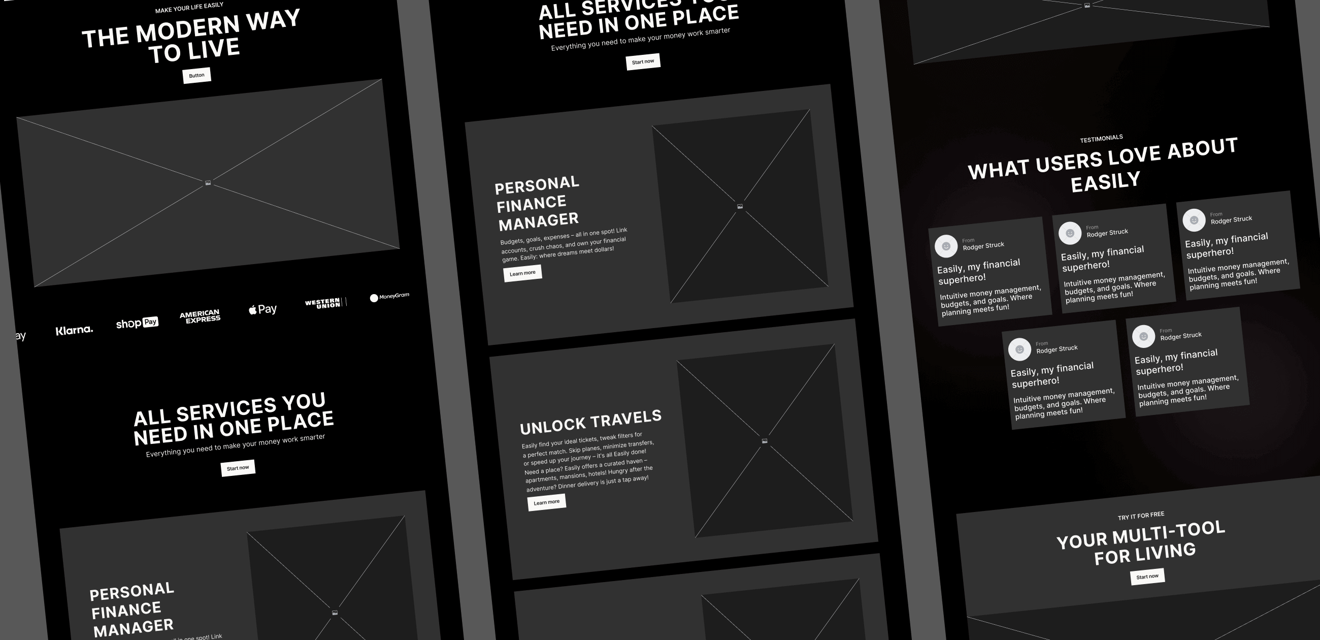
We created detailed wireframes to map out the product’s appearance and functionality. This planning helped us determine the placement of key elements and how users would interact with them. It’s akin to drafting a blueprint before moving on to the UI design stage.

Step 2

UI Design

Once the Moodboard and Concept got the green light, we jumped into UI design to give the design concept a real presence. The goal here was to craft an interface that’s not only user-friendly but also looks good, all in harmony with the overall design vision.

To streamline the process for our developers, we created design components that are integrated into the Design System, ensuring a smooth transition from design to development.

Step 3

Interactions

In this phase, we built a prototype to mimic how users would interact with the product. This gave us and stakeholders a firsthand experience of the features and functions before the actual development began.

Prototyping was key to testing design choices, collecting feedback, and refining the user experience through iterations, all of which informed the final product development.

Features we implemented

01
Clear Representation of Features

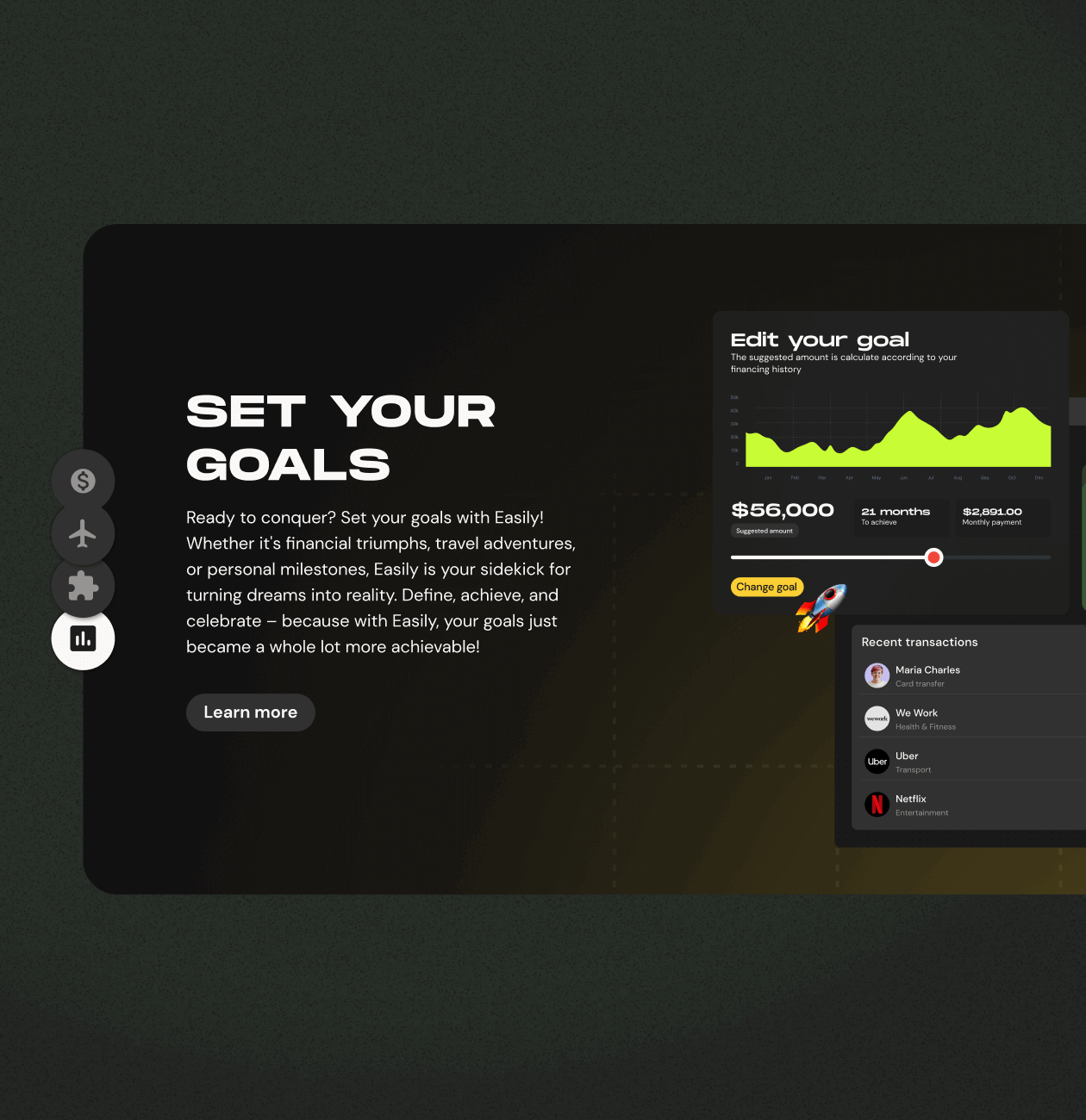
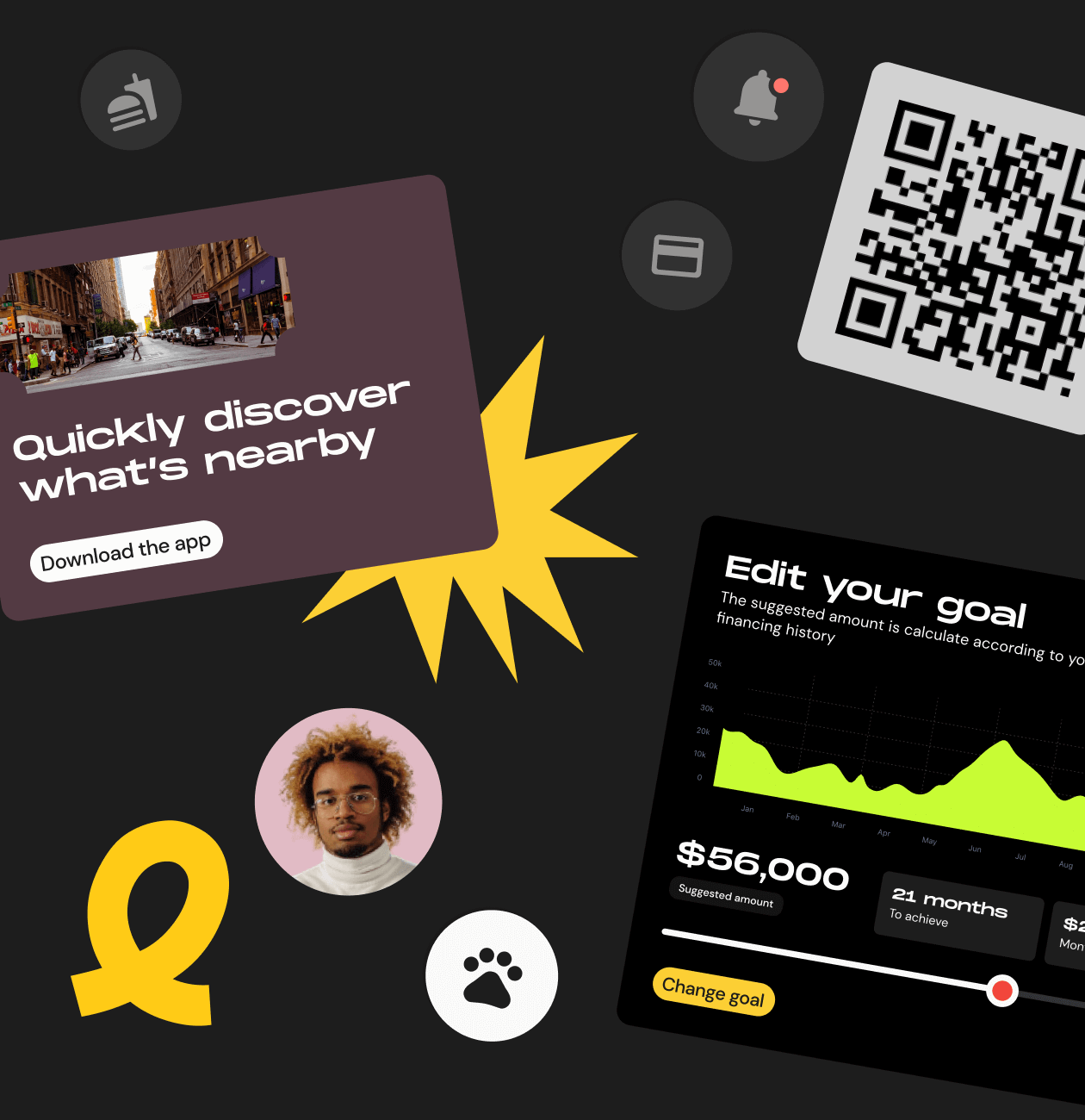
A dedicated section on the promo website that provides an organized and visually appealing display of the key features offered by the Easily web app. This feature effectively communicates the value proposition of Easily, allowing users to swiftly identify the services that align with their needs and interests.

02
User-Friendly Experience Emphasis

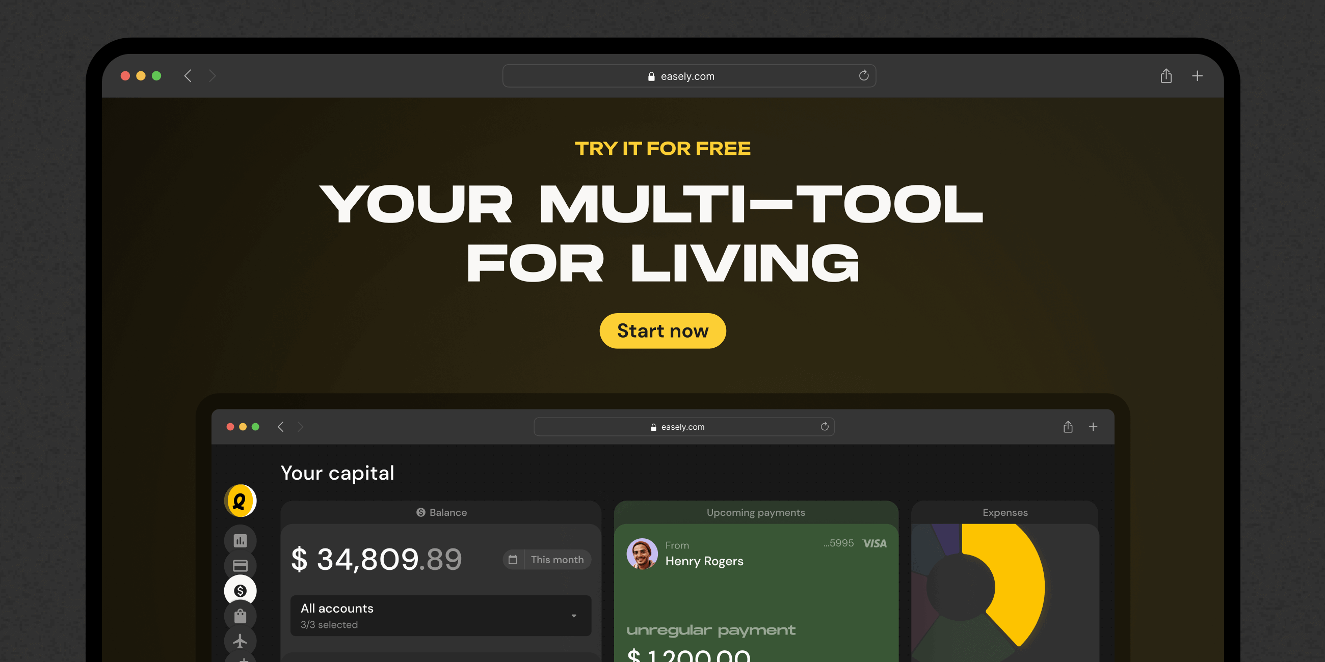
A key feature of the promo website is its emphasis on the simplicity and user-friendliness of the Easily web app. We used clear language, straightforward step-by-step guides, and interactive elements to create an intuitive environment. This design showcases how effortlessly users can navigate and utilize the app's functionalities.

03
Dynamic Visual Elements

We integrated dynamic visuals, animations, and interactive elements to boost the website's visual appeal and engagement. These features create a more immersive user experience. Whether through clickable functions or scroll-triggered animations, these interactive elements encourage users to actively engage with the content, enhancing their overall experience.
Result

Our results

Promo Website that Delivers Engagement, Conversions, and Positive Experience.
The Easily promo website is a hit, keeping users engaged, converting visitors effectively, and earning positive feedback.
With fast loading times and a design that matches Easily’s style, the site clearly communicates what Easily offers, boosting the brand’s image. Low bounce rates and a responsive design make it easy for users, while community features show active participation. Analytics insights guide ongoing improvements, making the site adaptable and successful for Easily.

Recent Case Studies

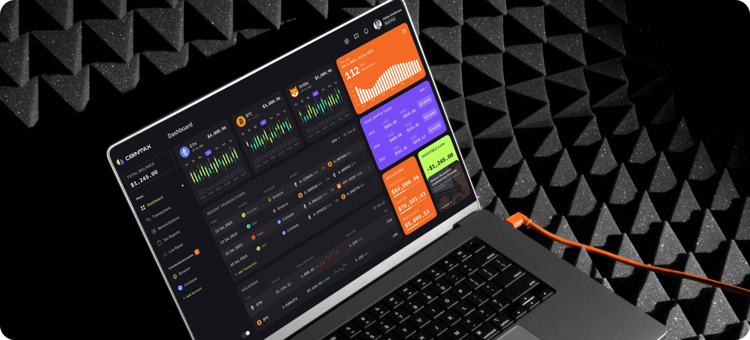
CoinTax – App
Crypto tax reporting tool

CoinTax is a cutting-edge cryptocurrency tax reporting tool designed to revolutionize how individuals, businesses, and organizations manage and fulfill their crypto tax obligations.

SaaS Web3 MVP Building Product Discovery
Aurora
Innovative AI Solution for Healthcare

Cutting-edge tech meets medical expertise for accurate insights and lightning-fast workflow. Aurora's streamlines your tasks and unlocks new possibilities in patient care.

Healthcare Presentation-Ready-Concept

Ready to bring
your idea to life?

Help us understand your vision by providing some details. We’ll follow up to set a consultation call.

Name

Email

A few words about your project

You can upload maximum 5 files
Some of your file not loaded, because maximum file size - 5 mb
What is your budget for this project?
How did you hear about us? (optional)

By clicking this button you accept Terms of Service and Privacy Policy

Project Talk - Kseniia Shalia
Account Executive
Partnership - Polina Chebanova
Co-Founder
Our website uses cookies