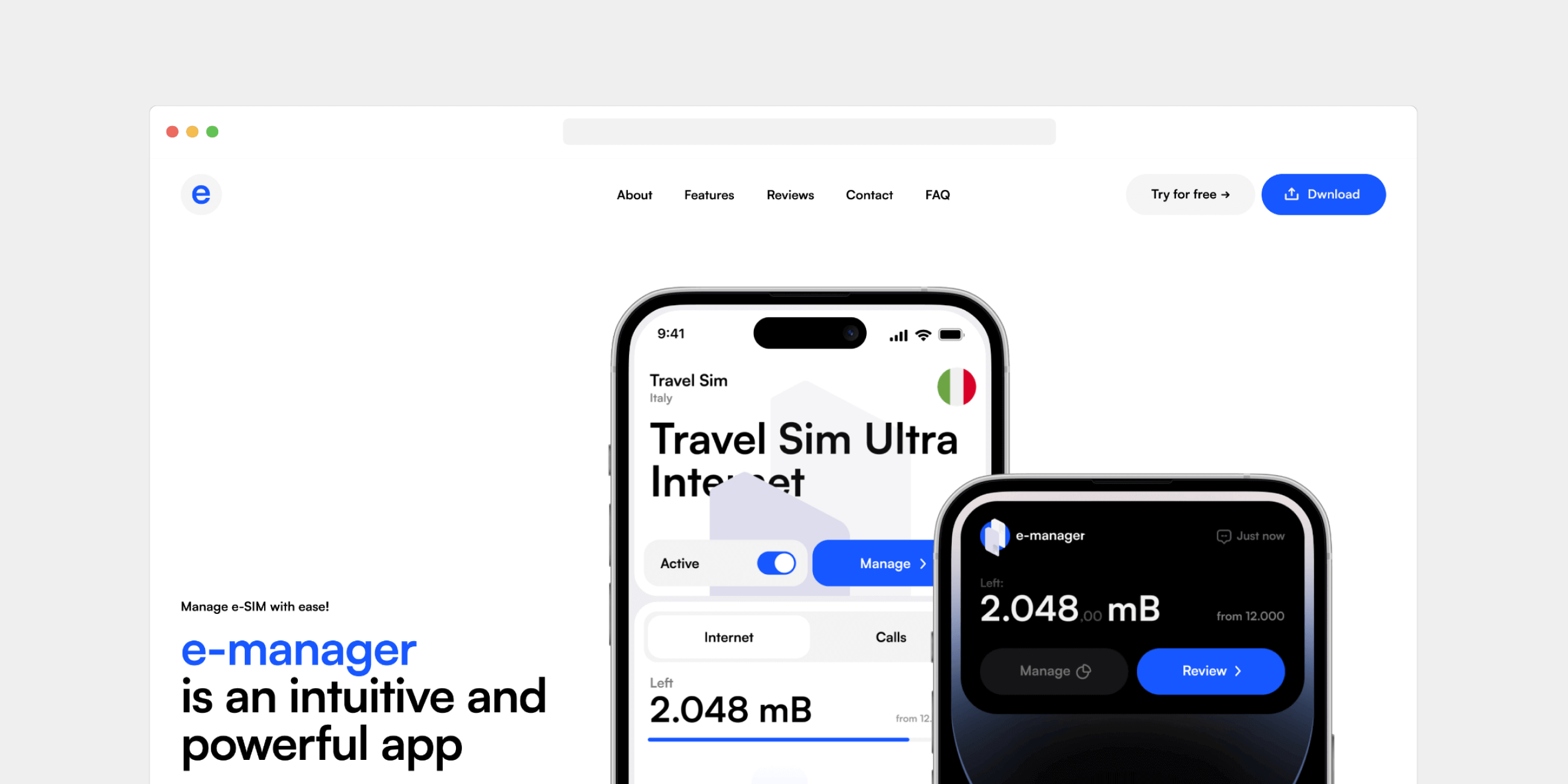
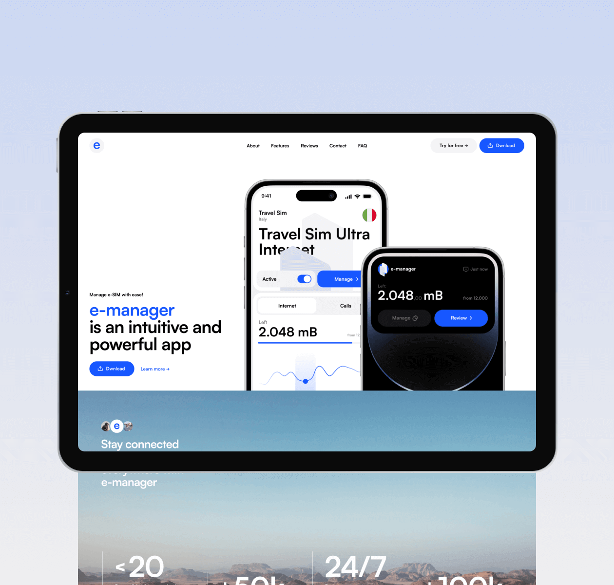
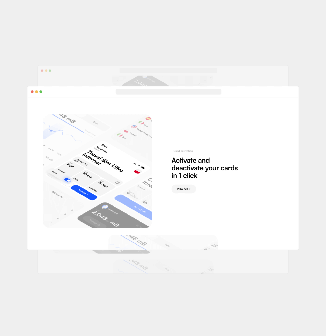
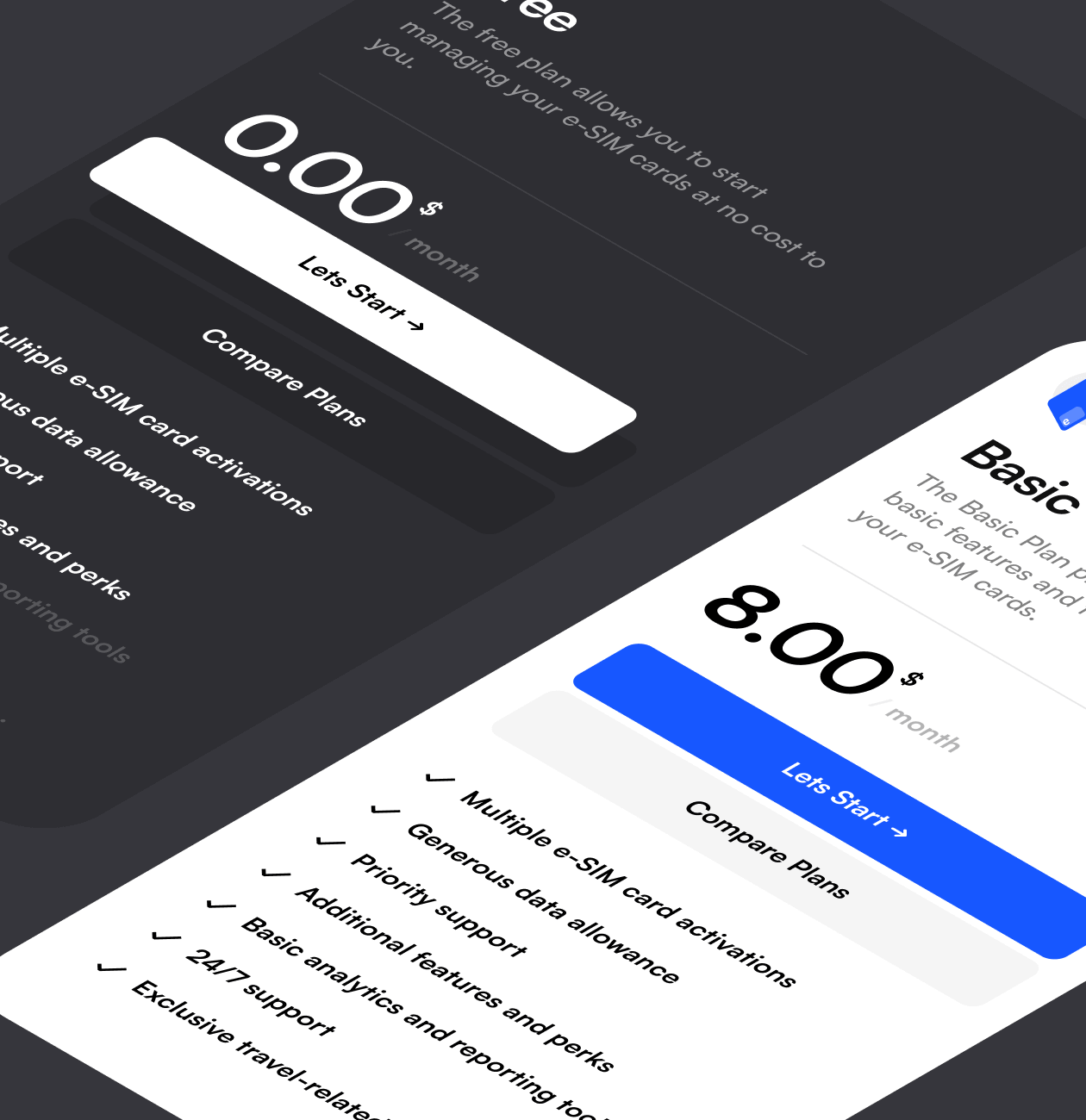
Promo website for mobile app for e-sim management

Highlighting the application and its advantages in a competitive market

E-maganer
Background

About the product

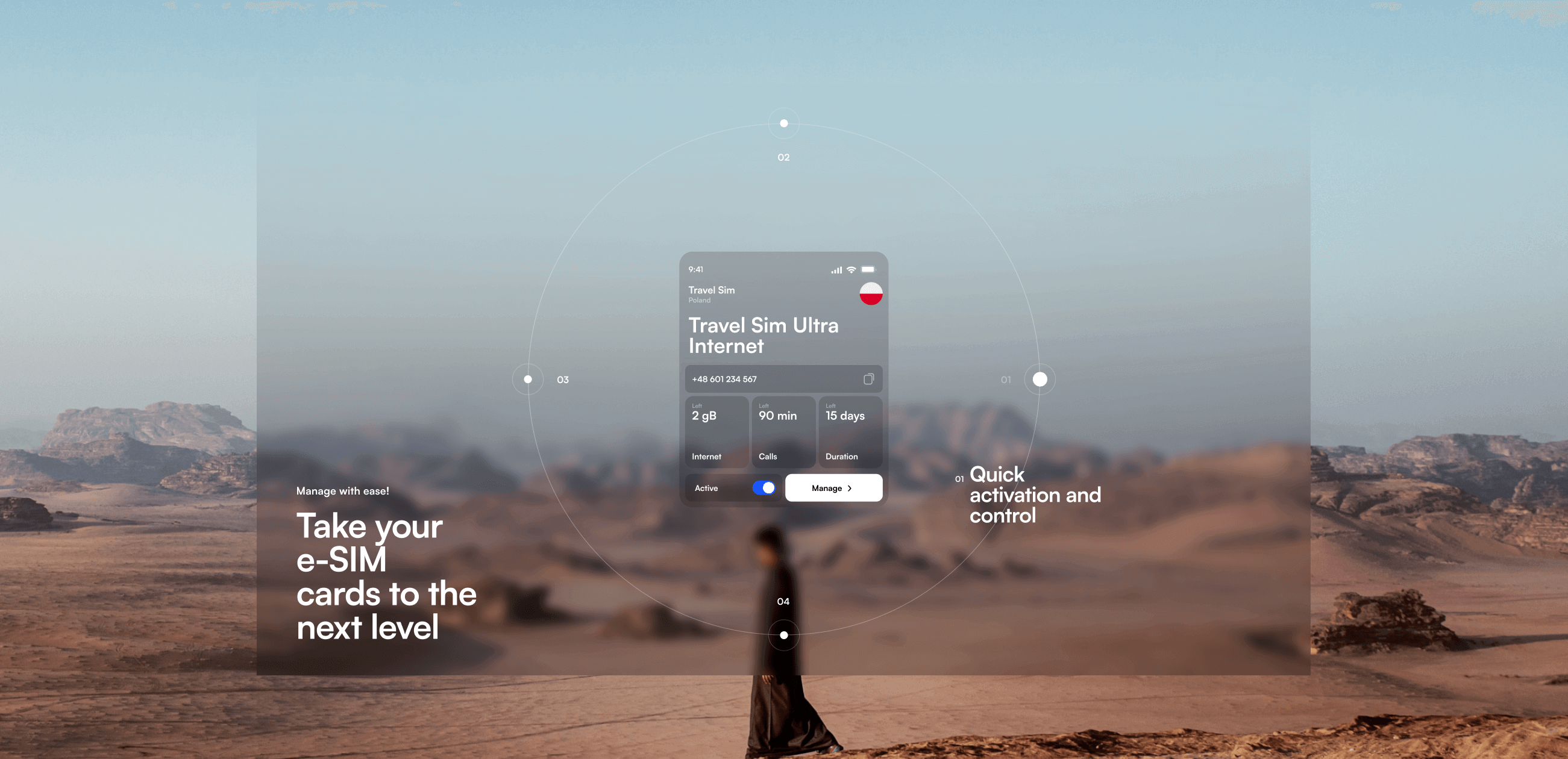
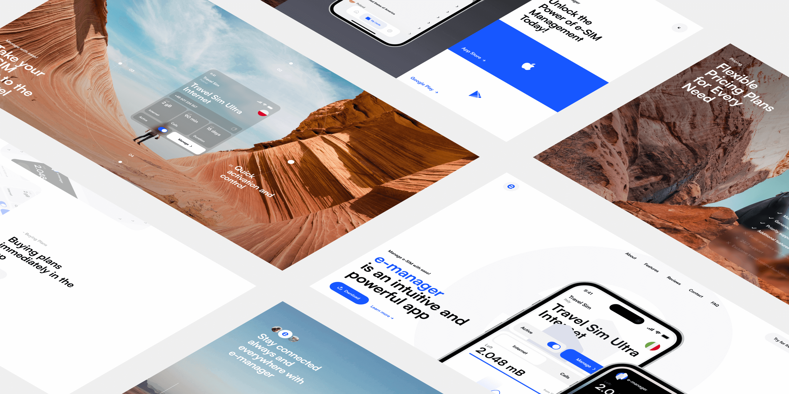
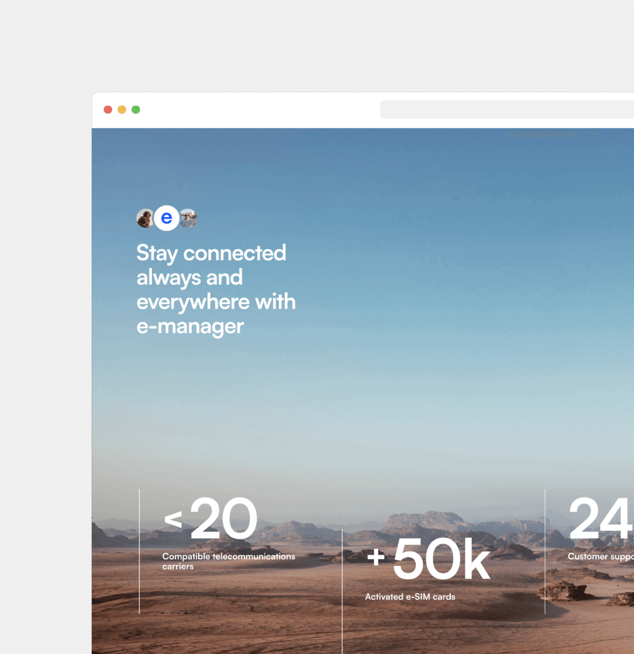
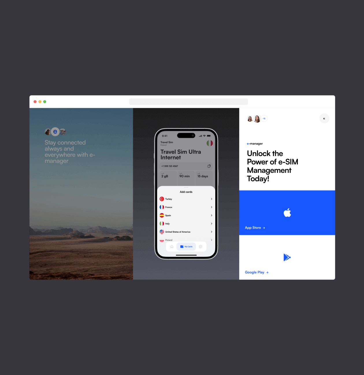
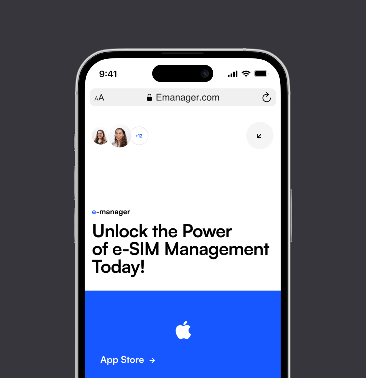
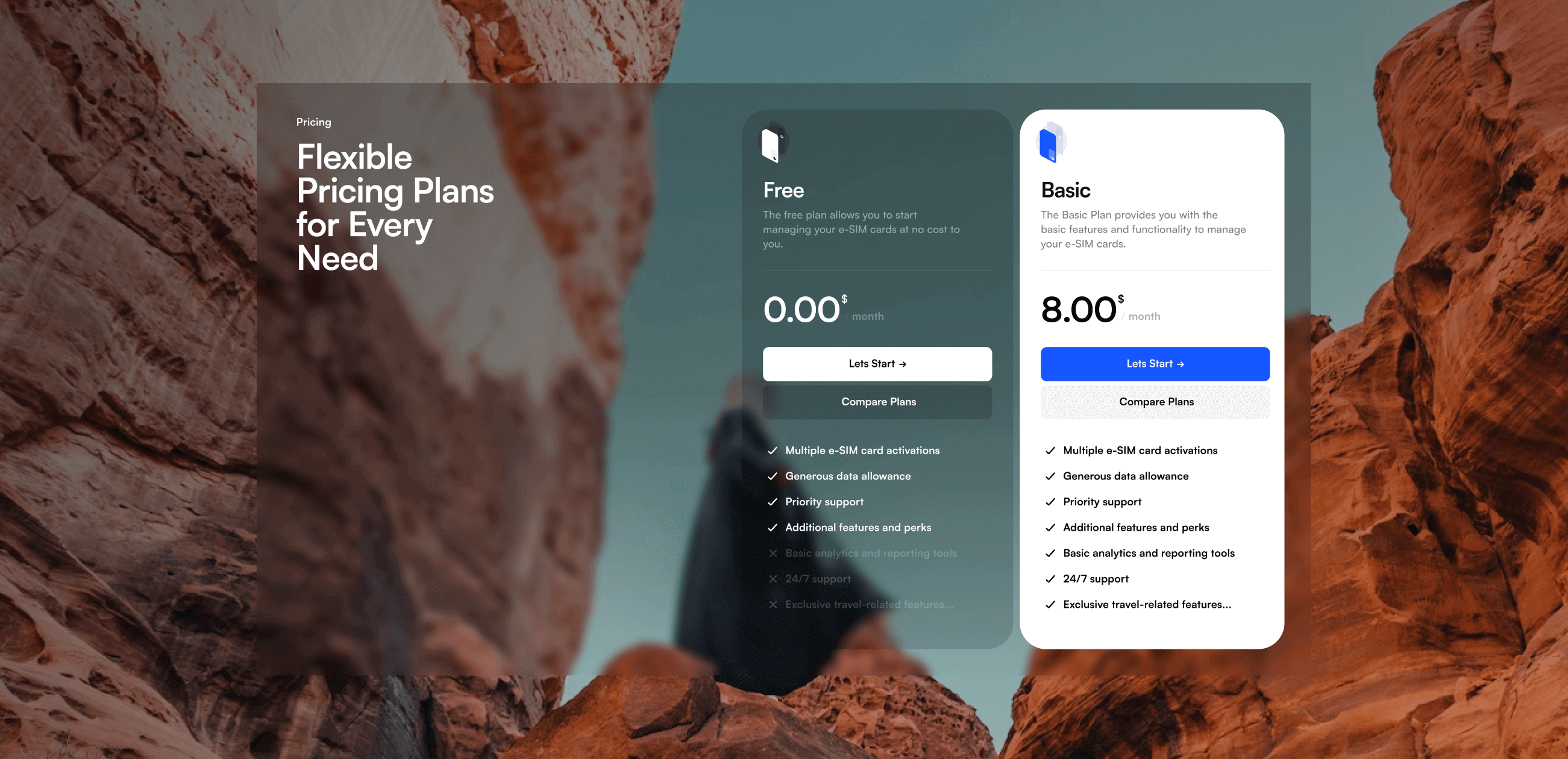
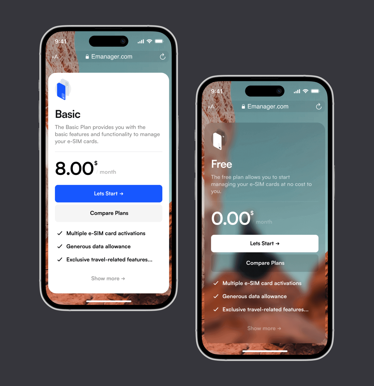
The goal was to convey the features and functionality of E-manager, drawing the audience’s attention to the convenience of e-SIM card management and freedom in choosing tariff plans. Therefore, a beautiful nature image was used to reflect the metaphor of freedom and ease.

Services:
Country:
USA
Problem

The challenge we’ve faced

The client wanted to maintain the visual identity of the app, including its color palette and typography, so that users would feel that it is a unified and recognizable product.

At the same time, the client wanted to make the design stand out among competitors and fully meet the needs and expectations of the target audience.

Responsiveness and optimization.

Information Management.

Coordination with the customer.

Proccess

General Proccess

We, as UI / UX designers, set ourselves the task of developing a promo site for the application that best presented the product, emphasized its unique advantages and value for users. Our design had to stand out from the competition and emphasize the core values ​​of the brand.

Research process

Through comprehensive competitor analysis, we gained valuable insights into the project’s primary and secondary objectives, as well as the critical features of the application. Understanding the significance of the visual aspect, we carefully preserved the app’s visual identity, including its color palette and typography.

With all research phases in mind, we strategically designed the site’s structure and individual blocks to highlight essential aspects of the application, showcasing its unique offerings in the best possible light. Our goal was to convince users that e-manager is the ultimate and unparalleled solution in the market.

Step 1

Competitor Analysis

By undertaking a thorough competitor analysis, we aimed to meticulously study web and mobile app-related promotional websites. The objective was to comprehensively evaluate their strengths, weaknesses, and potential opportunities and threats in the market. Our keen focus was on understanding how these apps showcased their functionality, unique selling proposition, and overall market positioning.

This analysis provided us with valuable insights on areas where we could distinguish ourselves and effectively demonstrate our app’s uniqueness and capabilities to potential customers. By leveraging this research, we strategically identified the most compelling and user-friendly methods to present information, effectively communicating our app’s unique selling proposition and highlighting its numerous benefits.

Begin Your Phenomenal Journey with a Website Design Services

We’ll secure your success by integrating the best industry experts and incredible skills. Your dream is in the right hands.

Design

After establishing a solid analytical foundation, our E-manager website design process focuses on creating a user-friendly interface, searching for visual metaphors, and carefully crafting the structure. We strive to provide our users with an intuitive experience while seeking a visual style that reflects the values and uniqueness of the application.

Wireframes

Moodboard & Design Concept

UI Design

Step 1

Wireframes

Wireframes play a crucial role in the product design process as they offer an initial visual representation of the product’s layout and functionality. Their primary objective is to present a basic outline of the product’s functioning without getting into intricate details and stylization. This process enabled us to emphasize effective ways of conveying essential information while ensuring the interface remained uncluttered, while also fine-tuning interactive and animated elements.

Step 2

Moodboard & Design Concept

In search of the concept, we spent an intensive brainstorming session, trying to discover visual metaphors that would perfectly capture the essence of the project and match the values of the target audience. Our goal was to find something that blended with the business and would be perceived by the user with ease and inspiration. That’s how we discovered the visual metaphor that became the basis for the expressive and unique look of the project.

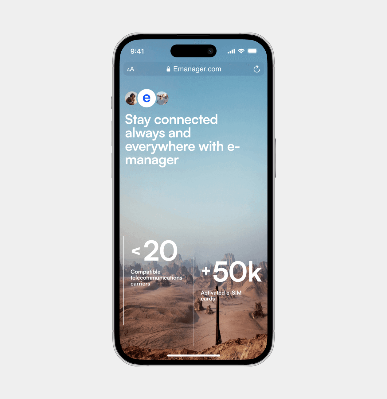
The visual metaphor we discovered and used for the E-manager project is the exciting and free world of adventure and travel. We applied bright and high-quality images of nature, symbolizing freedom and lightness, to create an atmosphere of joy and possibilities for the app’s users. This metaphor became the basis for the design, conveying a sense of simplicity and pleasure in using E-manager, while the application functionality remains a convenient and powerful tool for managing e-SIM cards.

Step 3

UI Design

After defining the concept and visual metaphor, we started developing the visual part of the project, which included creating the user interface (UI). This stage played a key role in bringing the whole idea to life and making the site attractive and user-friendly.

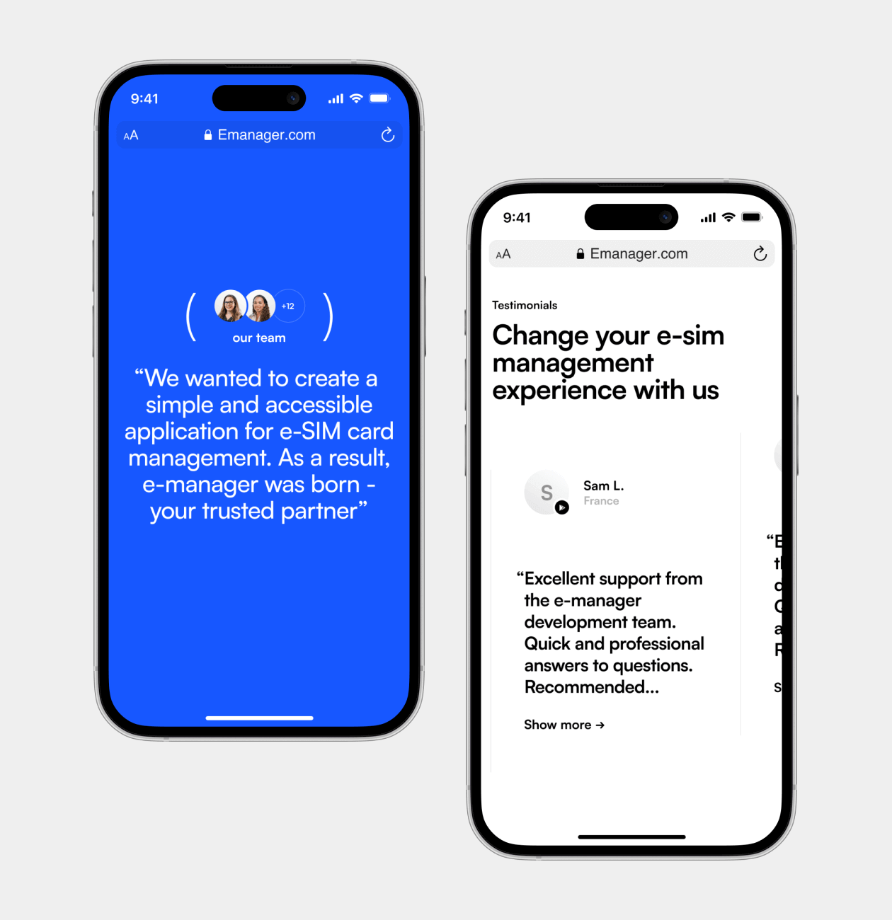
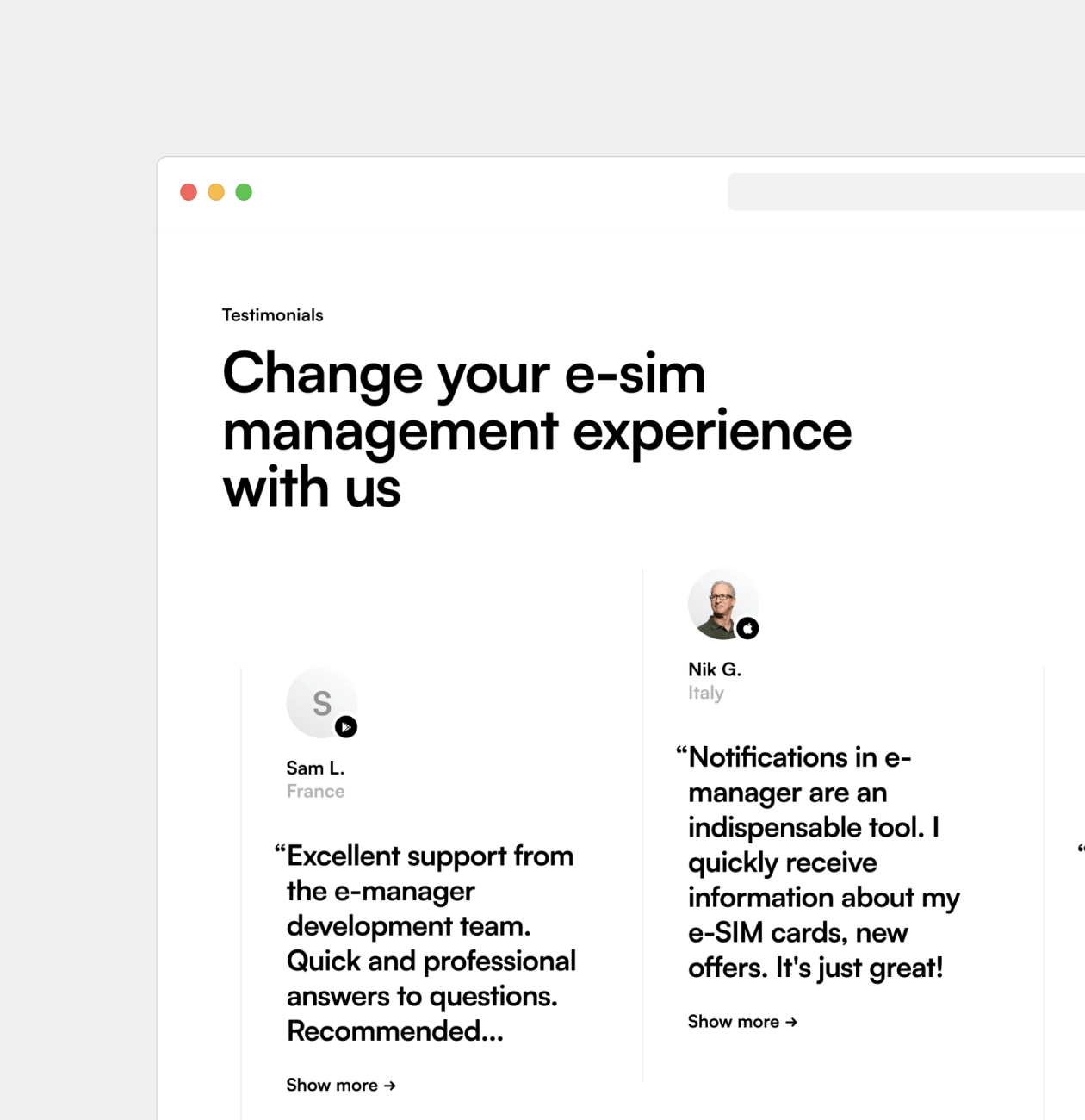
To start with, we defined basic color schemes, fonts and icons that matched the overall visual style of the E-manager application. This allowed us to keep the brand unity and create a sense of belonging of the site to the application itself.

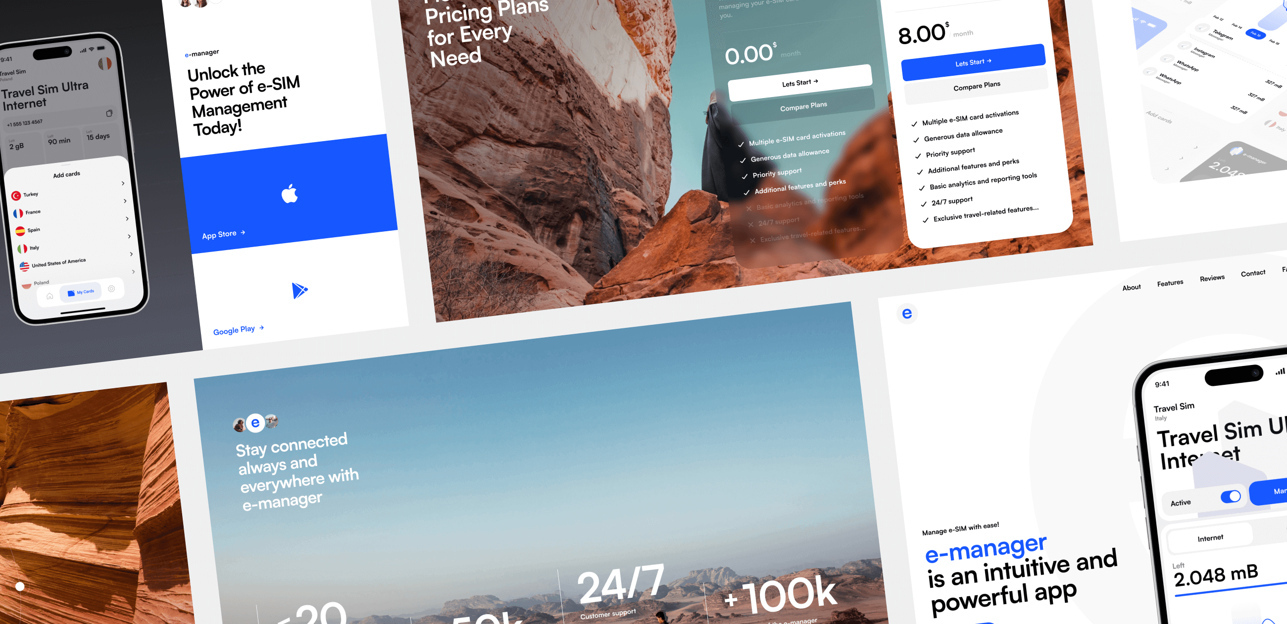
As a result, our team developed an attractive and user-friendly user interface that reflects all the benefits and features of the E-manager application. This will allow our client to present their product in the best possible light and attract the attention of their target audience.

Result

Our results

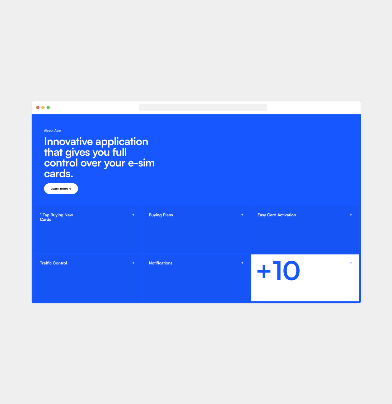
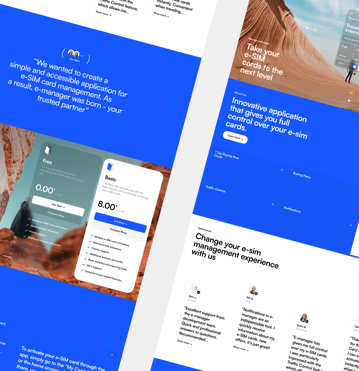
We created a user-friendly and attractive website structure, using high-quality images of nature as a metaphor for the freedom and ease of traveling with e-SIM cards. Keeping the basic design elements of the E-manager application emphasized the unity of the brand. We emphasized the key benefits of the app to convince users to choose our product.


The E-manager promo site became a powerful tool for attracting new users and promoting the application on the market. We are confident in its ability to communicate the benefits of E-manager and convince people to choose our convenient and innovative e-SIM card management platform.

Recent Case Studies

Greenow
Renewable Energy Service Dashboard

This innovative service makes wind power accessible for homes. User-friendly dashboard simplifies turbine selection, helping to find the most cost-effective option for user's location.
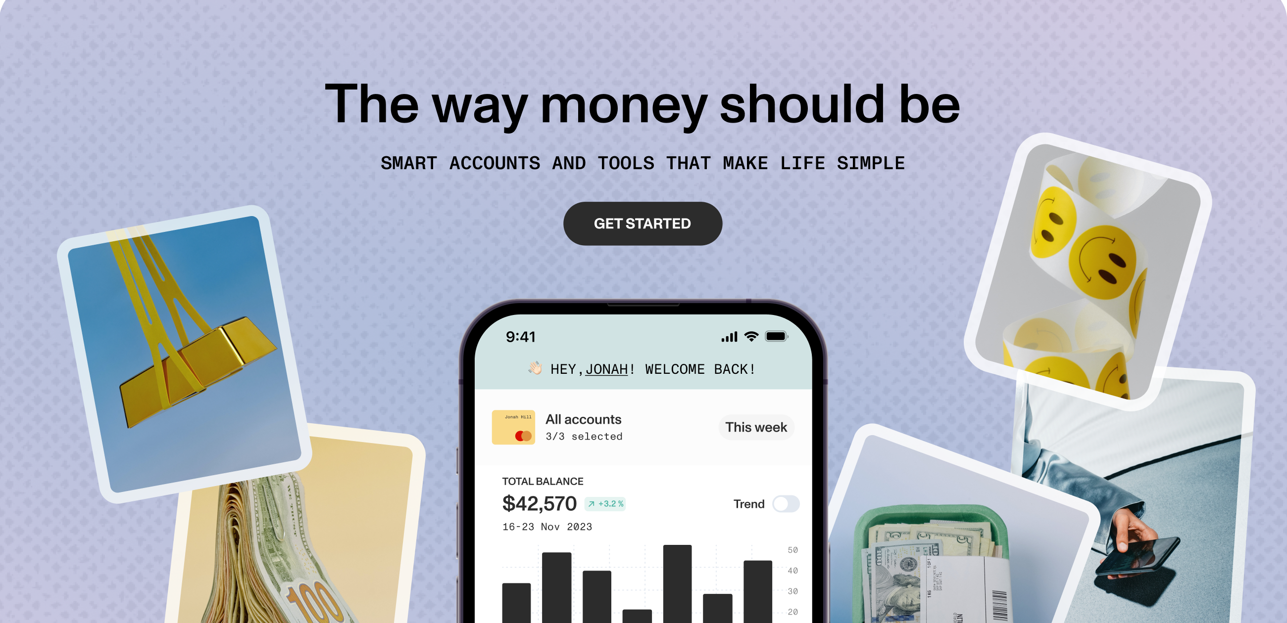
SaaS NoCode Development Presentation-Ready-Concept Product Discovery
Keap
Promo website for budgeting mobile app

Unveiling the Finance Revolution!

Fintech Website Development

Ready to bring
your idea to life?

Help us understand your vision by providing some details. We’ll follow up to set a consultation call.

Name

Email

A few words about your project

You can upload maximum 5 files
Some of your file not loaded, because maximum file size - 5 mb
What is your budget for this project?
How did you hear about us? (optional)

By clicking this button you accept Terms of Service and Privacy Policy

Project Talk - Kseniia Shalia
Account Executive
Partnership - Polina Chebanova
Co-Founder
Our website uses cookies