We appreciate your interest in our product design services and will get back to you as soon as possible.
To improve our services, please tell us where you heard about us by selecting an option:
Don’t worry, you’re in the right place. We’re just making new looks for our pages
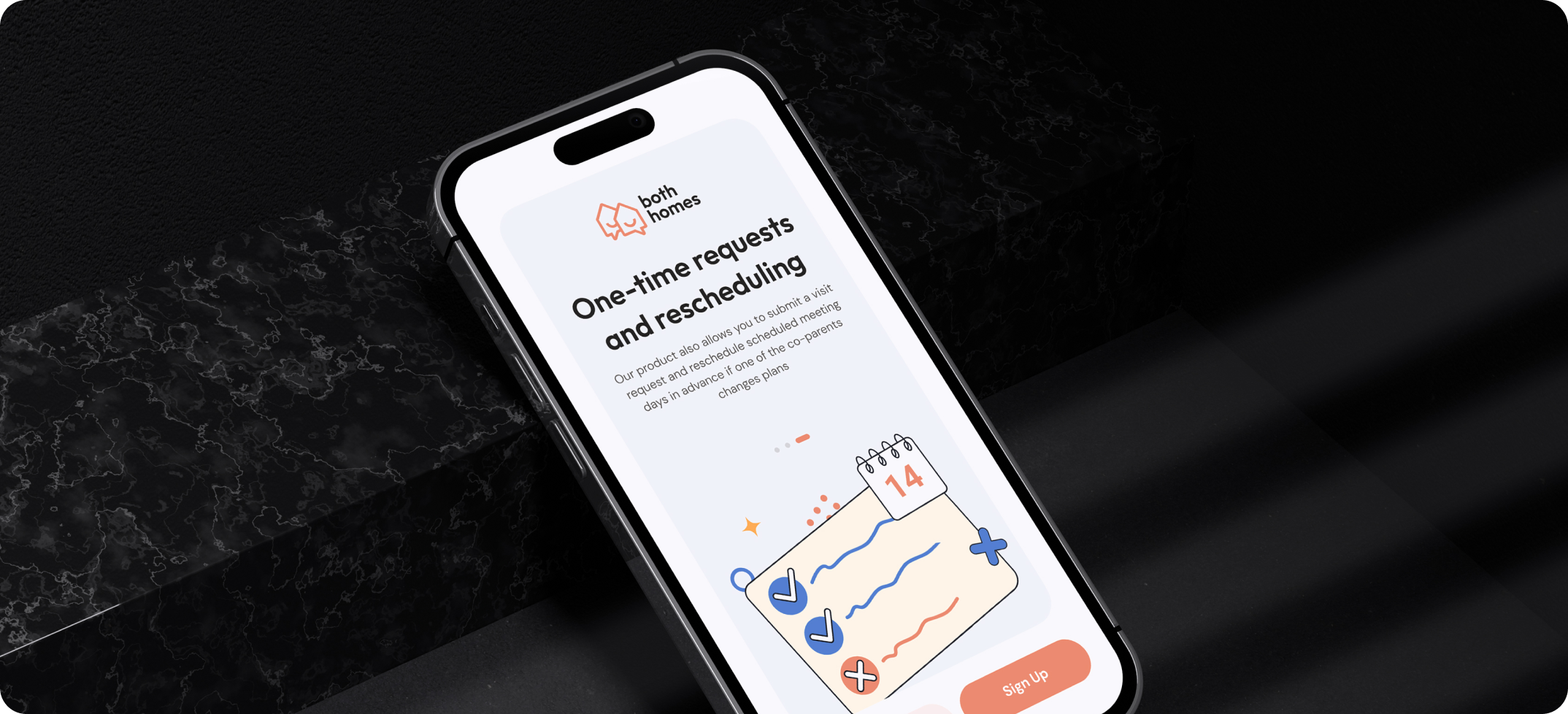
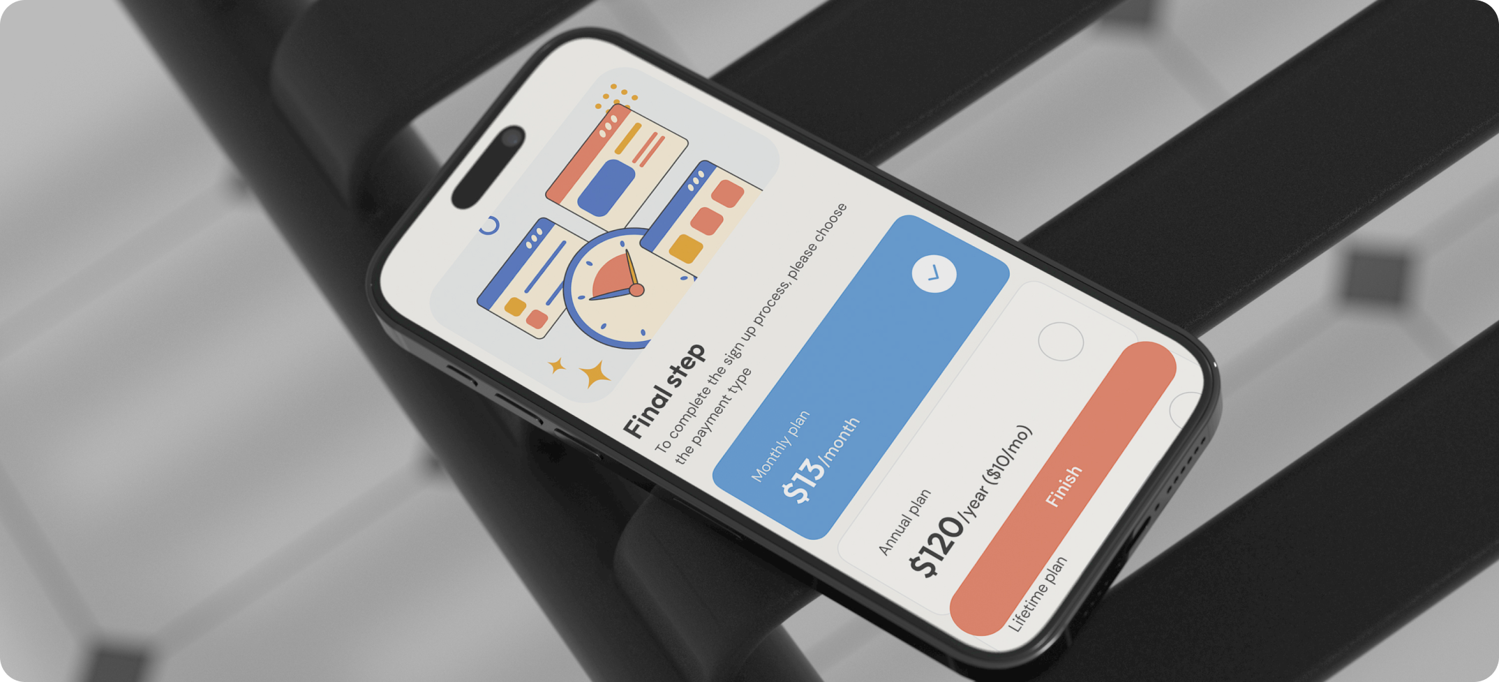
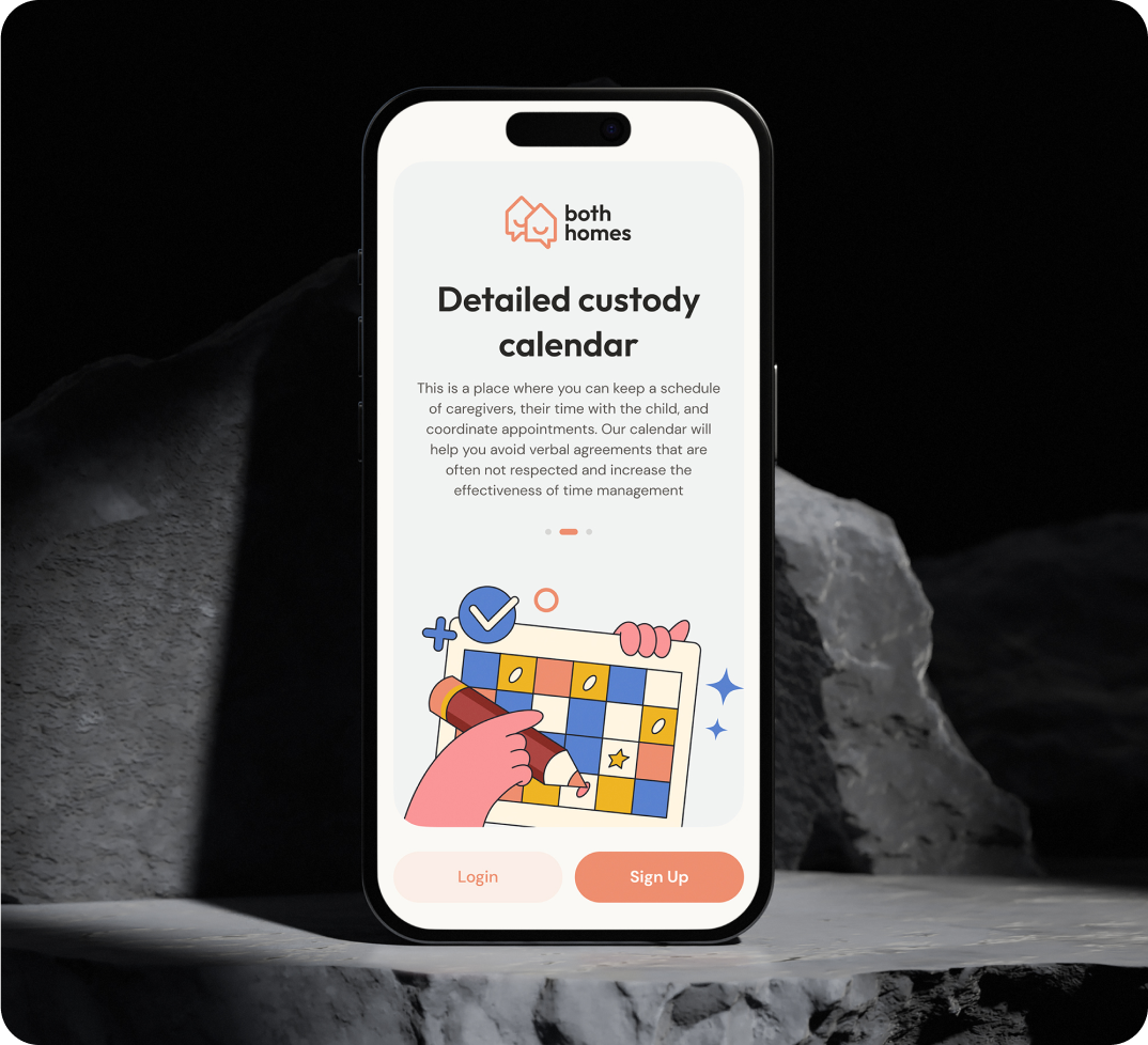
Both Homes is a co-parenting mobile app designed for shared child custody. The app reduces conflict, increases positive outcomes, and helps children thrive.
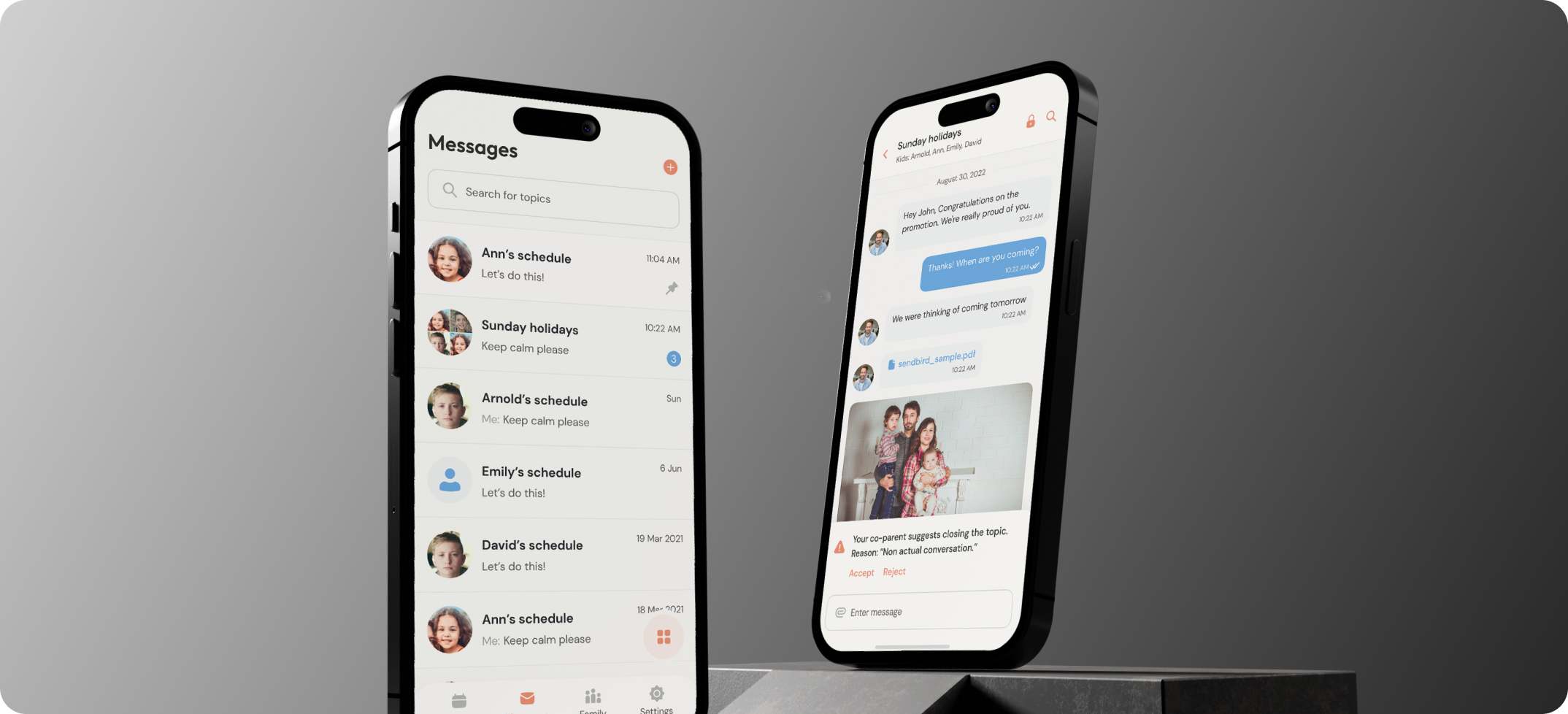
Both Homes is a co-parenting app that aims to streamline communication and scheduling for divorced, separated, and unmarried parents. It provides a safe and permanent messaging system that helps parents focus on their children’s needs while minimizing conflict.
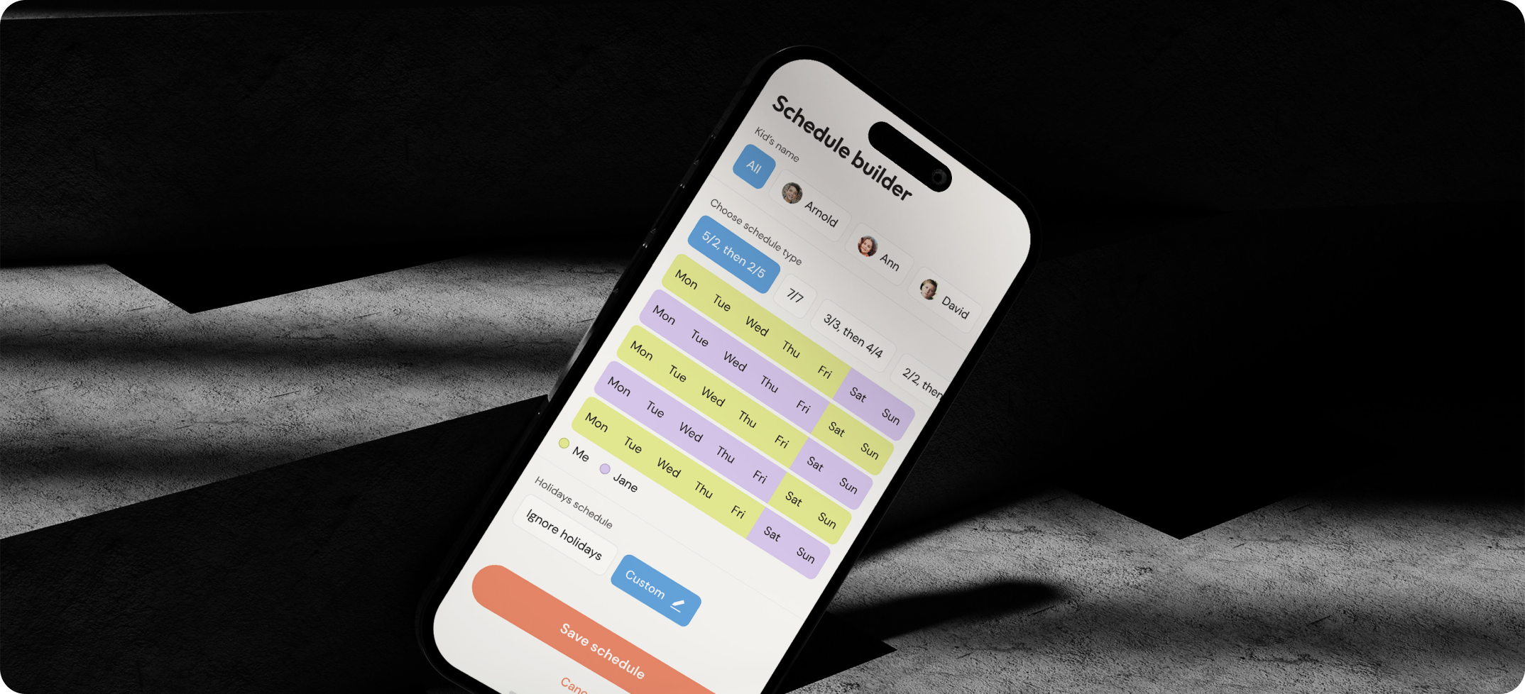
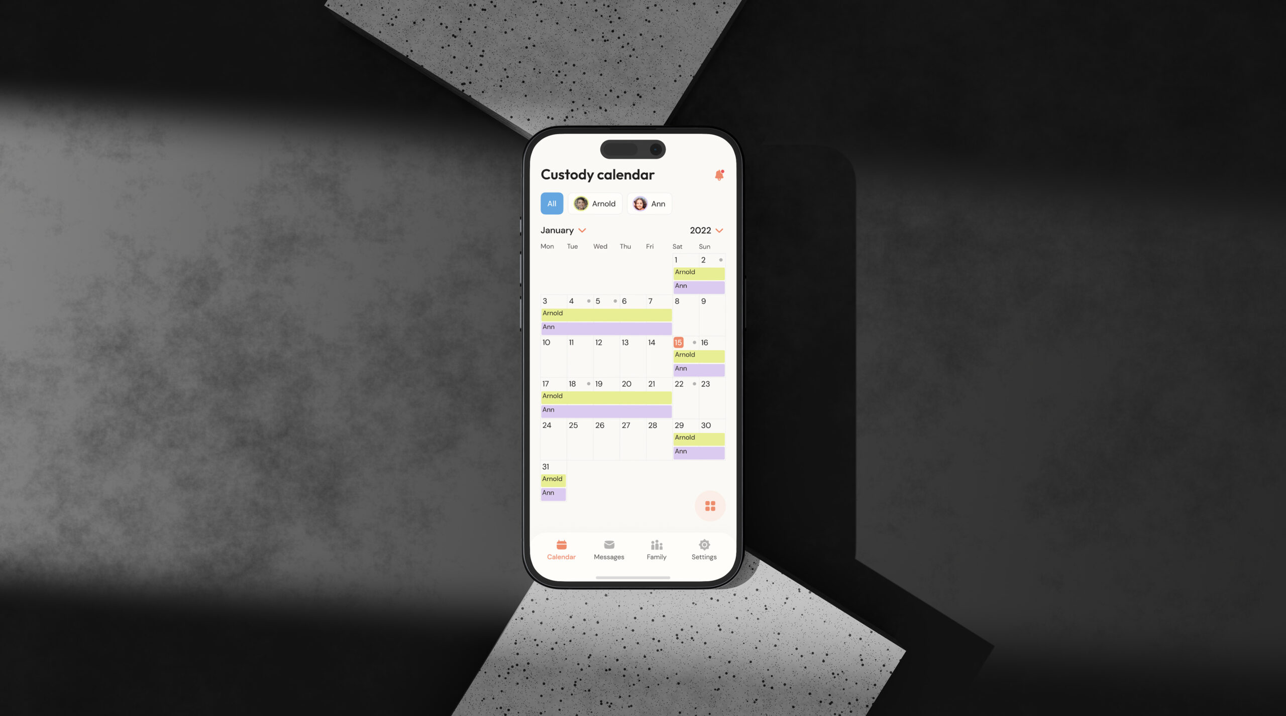
The app ensures that parents never miss important events or custody exchanges by offering a robust event and custody exchange tracking feature. Additionally, Both Homes makes it easy for parents to manage and trade parenting time, all of which is tracked in a comprehensive custody calendar. To protect the safety and privacy of children and parents, the app employs advanced encryption and sharing controls, ensuring that sensitive information is secure.
Navigating the complexities of co-parenting, especially in high-conflict situations, demanded a solution that prioritized communication, scheduling, and security. Our goal was to create an app that not only streamlined co-parenting logistics but also fostered a healthier environment for children.
We needed to address the issues of conflict reduction, reliable scheduling, and robust security to create a platform that parents could trust and rely on.
Also, because this was a startup project, we faced the challenge of making the design as simple as possible so that the client could later transfer it to a live environment using no-code solutions. This required careful consideration of design elements and functionalities to ensure they were intuitive and easily implementable without extensive coding knowledge.
Creating a robust system for tracking and managing custody exchanges and important events.
Implementing advanced encryption and sharing controls to protect the safety and privacy of children and parents.
Encouraging parents to adopt and consistently use the app amidst the emotional challenges of divorce and separation.
The development of Both Homes followed a structured and user-centric approach to ensure the final product effectively met the needs of co-parenting families.
Our work began with extensive research and discovery, which laid the foundation for creating a robust and user-friendly app. This was followed by designing a comprehensive informational architecture, developing wireframes and prototypes, and finalizing the design direction.
Throughout the design and development stages, we continuously tested and refined our work based on user feedback.
Discovery & Insight Gathering
Blueprinting the Information Architecture
Crafting Wireframes
Designing the Final Interface
Our initial phase was dedicated to understanding the complex landscape of co-parenting. We conducted in-depth research to identify the unique challenges and needs of co-parenting families. This involved several key activities.
We dove deep into existing literature and studies on co-parenting to ground our understanding in established research. Engaging with the client helped us gain a clear perspective on their vision and expectations for the app. We analyzed existing co-parenting tools and apps, benchmarking their features and pinpointing areas where Both Homes could excel.
Identified 20 common pain points that co-parents experience
Spent 10 hours observing user behavior
Held 3 hours of in-depth discussions with family counselors
With a wealth of data in hand, we moved on to designing the app’s informational architecture. This step was crucial in ensuring that the app would be intuitive and user-friendly.
We compiled an exhaustive list of all features and content that needed to be included in the app. Conducting card sorting sessions with potential users helped us understand how they naturally organize information, which informed our structural decisions. Based on the insights from card sorting, we created a detailed map outlining the app’s hierarchical structure. This map served as the foundation for ensuring logical content organization and easy navigation.
Through 4 team collaboration sessions, we ensured alignment with project goals.
This phase resulted in a detailed content map and a backlog of 18 critical features to be included in the app.
We’ll secure your success by integrating the best industry experts and incredible skills. Your dream is in the right hands.
The next phase involved transforming our information architecture into tangible designs. This iterative process included several key steps. We developed high-fidelity wireframes that laid out the basic structure and layout of the app.
These wireframes acted as blueprints for the app’s design. They allowed us to visualize the app’s functionality and gather early feedback. Through the wireframes, we ensured that the app’s structure was clear, logical, and user-friendly before moving on to more detailed design work.
Developed 50+ high-fidelity wireframes to outline the app’s basic structure and layout.
Finalized wireframes within 5 days, ensuring the project stayed on schedule for the next phase.
The design direction was approved with the client through moodboards, and we proceeded to draw all the interface screens. This phase involved creating high-fidelity layouts that incorporated the app’s visual design and branding.
To optimize development time and resources, the design was crafted to integrate seamlessly with various platforms and third-party services. This approach ensured that the app could leverage existing technologies and minimize custom development efforts as it is a startup.
Created detailed design specifications and guidelines for developers to ensure a seamless transition from design to development.
Developed advanced interactive prototypes ensuring seamless functionality.
Verified final designs against user requirements and feedback to ensure all critical needs were met before proceeding to development.
The Both Homes project culminated in the development of a user-friendly, secure mobile app designed to enhance the co-parenting experience for millions of divorced, separated, and unmarried parents.
The app successfully addresses the specific needs and pain points of co-parenting families, ensuring a seamless and efficient way to manage shared child custody.
The comprehensive and methodical approach taken during the project’s various stages resulted in a product that met and exceeded user expectations, leading to positive feedback from both parents and family counselors.
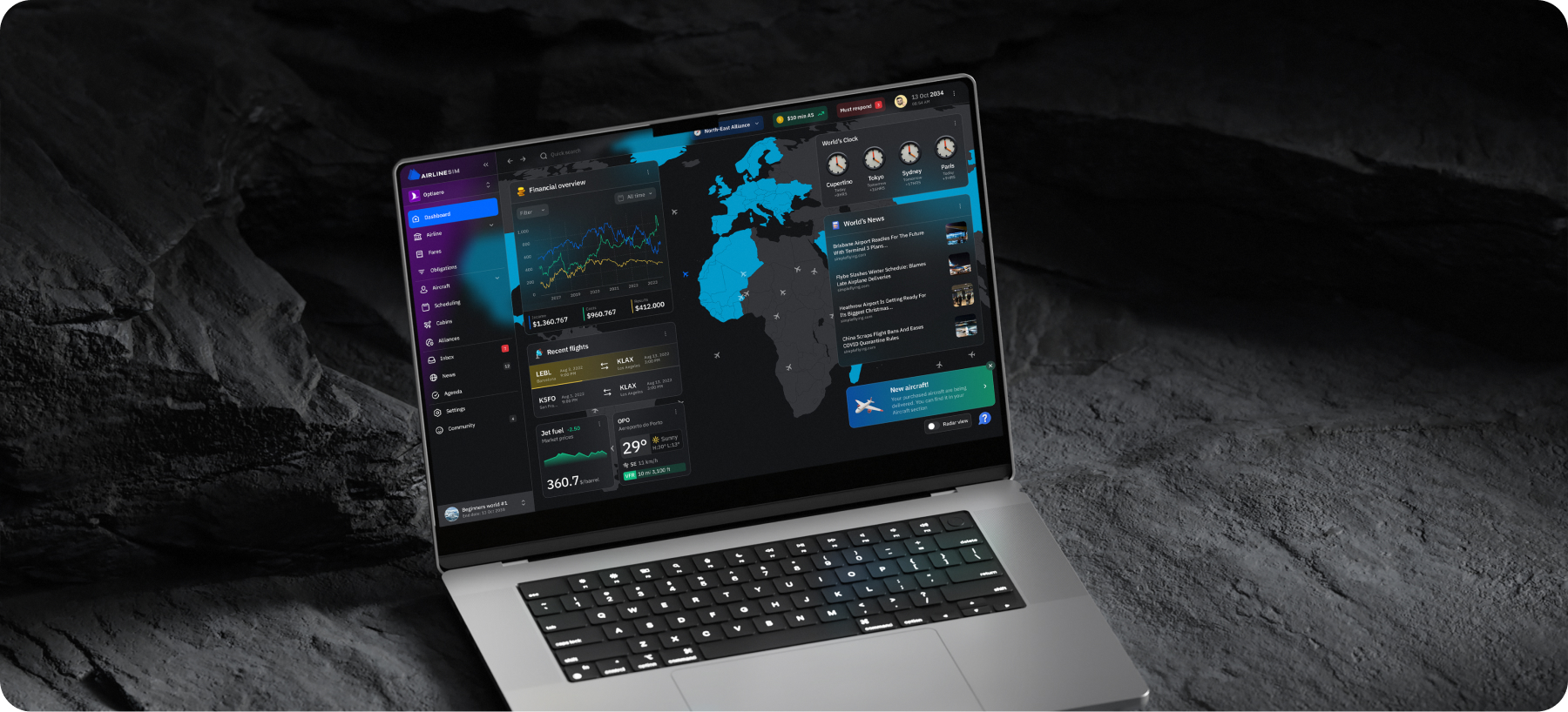
This project is a web-based flight simulator designed for professionals in the aviation industry. Users can establish their own virtual airline and handle real-world operations' complexities like planning, reservation, inventory, and management systems.
AI-powered Platform for App Personalization
We appreciate your interest in our product design services and will get back to you as soon as possible.
To improve our services, please tell us where you heard about us by selecting an option: