Development
Research
Client
Zest
 USA
USA
USA
Services
The client expressed high satisfaction with the team’s proficiency, facilitating the prompt and timely completion of the design within the initially estimated timeframes.
Zest approached us with a bold vision: to create a digital product that empowers individuals to take charge of their health while seamlessly integrating scientific research into their daily lives.
Our role was to design an intuitive and engaging user experience that aligned with Zest’s mission to make longevity science accessible while achieving their business objectives. We began by conducting in-depth research into health and wellness trends, gaining insights into user needs and expectations. This informed the creation of a visually compelling and user-friendly interface that simplified the process of assessing functional age and understanding personalized health recommendations.
We crafted seamless user flows and integrated tools for tracking progress, delivering tailored supplement plans, and providing actionable lifestyle insights. The result was a streamlined platform that demystified complex health concepts, exceeded user expectations, and reinforced Zest’s position as a leader in health technology.
To develop an app that is both innovative and genuinely valuable, we conducted a two-stage research process encompassing Competitive Analysis and Information Architecture. This method provided a deep understanding of the market landscape and user needs, ensuring the final product would be clear, engaging, and highly functional.
For Zest, this research uncovered key insights into user frustrations with existing health apps, such as the lack of personalized, actionable advice and the overwhelming complexity of health data. These findings guided the identification of essential features, including simplified age assessments and tailored wellness recommendations, designed to make health optimization accessible and effective for users.
By prioritizing simplicity, scientific accuracy, and an engaging user experience, we positioned Zest as a standout solution for individuals seeking to take control of their health and the aging process, while addressing gaps left by competitors in the market.
Stages
- Competitive Analysis
- Information Architecture
When analyzing competitors, the main gap we noticed is that while they offer valuable features, they lack integration between different aspects of health, namely physical fitness, nutrition, and mental wellness. Users often have to switch between multiple apps to manage different aspects of their health, resulting in a fragmented experience.
Using this knowledge, we designed the app to provide a holistic health management experience through integration:
- Allowing users to track sports activity, dietary habits, and mental health within one platform.
- Use user data to provide personalized advice that covers all aspects of health, promoting a balanced lifestyle.
- Provide easy navigation and engaging user experiences to encourage continued use and long-term commitment to health goals.
By addressing the gaps identified in our competitor analysis, we are positioning the Zest app as a unique solution that simplifies and enhances the user’s journey to better health and longevity.
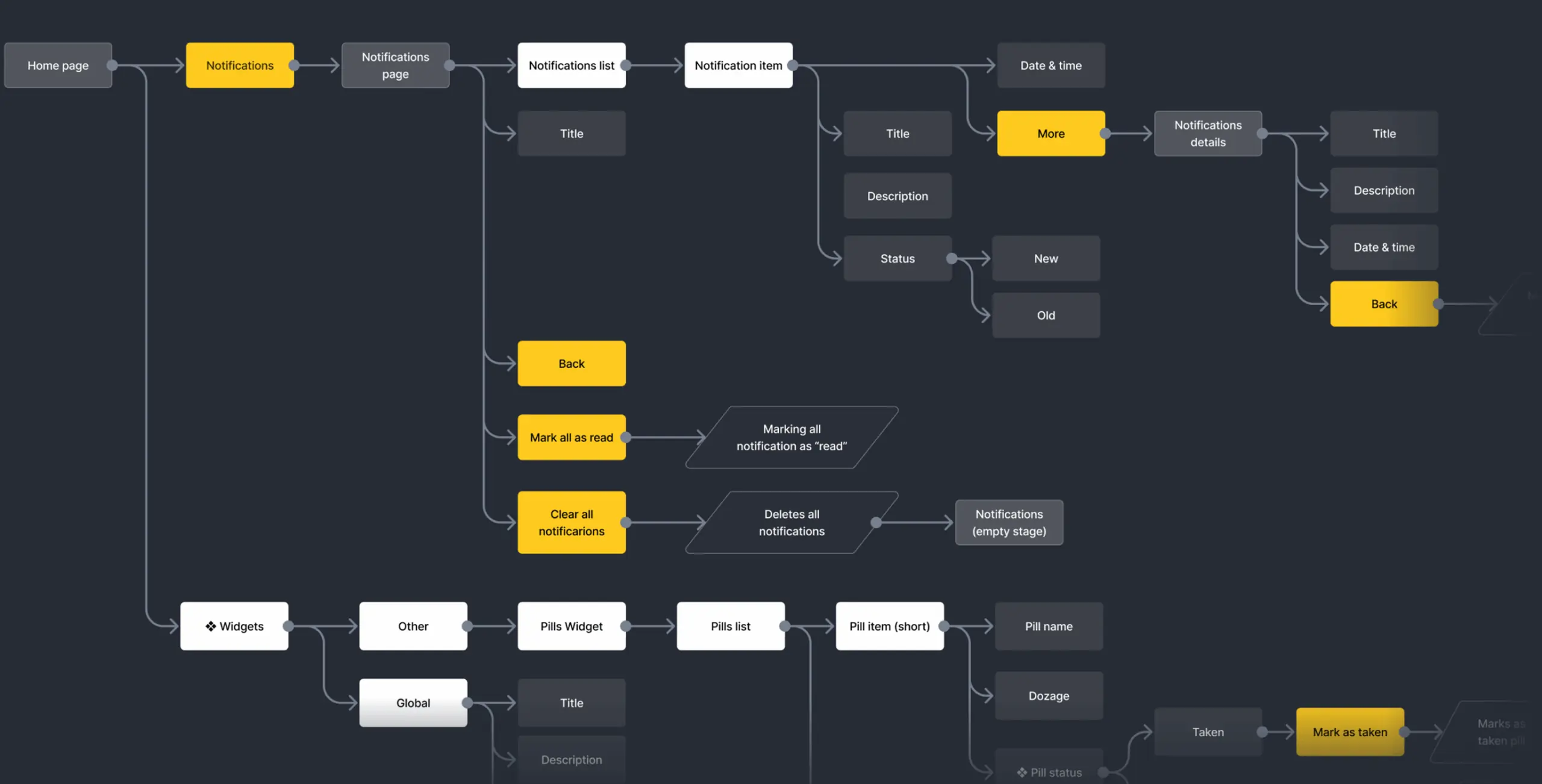
In the Information Architecture stage, we focused on organizing Zest’s content and features in a way that would provide users with a seamless, intuitive experience. The goal was to ensure that all health data, assessments, and recommendations were easy to navigate and accessible without overwhelming the user.
We carefully structured the app’s content by prioritizing key features like the functional age assessment, select mood symptoms, personalized health recommendations, and progress tracking.
Through this process, we:
- Designed an intuitive navigation system that minimized friction and simplified complex health data.
- Grouped related features to enhance usability and reduce cognitive load.
- Focused on clarity and simplicity, ensuring users could effortlessly interact with their health insights.
The result was an Information Architecture that not only met user needs but also laid the foundation for an engaging, user-friendly experience.
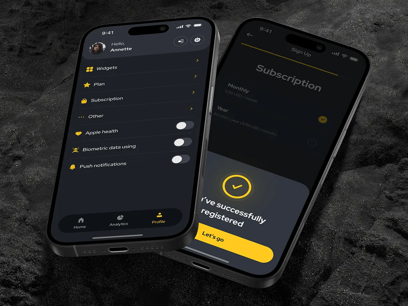
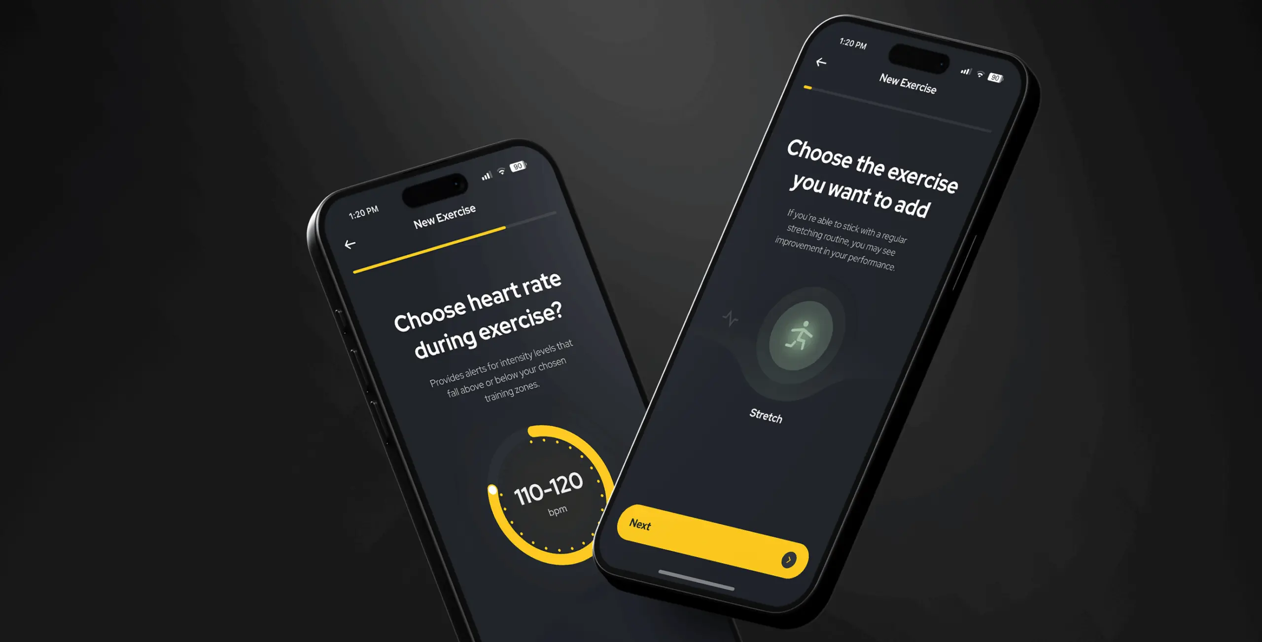
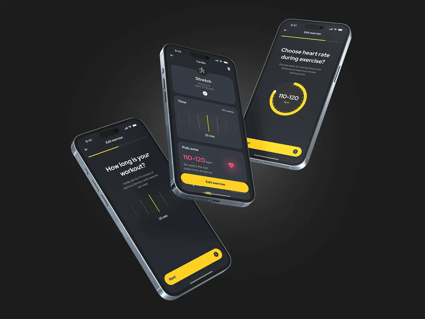
Finally, it’s time for UI design. The main priority here was to simplify the complex process of tracking health and wellness into an intuitive and visually engaging journey. The challenge was to present a variety of unique features, such as mood tracking, blood analytics, and supplement management, in a way that made them look cohesive and functional. To accomplish this, we favored clean, blocky layouts and bright accents. Also, since we used a dark theme by default, it was important to check the contrast and readability at every step to avoid causing users any discomfort.
Stages:
- Wireframes
- Design direction
- Mockups design
First, we developed detailed wireframes to visualize for us and the client which elements and functions should be located where. They helped us think through the entire structure of the application, spending less time searching for and solving key design problems. Here we faced the problem of overloading the main page, and this made us better prioritize which functions the user needs in one touch and which can be made secondary.
Wireframes helped us to quickly test and improve the structure of the application. This process laid a solid foundation for the next stages of design, aligning the app’s functionality with both user expectations and the clients.
We defined the visual style of the application, carefully considering the needs and preferences of our target audience, striving to make the interface clean, attractive and easy to use.
The first concept, with a white theme, prioritized interactivity by giving users direct control on the home screen. Many functions were available at once, creating a dynamic interface, but this approach made it difficult to prioritize and effectively display all the necessary functions.
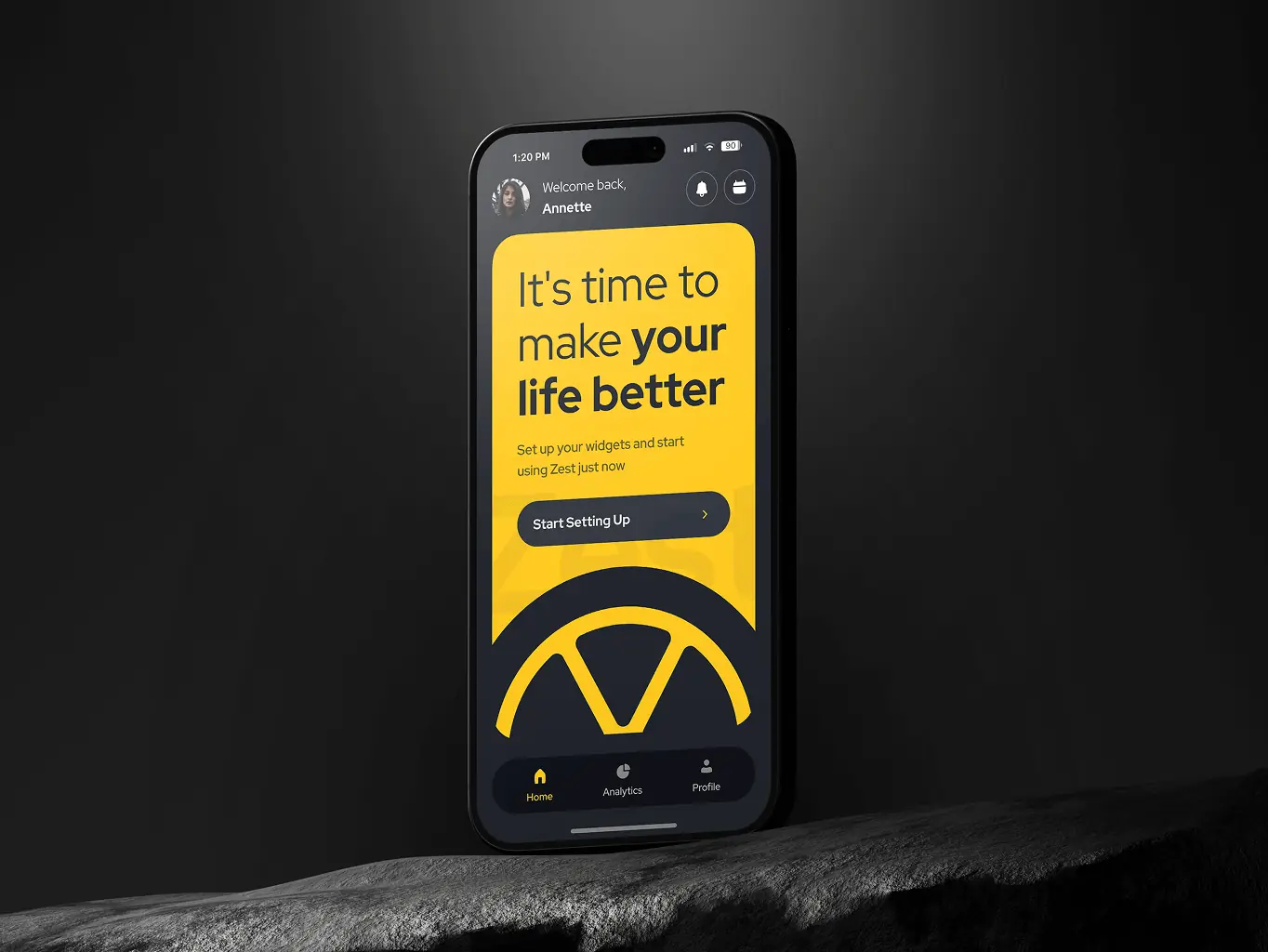
The second concept, with a dark theme, was quite the opposite, favoring simplicity and clarity, using a block structure with widgets that displayed key information at a glance. This way, we were able to place widgets of all functions on the main screen with a preview of statistics.
In the end, a second concept was chosen that follows a modern aesthetic and focus on simplicity, which resonated better with the app’s overall vision. This decision balanced user needs for quick access to core functionalities while maintaining a sleek and organized interface.
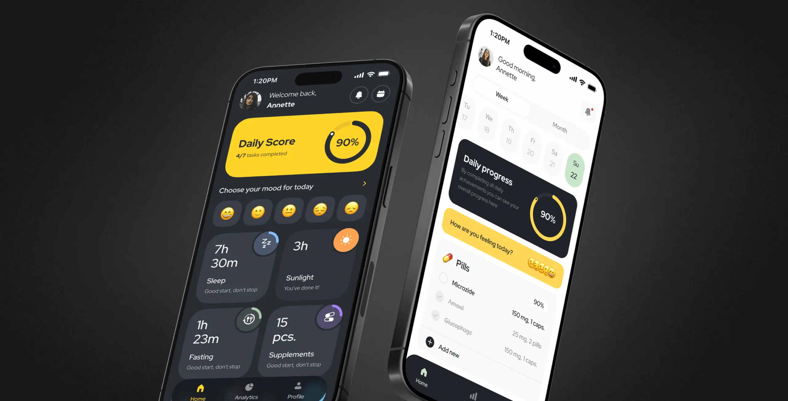
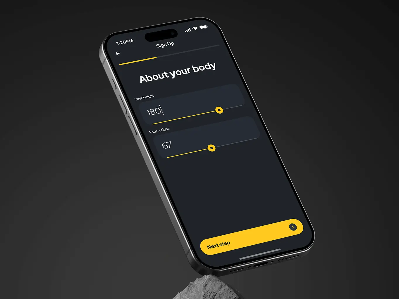
This phase was all about transforming creative ideas into a functional, user-friendly design that balances modern aesthetics with user-centered functionality. We focused on turning initial concepts into high-fidelity mockups, crafting clickable prototypes to rigorously test and iterate on the design. Intuitive navigation and thoughtful use of space ensured users could focus on their well-being and essential self-care functions without distractions. A key focus was simplifying complex health information into accessible and engaging formats, creating an attractive, modern, and practical design.
User feedback played a crucial role—through corridor tests, we gathered insights and refined the design to make every interaction seamless. This iterative process ensured an intuitive and polished interface, offering users a smooth and enjoyable journey through the app’s features while empowering them to take charge of their health.
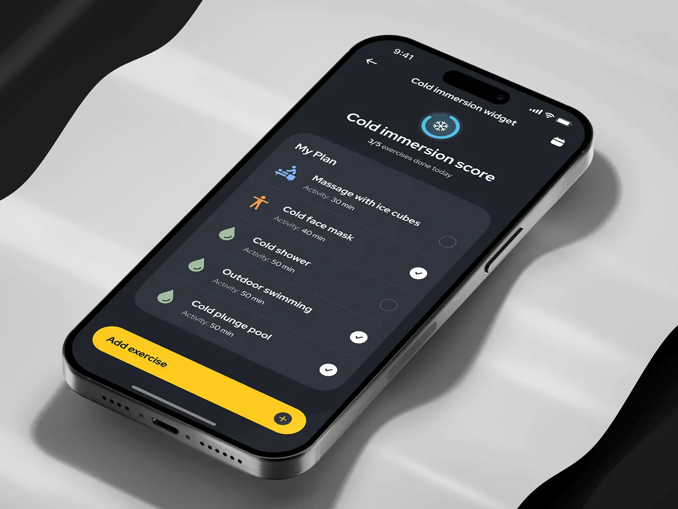
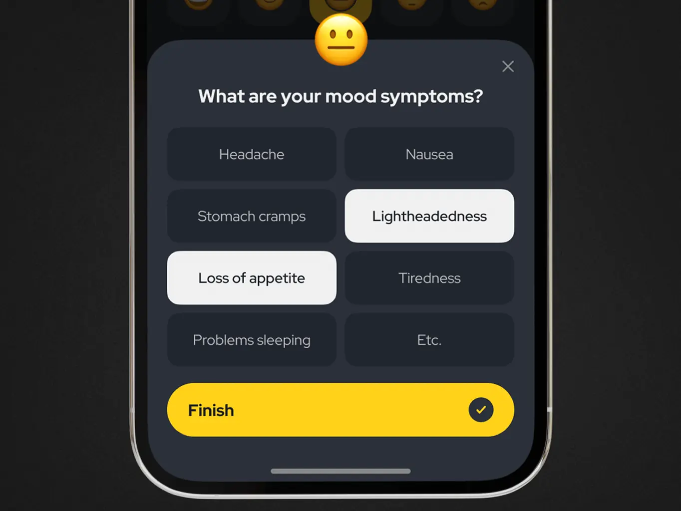
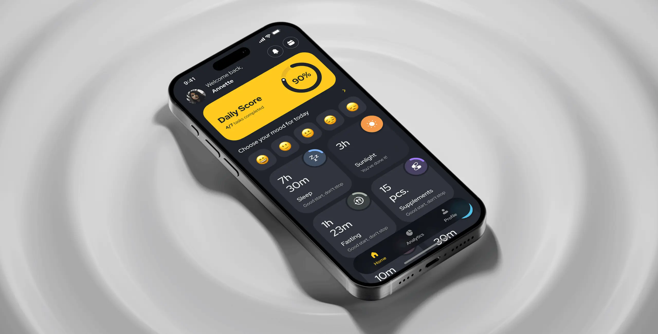
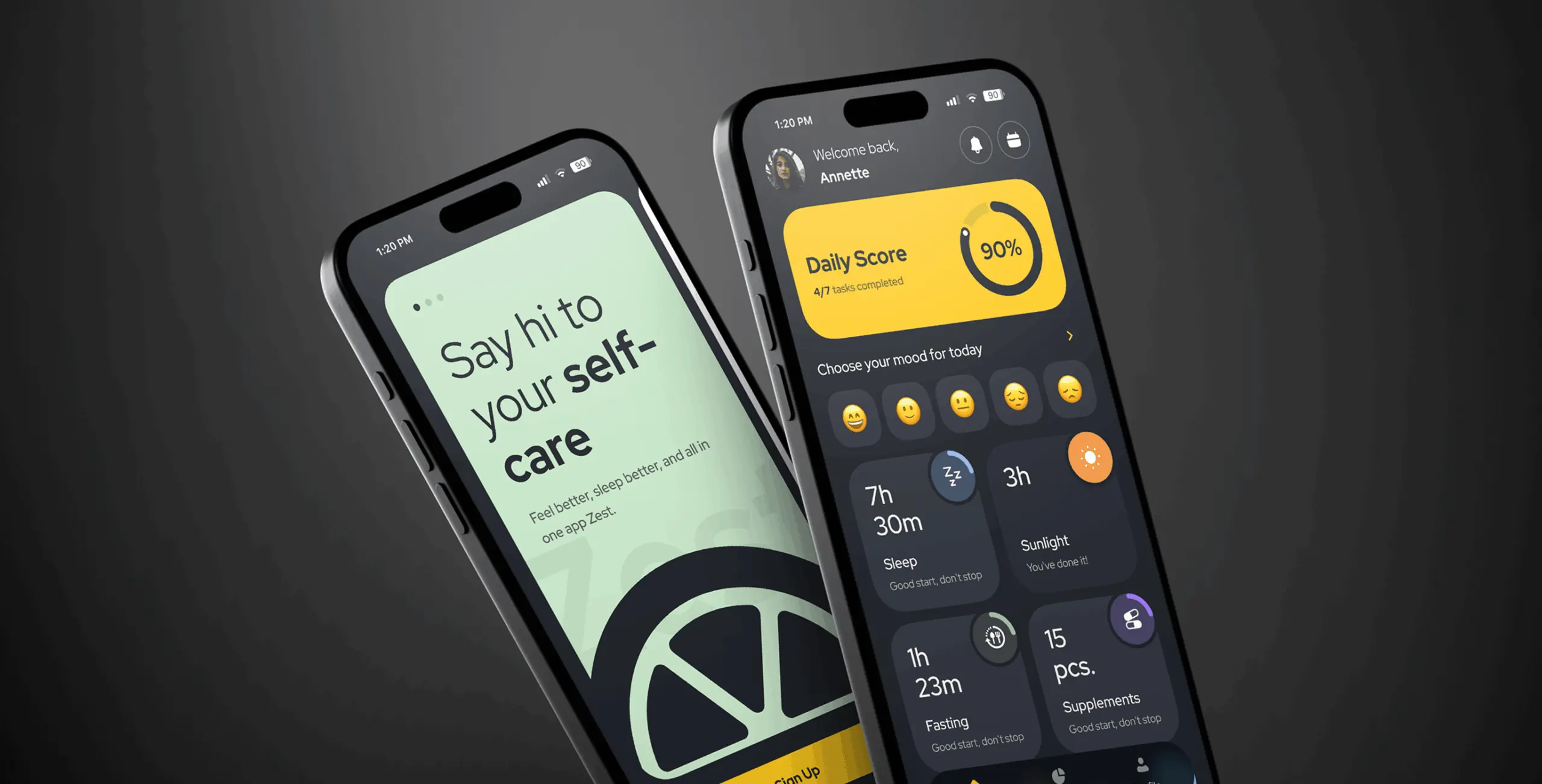
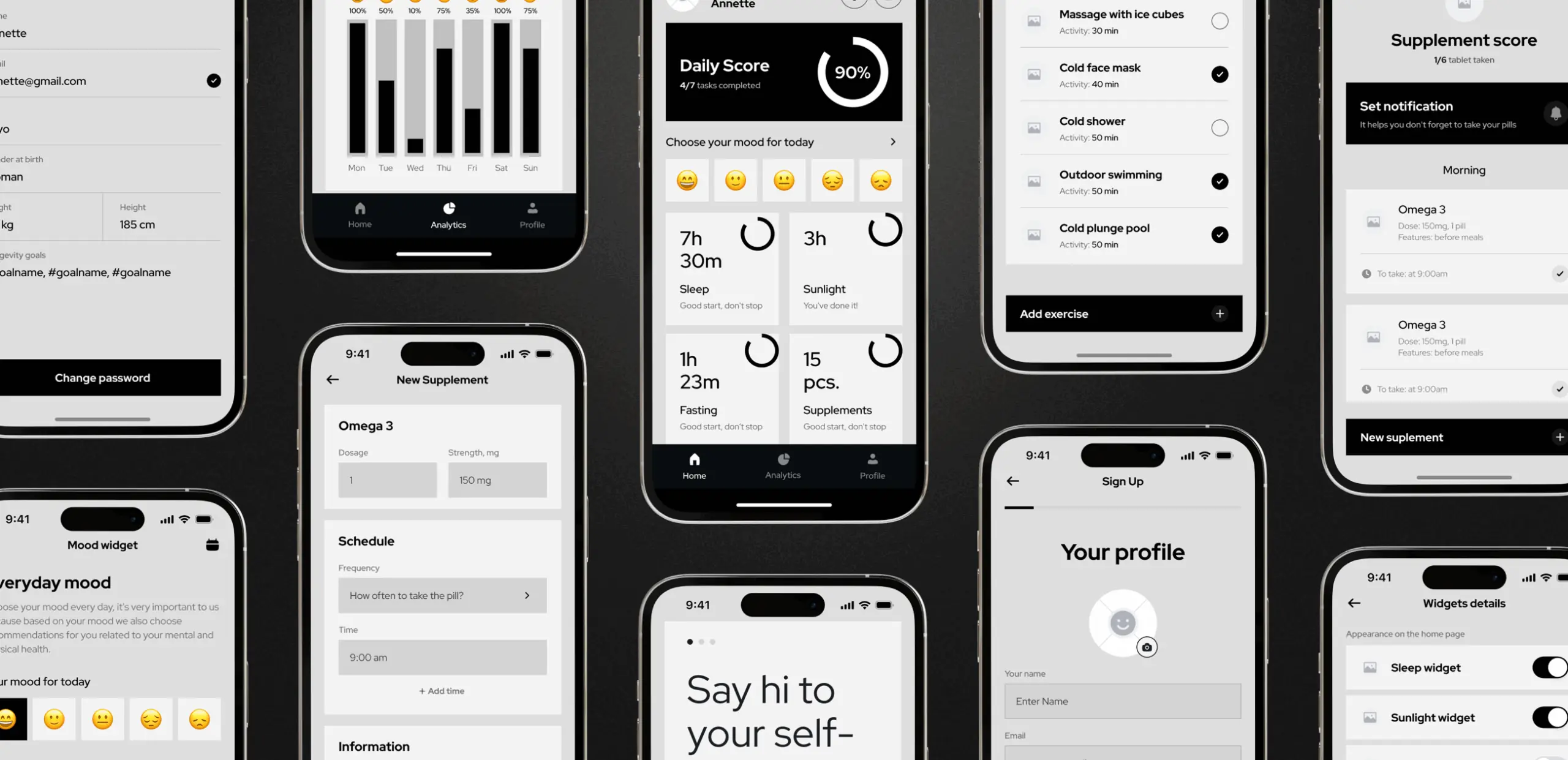
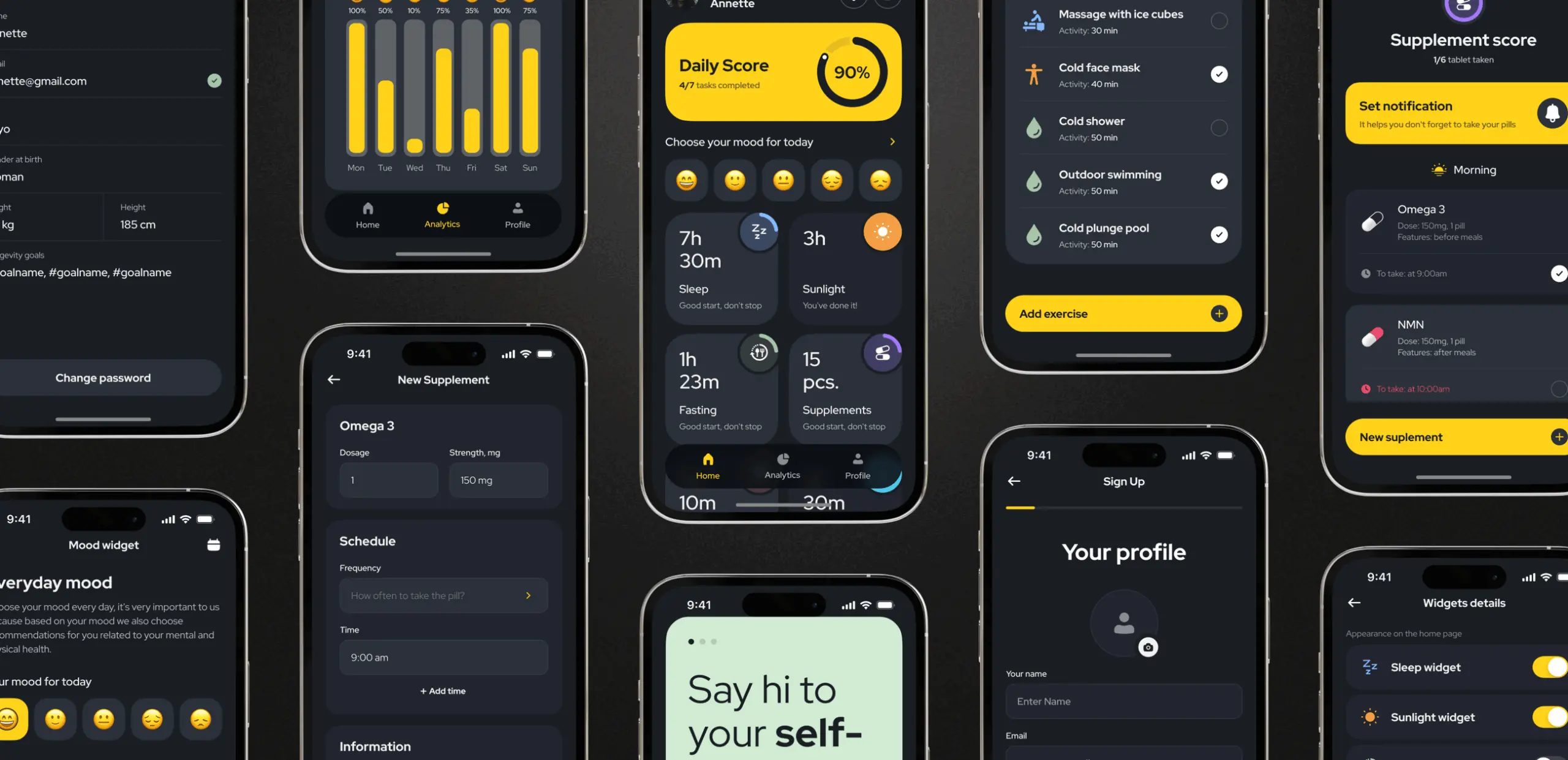
Mood symptom tracker
This feature allows users to log mood-related symptoms such as headaches, fatigue, or sleep disturbances. By tracking these patterns, users can gain a clearer understanding of how their emotional and physical well-being evolves over time, enabling them to take more informed actions to support their health.
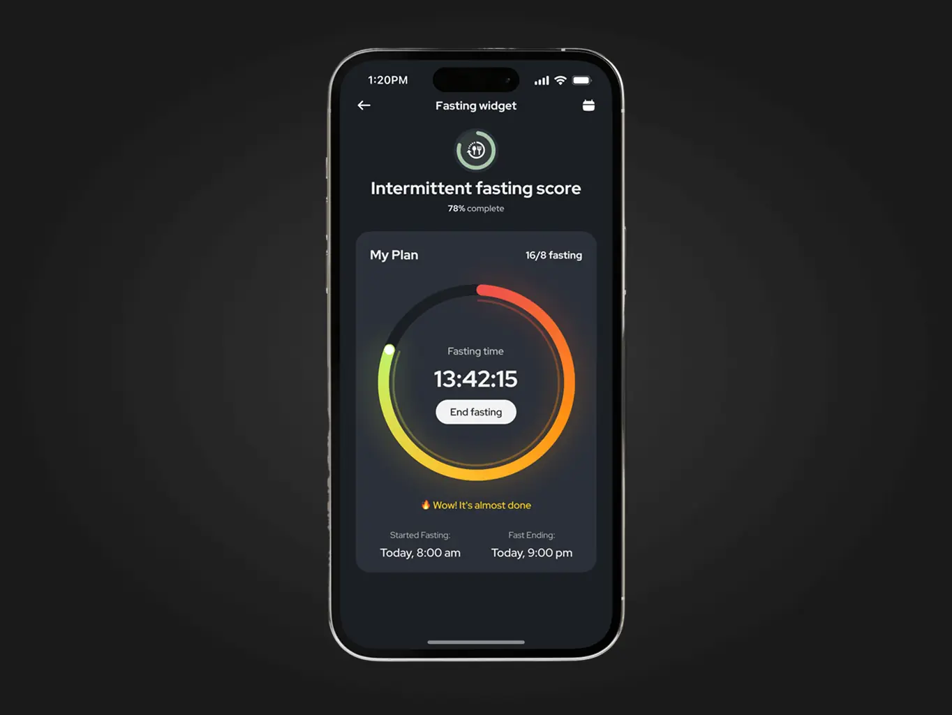
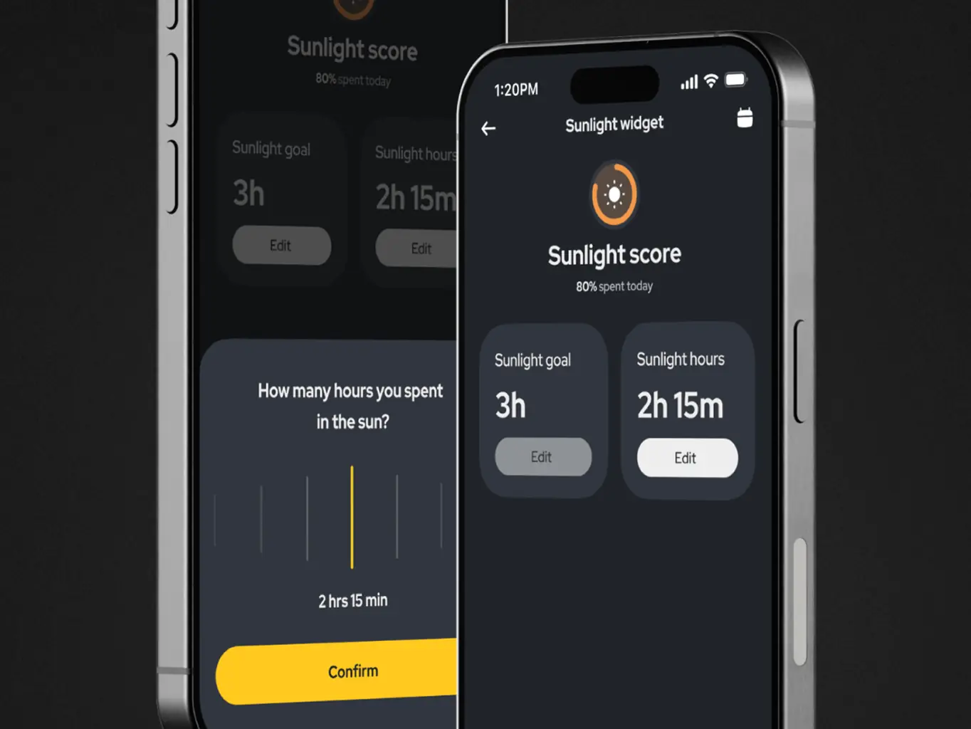
Daily progress tracker
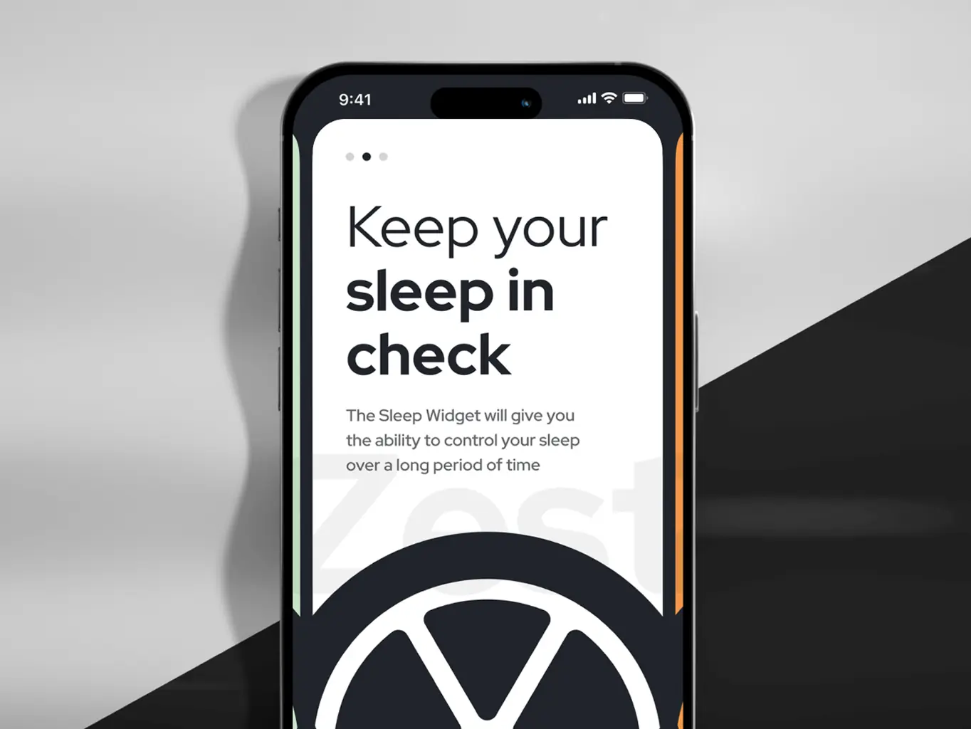
Users can set and track personalized wellness goals across key areas such as sleep, exercise, diet, and sun exposure. The tracker integrates with Apple Health for seamless data syncing or allows manual entry for flexibility. Progress is analyzed, and the app dynamically adjusts recommendations and health plans, ensuring a personalized experience that evolves alongside the user’s journey.
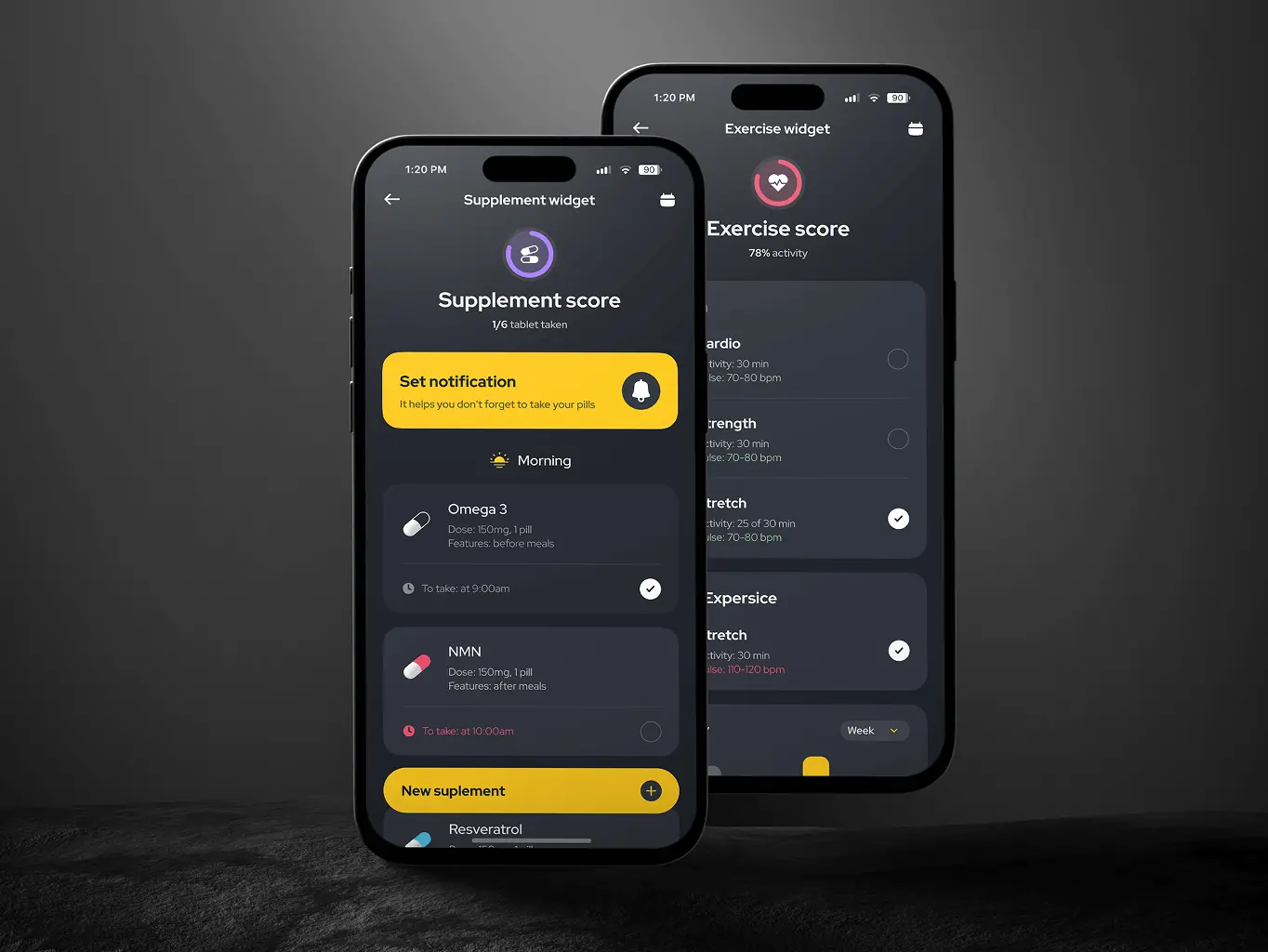
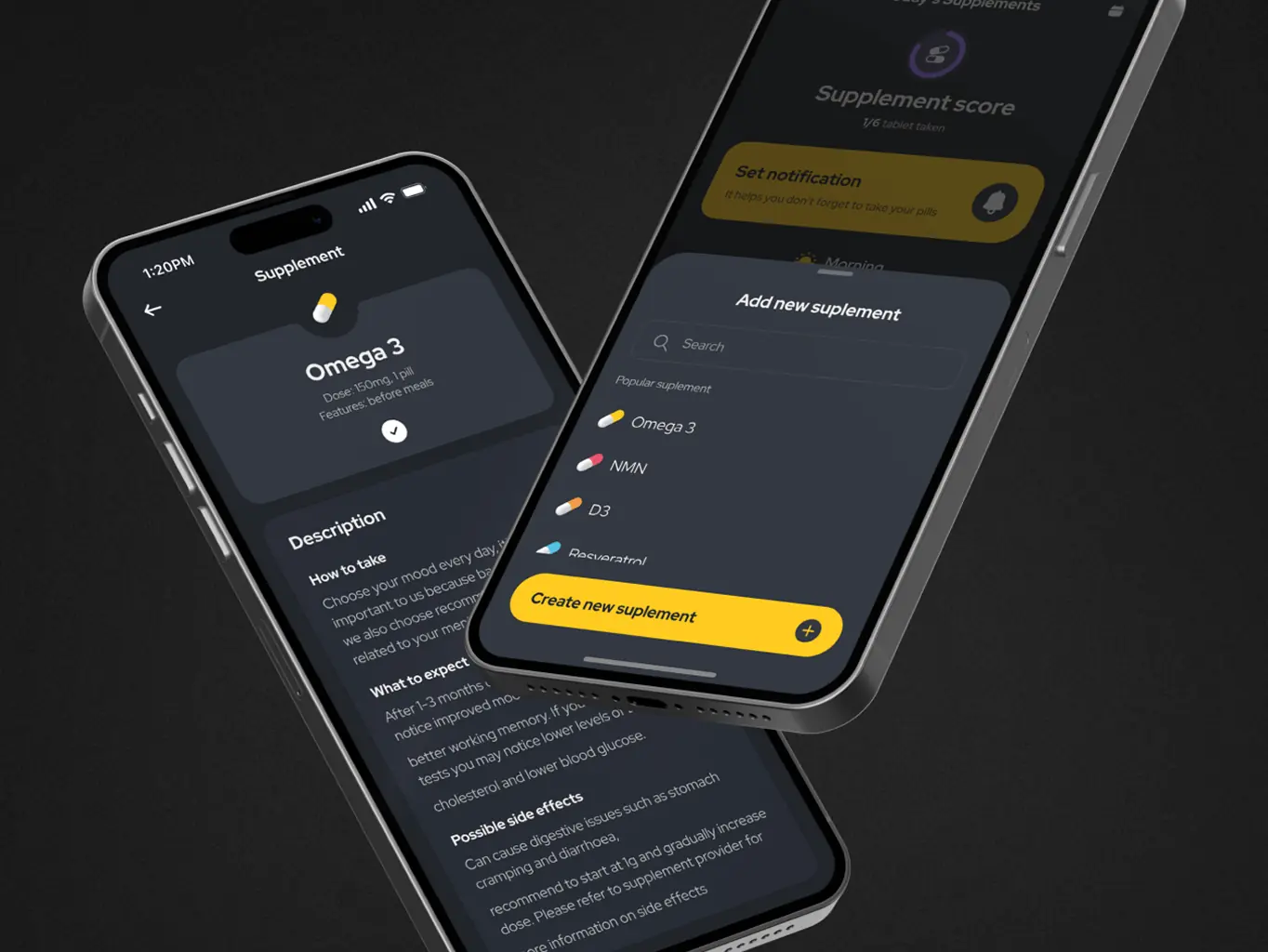
Personalized supplement management
This tool provides an organized way for users to manage their supplement routines. It includes options for searching popular supplements or adding custom records with detailed descriptions, usage guidance, and potential side effects. The app also enables users to set reminders and monitor intake, ensuring consistency and helping evaluate the effectiveness of their supplement plans over time.
#Product discovery #MVP Building
MindTales
 UAE
UAE
UAE
#MVP development #Mobile app design
Boost
USA
USA
#Web app design #Web development
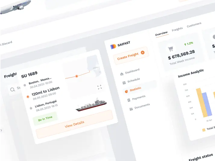
Saifast
USA
USA
Have a project in mind?
Let's chat
Have a project to
discuss?
discuss?

Have a partnership in
mind?
mind?