Task
The problem with applicants in many local specialties became more and more obvious. At the same time, the percentage of young people who could not find a suitable offer in the neighboring countries also grew.
Our mission was to bridge this gap and help two types of users (university representatives and applicants) find each other.
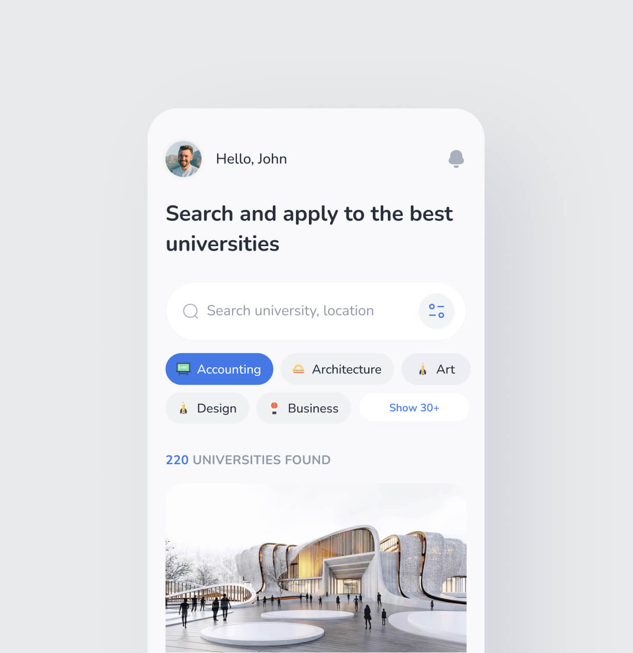
Our task was to create a convenient and understandable application to make the search and university admission faster and easier.
Solutions
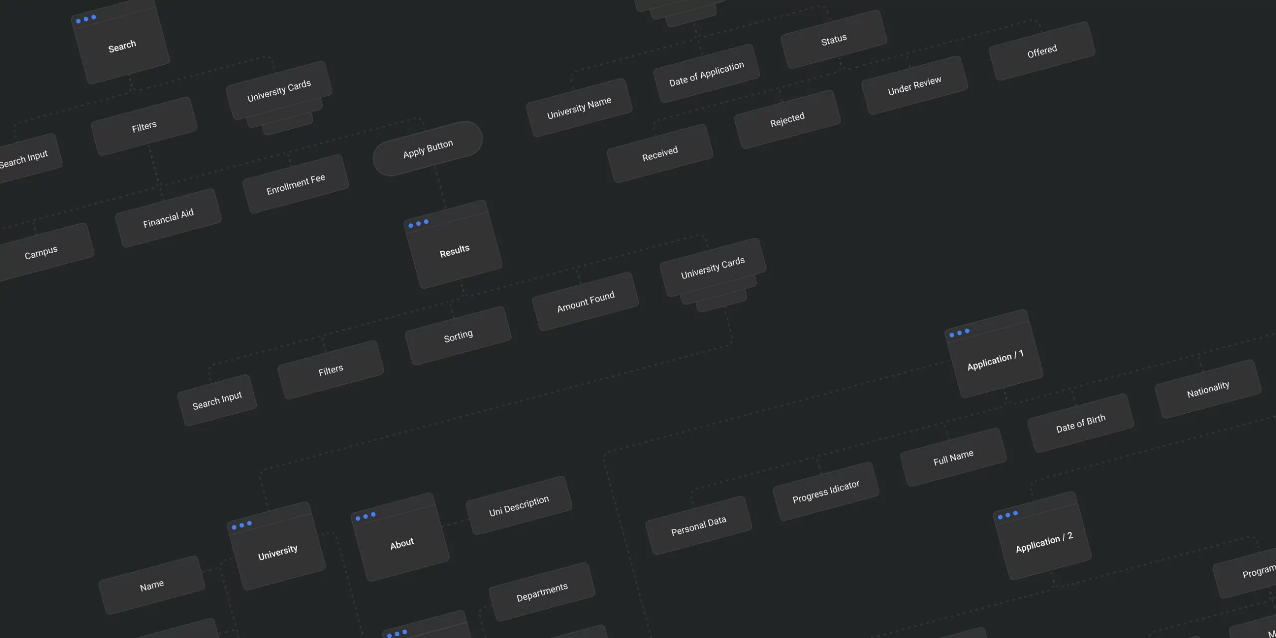
After conducting rounds of interviews and research, we defined that we would have two types of users, and the experience would be slightly different for each of them. However, no matter who our user is, the flows they go through should be clear and straight-forward and lead users to their goals, in particular:
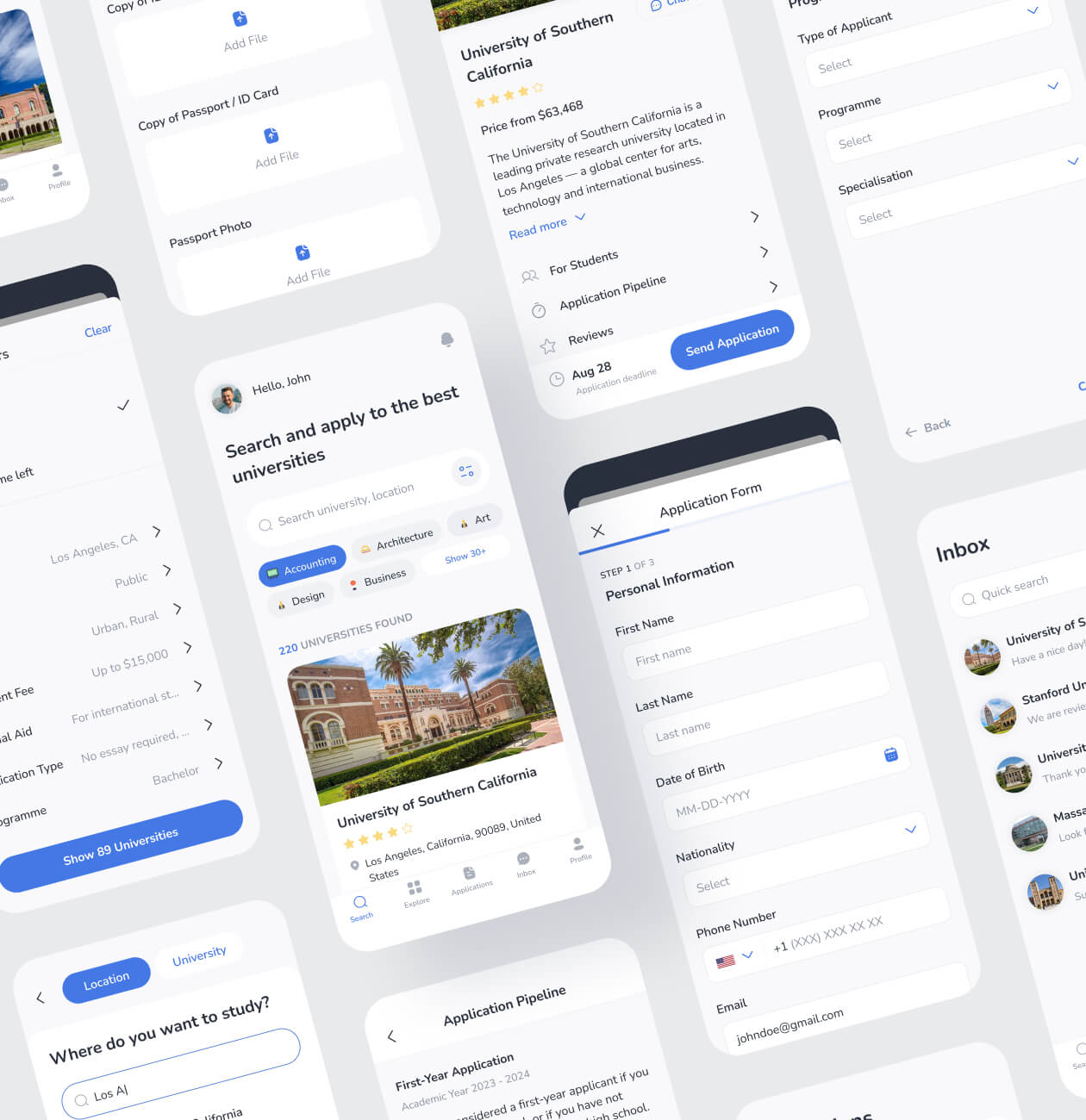
- Search for college or university;
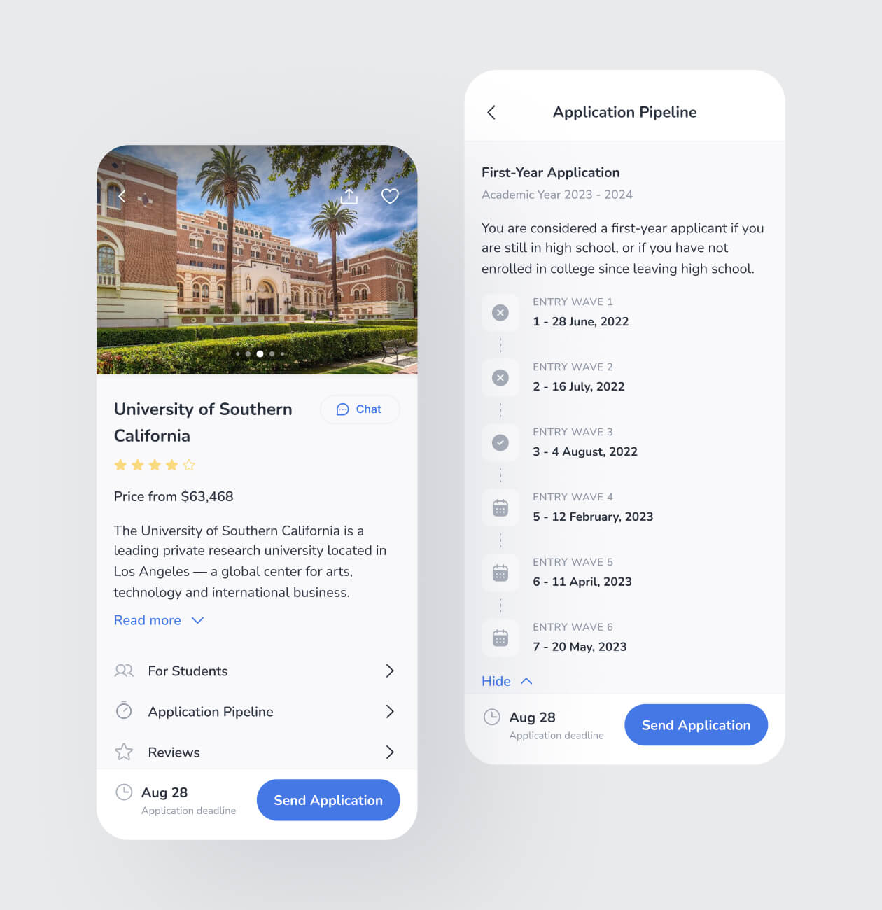
- See the timeline of the application period;
- Apply for studying;
- Be able to get assistance or help;
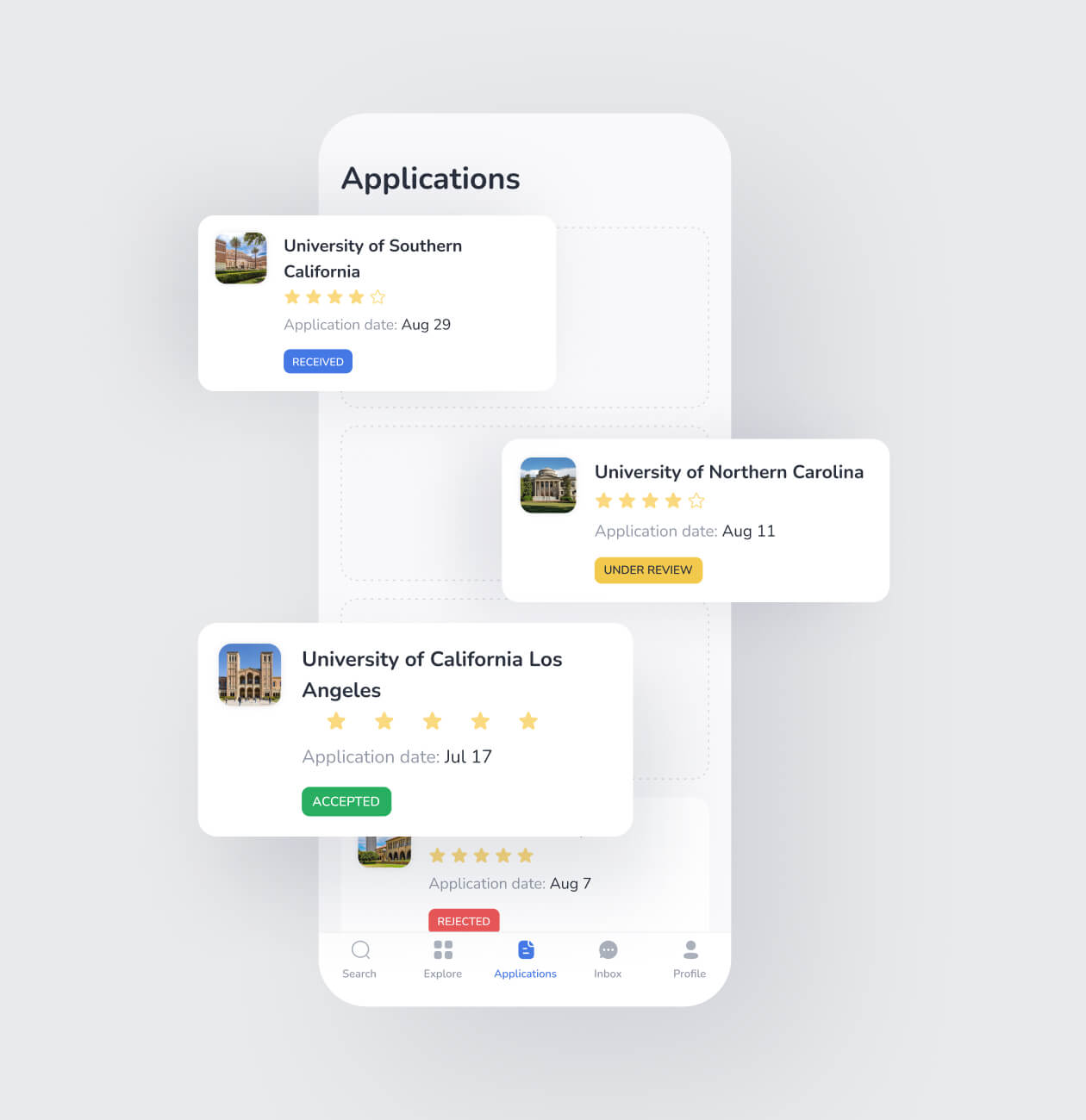
- Check the progress of the application.
Having all of the above would help us to create the application that would become a real helper for enrollees.
Research
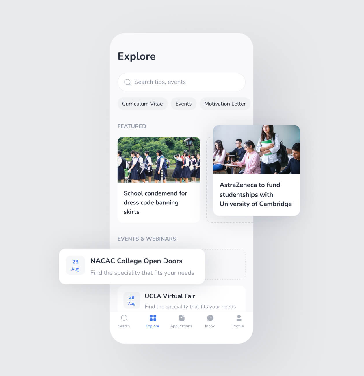
Before diving into wireframing, we conducted rounds of essential research. During the weeks, we studied competitors intensely, conducted market research, and talked to the users who had already been using such applications and those who hadn`t.
Wireframing
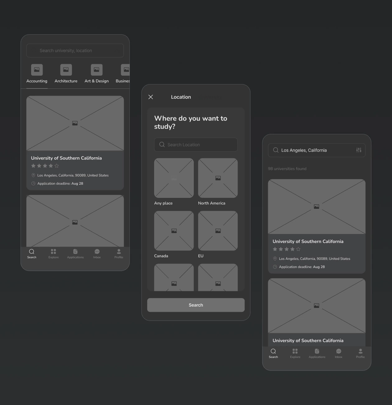
We created high-fidelity wireframes to make sure our users would not get confused or blocked by the things they don’t understand. We started working on the wireframes with all the reports from the research stage. We agreed on having two iterations of them, and each iteration had to be tested with users. By the way, we always follow such an approach because it helps us to save our time in the future and the client to save their money.
So, completing all the iterations and tests resulted in a user-friendly application with straightforward features.
Searching
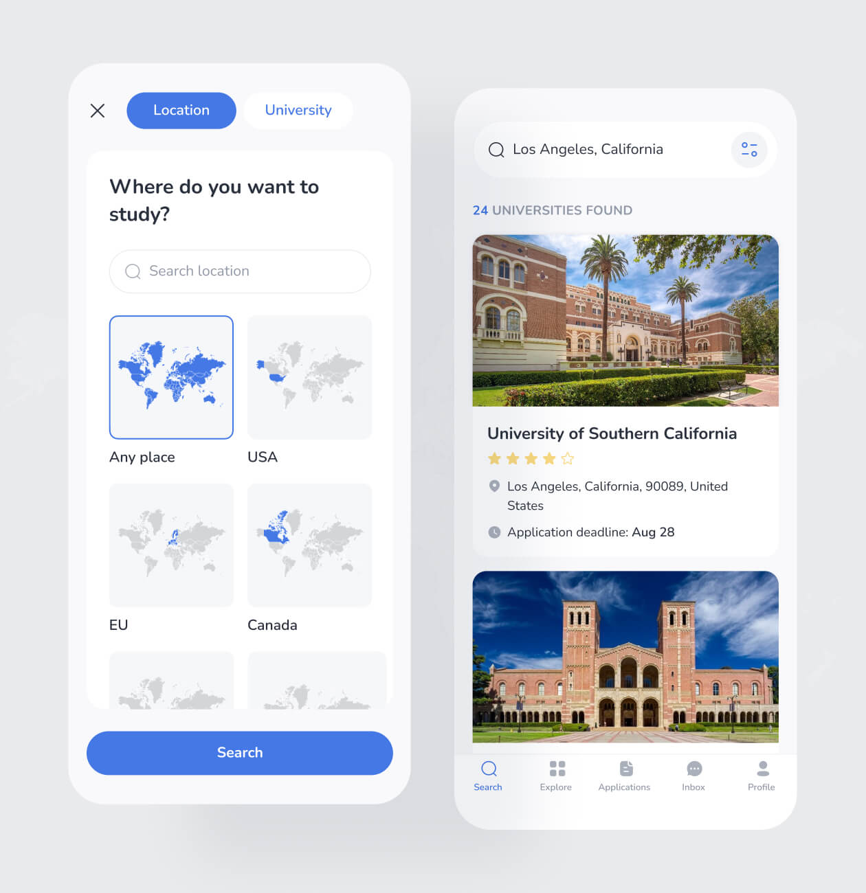
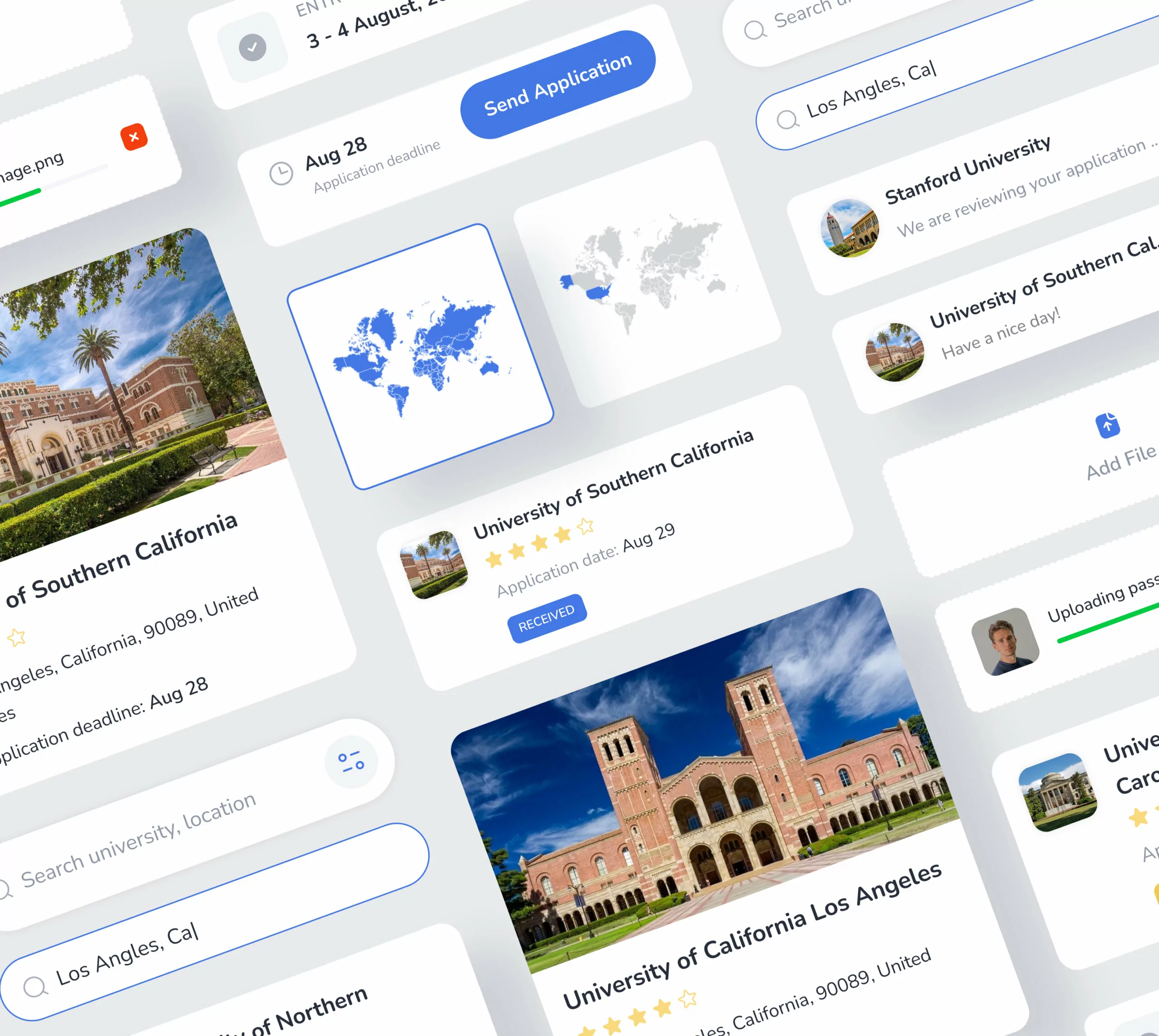
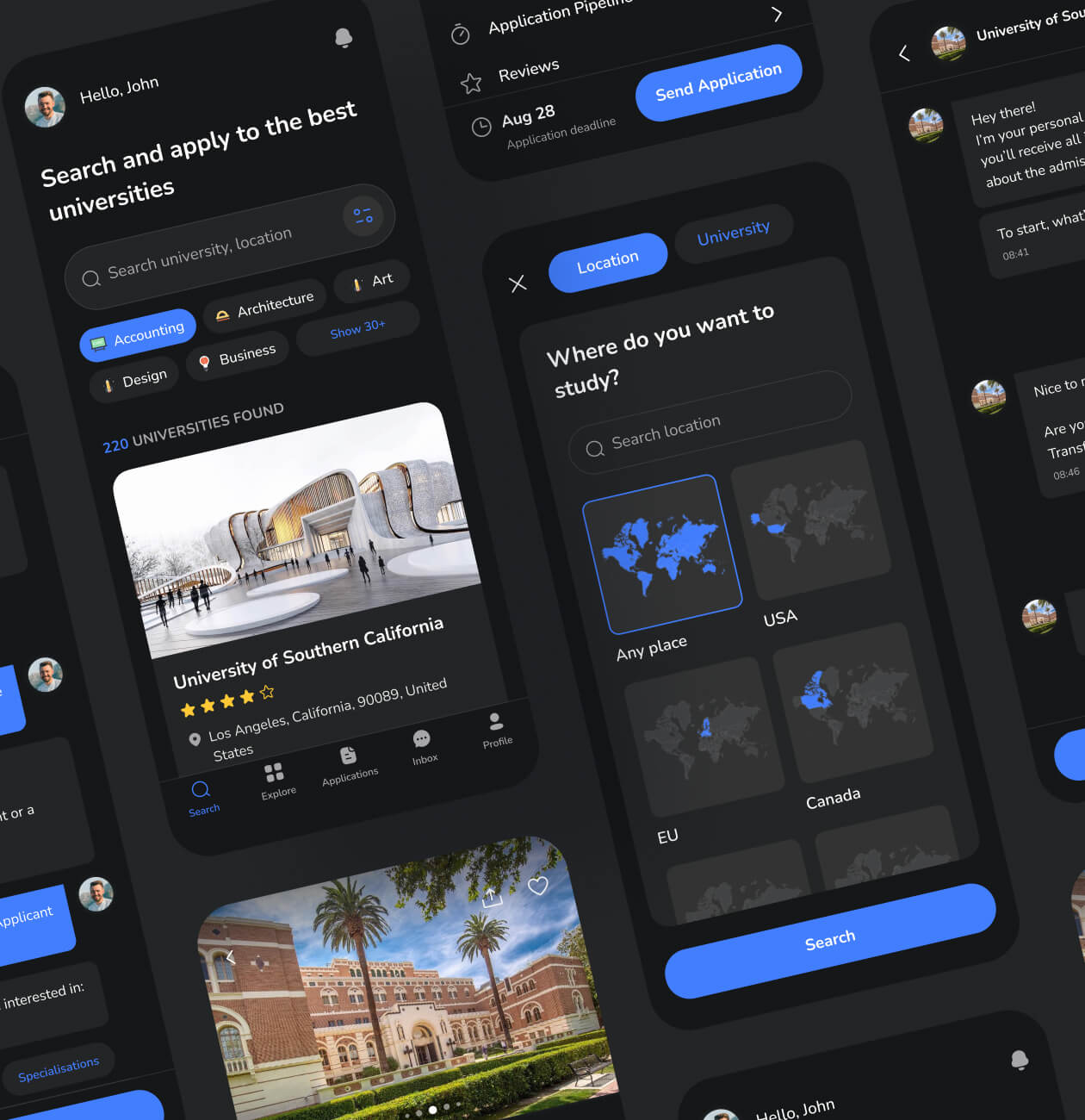
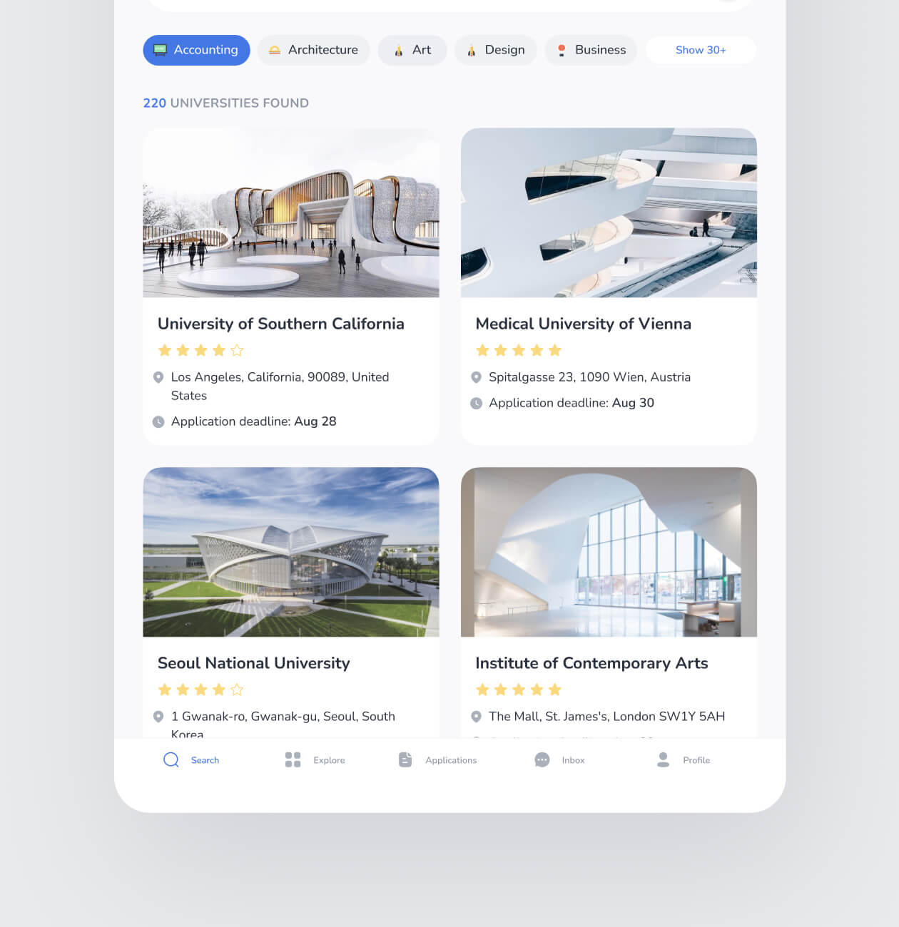
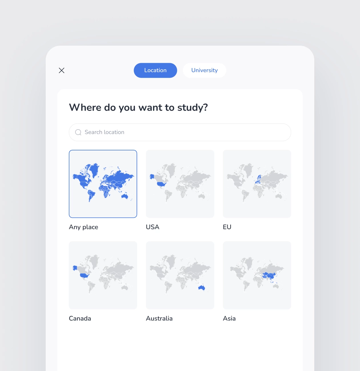
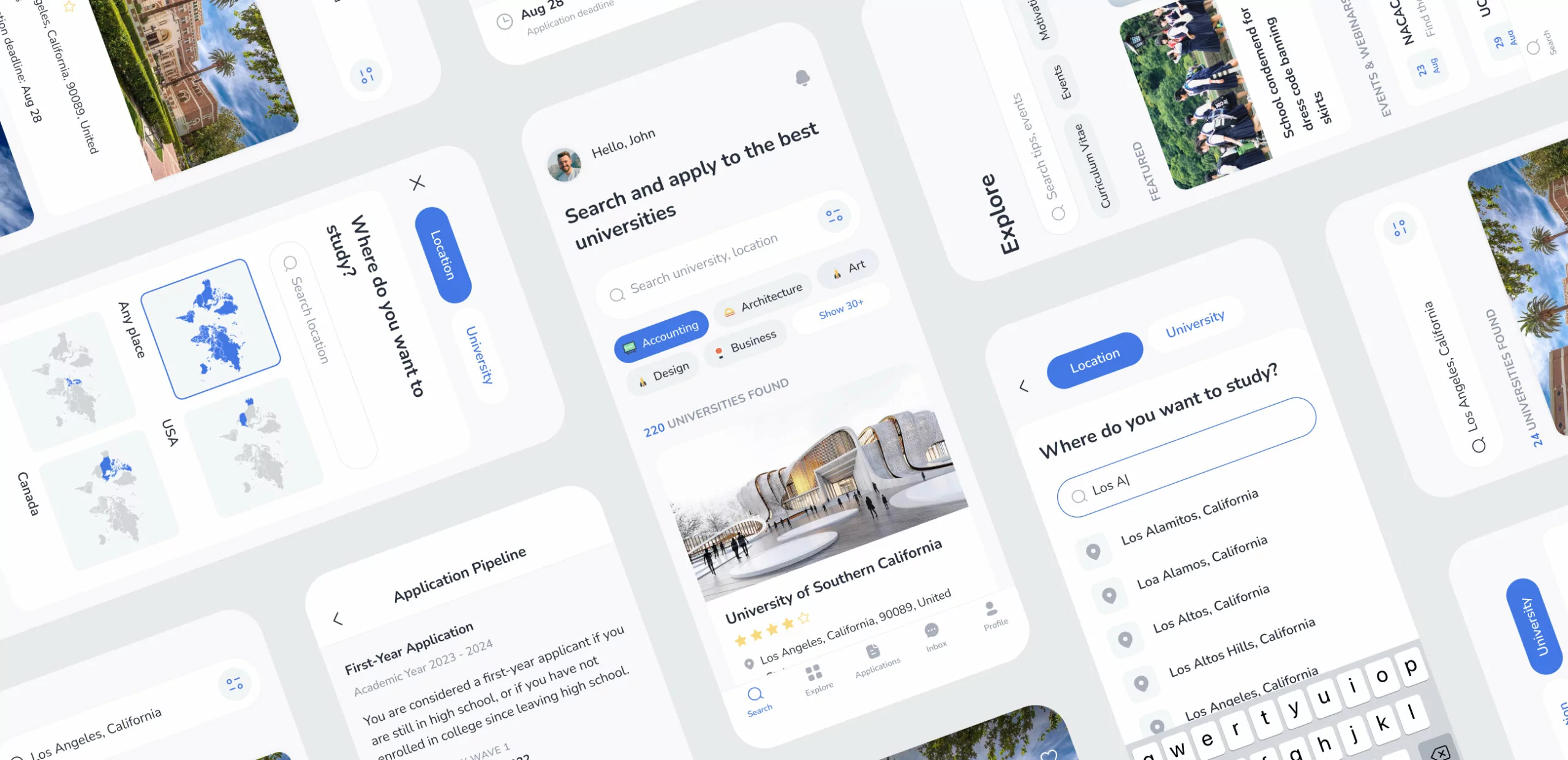
As we mentioned in the first section, we defined two types of users: those who already knew which university they wanted to study at; and those who weren’t sure. So to help both users select the appropriate option and navigate the app easily, we created two kinds of searches. The first one is created for those who aren’t sure where they want to study. It allows them to select the region on the world map and see all the universities available there. The second option of the search allows for selecting a particular university.
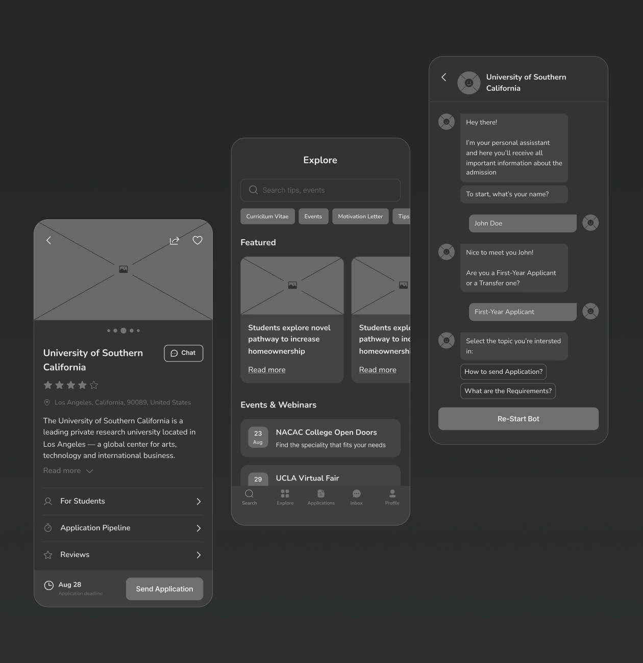
Another main part of the user experience in the app was to allow the user to learn as many details about the university as possible. So we added not only a gallery, description, price, and reviews but also an application pipeline that shows users periods of dates when they can send their applications. All already sent applications are also saved in the app so enrollees can always check their statuses.
Get professional assistance
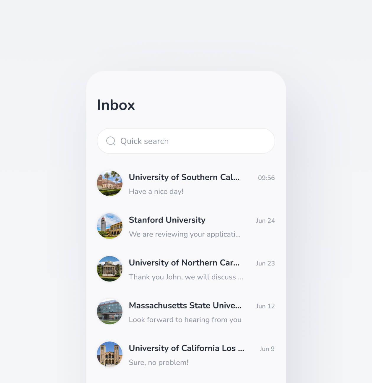
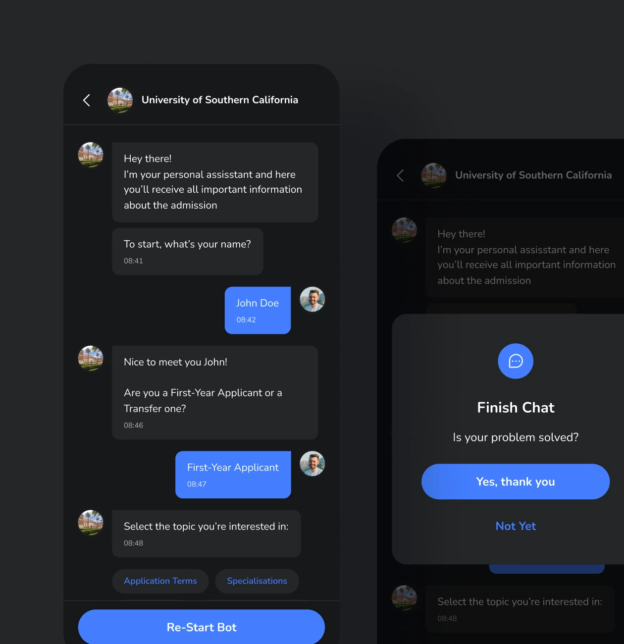
Additionally, we have allowed our users to chat with the university’s representative. The reason we have done that came from our interviews with the audience. Many people need to talk to someone from a particular university to think about whether they want to study there. Also, direct communication helps enrollees to cope with the stress that they might be left alone and have nobody to appeal to in case of any questions.
Working on this project gave us a lot of interesting insights about students and the whole education industry. Some of them are:
- 58% of students prefer state universities more than private ones (42%) because of the education quality. Some students answered they had chosen private universities only for prestige.
- Students are more likely to select those universities or colleges with campuses.
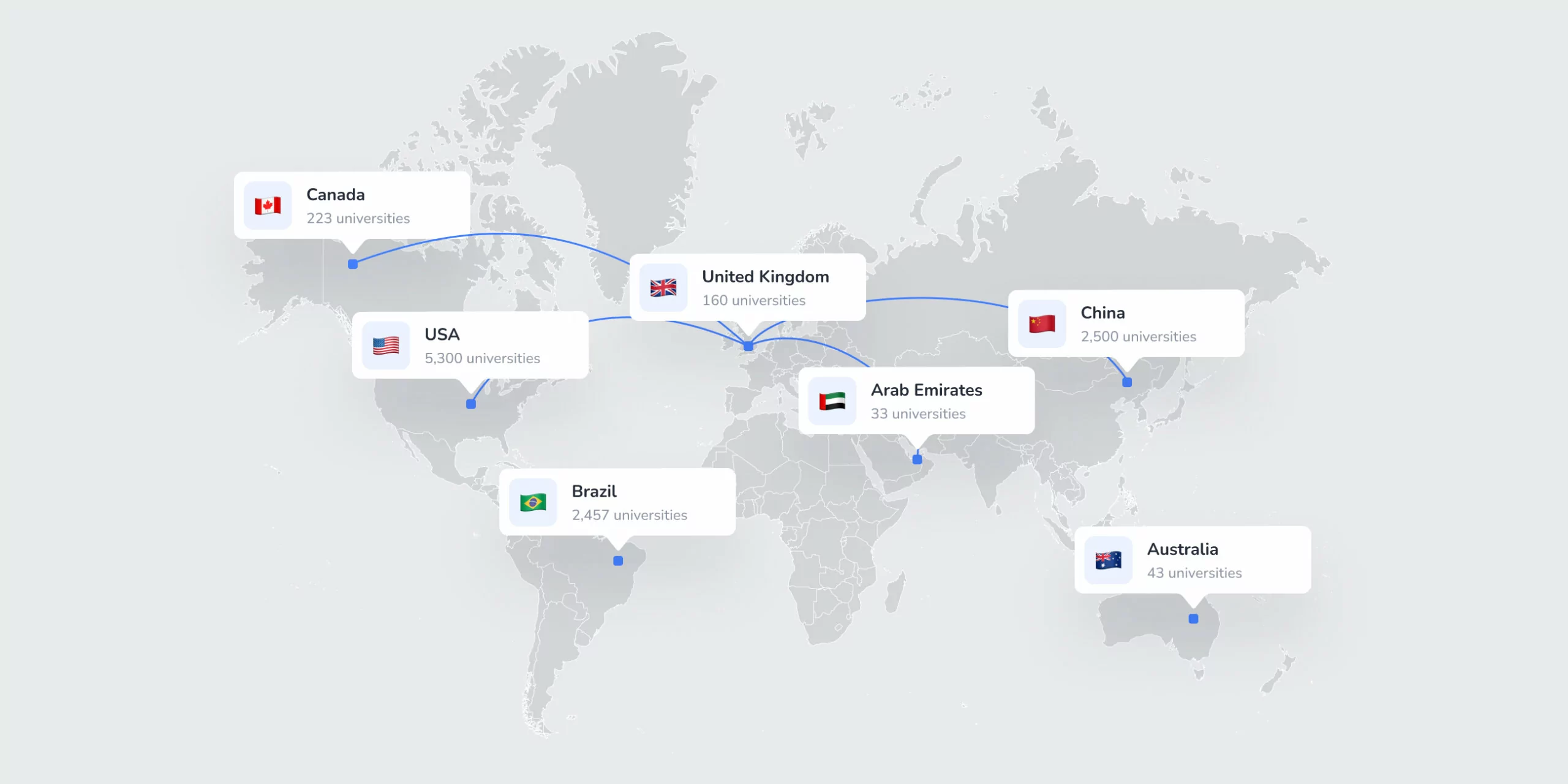
- Studying in the USA is twice more popular as studying in the EU or Canada.
And also we conducted interviews with our users and received the following data:
- The number of applications sent by one student increased by almost 40%.
- Students spend 50% less time filling out applications.
- The process of enrolling accelerated by 62%.
- The load on consultants during enrollment decreased by 38%.
In the future, we plan to develop our application and scale it for specific countries as MVP, but we continue researching now.


 UK
UK