Development
Research
Client
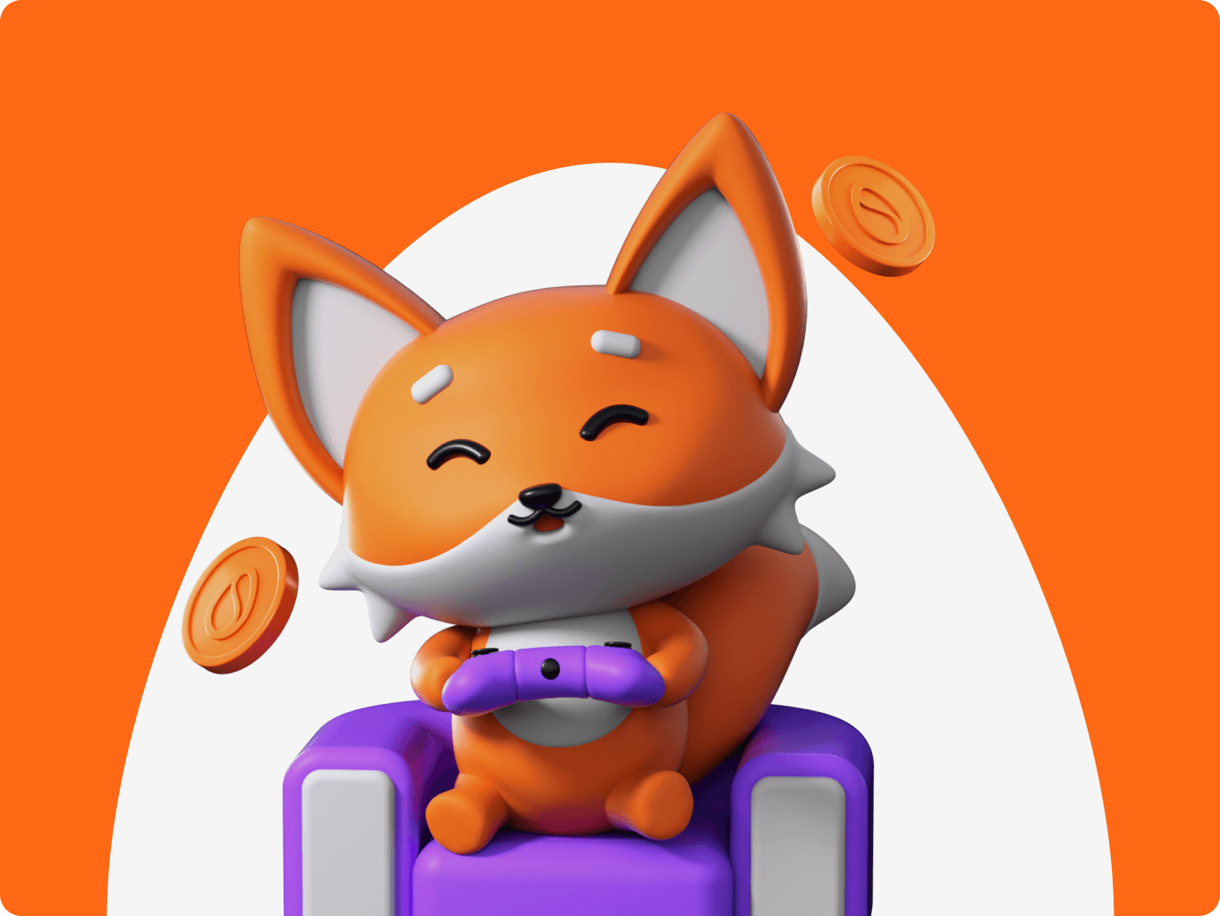
Scrambly
 Italy
Italy
Italy
Services
#UX Audit #Product Redesign

Illia Frantsevskyi
CTO & Co-founder
They demonstrated a high level of expertise and efficiency in every phase of the project.
The client initially approached us to organize and systematize their existing Figma file, which lacked consistency, clear component states, and scalable design structures. They needed a robust design system with defined styles, reusable components, and token-based architecture to support rapid product growth.
As the collaboration evolved, our scope expanded into a full redesign of the Android mobile app and web application, ensuring both aligned closely with the brand’s visual identity and business goals. Key objectives included increasing user conversion, improving navigation, supporting the continuous rollout of new features, and preparing the platform for global markets – all while delivering a distinct, playful, and scalable design that reinforced the company’s ambitious growth plans.

To create a product experience that matched both user needs and business goals, we began with a thorough discovery phase. This included a full UX audit of the existing platform, where we identified usability issues and drop-off points in key flows. We conducted a competitive analysis to benchmark best practices and uncover opportunities for differentiation.
Based on these insights, we developed a detailed information architecture for the web app and mapped out core user journeys using a mobile-first approach. This foundation allowed us to build a more intuitive, rewarding experience that supports long-term user retention.
Stages
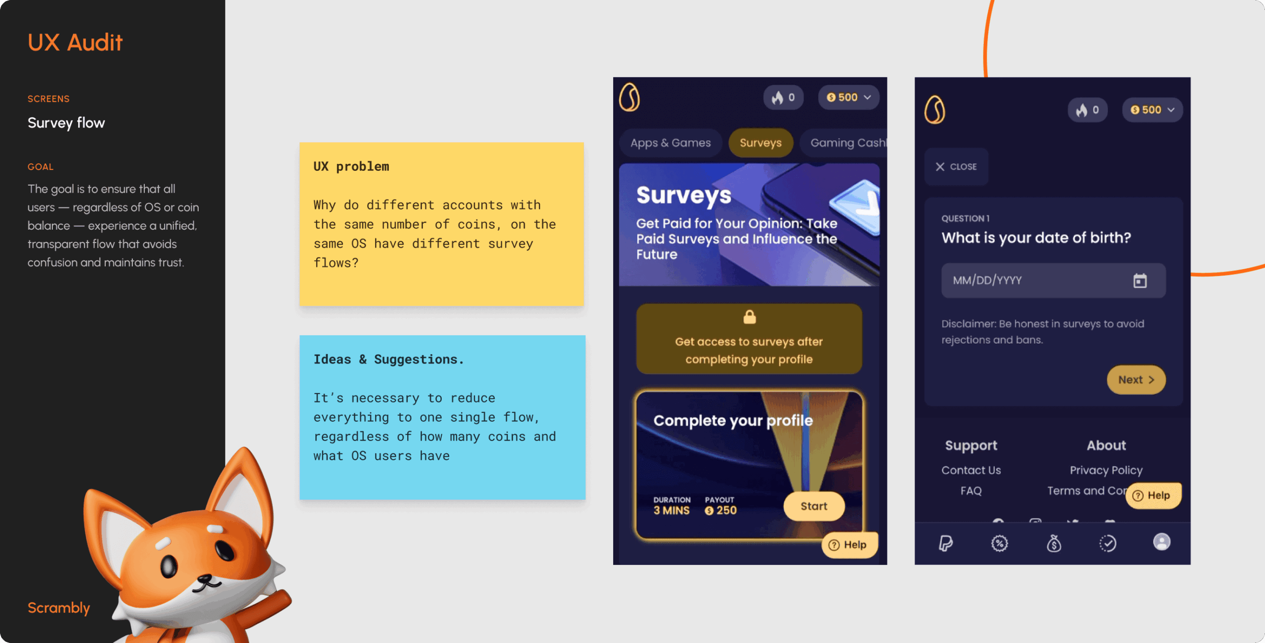
- UX audit
- Information architecture
We started by analyzing the existing product to identify usability flaws, broken flows, and inconsistent interface patterns. The audit revealed key drop-off moments during onboarding and offer completion, as well as visual inconsistencies that increased cognitive load and made it harder for users to perceive the interface as a coherent, intuitive whole. These insights formed the baseline for our redesign strategy, helping us prioritize improvements that would directly impact engagement and user satisfaction.
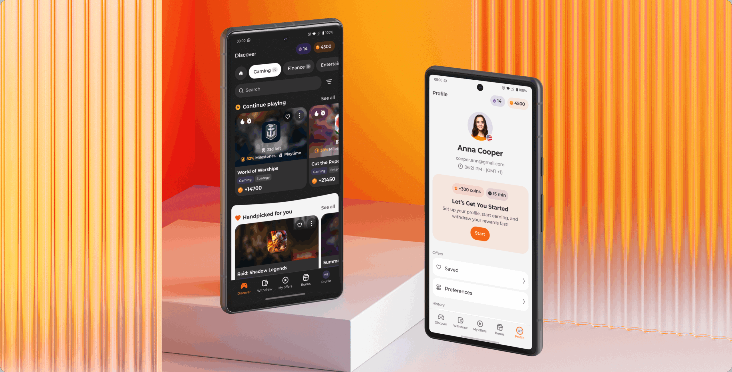
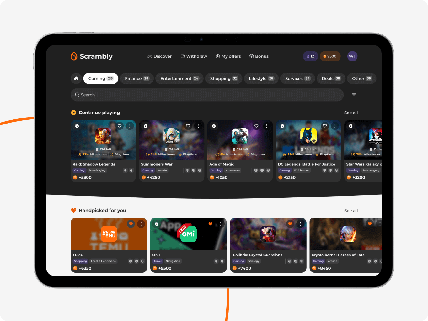
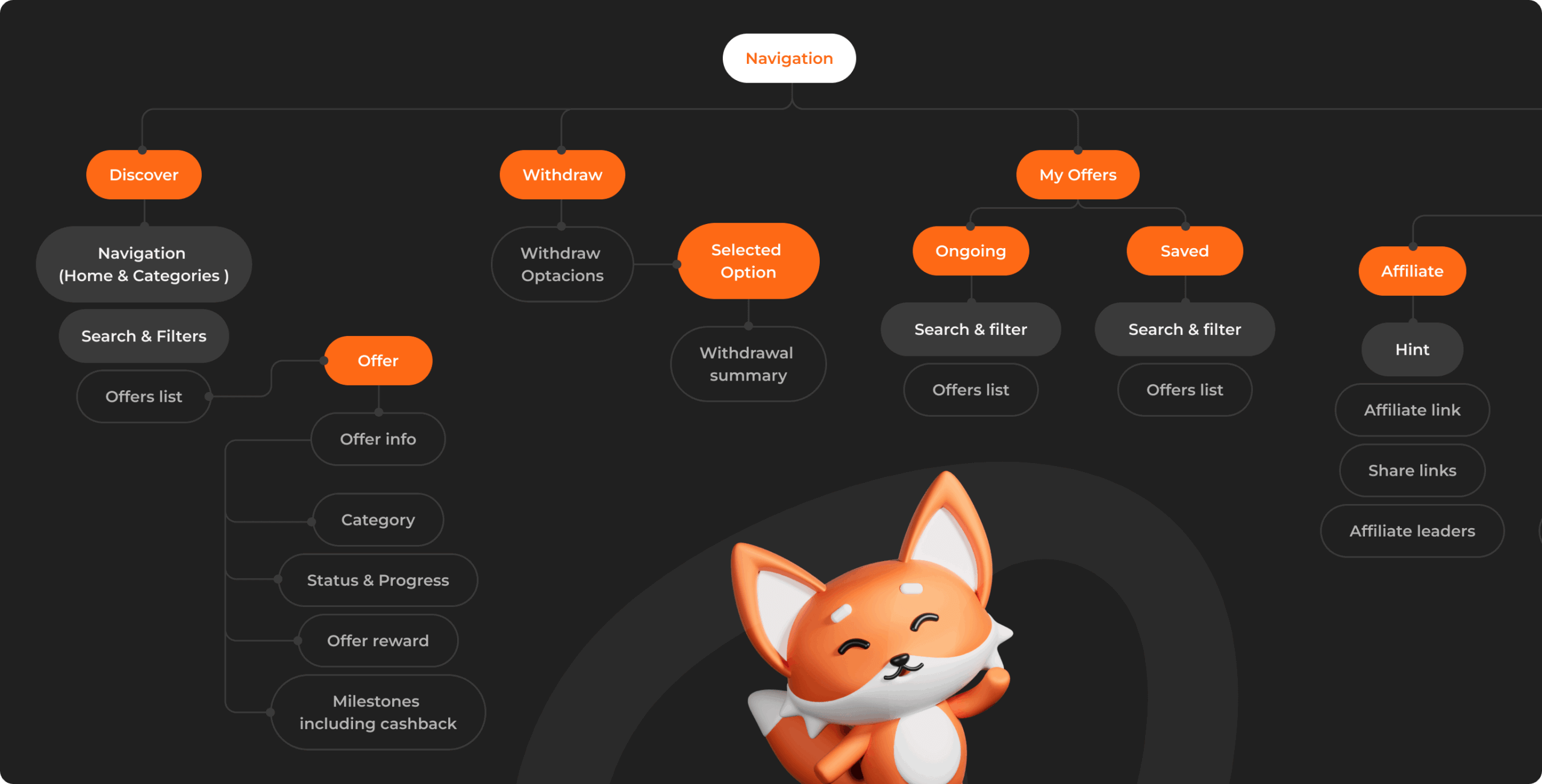
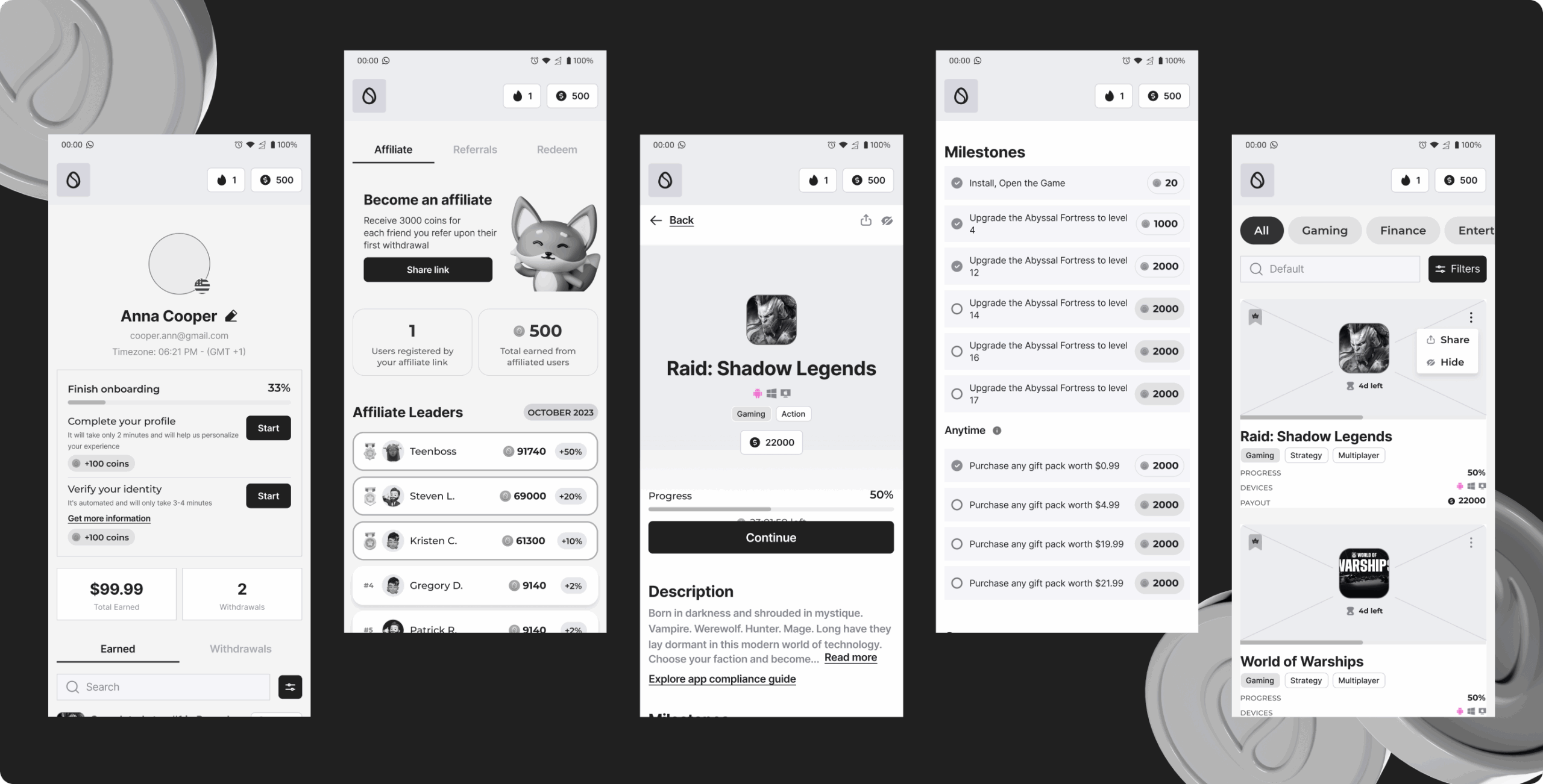
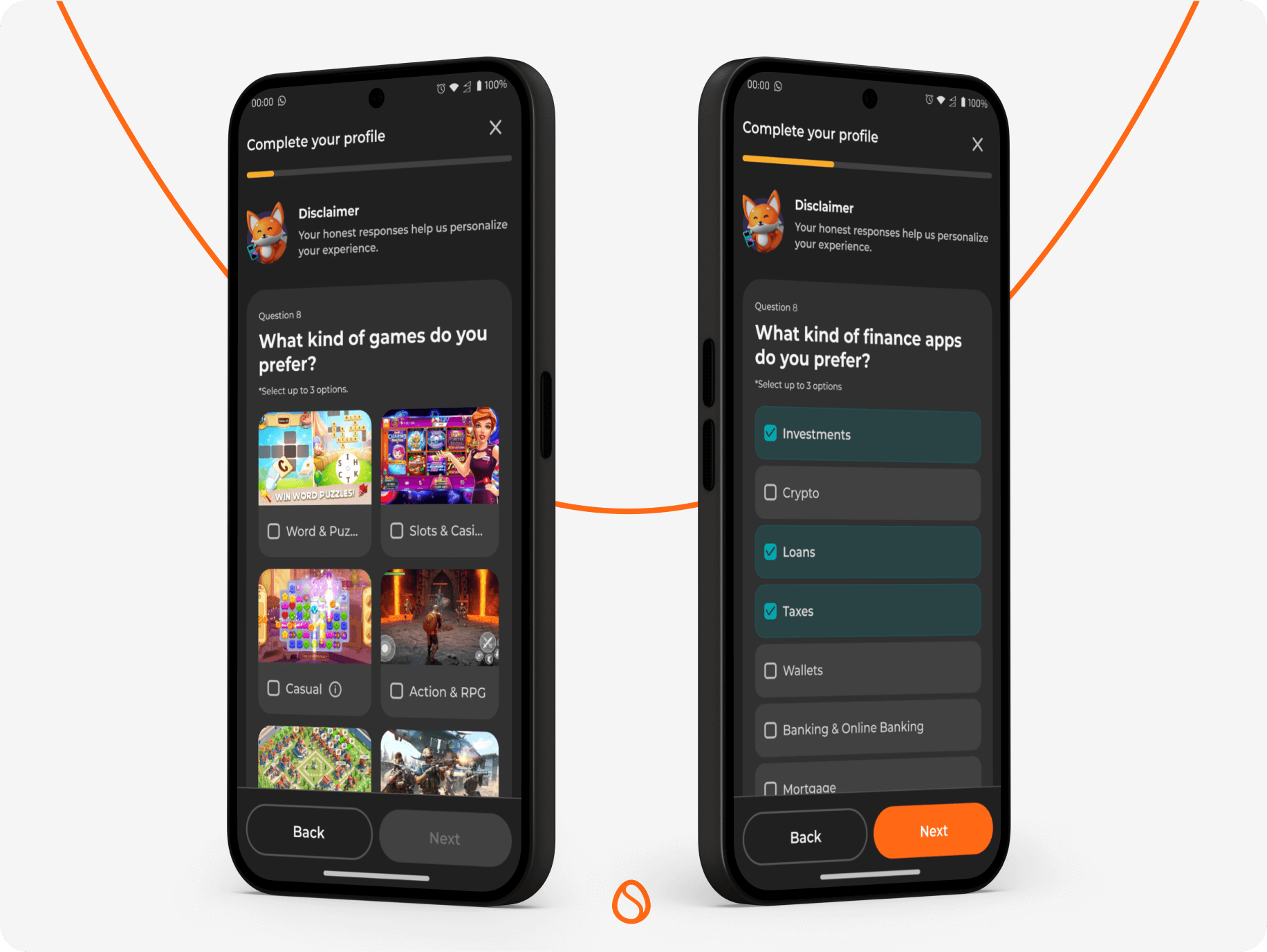
To improve usability and support the platform’s expanding feature set; we refined and strengthened Scrambly’s existing information architecture. The original navigation and organization had gaps that sometimes left users unsure where to find key actions or track their progress.
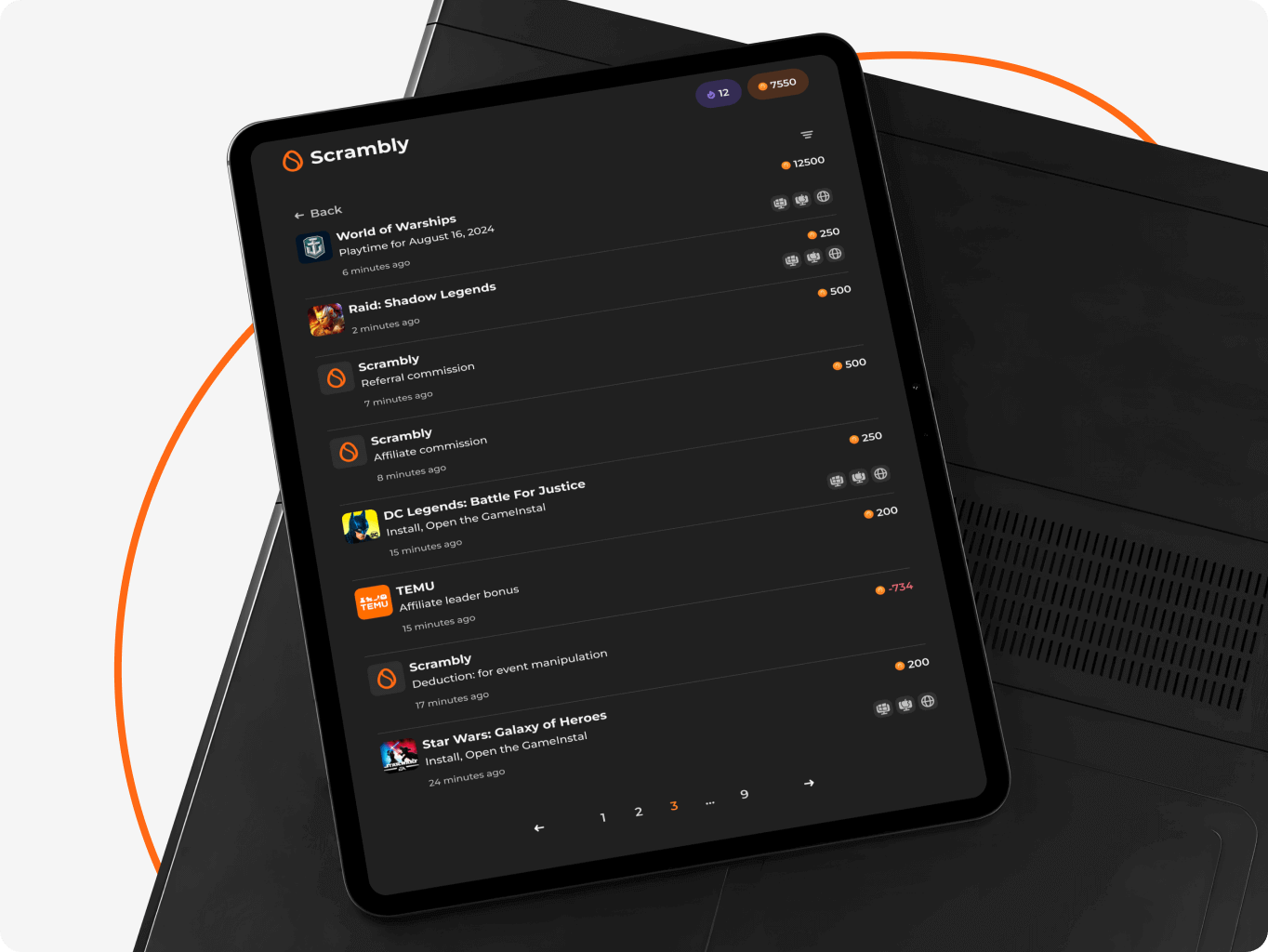
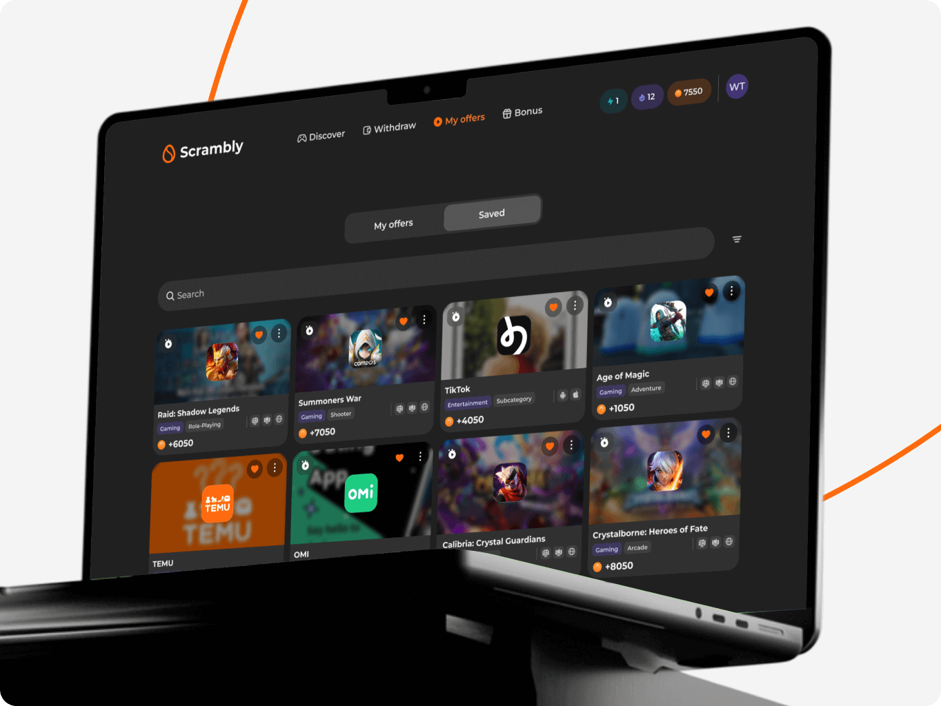
We optimized the structure around the most critical user goals discovering offers, monitoring progress, and managing earnings. Core sections like My Offers, Playtime, and Withdrawals were better defined and prioritized within the hierarchy. This helped reduce cognitive load, shorten user paths, and establish a navigation logic that smoothly accommodates new features over time.
The design phase began with wireframes where we refined and improved the core user experience enhancing navigation clarity, reward tracking, and onboarding flow. Once we improved and finalized the layout and flow, we moved to visual design, focusing on strengthening playfulness, reinforcing brand personality, and ensuring mobile-first usability.
In parallel, we built a flexible design system from the ground up. It included atomic components, tokenized styles, and separate core files for typography, color, and icons – all optimized for both light and dark modes. This foundation ensured visual consistency, simplified localization, and supported fast iteration as the product scaled across regions and features.
Stages
- Wireframe
- Design direction
- UI design
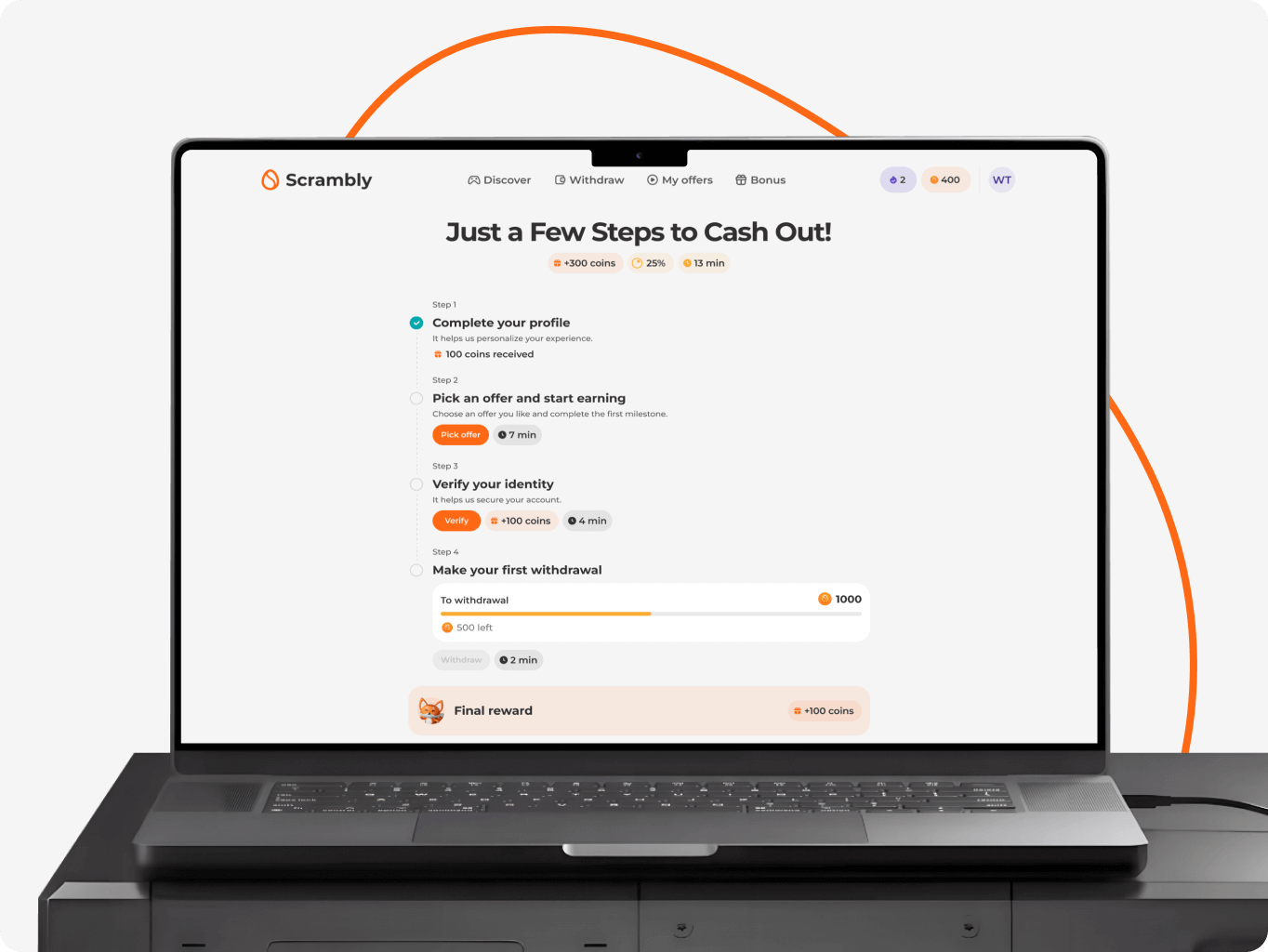
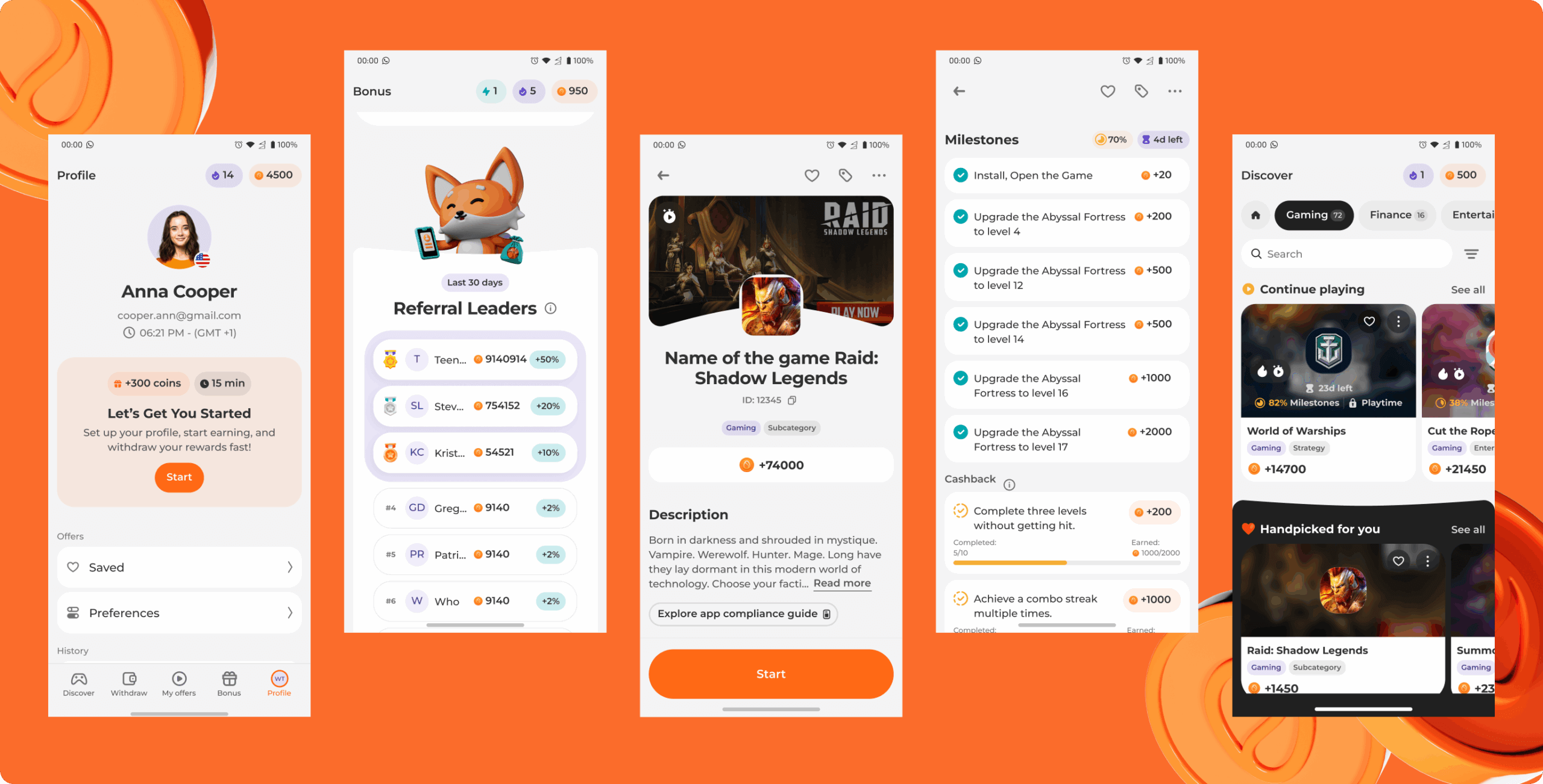
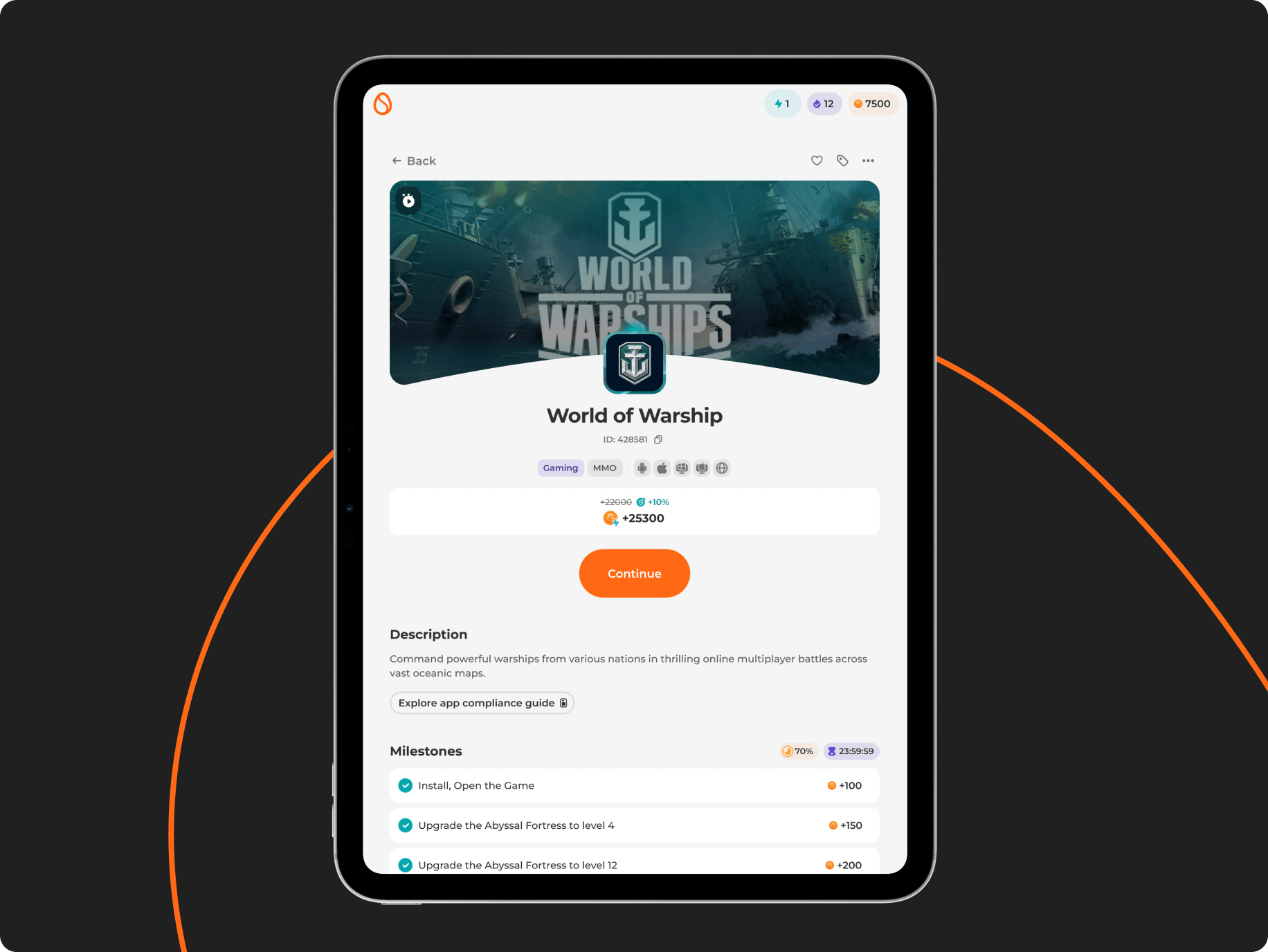
We started by rethinking the core user flow – from onboarding to discovering offers, tracking progress, and earning rewards. A key focus was the My Offers section, where we made milestones, saved offers, and playtime earnings easier to understand and interact with.
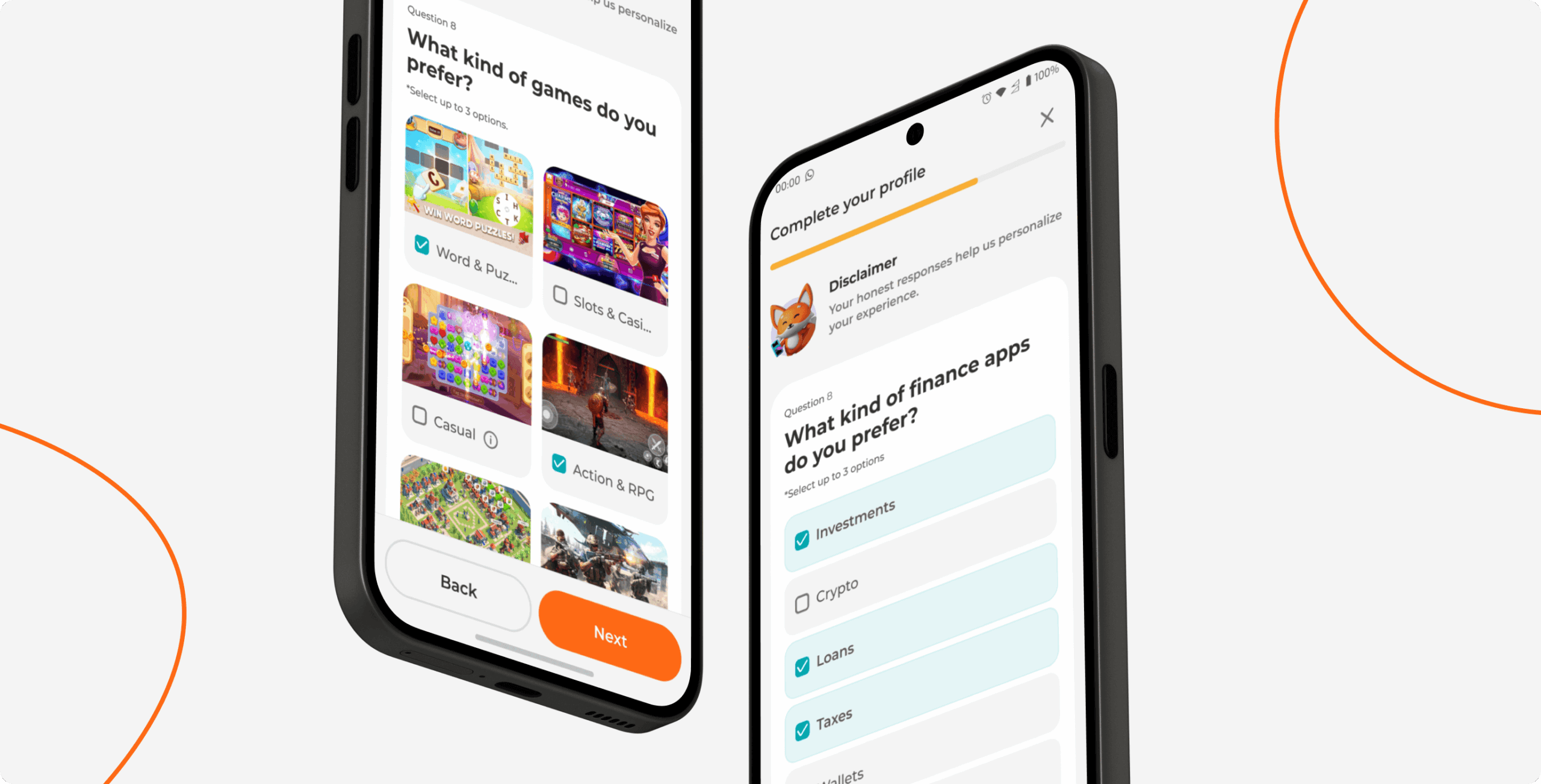
We also simplified the onboarding survey to better personalize content from the very first session. Wireframes helped us structure each screen clearly, set the right priorities, and define a tone that feels playful and easy to follow – all before moving into visual design.
At the foundation of the visual direction was a branding package provided by the client, which our graphic design team used to shape the overall design concept. We built on the existing identity – including the mascot, color palette, and visual tone – and extended it into a digital-first, product-ready design language.
The concept focused on creating a playful, high-energy interface that still felt structured and usable. We introduced large, expressive content blocks, spacious layouts, and a generous use of white space to keep the interface light and readable. The illustrations, anchored by the brand mascot, were designed to support key interactions and enhance emotional engagement without overwhelming the user experience.
We designed Scrambly to seamlessly adapt across three key environments: the web platform, the Android mobile app, and responsive web views all supported by a unified design system. This system ensures consistent experiences across screen sizes, orientations, and devices, maintaining visual clarity and usability everywhere.
Our visual approach focuses on capturing user attention and encouraging interaction, using playful design elements, dynamic layouts, and bold colors to keep users engaged while guiding them smoothly through tasks and rewards.

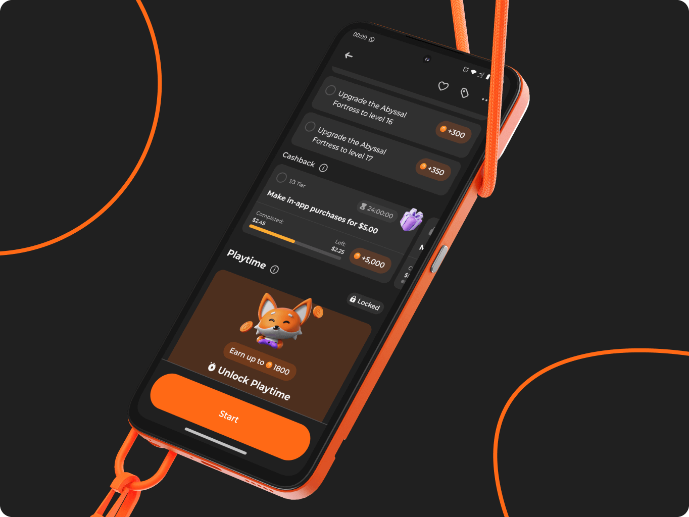
Milestone-based rewards
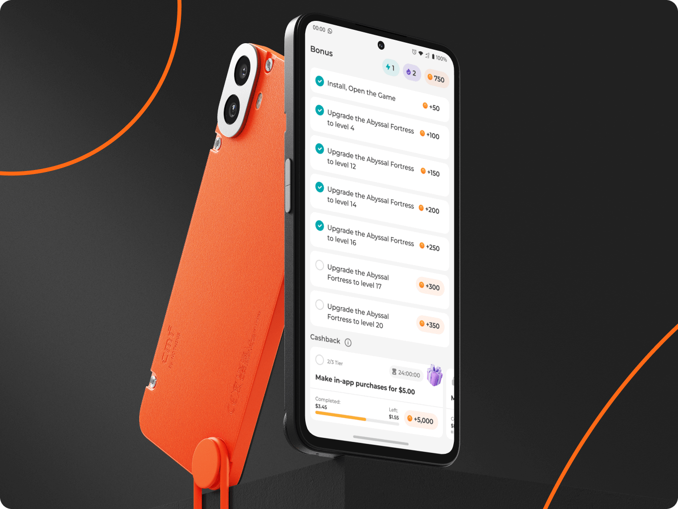
We developed a progressive task system within offers, allowing users to earn rewards not only for final completion but also for reaching intermediate milestones. This approach keeps users motivated throughout their journey, making the earning process more engaging and rewarding.
Personalized user experience
To make the experience truly user-centered, we introduced a simple onboarding survey that captures user preferences - from favorite game genres to preferred reward types. Using this data, Scrambly dynamically curates personalized offers, increasing engagement, enhancing satisfaction, and making every interaction feel relevant and rewarding.
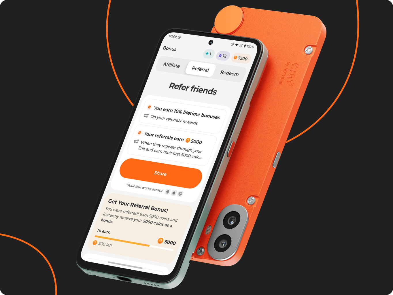
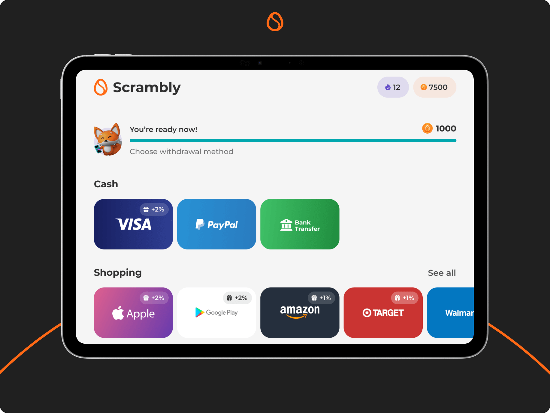
Localized withdrawal options
On the Withdrawals page, Scrambly automatically detects the user's location to display the most relevant payout methods from PayPal and bank cards to partner gift cards. Each option is presented with clear details and transparent fees, helping users confidently choose how they want to cash out.
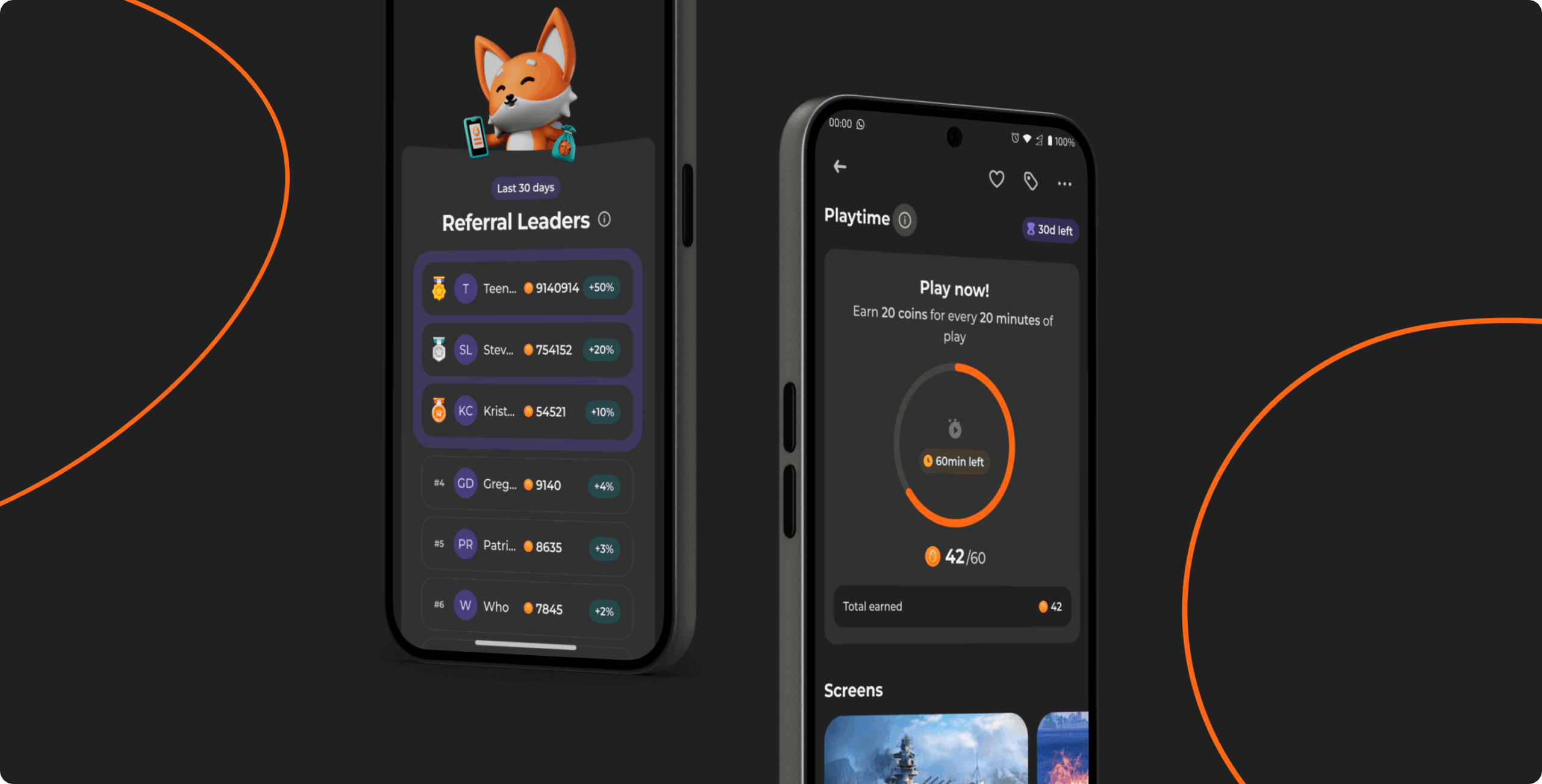
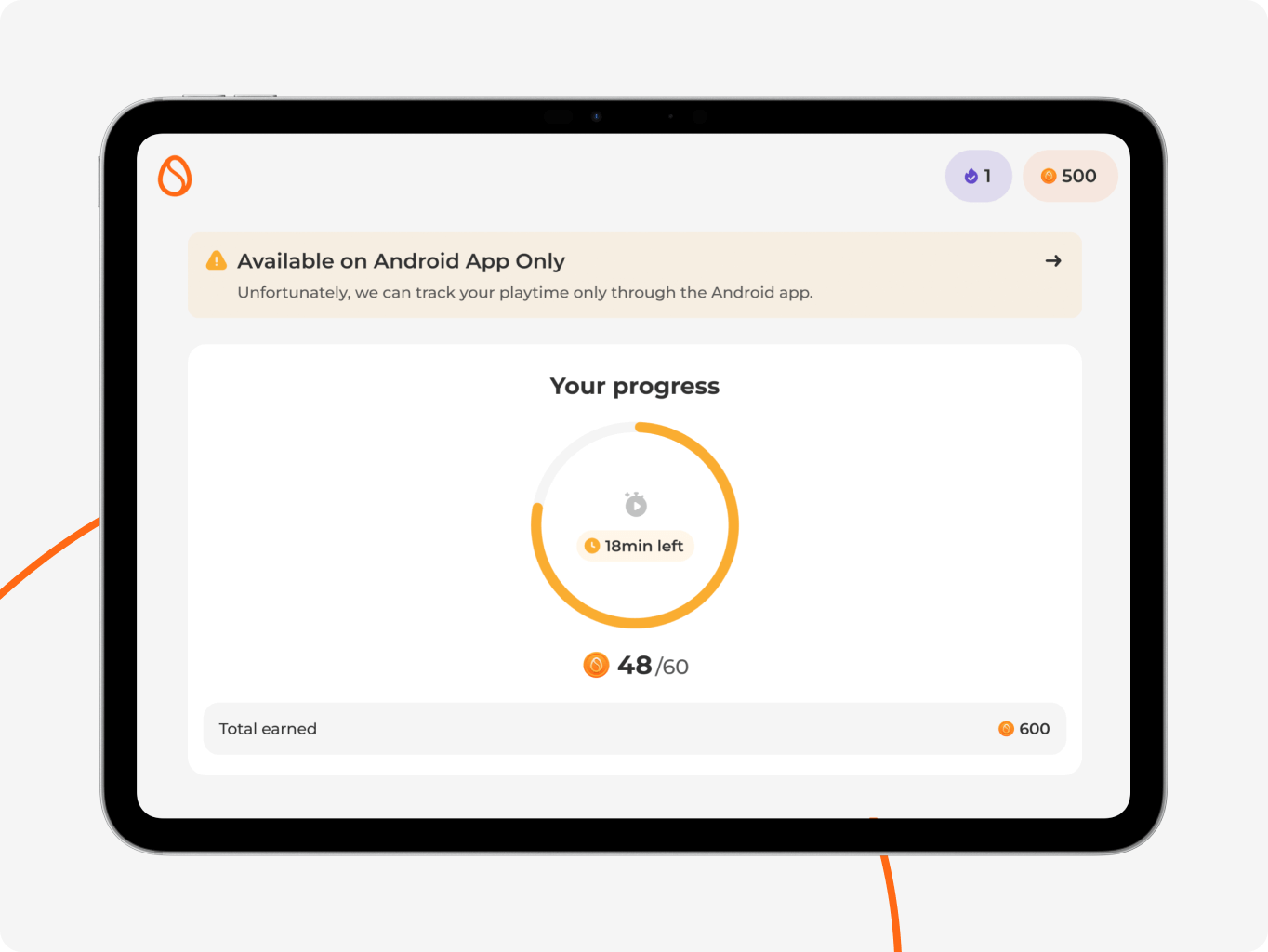
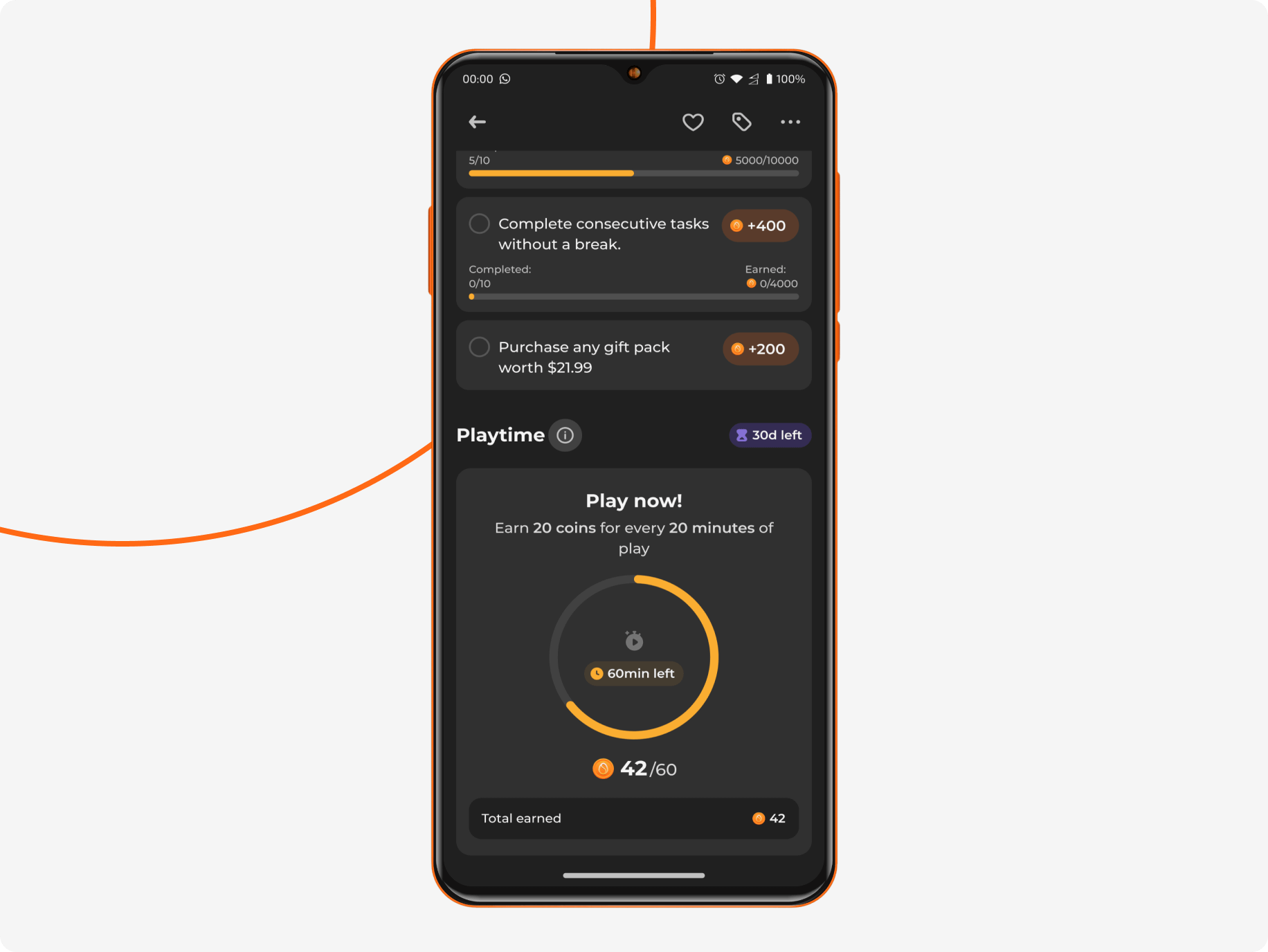
Playtime rewards section
We introduced a Playtime section where users automatically earn rewards based on the time they spend in selected games. We implemented precise time tracking and a transparent earning system to ensure clarity and fairness.
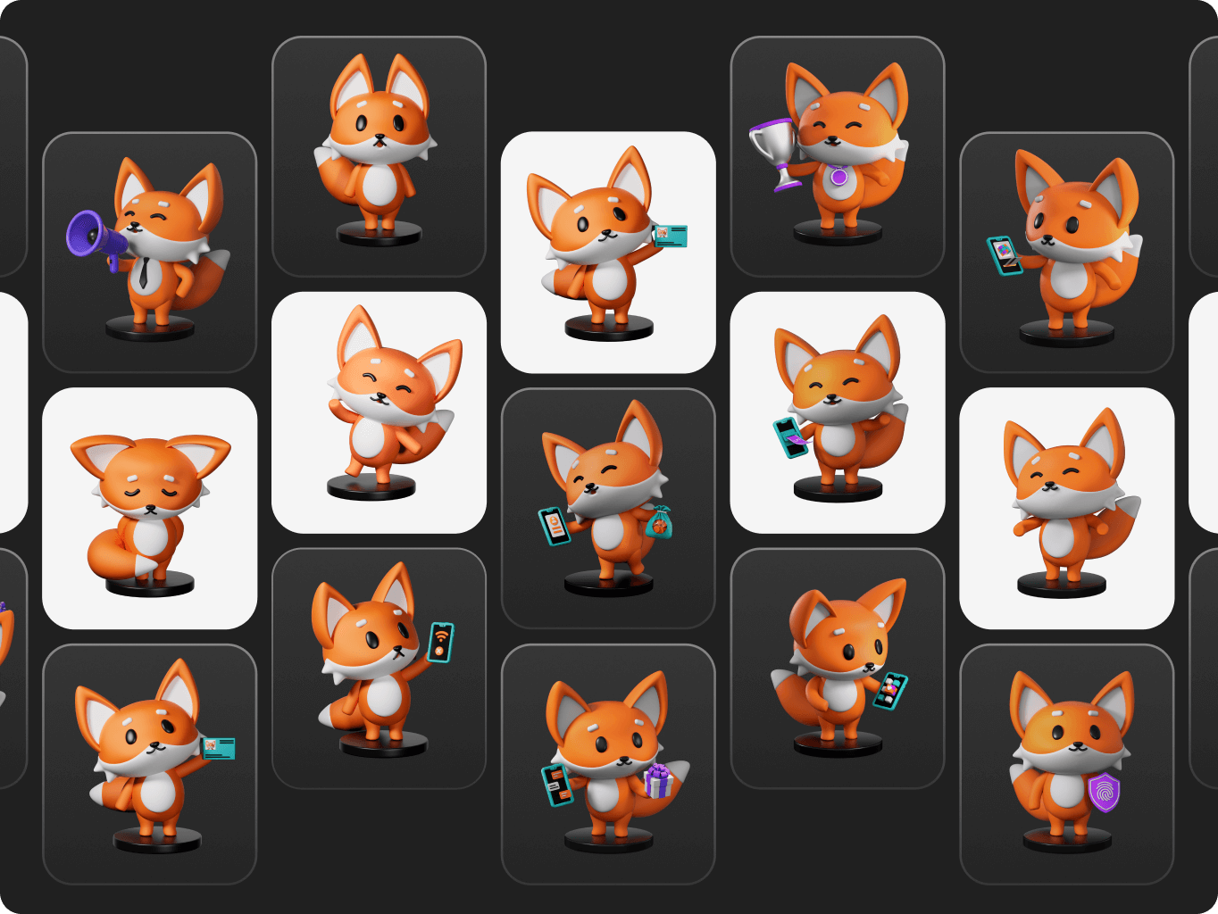
The client provided the original mascot as part of the brand assets, which we used as the foundation for a broader illustration system. Our role was to expand its use across the product – integrating it into contextual Ul scenarios and creating a consistent visual language around it.
We developed a set of supporting illustrated icons and interface visuals that aligned with the mascot’s style, enhancing moments like onboarding, empty states, progress tracking, and identity verification. This helped create a more cohesive and emotionally engaging experience while reinforcing brand recognition throughout the product.
Our work on Scrambly is ongoing, as we continue to refine the design across all key flows based on real user feedback. The team is actively preparing for the iOS application launch to complement the existing Android version and expand platform reach.
In parallel, we’re rolling out incremental improvements – such as adding save buttons on offer cards, implementing a homepage highlights section for key promotions, introducing new cashback mechanics, and refining report flows to capture more detailed, actionable user insights.
#ux audit #Product redesign #web development
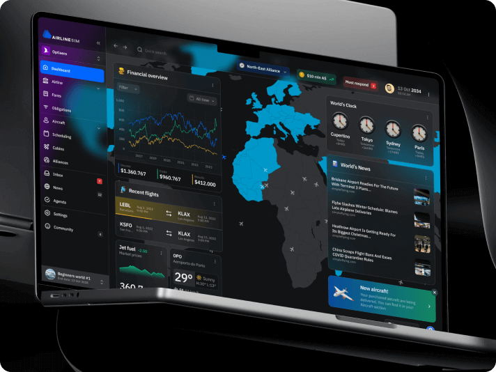
Airline sim
 Germany
Germany
Tech Stack
Vite, React, Typescript, SCSS, Framer motion, React Router, Redux
Timeline
5 month
Results
Faster time-to-market
Built with scalability in mind
Deeper engagement
#Mobile app design #
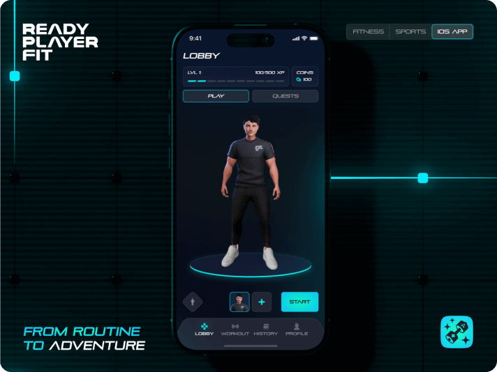
Ready Player Fit
 USA
USA
USA
Results
Early user feedback
Reduced development costs
Built with scalability in mind
#Website design #Website development
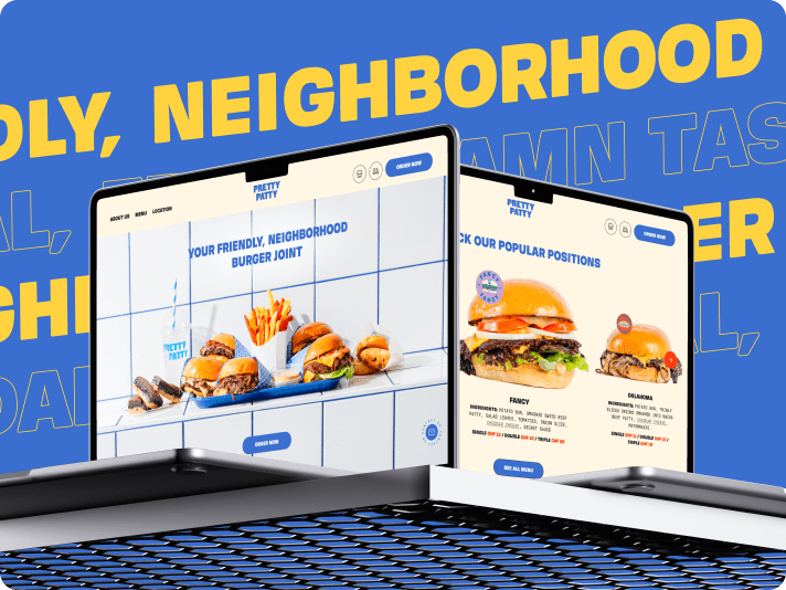
Pretty patty
 Switzerland
Switzerland
Tech Stack
Webflow
Timeline
3 month
Results
Brand alignment & vibrant design
Improved сonversion opportunities
Customer-centric approach

Adrian Smith
Co-Founder, PRETTY PATTYThey always respected deadlines, were super reactive, and were super helpful.
Have a project in mind?
Let's chat
Have a project to
discuss?
discuss?

Have a partnership in
mind?
mind?