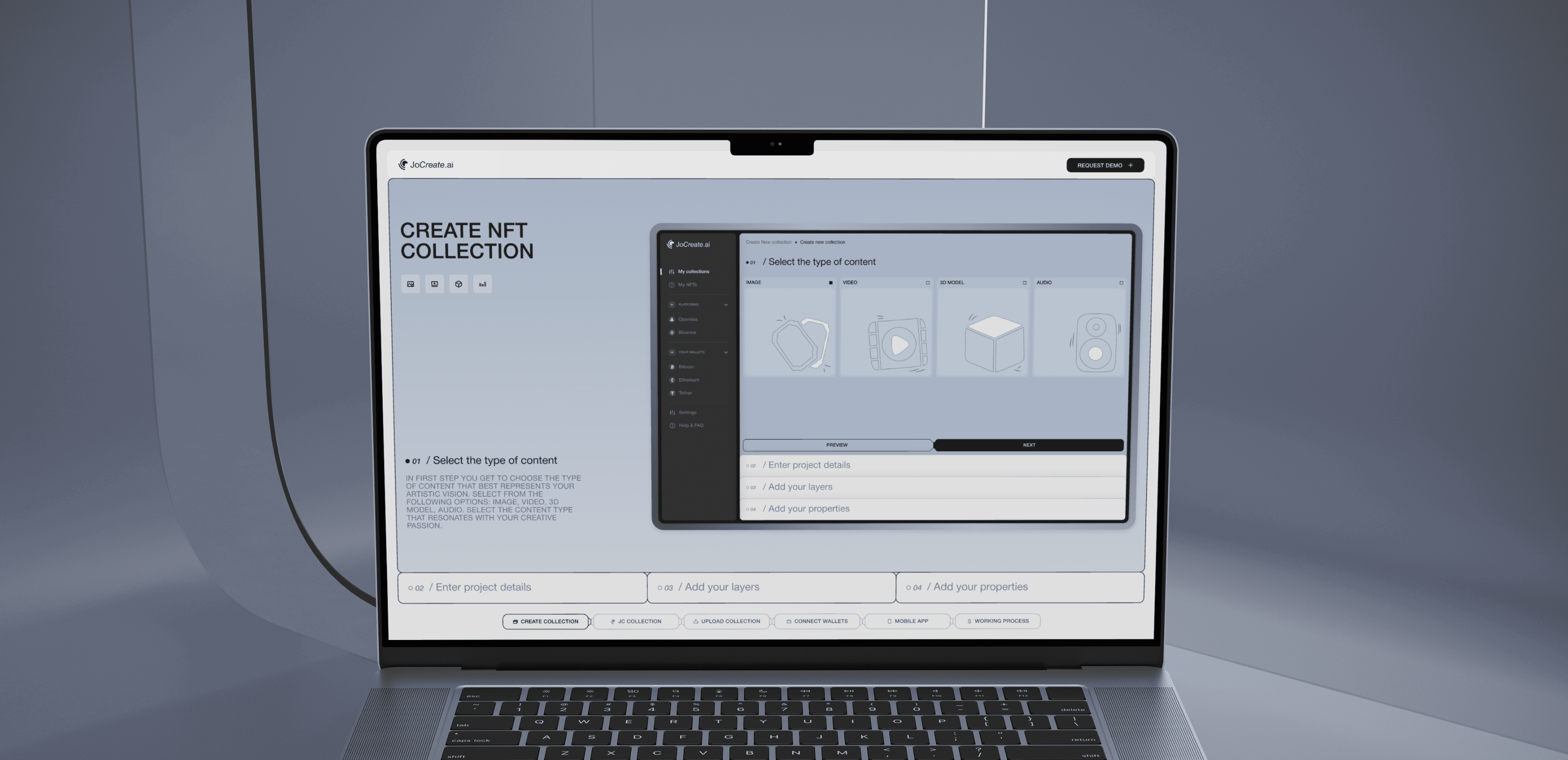
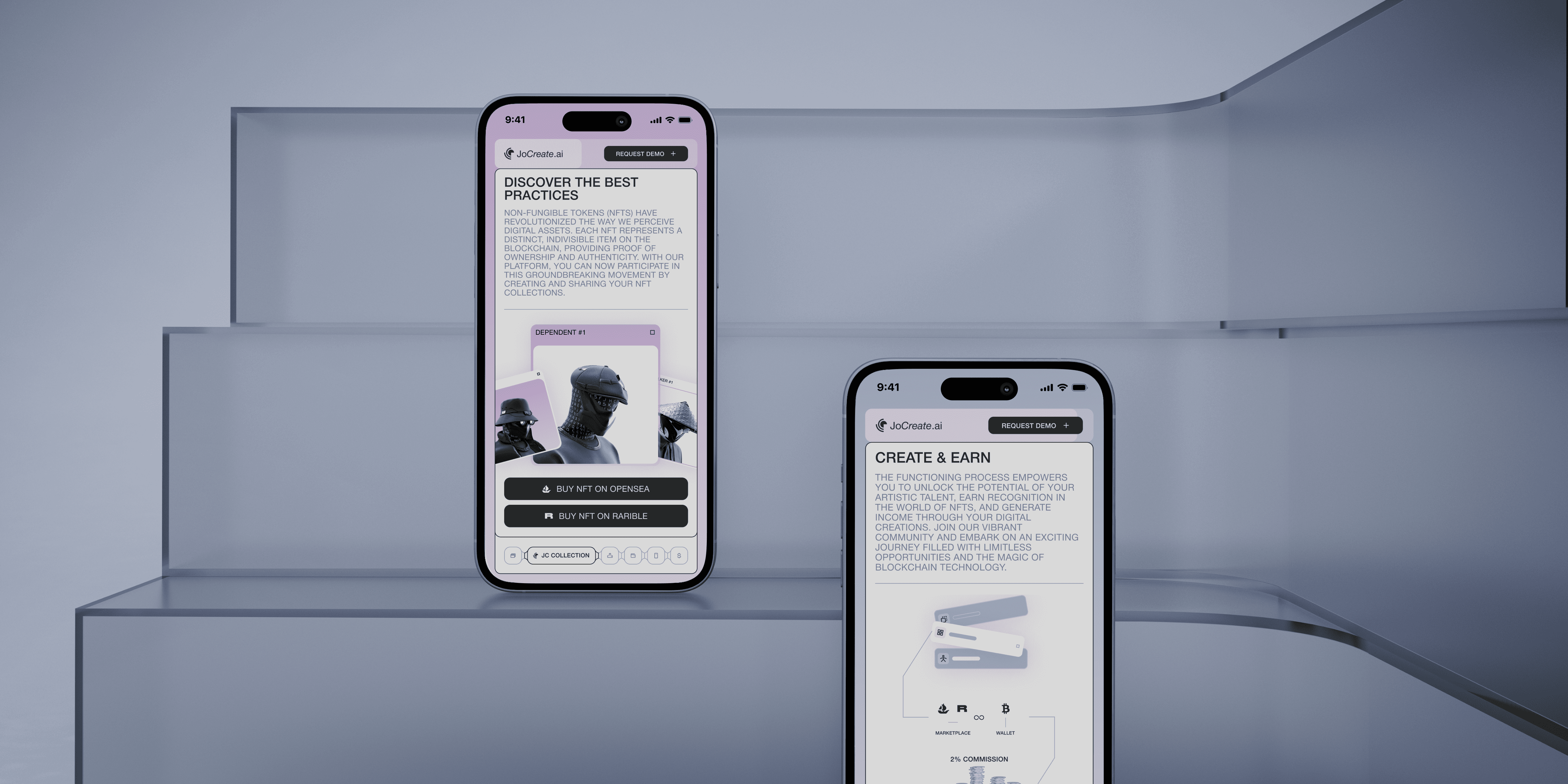
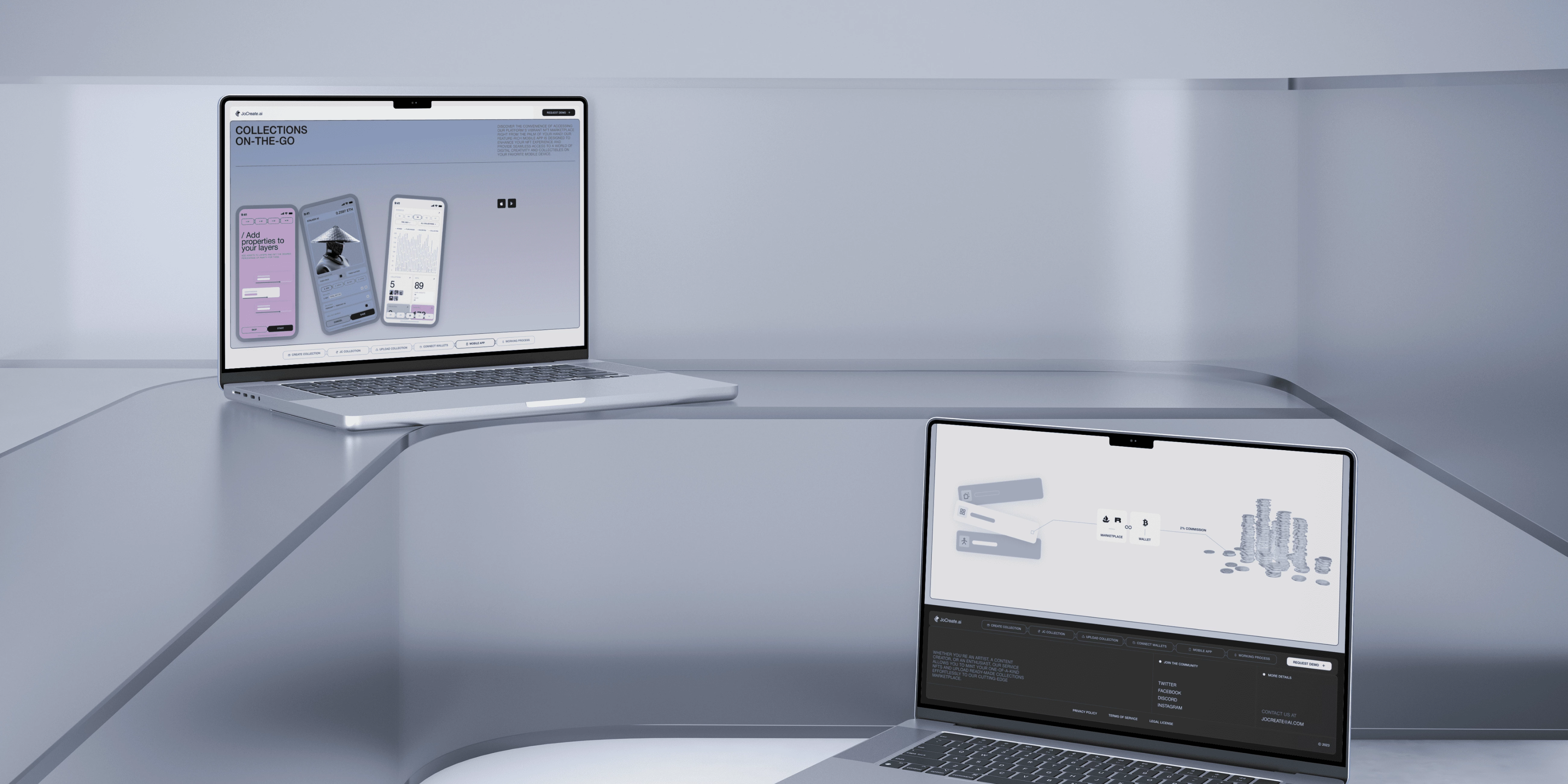
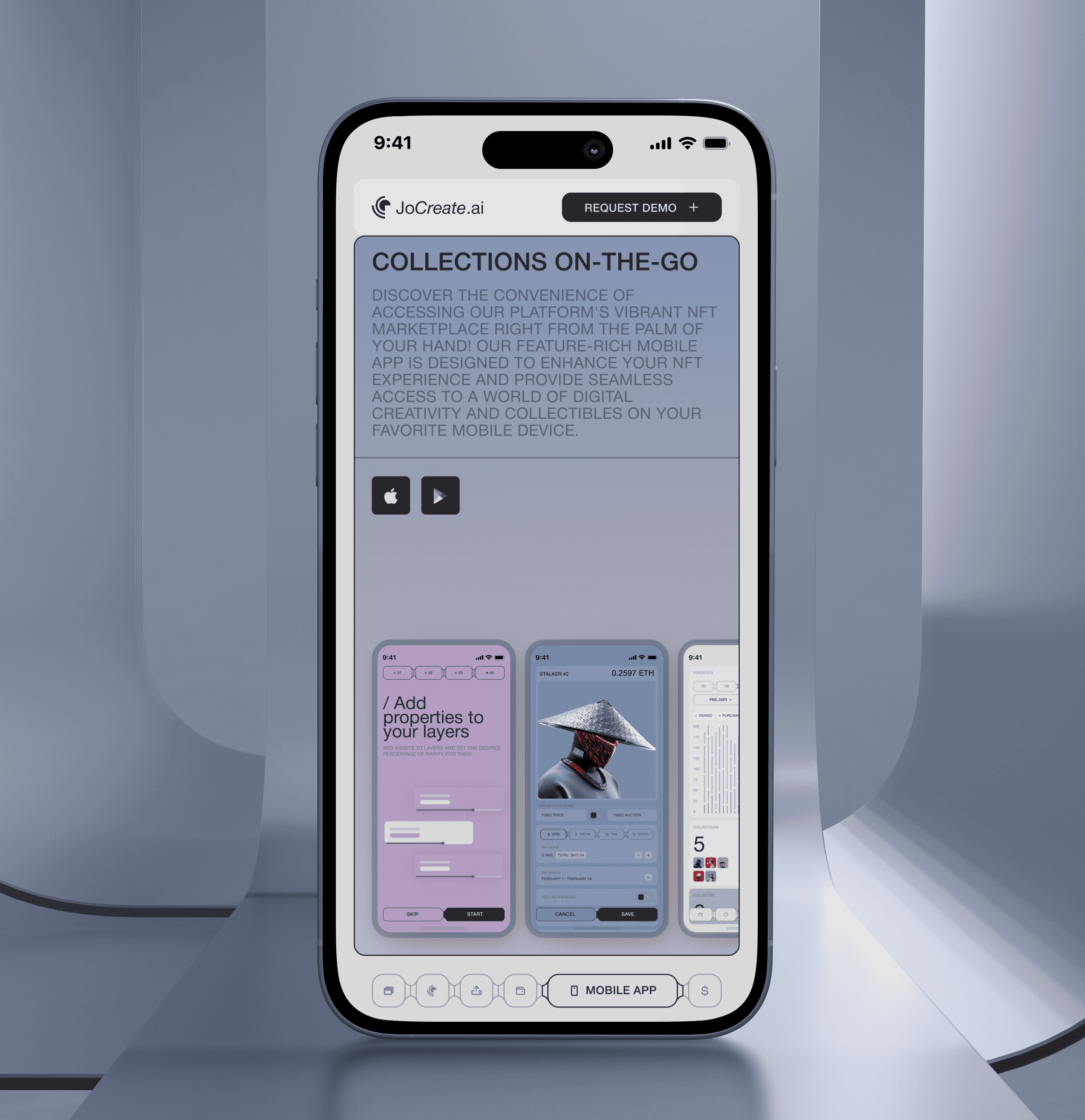
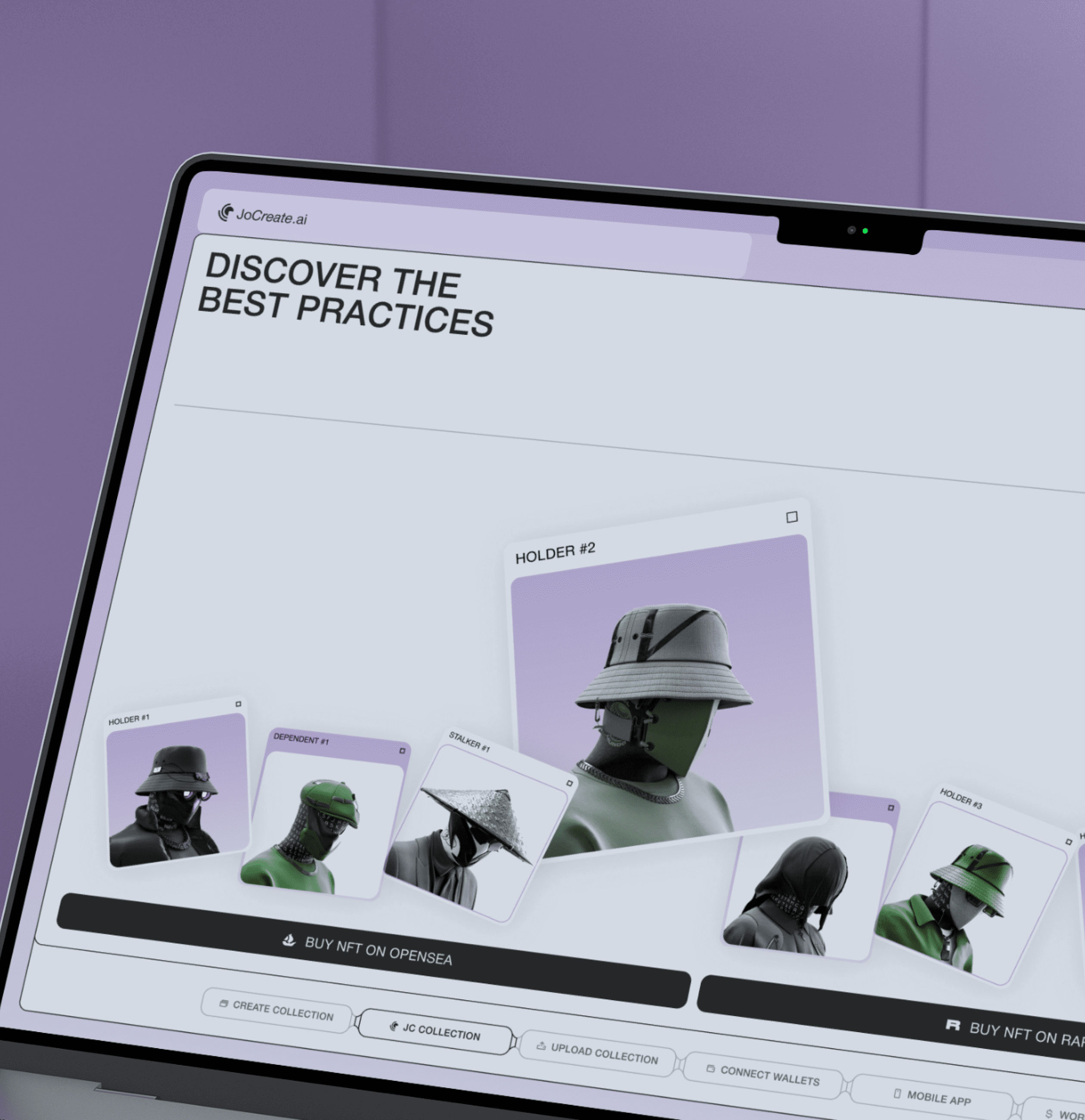
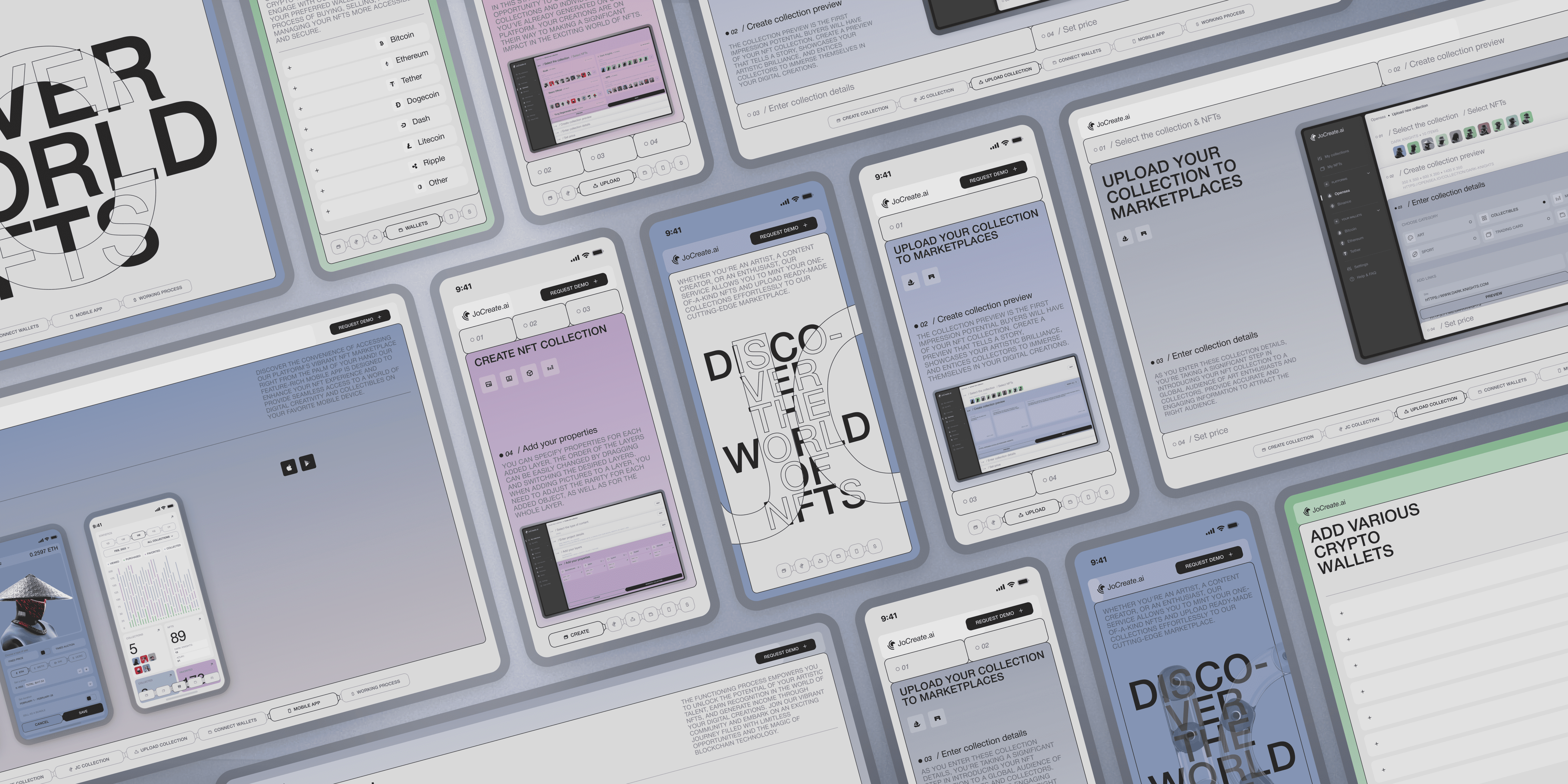
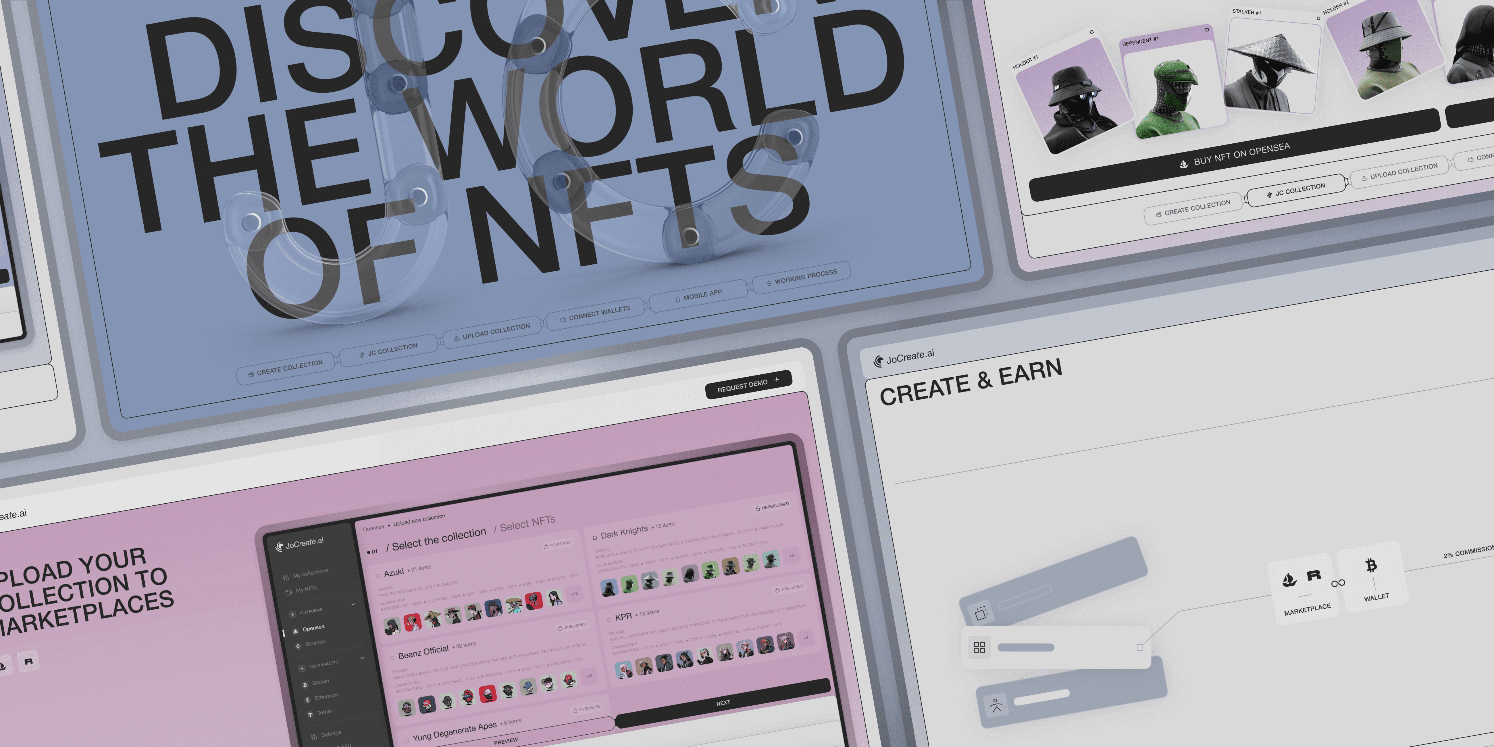
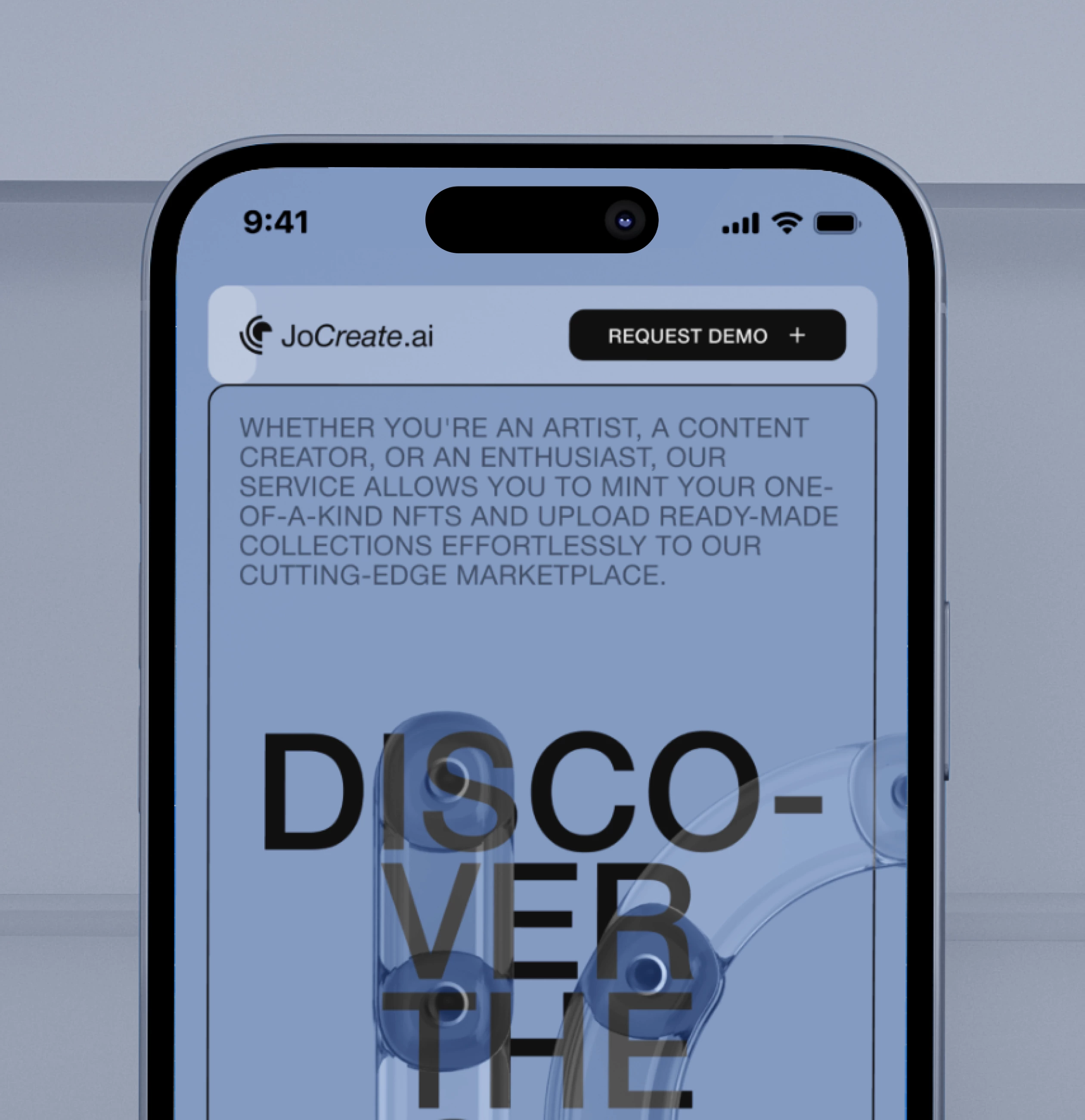
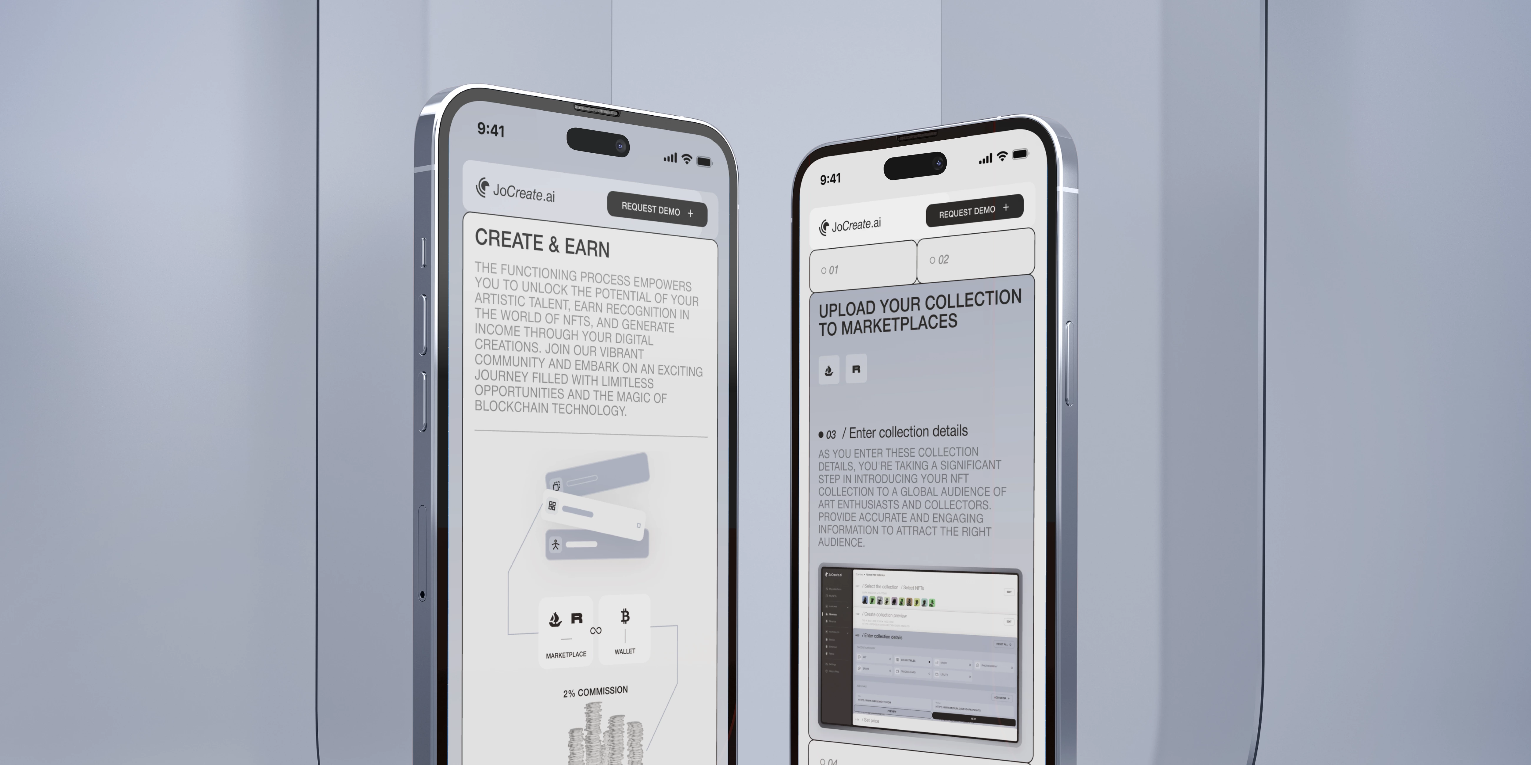
The client’s objective was to ensure the website effectively communicates the key advantages of the JoCreate app, which encompass NFT collection generation, seamless integration with popular marketplaces and crypto wallets, easy uploading of collections to the marketplace, and a user-friendly interface.
The customer wanted that the application’s information be conveyed clearly and uncomplicated, employing interactive and animated elements for effective user engagement. The visual style of the JoCreate app was to be utilized, ensuring a cohesive and harmonious visual experience throughout the promo website.
Our role
Considering the client’s preferences and conducting market analysis, we crafted a design that effectively communicates the app’s unique selling proposition. Employing interactive elements and animations, we presented information in a straightforward and compelling manner. The outcome is an engaging and informative promo website that successfully showcases the outstanding features of the JoCreate app, raising awareness among its target audience.
To ensure our web platform stands out as a cutting-edge solution, we conducted an extensive and thorough research process that involved analyzing our competitors.
By conducting a comprehensive research process, we gained a profound understanding of the competitive landscape and how our product could offer a unique and innovative solution in the ever-evolving world of NFT collections and marketplaces. This knowledge empowered us to build a platform that not only competes but excels in providing a seamless and rewarding experience for our users.
- Competitors analysis
- Product analysis
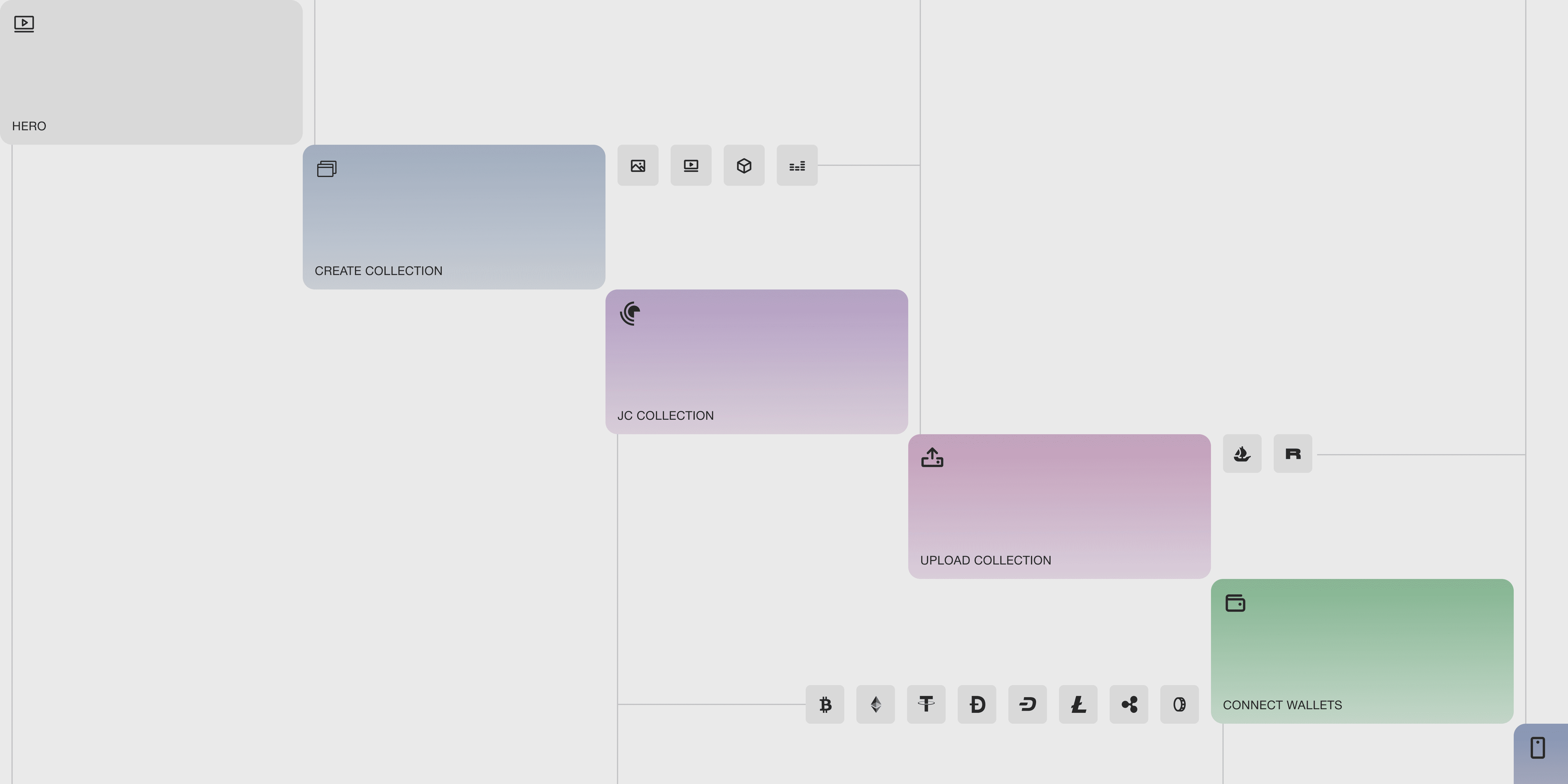
- Map
The competitor analysis serves the purpose of systematically reviewing promotional websites related to web and mobile apps. It aims to identify and evaluate their strengths, weaknesses, as well as opportunities and threats in the marketplace. Special focus is placed on how apps showcase their functionality, unique selling proposition, and overall positioning in the market.
Through competitor analysis, we pinpointed opportunities to distinguish ourselves and effectively showcase our distinctiveness and capabilities to potential customers.
What we’ve done
During our research, we deliberately chose the most exceptional promotional websites, not limiting ourselves to those of similar apps. Our decision was influenced by the distinctive functionality of our app, as we aimed to comprehend how competitors showcase their products, highlight their benefits and functionalities, and position themselves within the market.
By adopting this approach, we were able to pinpoint several crucial factors:
- Firstly, we observed that only a few competitors considered user preferences when it came to reading lengthy texts to comprehend how their app functions. Recognizing this, we determined that employing interactive elements and animations would be the optimal approach to swiftly and clearly convey information about our app’s capabilities.
- Secondly, understanding how competitors conveyed their product information and benefits allowed us to fine-tune our communication strategies. We tailored our messaging to clearly and persuasively communicate the value of our platform to potential users.
Overall, the analysis of competitors played a pivotal role in guiding our platform’s development and growth. It empowered us to refine our strategies, improve user experience, and leverage our unique strengths to establish a strong presence in the competitive world of NFT collection generators.
In showcasing the JoCreate app and its functionalities, we placed a significant emphasis on comprehensively presenting its features and capabilities on the promotional website. Working closely with our design team, who had a profound understanding of the application, we delved deeper into the product to create the most effective promotional website possible.
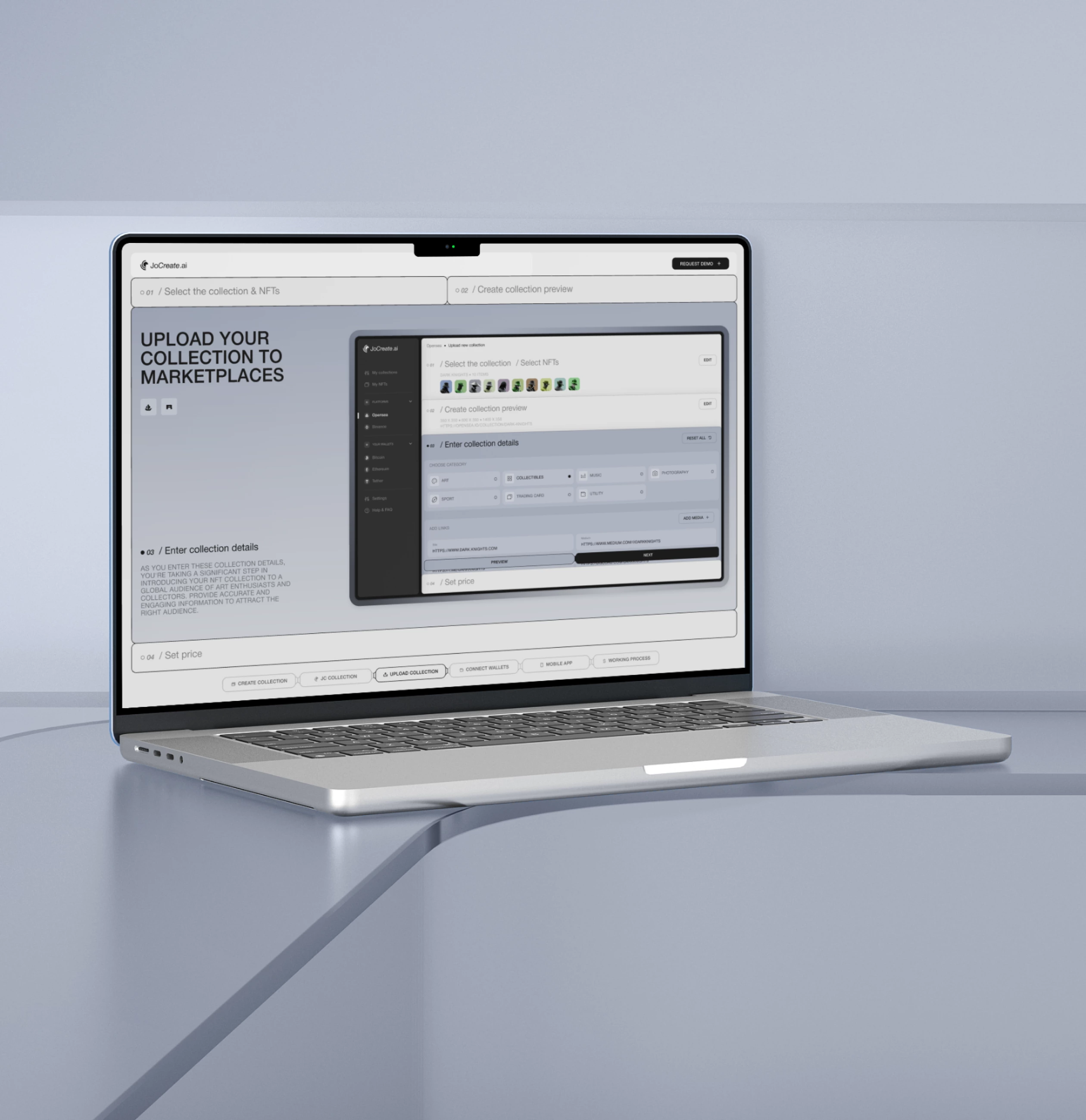
This involved showcasing all key functions, including creating NFT collections, smooth integration with well-known marketplaces and crypto wallets, and effortless uploading of collections to the marketplace.
What we’ve done
During the website design process, we meticulously incorporated these functional aspects to provide users with a comprehensive understanding of the application’s features and benefits. Our strategic approach focused on visually highlighting the importance of these features, making them easily comprehensible and appealing to users.
The outcome is a website design that effectively conveys the functionality of the JoCreate app in an intuitive manner. Our goal was to craft an appealing and user-friendly interface, enabling users to swiftly grasp the application’s advantages and features, and encouraging them to actively engage in creating NFT collections.
Designing the landing page structure was an important phase of the project, necessitating a comprehensive examination of the app’s functionalities, prevailing market trends, and competitor presentation approaches. Our team meticulously considered various factors, including users’ objectives and expectations, to construct an optimal structure that proficiently conveys the value and advantages of the JoCreate app.
What we’ve done
During the BA, we explained to the client the characteristics of the solutions we collected, outlining their benefits and risks.
- Delineation of Key Sections: We pinpointed the essential sections required on the site to effectively communicate all necessary information. These encompassed sections detailing the application benefits, functionality, best practices, and the working process.
- Ordering of Blocks: We strategically sequenced the sections and blocks on the page, presenting the information in a logical and step-by-step manner. Emphasizing user engagement, we positioned the most critical and attention-grabbing blocks near the page’s outset to captivate users from the start.
- Conveying User Value: Within each box, we succinctly outlined the specific value and benefits it offered to users. Emphasizing the app’s core features and advantages, we also highlighted its USP. Our objective was to demonstrate how the JoCreate app simplifies users’ lives and provides a more engaging means to generate income.
Consequently, we crafted the page structure to ensure that each block held significant information and value for users. Our primary focus was on creating an informative, visually appealing, and user-friendly site, where users could readily access all the essential details about the JoCreate app, empowering them to make well-informed decisions about its utilization.
After laying a robust analytical foundation, the next phase of designing the JoCreate promo site involves crafting a user-friendly interface. This encompasses designing the interface layout, strategically placing each element, developing an animation storyboard, and defining the interaction for every block.
- Wireframe
- Moodboard
- Design Concept
- UI Design
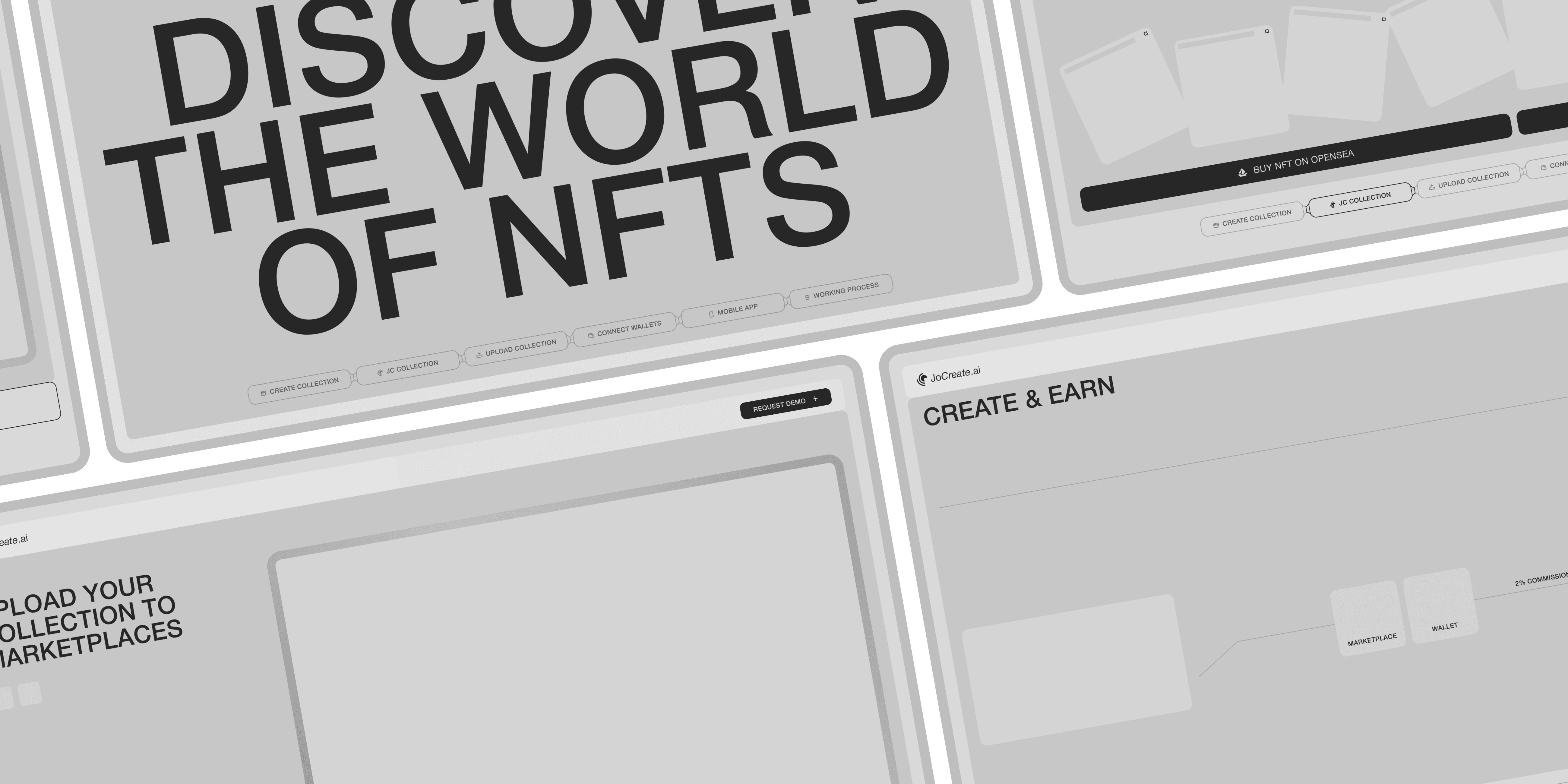
Wireframes play a vital role in the product design process as they offer an initial blueprint of the product’s layout and functionality. The primary objective of wireframes is to provide a foundational understanding of the product’s functioning without delving into intricate details and stylization.
Utilizing wireframes enabled us to concentrate on effectively conveying crucial information without overwhelming the interface. It also allowed us to refine all interactive and animated elements, ensuring a seamless and engaging user experience.
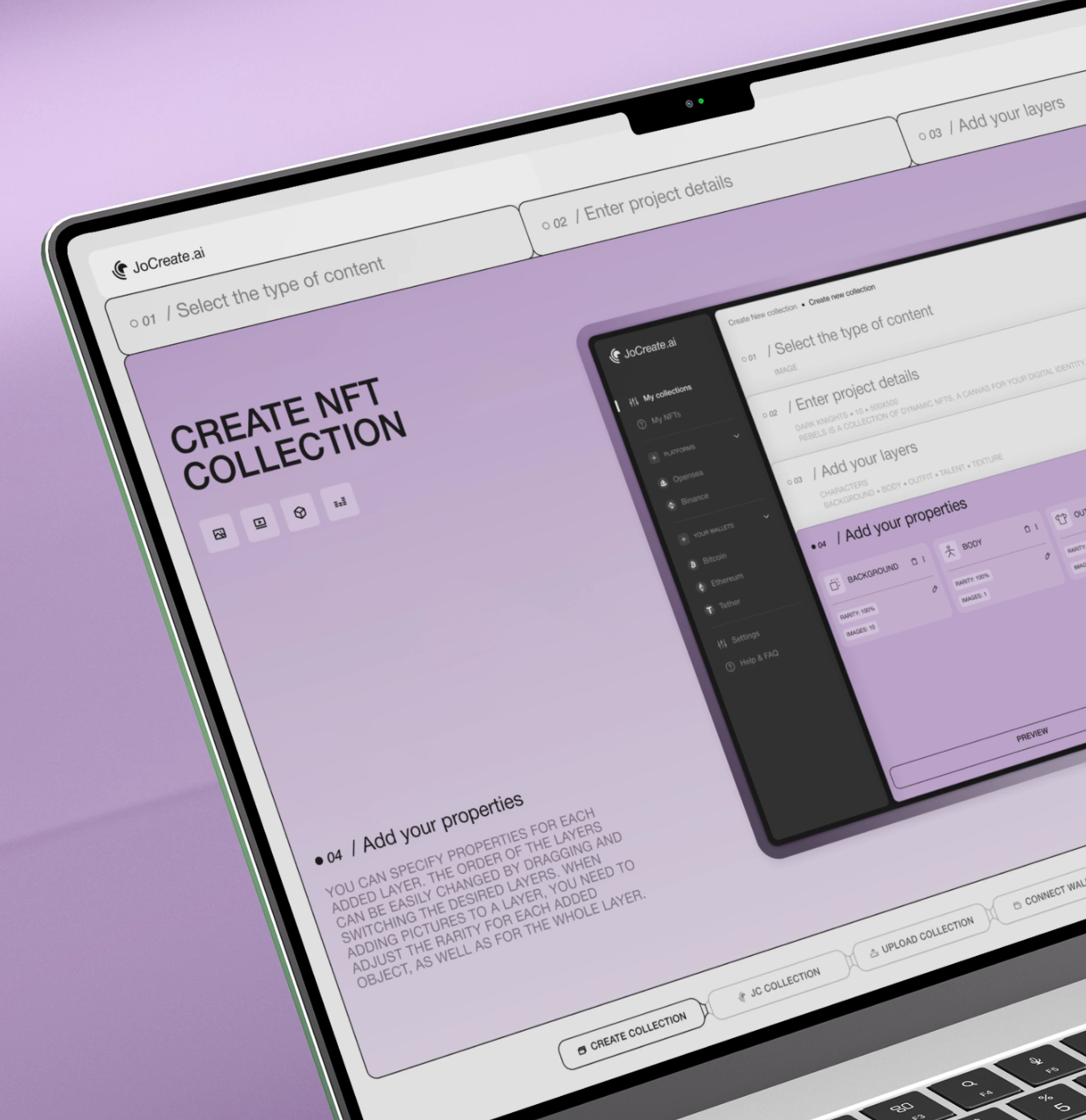
Drawing inspiration from the JoCreate app, we crafted a visual style that established a cohesive and consistent impression between the website and the app. We seamlessly adapted interface elements, color schemes, and symbolism to suit the web format, ensuring a harmonious integration.
The outcome was a visual style that accurately reflected the essence of the JoCreate app, imparting a unified and appealing appearance to the promotional website.
In developing the user interface (UI) for JoCreate, we set out to accomplish several crucial objectives:
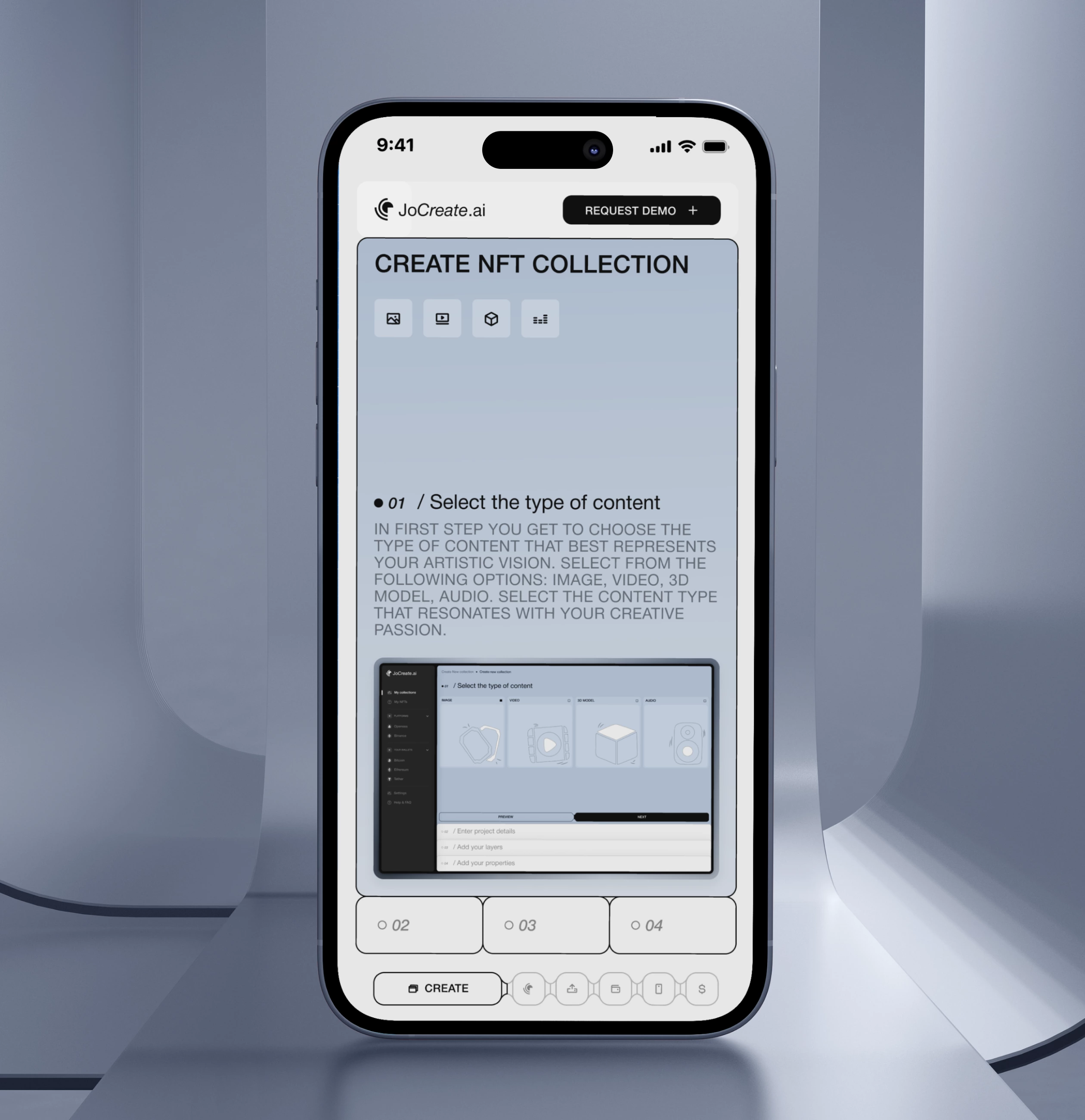
- Our primary goal was to design a straightforward and intuitive interface that enables users to navigate and interact with the application’s functionality effortlessly. To achieve this, we streamlined the navigation and layout of elements, ensuring users can swiftly locate the desired features.
- Secondly, our objective was to develop an appealing and contemporary design that resonated with JoCreate’s unique selling proposition. Utilizing clean and modern design elements, we accentuated the app’s progressive, user-friendly, and innovative essence.
- Lastly, we ensured the design’s full adaptability to ensure seamless display and functionality across various devices and screen sizes. Considering different screen dimensions and device orientations, our design allows users to access JoCreate features with equal ease, regardless of the device they use.
Through our diligent efforts, we have successfully achieved a well-balanced and visually appealing user interface that harmoniously blends user-friendliness, modern design, and adaptability. This amalgamation ensures an exceptional user experience, catering to the diverse needs of our valued users.


