Development
Research
Client
SaltyCloud
 Texas, USA
Texas, USA
Technologies
 Vite
Vite
 React
React
 Typescript
 React Router Dom
 Radix Primitives
 TailwindCSS
Recharts
TailwindCSS
Recharts
 Storybook
UX Design Awards - Nomination 2024

When Isora GRC approached us, their product faced several challenges that impacted usability and overall user experience. The platform’s outdated design lacked intuitive navigation and user-centered workflows, creating friction for end-users. The client sought a modern redesign to improve the platform’s look and feel while addressing user pain points.
Through our comprehensive audit, we identified deeper issues. Beyond aesthetic updates, the platform needed usability improvements to align with the client’s business goals and provide a seamless experience for non-technical users.
Our role
We joined as an extension of the client’s team, offering expertise in user-centred design and front-end development. Our contribution went beyond visual enhancements – we reimagined the product to deliver a seamless and intuitive user experience. By collaborating closely, we led the client through a comprehensive redesign, improving usability and empowering end-users to confidently navigate complex processes.
Our research process laid the foundation for a successful redesign by thoroughly analyzing the product’s functionality and user interactions. We reviewed technical and user-facing documentation, conducted a UX audit to identify pain points, and restructured the informational architecture. Additionally, we mapped out user flows to streamline complex processes and improve usability. Finally, we prioritized features for development, ensuring a user-focused, feasible, and impactful solution.
Stages
- Documentation analysis
- UX audit
- Informational architecture
- Userflow
The first step in our research process was an in-depth exploration of the product’s documentation to build a comprehensive understanding of how it worked.
Designers focused on user-facing materials, such as manuals and guides, to grasp how the product was intended to function. They complemented this by testing the product firsthand, adopting an empathetic perspective to uncover pain points and usability challenges that real users might encounter.
Simultaneously, our developers delved into the backend documentation to understand the technical architecture and limitations they would be working with. This dual approach ensured alignment between user experience and technical feasibility.
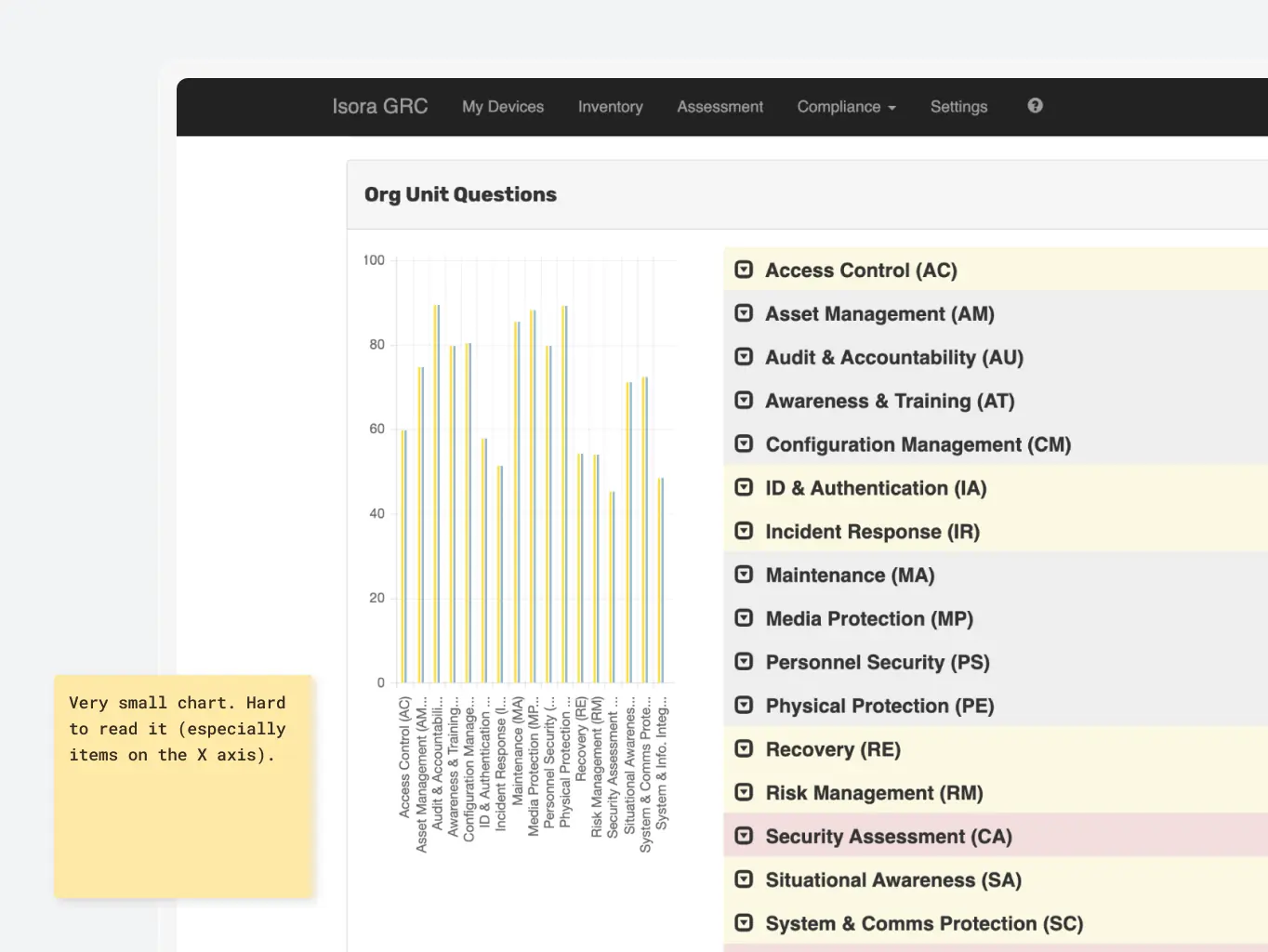
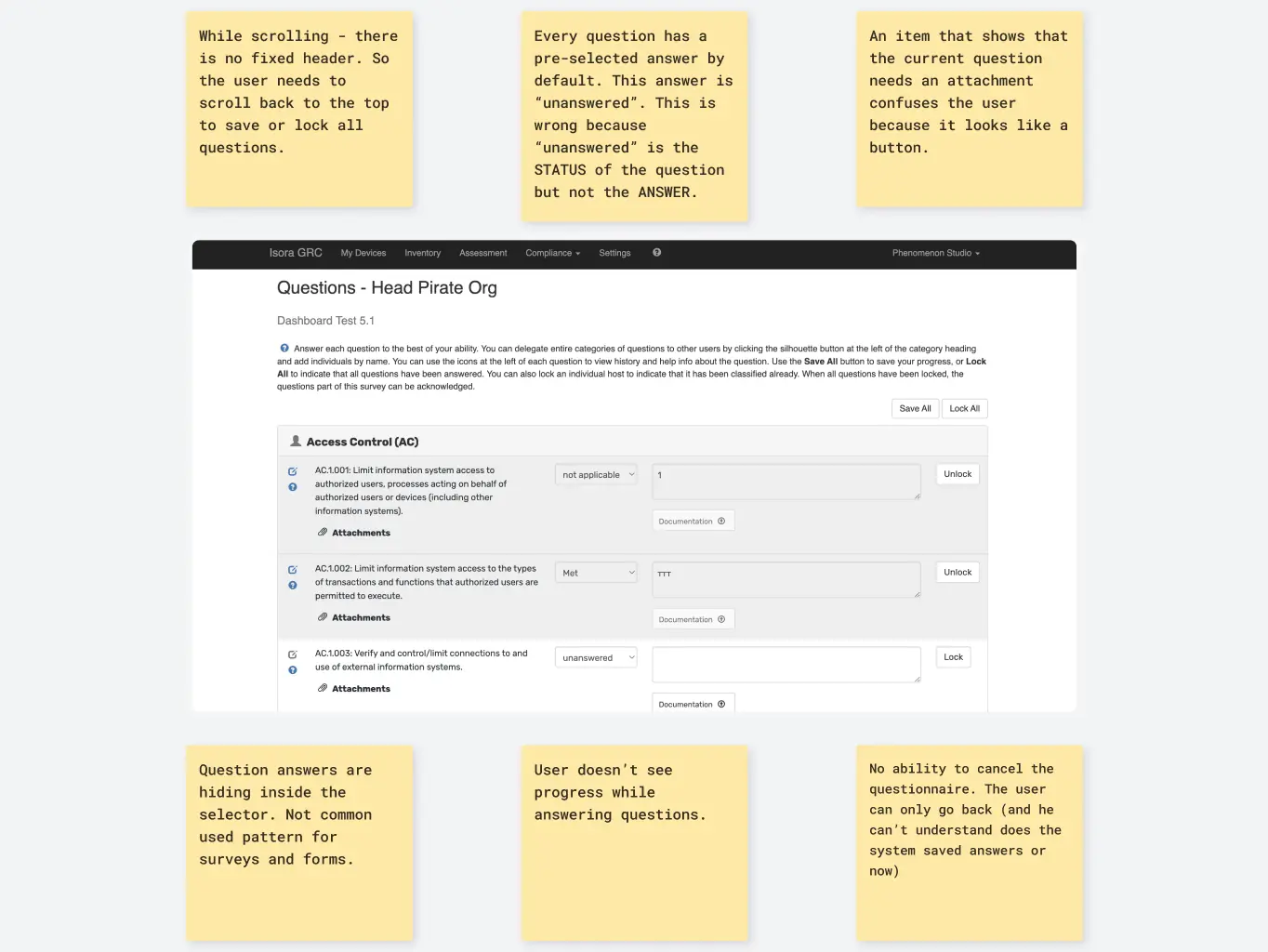
During the UX-Audit phase, we conducted a thorough analysis of all user flows within the product, evaluating them against industry-standard UX patterns, Nielsen’s heuristics, and user feedback provided by the client. This comprehensive review allowed us to identify pain points and usability issues that hindered the product’s effectiveness.
Beyond identifying problems, we also generated hypotheses for features and improvements that could enhance the product’s usability and value. Our audit extended to assessing the overall quality of the UI, ensuring that our redesign would address visual and functional shortcomings in tandem.
By collaborating closely with the client throughout this phase, we ensured that findings aligned with their goals, setting a foundation for impactful design changes.
Based on insights from the UX audit and final discussions with the client, we began crafting the product’s new informational architecture. This structure addressed existing issues while defining the integration and functionality of new features. Our focus was on creating a logical, intuitive framework that streamlined interactions and enhanced usability.
Simultaneously, we mapped user flows directly onto the architecture to optimize processes and ensure a cohesive design approach. This dual effort allowed us to visualize how users would interact with the product and identify opportunities to simplify and enhance their journeys.
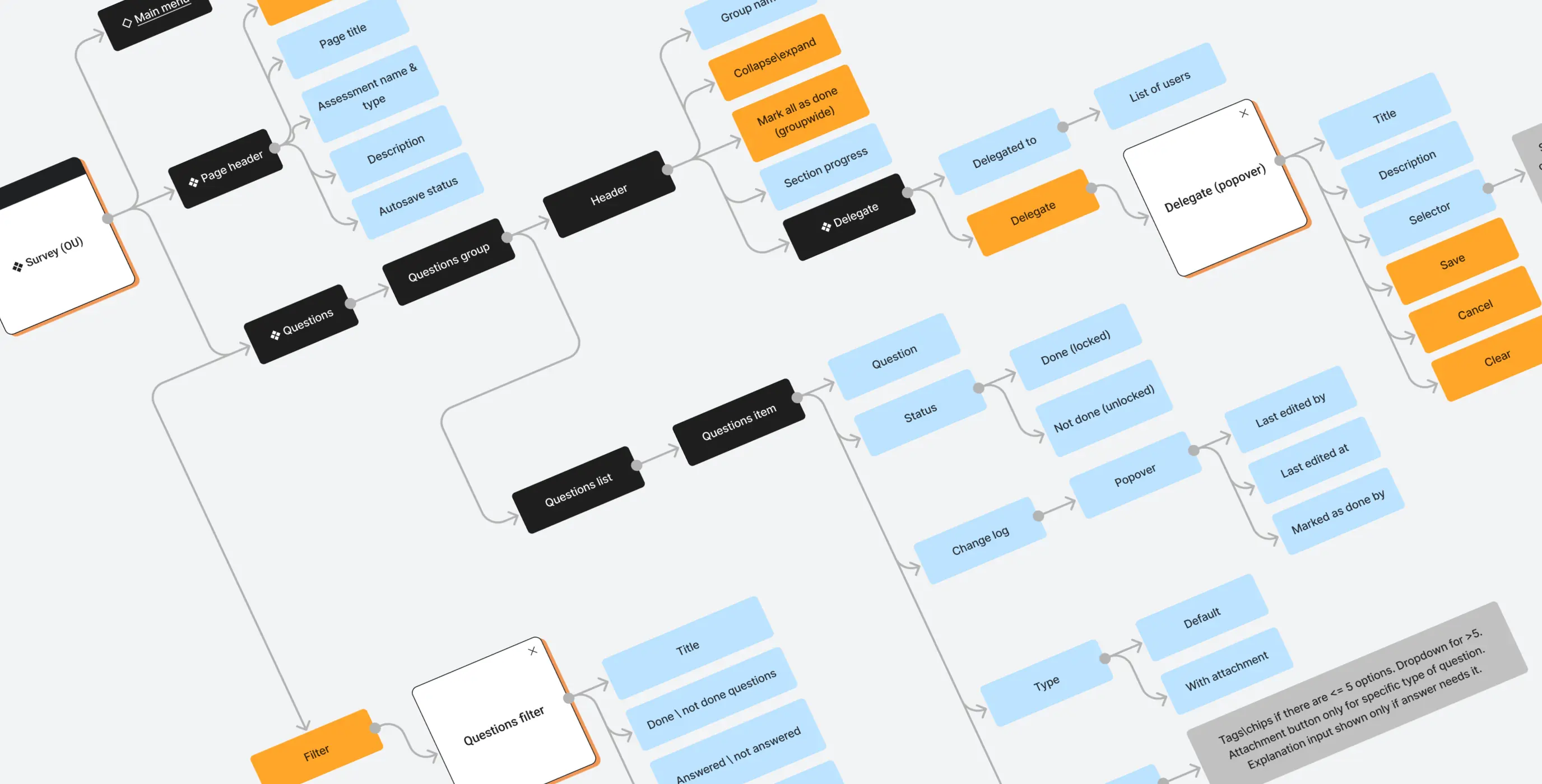
Given the visual focus of the redesign with selective feature additions, we streamlined the process by skipping traditional wireframes. Instead, we treated the live product and the newly developed informational architecture as our foundation. This approach allowed us to move faster and optimize the client’s budget without compromising on quality.
Stages
- Design direction
- Product UI design
- Design system
Before diving into the design concept, we created a comprehensive mood board and conducted a short client survey. These steps helped us align on the overall visual direction and establish a clear path forward. Accessibility was a key focus throughout this stage. From the outset, the design needed to be inherently accessible, ensuring usability for all users. This requirement introduced certain constraints on visual choices, guiding the design team toward solutions that balanced creativity with inclusivity.
With the design direction in place, we developed interface layouts for all key screens, considering edge cases and varied workflows. Each screen was tailored to support seamless user interactions while addressing the product’s complexities.
Given the backend limitations identified earlier, not every design idea could be implemented exactly as envisioned. This required close collaboration between designers and developers to validate ideas and adapt solutions to align with technical constraints. This continuous communication ensured that the final designs were both visually compelling and technically feasible, maintaining a balance between innovation and practicality.
Throughout the creation of mockups, our designers worked in parallel on building and documenting a comprehensive design system. While this approach initially required more time, it significantly accelerated progress in later stages. For instance, an epic requiring more than month of design effort could be prepared for development in just in a few weeks. This efficiency was driven by an atomic approach to component design, where smaller elements were reused across multiple screens and features.
The design system extended beyond Figma components. On the development side, our team maintained a mirrored design system within Storybook, ensuring consistency and seamless handoff between design and development.
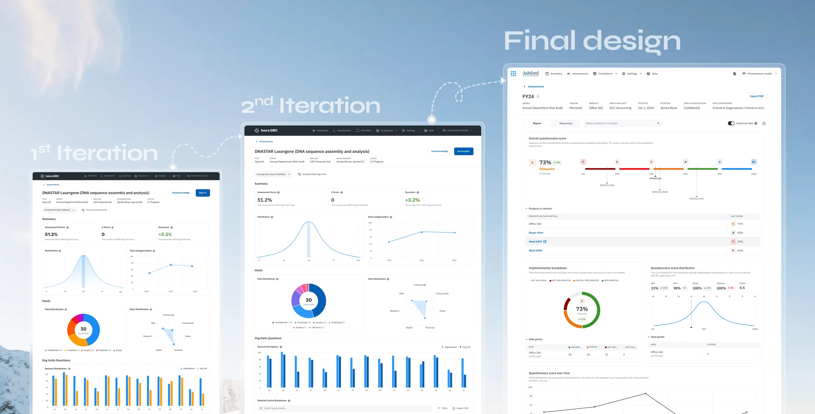
This comprehensive, dual-system approach not only streamlined the design and development processes but also reduced the product’s time-to-market by over 50%, delivering faster results without compromising quality.
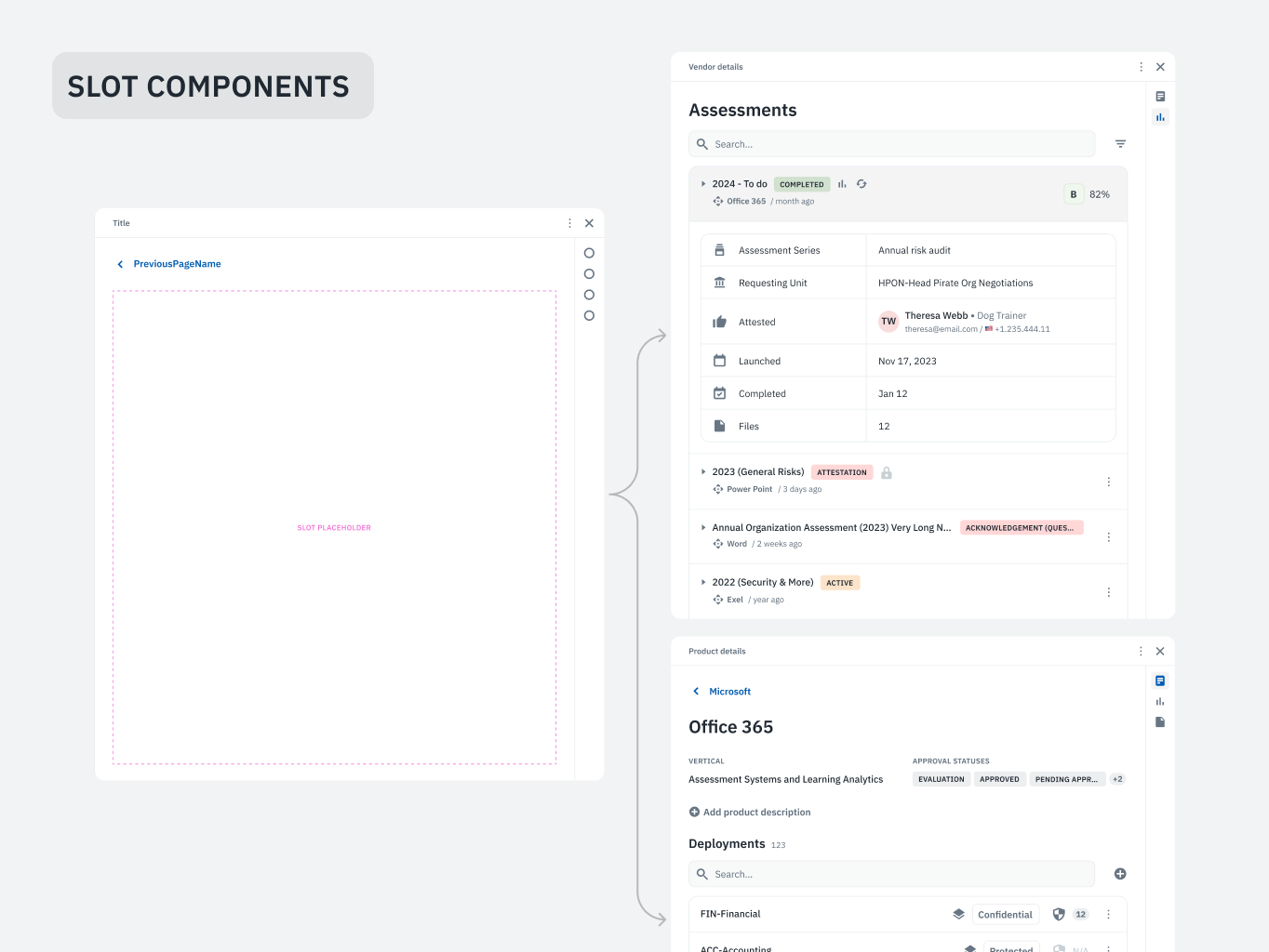
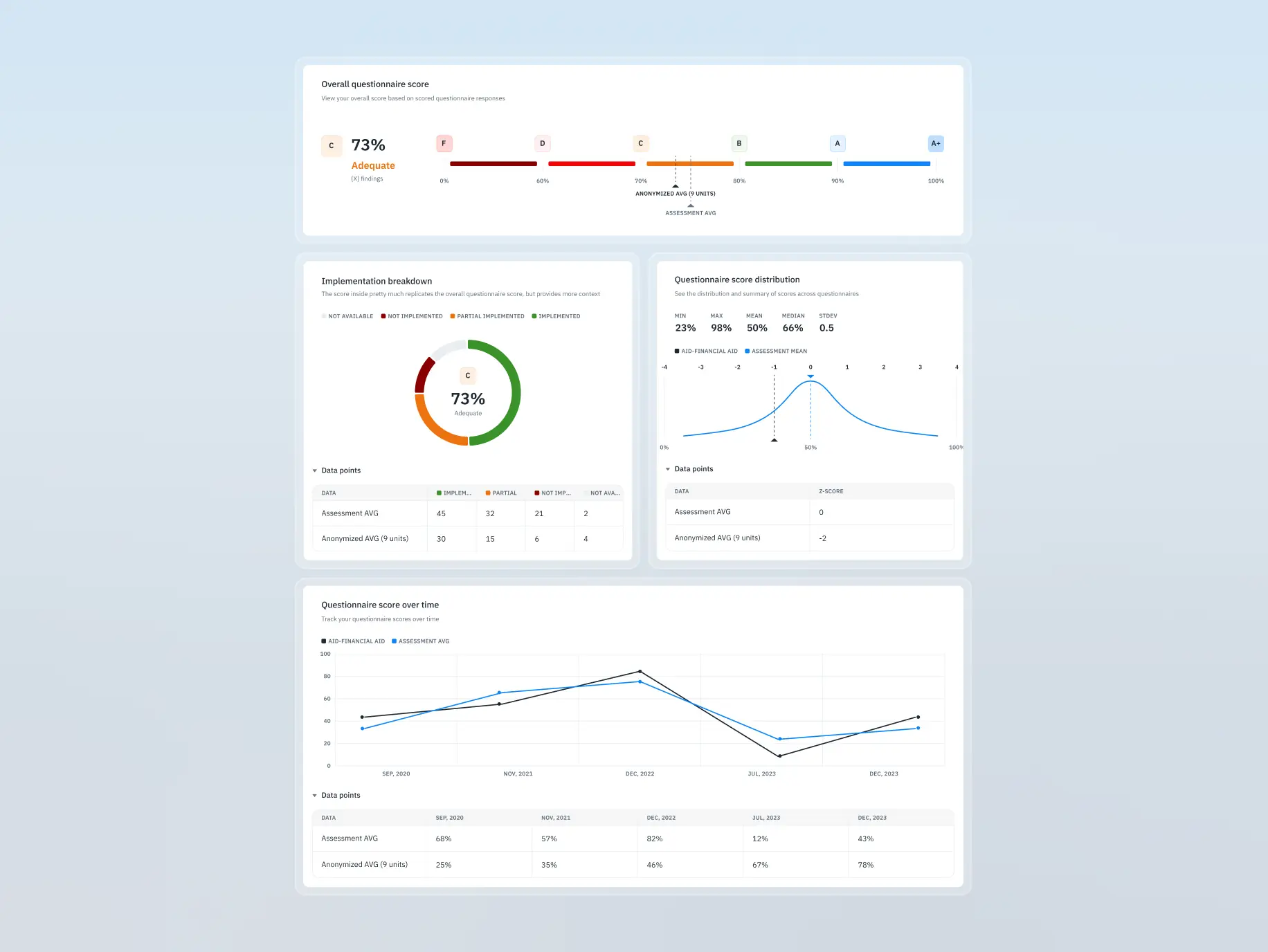
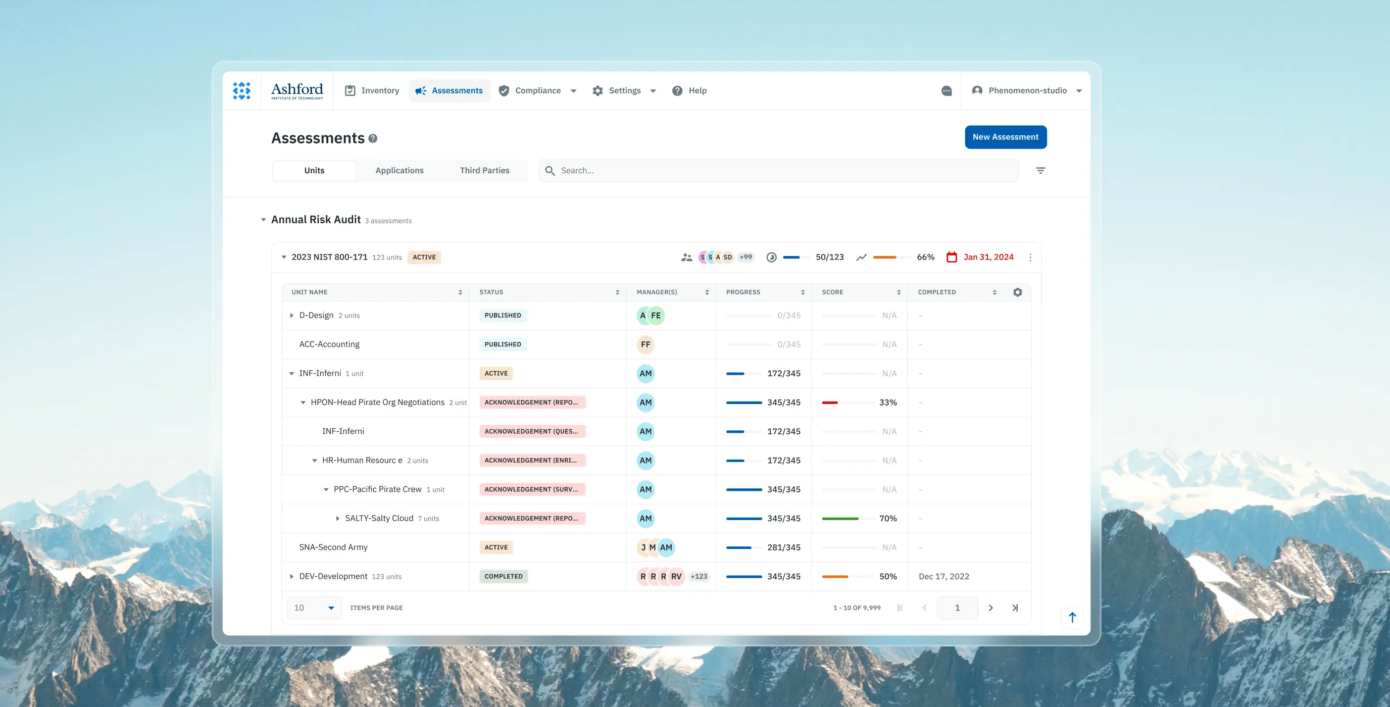
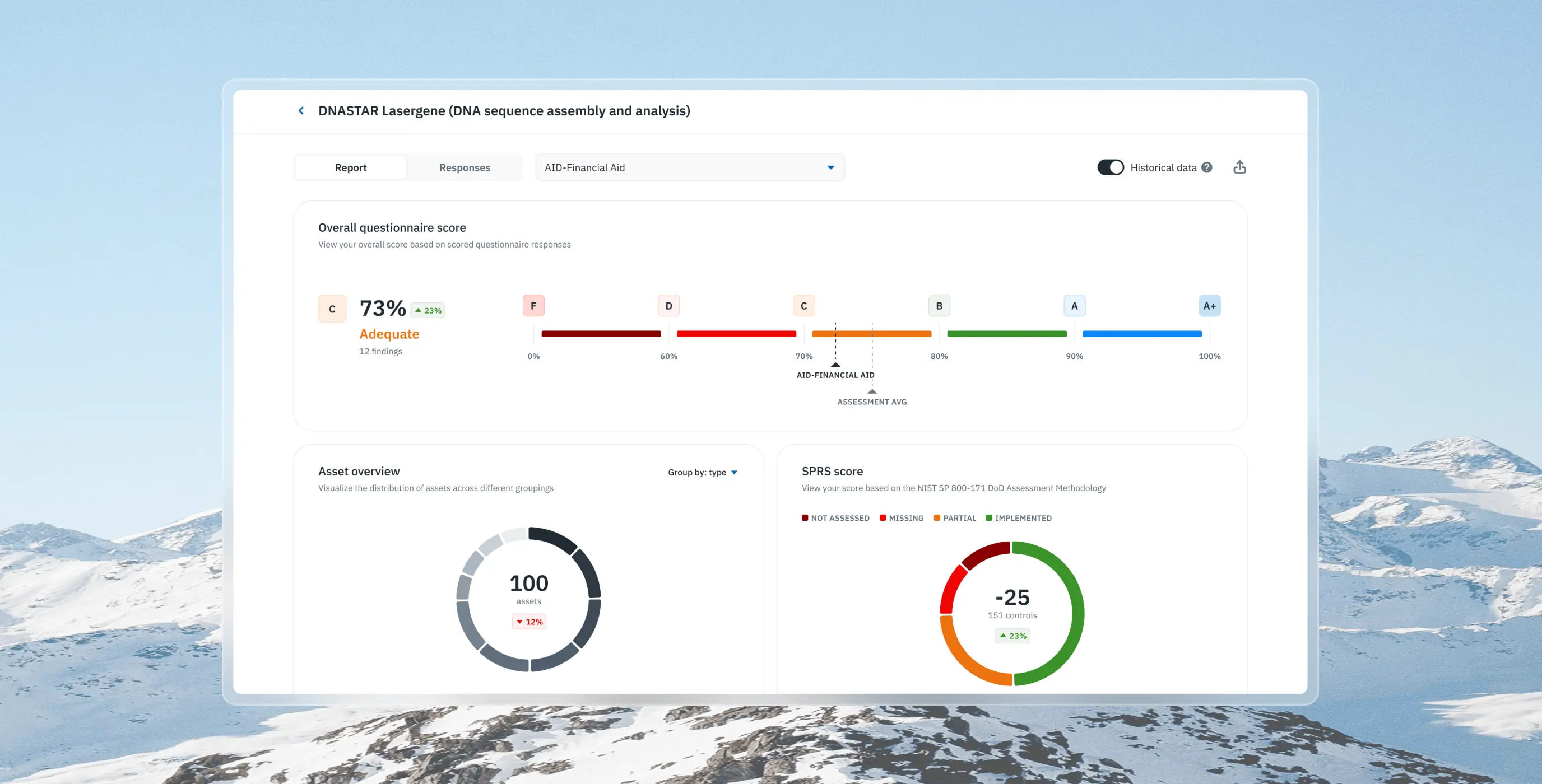
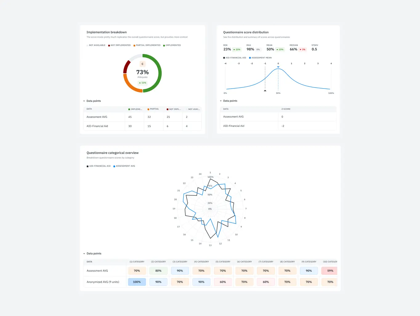
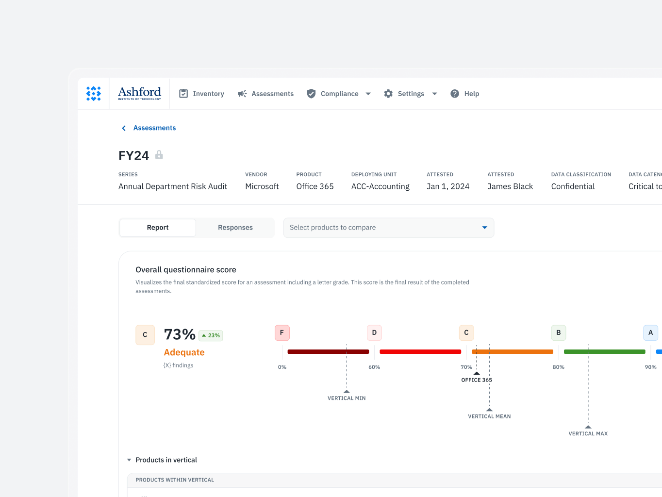
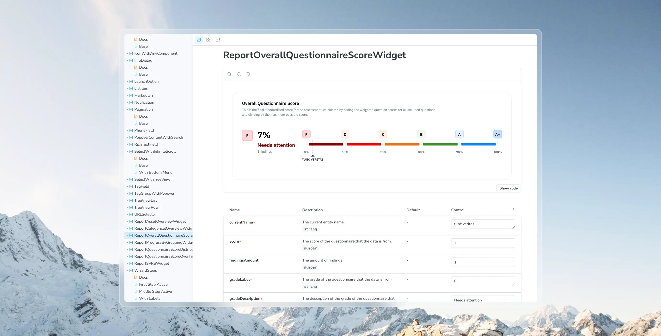
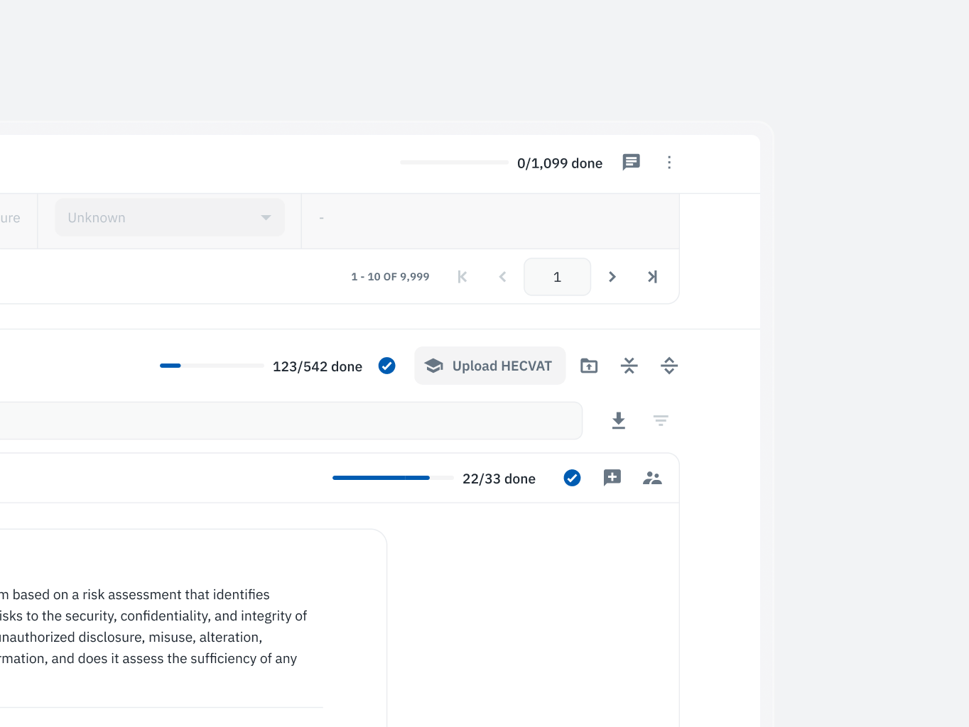
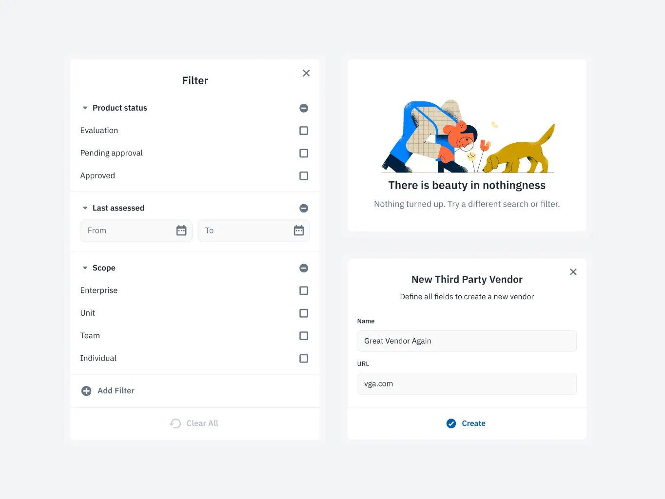
Assessment management
Users struggled with navigating and interpreting the information due to a lack of clear structure and visual prioritization, leading to inefficiencies in managing assessments.
What we’ve done:
- Introduced an intuitive layout for effortless navigation and management of assessments.
- Implemented visual progress indicators, enabling users to quickly grasp critical information.
- Improved clarity and efficiency in handling assessments by simplifying key workflows.
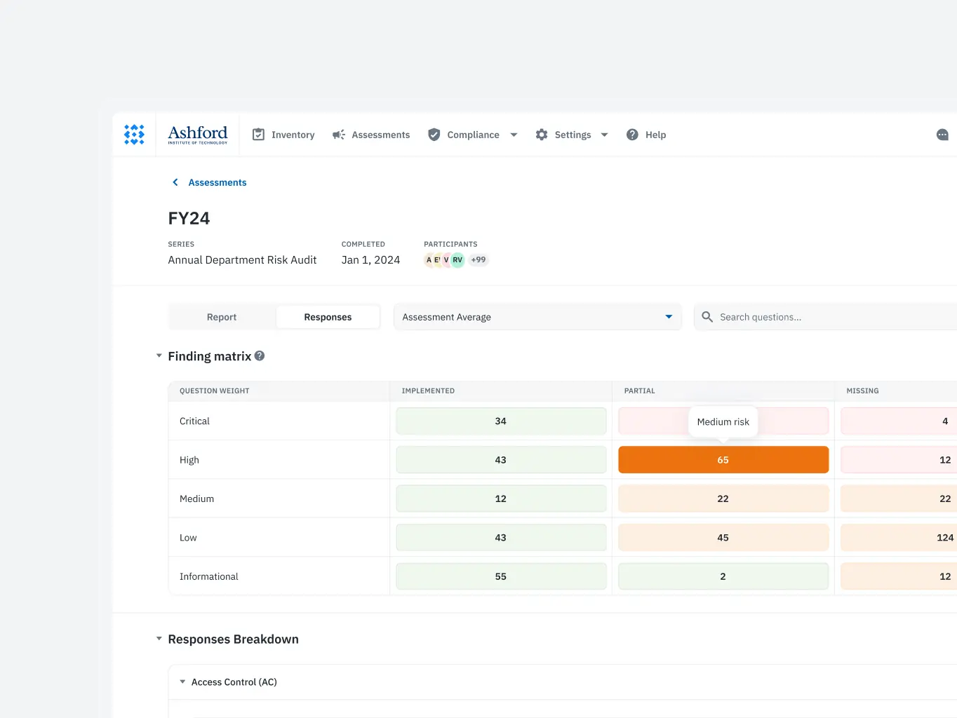
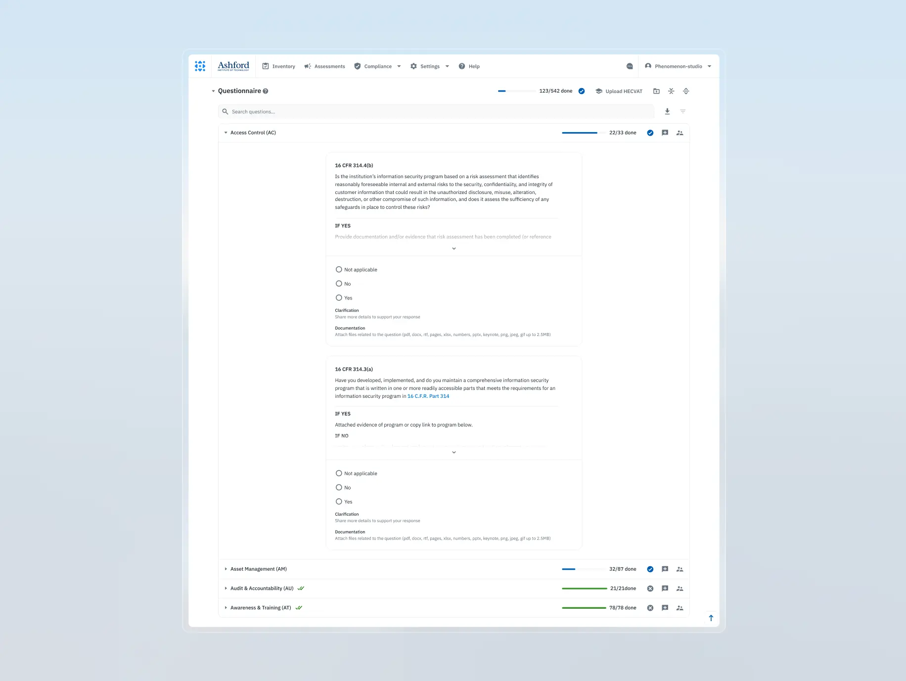
Assessment survey completion
The survey process lacked clarity and flexibility, making it difficult for users to complete tasks efficiently and understand their roles within collaborative workflows.
What we’ve done:
- Redesigned the survey process to mirror familiar tools, enhancing usability.
- Developed a step-by-step pipeline to guide users through the survey seamlessly.
- Optimized workflows for role-based permissions, ensuring smooth collaboration between distinct user roles.
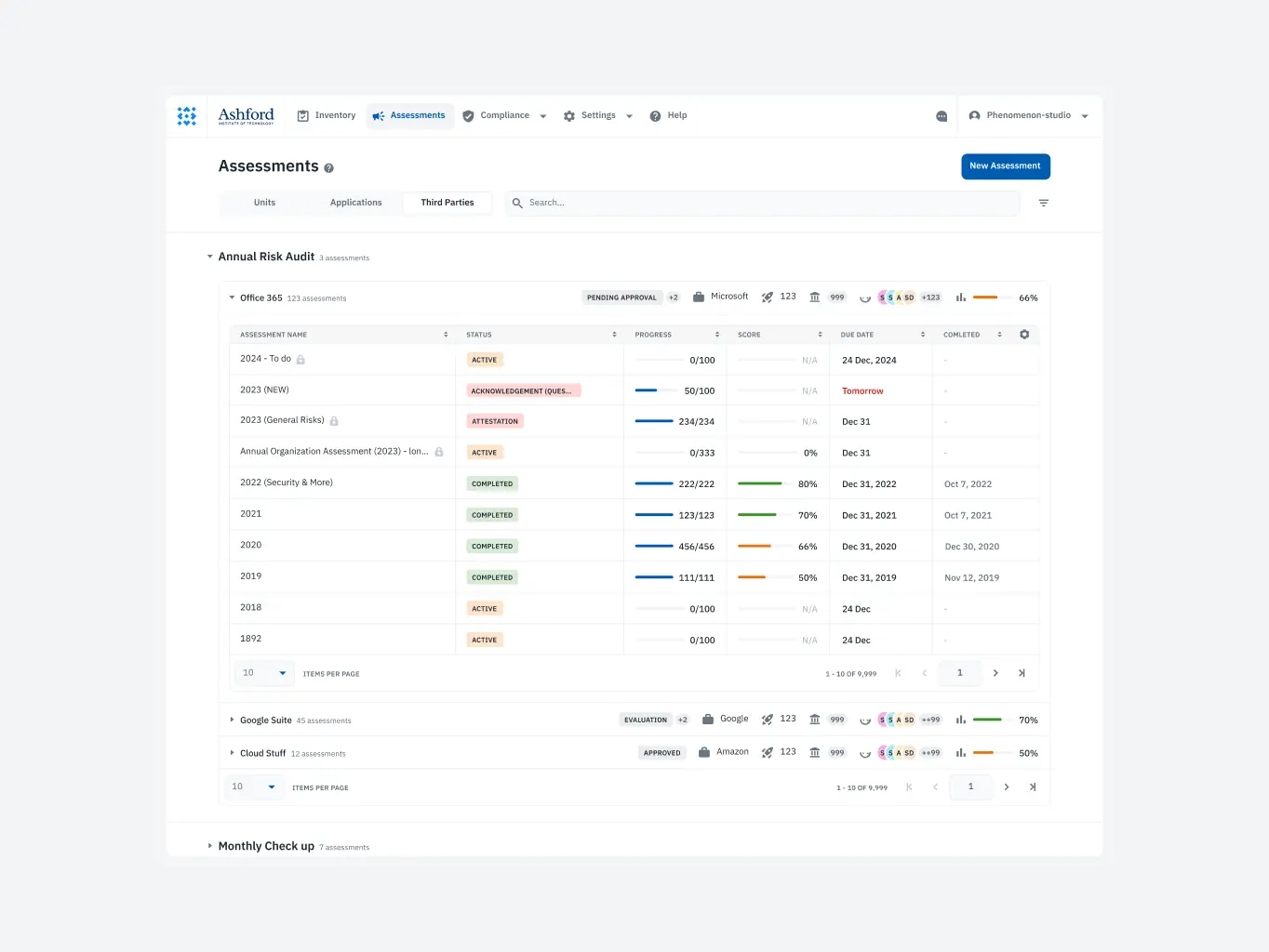
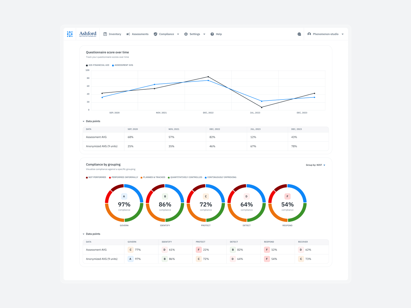
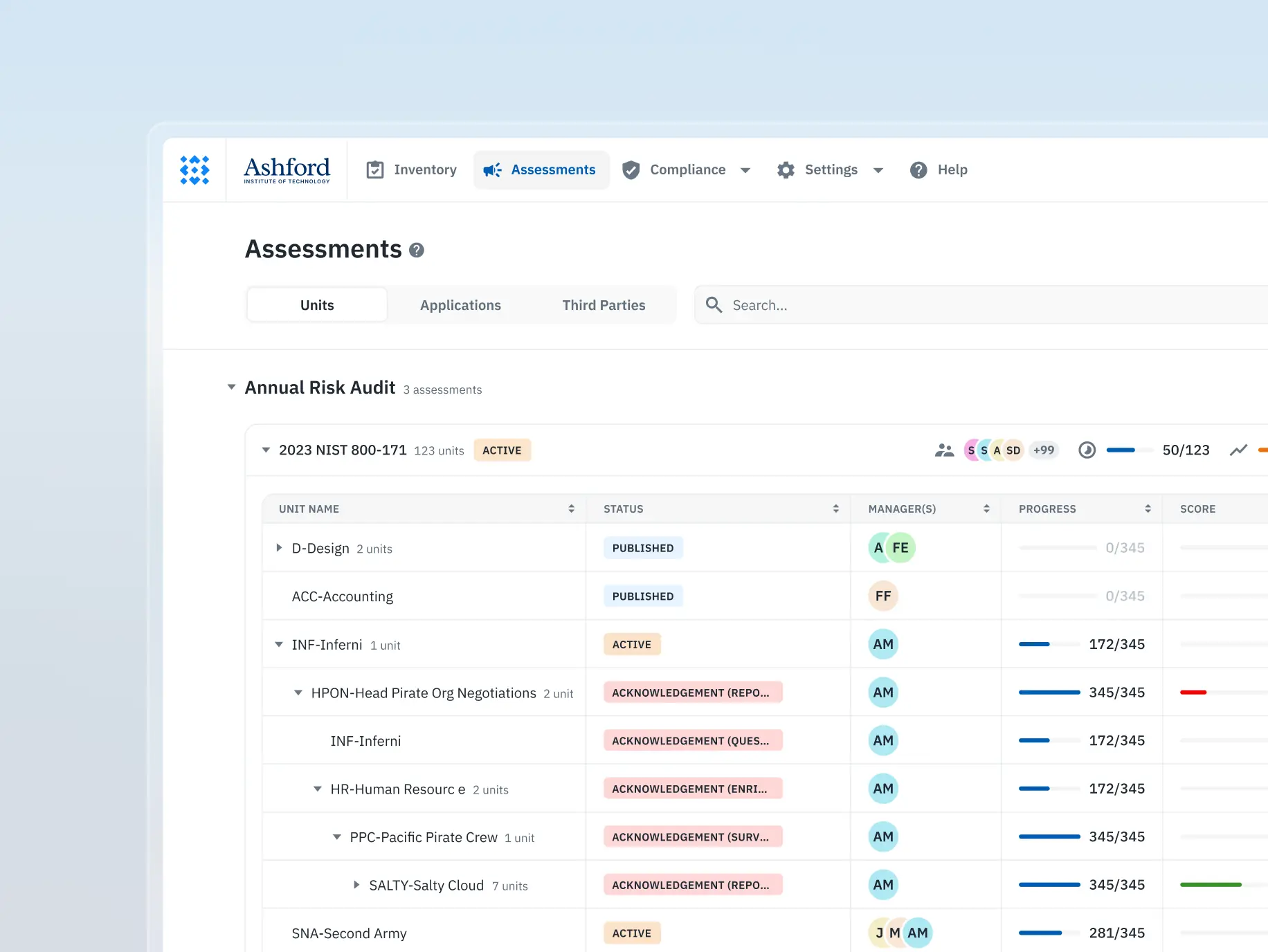
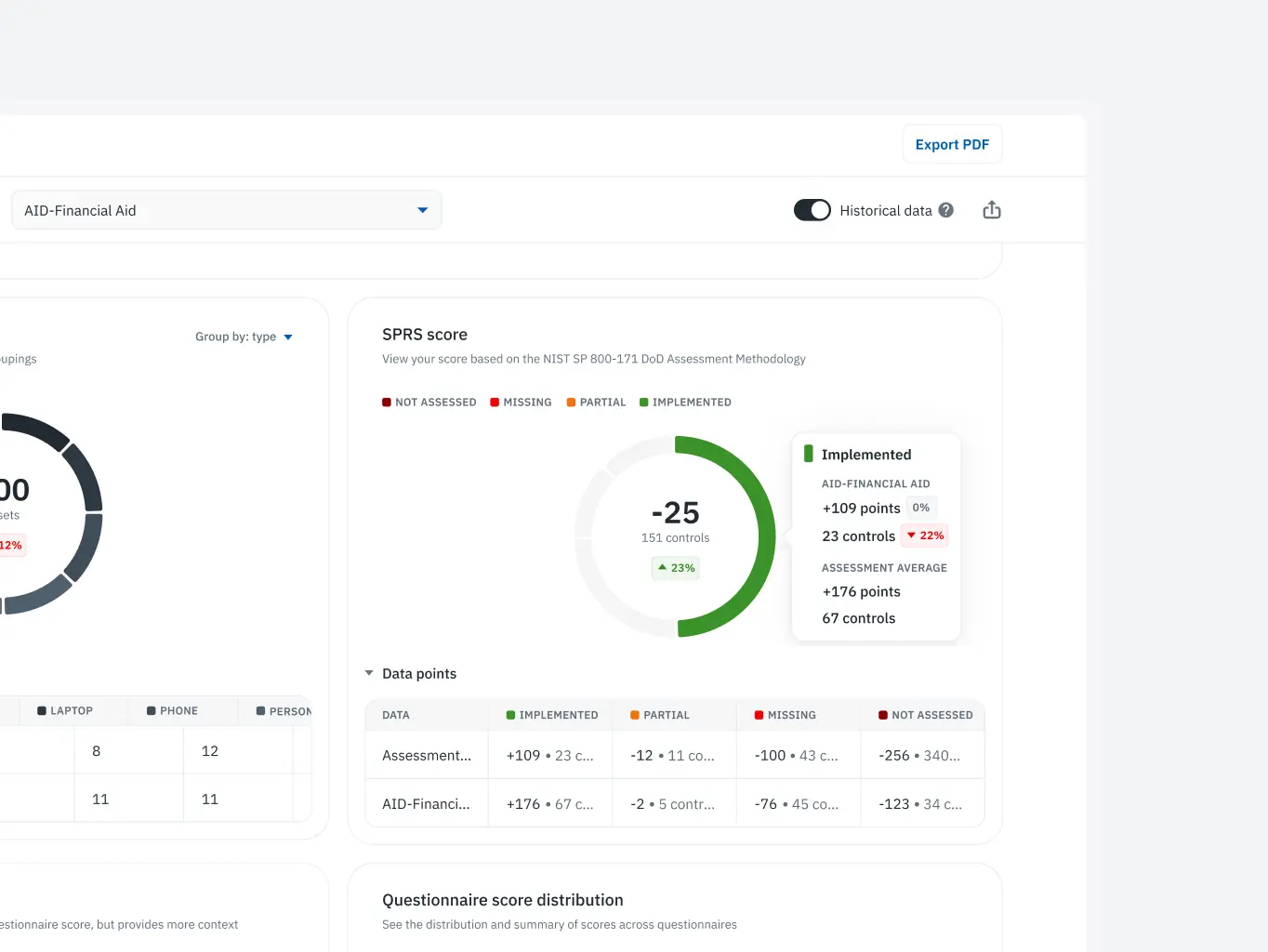
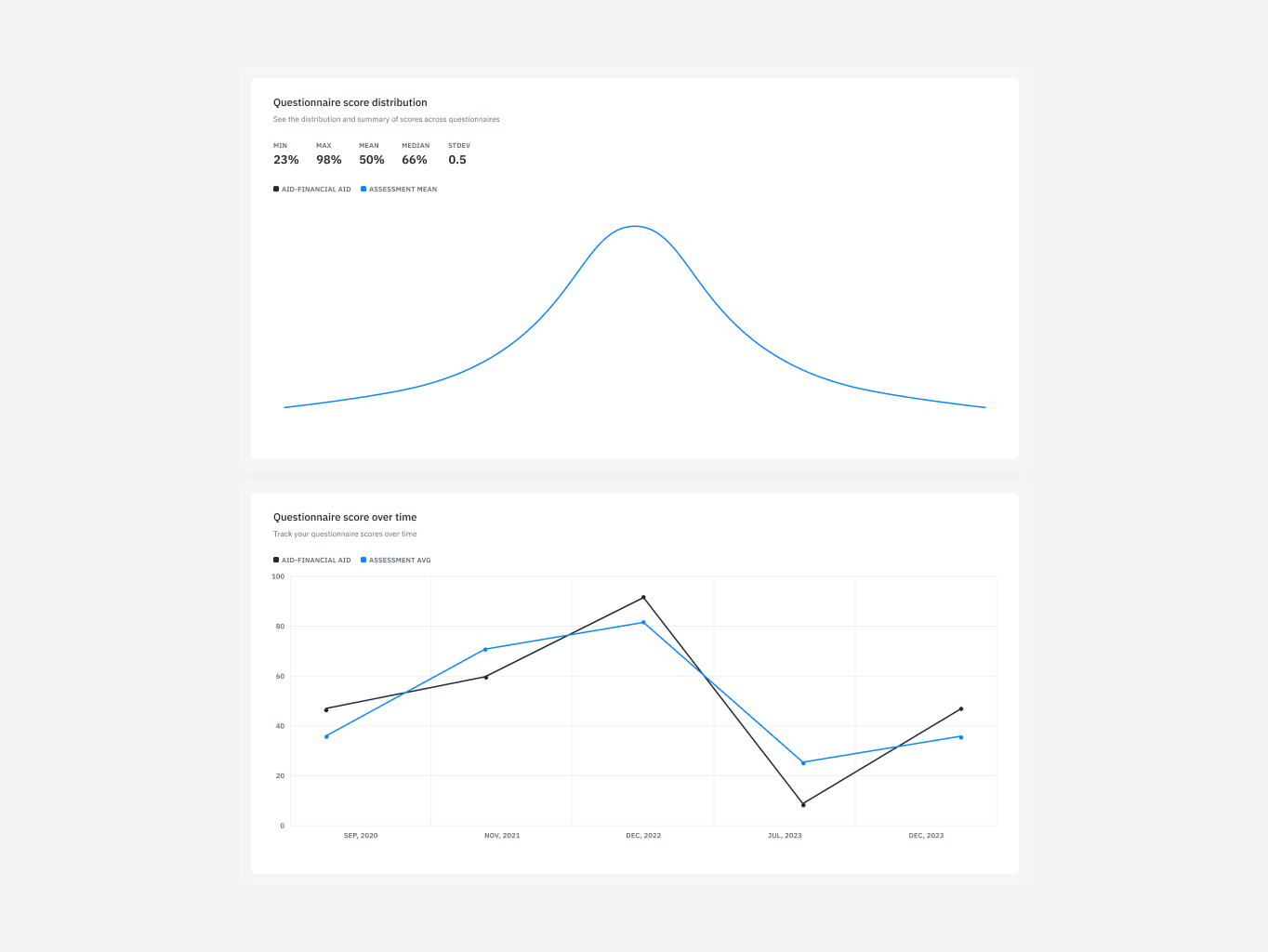
Assessment reporting
Comparing data across assessments was cumbersome and error-prone, with no intuitive way to analyze or switch between reports seamlessly.
What we’ve done:
- Enabled seamless switching between reports for improved side-by-side comparisons.
- Introduced features to streamline data analysis across organizational units and vendors.
- Enhanced decision-making by reducing reliance on manual cross-referencing.
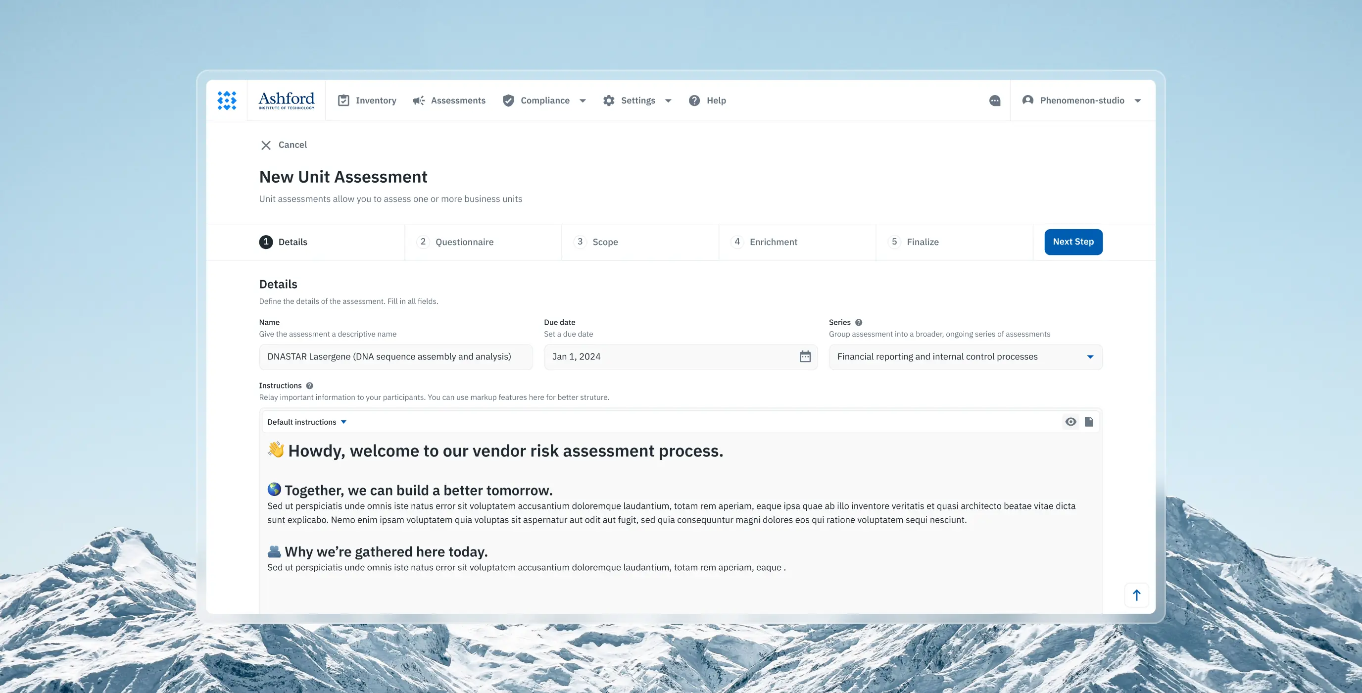
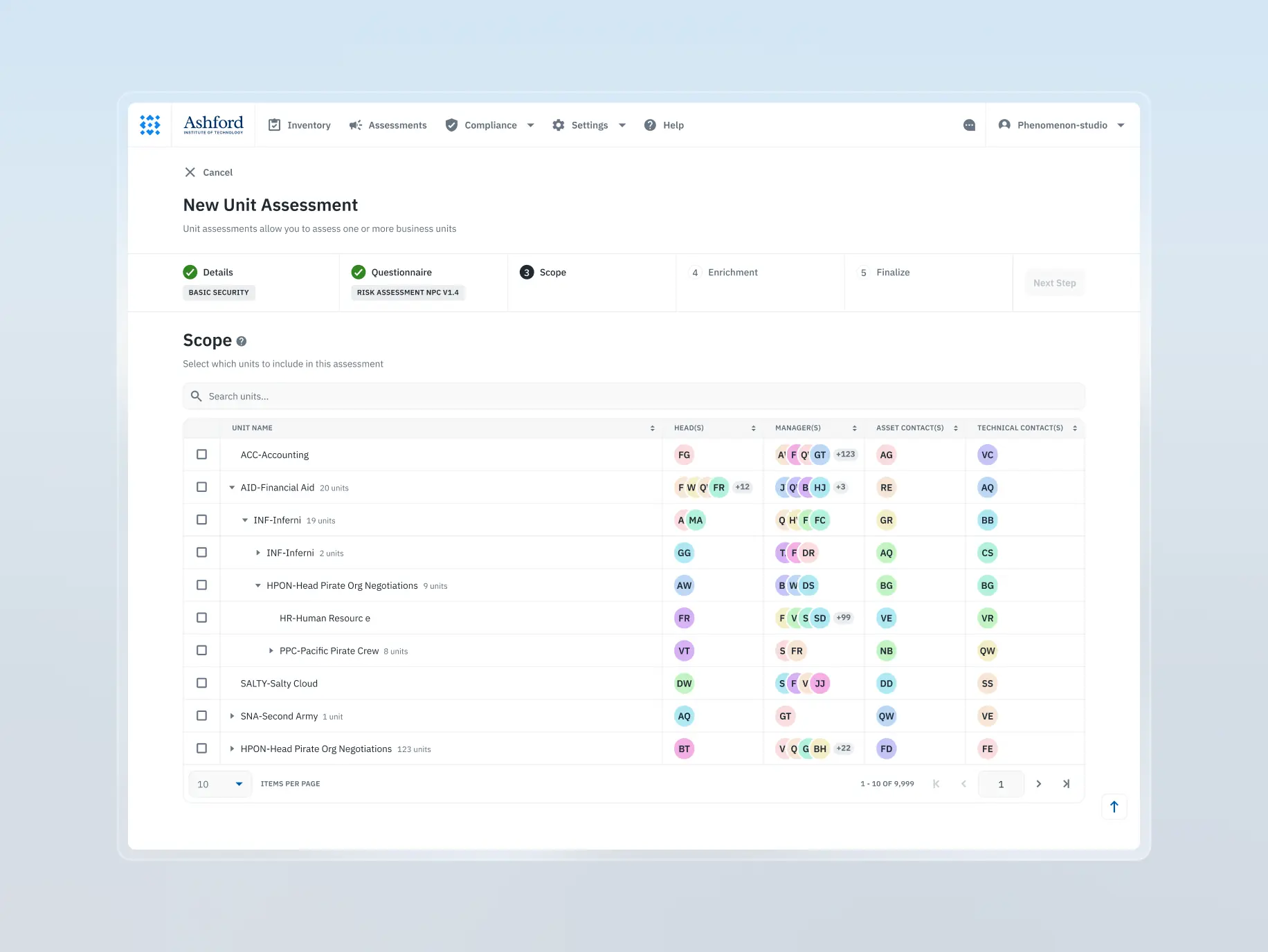
Assessment builder
Creating new assessments was overly complex and unintuitive, resulting in confusion and a steep learning curve for users attempting to set up processes.
What we’ve done:
- Transformed assessment creation into a guided, user-friendly process
- Provided contextual tips at each step to assist less experienced users
- Simplified complex workflows, improving accessibility for diverse user skill levels
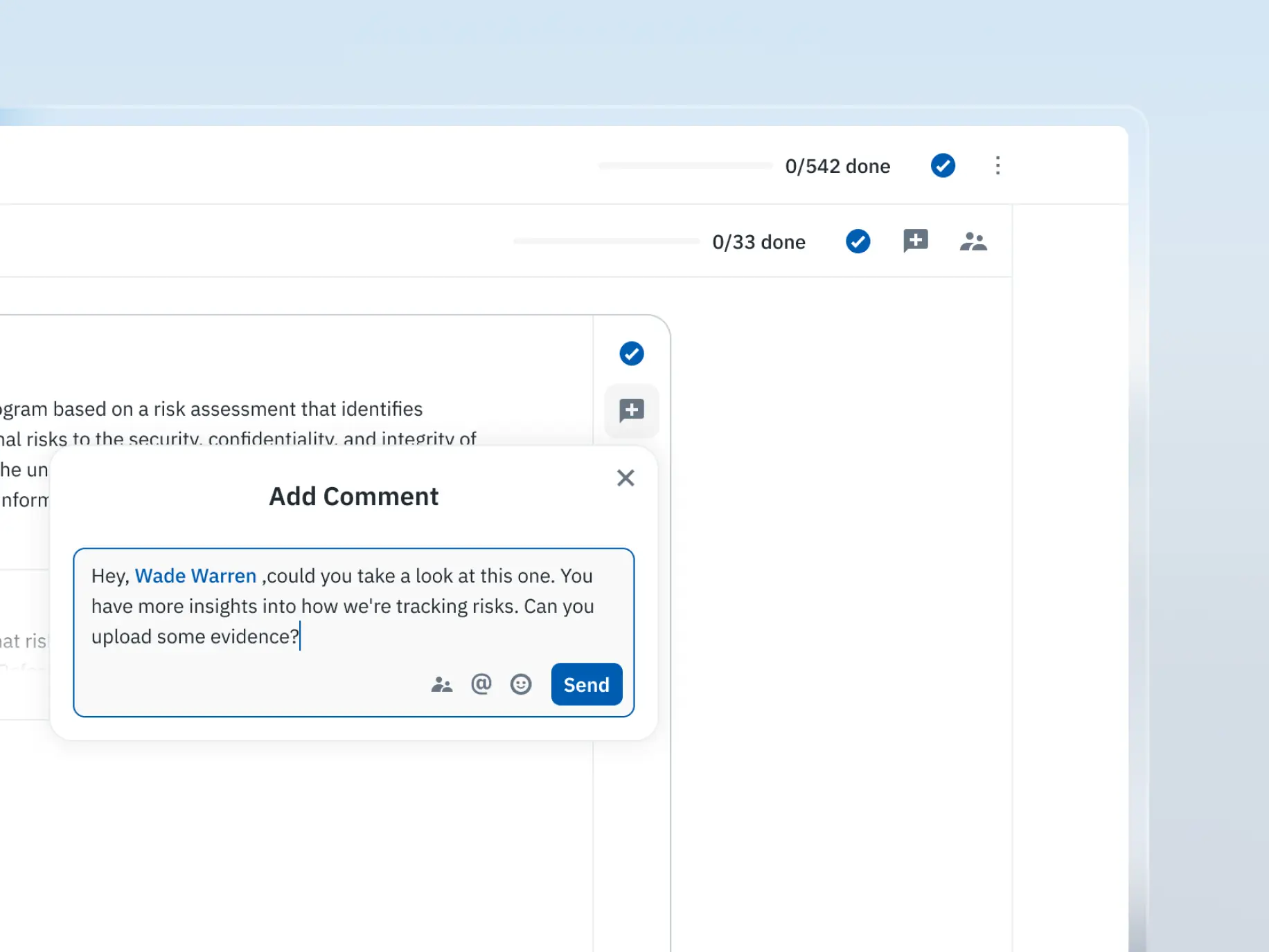
Commenting the survey
The absence of built-in collaboration tools forced users to rely on external solutions, leading to fragmented workflows and reduced team efficiency.
What we’ve done:
- Added collaboration tools allowing users to comment on specific survey sections
- Introduced threaded discussions, fostering team-based problem-solving
- Positioned the product as a collaborative tool, enhancing teamwork and communication
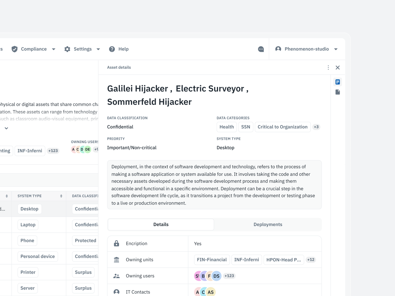
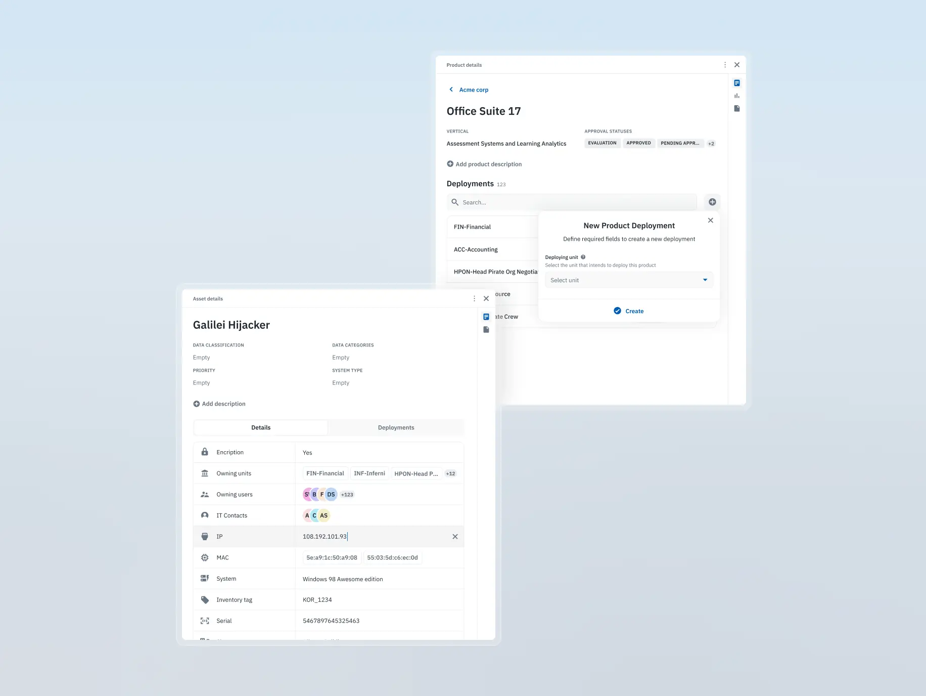
Dynamic sidebar
Users faced friction when reviewing or editing records, as the process was slow and required unnecessary steps, disrupting the overall workflow.
What we’ve done:
- Integrated a context-sensitive sidebar for quick access to record details and edits
- Streamlined workflows by enabling seamless transitions between sections without extra steps
- Enhanced productivity by eliminating friction in repetitive tasks
The development phase of Isora GRC was driven by precision, collaboration, and scalability. From dissecting outdated API documentation to building a fully interactive Storybook and crafting an accessible, high-performance frontend, every step focused on ensuring the product’s reliability and longevity.
By integrating Vite, React, and Radix Primitives, we ensured seamless, accessible interfaces, while tools like Recharts brought complex data to life through interactive visualizations. Challenges, such as backend limitations and design adjustments, were met with flexibility and creative problem-solving, ensuring the final product aligned with both technical constraints and design intent.
This comprehensive approach not only delivered a polished product but also set the foundation for rapid scaling and future feature development.
Stages
- APIs & back-end analysis
- Building the Storybook
- Front-end development
- Recharts integration
At the start of development, one of the primary challenges was dealing with outdated and incomplete API documentation. The existing Redoc documentation was unreliable, as the client lacked the resources to update or maintain it. This meant our developers couldn’t rely solely on the available documentation and had to manually inspect API endpoints to fully understand the system’s behavior and dependencies.
The project’s business logic was intricate, with complex relationships between different API services. This required deep exploration and hands-on testing to accurately map out how the various services interacted. A clear understanding of these interdependencies was essential for building robust frontend components and ensuring that new features, such as the questionnaire builder, integrated smoothly with the existing backend architecture.
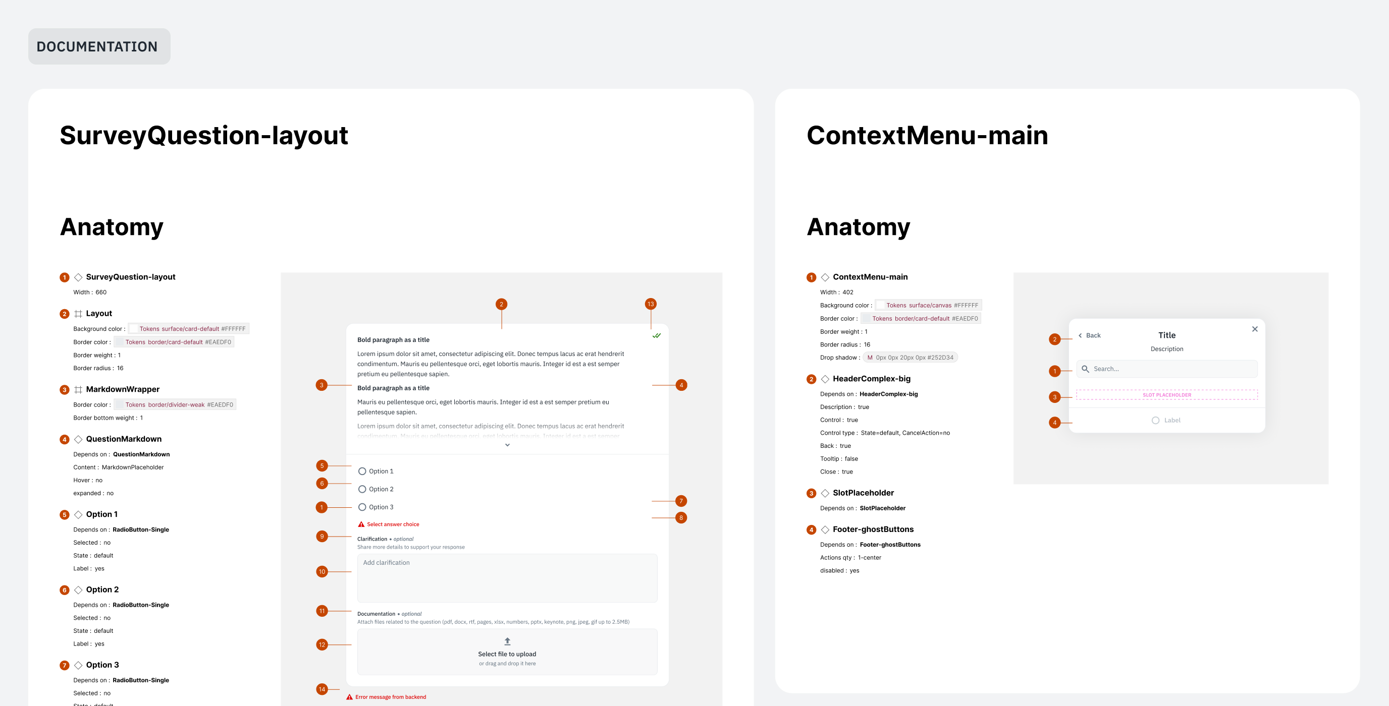
To streamline development and maintain consistency, we chose to implement Storybook specifically for shared and ordinary components. Shared components included small, reusable UI elements like buttons, icons, and selects, while ordinary components encompassed larger structures built from these smaller pieces, such as headers and footers.
This approach allowed us to create a comprehensive library of interactive, fully testable components with various states, ensuring that each piece of the interface could be previewed and refined independently. While building Storybook required an upfront investment of time, it proved invaluable for the long-term health of the project by enhancing maintainability and accelerating future feature development.
Occasionally, discrepancies emerged between the design in Figma and the actual implementation in Storybook, but this process helped us catch and resolve issues early. The result was a synchronized design and development environment, ensuring that the final product closely aligned with the original design vision.
Frontend development progressed in parallel with the creation of Storybook, ensuring that component design and implementation stayed closely aligned. Our focus extended beyond visual accuracy—we prioritized accessibility (a11y), performance, and overall code quality from the outset.
To maintain high standards, we established a robust development pipeline, integrating linters and CI/CD workflows to catch errors early and streamline deployments. The frontend was built using Vite for its speed and lightweight bundling, while React served as the core library, providing the flexibility needed to handle the project’s complexity. For accessible, customizable components, we relied on Radix Primitives, which ensured that all UI elements met accessibility standards by default.
The project’s design presented unique challenges that required creative solutions. In certain cases, backend limitations forced us to slightly adjust the design during development. These adaptations were handled through brainstorming sessions with the design team, allowing us to preserve the overall intent while ensuring feasibility within the existing backend constraints.
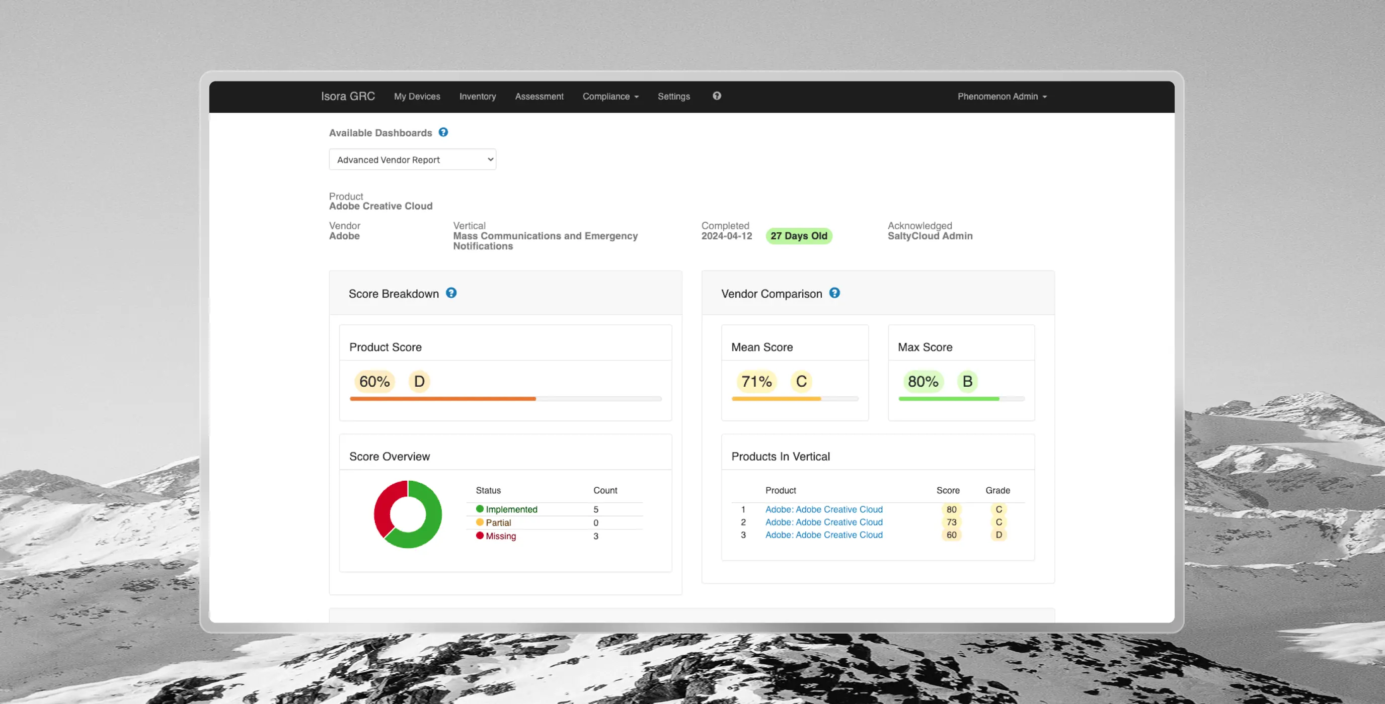
Throughout the project, we leveraged several third-party libraries to enhance functionality and streamline development. Among them, Recharts stood out as one of the most impactful tools.
Recharts is a powerful charting library designed specifically for React applications. Its extensive collection of pre-built chart types, coupled with the flexibility to create custom solutions, made it an ideal fit for visualizing complex data within Isora GRC. By integrating Recharts, we provided users with clear, interactive data representations that seamlessly aligned with the product’s overall design and functionality.
The adaptability of Recharts allowed us to handle diverse charting needs without compromising performance or accessibility, reinforcing the platform’s analytical capabilities and delivering valuable insights to users in a visually engaging format.
The redesign of Isora GRC not only transformed the product but also gained recognition on a global stage. The project was submitted to the prestigious UX Design Awards, where it secured a nomination, highlighting its excellence in user experience design. This acknowledgment from industry experts validated the product’s improved usability and accessibility, positioning it as a benchmark within the professional community.
The recognition further solidified Isora GRC’s reputation as an innovative and user-focused solution in the competitive GRC space, paving the way for sustained growth and engagement.
#website design
Tyler Ussery
 USA
USA
USA

#Branding
Tyler Ussery
USA
USA
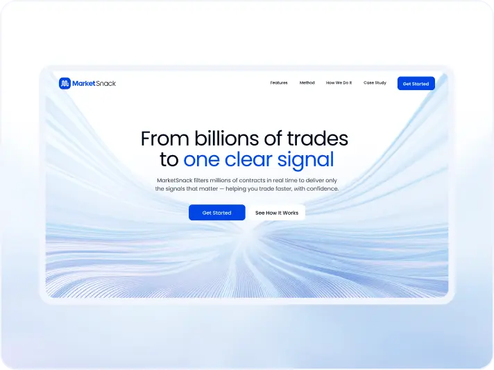
#Website redesign #Website development
marketsnack
USA
USA
Have a project in mind?
Let's chat
Have a project to
discuss?
discuss?

Have a partnership in
mind?
mind?