Development
Research
Client
nda
 Australia
Australia
Services
Product redesign
web development
Technologies
 Node.js
 React
React
 Nest.js
 AWS
AWS
 PostgreSQL
 Calendly
 Stripe
 Healius labs
 Aus post
 Addressfinder

The client approached us to rebrand Enhanced Men’s Clinic (EMC) into new one with a brand new name and build a full-service digital health platform. The goal was to unify multiple treatments, including TRT, erectile dysfunction, weight loss, and male fertility, into one cohesive and trusted experience under a single brand.
In addition to the patient-facing portal, the client required a robust admin platform to support clinical and operational workflows. Key objectives included automating blood test analysis, Medicare validation, and e-prescribing, improving patient onboarding, and creating role-based admin tools for doctors, pharmacists, and administrators.
The result needed to be a scalable system that seamlessly connects patients, clinicians, and pharmacies through one end-to-end workflow.

The research phase was not a traditional product audit. Since the platform had to be reconsidered for a new level of scale, complexity, and regulatory requirements, we approached discovery more broadly. Instead of auditing the existing experience in isolation, we started with competitor research, then defined the app map, and only after that shaped the key user flows. This sequence helped us build a stronger product foundation before moving into detailed UX decisions.
The process was collaborative across design, business analysis, clinical analysis, and development. The designer worked closely with BA and CA throughout discovery, combining UX thinking with business, clinical, and operational input from the start. While the designer focused on product structure and flow logic, BA and CA helped validate feasibility, integrations, and system constraints early on. This ensured that decisions were not only user-centered, but also grounded in the real technical and operational context.
Stages
- Competitors analysis
- App map
- User flow
Competitor analysis revealed that many platforms overload users with marketing-first experiences, where branding and promotions overshadow medical clarity. This often leads to confusion around treatment logic, subscriptions, and next steps. We intentionally avoided dark patterns, unclear pricing, and hidden cancellation paths, focusing instead on transparent flows where users always understand what is happening, why it matters, and what comes next.
We analyzed leading men’s health platforms including Hims, Numan, and Manual to identify patterns that genuinely work. Clear top-level navigation, structured content, and proactive guidance such as task-based dashboards and visible next steps proved especially effective. We reused these approaches to make complex medical journeys feel calm, predictable, and easy to follow.
The information architecture was built in close collaboration with a business analyst, whose primary role was to define, structure, and preserve product requirements across the entire development lifecycle. This ensured that complex clinical logic, operational workflows, and regulatory constraints were consistently translated into clear, actionable system behavior.
Rather than acting as a one-time input, the business analyst maintained continuity between product, design, and development — validating decisions, managing edge cases, and preventing misalignment as the platform evolved. This approach minimized ambiguity, reduced implementation risks, and ensured that the final product remained aligned with its original intent at scale.
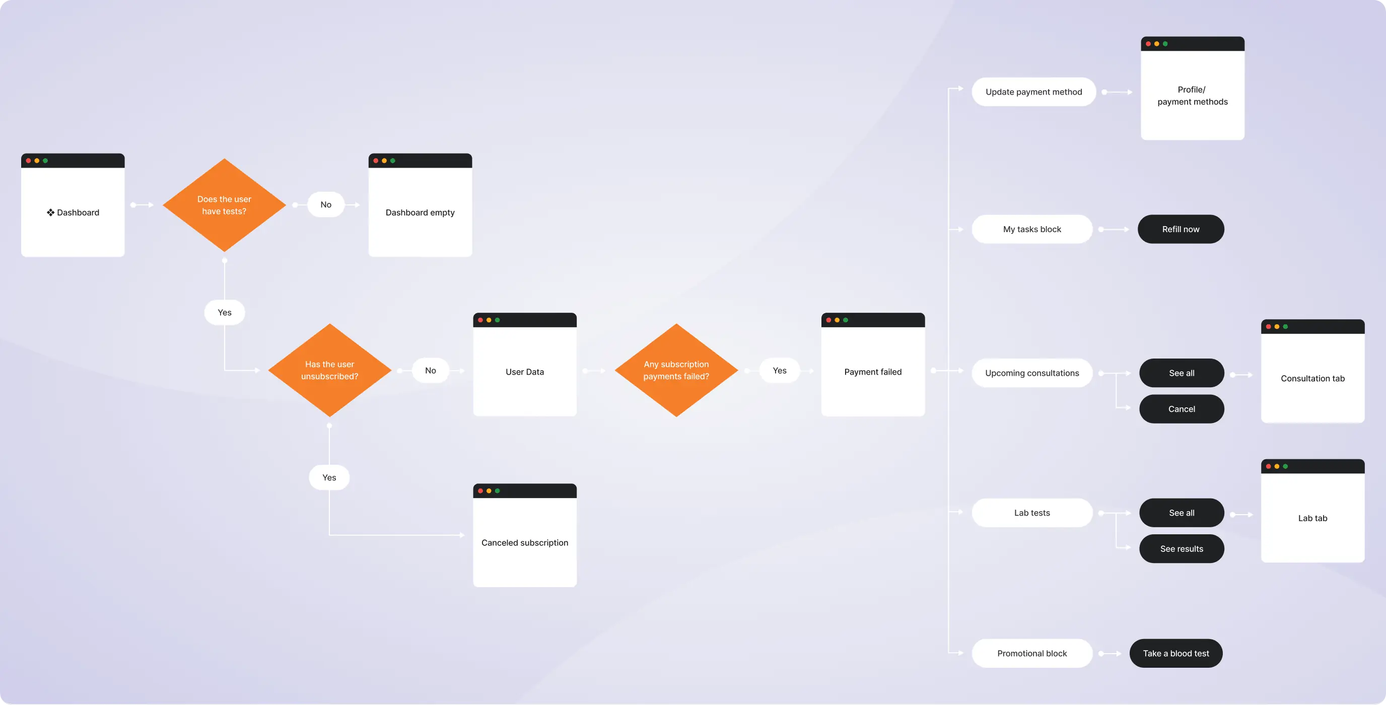
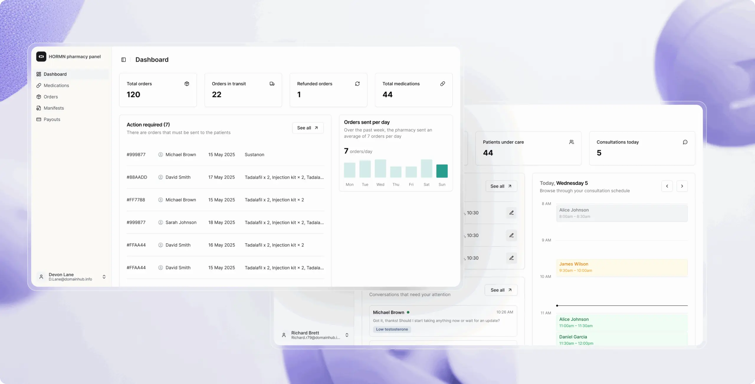
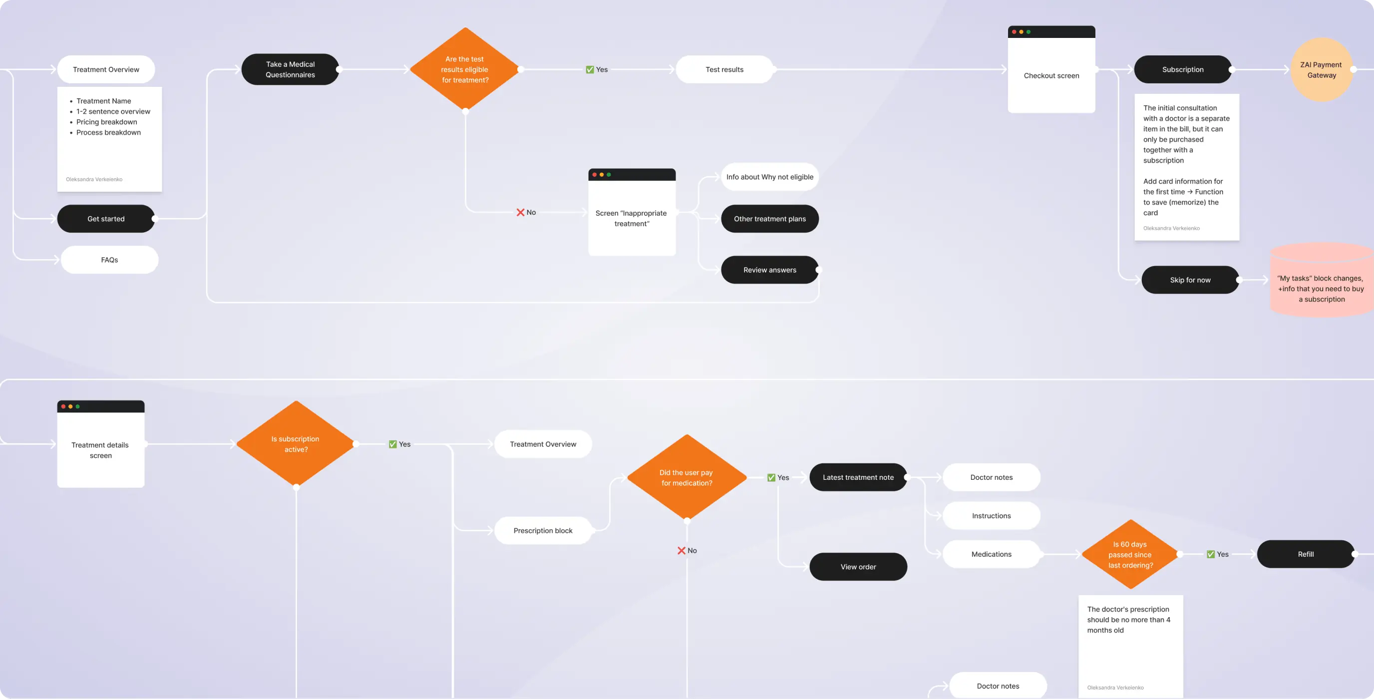
The main platform was designed around recurring patient actions, not one-time onboarding. Core flows such as treatment selection, surveys, consultations, orders, and lab results are connected into a continuous care journey. Clear status indicators and contextual CTAs guide users through each step, reducing uncertainty over time.
On the admin side, workflows are role-based and interconnected. Doctors manage consultations and issue prescriptions, pharmacies handle fulfillment and payouts, and administrators oversee operations and system performance.
Time-based rules (e.g., refill timing, prescription validity) ensure compliance and continuity. This structure reduces manual coordination, minimizes errors, and allows the platform to scale efficiently across thousands of patients.
The user portal was designed around recurring patient actions, not one-time onboarding. Clear status indicators and contextual CTAs guide users through each step, helping them understand what to do next and reducing uncertainty over long-term treatment.
The visual direction was defined through a moodboard based on best practices in digital healthcare. After aligning on the design concept, we moved into UI design with a focus on clarity and consistency. Clean typography, clear hierarchy, and a calm color palette help guide attention without visual overload.
Stages
- Wireframes
- Design direction
- Mockups design
- User testing
Wireframes were the foundation of the patient platform, helping us design the experience around real user actions before moving to visuals. We mapped the full journey from treatment selection and medical surveys to consultation booking, lab results, medication orders, and ongoing care. This allowed us to validate flow logic early and remove friction at key moments.
We focused especially on decision points, waiting states, and next-step guidance. Each screen was designed to clearly answer “what’s happening now” and “what should I do next,” creating a predictable and reassuring experience. This structure ensured the final UI felt intuitive, calm, and easy to navigate.
The visual direction followed the brand system we developed during the promotional phase of the project, ensuring full alignment between the platform and its identity.
Instead of defining style in isolation, the interface extends the brand’s core principles — trust, clarity, and clinical credibility. This translated into a calm, minimal aesthetic with a focus on readability and structure, avoiding both overly promotional visuals and heavy medical styling.
The website and product experience were designed as a cohesive system, sharing the same visual language, tone, and interaction patterns.
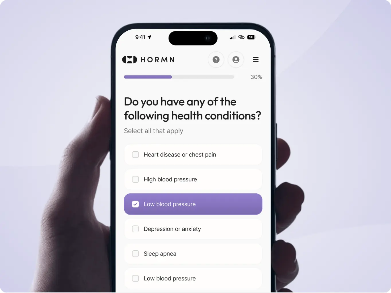
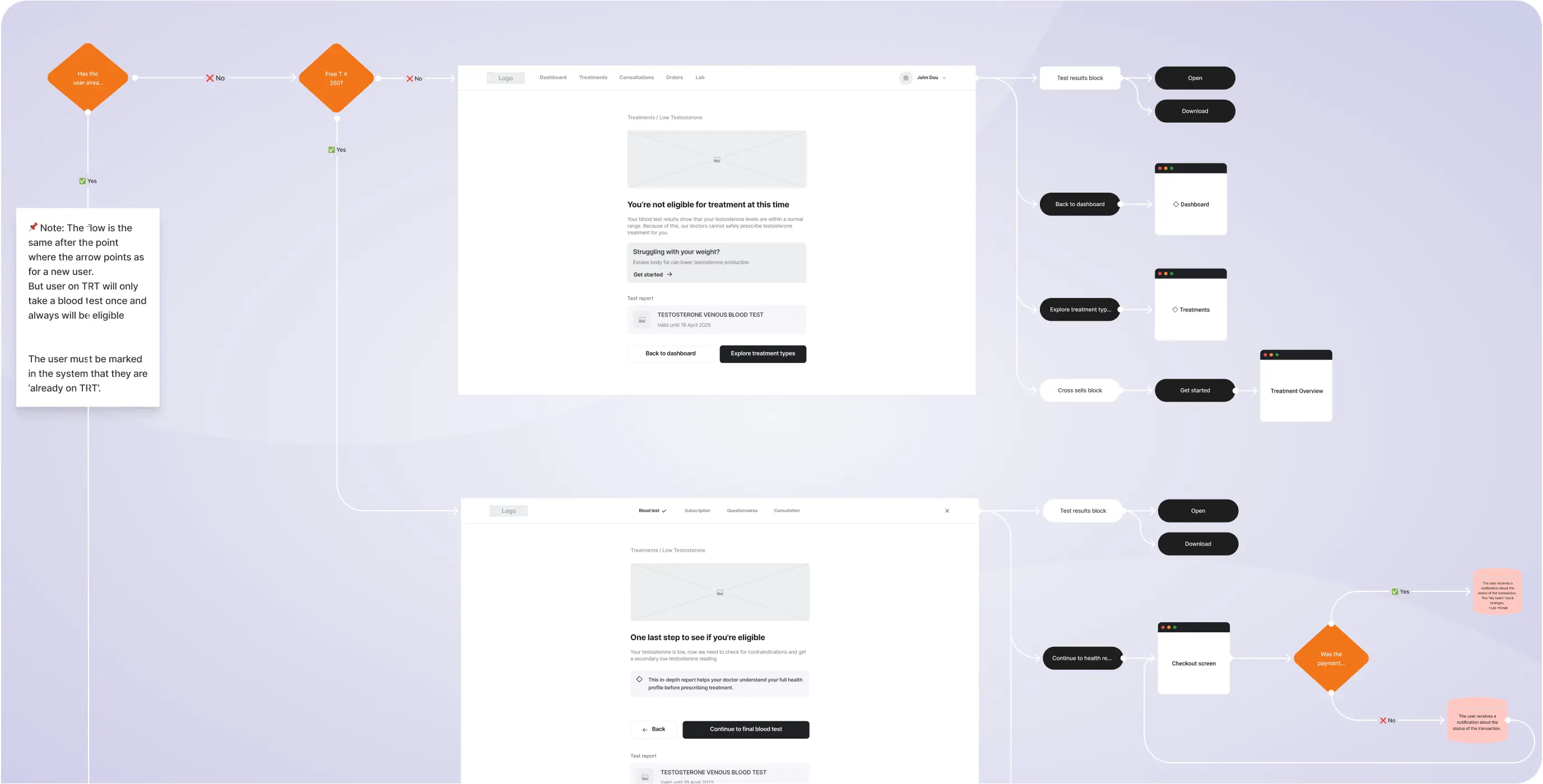
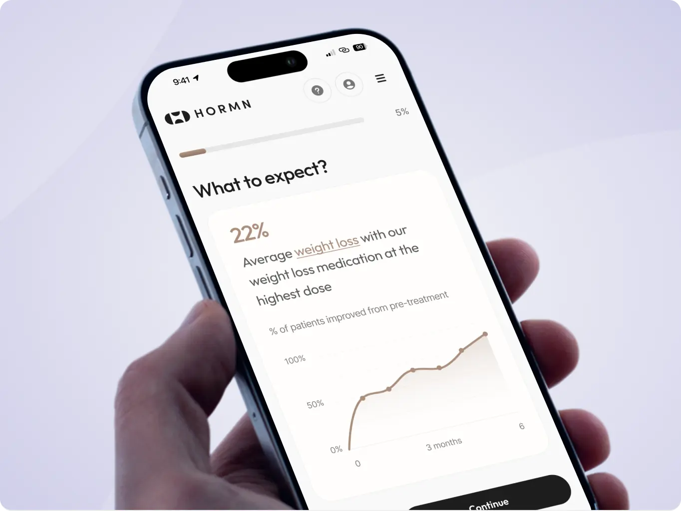
A key challenge was designing long, medically detailed questionnaires required before users can purchase a treatment. Each treatment has its own survey logic and constraints, so clarity and pacing were critical. We worked closely with the client through multiple iterations, refining structure, question order, and hierarchy to reduce cognitive load without compromising medical accuracy.
To help users stay oriented, we introduced clear visual structure and color coding, where each treatment plan has its own color. Combined with clean typography and consistent layouts, this keeps complex flows readable, calm, and easy to follow.
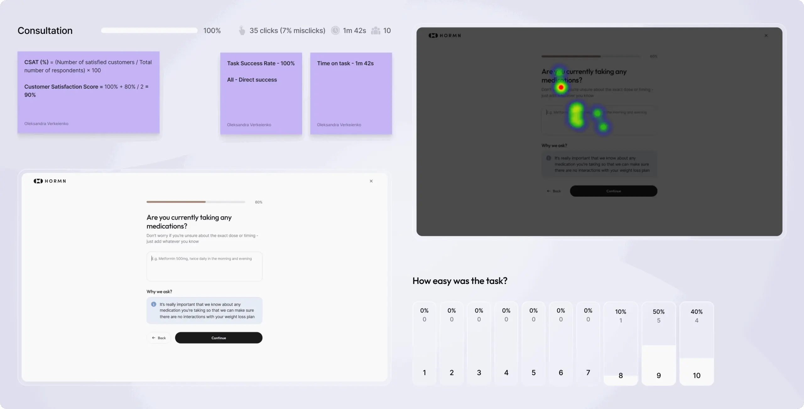
User testing was conducted across key flows to validate clarity, task completion, and decision-making under real conditions. We focused on treatment discovery, medical surveys, consultation booking, and access to clinical information.
Insights from testing directly informed design refinements. We simplified language, clarified medical terms, adjusted visual hierarchy, and refined progression cues to reduce friction. As a result, users completed tasks faster, felt more confident in their choices, and moved through complex healthcare flows with less effort and uncertainty.
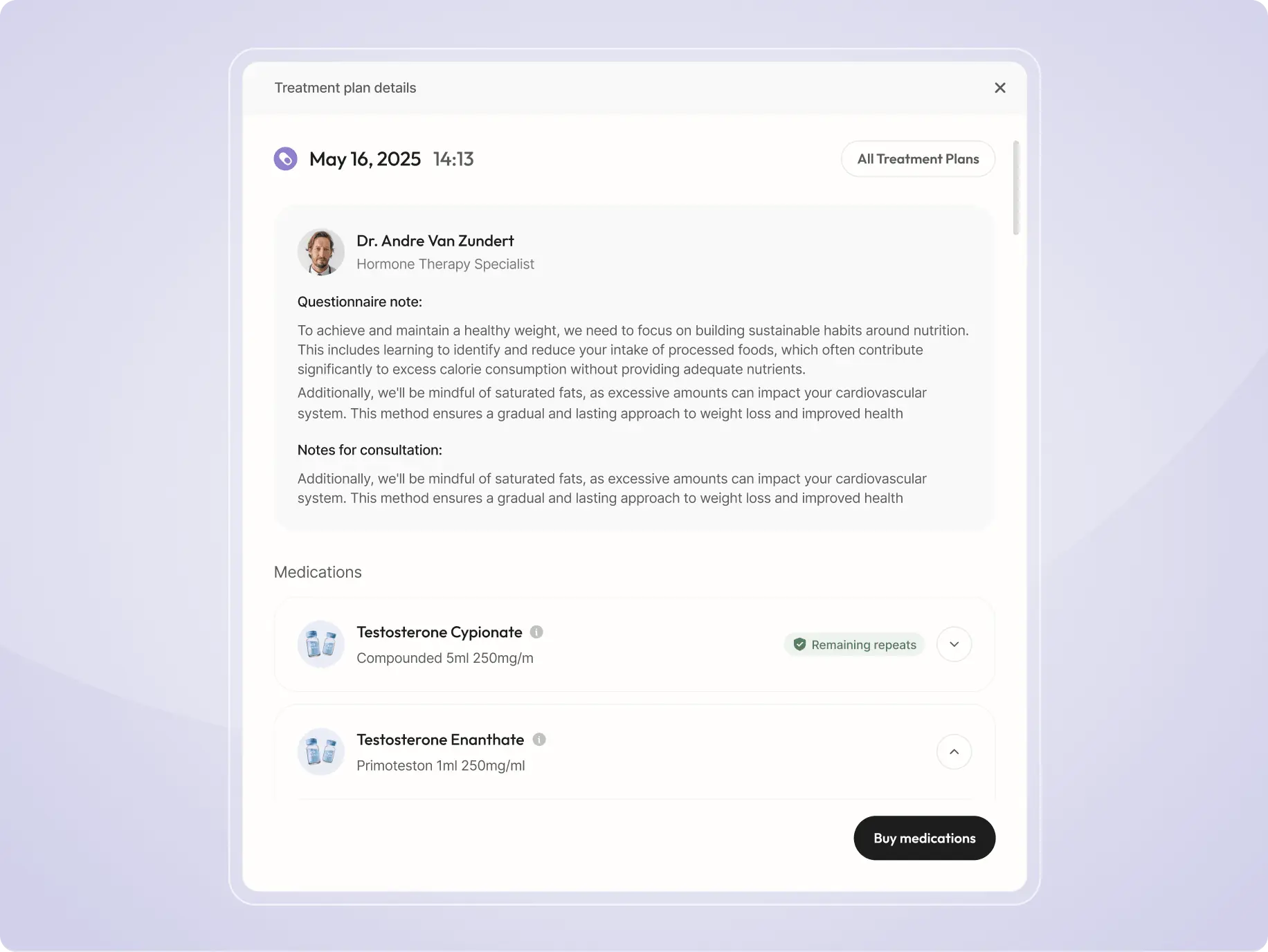
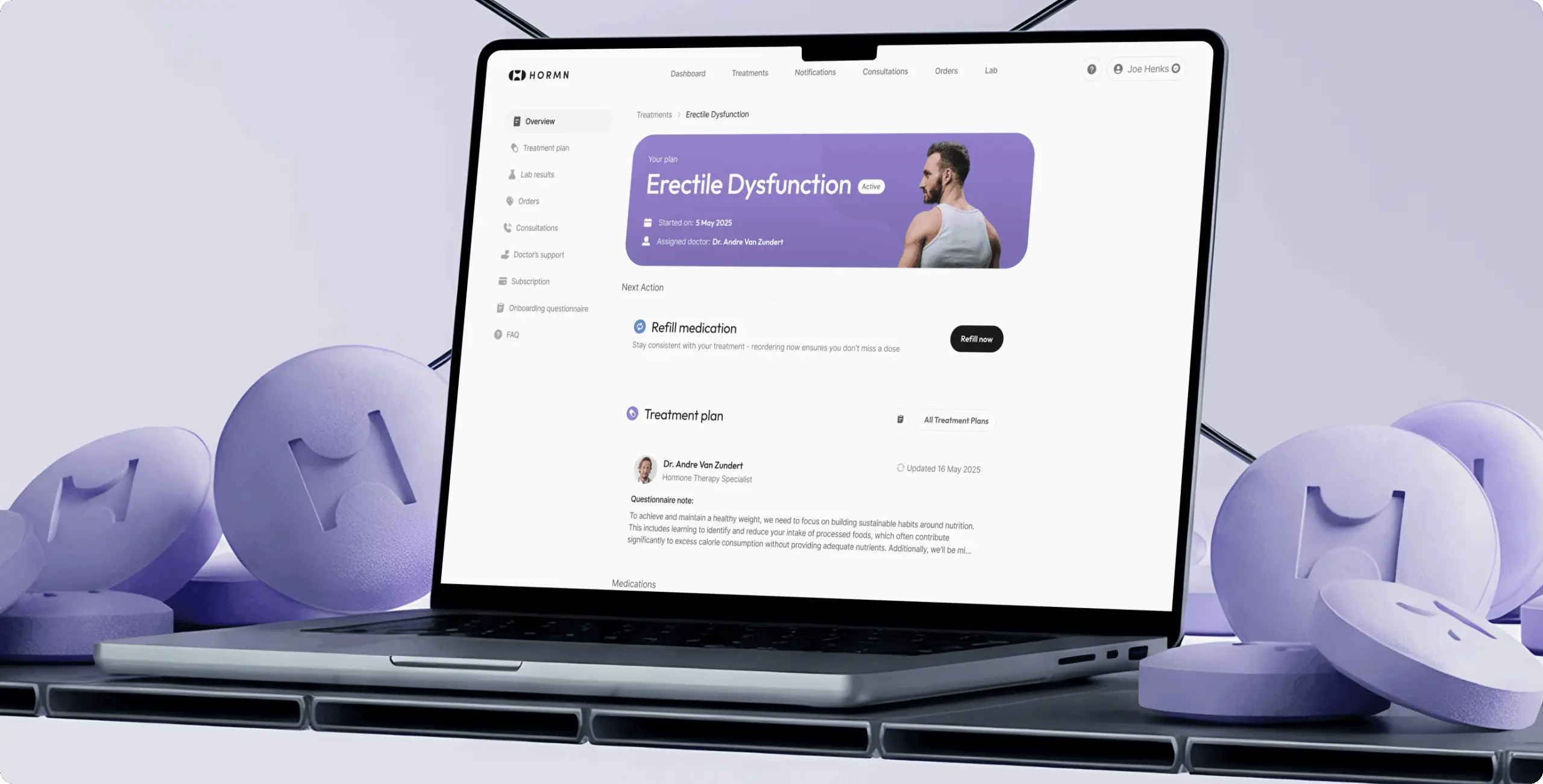
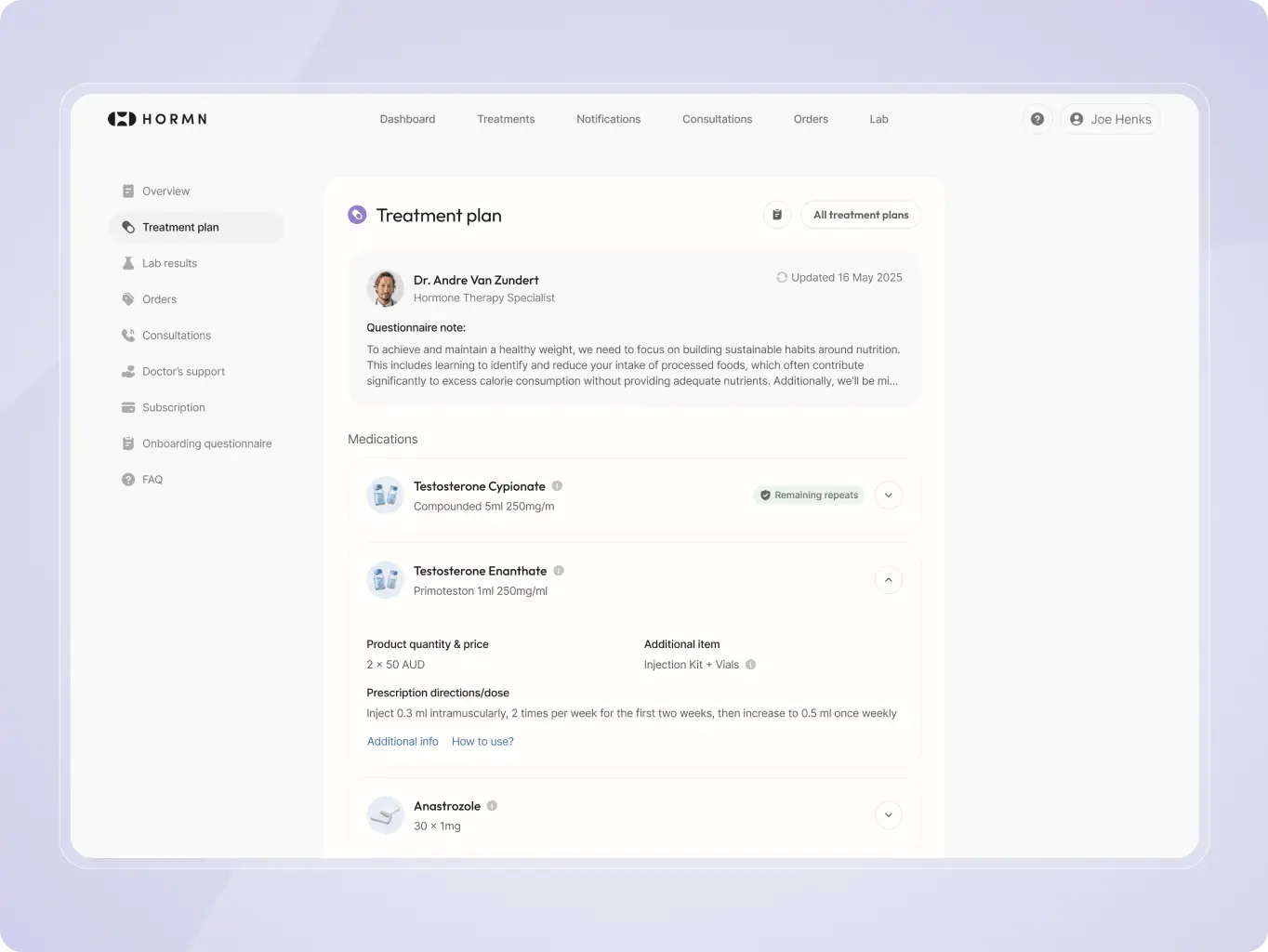
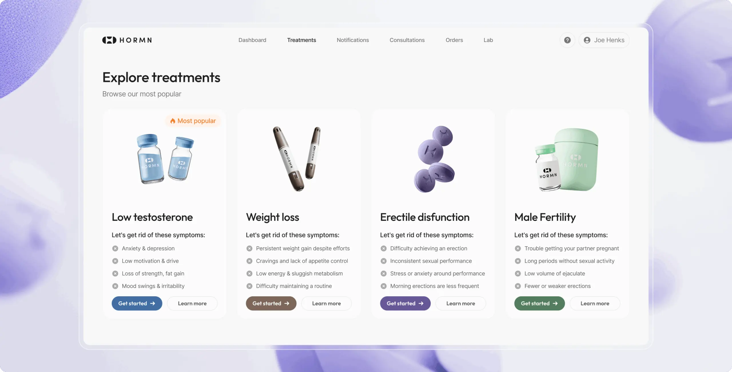
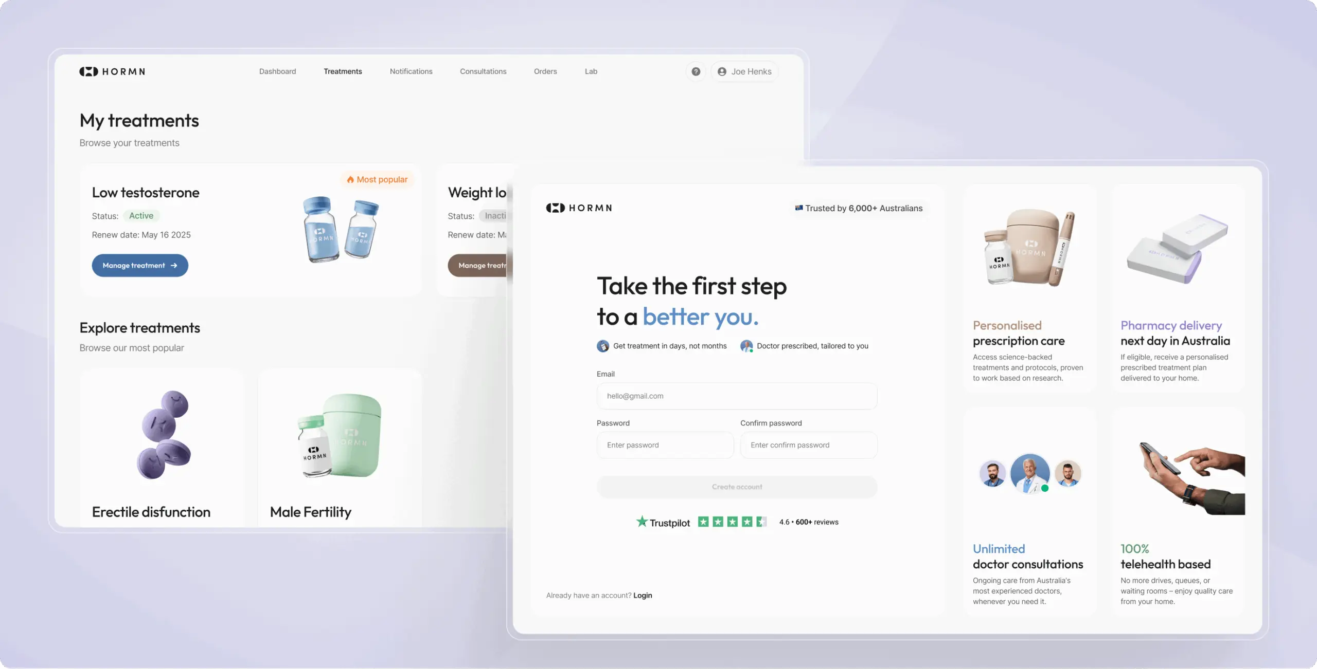
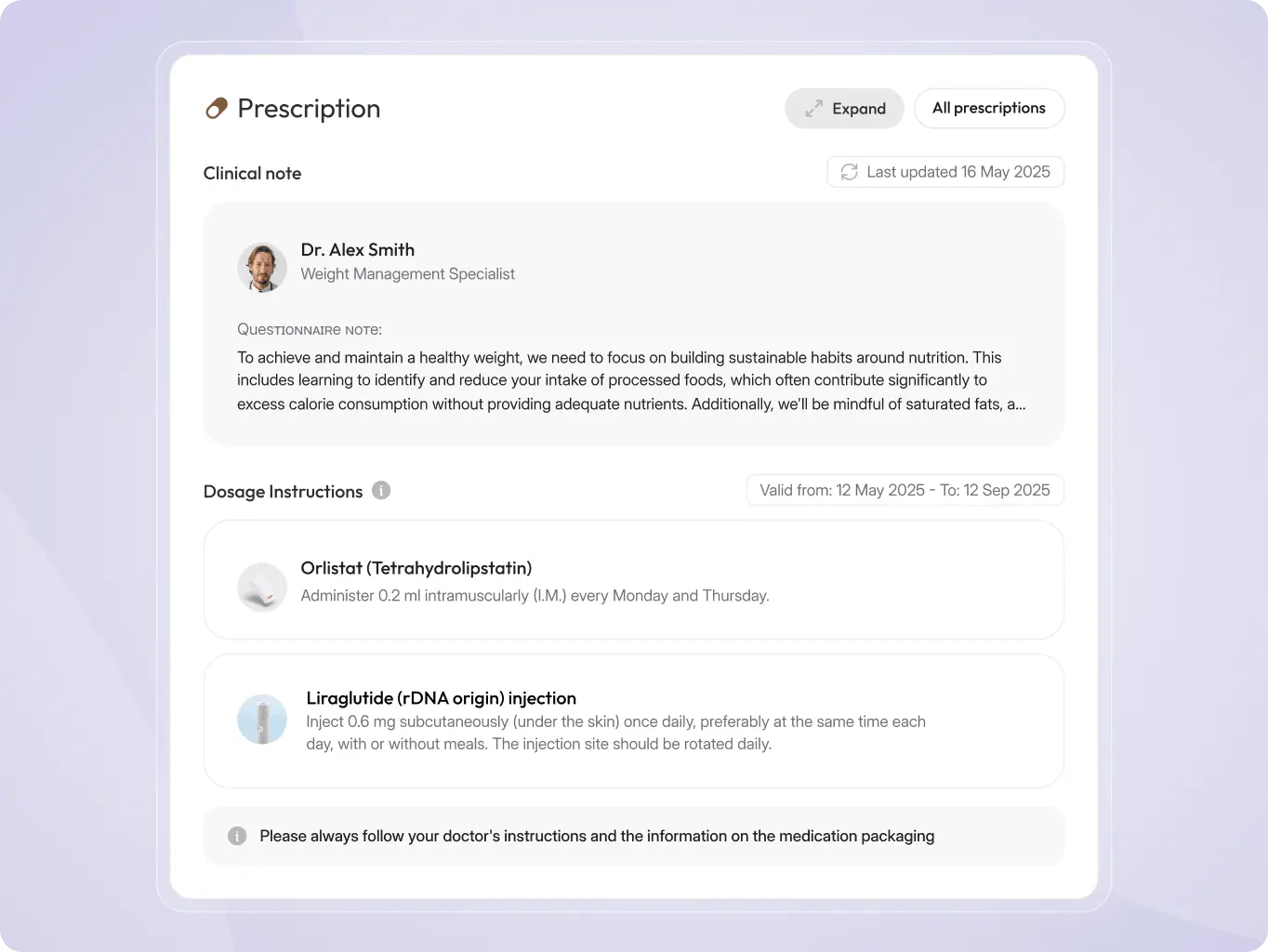
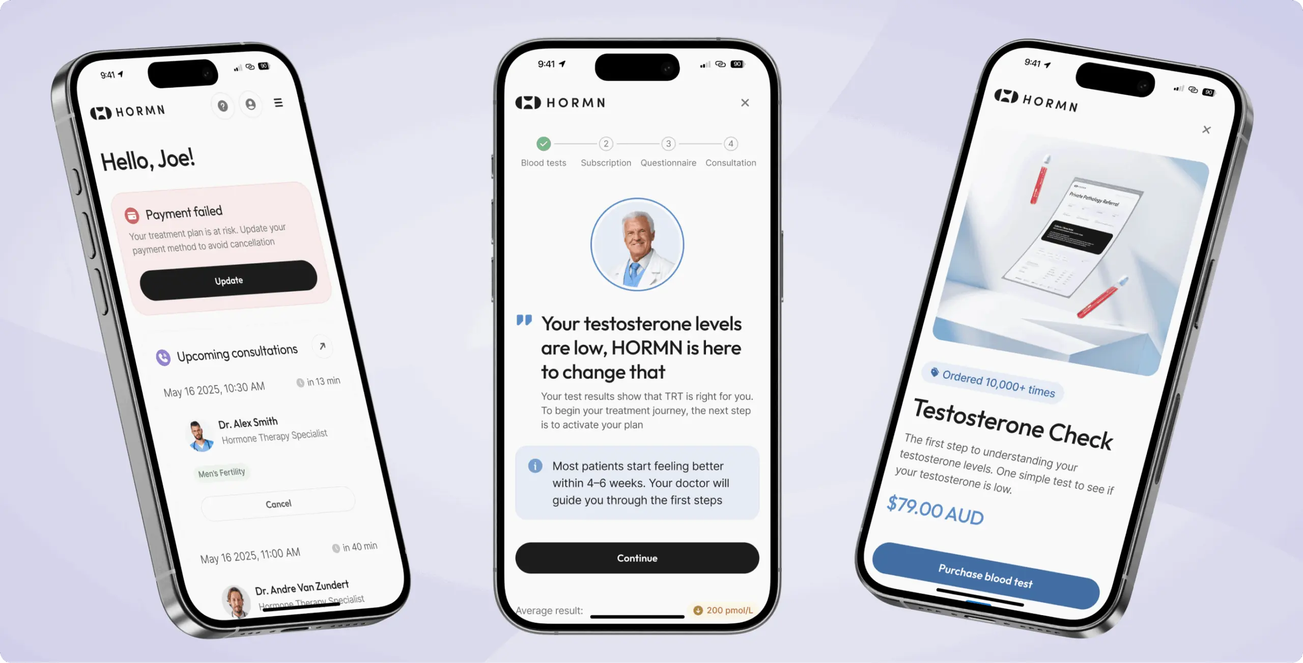
Personalized treatment plan
The platform provides patients with a clear, structured view of their prescribed treatment, including medications, dosages, consultation notes, and refill status. This helps users easily understand their care plan, track progress, and manage prescriptions while reducing confusion and improving treatment adherence.
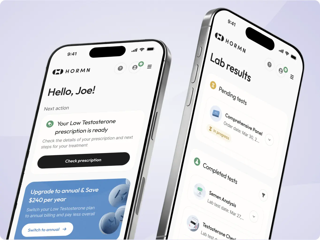
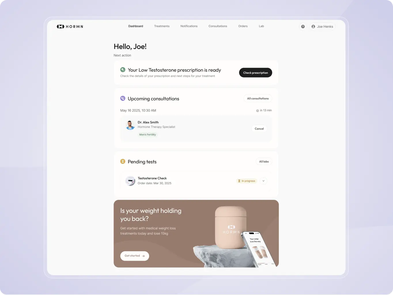
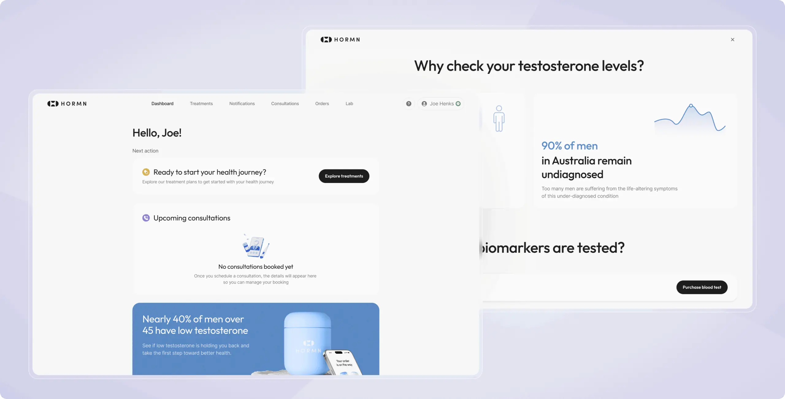
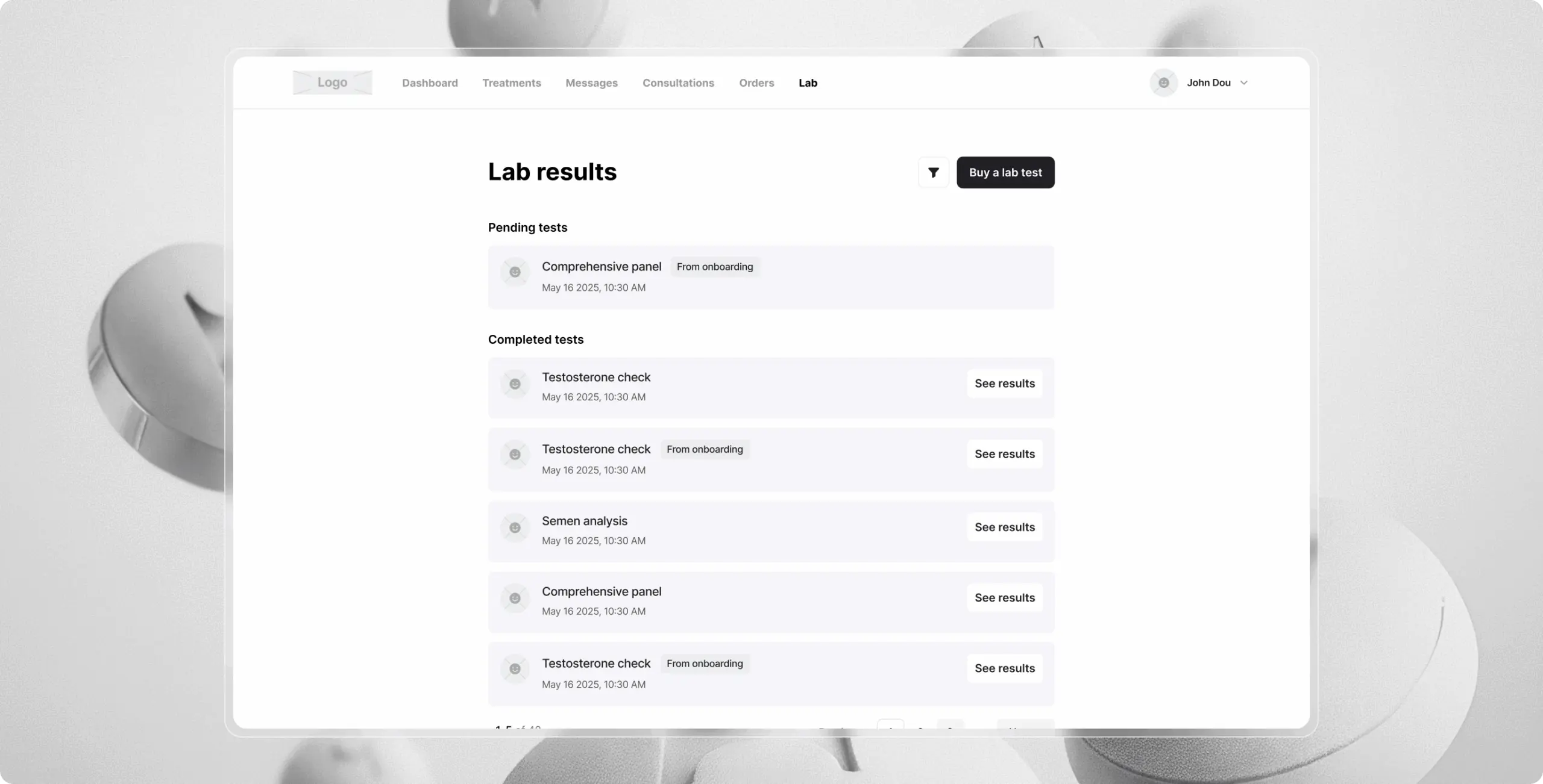
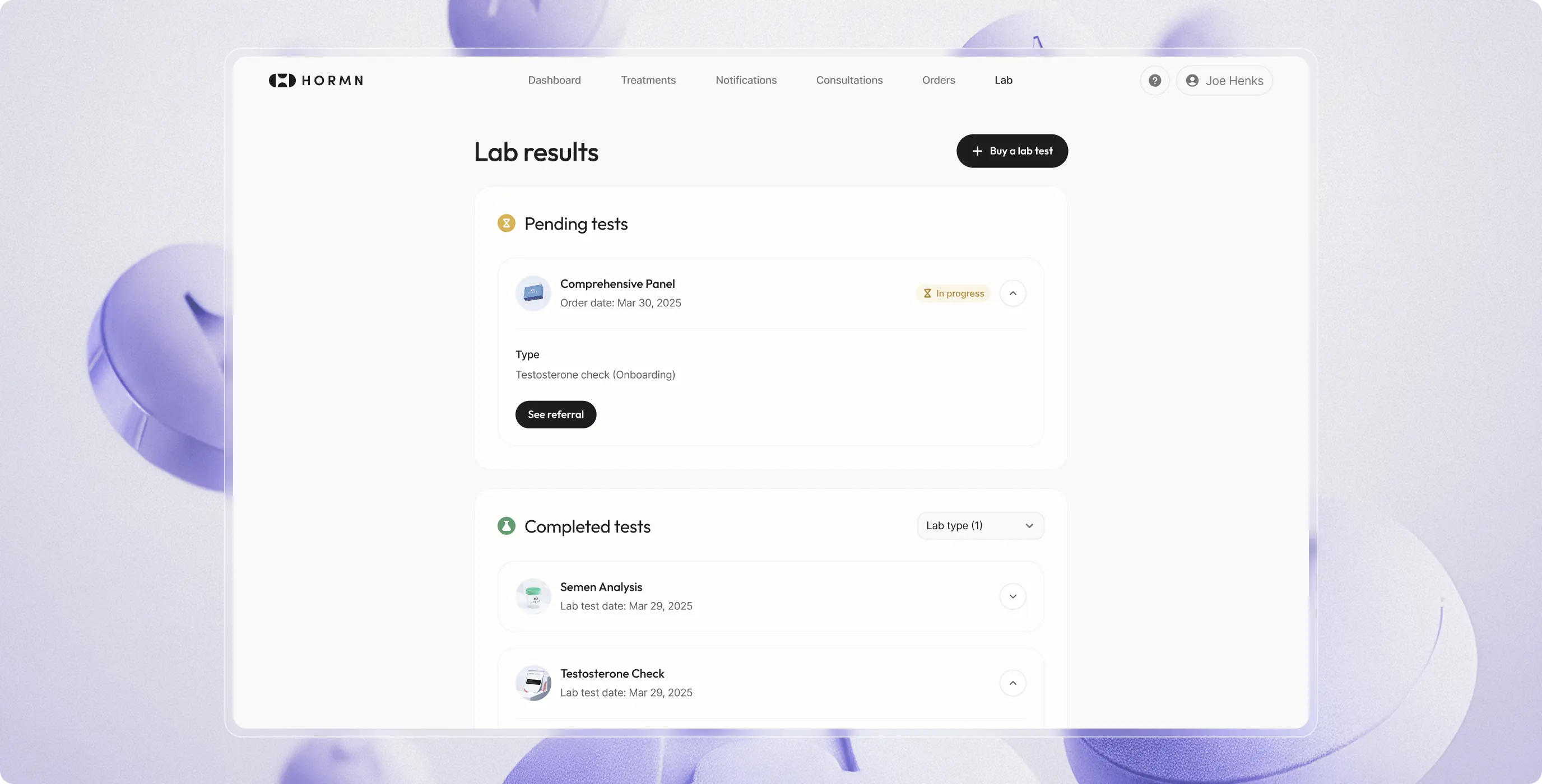
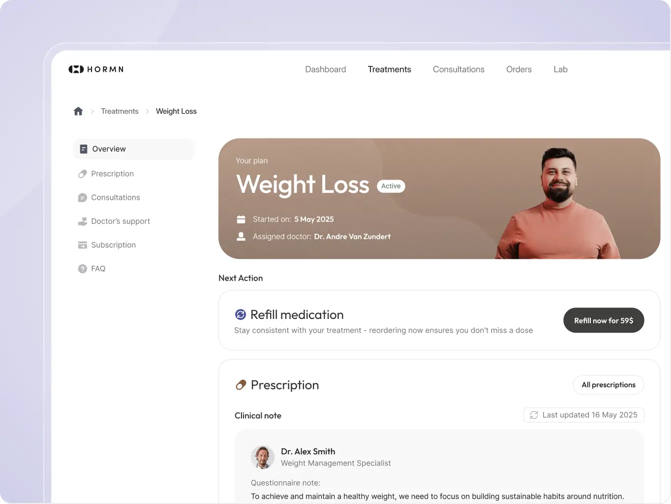
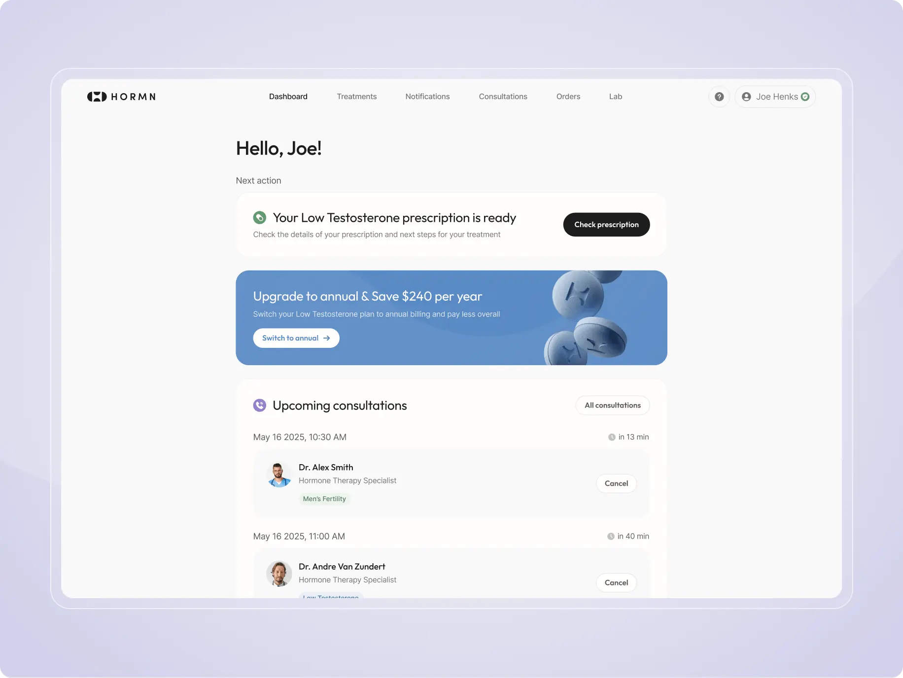
Managing care in one place
The platform simplifies complex medical processes into clear, structured steps allowing users to track progress, manage treatments, and take the right actions at the right time. From ongoing treatments to upcoming consultations and lab results, users have full visibility into their care, reducing confusion and improving engagement.
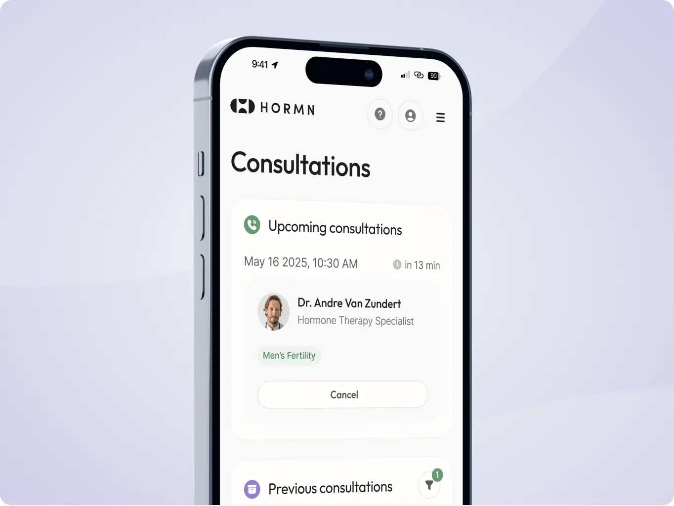
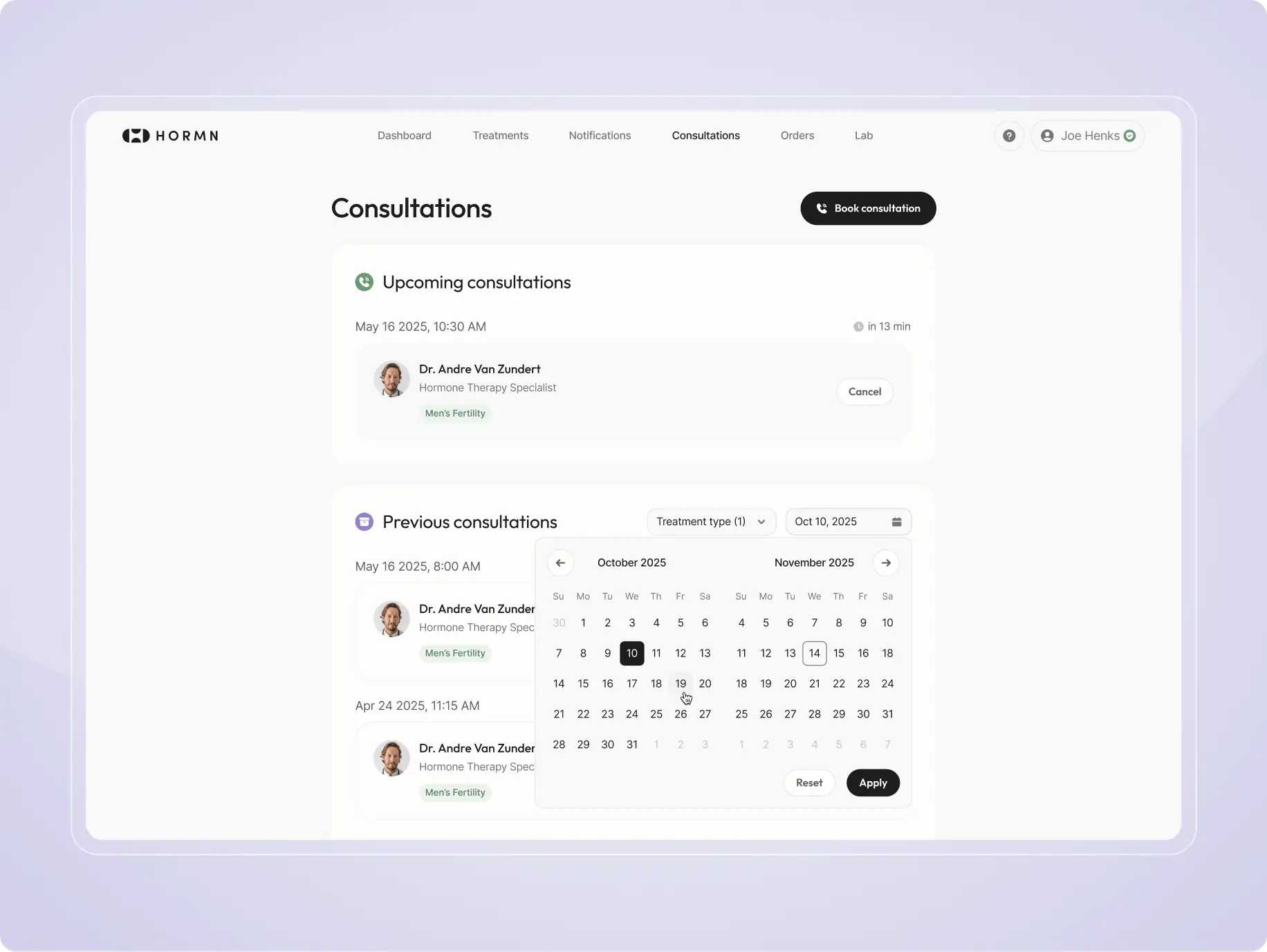
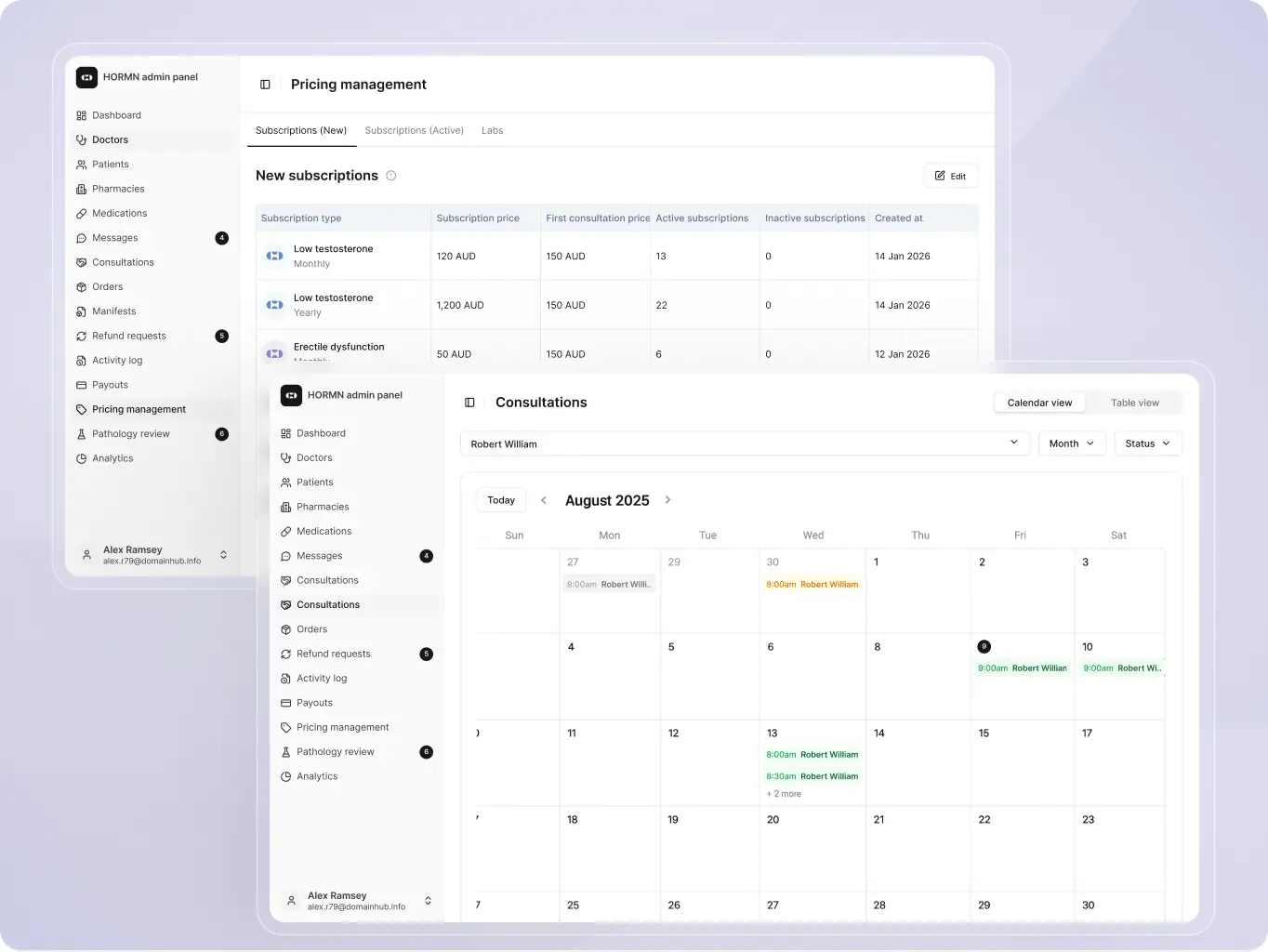
Flexible consultation booking
The consultation booking flow allows patients to easily schedule, manage, and review appointments directly inside the platform. Clear availability, treatment context, and reminders help users book consultations with confidence while reducing scheduling friction and missed appointments for the clinic.
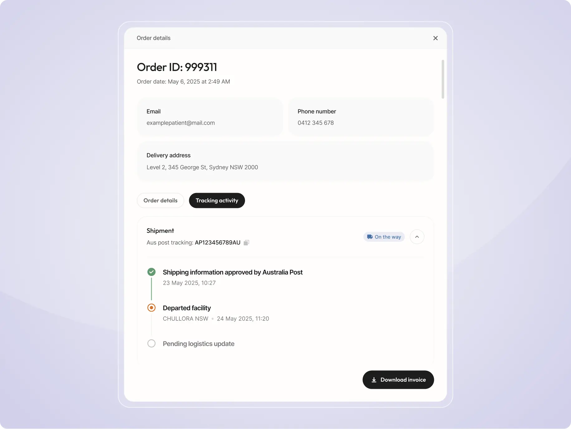
Order tracking & management
Users can view order details, track delivery status in real time, and access shipment updates in one place. Clear timelines and status indicators provide full transparency, reducing uncertainty and support requests.
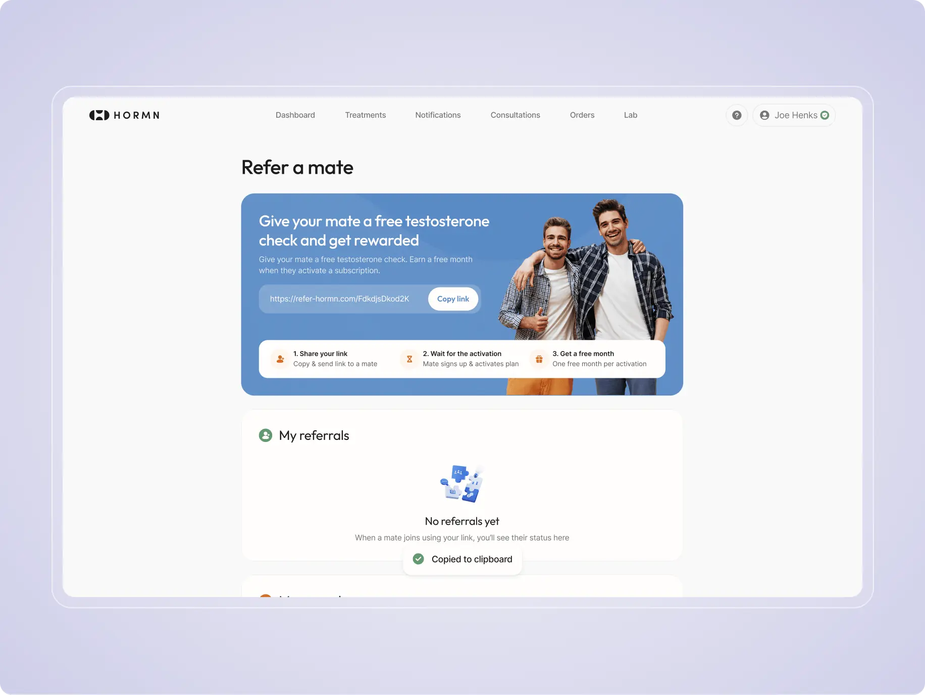
Referral program
Users can invite friends through a simple referral system, sharing personalized links and tracking rewards. This creates a seamless way to grow the user base while rewarding engagement and loyalty.
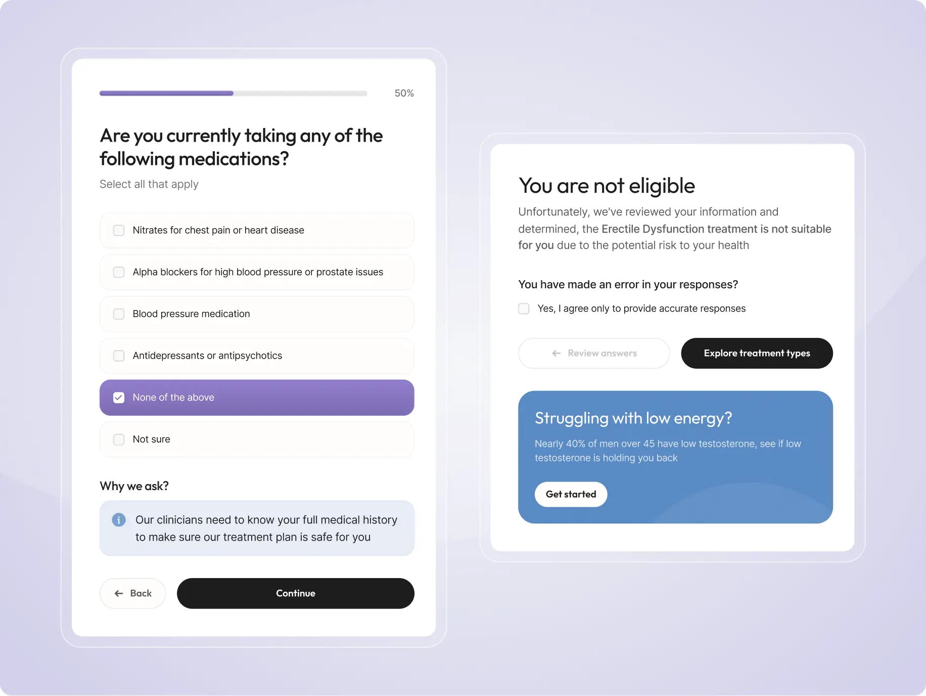
Medical eligibility screening
The platform automatically reviews lab results before allowing users to proceed with treatment. This prevents inappropriate or unnecessary purchases, protects patients from unsafe decisions, and ensures that every step is based on medical evidence.
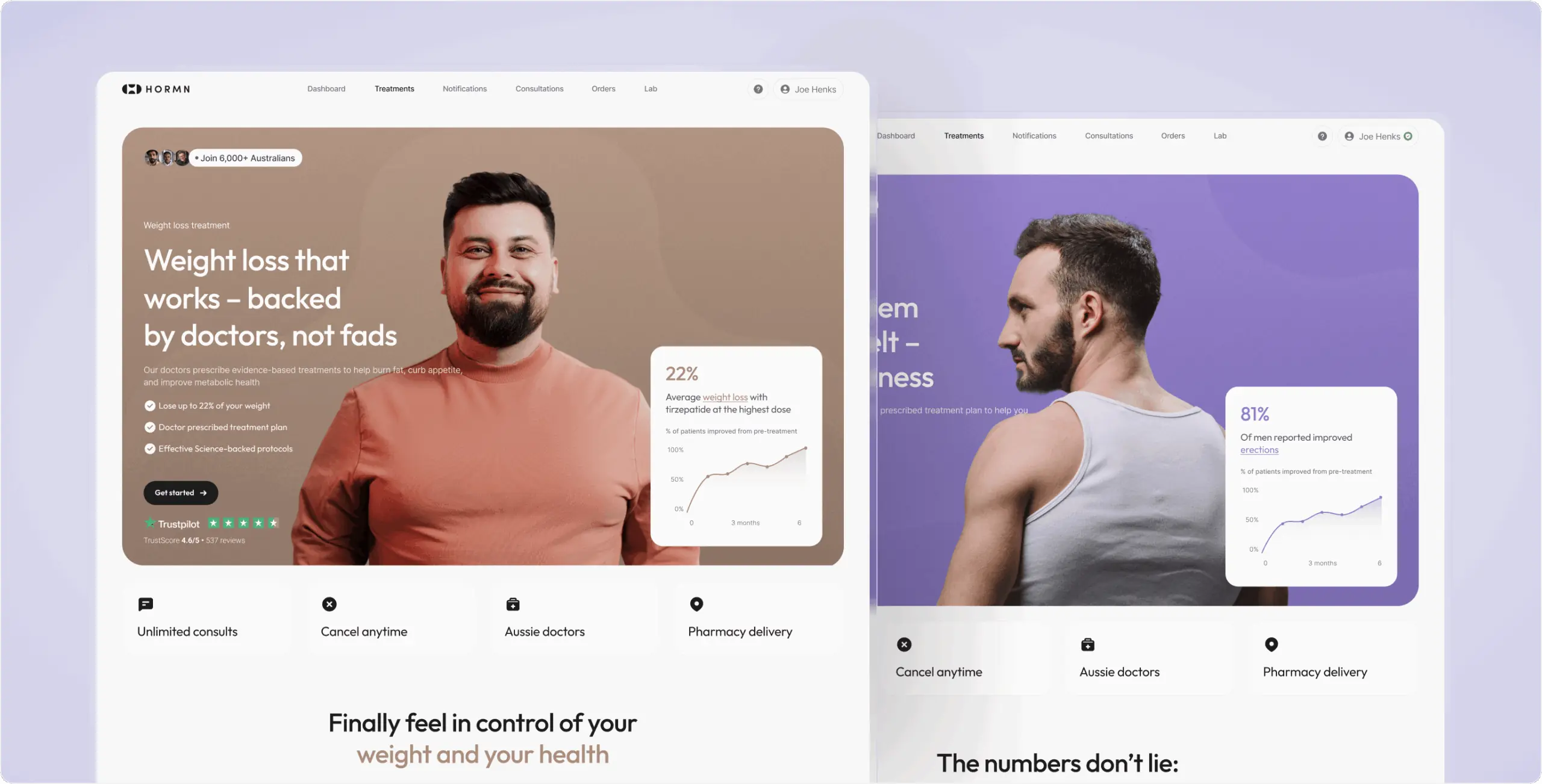
For patients, we designed a polished B2C experience aligned with the brand and promotional website – focused on clarity, trust, and a seamless treatment journey.
For internal operations, we created a unified B2B admin platform used by doctors, pharmacies, and administrators. It’s one operational system with role-based workspaces tailored to different responsibilities – from consultations and prescriptions to order fulfillment and system management. This allowed teams to manage the full care cycle within a single ecosystem.
To support speed and scalability, the admin platform was built on top of shadcn/ui, helping the team prioritize workflow clarity and usability over unnecessary visual complexity.
Stages
- Informational architecture
- Design system
- Mockup design
- User testing
The information architecture focused on building a complex system that supports both the user experience and operational workflows for doctors and administrators. We structured key entities treatments, consultations, prescriptions, labs, and orders into a clear, scalable logic, defining relationships, data dependencies, and role-based access. This ensured that each role interacts with the same system in a controlled and consistent way, without overlap or conflict.
The process was highly collaborative, involving designers and BA working in parallel. Through continuous discussions, flow validation, and edge case handling, the architecture evolved iteratively rather than through linear handoffs. This approach reduced ambiguity early and ensured the system was both logically consistent and ready for implementation.
For the admin interface, we used shadcn/ui as an out-of-the-box foundation to accelerate development and reduce implementation complexity. As an internal system, the priority was functionality, speed, and scalability rather than custom visuals.
We intentionally avoided additional customization and used the library largely as is to move faster and reduce unnecessary design overhead. This component-based approach helped us quickly build consistent, reliable interfaces across different workflows while maintaining usability and clarity.
A key challenge was designing interfaces that handle large volumes of clinical and operational data without overwhelming users. Each role: doctors, pharmacies, and administrators, works with different levels of complexity, so clarity, prioritization, and speed were critical.
We structured the UI around real workflows, focusing on how information is consumed and acted on. For pharmacies, interfaces were optimized for queue-based processing, making it easy to track prescription status and manage orders. For administrators, we prioritized high-level visibility, with dashboards and controls focused on performance and operations.
To reduce cognitive load, we used consistent layouts, clear status indicators, and structured data blocks. Visual hierarchy and spacing help separate critical information from secondary details, while system states
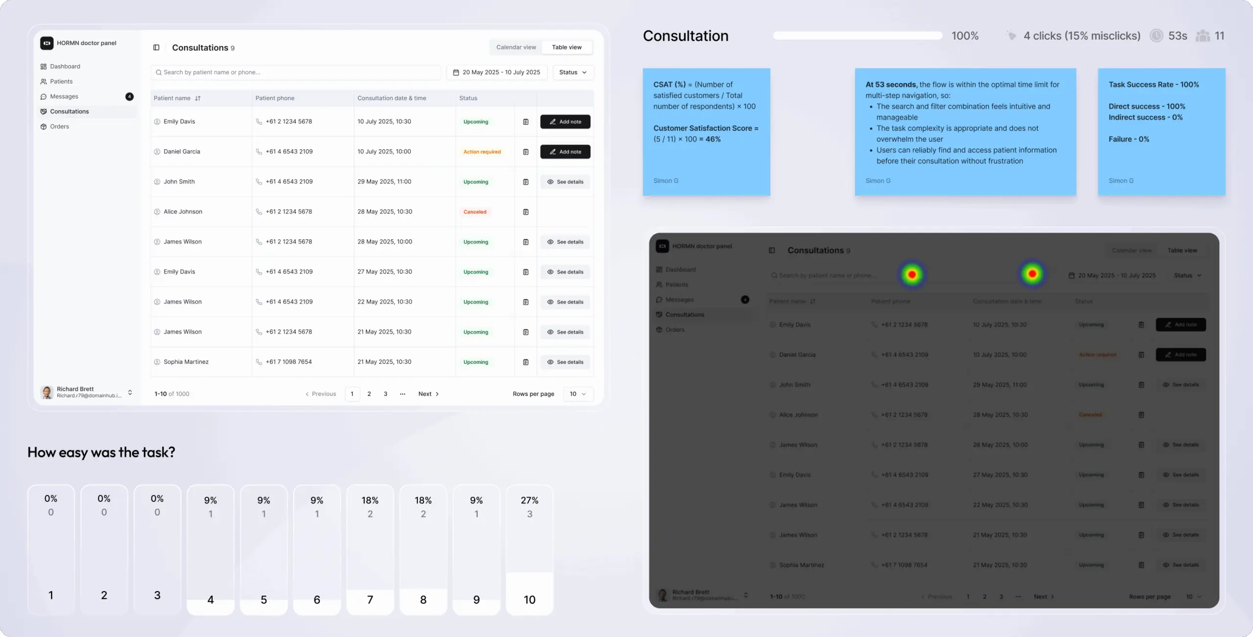
User testing focused on validating operational efficiency across roles. We evaluated how quickly doctors, pharmacies, and administrators could complete core tasks, how clearly system states were understood, and where errors or delays occurred.
Insights from testing helped refine workflows, improve data hierarchy, and reduce unnecessary steps, ensuring each role can operate independently while staying aligned within the overall system.
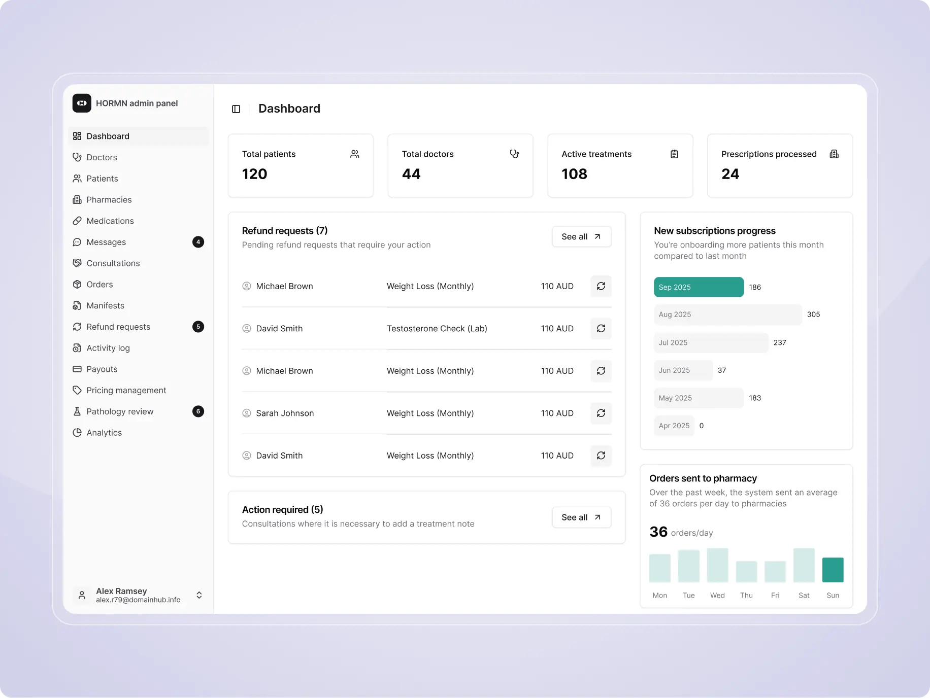
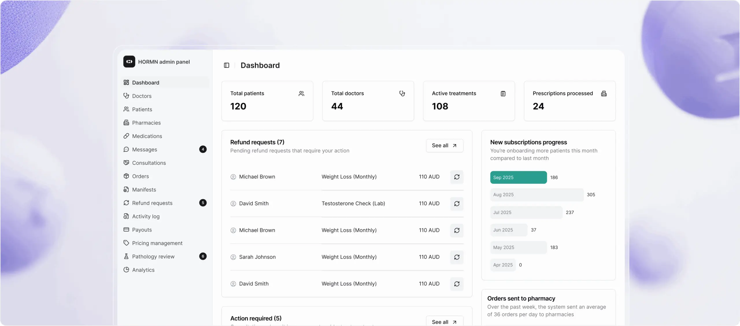
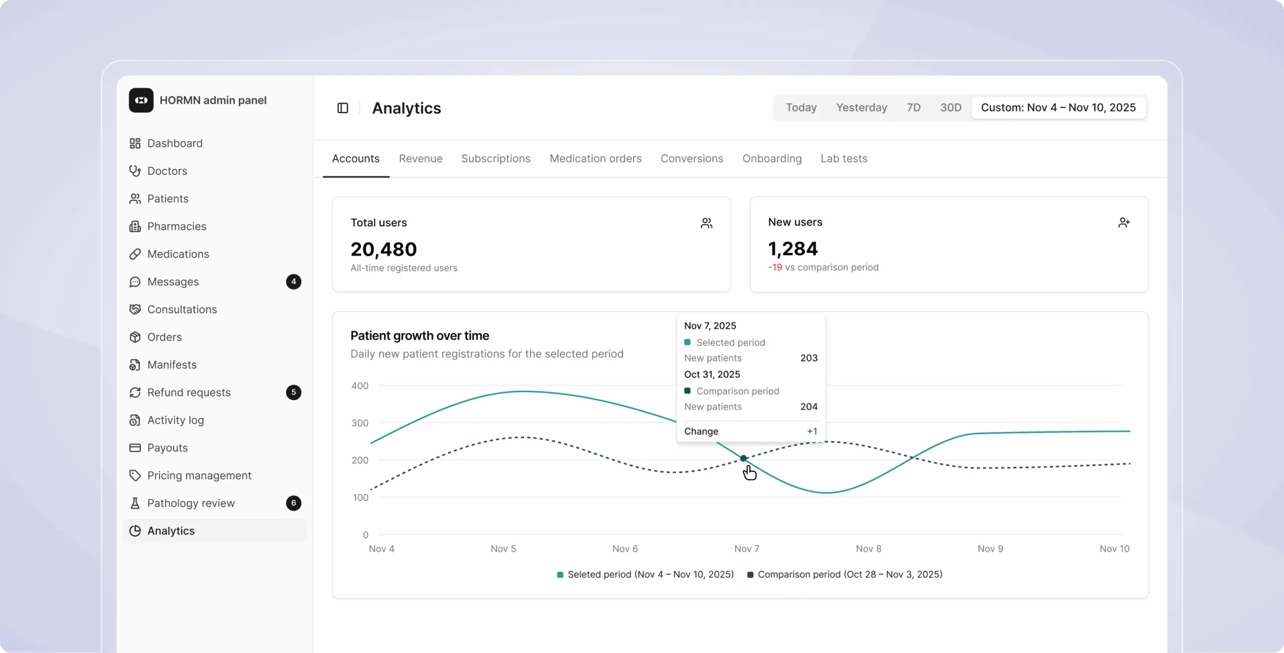
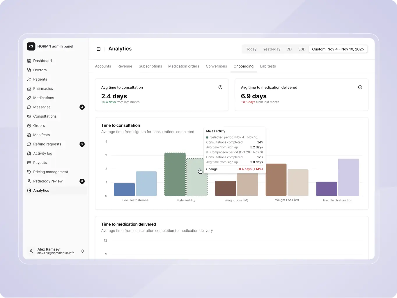
Centralized dashboard
The platform provides a unified dashboard with key metrics across patients, orders, revenue, and operations. Flexible data views and real-time updates give full visibility into system performance, enabling faster decisions and easier monitoring.
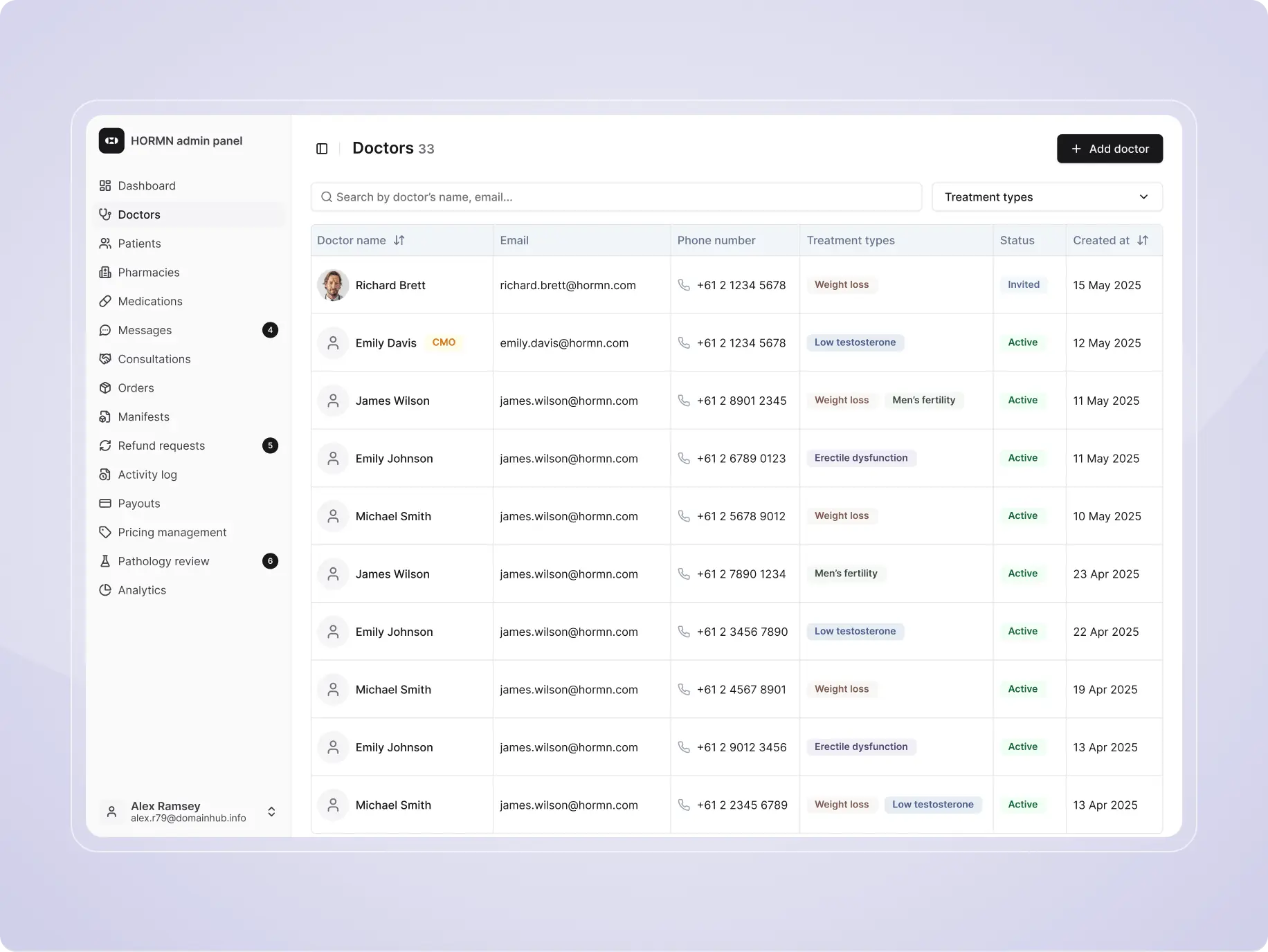
Doctor management
Administrators can manage doctors, assign roles, and control access rights. This ensures that each doctor interacts only with relevant data while maintaining compliance and structured clinical workflows.
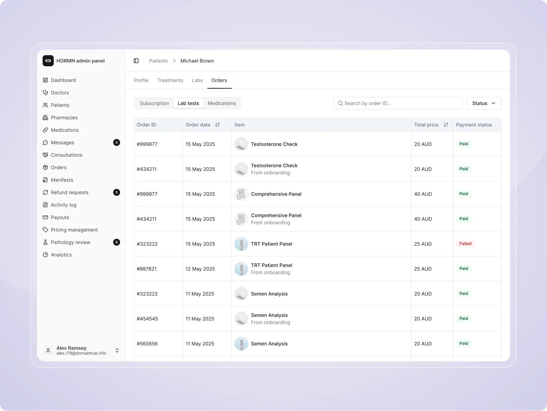
Patient management
The system allows full management of patient profiles, including medical history, treatments, lab results, and orders. All data is structured and accessible in one place, supporting efficient review and decision-making.
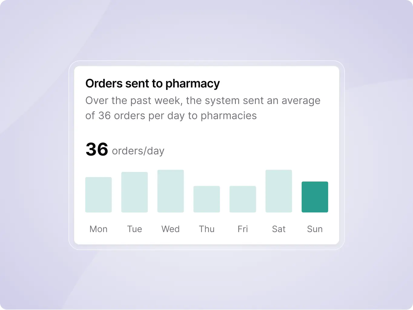
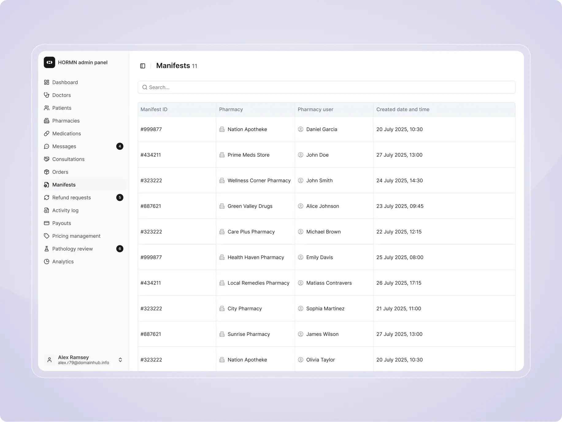
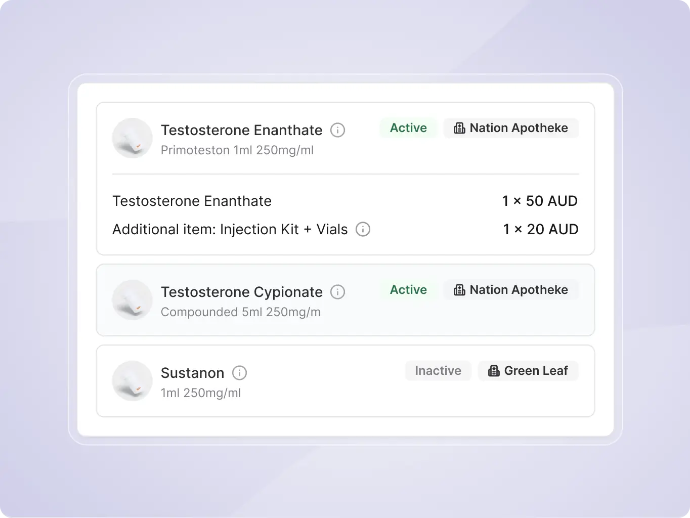
Order & manifest management
Orders and manifests are organized into clear, trackable flows. The system enables pharmacies and admins to manage fulfillment, monitor statuses, and ensure accurate delivery processes without manual coordination.
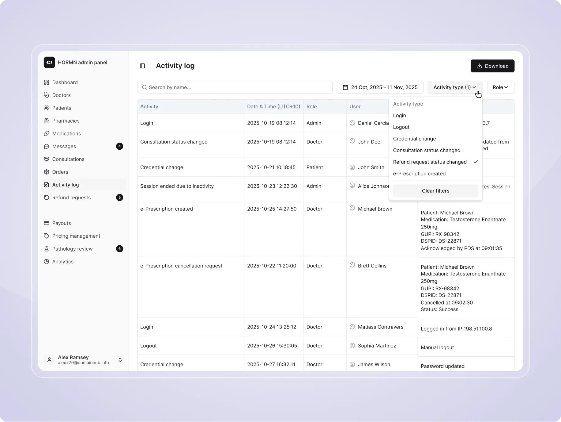
Activity log & system transparency
Every action within the platform is recorded in a centralized activity log. This provides full visibility into user actions, improves accountability, and helps quickly identify issues or inconsistencies.
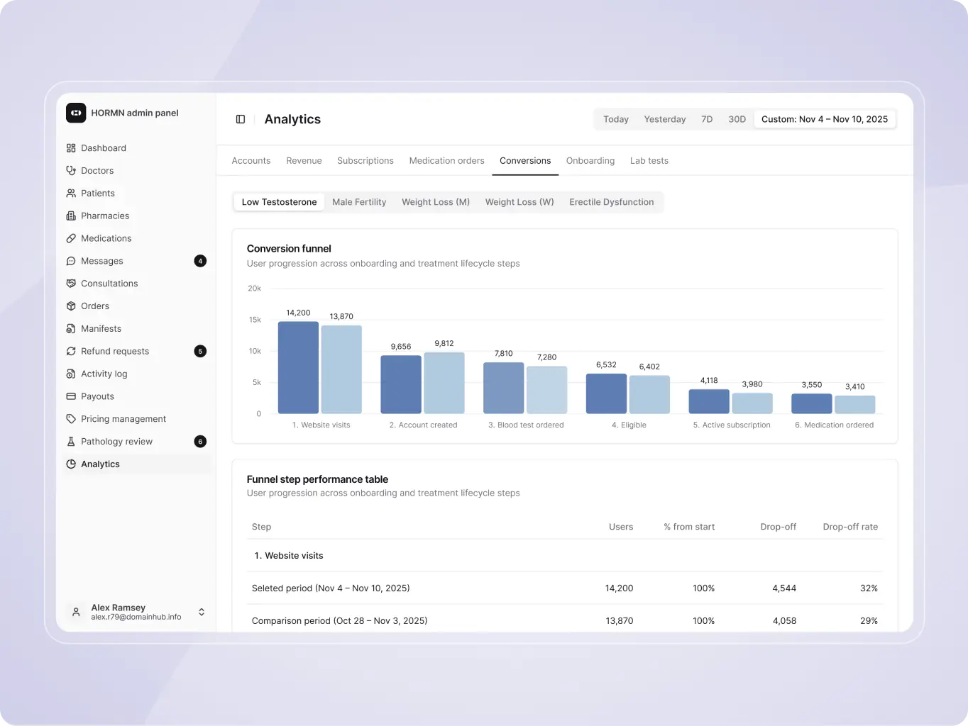
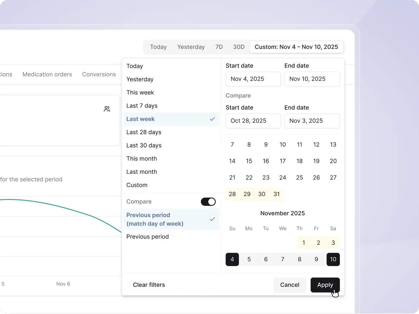
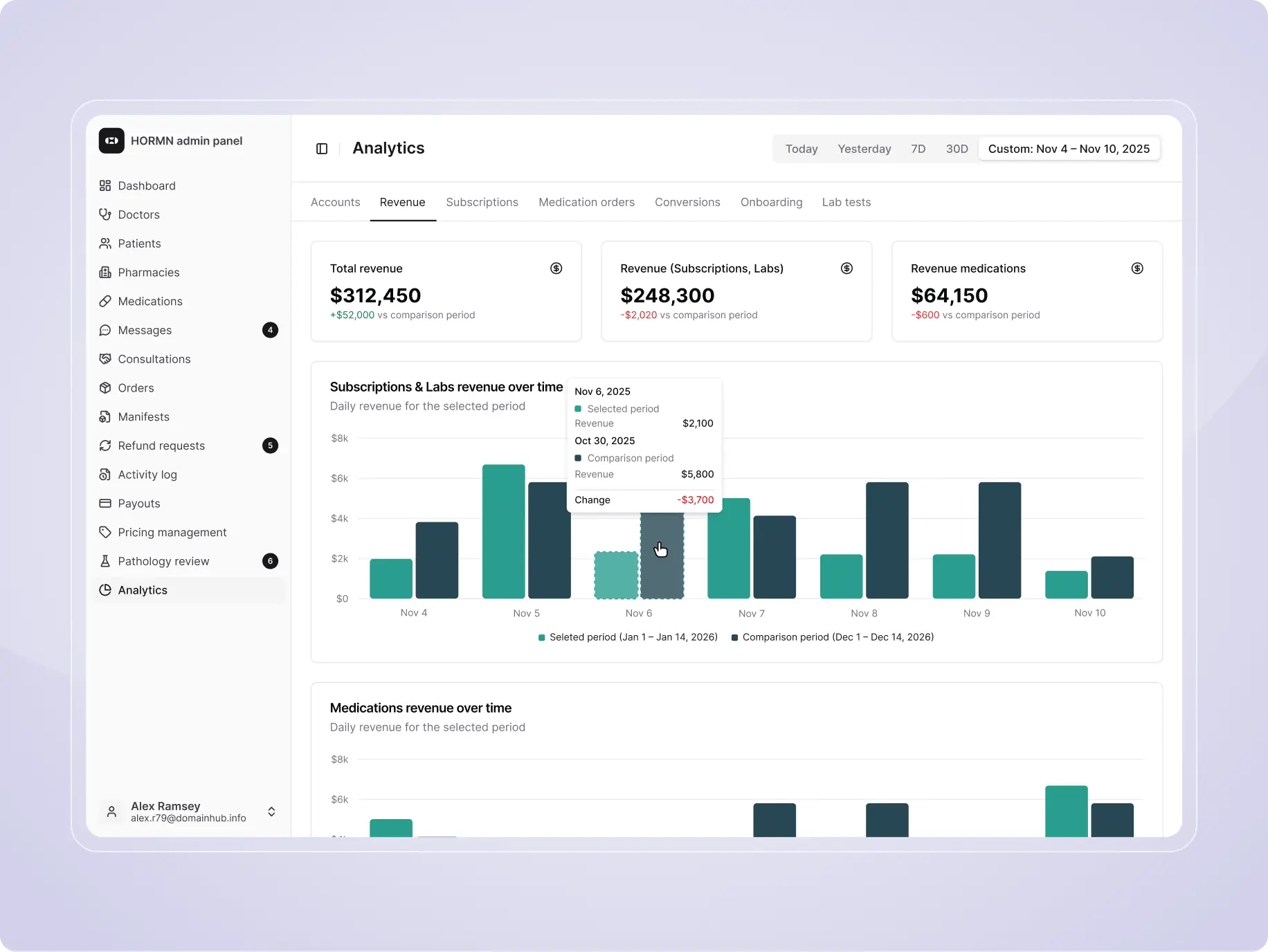
Analytics & performance insights
Built-in analytics provide clear insights into accounts, revenue, subscriptions, and operations. Visual charts and comparison tools make it easy to track trends, measure performance, and support data-driven decisions.
The development phase required a high level of flexibility. Regulatory changes, evolving integrations, and new automation ideas shifted priorities throughout the project, demanding fast iteration without compromising stability or security. We built custom logic for multiple treatment flows, including TRT, erectile dysfunction, weight loss, and fertility, and unified complex third-party services into a single scalable system.
The platform was developed as a production-ready solution for real clinical workflows. The backend uses Node.js and NestJS for secure, role-based logic, while the frontend is built with React and Next.js for fast, responsive experiences. Running on AWS with PostgreSQL, the infrastructure supports reliable performance and seamless integrations for scheduling, payments, labs, e-prescriptions, and delivery.
Stages
- DevOps
- Back-endback-end
- Front-end
- Integrations
- Technologies
The system is designed for high-scale healthcare workloads with a strong focus on stability, security, and compliance. The back-end runs on a horizontally scalable Node.js / NestJS architecture behind load balancers, distributing traffic across multiple instances to ensure high availability and consistent performance under heavy load.
Infrastructure is built with redundancy in mind – application servers and databases operate in failover-ready environments with automated recovery mechanisms. Data durability is ensured through automated, encrypted database dumps and recovery options to support disaster recovery and HIPAA requirements.
Security is enforced end-to-end via SSL/TLS encryption in transit. Data at rest is protected using fully encrypted AWS server volumes, and data within the database itself is encrypted using Amazon KMS keys. Strict infrastructure-level access control is maintained using AWS IAM roles, ensuring isolated, least-privilege access for all system processes. The system also maintains full audit logging of all PHI-related actions.
This setup provides a secure, scalable, and fault-tolerant foundation for large-scale healthcare.
The back-end, built with Node.js and NestJS, is designed with HIPAA compliance as a core principle, ensuring secure handling of all Protected Health Information (PHI).
Data protection is enforced through encryption at rest (AES-256) and encryption in transit (TLS), along with selective field-level encryption for sensitive patient data. Access is controlled via strict role-based access control (RBAC), guaranteeing least-privilege interaction with PHI.
The system maintains comprehensive audit logs of all PHI access and critical actions, providing full traceability for compliance and security reviews.
Clinical workflows (eligibility, prescriptions, lab validation) are governed by rule-based logic with time-based constraints (e.g. expirations, follow-ups), ensuring both medical accuracy and regulatory alignment.
Built with React and Next.js, the front-end is architected around a modular, state-driven system that supports complex, multi-step treatment flows.
Application state is managed centrally (e.g. via hooks/context or state libraries), enabling deterministic UI behavior and real-time adaptation based on user status, eligibility, and treatment progress.
The interface dynamically renders only relevant actions and data, reducing cognitive load and preventing invalid user paths. The UI is composed using a scalable design system with reusable, composable components and strict consistency in interaction patterns. This ensures predictable UX across deeply nested and conditional flows.
Performance is optimized through:
- server-side rendering (SSR) and/or static generation (SSG) via Next.js
- code-splitting and lazy loading of route-level components
- memoization and controlled re-renders for state-heavy views
This results in a fast, responsive interface that scales well with increasing feature complexity and user concurrency.
Multiple third-party services – including Healius (pathology labs), Stripe (payments), RxConnect (e-prescriptions), Calendly (scheduling) and Twilio (email and SMS) – were integrated into a single workflow.
Each service supports a core part of the care cycle: lab testing, payments, prescriptions, booking, and communication. The main challenge was aligning these systems within one consistent logic, as each integration had different APIs, response times, and edge cases.
This required reliable data synchronization and clear trigger points – for example, lab results updating patient profiles, prescriptions flowing to pharmacies, and payments unlocking next steps. By embedding integrations directly into platform logic, we ensured a seamless and stable end-to-end experience.

Stripe

Twilio

Calendly

Auspost

eRX

Healius labs
A carefully selected technology stack – including Node.js, NestJS, React, PostgreSQL, TypeORM, Redis, and AWS – formed the foundation of a secure, scalable, and high-performing healthcare platform.
Each technology played a distinct role in delivering a seamless product experience: Node.js and NestJS enabled a robust back-end architecture, React powered a responsive and intuitive interface, PostgreSQL managed complex structured data, TypeORM streamlined application-level data operations, Redis improved speed and system efficiency, and AWS provided reliable cloud infrastructure. The key challenge was not only choosing the right tools, but making them work together as one cohesive system capable of supporting sensitive healthcare workflows at scale.
By combining proven technologies within a well-structured architecture, we built a platform designed for long-term reliability, performance, and growth – ensuring the product could evolve with business needs while maintaining stability, security, and a strong user experience.

Node.js

Nest.js

React

PostgreSQL

TypeORM

Redis

AWS
The platform is now evolving through three main directions. First, the team continues to refine both patient and admin experiences based on ongoing user feedback, using real insights to improve flows and usability over time.
Second, the product is being scaled for new international markets, with workflows adapted to different regulatory requirements and operational models.
At the same time, the team is expanding its analytics capabilities by introducing new tools and internal workflows for tracking performance, understanding user behavior, and supporting more data-informed product decisions.

#branding
NDA
 Australia
Australia

#Branding
Awesome Client
 United States
United States

#landing page design
bm Śladewska
 poland
poland
Have a project in mind?
Let's chat
Have a project to
discuss?
discuss?

Have a partnership in
mind?
mind?