Development
Research
Client
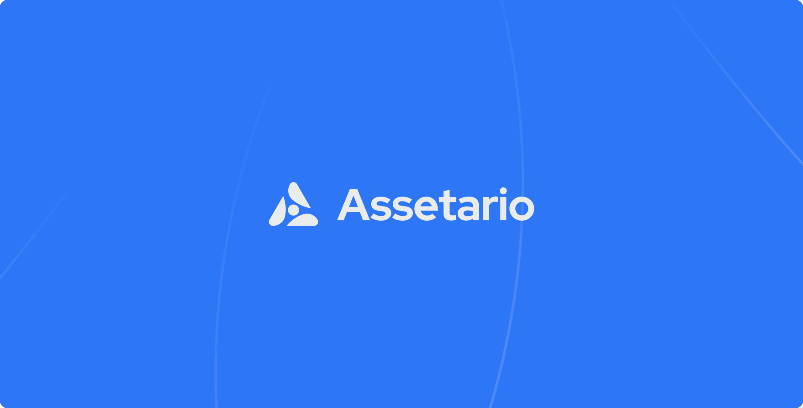
Assetario
 Slovakia
Slovakia
Services
The Assetario team assembled thanks to a common passion for artificial intelligence. The question they asked themselves was, “How will we help fill the gap in the mobile app market with accurate behavioral data for companies that contribute to financial stability, growth, and engagement for both companies and their users?”
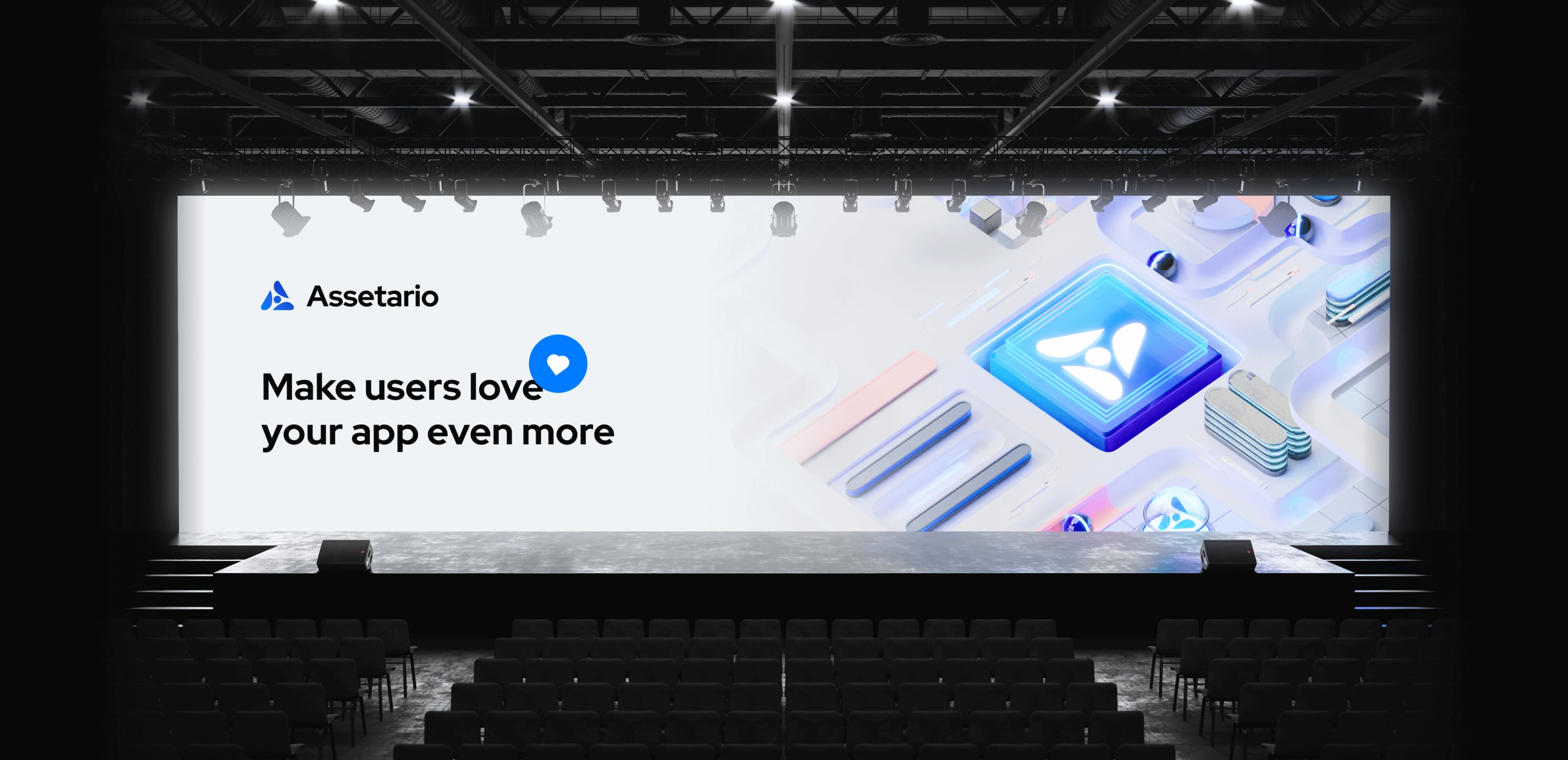
And then Assetario was born.
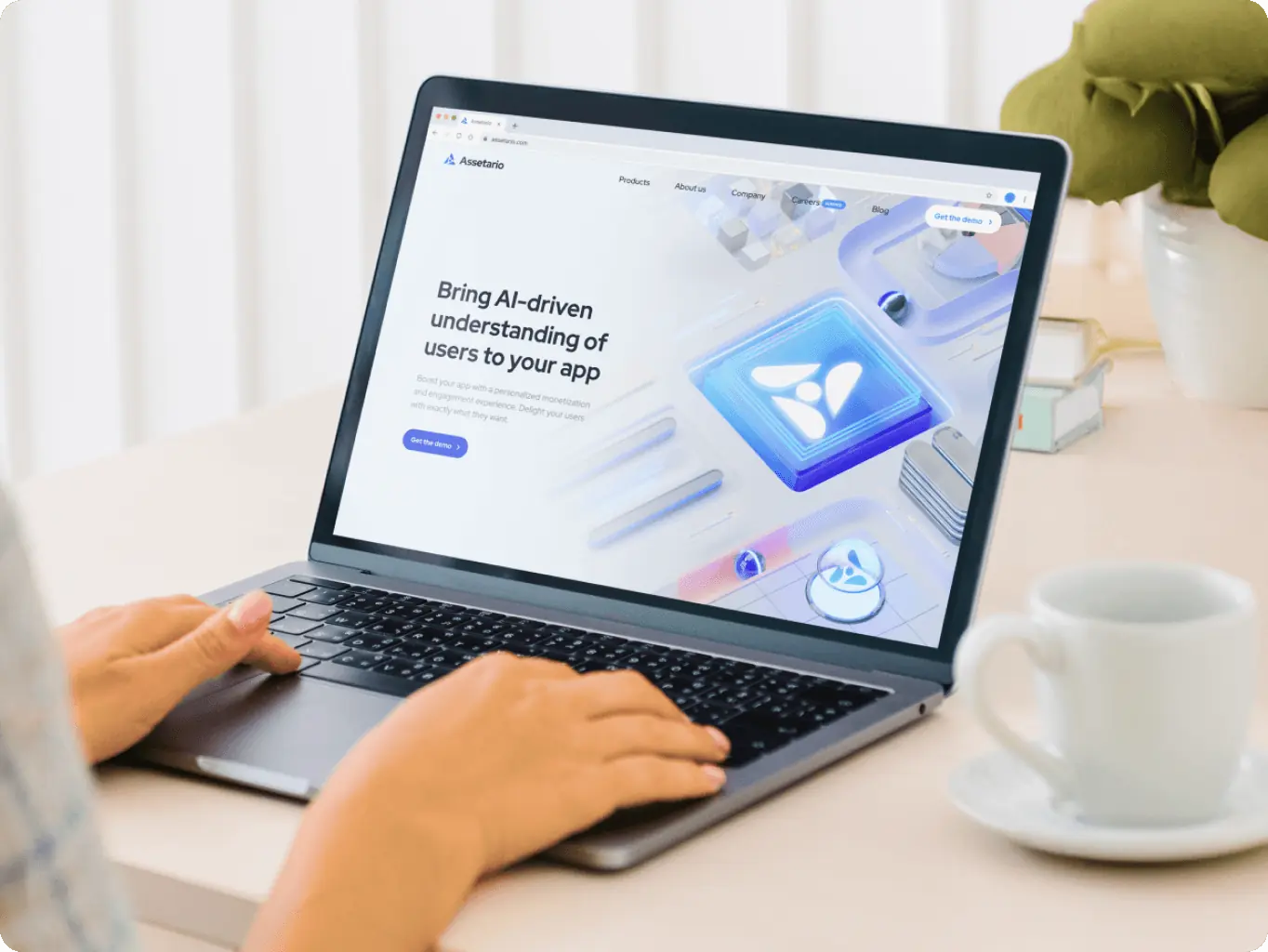
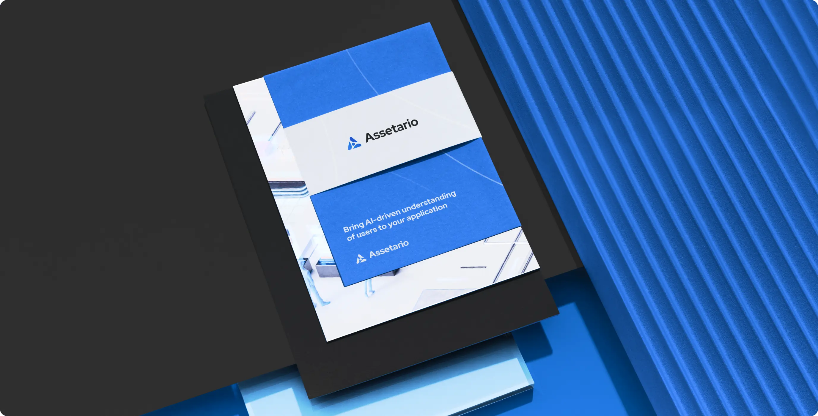
They trusted us with the total rejuvenation of their entire brand identity and corporate website. We’re very excited to share the results.
- Logo design
- Creation of the whole Brand Identity
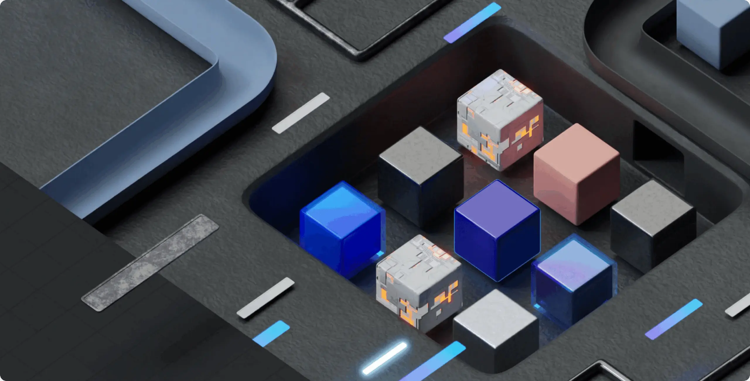
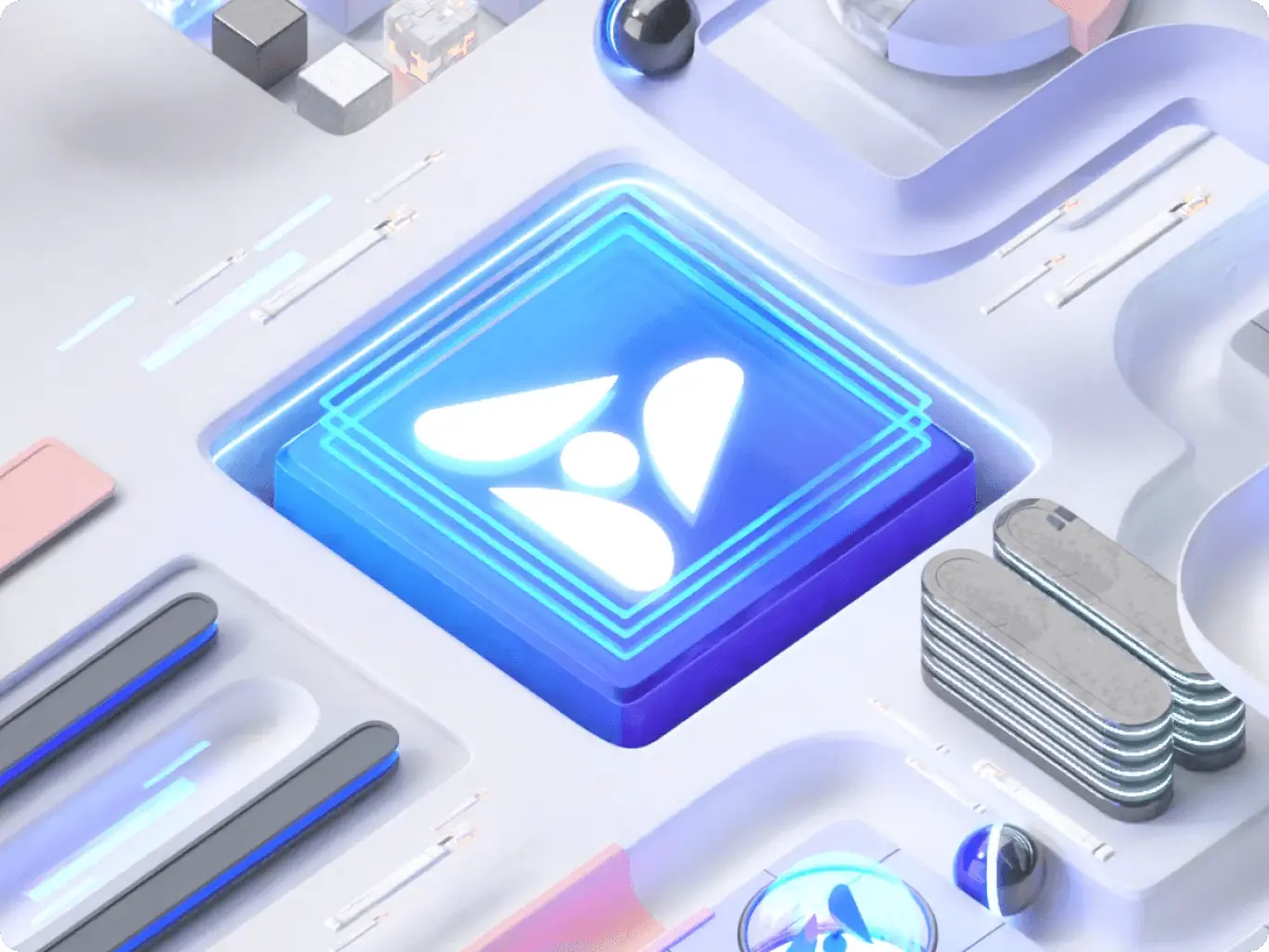
- 3D Motion Design & Illustrations for the Website and Brand Identity
- Marketing assets for the advertising campaigns.
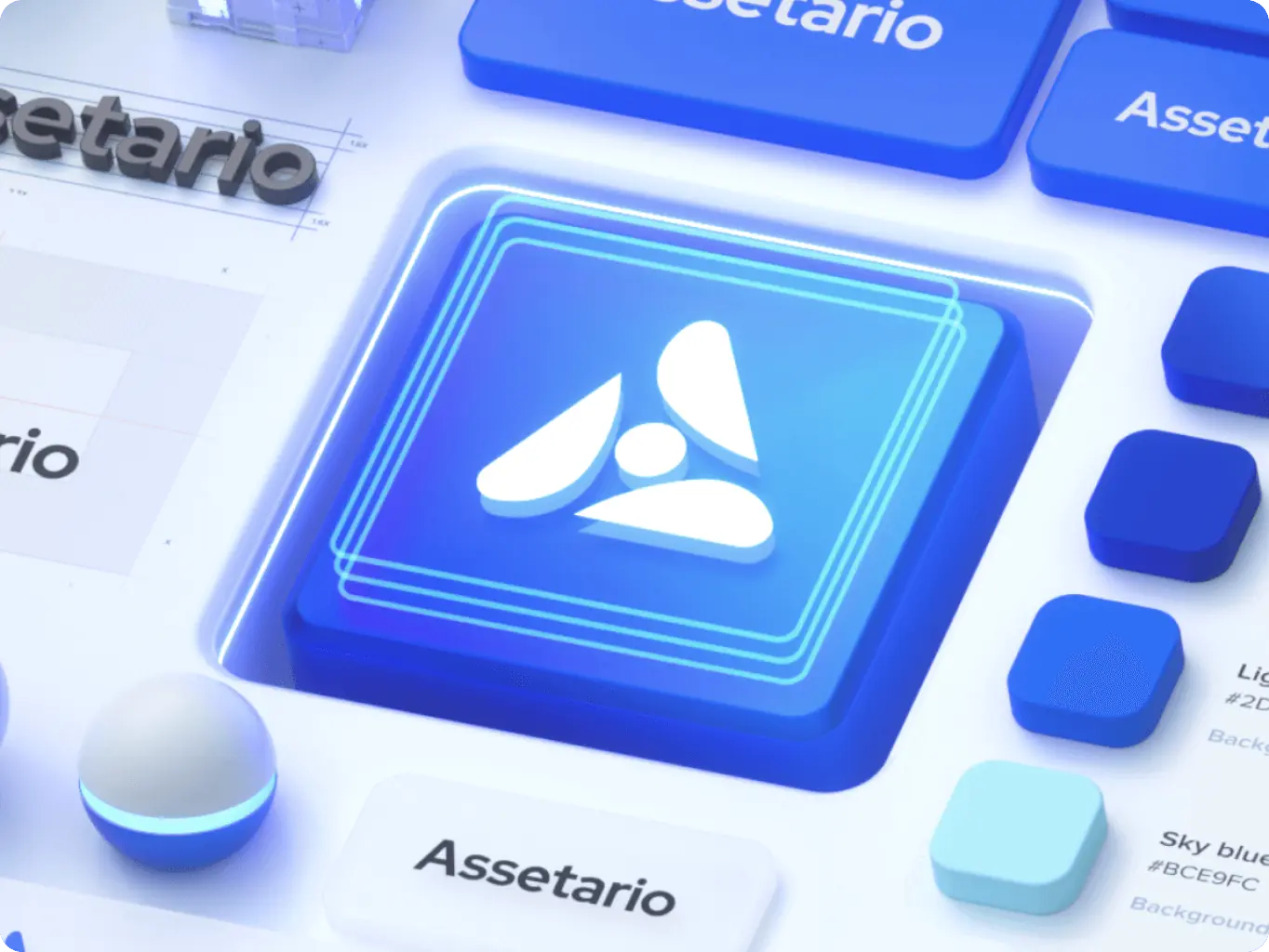
Logo idea and execution
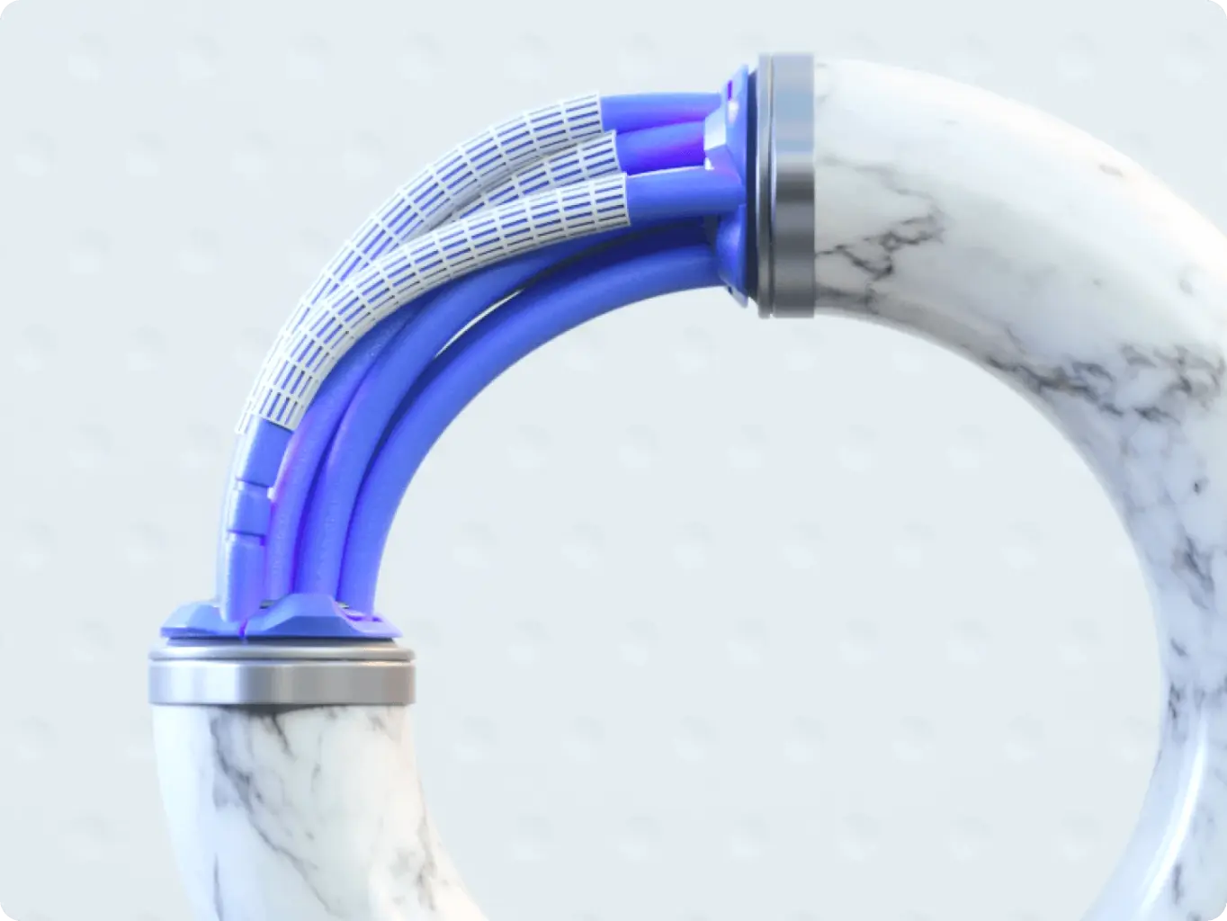
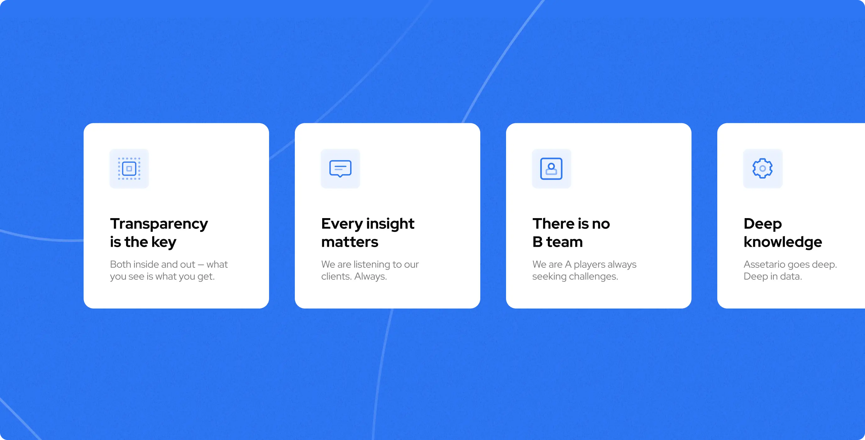
The logo unites several metaphors into a single icon. The triangle and dot in the middle refer to the letter A, the drops give the impression of a whirlwind (data transmission/flow), and the dot in the middle also refers to AI as a sphere around which calculations take place. In addition, a whirlwind can also be shown as a prediction because a drop in the center is the best and only solution.
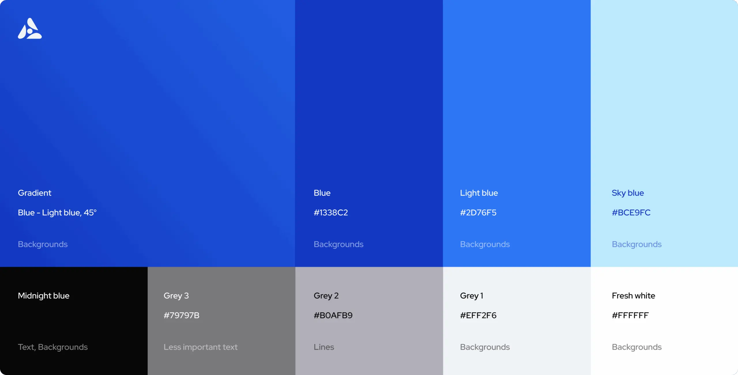
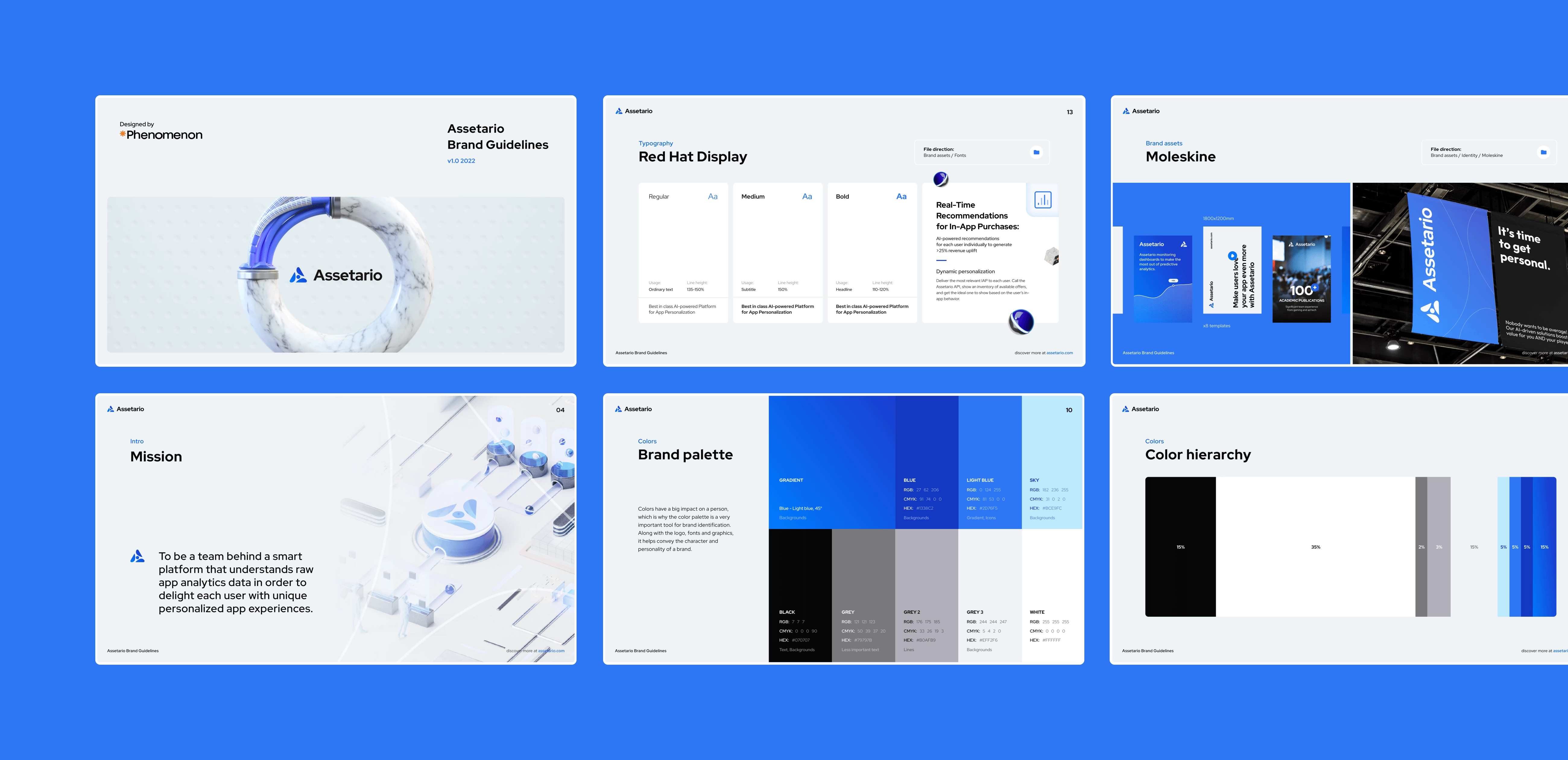
Brand colors
It can make or break a brand, which is why a color palette is an essential tool for identifying a brand. It helps convey the character and personality of a brand along with the logo, fonts and graphics.
The basis of the corporate identity is to be light and professional. And to support this, below are the percentages of all the corporate identity colors. These numbers may change from one layout to the next, but not by much. The main principle is to make the brand feel light, clean, modern and professional.
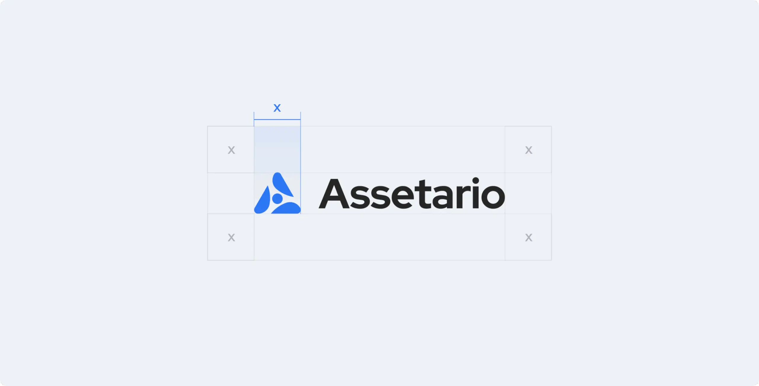
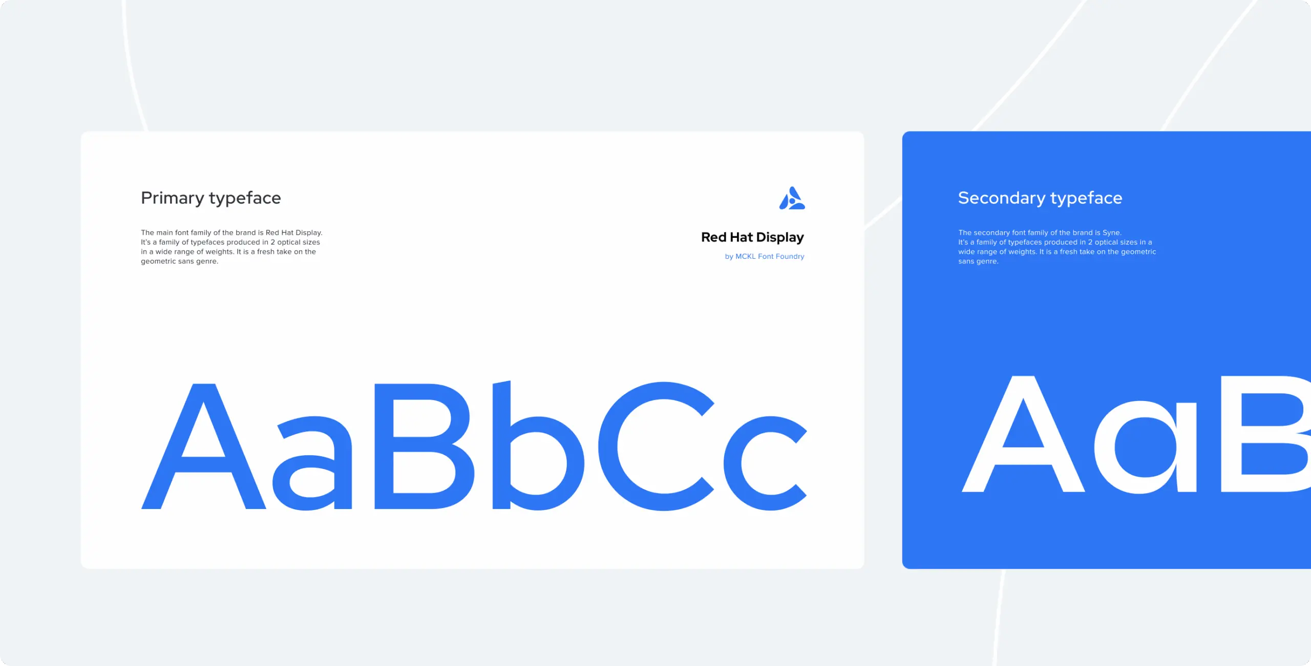
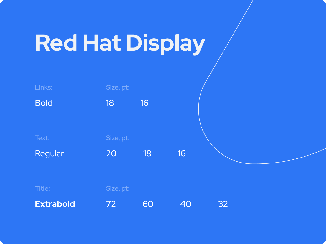
Typography solution
The brand typography is another visual element of the brand style that organizes the written representation of a brand and is in line with the message that brand wants to convey to customers.
For the Assetario font solution, we were consistent in our choice of typeface and did not deviate from the most technical and modern typeface. At the same time, we ensured that the brand’s packaging is easy to use.
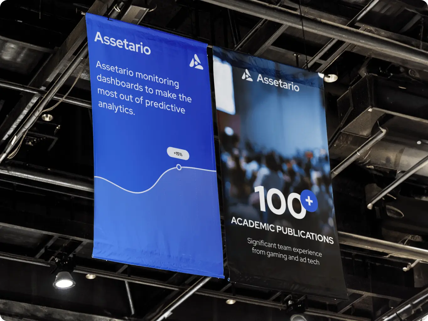
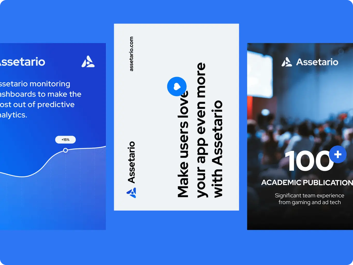
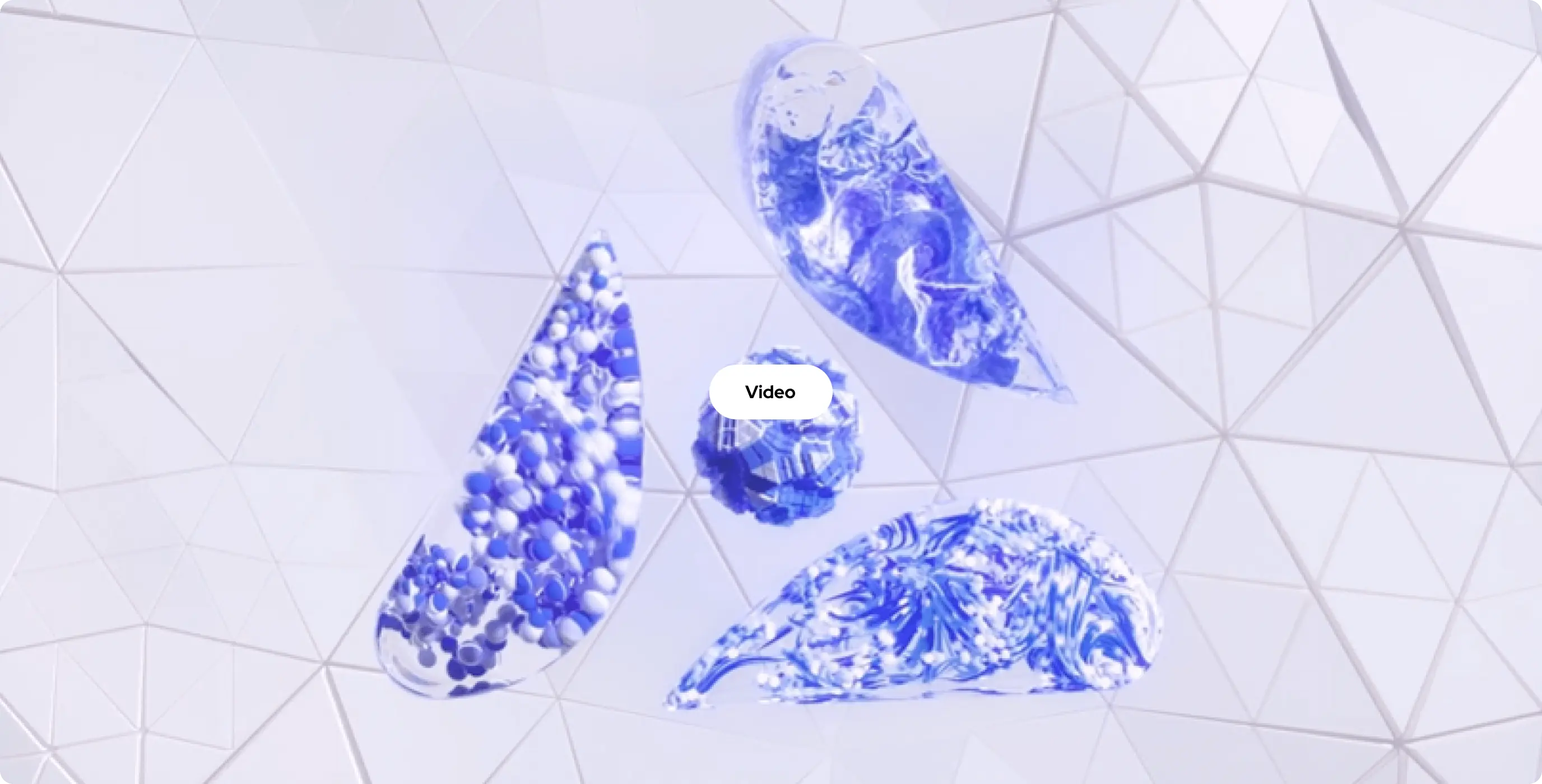
These illustrations are for both user engagement and marketing activities. All these things help our clients to stand out from other startups. But still look relevant in their field.
It doesn’t just work on the website. Engagement is much better with these kinds of visuals and animations. But it also works for social media and for video presentations to investors or customers. This stunning design also increases brand trust in general because it looks professional.

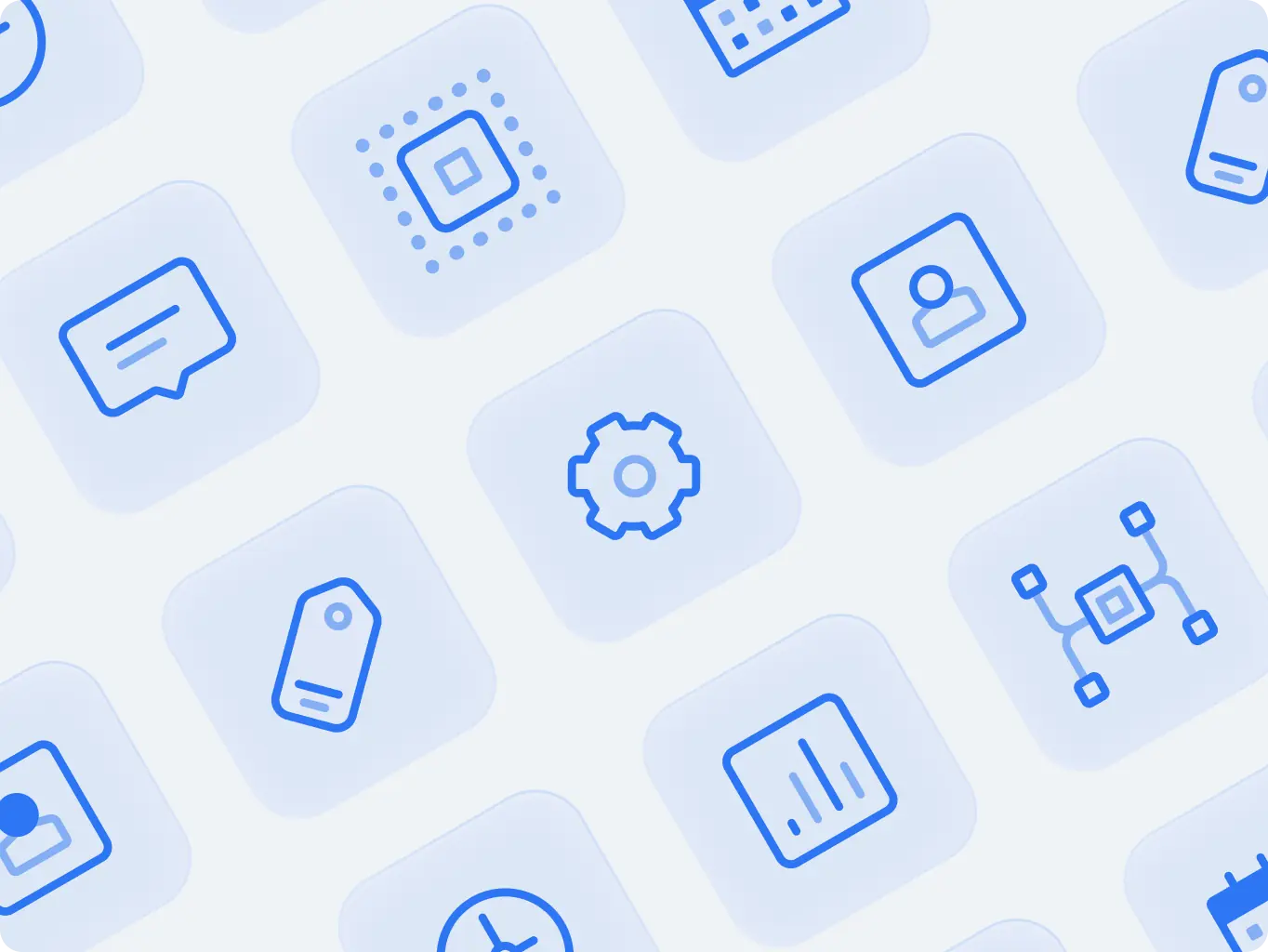
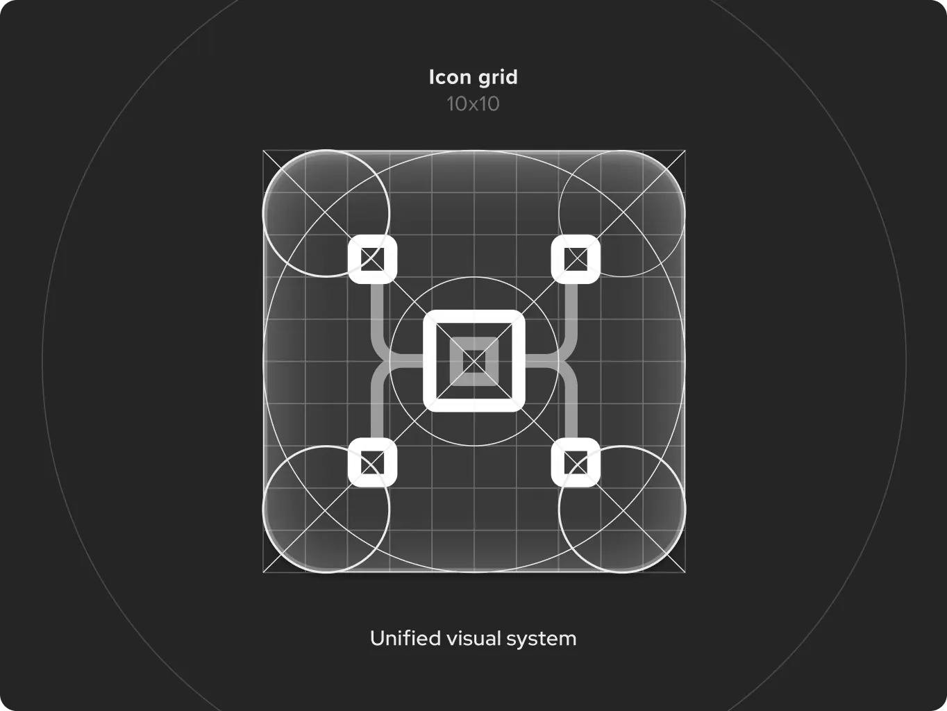
Iconography
We developed icons that covered all types of digital assets. Our team meticulously planned for various types of branded iconography, from social media platforms to website usage. Whether it is a website or an app, we ensured that our icons align seamlessly with the brand’s identity and conveys its message effectively.
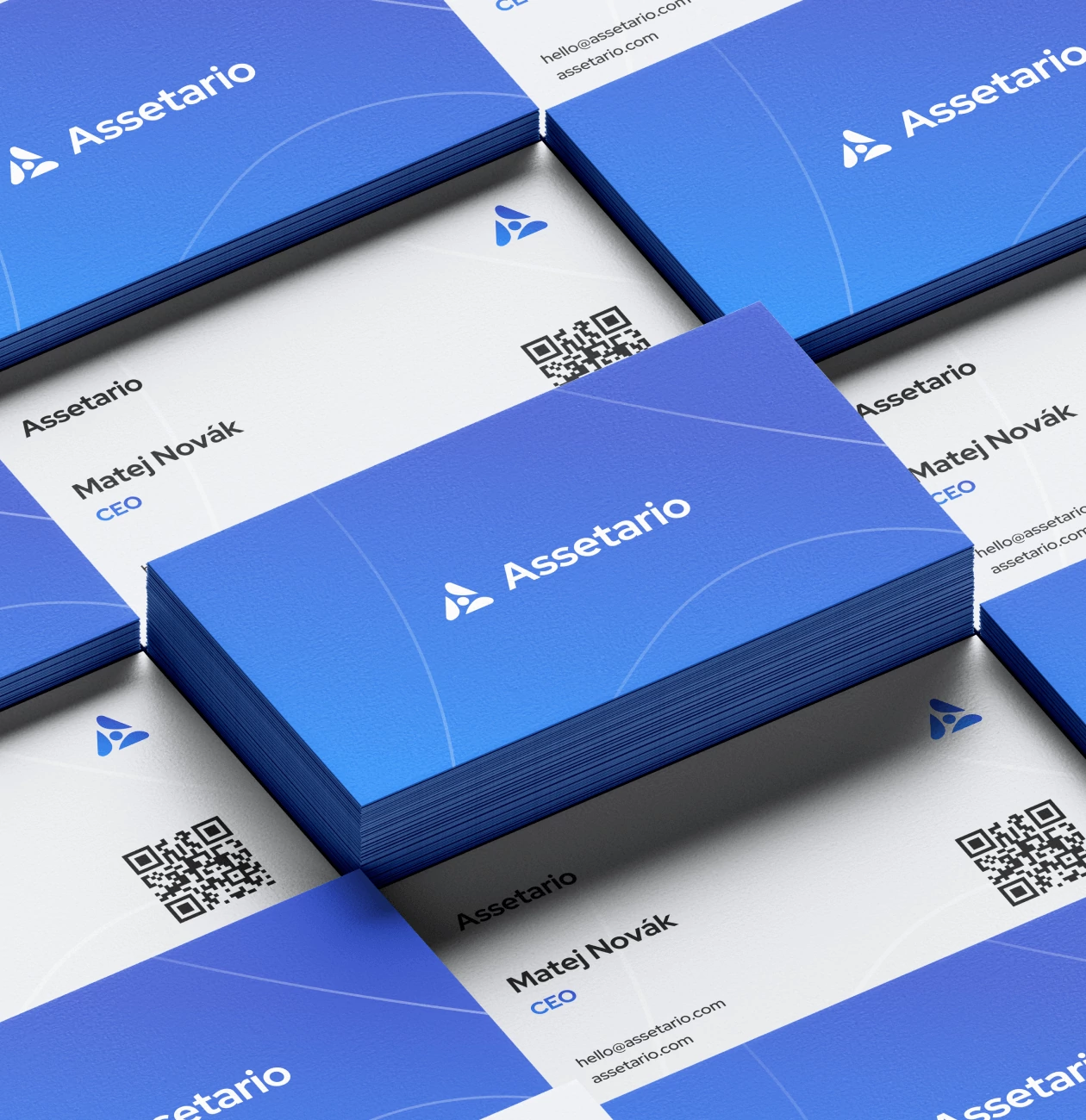
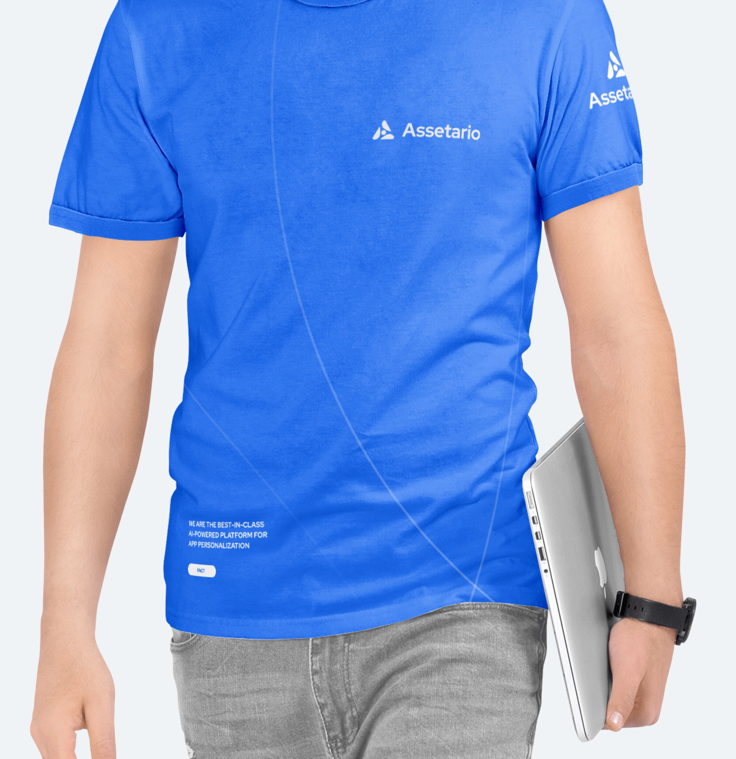
We have created an identity that covers all kinds of materials. We always think ahead about different types of brand assets, from digital to physical. So developing the design of printed products is no exception.
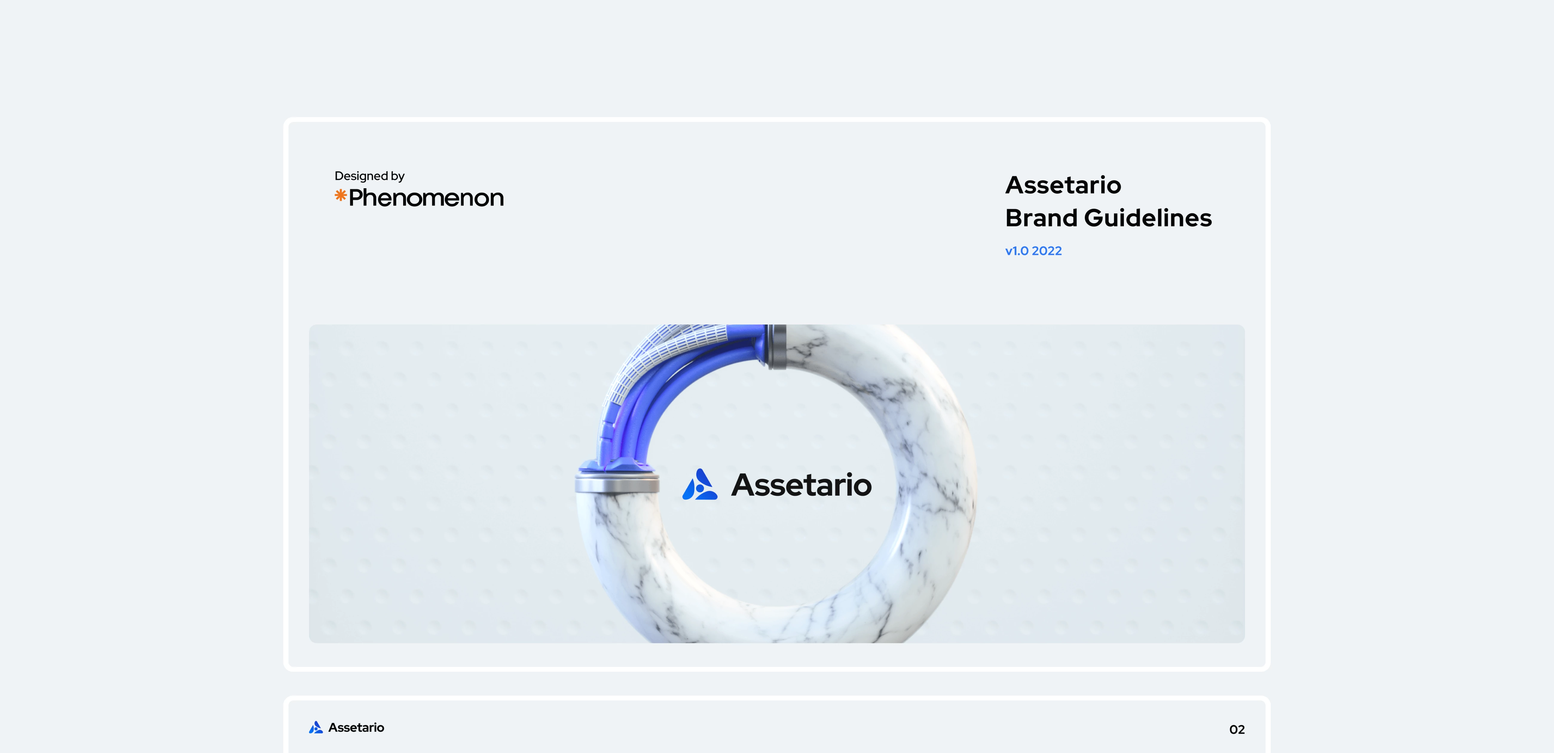
To ensure the brand’s proper usage, we created basic brand guidelines that clarify the appropriate use of logo, color palette, typography, and other graphic elements, collected in a complete folder with all brand assets, readily available for use.
#Web app design #Web development
Saifast
 USA
USA
USA
#Web app design #Web development
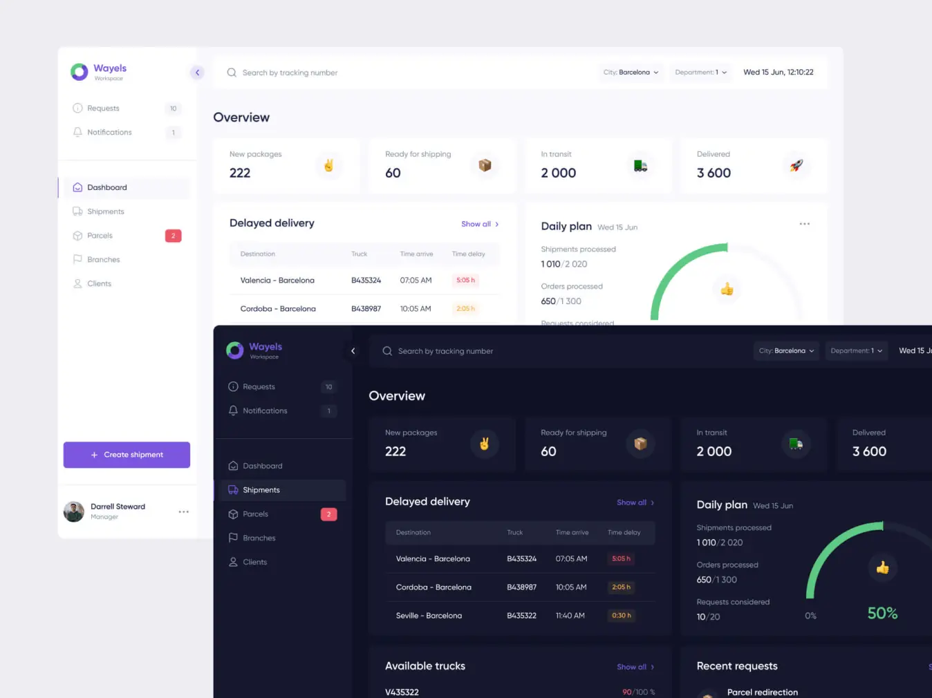
Wayels
USA
USA
Have a project in mind?
Let's chat
Have a project to
discuss?
discuss?

Have a partnership in
mind?
mind?