Development
Research
May 8, 2025
6 min read
summary
Discover how responsive design enhanced P2P platform usability, cut support tickets by 35%, and improved user experience across devices.
Peer-to-Peer (P2P) platforms have transformed industries ranging from finance and technology to online marketplaces. However, broad adoption often depends on the quality of the user experience. Responsive web design has proven to be a breakthrough in optimizing user interfaces, ensuring seamless usability for all site visitors across all devices. One case study reports a staggering 35% drop in customer support queries after implementing responsive design principles.
This blog will explore how responsive web design improves usability, fosters user trust, drives P2P platform adoption, and reduces support needs. Along the way, we’ll highlight actionable insights for leveraging this approach in your business.
Introduction to Responsive Web Design
Responsive web design is a crucial aspect of creating a seamless user experience across various devices and screen sizes. With the increasing use of mobile devices, having a responsive website is no longer a luxury but a necessity for businesses to reach a wider audience. Our responsive web design services ensure that your website is optimized for search engines, providing a consistent user experience and improving user engagement.
A responsive website design adapts to different screen sizes and devices, ensuring that your website looks and functions perfectly on desktops, tablets, and mobile phones. By investing in responsive web design services, you can improve your website’s visibility, drive more traffic, and increase conversions. This approach not only enhances user satisfaction but also aligns with modern user expectations, making your digital presence more robust and effective.
What Is Responsive Design?
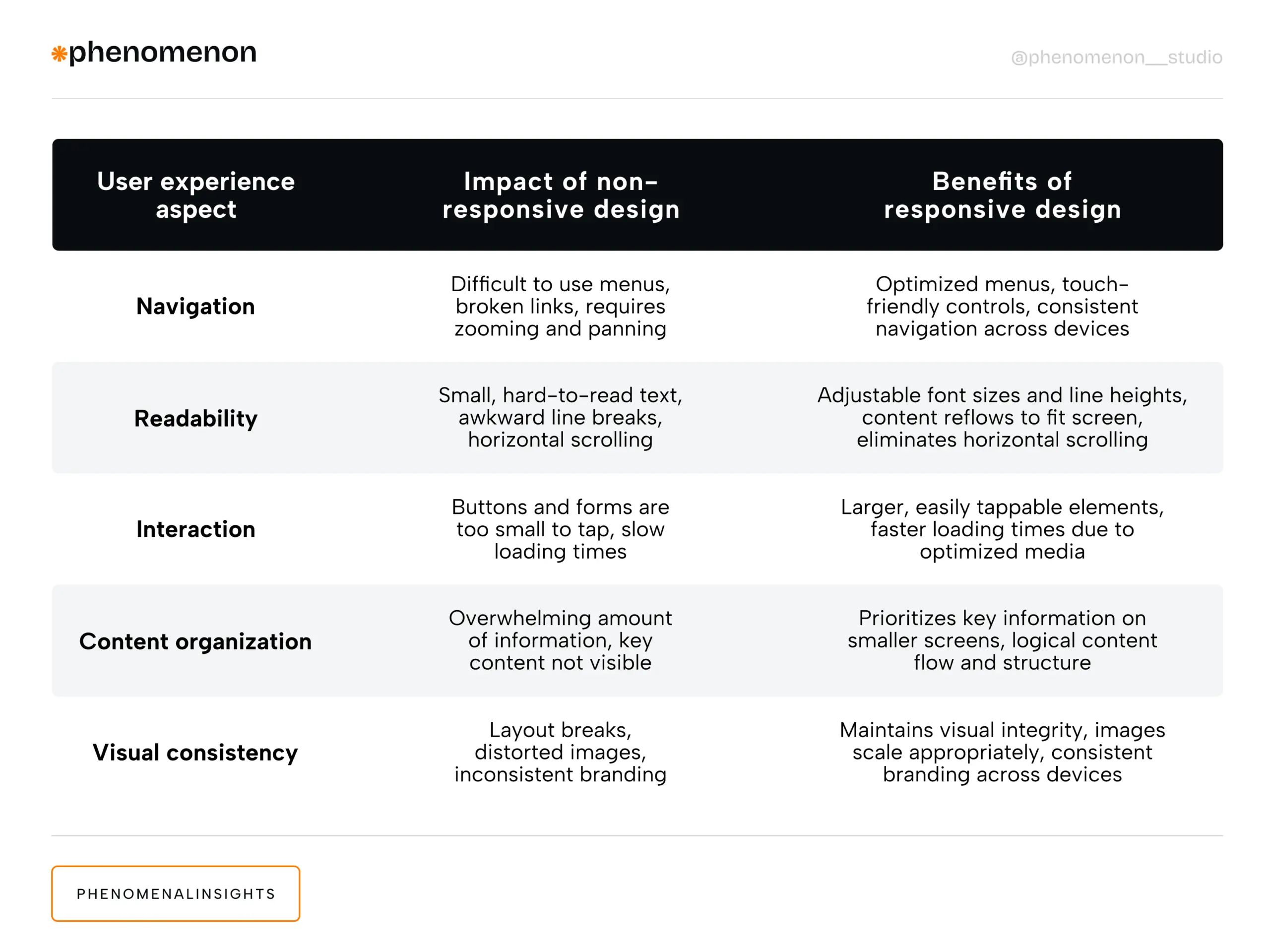
Responsive design ensures a website looks and functions well on any device, from large desktop screens to small smartphones. This flexibility is achieved through key principles such as:
- Fluid Grids: Page elements are sized in relative units (percentages) instead of fixed pixels. This allows layouts to adjust dynamically based on screen size.
- Flexible Images: Media assets scale proportionally so they fit within their boundaries without being cropped or distorted.
- CSS Media Queries: These allow web designers to apply specific styles based on the characteristics of the user’s device (e.g., screen resolution or orientation).
First coined by Ethan Marcotte in 2010, the concept of responsive design eliminated the need for multiple site versions (desktop vs. mobile), offering a single, adaptable solution to accommodate diverse devices.
By employing these components, a website can maintain optimal usability and visual balance across devices, creating a consistent experience for users.
Why Responsive Design Matters for P2P Platforms
The user experience is at the heart of any successful P2P platform. Whether borrowers use a lending platform, buyers and sellers interact on a marketplace, or individuals share tech resources, users expect intuitive functionality and reliability. With the growing diversity of devices, inconsistent layouts or clunky navigation can quickly frustrate users and drive them away. Additionally, responsive design plays a crucial role in digital marketing by improving website visibility and driving more traffic to the platform.
Here’s why responsive design is crucial for P2P platforms:
1. Fosters User Trust
A professional, consistent interface signals credibility. For example, in financial P2P settings like lending, users need assurance that transactions are secure. A cohesive experience across desktops, tablets, and smartphones boosts confidence in the platform’s reliability, contributing to an exceptional user experience.
2. Improves Usability
Responsive design eliminates common frustrations like horizontal scrolling or broken layouts. Features such as larger touch-friendly buttons and streamlined navigation menus optimize functionality on smaller screens. This usability supports user retention and encourages frequent engagement.
3. Broadens Accessibility Across Mobile Devices
Responsive design accommodates users regardless of the device they own. This inclusivity expands the potential user base and ensures users can participate without barriers, whether they’re on an older phone or a high-resolution desktop setup. This inclusivity ensures that user journeys are seamless and intuitive, regardless of the device being used.
4. Supports User Personalization
Responsive platforms can dynamically adapt interfaces, offering custom solutions that cater to individual user needs. For example, a mobile interface might prioritize loan application screens for borrowers or quick-edit tools for sellers, while desktops provide more detailed dashboards or analytics.
5. Strengthens Branding Consistency
Consistent branding across devices, supported by cohesive visual elements, builds recognition and trust. Users know they’re interacting with the same platform, regardless of their tech preferences.
Key Elements of Responsive Design
The key elements of responsive design include fluid grids, media queries, and flexible images, which work together to create a seamless user experience. Fluid grids allow content areas to adjust to different screen sizes, ensuring that your website maintains its structure and readability. Media queries help websites adapt to different devices and screen sizes by applying specific styles based on the user’s device characteristics.
Flexible images can be resized to fit different screen sizes, ensuring that your website looks perfect on various devices without any distortion. Our responsive web design company uses the latest technologies and techniques to create custom responsive websites that meet your business objectives. By prioritizing user experience and user satisfaction, we ensure that your website is optimized for maximum conversions and minimum bounce rates, providing a consistent and engaging experience for all users.
Responsive Design’s Role in Driving P2P Adoption
1. Enhanced Perceived Ease of Use
Ease of navigation is a critical factor driving the adoption of new technologies. Responsive design simplifies platform usage, creating a frictionless path for users to understand and adapt to features quickly.
A well-structured development process ensures that responsive design elements are seamlessly integrated, enhancing ease of use.
2. Increased Perceived Usefulness
When users can interact with key platform features effortlessly on their device of choice, the perceived value of that platform rises. Borrowers who appreciate seamless mobile loan tracking, for example, are more likely to stick around.
Comprehensive user research helps identify key features that users value, enhancing the perceived usefulness of the platform.
3. Competitive Edge
Offering a mobile-friendly, accessible platform can distinguish a P2P business from competitors stuck in the past. Modern users expect functionality across all devices; a failure to deliver risks alienating your target audience. Partnering with a responsive web design agency can provide the expertise needed to stay ahead of competitors.
4. Amplified Network Effects and User Engagement
P2P platforms grow stronger as their user base expands. Responsive design lowers entry barriers, onboarding more users and contributing to valuable network effects. Effective responsive website development can lower entry barriers and amplify network effects.
5. Trust in Financial Transactions
For financial P2P platforms like lending or payment systems, responsive designs emphasize security and usability. This assures users that their sensitive information remains protected, contributing to an optimal user experience and boosting their willingness to adopt the platform.
When implemented effectively, responsive design becomes a major driver of platform growth, broadening reach, increasing engagement, and lowering the adoption threshold for users across devices.
Cutting Support Needs by 35% With Responsive Design
A seamless, intuitive interface directly reduces the need for customer support. For P2P platforms, responsive design:
- Minimizes Device-Specific Issues
Users no longer need guidance for device compatibility issues. A responsive design ensures features work across all devices.
- Eliminates Layout Confusion
Frustrating navigation layouts, broken buttons, or unreadable text lead users to contact support. Responsive design addresses these challenges upfront, improving self-service success.
- Boosts Self-Help Resources
A responsive design ensures FAQ pages, tutorials, and help articles display effectively on all devices, enabling users to resolve issues independently.
- Reduces Friction in User Tasks
Key actions like applying for loans, posting listings, or completing transactions are streamlined, making the user experience smoother and frustration-free.
Investing in responsive website development services can significantly reduce the need for customer support by ensuring a seamless user experience.
Real Results in Action
By implementing responsive design, one P2P platform achieved:
- A 35% drop in support ticket volume
- Faster task completion on mobile devices
- A boost in user satisfaction scores among website visitors
This tangible impact demonstrates how aligning your platform’s user interface with responsive design principles can lower operational costs and improve efficiency.
Digital Presence and SEO
A strong digital presence is essential for businesses to succeed in today’s competitive market, and responsive web design plays a critical role in achieving this. Search engine optimization (SEO) is a crucial aspect of responsive web design, as it helps improve your website’s visibility and drive more traffic. Our responsive web design services include SEO optimization, ensuring that your website is optimized for search engines and improves your online visibility.
By creating a responsive website, you can improve your website’s loading speed, reduce bounce rates, and increase user engagement, all of which are critical factors in SEO. Our team of experts has extensive experience in creating responsive websites that are optimized for search engines, ensuring that your website reaches a wider audience and drives more conversions. This comprehensive approach not only enhances your digital presence but also ensures that your website performs well across all devices, meeting the needs of your target audience.
Best Practices for Implementing Responsive Design for Search Engine Optimization
When adopting responsive design for your P2P platform, keep these strategies in mind:
- Adopt a Mobile-First Approach
Start by designing for the smallest screen, then scale your design up for larger devices. This mobile first design approach ensures mobile users experience the core functionalities seamlessly.
- Optimize Performance
Compress images and streamline code to prevent slow loading times, especially on mobile networks.
- Leverage Responsive Frameworks
Frameworks like Bootstrap and Foundation provide pre-built tools that simplify responsive design implementation.
- Include Accessibility Features
Follow guidelines like WCAG to ensure usability for individuals with disabilities.
- Test Across Real Devices
Simulators are helpful, but real-world testing on different device types ensures flawless functionality.
- Monitor Analytics & Gather Feedback
Track how users interact with your platform after implementing responsive design. Use insights to iterate and improve.
Building Better P2P Platforms With Responsive Design for Optimal User Experience
The rise of responsive design has reshaped user experience expectations for digital platforms, making accessibility, trust, and usability cornerstones of P2P platform success. By delivering a cohesive interface across all devices, responsive design encourages adoption, improves engagement, and streamlines operations. Partnering with a reputable development company can ensure that your platform is built with the latest responsive design principles, enhancing user experience and platform success.
For P2P businesses, the payoff is clear. Responsive design provides not only a superior user experience but also measurable benefits like reduced support costs and increased platform growth.
If you’re ready to enhance your platform’s responsiveness, take these insights and start implementing these best practices today. Whether you’re refining navigation for users or simplifying layouts for better accessibility, responsive design is your gateway to success in a competitive market.
Share this opening with friends
Jul 25, 2025
9 min read
Learn strategic frameworks for securing stakeholder approval for FinTech redesigns. Address compliance, security, and ROI concerns effectively.
Jul 14, 2025
9 min read
Discover why software design patterns, decision frameworks, and content strategy matter more than UI. Learn to document invisible systems that enable scalable growth.
Have a project in mind?
Let's chat
Have a project to
discuss?
discuss?

Have a partnership in
mind?
mind?